A Melbourne family home draws on classic modernism to create a pavilion in the landscape
This Melbourne family home by Vibe Design Group was inspired by midcentury design and shaped to be an extension of its verdant site
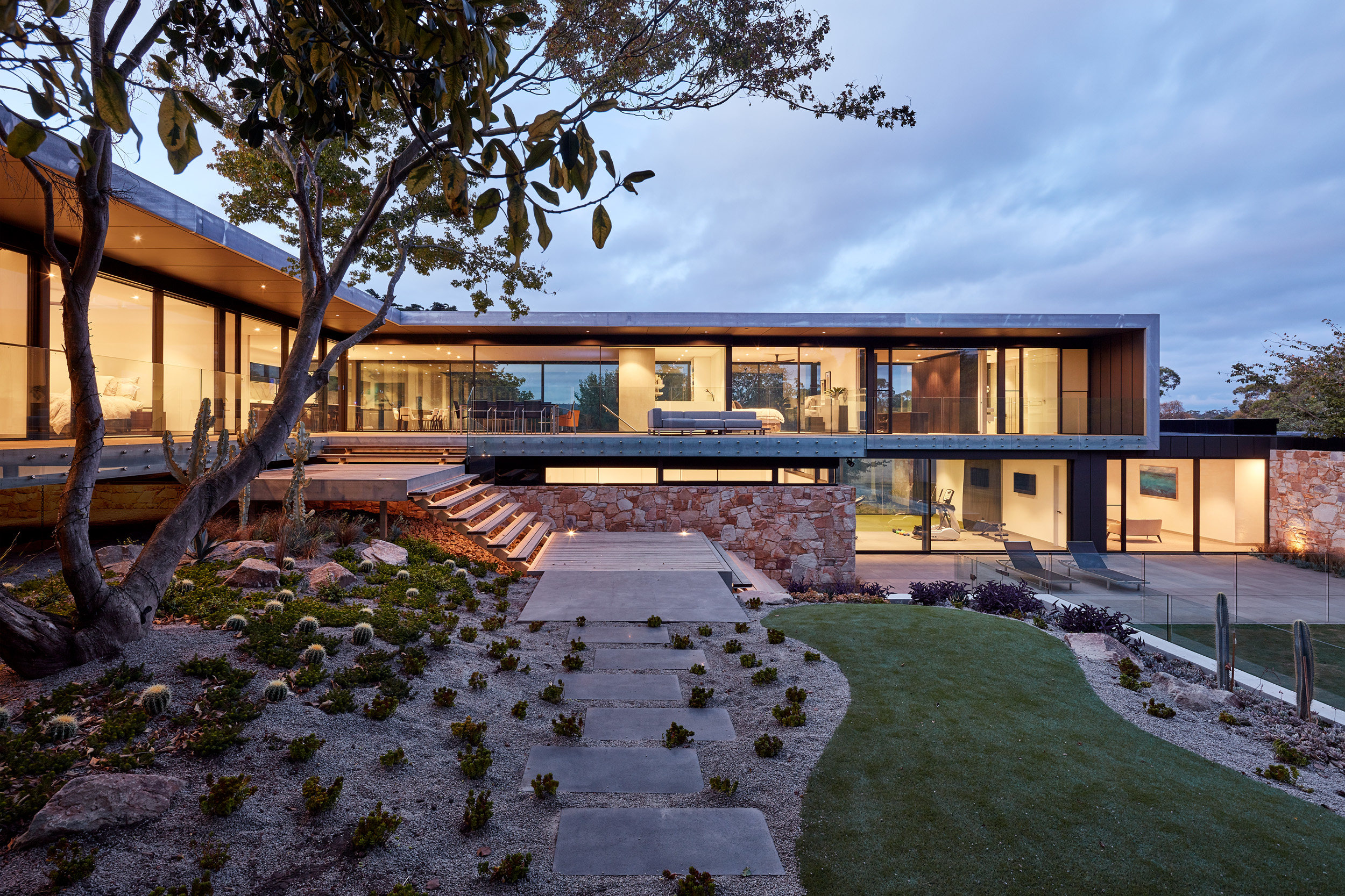
A new Melbourne family home on the Mornington Peninsula, Moat’s Corner is a multigenerational space that has been designed with an eye to the enduring style and appeal of classic West Coast midcentury modernist architecture. In fact, Vibe Design Group’s team had an American sojourn to explore some key influences.
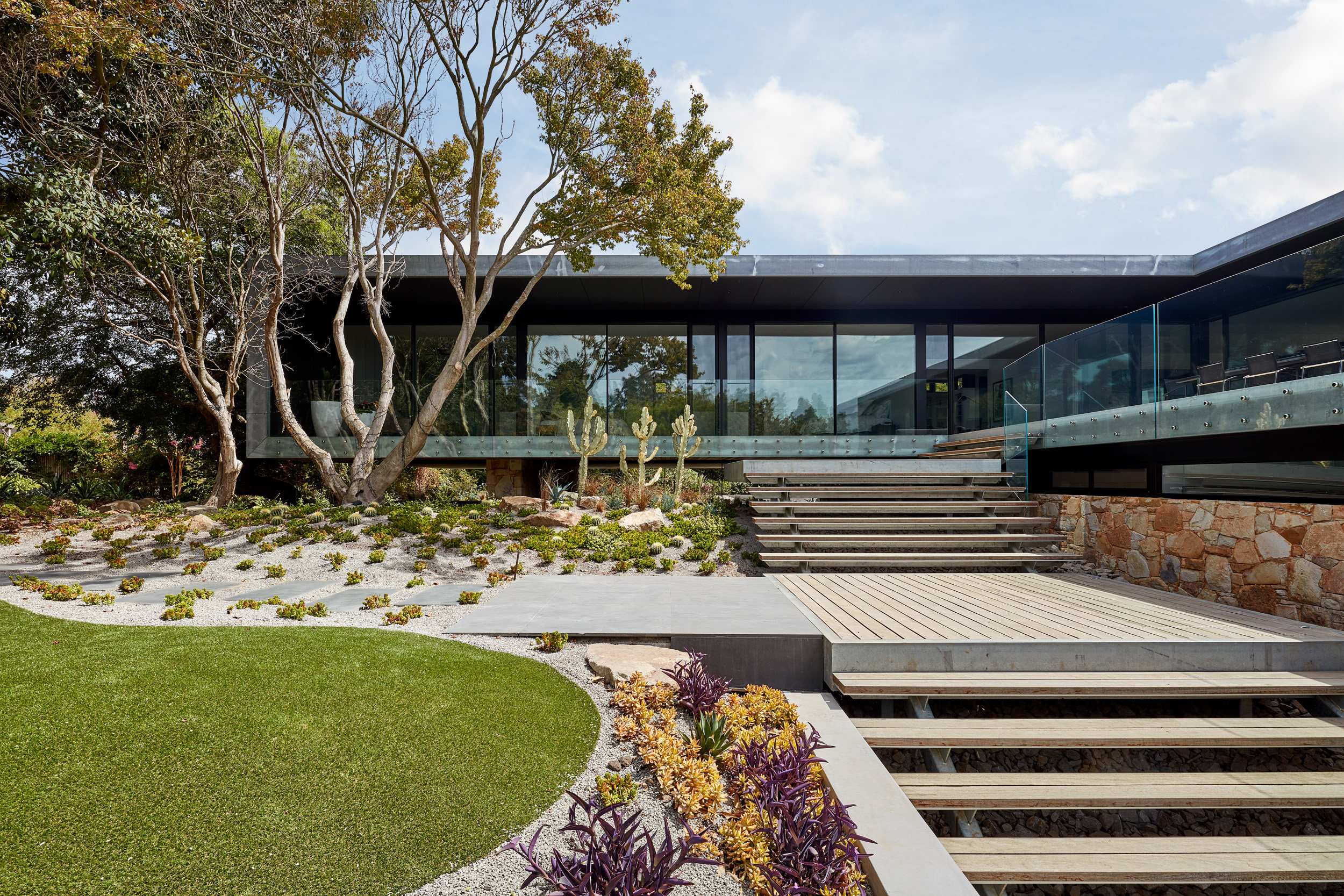
The house is set amongst botanical gardens
Step inside this Melbourne family home
‘A midcentury modernist ethos encompassing honesty to materials, structural innovation and minimal ornamentation was at the core of the design,’ the Melbourne-based studio says. Founded by architect Michael O’Sullivan in 2006, Vibe Design Group specialises in residential work in and around the Australian city.
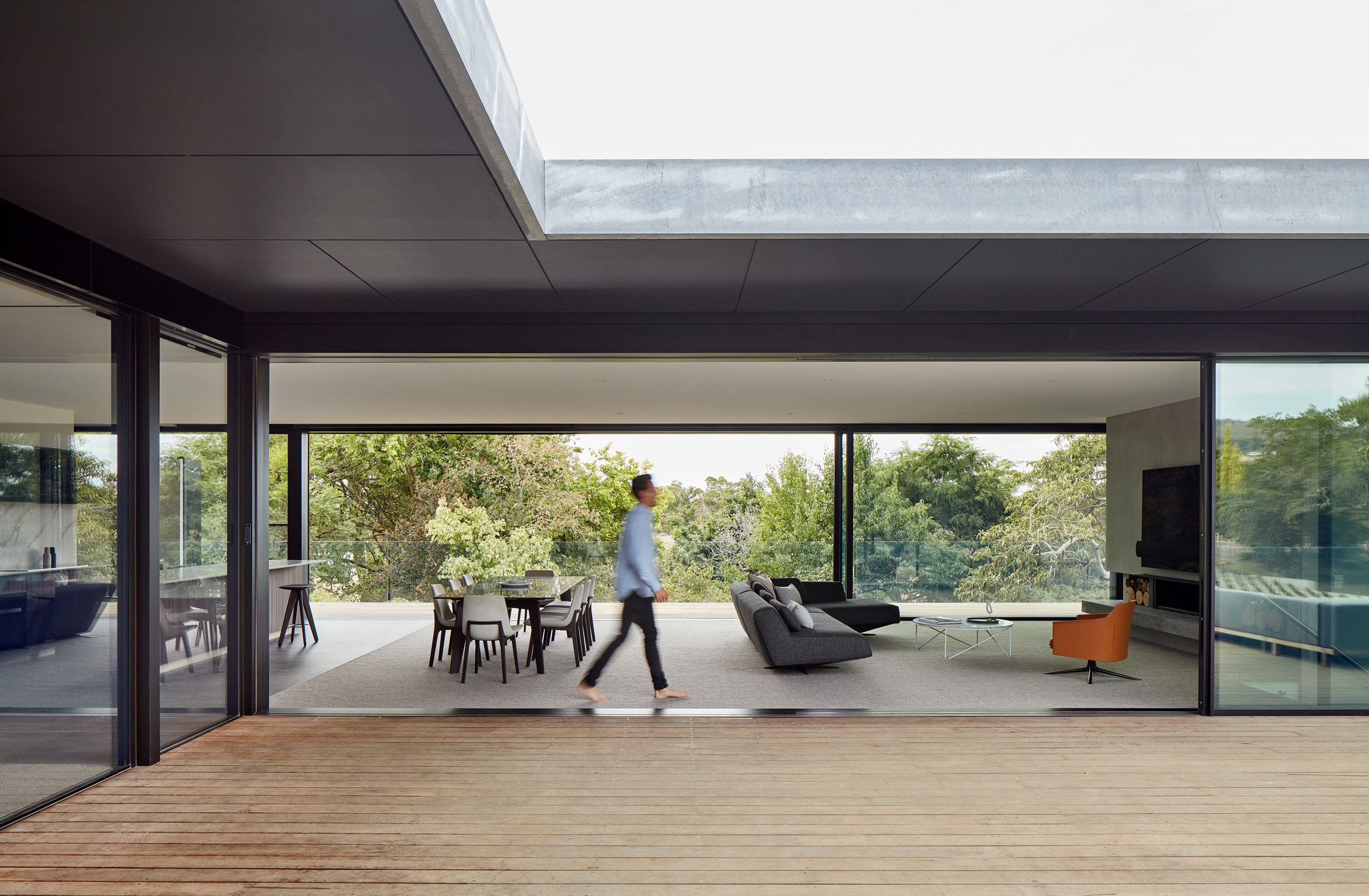
The main living space at Moat's Corner
The Mornington Peninsula is a sought-after location and the new house sits on an impressive sloping site, surrounded by five acres of botanical gardens. The primary living spaces are raised up above the site, with an L-shaped plan flanked by decks on either side.
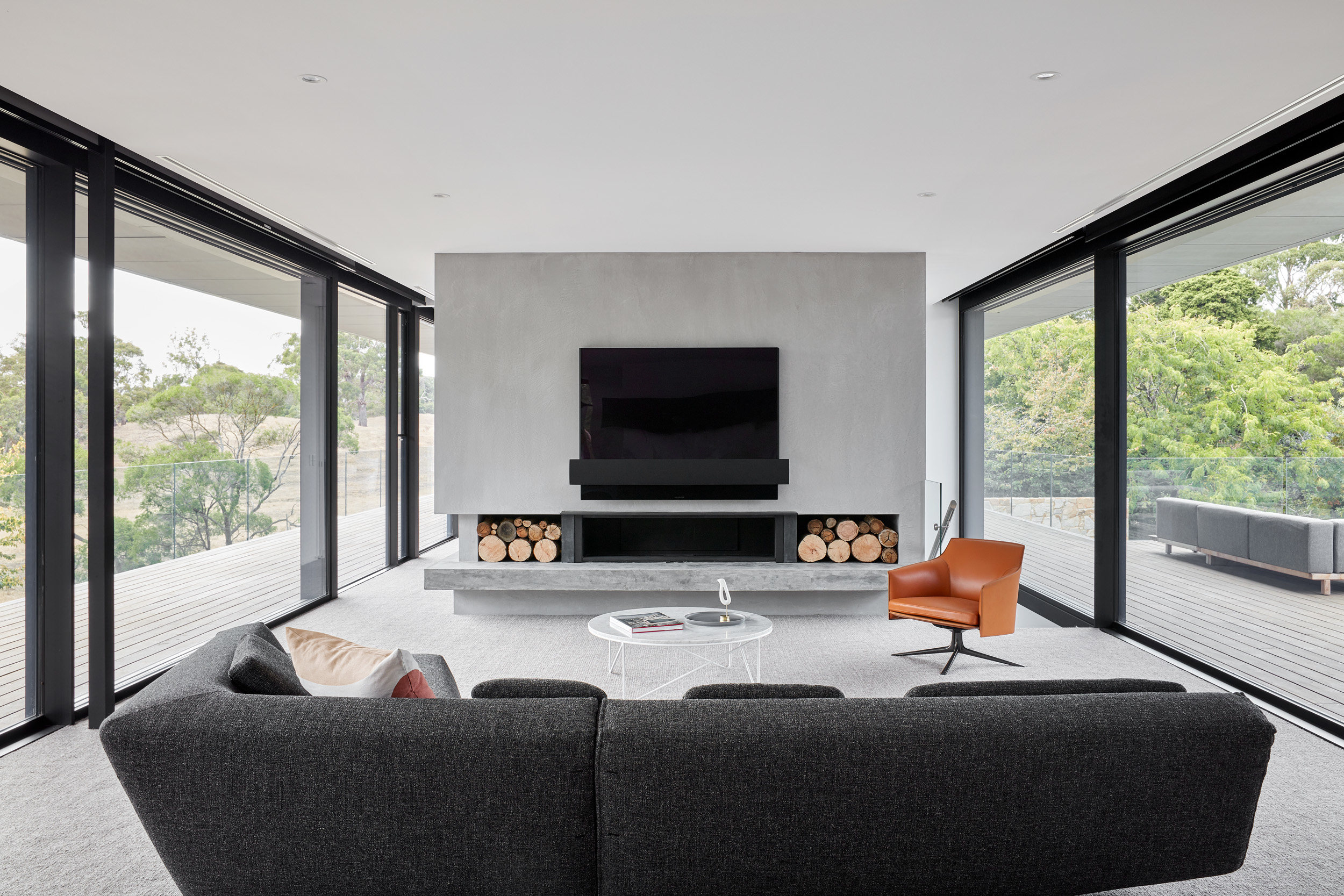
Inside the main living space at Moat's Corner
The living, dining and rumpus rooms are flanked by two wings of bedrooms, with three identical suites to the south, reached from a long library corridor on one side, with terrace access on the other. The principle bedroom occupies the eastern wing, a generously sized complex with a study, dressing room and bathroom.
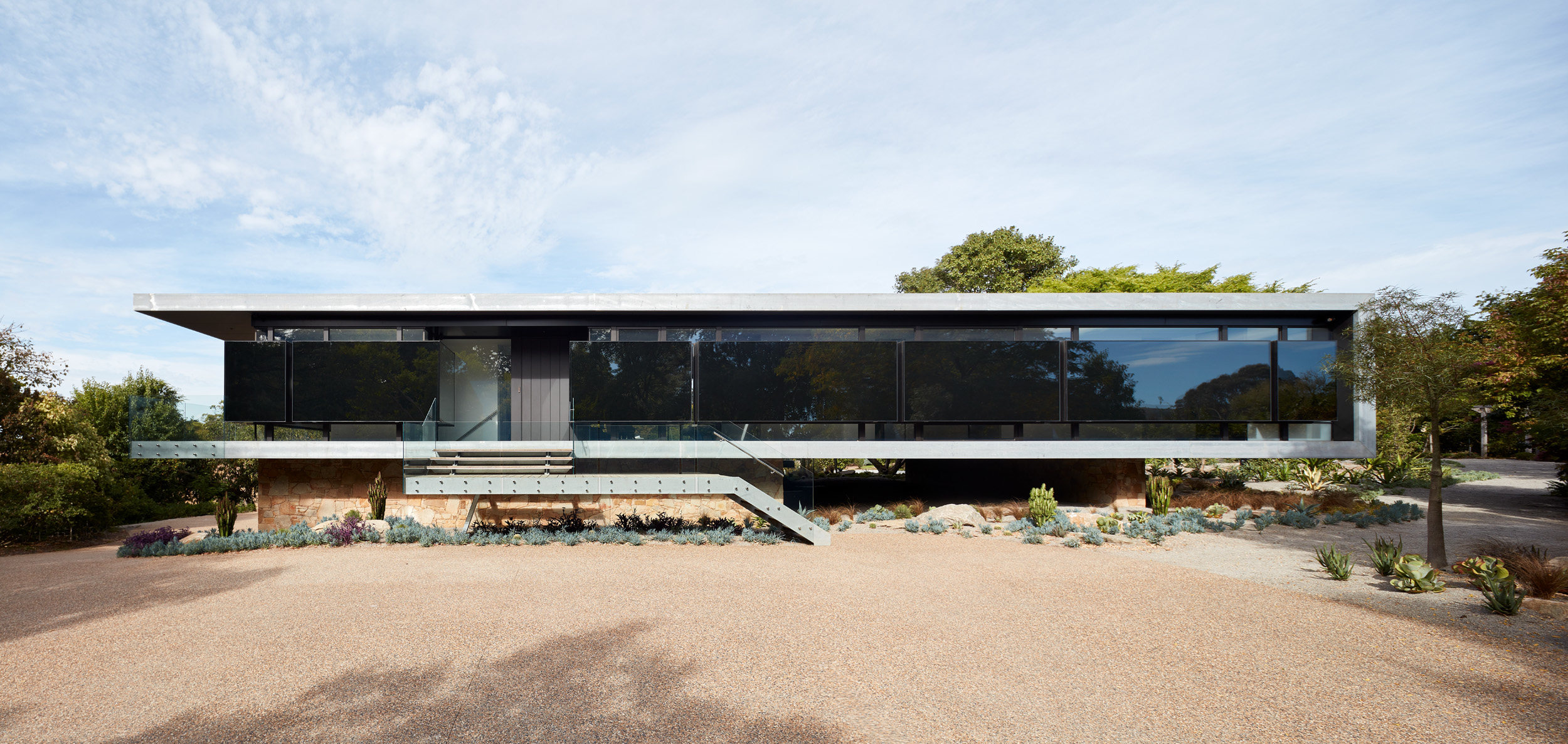
The mysterious entrance facade
The ground floor connects directly to the garden, with a large garage providing internal access to the house alongside an external staircase. A terrace leads to a pool to the south, with utility areas flanked by a gym, golf room and bar. This level also houses a self-contained two-bedroom annexe with its own private terrace.
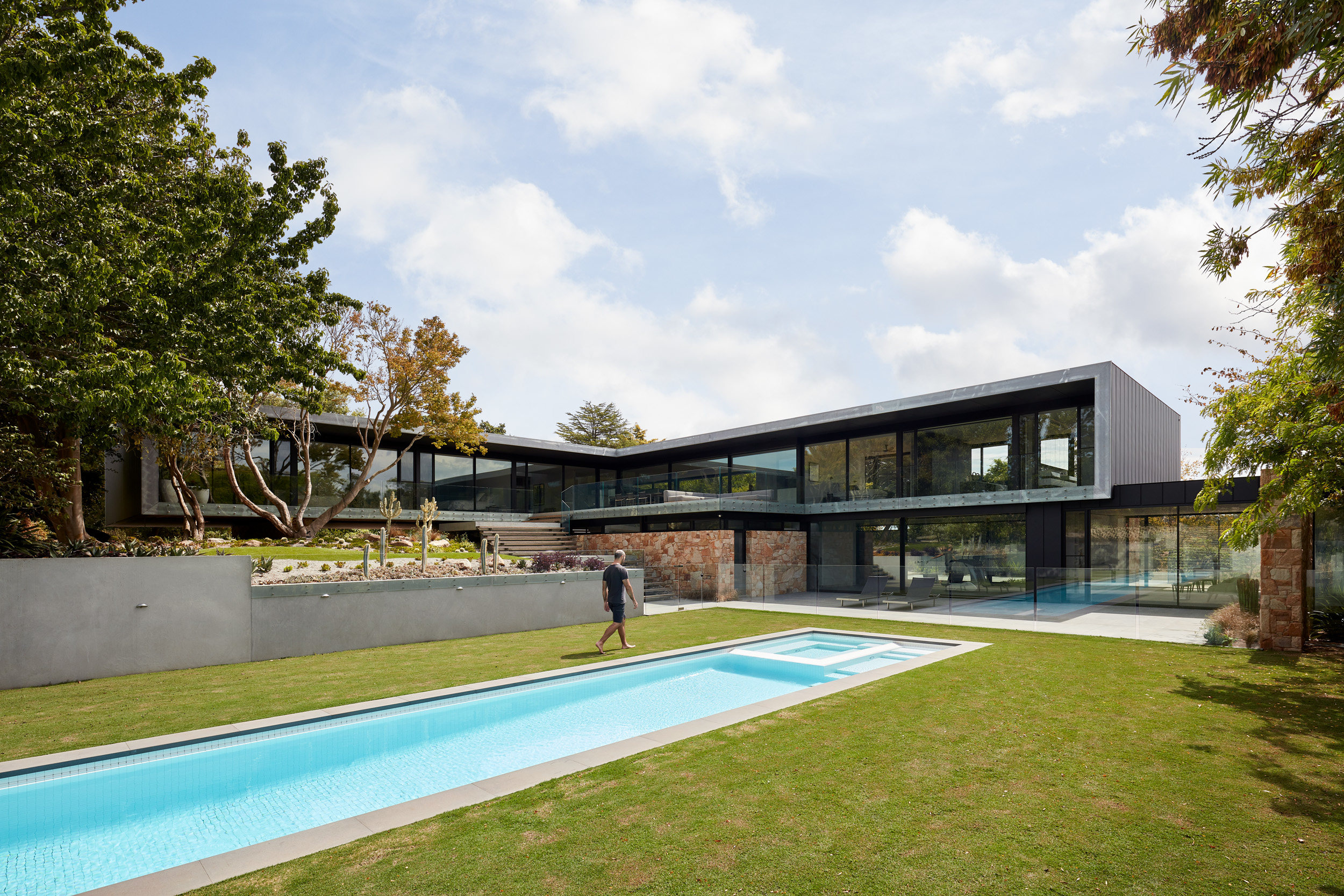
The pool adjoins the garden gym and bar
‘By virtue of the house design, to live in the home is to co-exist with the garden,’ the studio says. ‘The modernist-inspired style opens itself up to the garden at every opportunity – there is not a space within the home deemed principal or secondary that does not acknowledge the life that surrounds it.’
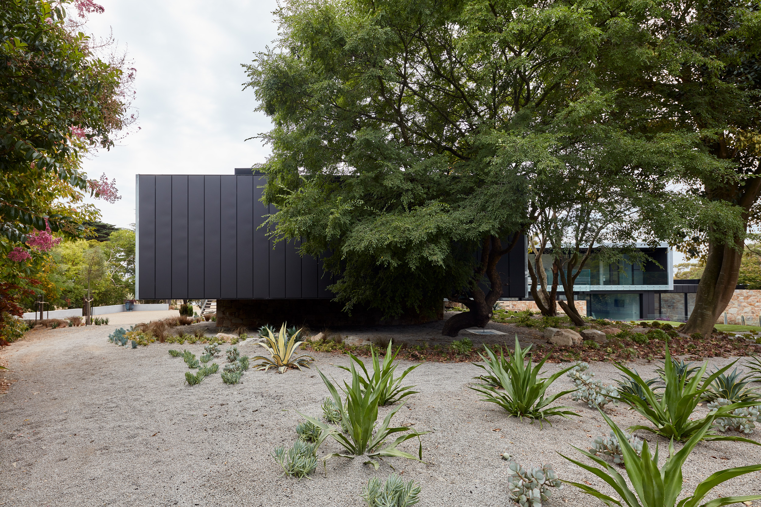
Naturalistic planting adjoins the modern forms of the house
Particular attention was paid to maximising the sense of transparency, and the decks that flank the living space become an extension of the room when the large glass sliding doors are opened. Frameless glass balustrading adds to this sense of transparency all year round.
Wallpaper* Newsletter
Receive our daily digest of inspiration, escapism and design stories from around the world direct to your inbox.
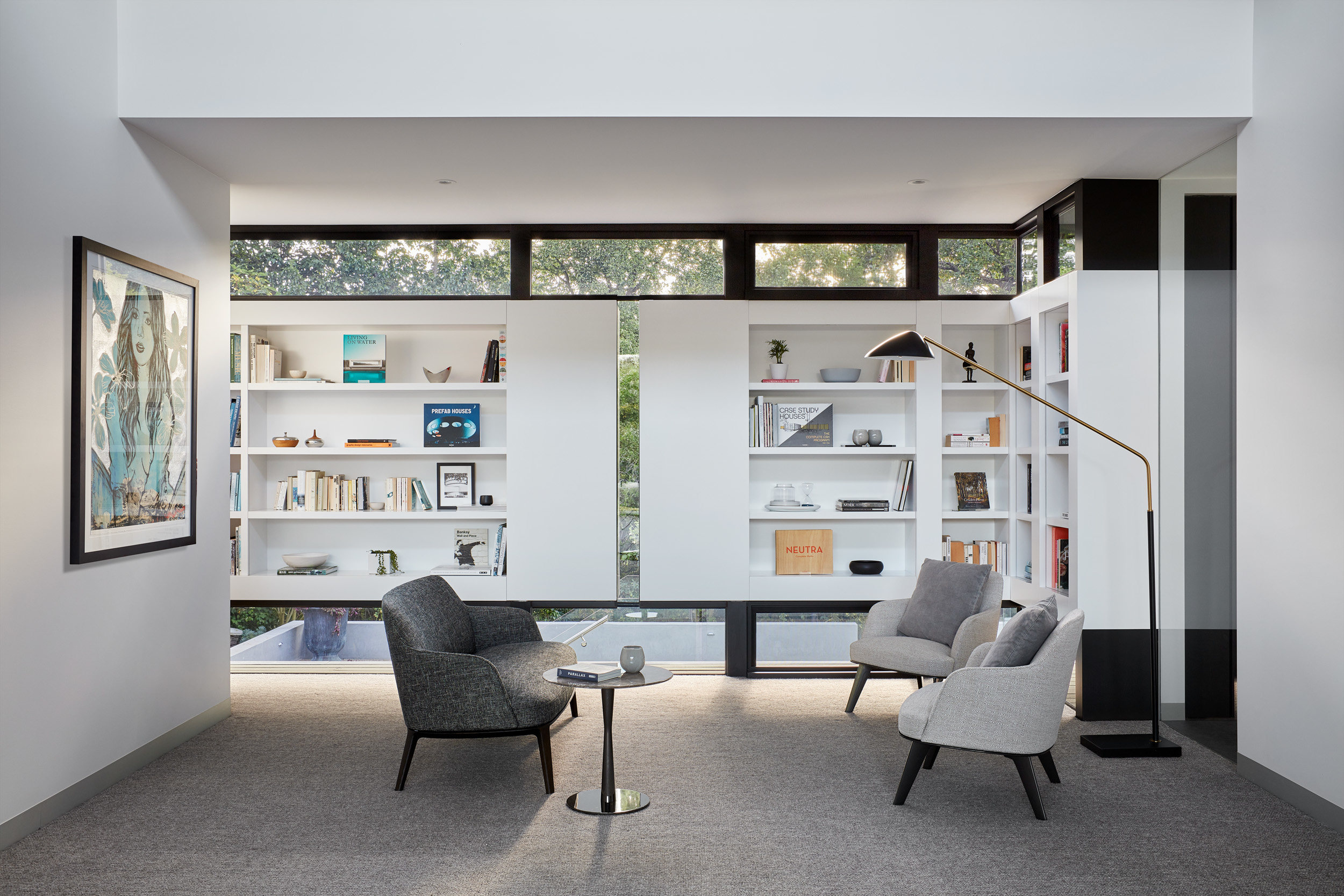
The study, Moat's Corner, by Vibe Design Group
The linear emphasis of the design is highlighted by a main façade with high and low level windows paired with reflective black panels, bringing in light while retaining privacy and a sense of mystery. Each structural component is edged in metal cladding and sits up a stone clad plinth, which in turn blends in with the contours and natural planting of the surrounding gardens.
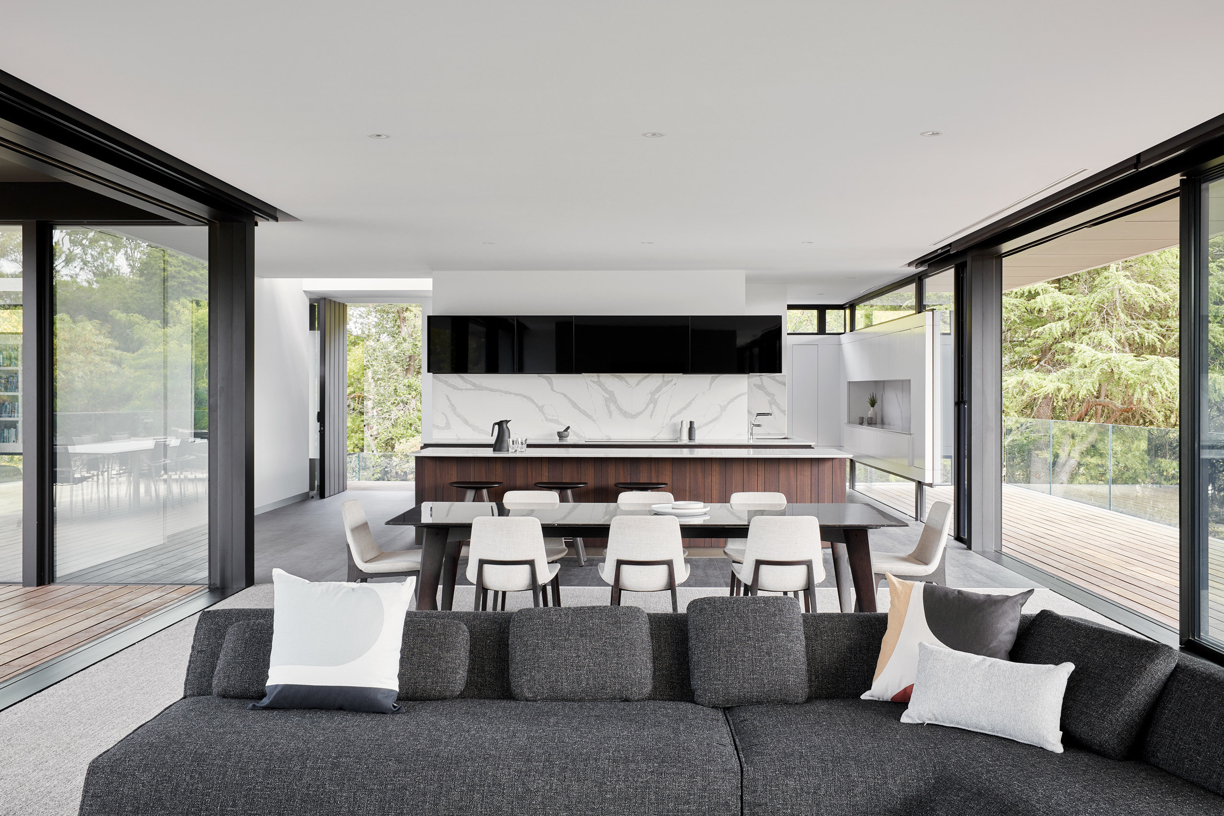
The main living space, Moat's Corner
Jonathan Bell has written for Wallpaper* magazine since 1999, covering everything from architecture and transport design to books, tech and graphic design. He is now the magazine’s Transport and Technology Editor. Jonathan has written and edited 15 books, including Concept Car Design, 21st Century House, and The New Modern House. He is also the host of Wallpaper’s first podcast.
-
 Put these emerging artists on your radar
This crop of six new talents is poised to shake up the art world. Get to know them now
By Tianna Williams
-
 Dining at Pyrá feels like a Mediterranean kiss on both cheeks
Designed by House of Dré, this Lonsdale Road addition dishes up an enticing fusion of Greek and Spanish cooking
By Sofia de la Cruz
-
 Creased, crumpled: S/S 2025 menswear is about clothes that have ‘lived a life’
The S/S 2025 menswear collections see designers embrace the creased and the crumpled, conjuring a mood of laidback languor that ran through the season – captured here by photographer Steve Harnacke and stylist Nicola Neri for Wallpaper*
By Jack Moss
-
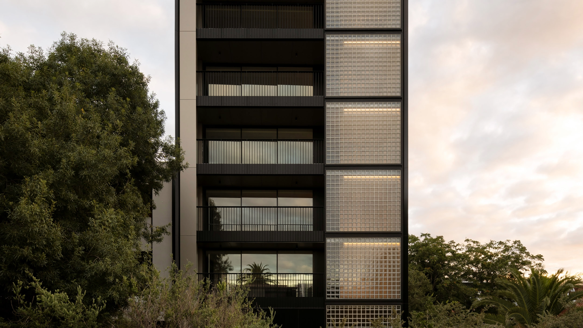 The humble glass block shines brightly again in this Melbourne apartment building
Thanks to its striking glass block panels, Splinter Society’s Newburgh Light House in Melbourne turns into a beacon of light at night
By Léa Teuscher
-
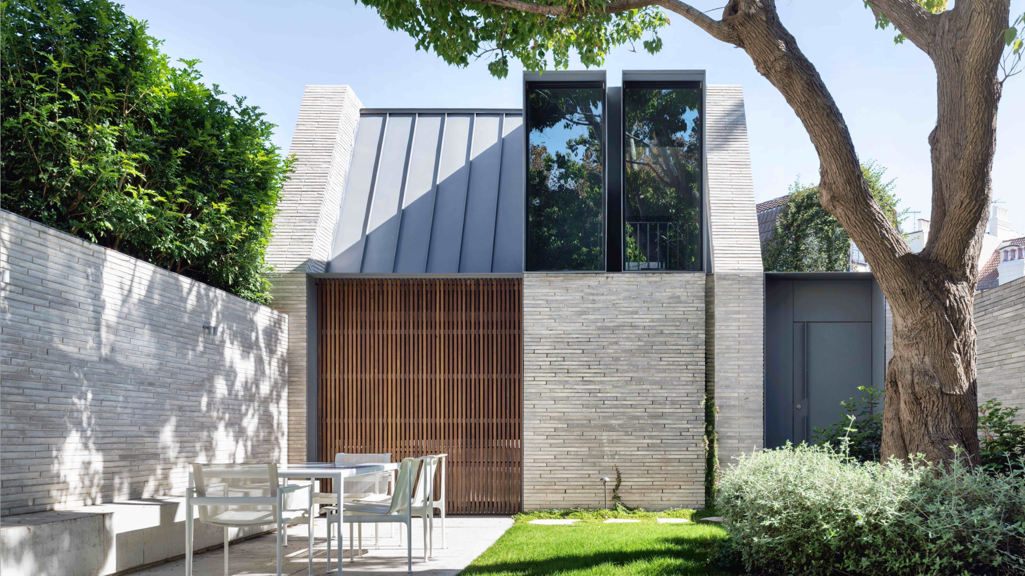 A contemporary retreat hiding in plain sight in Sydney
This contemporary retreat is set behind an unassuming neo-Georgian façade in the heart of Sydney’s Woollahra Village; a serene home designed by Australian practice Tobias Partners
By Léa Teuscher
-
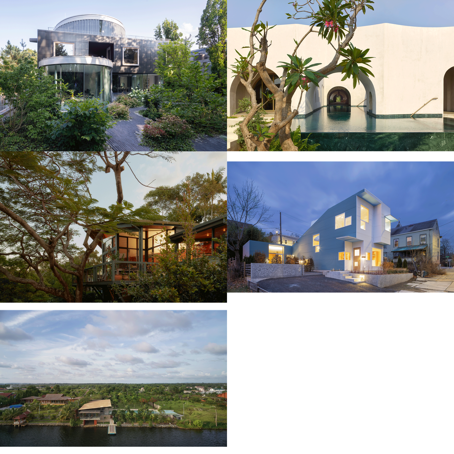 Join our world tour of contemporary homes across five continents
We take a world tour of contemporary homes, exploring case studies of how we live; we make five stops across five continents
By Ellie Stathaki
-
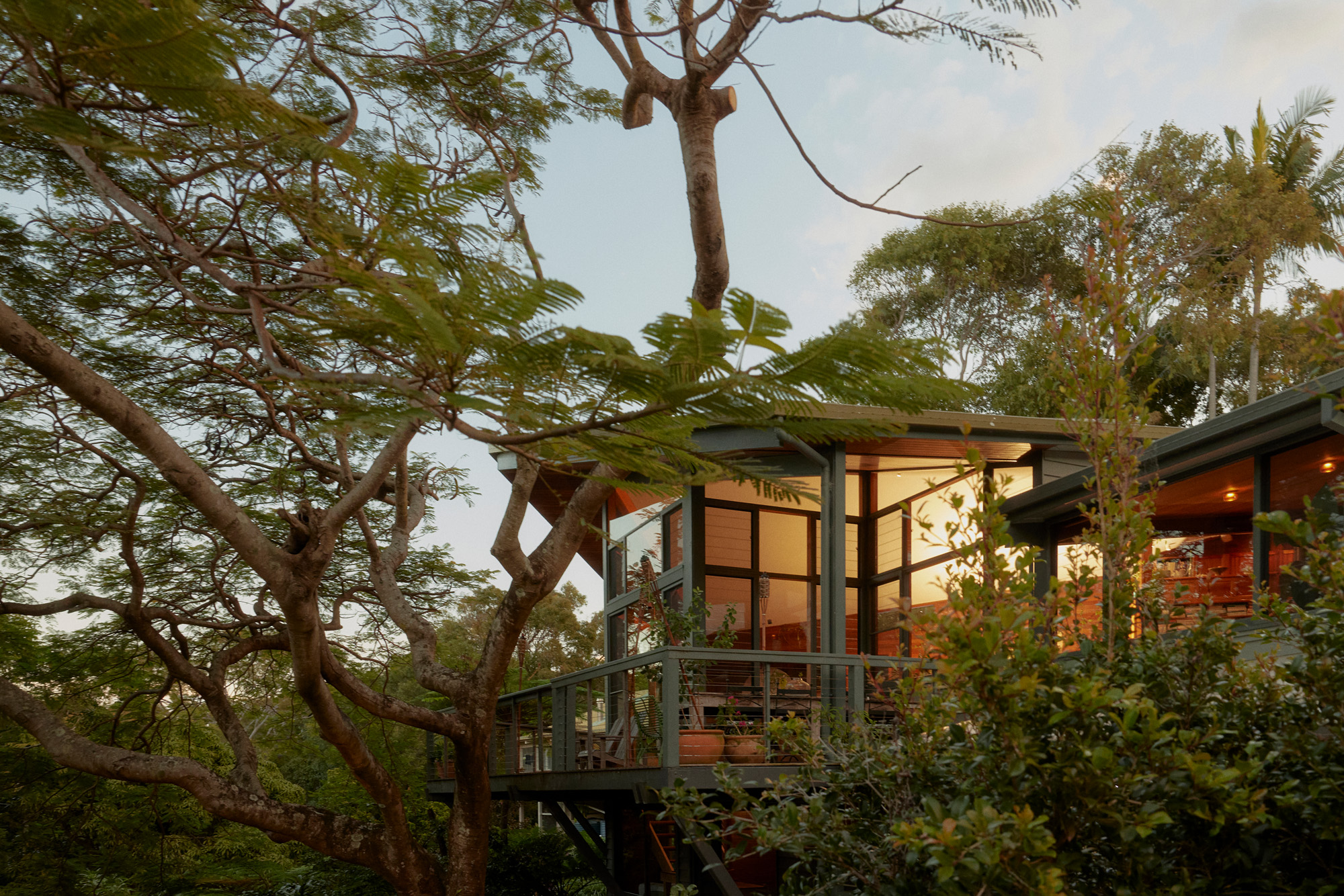 Who wouldn't want to live in this 'treehouse' in Byron Bay?
A 1980s ‘treehouse’, on the edge of a national park in Byron Bay, is powered by the sun, architectural provenance and a sense of community
By Carli Philips
-
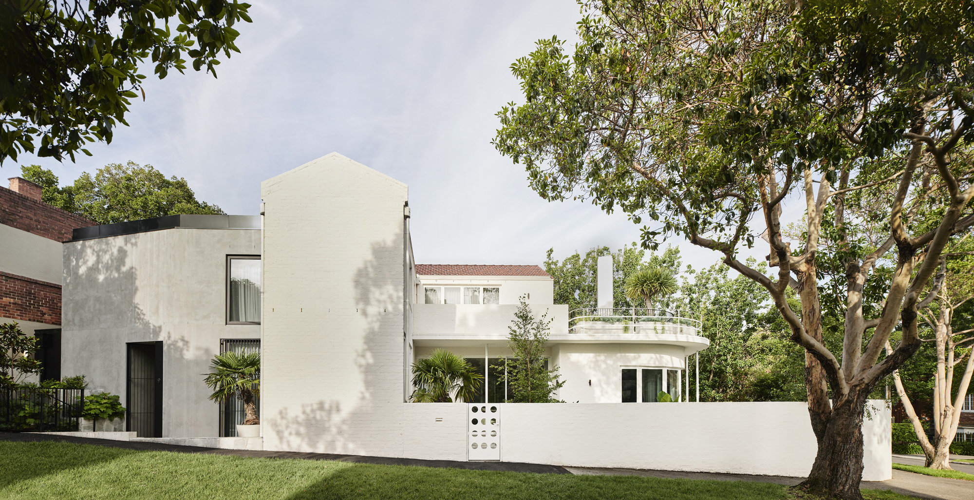 A modernist Melbourne house gets a contemporary makeover
Silhouette House, a modernist Melbourne house, gets a contemporary makeover by architects Powell & Glenn
By Ellie Stathaki
-
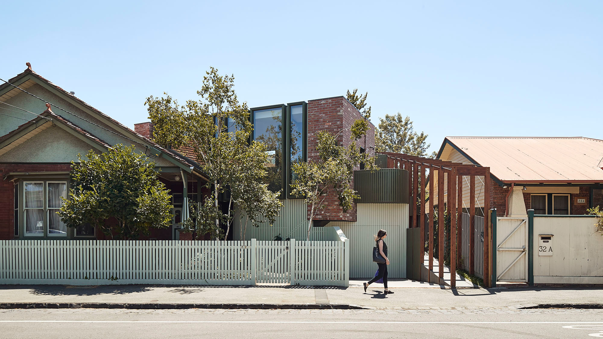 A suburban house is expanded into two striking interconnected dwellings
Justin Mallia’s suburban house, a residential puzzle box in Melbourne’s Clifton Hill, interlocks old and new to enhance light, space and efficiency
By Jonathan Bell
-
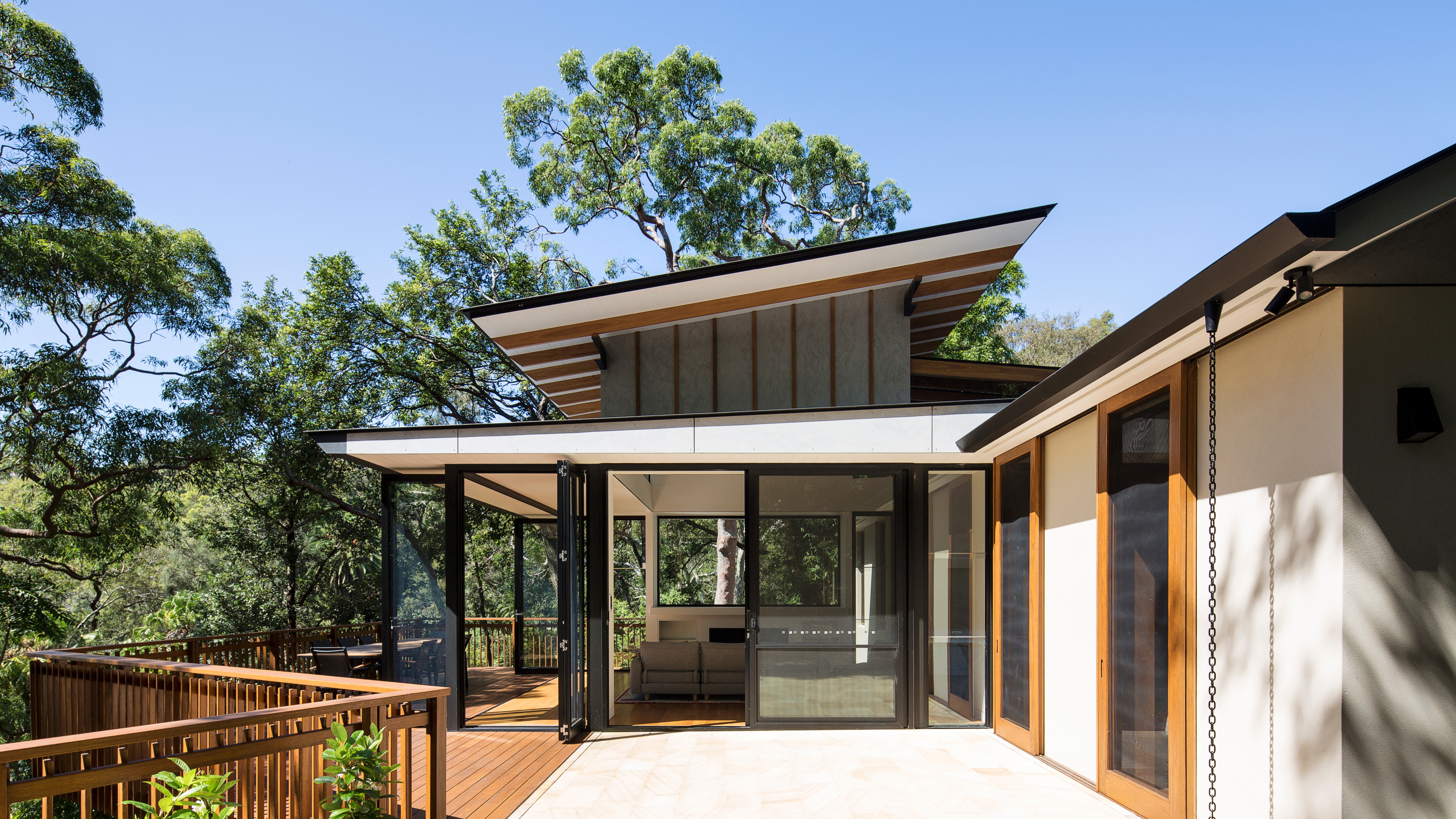 Palm Beach Tree House overhauls a cottage in Sydney’s Northern Beaches into a treetop retreat
Set above the surf, Palm Beach Tree House by Richard Coles Architecture sits in a desirable Northern Beaches suburb, creating a refined home in verdant surroundings
By Jonathan Bell
-
 Year in review: the top 12 houses of 2024, picked by architecture director Ellie Stathaki
The top 12 houses of 2024 comprise our finest and most read residential posts of the year, compiled by Wallpaper* architecture & environment director Ellie Stathaki
By Ellie Stathaki