Rafael de Cárdenas’ first ground-up project is a forever home with waterfront views and hidden treasures
Rafael de Cárdenas reveals his latest completed project in the Pacific Northwest, a family home of calming spaces that bleed the outside in, and ten years in the making
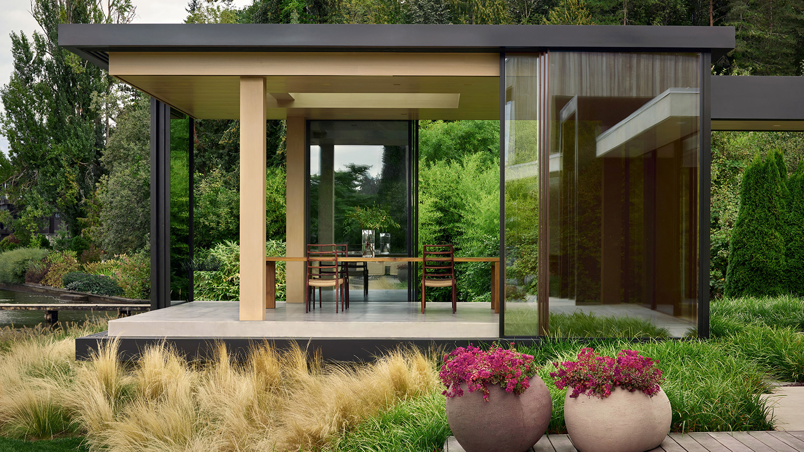
Open to the blue waters and green coastal expanses of the greater Seattle region, this suburban Pacific Northwest house ticks all the boxes as a forever family home – there’s ample space, purposeful design, a connection to nature, a solid future-proofing plan, and flexible areas that are ready to adapt to its residents’ changing needs.
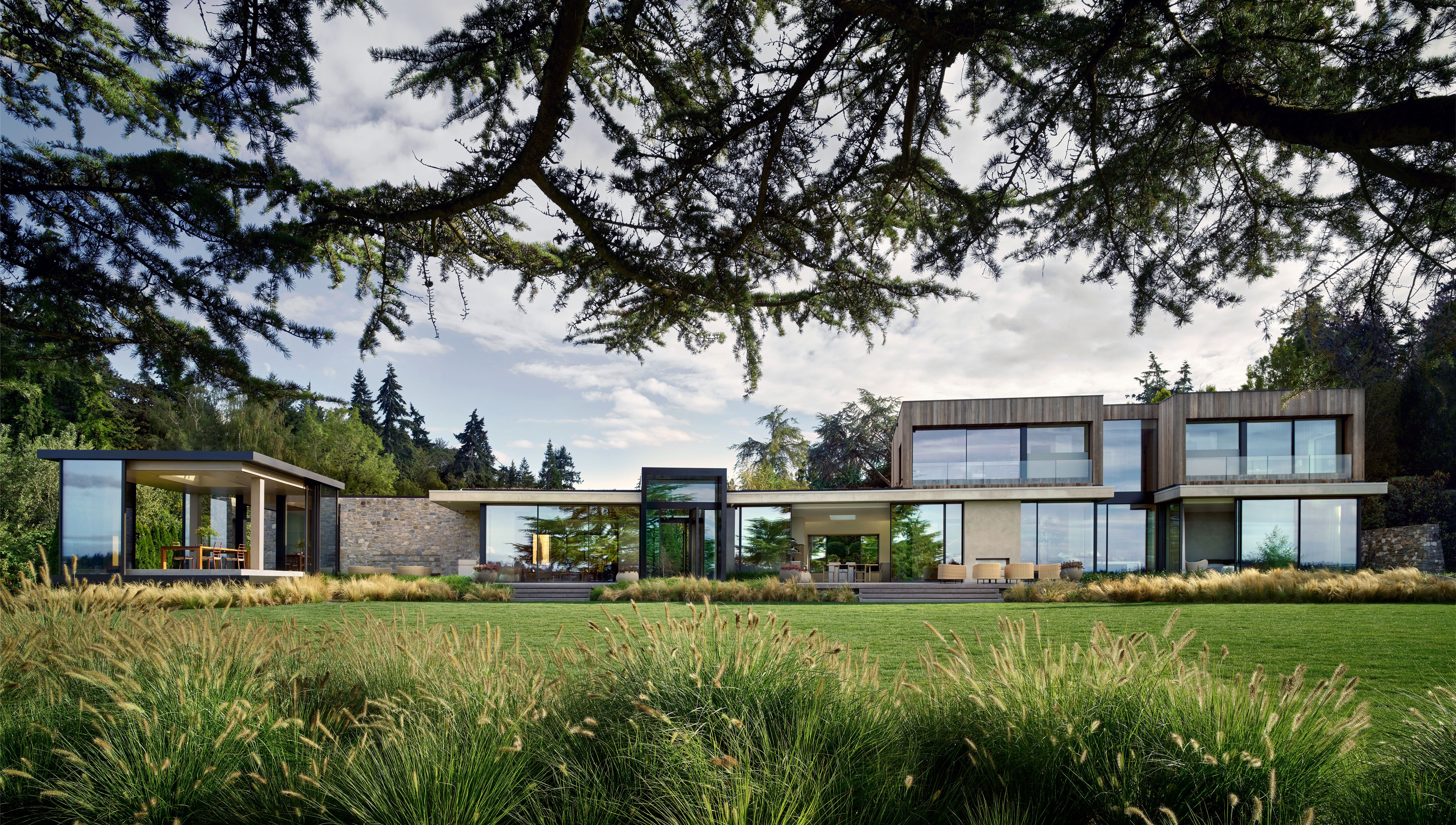
Step inside Rafael de Cárdenas' new Seattle design
Its author, New York-based designer and founder of namesake studio Rafael de Cárdenas, explains: ‘The clients had lived in a little house on this site for 20 years. They loved it and never wanted to leave. It’s only about 20 minutes from downtown Seattle, but you can also swim in the lake, the nature is amazing. Its waterfront location and exquisite landscape design suggest a weekend retreat. So they decided to expand and transform their existing property into their forever home.’
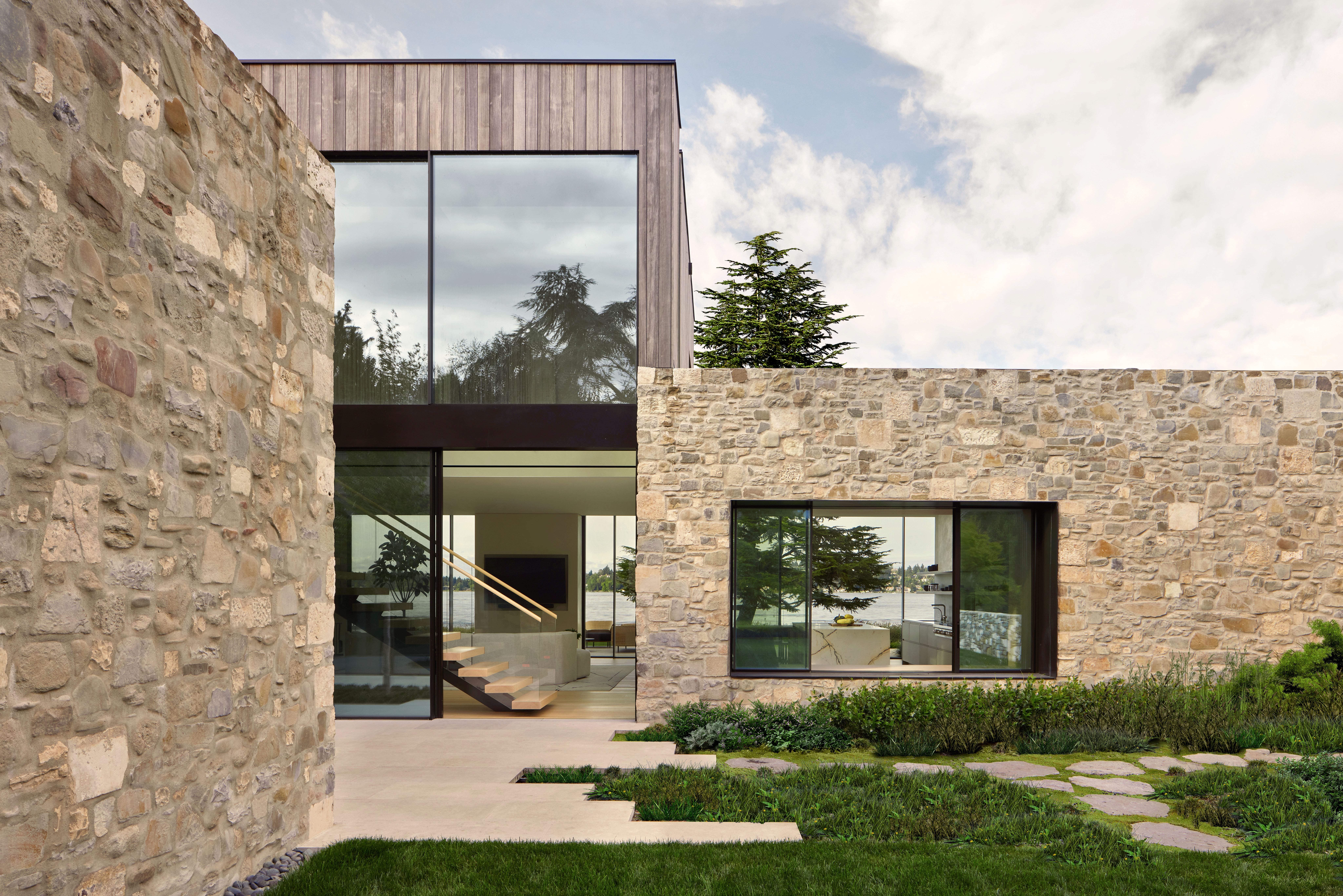
The designer worked closely with his clients – a cat- and dog-owning family of four – to create a new build that replaced the existing, tired and restrictive (in terms of space and style) house.
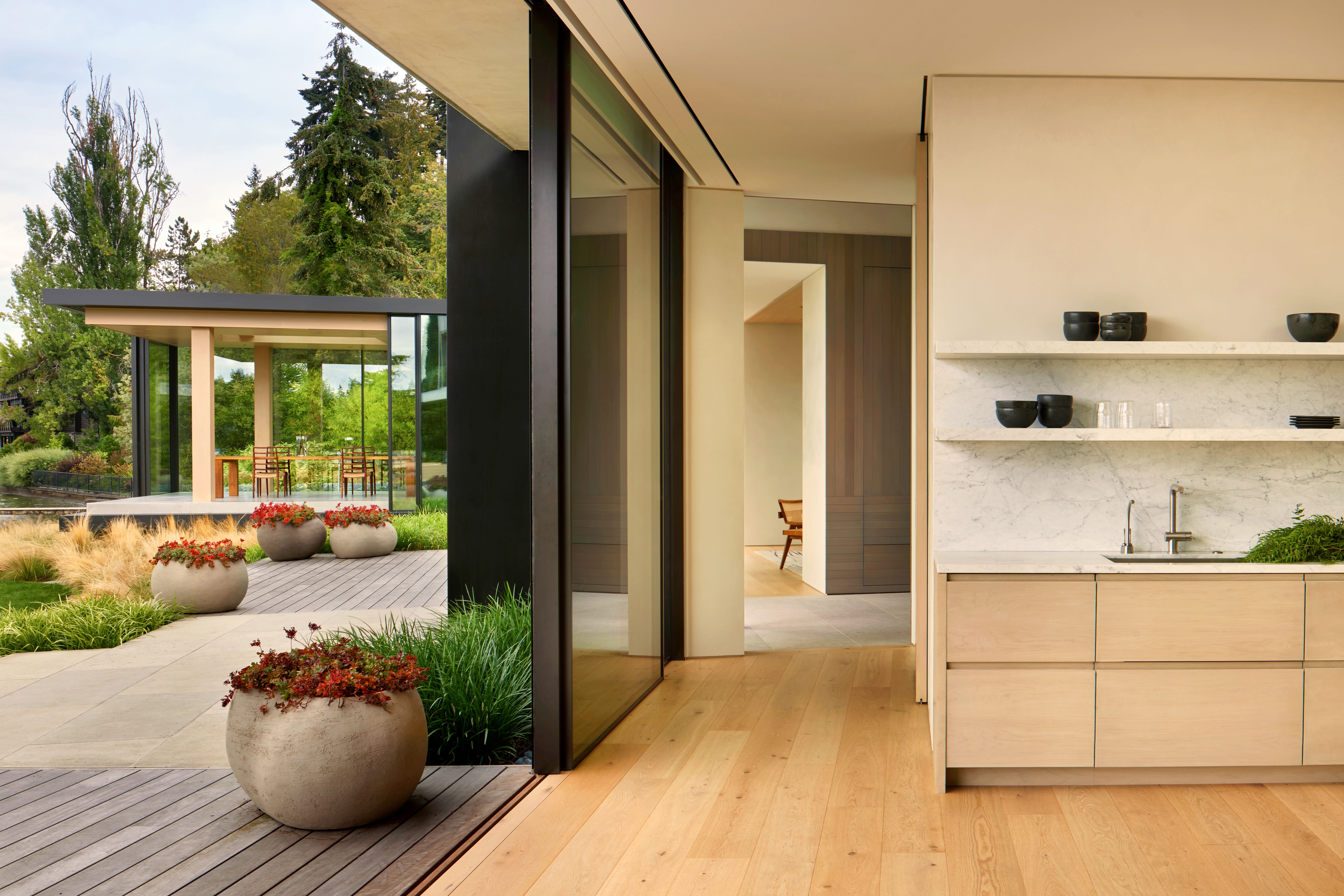
The design would incorporate the footprint of the original structure on site, and expand towards the adjacent plot, which the owners acquired as they embarked on their development process. The result now gently sprawls across the expanded site, subtly orientated towards the long waterfront vistas and wrapped in glazing, which brings the outside in at every turn. It mostly unfolds on a single, ground level, with the east wing containing the living and entertainment spaces and the west one the more private sleeping quarters. The children’s bedrooms are on the much smaller first floor, placed just above an informal family room and the parents’ primary suite.
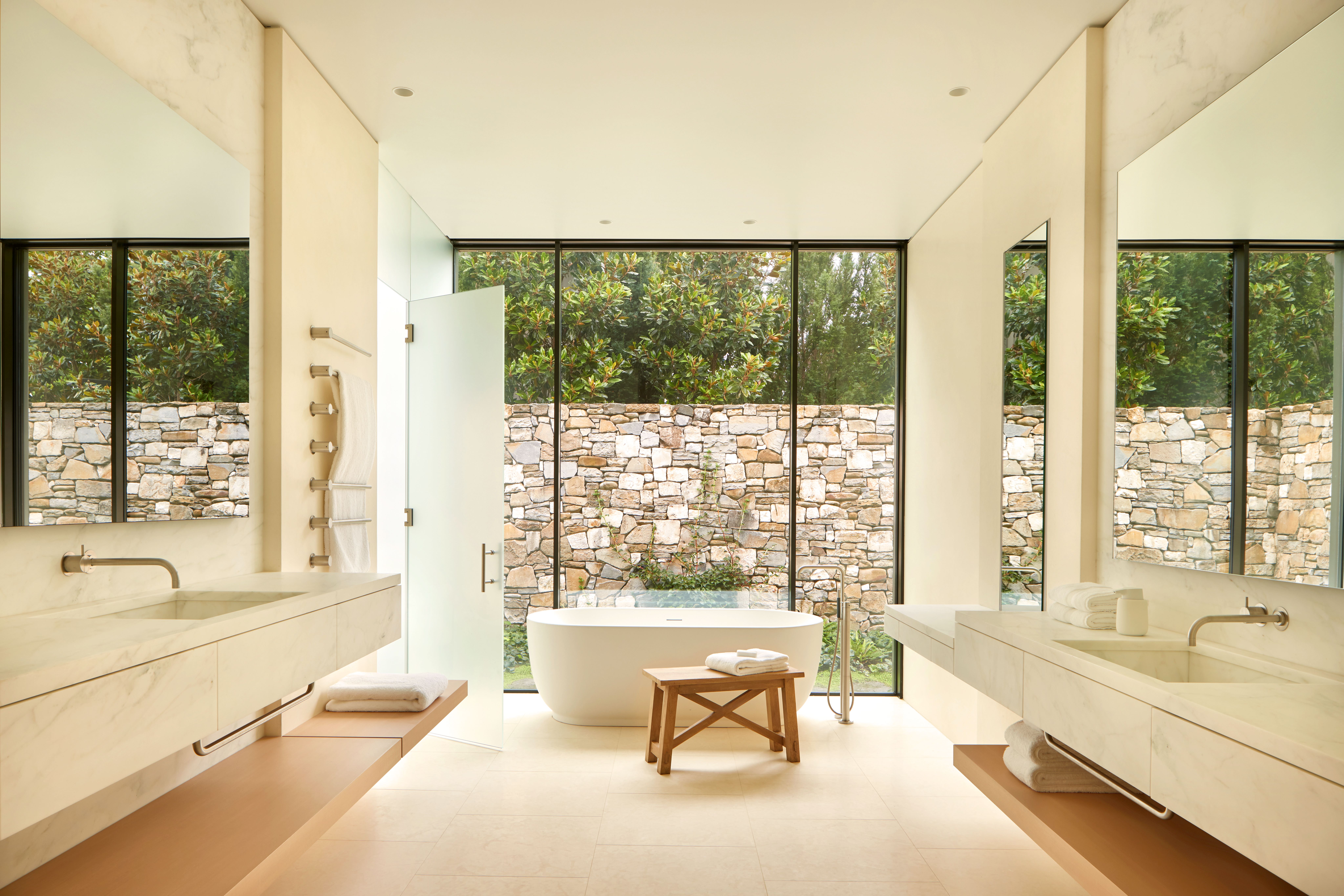
The brief, de Cárdenas recalls, described ‘a contemporary house with calming spaces that bleed the outside in. Rooms had a series of specific functions. For example, a wing off the eastern side of the house was a client directive: a room that capitalises on oceanfront views romanticising the Pacific Northwest’s rainy weather while enhancing the sound of water on glass. Its function? Ambiguous. Sometimes a dining room, sometimes a wellness space, and sometimes a party venue. We somewhat casually started calling it the ‘rain room’ and it stuck.’
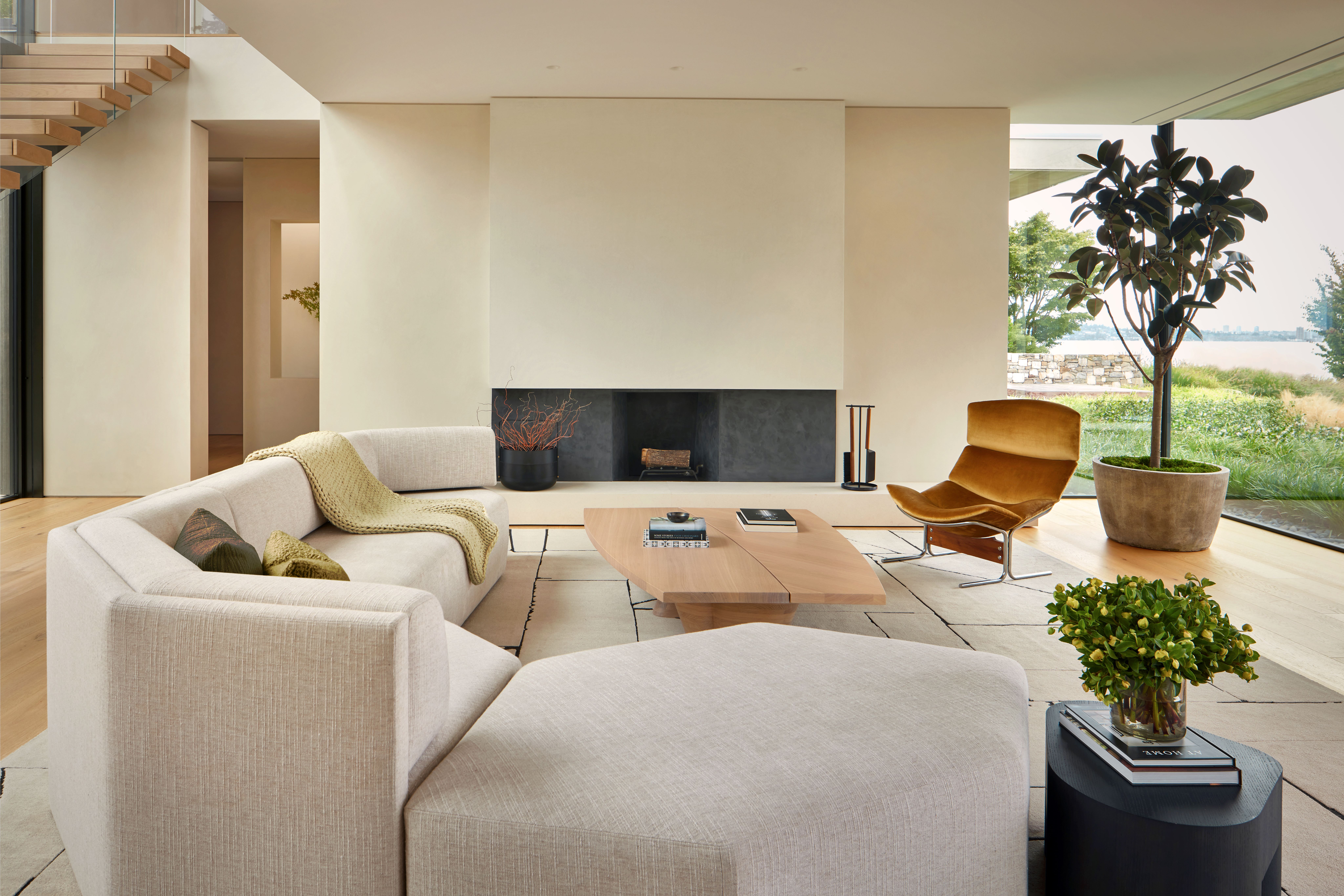
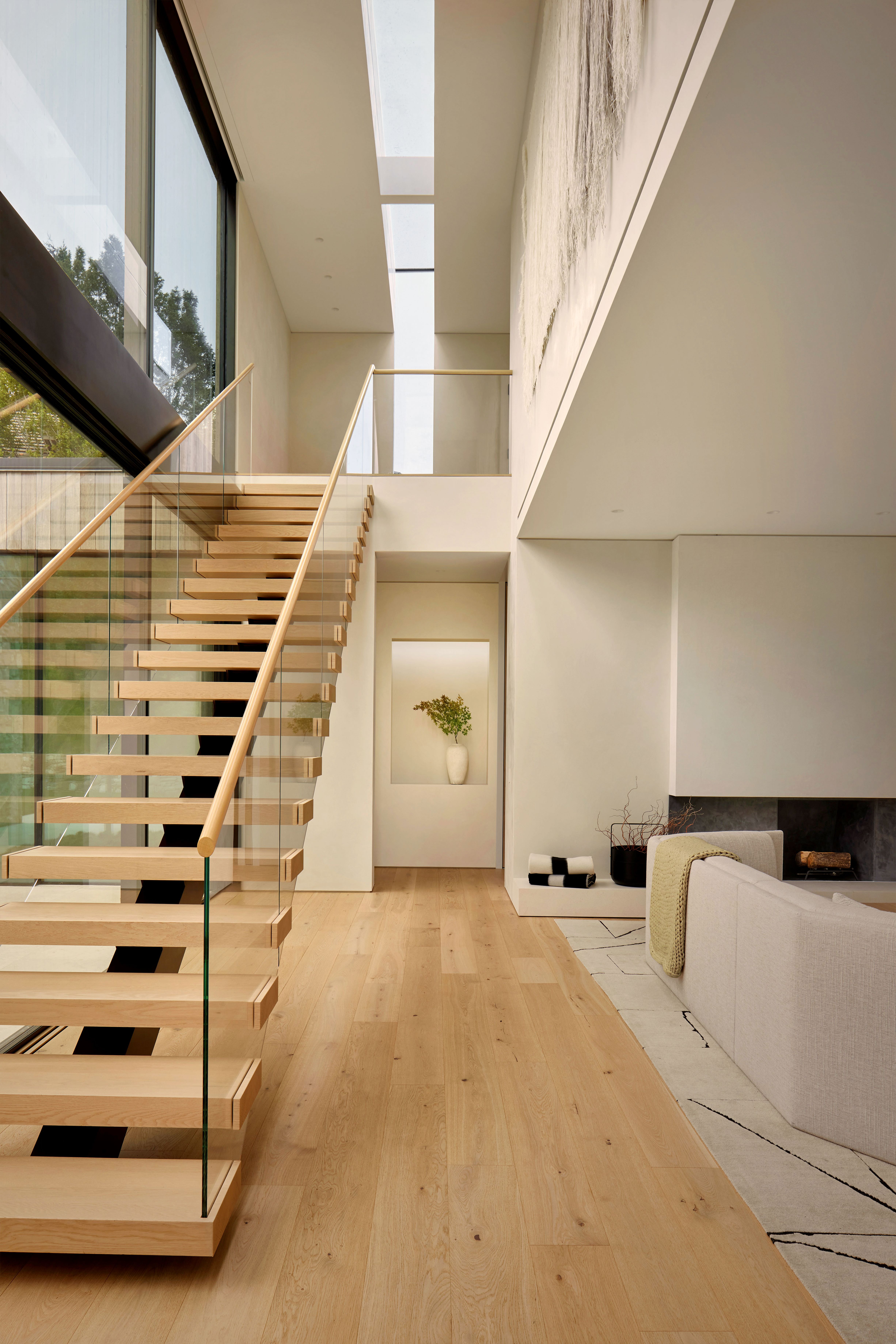
A continuous corridor on the southern side of the plan, situated ‘like a bar following the more or less straight waterfront edge’, is the property’s main circulation space, marked by a thin skylight running along it. A barely noticeable kink of about 15 degrees keeps the glass side of the house in line with the shoreline, embracing the grounds, which were landscaped by Randy Allworth and Nanda Patel of Allworth Design, and the horizon vistas beyond.
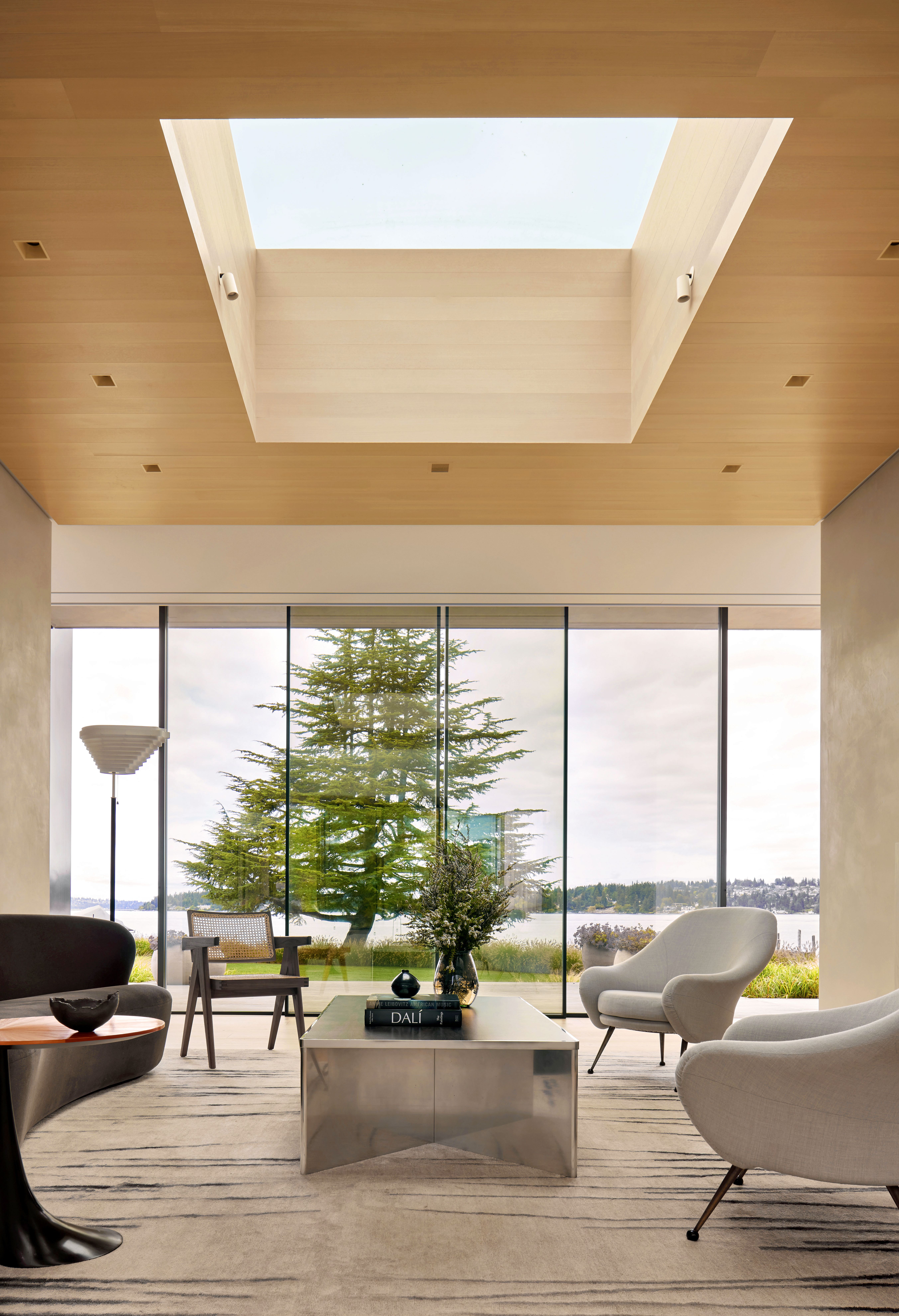
The entrance is centred on the view of a mature cypress tree on the other side of the property, seen through an open-plan living space interior and the waterside’s glazed walls. And while all this feels magnificently open to its suburban surroundings, the home’s goings-on are expertly concealed for privacy by rows of more cypress trees across the plot.
Wallpaper* Newsletter
Receive our daily digest of inspiration, escapism and design stories from around the world direct to your inbox.
The south, street-facing side is largely over-mortared antique cobble, with some cedar and bronze elements, while the north façade is largely glass with cedar decks.‘We wanted the exterior to be quiet and not heroic,’ says de Cárdenas. ‘The client, though committed to excellence, had a difficult time responding to renderings. We had to make physical models, which is rare these days, and mocked up large-scale aspects of the project far more than we ever had.’
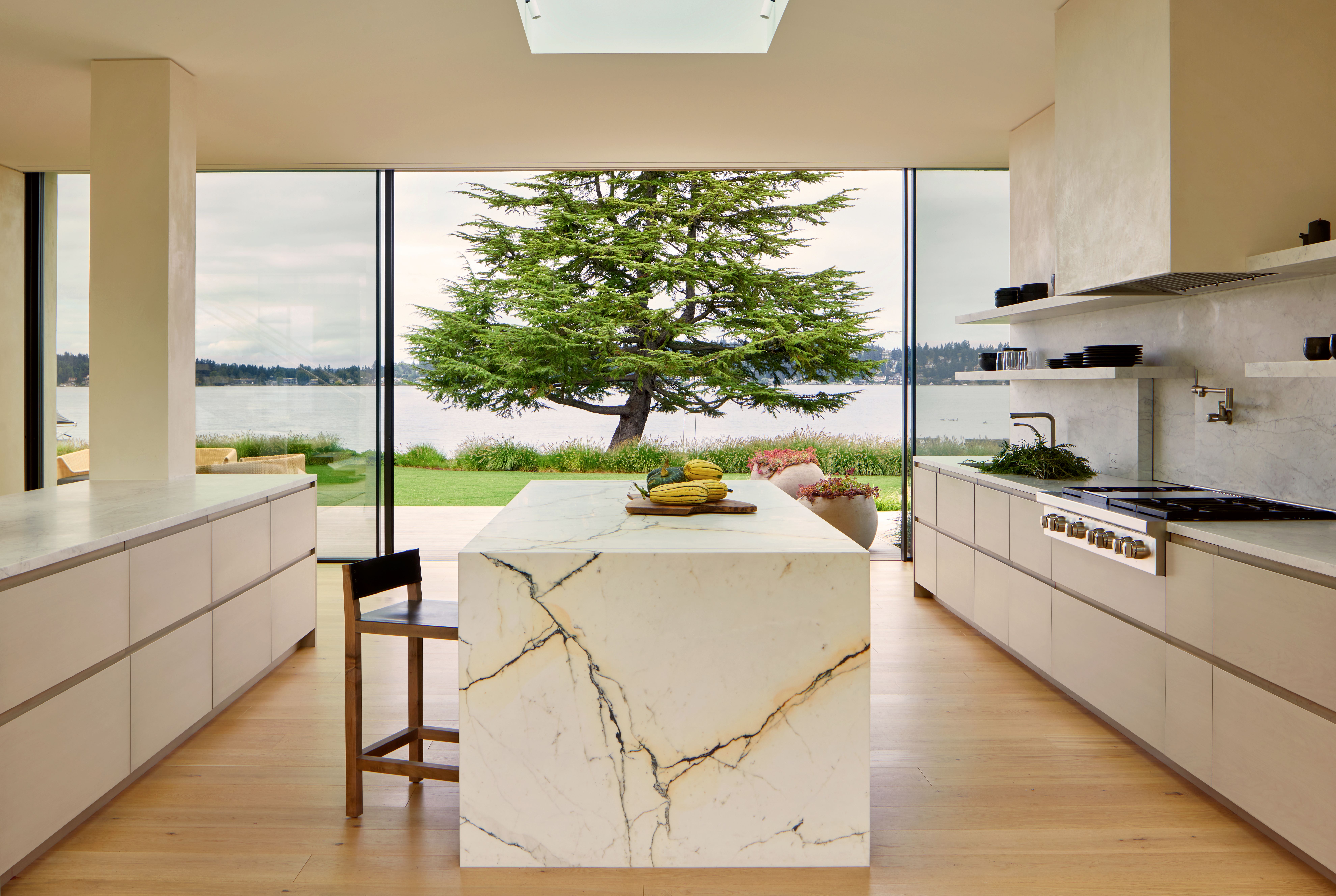
Working alongside architects of record Conard Romano, building experts King Construction, and lighting designers LightPlan, de Cárdenas completed the project after ten years of development and building work to exquisite detail.
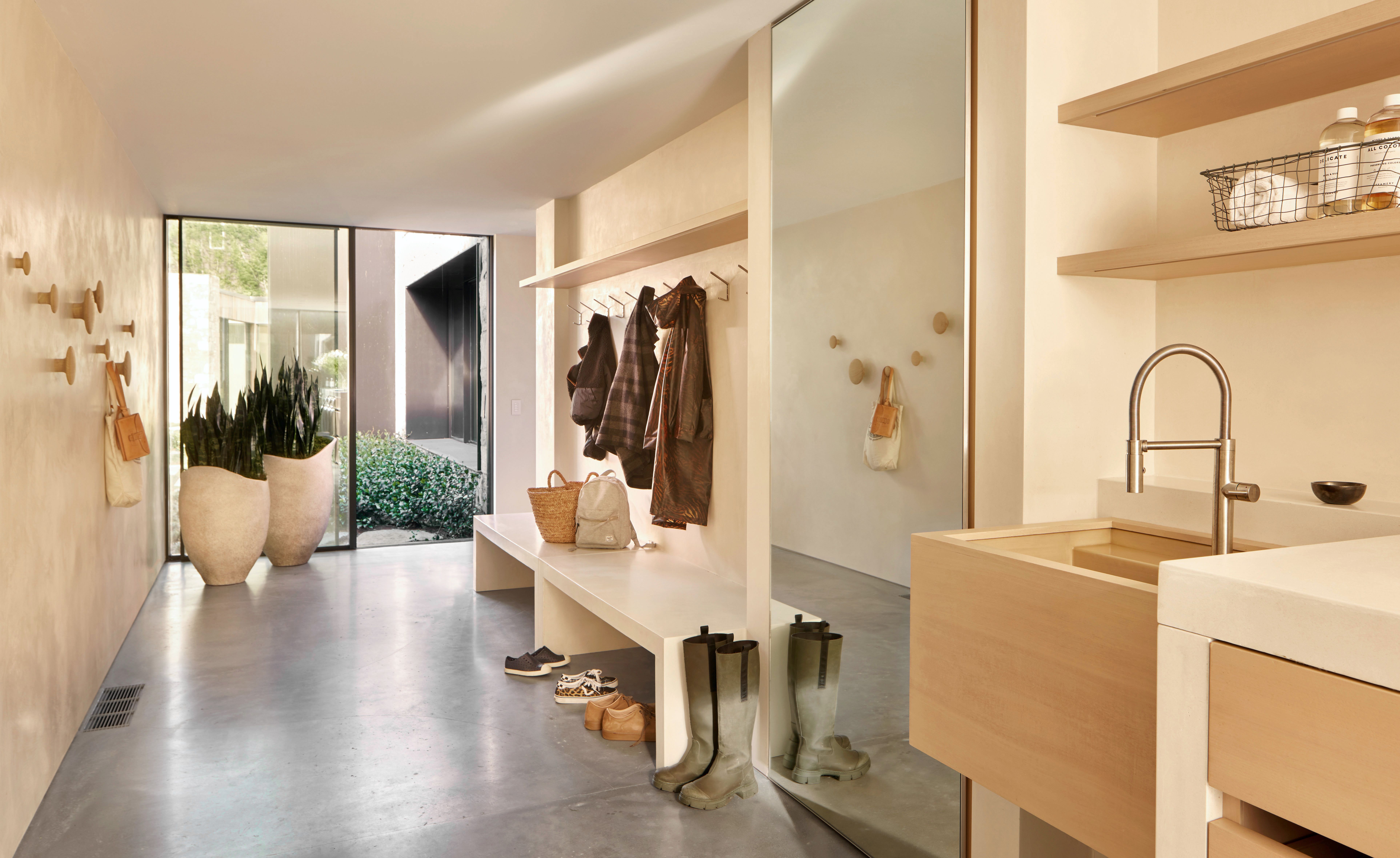
The studio has designed additions and extensive interior schemes in the past, but this scheme marks its first ‘ground-up project’, notes de Cárdenas, adding that this is also ‘almost an invisible house, or at least that was its aim: design that’s meant to be as quiet as possible, including interiors, furniture, materials and so on. That’s a big departure from the rest of our projects’.
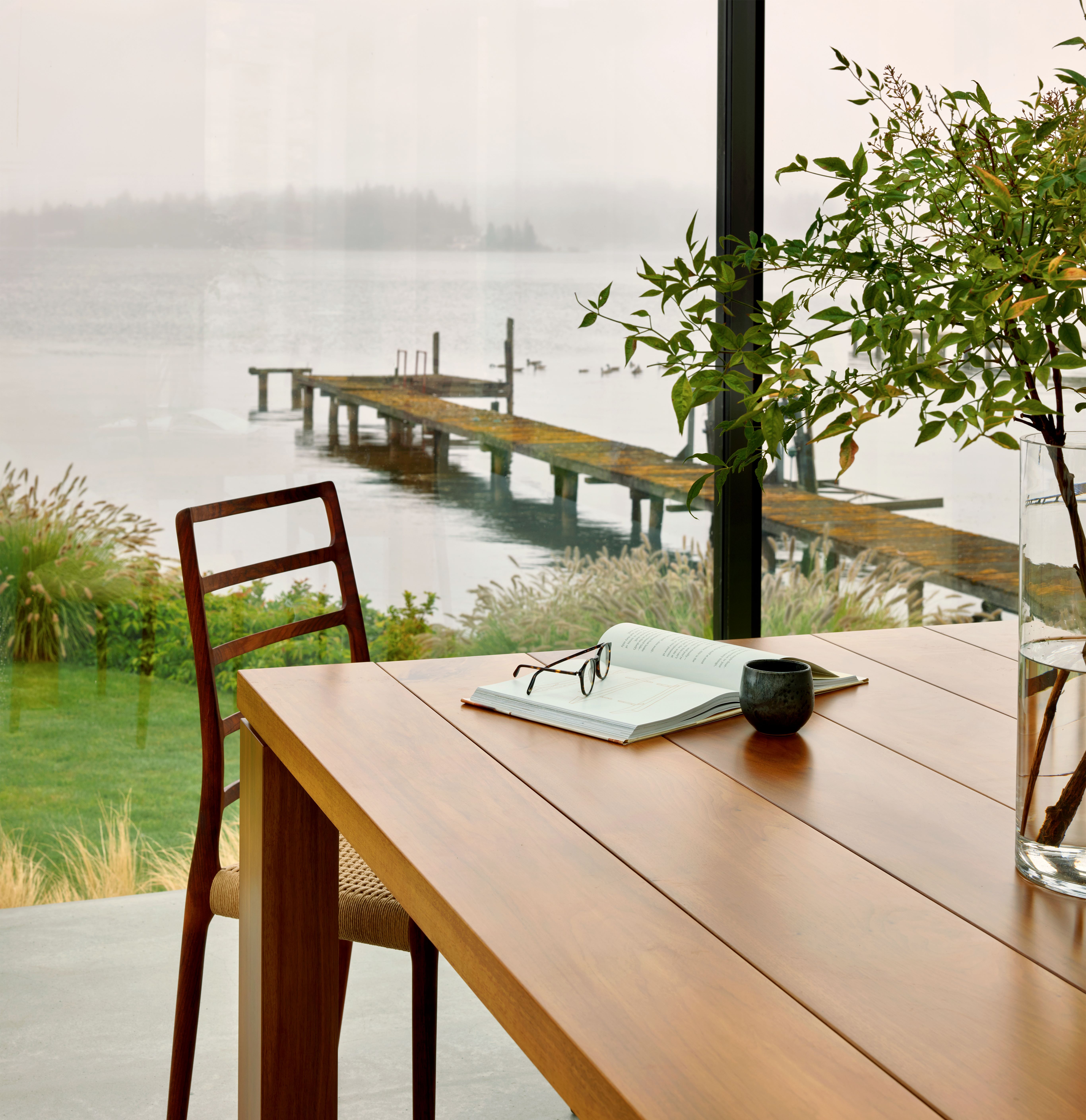
This article appears in the August 2024 issue of Wallpaper*, available to download free when you sign up to our daily newsletter, in print on newsstands from 4 July, on the Wallpaper* app on Apple iOS, and to subscribers of Apple News +. Subscribe to Wallpaper* today
Ellie Stathaki is the Architecture & Environment Director at Wallpaper*. She trained as an architect at the Aristotle University of Thessaloniki in Greece and studied architectural history at the Bartlett in London. Now an established journalist, she has been a member of the Wallpaper* team since 2006, visiting buildings across the globe and interviewing leading architects such as Tadao Ando and Rem Koolhaas. Ellie has also taken part in judging panels, moderated events, curated shows and contributed in books, such as The Contemporary House (Thames & Hudson, 2018), Glenn Sestig Architecture Diary (2020) and House London (2022).
-
 Put these emerging artists on your radar
This crop of six new talents is poised to shake up the art world. Get to know them now
By Tianna Williams
-
 Dining at Pyrá feels like a Mediterranean kiss on both cheeks
Designed by House of Dré, this Lonsdale Road addition dishes up an enticing fusion of Greek and Spanish cooking
By Sofia de la Cruz
-
 Creased, crumpled: S/S 2025 menswear is about clothes that have ‘lived a life’
The S/S 2025 menswear collections see designers embrace the creased and the crumpled, conjuring a mood of laidback languor that ran through the season – captured here by photographer Steve Harnacke and stylist Nicola Neri for Wallpaper*
By Jack Moss
-
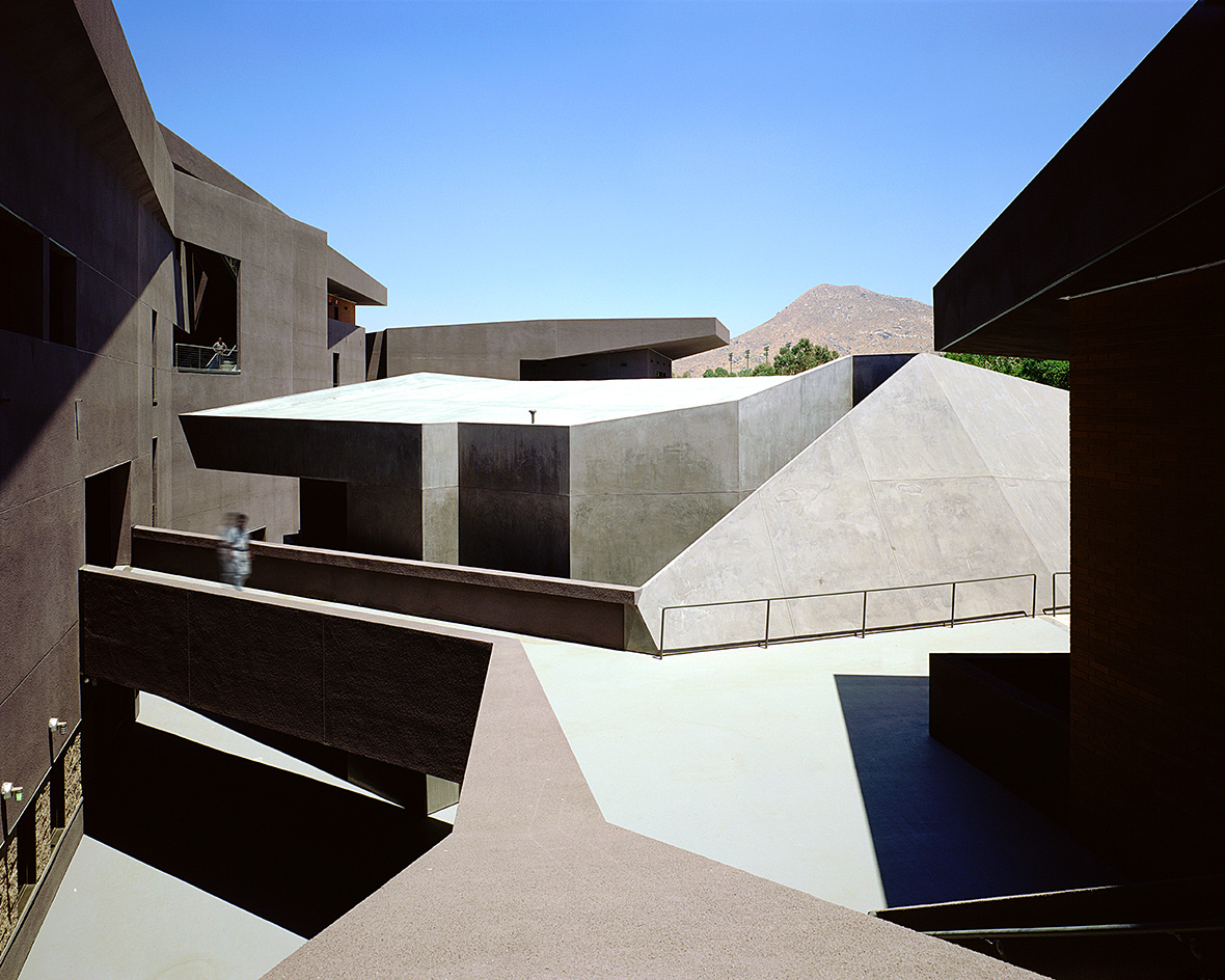 We explore Franklin Israel’s lesser-known, progressive, deconstructivist architecture
Franklin Israel, a progressive Californian architect whose life was cut short in 1996 at the age of 50, is celebrated in a new book that examines his work and legacy
By Michael Webb
-
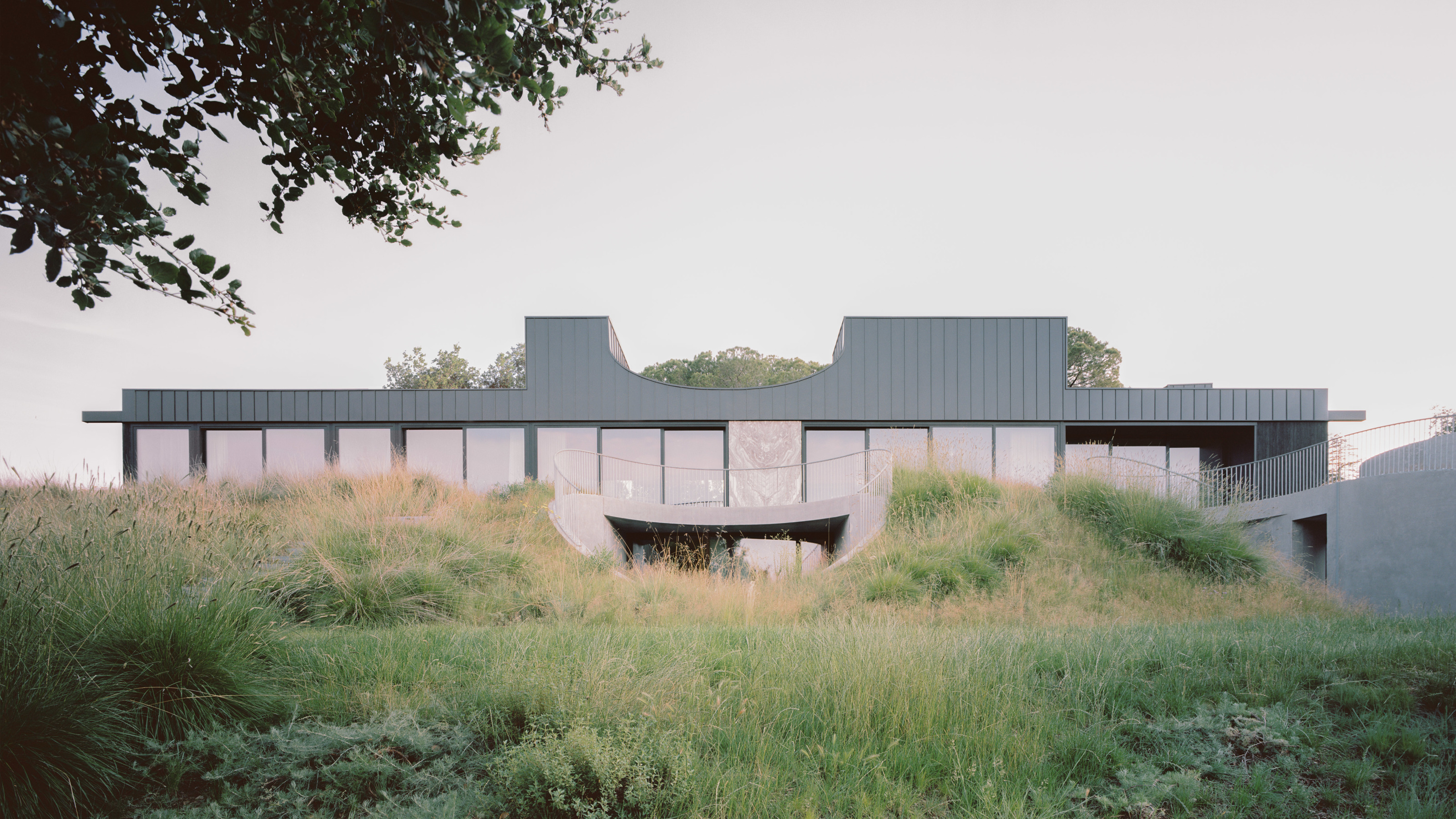 A new hilltop California home is rooted in the landscape and celebrates views of nature
WOJR's California home House of Horns is a meticulously planned modern villa that seeps into its surrounding landscape through a series of sculptural courtyards
By Jonathan Bell
-
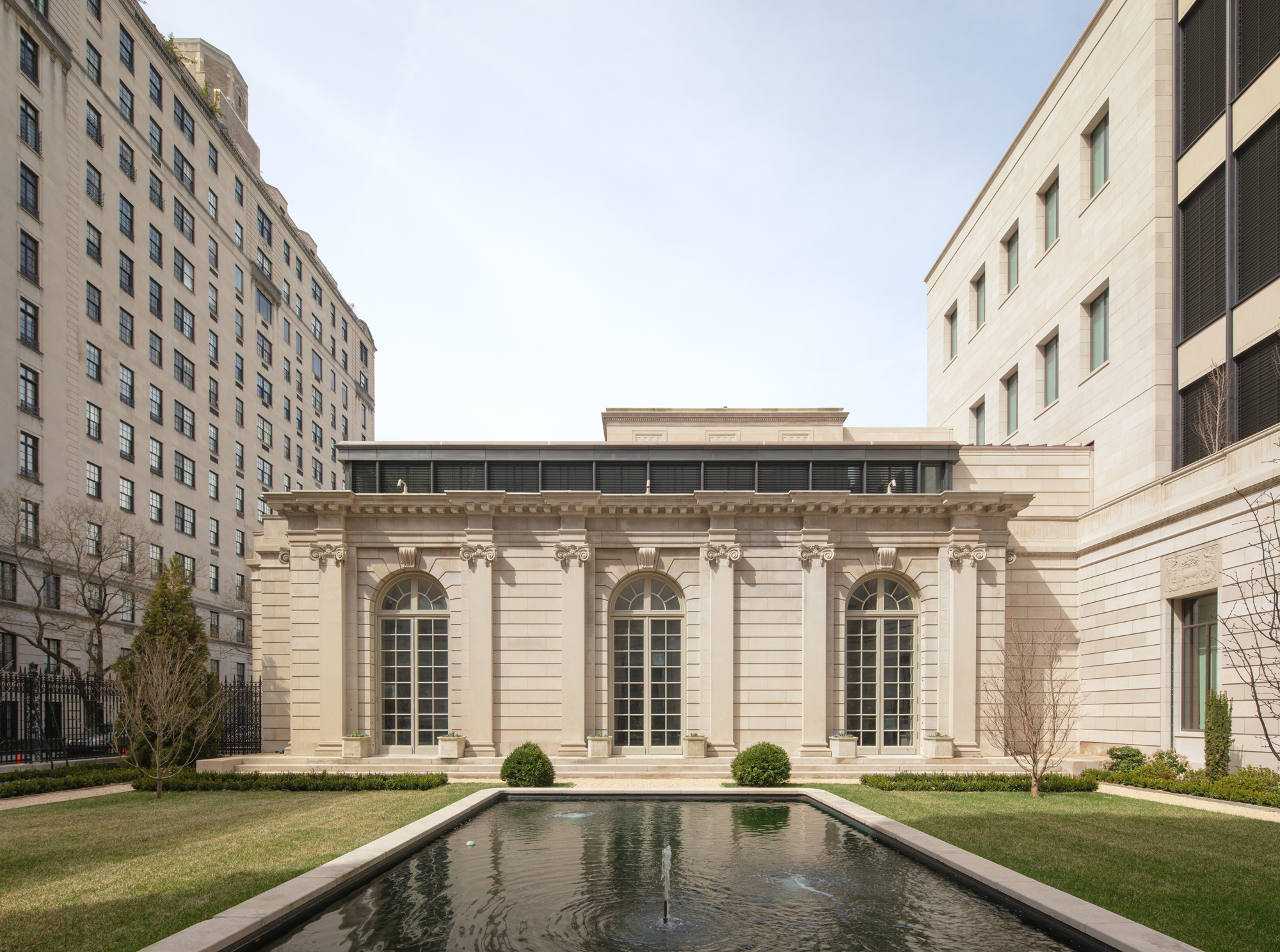 The Frick Collection's expansion by Selldorf Architects is both surgical and delicate
The New York cultural institution gets a $220 million glow-up
By Stephanie Murg
-
 Remembering architect David M Childs (1941-2025) and his New York skyline legacy
David M Childs, a former chairman of architectural powerhouse SOM, has passed away. We celebrate his professional achievements
By Jonathan Bell
-
 The upcoming Zaha Hadid Architects projects set to transform the horizon
A peek at Zaha Hadid Architects’ future projects, which will comprise some of the most innovative and intriguing structures in the world
By Anna Solomon
-
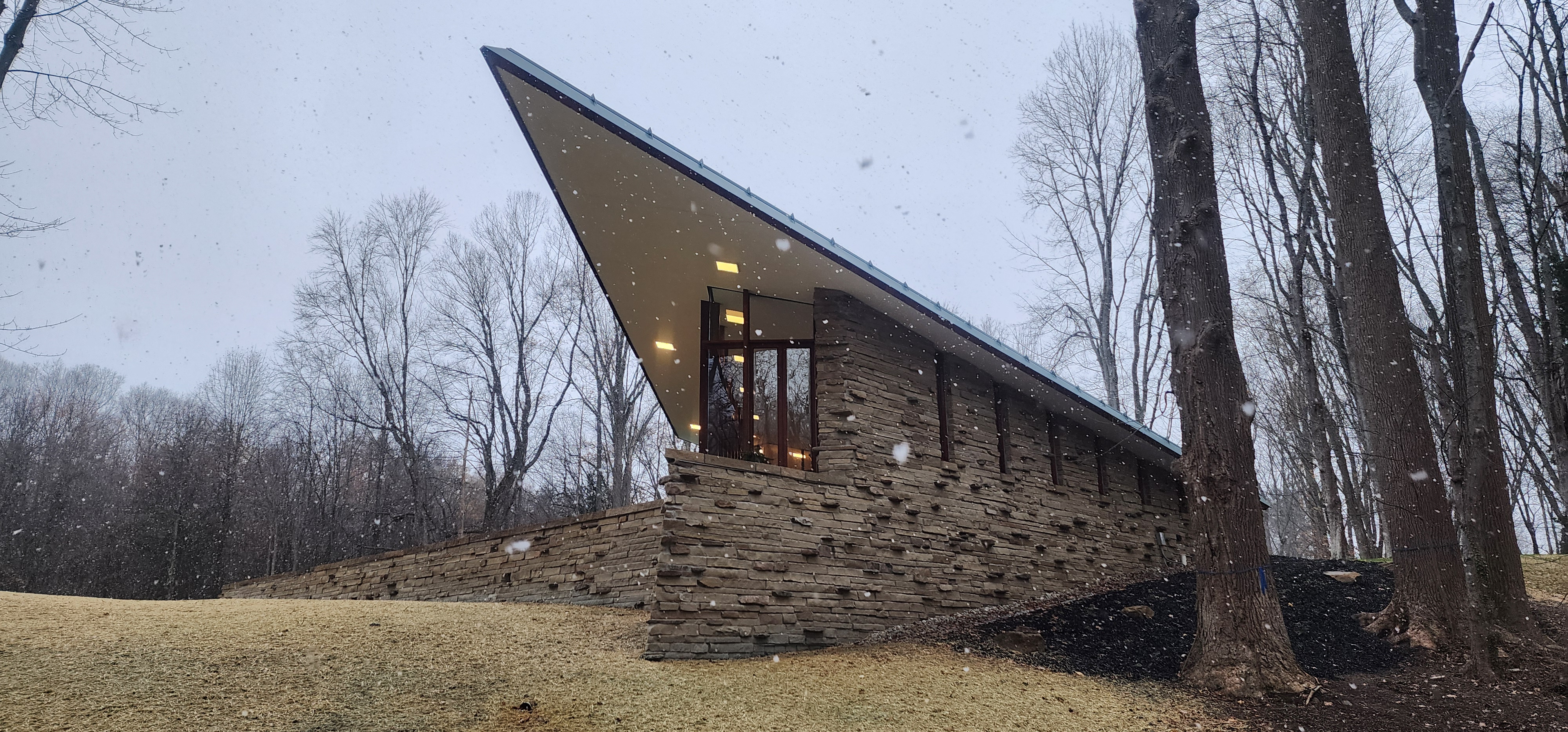 Frank Lloyd Wright’s last house has finally been built – and you can stay there
Frank Lloyd Wright’s final residential commission, RiverRock, has come to life. But, constructed 66 years after his death, can it be considered a true ‘Wright’?
By Anna Solomon
-
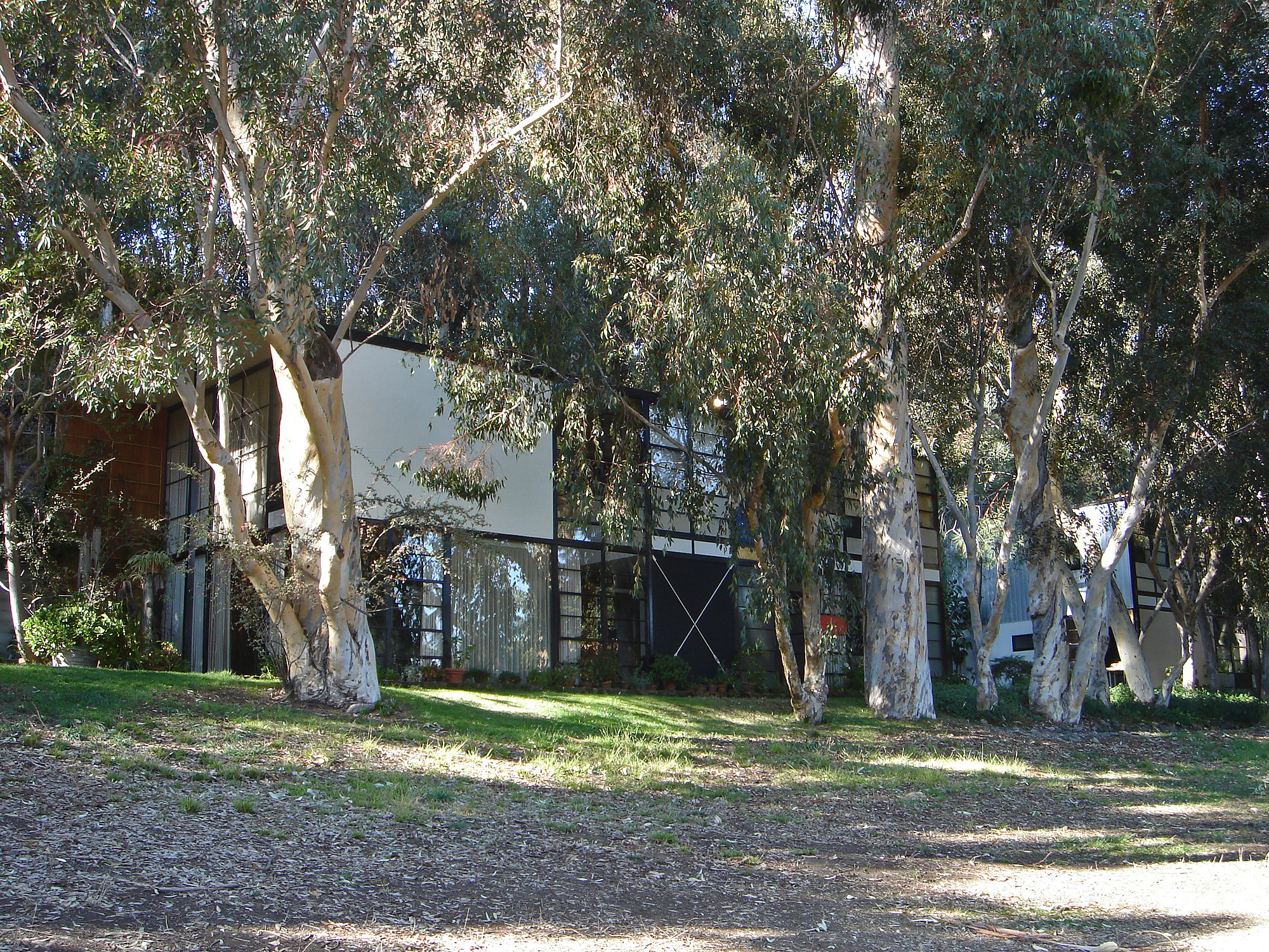 Heritage and conservation after the fires: what’s next for Los Angeles?
In the second instalment of our 'Rebuilding LA' series, we explore a way forward for historical treasures under threat
By Mimi Zeiger
-
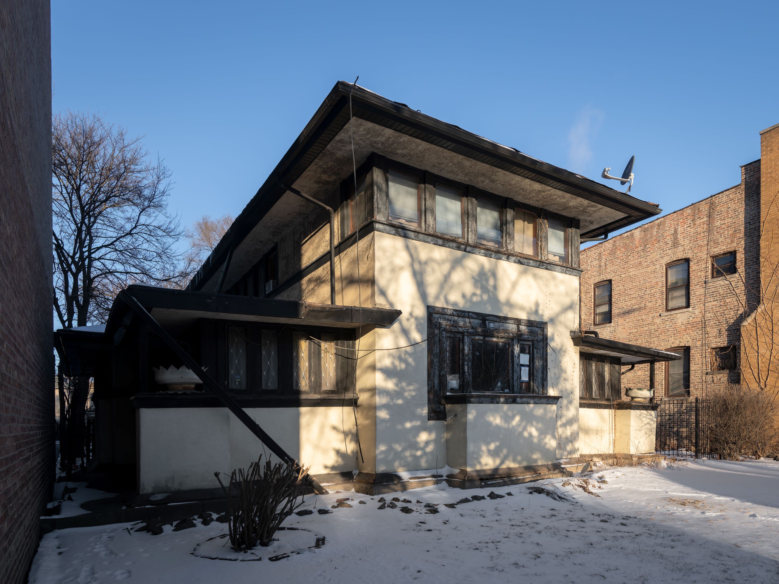 Why this rare Frank Lloyd Wright house is considered one of Chicago’s ‘most endangered’ buildings
The JJ Walser House has sat derelict for six years. But preservationists hope the building will have a vibrant second act
By Anna Fixsen