Scene stealer: this minimalist Lake Tahoe house makes a splash
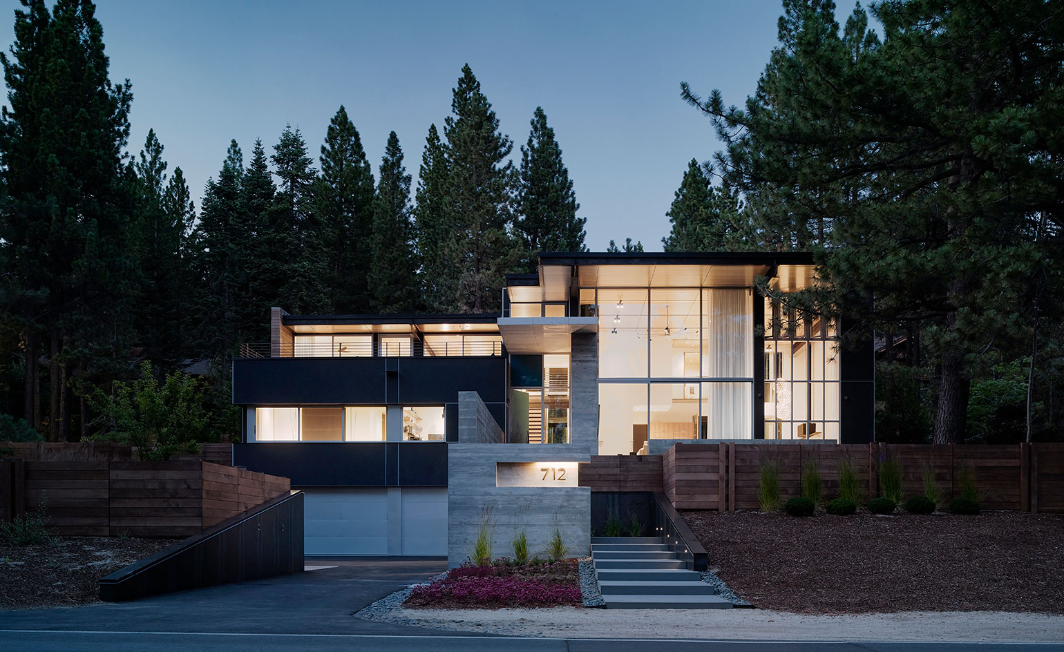
You’d think living across the street from the largest alpine lake in North America would provide all the wonder one could ask for. But when Californian architect Greg Faulkner designed a minimalist house for a Lake Tahoe-adjacent plot in Incline Village, Nevada, he added more awe to the mix.
Faulkner had a lot to play off and play with, of course: a glassy, freshwater lake surrounded by the Sierra Nevada mountains and countless towering pines. By incorporating the scene as part of his design, the architect blurred the boundary between the natural landscape and the built environment. When the residents retreat to the interior of their home – predominantly made of glass, plaster and board-formed concrete – and look through the transparent front façade, they see only water, trees and sky.
‘It’s kind of a single-aperture house,’ says the architect, who employed significantly smaller windows and practically opaque walls for the structure’s remaining three elevations. ‘The framework of glass and steel faces the light and the lake; the other sides are much more closed.’
On the exterior of the front façade, a low concrete wall that functions as a bench helps to crop the view so street traffic and lakeshore activity are obscured. The clients, a couple and their two children, wanted to be able to engage with the landscape, but they also wanted privacy. ‘We can go snowboarding or rock climbing or take the boat out,’ they say. ‘But then we can come back, sit in the living room and stare out at the bright blue sky and feel like we’re outside.’
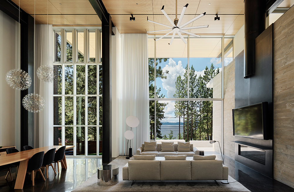
Sunlight bouncing off the living area’s highly polished black concrete floors creates a sensation of floating on water, reflecting the distant landscape of the glassy lake beyond.
An explosion of epic landscape through a house’s front façade is a grand gesture that needs balance. Faulkner relieved the intensity of the design by carving floor-to-ceiling slits out of one of the opaque walls. The slender transparencies appear as splits in the building that cast slivers of sunlight onto the polished black concrete floors. ‘The light on that reflective flooring creates a sensation of being on the water,’ he says. ‘It takes you right back to the lake.’
It’s reminiscent of the work of American artist Gordon Matta-Clark, who studied architecture at Cornell University before creating site-specific installations that featured building cuts as social commentary. ‘I learned from the way he described the light as swathes and beams that maintain and hold the house’s energy and track the way it changes from morning to evening,’ Faulkner explains.
The sunlight’s interaction with the concrete floors creates a floating sensation, but Faulkner wanted the house to feel anchored to its sloping site. ‘The clients collect cars and requested a large garage,’ says the architect, who created a six-car space that became the house’s ground form. The couple’s collection includes a Porsche 918 Spyder and a Volkswagen Thing. ‘We love parking the two next to each other and studying the lines that wrap around their forms,’ say the clients.
The garage’s board-formed concrete exterior climbs from street level to the entrance, where it punctures glass, then continues inside to form an entry wall and a fire surround in the living room. ‘The boardformed concrete was sandblasted to raise the grain so it picks up the texture of the tree trunks on the property.’ The weathered rock on the site also informed the dark grey colour of the exterior plaster, and the heavy snow loads that fall in winter dictated the need for steel ceiling beams that contrast with a bright-hued maple soffit and ceiling.
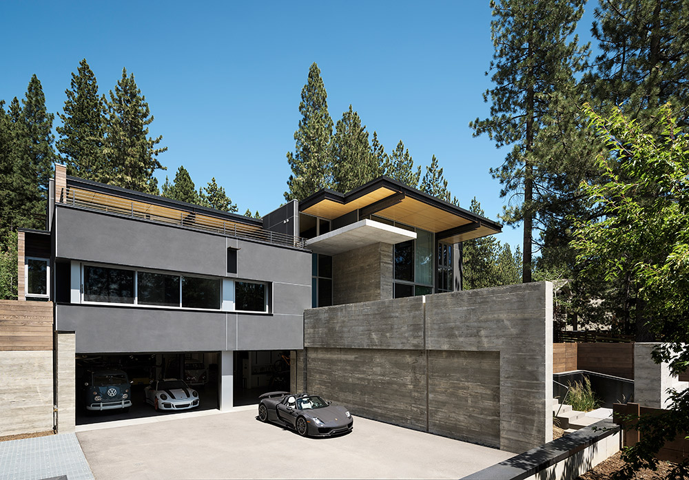
A large garage was requested for the clients’ collection of cars.
Faulkner created more contrast for the exterior’s rear façade. ‘There is a wood skin on the section of the house that holds some of the sleeping areas and cantilevers over the outdoor bar and dining area,’ he says. ‘That volume wanted to go lighter than the plaster because it’s elevated. It’s nice to tweak something to activate the eye. If the entire rear mass interior features another projection – a glass-and-steel bridge that is suspended above the kitchen area. ‘It accesses the bedrooms, but it became this amazing viewport that faces the aperture and looks to the lake,’ Faulkner says. ‘The railing is glass, but the floor of the bridge is one-inch-thick plate steel; the metal has a softness that relates to the liquid character of the floor.’
Faulkner designs with the idea of experience foremost in his mind, letting the surroundings and the site dictate what a building should be. In the case of a property nestled into a hillside overlooking Lake Tahoe, he discovered that the effect of sunlight on the surface of the water is a natural material that can be harnessed as part of a house. ‘When focused, light can be transcendent,’ the architect says.
Edges, joints, alignments and glazing patterns are important. But space can also be formed with ephemeral elements or the absence of elements. The living room in this house is buttressed with acoustic plaster. That silence is a big part of the living experience.’
As originally featured in the October 2017 issue of Wallpaper* (W*223)
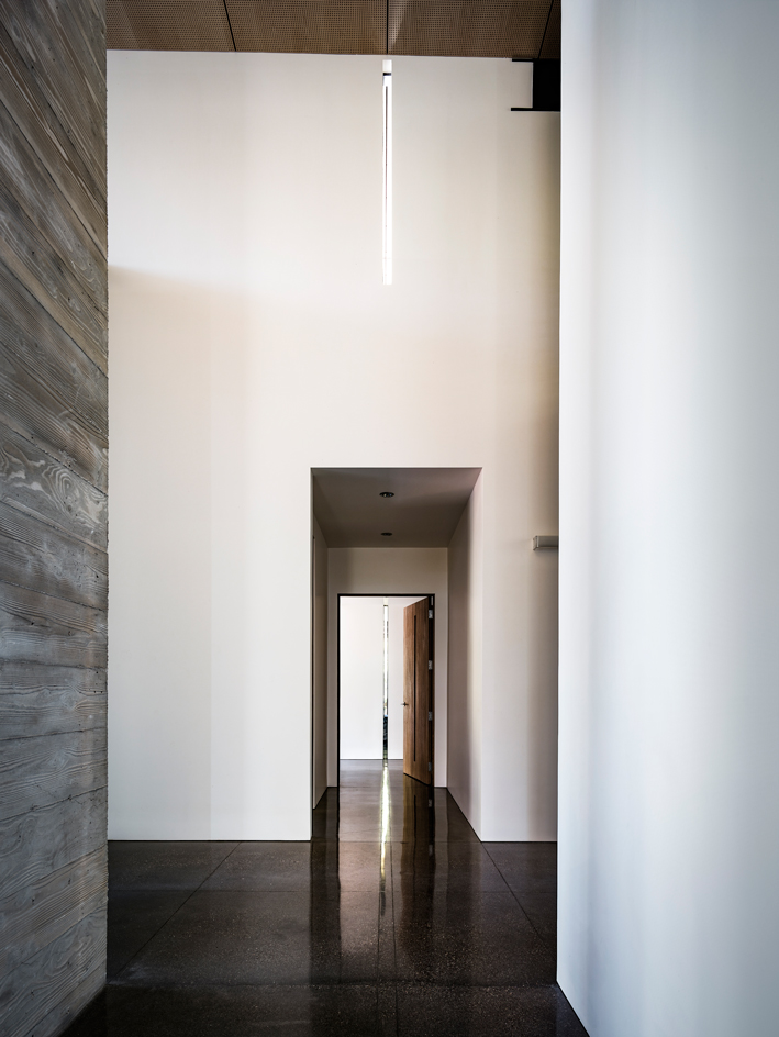
The interior is highly minimalist, a combination of glass, plaster and board-formed concrete
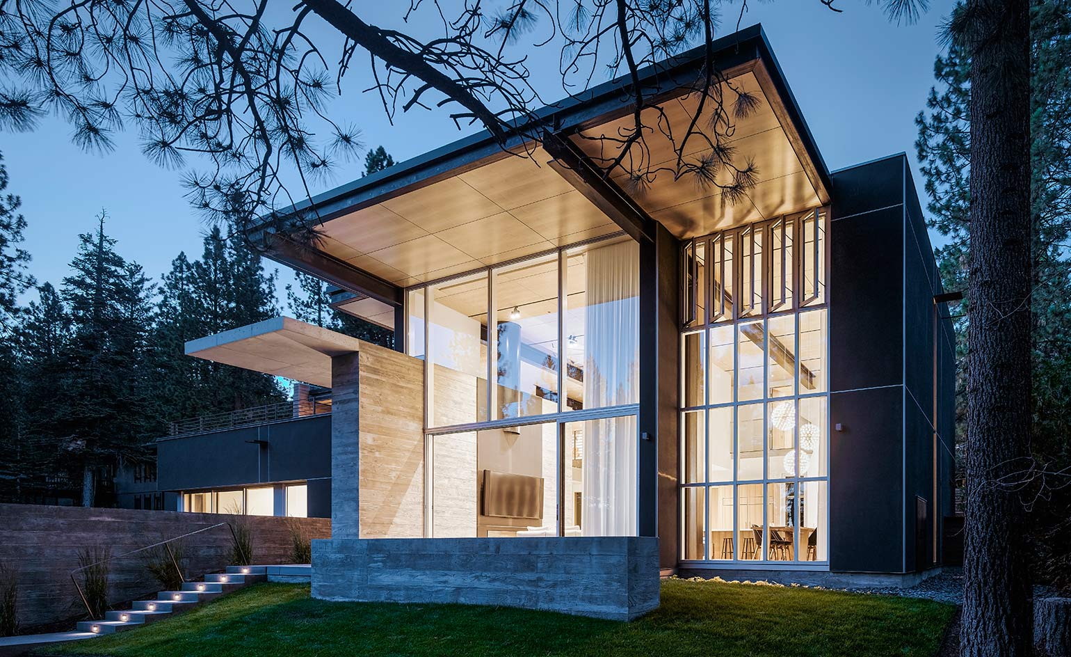
The house finds itself surrounded by the natural landscape consisted of Lake Tahoe, Sierra Nevada mountains and inumerable pine trees
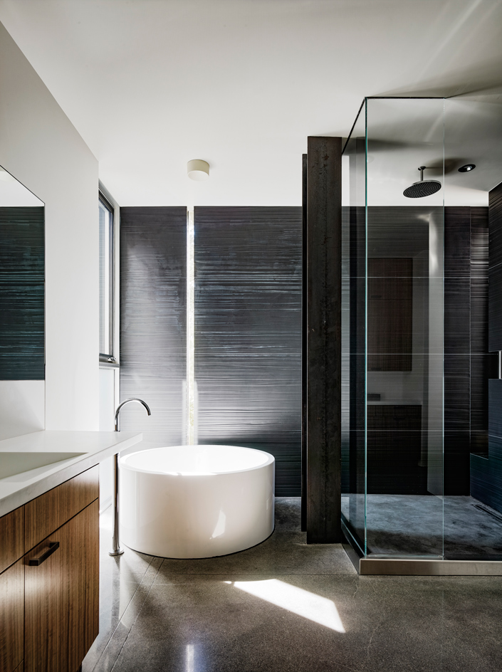
Its colour palette takes keen inspiration from the surrounding outdoors
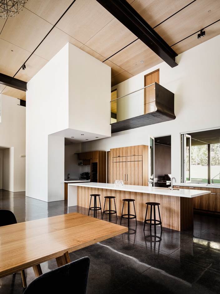
A glass-and-steel bridge suspended above the kitchen area leads to the bedrooms
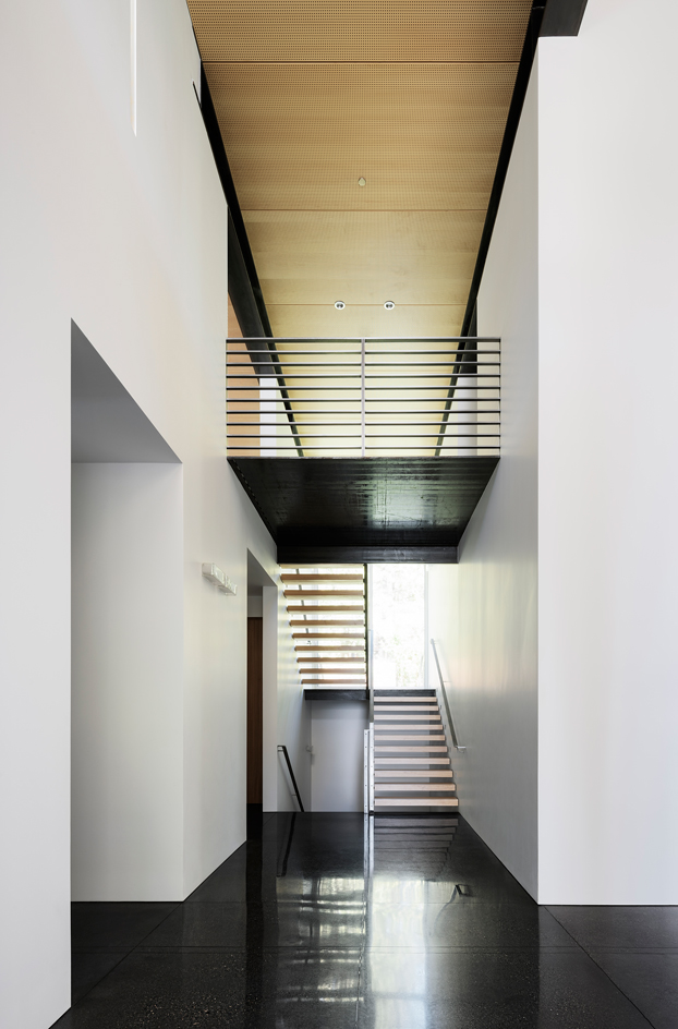
The central staircase tidily leads to the left and right of the house
INFORMATION
For more information, visit the Faulkner Architects website
Wallpaper* Newsletter
Receive our daily digest of inspiration, escapism and design stories from around the world direct to your inbox.
-
 Extreme Cashmere reimagines retail with its new Amsterdam store: ‘You want to take your shoes off and stay’
Wallpaper* takes a tour of Extreme Cashmere’s new Amsterdam store, a space which reflects the label’s famed hospitality and unconventional approach to knitwear
By Jack Moss
-
 Titanium watches are strong, light and enduring: here are some of the best
Brands including Bremont, Christopher Ward and Grand Seiko are exploring the possibilities of titanium watches
By Chris Hall
-
 Warp Records announces its first event in over a decade at the Barbican
‘A Warp Happening,' landing 14 June, is guaranteed to be an epic day out
By Tianna Williams
-
 This minimalist Wyoming retreat is the perfect place to unplug
This woodland home that espouses the virtues of simplicity, containing barely any furniture and having used only three materials in its construction
By Anna Solomon
-
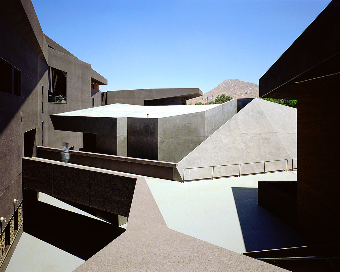 We explore Franklin Israel’s lesser-known, progressive, deconstructivist architecture
Franklin Israel, a progressive Californian architect whose life was cut short in 1996 at the age of 50, is celebrated in a new book that examines his work and legacy
By Michael Webb
-
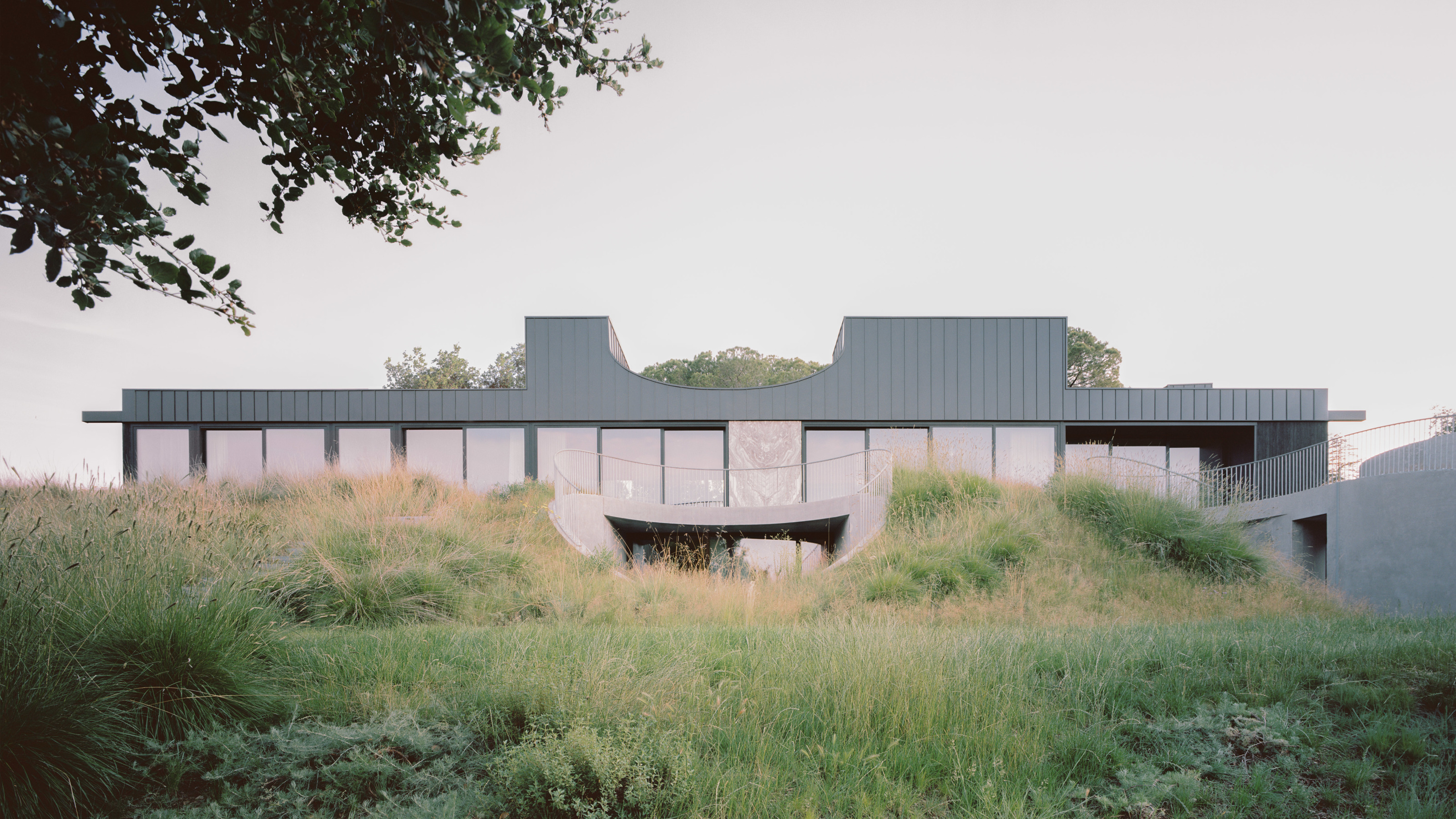 A new hilltop California home is rooted in the landscape and celebrates views of nature
WOJR's California home House of Horns is a meticulously planned modern villa that seeps into its surrounding landscape through a series of sculptural courtyards
By Jonathan Bell
-
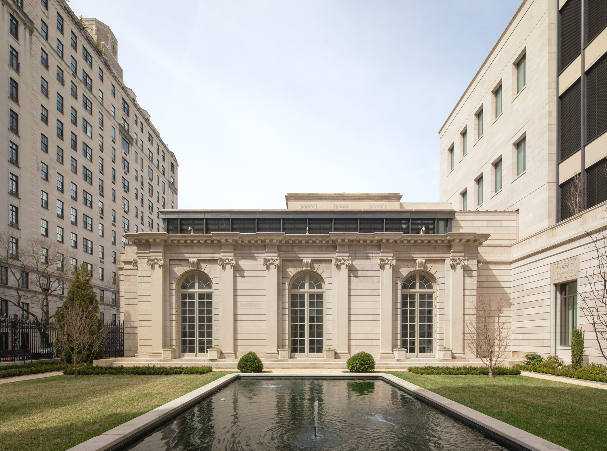 The Frick Collection's expansion by Selldorf Architects is both surgical and delicate
The New York cultural institution gets a $220 million glow-up
By Stephanie Murg
-
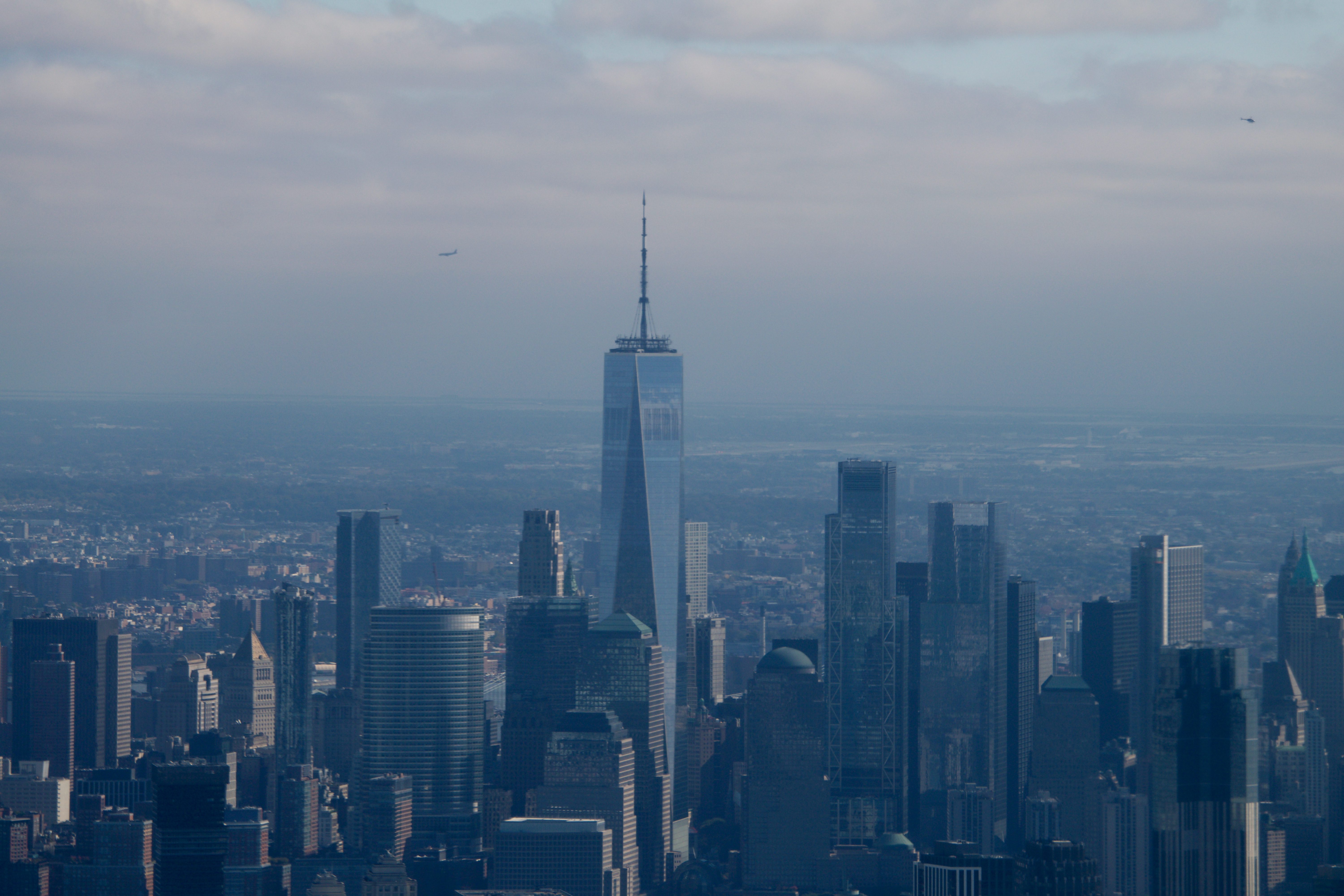 Remembering architect David M Childs (1941-2025) and his New York skyline legacy
David M Childs, a former chairman of architectural powerhouse SOM, has passed away. We celebrate his professional achievements
By Jonathan Bell
-
 The upcoming Zaha Hadid Architects projects set to transform the horizon
A peek at Zaha Hadid Architects’ future projects, which will comprise some of the most innovative and intriguing structures in the world
By Anna Solomon
-
 Frank Lloyd Wright’s last house has finally been built – and you can stay there
Frank Lloyd Wright’s final residential commission, RiverRock, has come to life. But, constructed 66 years after his death, can it be considered a true ‘Wright’?
By Anna Solomon
-
 Heritage and conservation after the fires: what’s next for Los Angeles?
In the second instalment of our 'Rebuilding LA' series, we explore a way forward for historical treasures under threat
By Mimi Zeiger