SHoP Architects design an ambitious contemporary art facility in Santa Fe
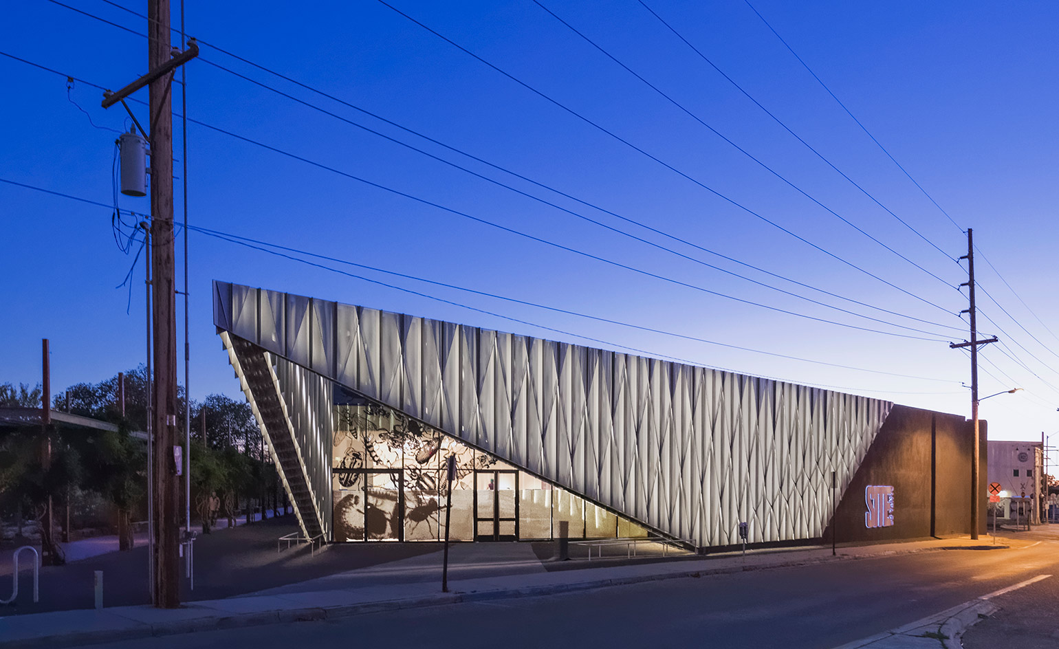
There comes a time in many young art institutions’ lives when they have to grow up; elevating from daring upstart to established institution. Such was the case with SITE Santa Fe, an inventive Kunsthalle located in a boxy former beer warehouse in Santa Fe’s Railyard district. SITE, which recently turned 20, had over the years hired renowned architects like Greg Lynn, Graft, Todd Williams and Billie Tsien to enact temporary changes, but it needed something permanent and ambitious. ‘We were dreaming of something much more,’ explains SITE director and chief curator Irene Hofmann.
Earlier this month SITE celebrated the results of that undertaking – a reimagined facility designed by New York-based SHoP Architects. The museum now boasts about 14,000 new sq ft of (well-organised) space, much-needed technical improvements, and a dramatic new entryway.
That extended entrance, which the architects call the ‘prow’ because of how it juts sharply out toward the street, is a layered, folded, and perforated aluminium beacon that simultaneously pulls people in, defines a new outdoor plaza and frames the sky. It changes dramatically as light around it shifts, both day and night.
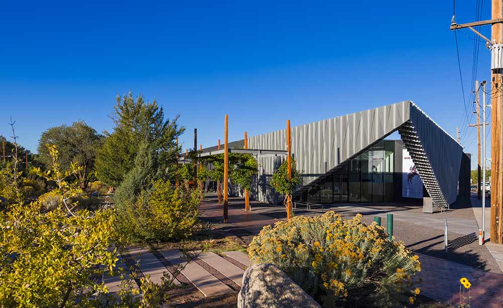
The building’s ‘prow’ defines the new outdoor plaza, framing the sky.
Its digitally-modeled creation, says SHoP principal Christopher Sharples, was inspired by the corrugated aluminum sides of boxcars in the nearby railyard, and by the triangular shapes prevalent in the city’s indigenous designs. Beyond the new beacon, a glass curtain wall exposes and draws people into SITE’s expanded, wide open new lobby, which flows freely into a gift shop and café. ‘We were taking the closed, opaque spaces and opening them up to the city,’ explains Sharples, who likened the complex, budget-challenged project to open heart surgery.
Galleries, in many ways familiar, have been slightly reconfigured with temporary walls. Around them are a new multi-purpose learning lab, a large, flexible auditorium, new offices, storage, a central courtyard and, above it, a sky terrace. All these spaces have been fitted with new lighting, electricity and (something SITE amazingly never had before) climate control; allowing them to stay open a much greater portion of the year and draw artists that couldn’t work in the previous conditions.
Happily the team preserved some of the old facility’s rough edges – like the concrete floors, marred in places from artist interventions, and the original stucco façade, albeit painted black, playing a sneaky supporting role. While much of the intervention is understated, it’s impossible to miss the jagged, brash prow, and its smaller sibling to the museum’s rear (which frames a smaller public space).
‘It’s scrappy, it’s got some attitude,’ says Sharples. Much like SITE. Whether the institution will maintain its jagged edges remains to be seen. But there’s no question about its elevated standing as one of the America’s homes of artistic innovation.
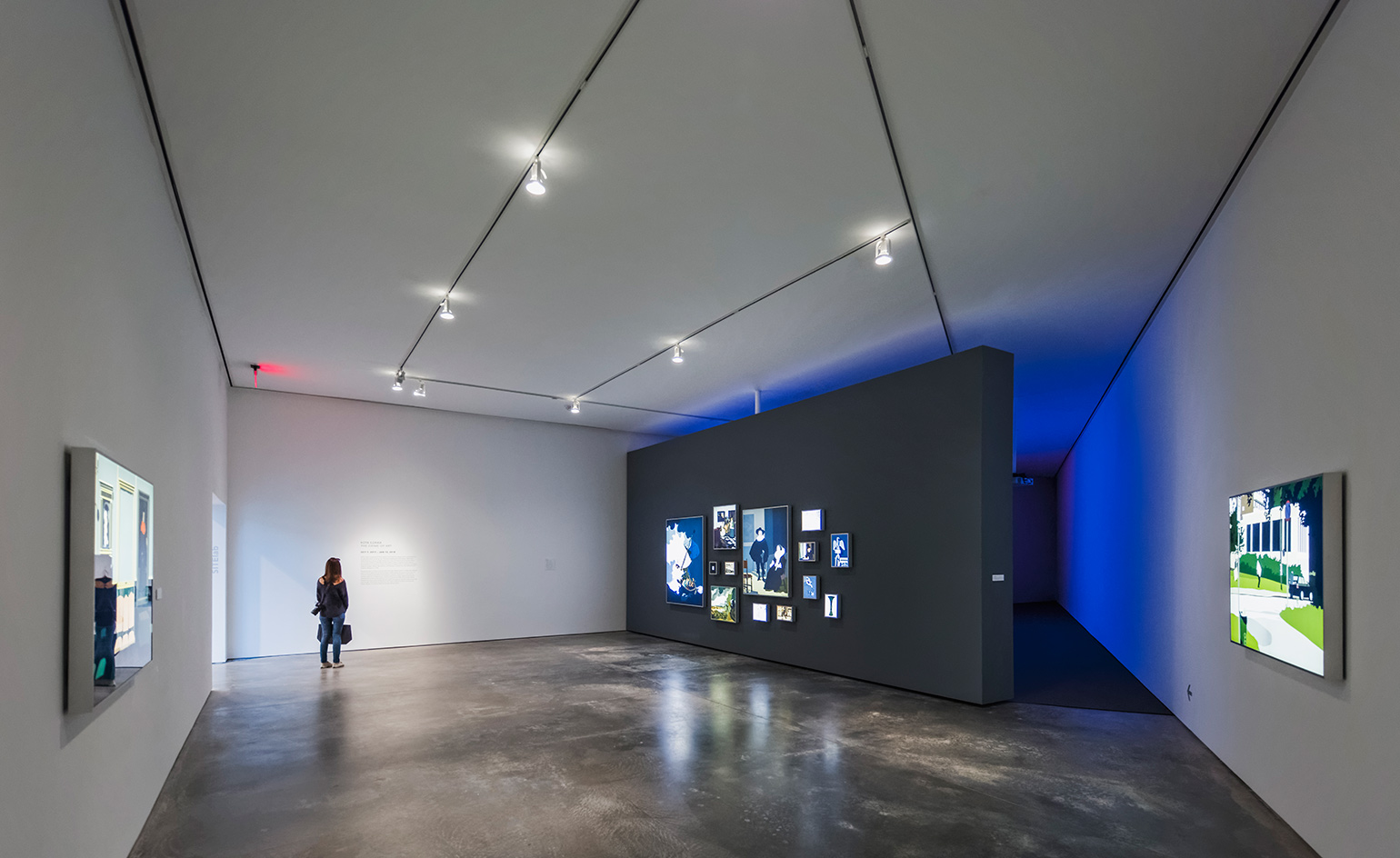
New improvements include around 14,000 sq ft of new space and much-needed technical improvements
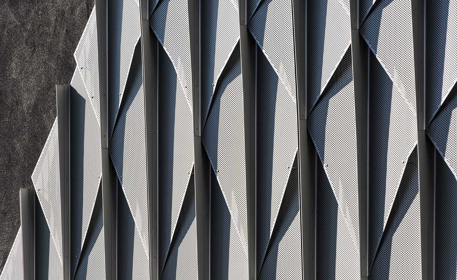
SHoP’s Christopher Sharples took inspiration from the corrugated aluminium sides of boxcars in the nearby railyard, as well as triangular shapes prevalent in the city’s indigenous designs
INFORMATION
For more information, visit the SITE website and the SHoP architects website
ADDRESS
SITE
2606 Paseo De Peralta
Santa Fe NM 87501
Wallpaper* Newsletter
Receive our daily digest of inspiration, escapism and design stories from around the world direct to your inbox.
-
 Naoto Fukasawa sparks children’s imaginations with play sculptures
The Japanese designer creates an intuitive series of bold play sculptures, designed to spark children’s desire to play without thinking
By Danielle Demetriou
-
 Japan in Milan! See the highlights of Japanese design at Milan Design Week 2025
At Milan Design Week 2025 Japanese craftsmanship was a front runner with an array of projects in the spotlight. Here are some of our highlights
By Danielle Demetriou
-
 Tour the best contemporary tea houses around the world
Celebrate the world’s most unique tea houses, from Melbourne to Stockholm, with a new book by Wallpaper’s Léa Teuscher
By Léa Teuscher
-
 Leonard Baby's paintings reflect on his fundamentalist upbringing, a decade after he left the church
The American artist considers depression and the suppressed queerness of his childhood in a series of intensely personal paintings, on show at Half Gallery, New York
By Orla Brennan
-
 Desert X 2025 review: a new American dream grows in the Coachella Valley
Will Jennings reports from the epic California art festival. Here are the highlights
By Will Jennings
-
 In ‘The Last Showgirl’, nostalgia is a drug like any other
Gia Coppola takes us to Las Vegas after the party has ended in new film starring Pamela Anderson, The Last Showgirl
By Billie Walker
-
 ‘American Photography’: centuries-spanning show reveals timely truths
At the Rijksmuseum in Amsterdam, Europe’s first major survey of American photography reveals the contradictions and complexities that have long defined this world superpower
By Daisy Woodward
-
 Sundance Film Festival 2025: The films we can't wait to watch
Sundance Film Festival, which runs 23 January - 2 February, has long been considered a hub of cinematic innovation. These are the ones to watch from this year’s premieres
By Stefania Sarrubba
-
 What is RedNote? Inside the social media app drawing American users ahead of the US TikTok ban
Downloads of the Chinese-owned platform have spiked as US users look for an alternative to TikTok, which faces a ban on national security grounds. What is Rednote, and what are the implications of its ascent?
By Anna Solomon
-
 Architecture and the new world: The Brutalist reframes the American dream
Brady Corbet’s third feature film, The Brutalist, demonstrates how violence is a building block for ideology
By Billie Walker
-
 ‘Gas Tank City’, a new monograph by Andrew Holmes, is a photorealist eye on the American West
‘Gas Tank City’ chronicles the artist’s journey across truck-stop America, creating meticulous drawings of fleeting moments
By Jonathan Bell