Receive our daily digest of inspiration, escapism and design stories from around the world direct to your inbox.
You are now subscribed
Your newsletter sign-up was successful
Want to add more newsletters?
The Stedelijk Museum Amsterdam has just welcomed the latest phase in its 150-year evolution – a journey that has included a major renovation and extension by Benthem Crouwel Architects in 2012, the launch of the Stedelijk Base designed by AMO in 2017, and now, the unveiling of its brand-new Don Quixote Sculpture Hall.
Inside the Stedelijk Museum's new wing
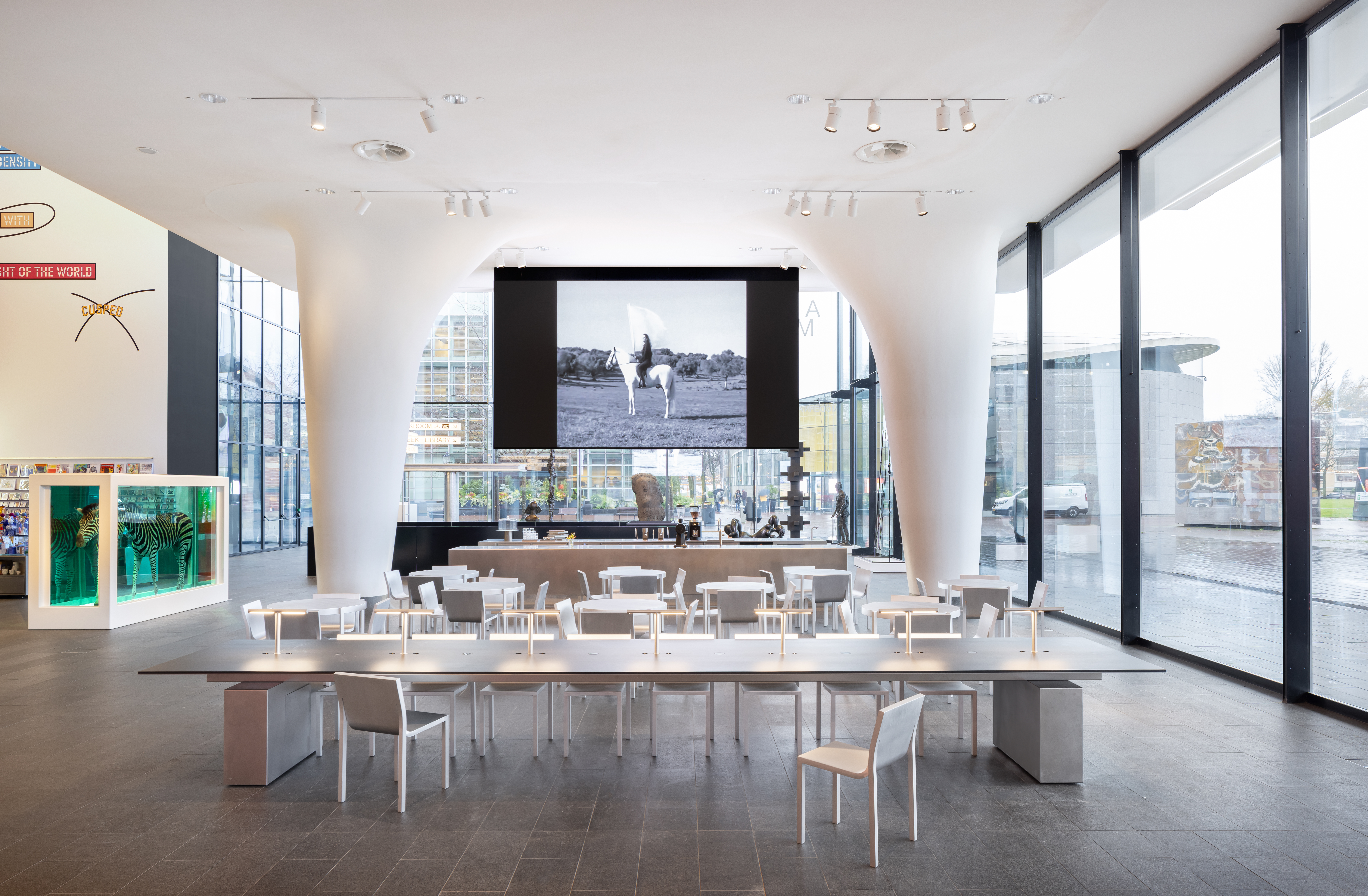
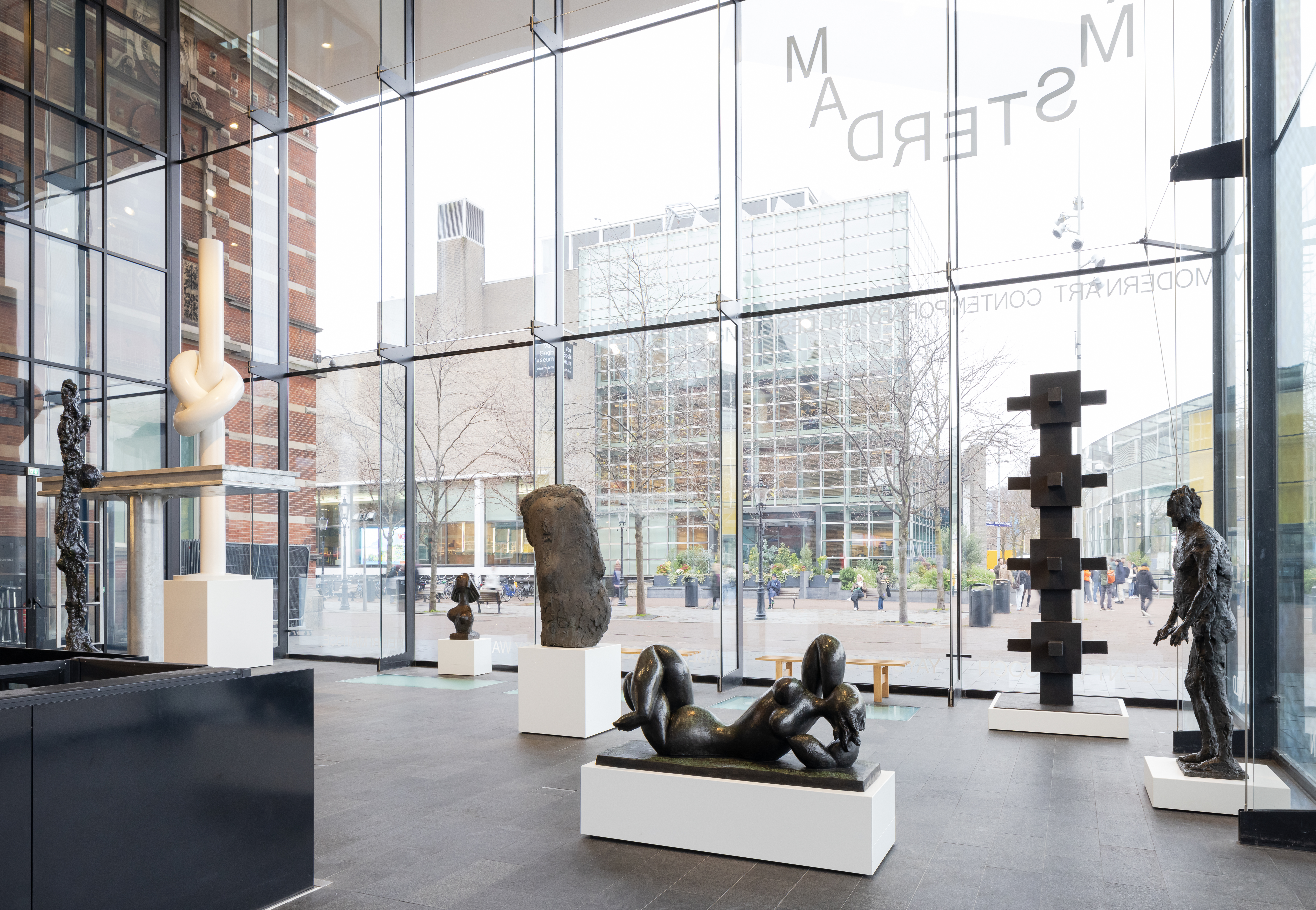
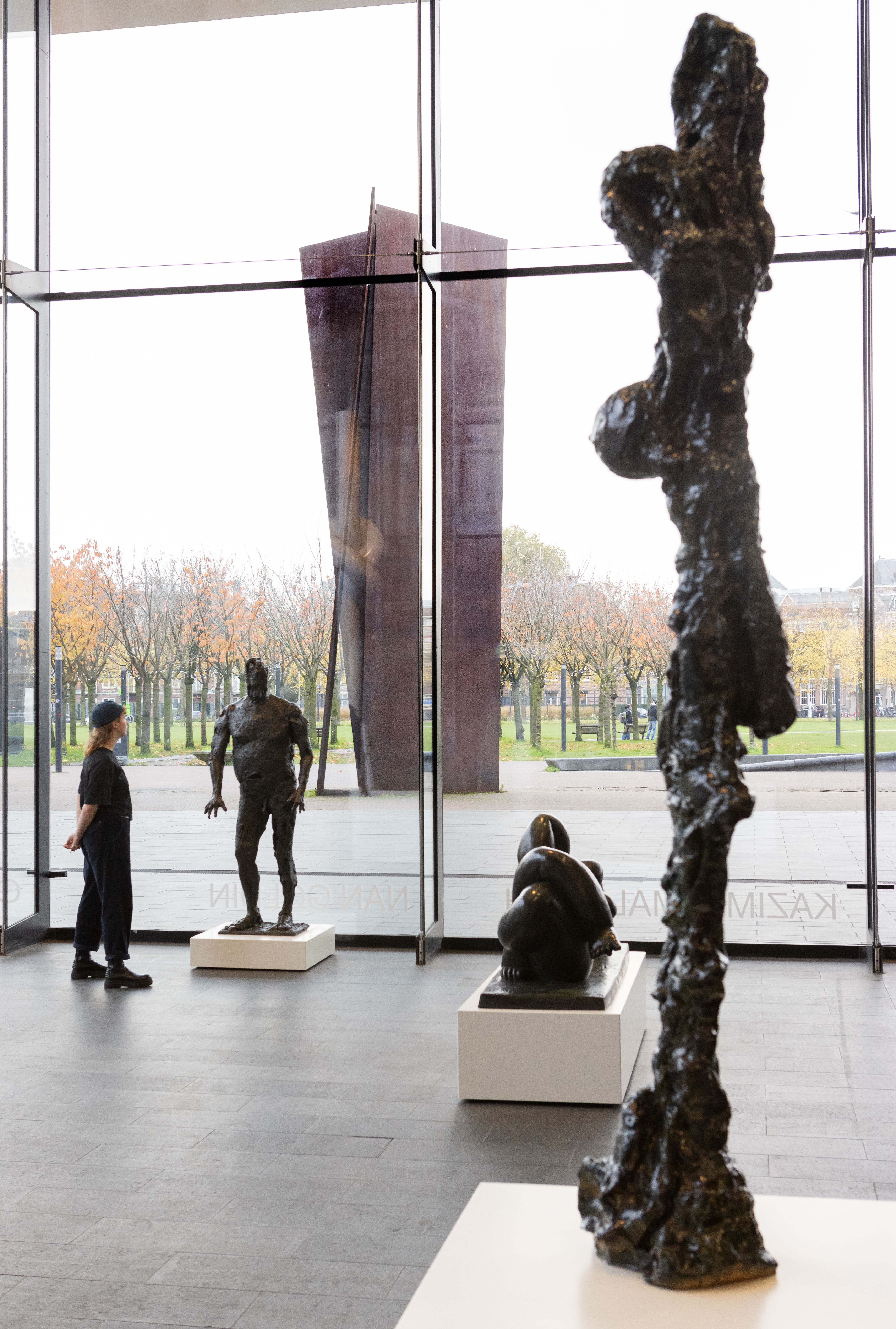
Located on the entrance level, the Don Quixote Sculpture Hall features an indoor space that allows the museum to display works from its collections while reintroducing the space's legacy as a sculpture garden. The renovation also aims to return the space to the public to diversify its offerings and activities in the future.
‘It’s a new beginning for the museum. The Stedelijk is constantly transitioning and transforming, and we believe that today, accessibility is more important than ever. By opening up to the public, we strive to inspire people to engage with art,’ says Rein Wolfs, director of the Stedelijk.
Making the Stedelijk Museum addition
French architect Paul Cournet, founder of Cloud in Rotterdam, was tasked with redesigning the entire entrance level to align with the museum's vision. The goal was to create adaptable, future-proof solutions that would ensure the space remains relevant for years to come.
‘It is as much an architectural question as one of identity for the museum – what direction should we take? On one hand, it’s a beautiful 1895 brick structure; on the other, it’s the iconic contemporary addition from the early 21st century. We had to create something new while still giving space to the arts. The new design is present, but we intended for it to remain in the background,’ says Cournet.
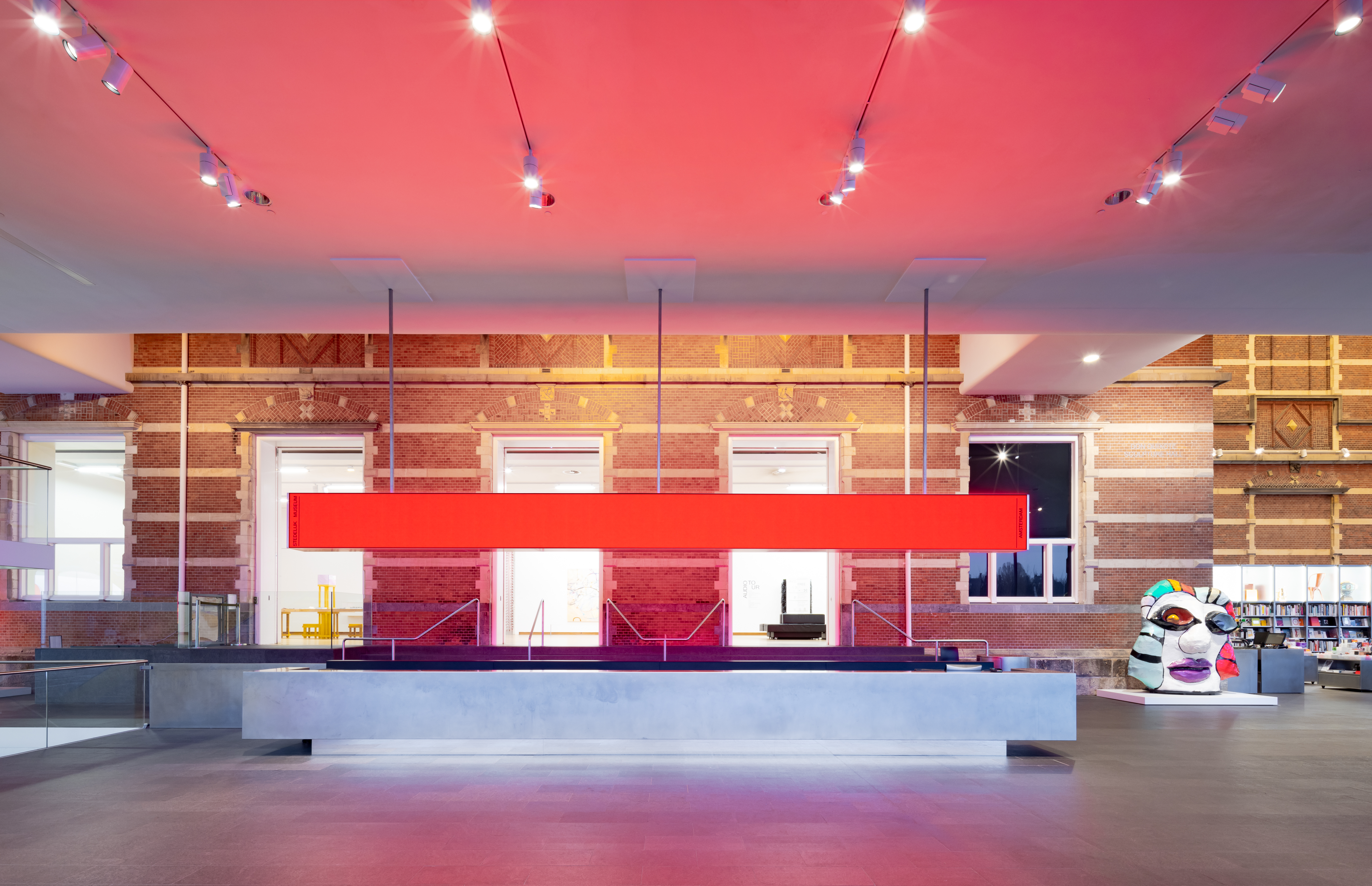
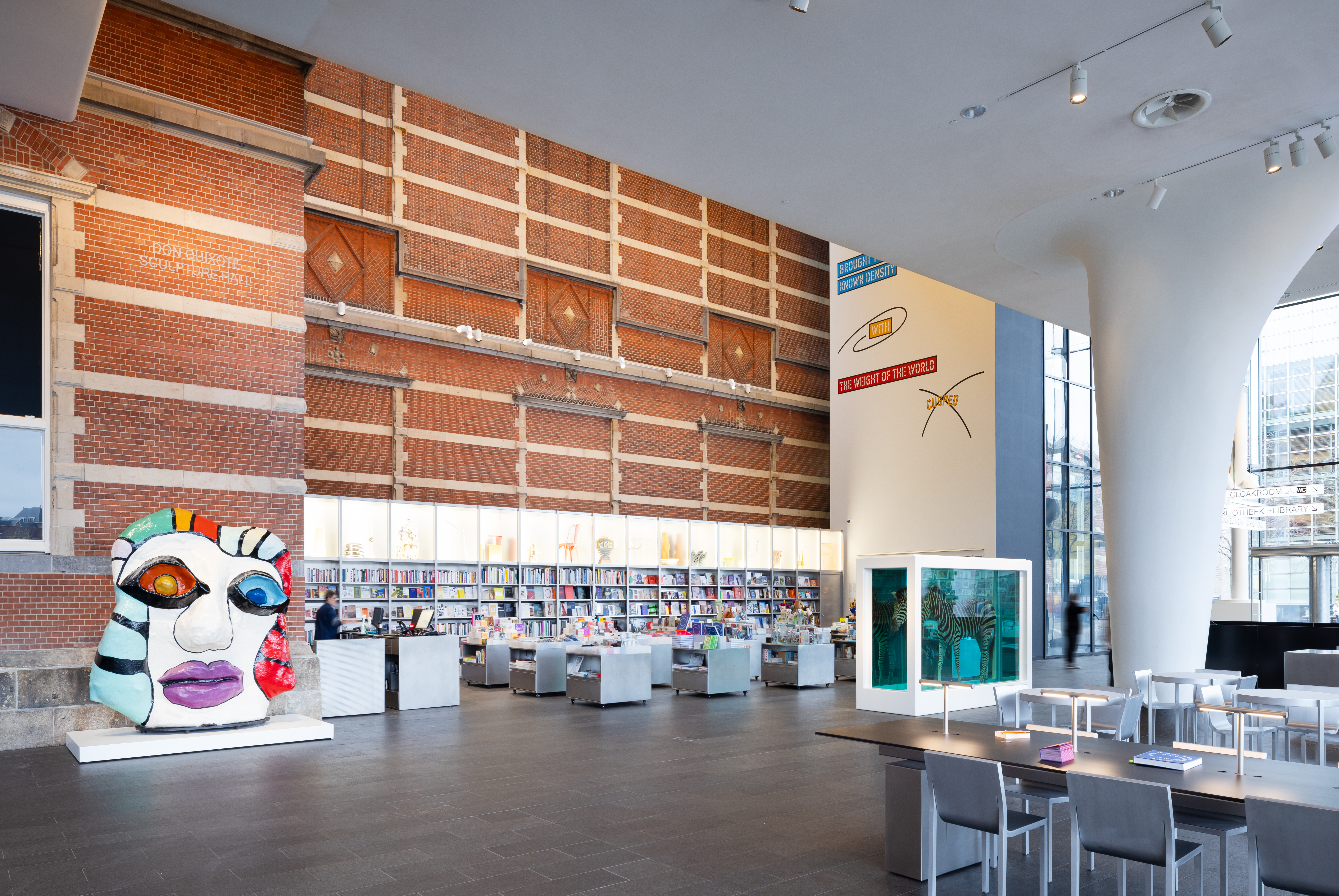
Rather than making a bold statement, the architect opted for a more subtle approach with small but precise interventions. A thorough clean-up was done, and modular elements were introduced to create varied functions and flows throughout the space. The information counter in front of the main entrance, where visitors check in, also acts as a transition between the public areas and the ticketed sections.
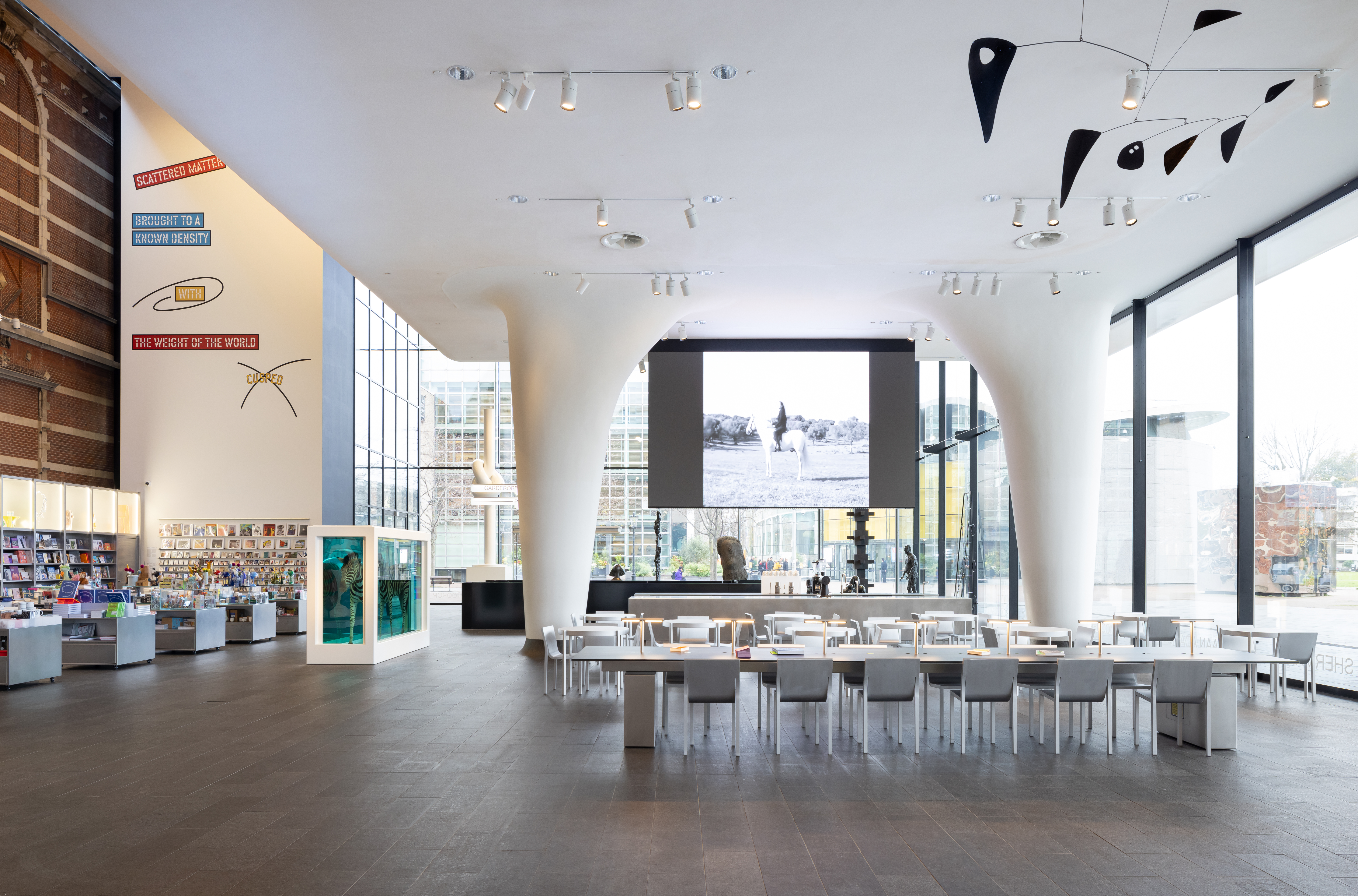
To the right is the Fonda Bar, which consists of two simple, unadorned volumes that serve as the kitchen and the serving area. The bookshop is now located to the left of the bar, with 1 x 1m storage and display units forming a modular system that can be adapted to different layouts. Taking advantage of the space’s height, 17 vitrines extend above the 2.5m wall-mounted bookshelf, created to highlight the museum’s design collection alongside its art.
Receive our daily digest of inspiration, escapism and design stories from around the world direct to your inbox.
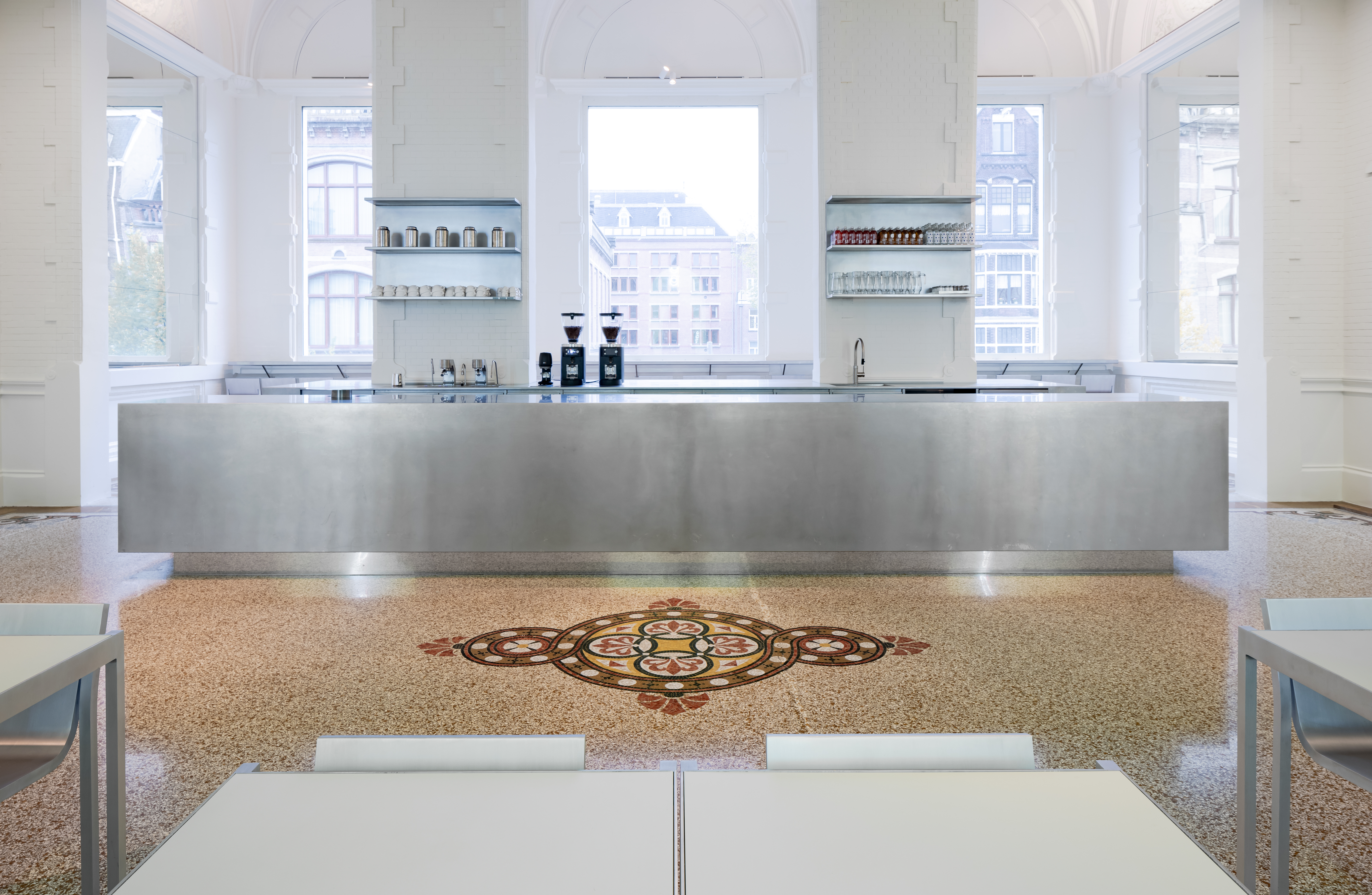
‘The kind of innovation we wanted to discuss with the museum in terms of materials is: how can we be contemporary?’ Cournet answered the question with a single materiality: ‘We went for brushed stainless steel for the entire scheme because of its timeless quality – these [elements] could have been built 50 years ago, or they could be designed in 50 years and still feel like they belong here.’
Over the past two years, the team has worked with the Dutch company Rovasta to refine both the engineering details and the finishing. All pieces in the space are crafted from wood and clad in a 2mm layer of stainless steel. The labour-intensive process begins with folding sheets of steel, with each joint welded and hand-brushed to ensure a seamless final appearance. This is how the 10.2m-long information counter appears as one continuous piece of metal; it was fabricated in the factory and brought to the museum as a single unit.
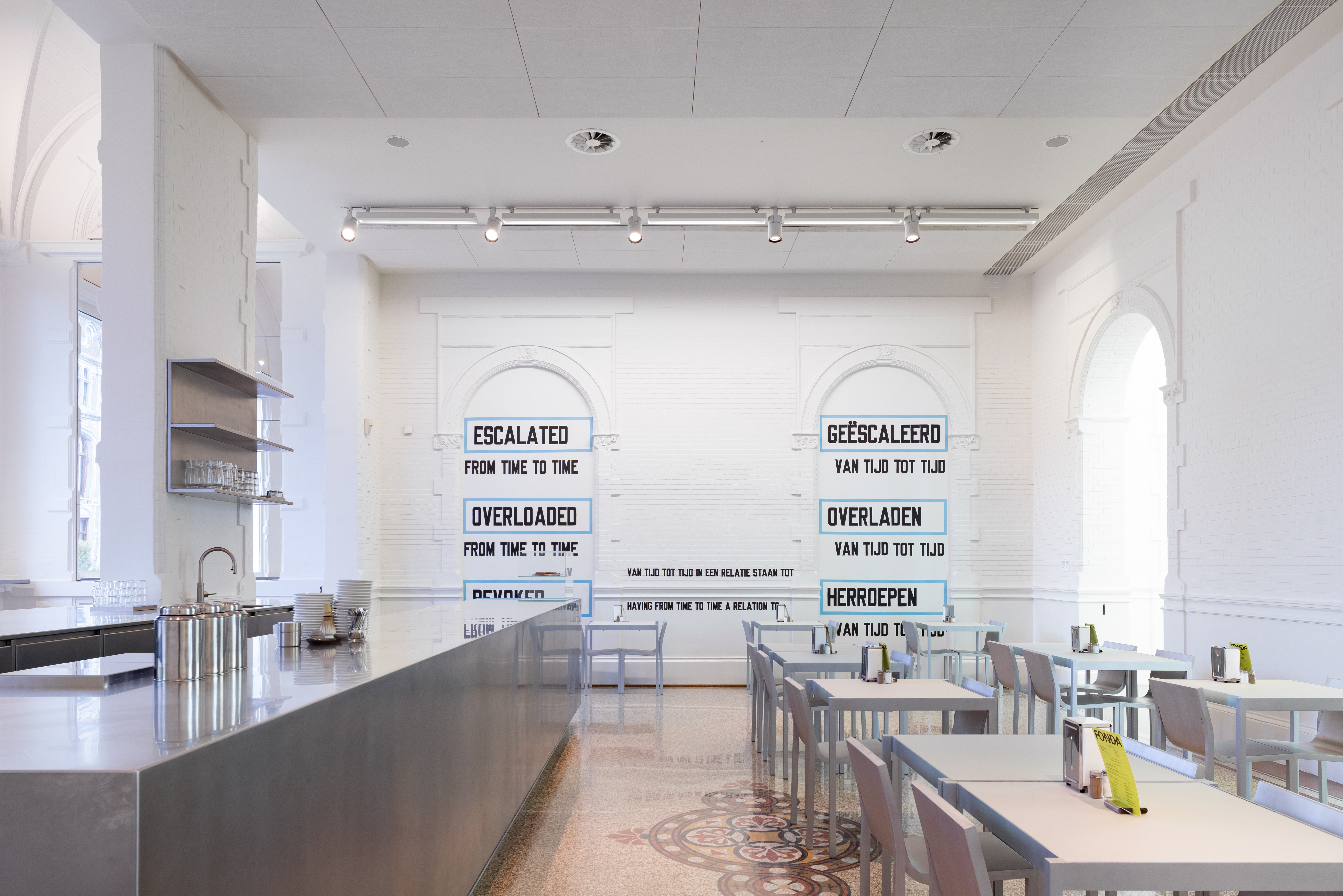
Cournet’s intervention also aimed at enhancing the overall visitor experience. A digital screen was added above the information counter to provide more timely communication, replacing traditional printed collateral, while also doubling as a digital showcase for hosting digital artworks. The existing graphic signage system, originally designed by Mevis & Van Deursen, was transformed into illuminated light bars with an LED system that can customise colours for different events.
The Stedelijk has a long tradition of commissioning design pieces, including the BZ slatted bench by Martin Fisser, designed in 1960 and still produced by Dutch manufacturer Spectrum. ‘We felt it was time for another piece directly connected to the museum,’ says Wolfs. This led to the commission of Sabine Marcelis, whose resulting ‘Stedelijk’ chair features an aluminium form with smooth, flowing lines that extend from the legs to the backrest, accentuating its materiality.
It is the very first chair Marcelis has ever designed: ‘It was difficult because the chair had to be stackable, lightweight, durable, consciously produced, and recyclable, and it is a new material for me. But I think the biggest challenge was working within all those constraints while still trying to create something with its own character.’
Manufactured by the Spanish brand BD Barcelona, the chair appears to be cut from a single sheet of aluminum, but its structure is actually more intricate. It possesses a certain anonymity – detached from any specific aesthetic, time, or trend – that enables it to adapt to various settings, with its longevity rooted in that versatility.
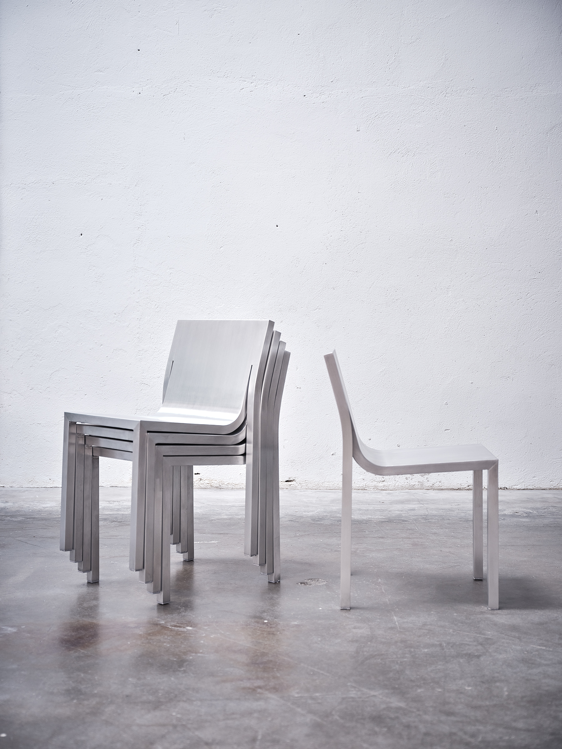
‘Stedelijk’ chair by Sabine Marcelis, produced by BD Barcelona
In collaboration with filmmaker Juan Benavides, the behind-the-scenes movie showcases Paul Cournet's process, working with the Dutch company Rovasta, which specialises in custom stainless-steel solutions, and Hypsos to realise the design and installation.
Yoko Choy is the China editor at Wallpaper* magazine, where she has contributed for over a decade. Her work has also been featured in numerous Chinese and international publications. As a creative and communications consultant, Yoko has worked with renowned institutions such as Art Basel and Beijing Design Week, as well as brands such as Hermès and Assouline. With dual bases in Hong Kong and Amsterdam, Yoko is an active participant in design awards judging panels and conferences, where she shares her mission of promoting cross-cultural exchange and translating insights from both the Eastern and Western worlds into a common creative language. Yoko is currently working on several exciting projects, including a sustainable lifestyle concept and a book on Chinese contemporary design.