Matheson Whiteley turns a Hackney commercial unit into artist spaces
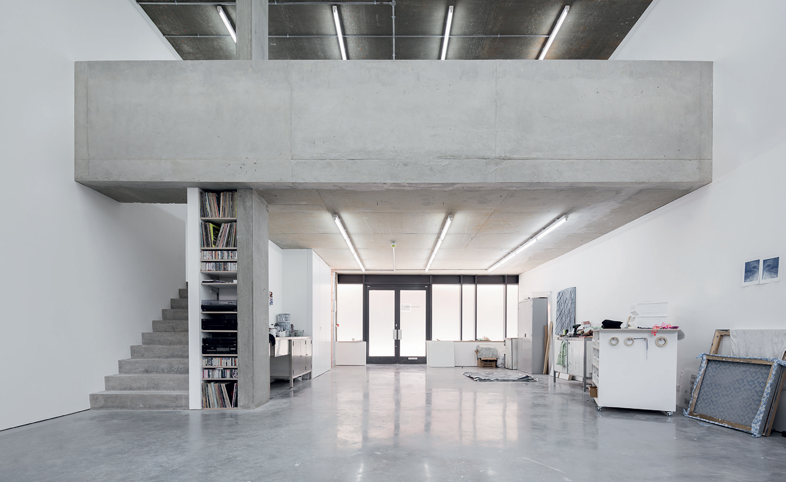
In the process of urban gentrifcation, it is traditionally the artists who have to relocate to make way for commercially-minded developments and the moneyed middle classes. It famously happened in New York, when ‘yuppies’ took over the art hubs of SoHo and, later, the historical Lower East Side. And it has been slowly happening in London’s hip borough of Hackney since house prices soared several years ago, gradually pushing the area’s thriving creative communities further out to the east and north.
The latest project from architecture practice Matheson Whiteley proudly bucks this trend. Its client is a group of four London-based artists – David Noonan, Charles Avery, Michael Raedecker and 2015 Turner Prize-shortlisted Goshka Macuga – who were on the hunt for new workspace in Hackney. They soon realised that there were very few individual sites available in the area and that by pooling their resources they could buy a larger one and subdivide it. A ground-floor space within a mixed-use development from the early 2000s, a few moments from Homerton railway station, provided the perfect redevelopment opportunity.
The property was always meant for commercial use but its slightly awkward location – somewhat hidden at the back of a narrow road of the high street – meant it never got leased. A 12-storey residential tower sits above it. Jason Whiteley and Donald Matheson’s emerging London practice – one of the firms-to-watch in Wallpaper’s 2014 Architects’ Directory (W*184) – were appointed to subdivide the existing single space into four parts, one for each studio, which they would then develop individually according to each artist’s needs. Even though a new and essentially blank canvas, the space had its own set of challenges for the team.
‘There is an established tradition of creating artist spaces from early modern or Victorian-era industrial buildings. However, in London much of that building stock has disappeared, replaced by large, mixed-use buildings of limited quality,’ says Matheson. ‘These have poorly considered ground-floor spaces – generic commercial boxes that don’t contribute much. An architectural afterthought. The challenge, and appeal, of this project was to transform a difficult, unused space into something that could support artistic production.’
Today, it is hard to imagine that the studios – immaculately detailed and largely enveloped in crisp white walls and polished concrete floors – may once have been a storage facility or the back of a shop. The team identified the original envelope’s rawness and scale as its most striking feature and worked to keep this, avoiding excessive lining or fake ceilings. ‘This meant that the existing service pipes from the apartments had to be carefully incorporated, almost in a compositional way, into the design, giving them a kind of logic,’ explains Matheson. ‘We tried to keep things as direct as possible and to maintain an ambiguity about what was original and what is new.’
Although the project was housed in a fairly recent construction, the architects’ surgical intervention required some serious structural rethinking. ‘Contemporary commercial spaces are surprisingly inflexible,’ points out Matheson. When dividing up the areas, the team wanted to make the most of the big openings and double-height ceiling potential. The temporary works needed in order to cut back an existing concrete mezzanine floor, which also acted as a structural support for the residential tower above, were significant, ‘almost infrastructural’ in scale.
Each occupying a slice of the project’s long footprint, the four properties now sit in a row, and have their own entrances. Macuga’s studio is the largest, occupying one end of the building and embracing its curved corner. It includes a double-height atelier linked to a rough-sawn, oak-floored library and office on the mezzanine. Upstairs there’s also a more intimate kitchen and a minimalist bathroom. The latter is a labour of love, enclosed in new cast-concrete walls and featuring a Japanese-cedar soaking tub and a heated concrete bench.
Raedecker’s space comes next, featuring a continuous main studio and mezzanine space, linked by a new concrete staircase with a kitchen beneath. The mezzanine’s balustrade is fitted with a single, 5m-long piece of cross laminated timber used as a desk. Noonan’s workspace follows. It is the ‘most gallery-like’ of all, explain the architects. A small alcove-like library beneath its own mezzanine and a kitchen complement the large main volume. Storage, a bathroom and an office upstairs are accessed from the timber-lined entrance area, cleverly separating uses and allowing extra privacy. Avery developed his interior separately after the initial space division.
It’s the project’s clever detailing that makes these studios unique, avoiding the generic white-box gallery feel: from Macuga’s angled-plank timber flooring that unifies all the upstairs spaces (and is inspired by the floor of Walter De Maria’s The Broken Kilometer installation in New York) to her sculptural and tactile concrete bathroom, and the graphic quality of the concrete mezzanine in Raedecker’s space. Ultimately, the studios elevate their standard shell, providing clean, yet complex, contemporary art spaces fit for the creative production Hackney is still known for.
As originally featured in the November 2015 issue of Wallpaper* (W*200)
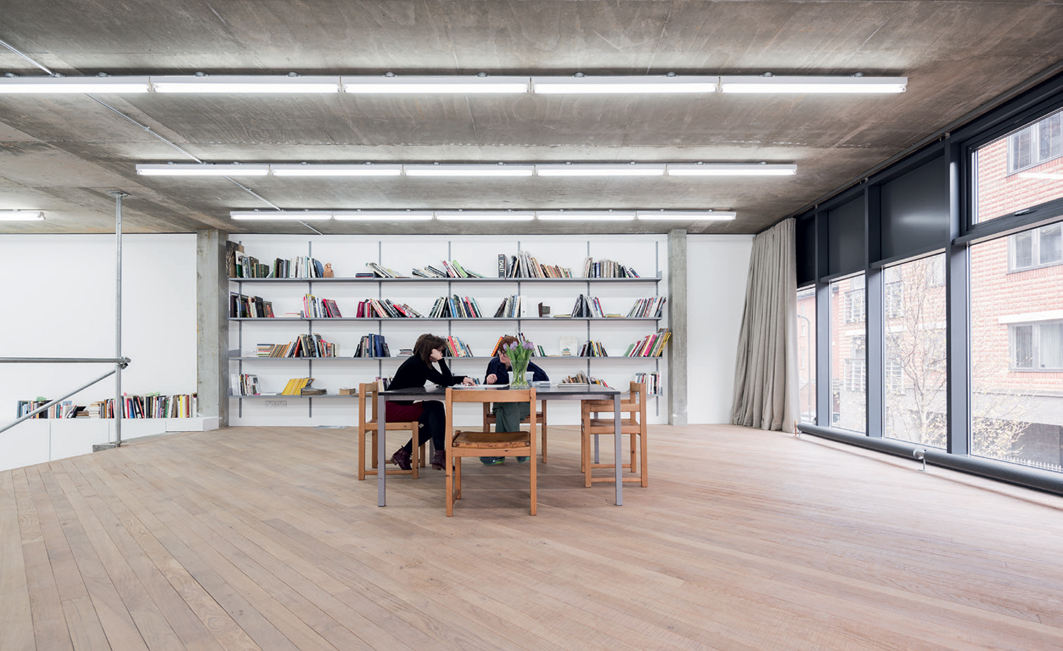
The group of artists are David Noonan, Charles Avery, Michael Raedecker and Goshka Macuga. Pictured: the oak-floored library on the mezzanine of 2015 Turner Prize-shortlisted Mucaga’s studio
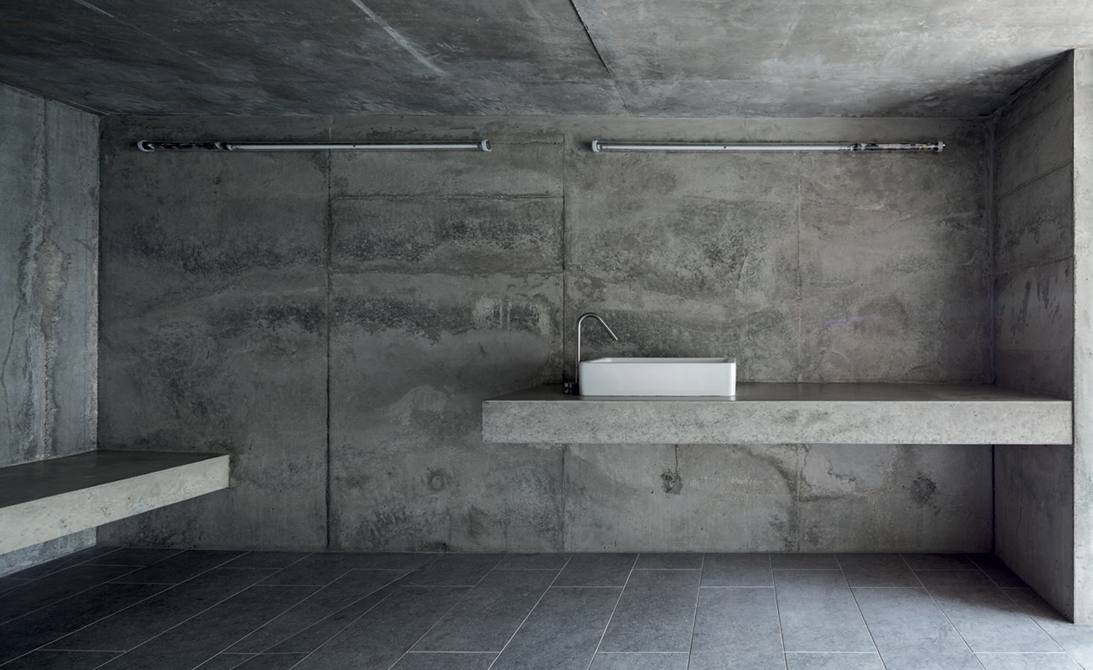
Macuga’s cast-concrete bathroom, which includes a heated concrete bench
INFORMATION
For more information, visit Matheson Whiteley's website
Photography: Maris Mezulis
Wallpaper* Newsletter
Receive our daily digest of inspiration, escapism and design stories from around the world direct to your inbox.
Ellie Stathaki is the Architecture & Environment Director at Wallpaper*. She trained as an architect at the Aristotle University of Thessaloniki in Greece and studied architectural history at the Bartlett in London. Now an established journalist, she has been a member of the Wallpaper* team since 2006, visiting buildings across the globe and interviewing leading architects such as Tadao Ando and Rem Koolhaas. Ellie has also taken part in judging panels, moderated events, curated shows and contributed in books, such as The Contemporary House (Thames & Hudson, 2018), Glenn Sestig Architecture Diary (2020) and House London (2022).
-
 All-In is the Paris-based label making full-force fashion for main character dressing
Part of our monthly Uprising series, Wallpaper* meets Benjamin Barron and Bror August Vestbø of All-In, the LVMH Prize-nominated label which bases its collections on a riotous cast of characters – real and imagined
By Orla Brennan
-
 Maserati joins forces with Giorgetti for a turbo-charged relationship
Announcing their marriage during Milan Design Week, the brands unveiled a collection, a car and a long term commitment
By Hugo Macdonald
-
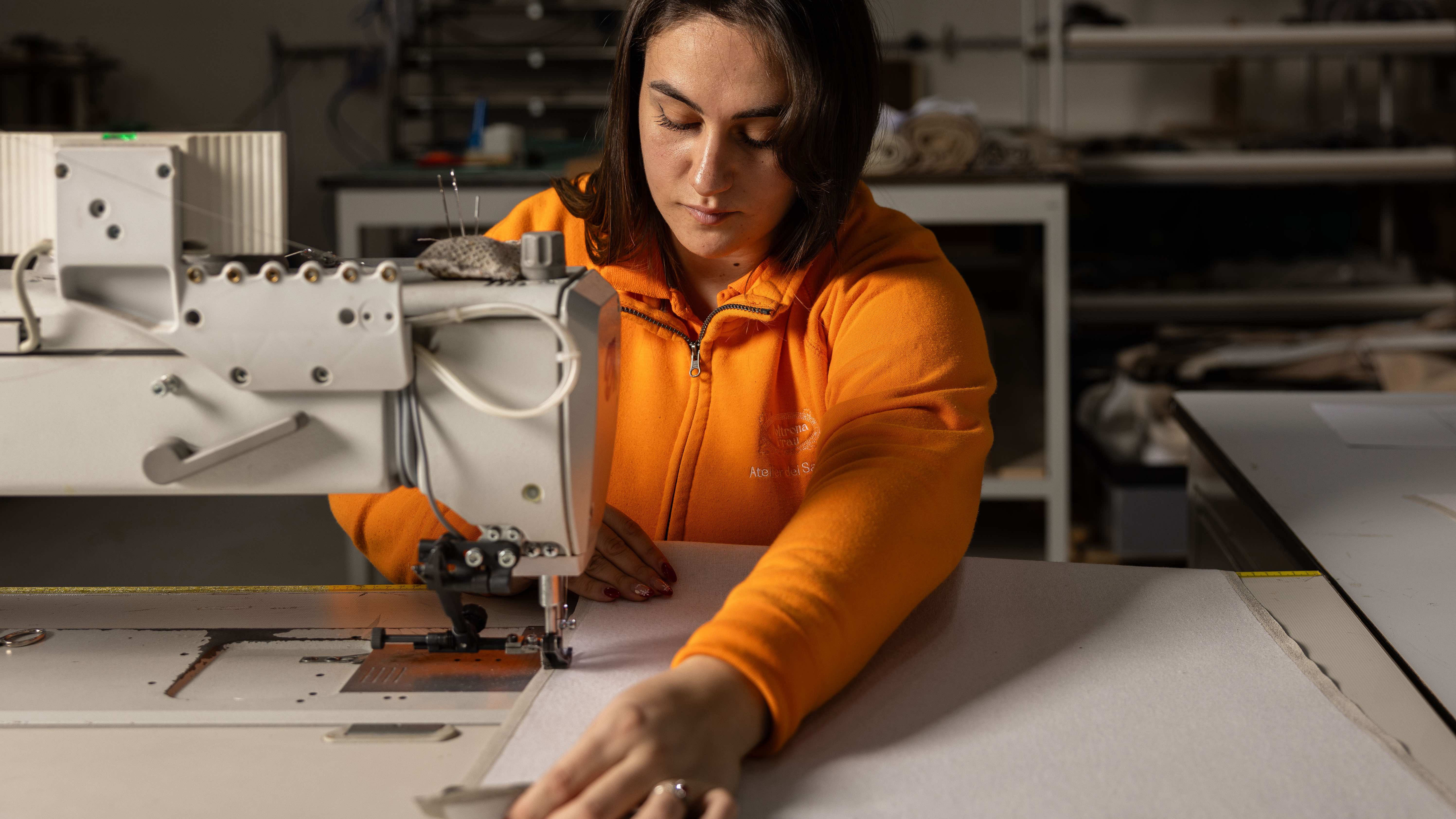 Through an innovative new training program, Poltrona Frau aims to safeguard Italian craft
The heritage furniture manufacturer is training a new generation of leather artisans
By Cristina Kiran Piotti