‘How we make our audience go wow’: Take That on tour
Behind the scenes of the Take That tour set design. Wallpaper* speaks to the band and the architects about the flames, fountains, paper storms and twin ten-tonne kinetic staircases that we saw live at London's O2
Receive our daily digest of inspiration, escapism and design stories from around the world direct to your inbox.
You are now subscribed
Your newsletter sign-up was successful
Want to add more newsletters?
The Take That tour of 2024 is underway. ‘This Life on Tour’ features a set design by Stufish, which Wallpaper* experienced live at London’s O2 this week, created by the entertainment architects behind spectacles such as ABBA Arena, Madonna's Celebration Tour and U2 at the Las Vegas Sphere. Here, they harness ten-tonne kinetic staircases, a 20m bridge that swoops in above the crowd, a giant television, lifts, a spinning satellite stage, fire, water, paper and more to help tell the story of the band’s 30-year career, from the perspective of its three remaining members, Gary Barlow, Mark Owen, and Howard Donald.
Take That tour 2024: Stufish’s set design, from exploding TVs to curtains of rain
The inspiration for the set design came initially from the band, in particular Owen. Architect and Stufish partner Ric Lipson explains: ‘Mark was one of the band's driving forces on this project. He had this idea of stairs being important to the show. A lot of shows use stairs, it's not an unused trope, but the reason for them was the new album, This Life, which is [about] 50-something men looking back at their career, and the ups and downs.’
Adds Owen: ‘Our thoughts around the tour start from the moment that first note is written on the album. We start to visualise the stage and how the show will come alive.’ In this case, he built an early model. ‘Just after we’d announced the tour dates, I went to the shops for some cardboard to start playing around with stage ideas. We had already had several tour-related meetings by then, but I always need to physically see what it might look like to get my head around it.’
Our thoughts around the tour start from the moment that first note is written on the album. We start to visualise the stage and how the show will come alive.
Mark Owen, Take That
Continues Lipson: ‘They wanted to find a way of the stairs doing more than just being static. So Kim Gavin, longtime creative director for Take That, Mark and ourselves came up with this kinetic staircase idea, and the idea that time would pass by the stairs revolving.’
While Stufish has created ‘lots of staircases in our time – we did a staircase with Madonna and on the Eurovision Song Contest four years ago – we've never made a staircase that big, that is kinetic, and not two of them that then have to rotate and not hit each other.’ The architects set to work with their usual process and precision, starting with sketches, CAD, and Rhino 3D modelling software. ‘We visualise it, we automate it, we animate it so that we can see how it will all fit together,’ says Lipson. ‘We made a 3D-printed model that the director could use in rehearsal, to explore how he wants to do [things].’
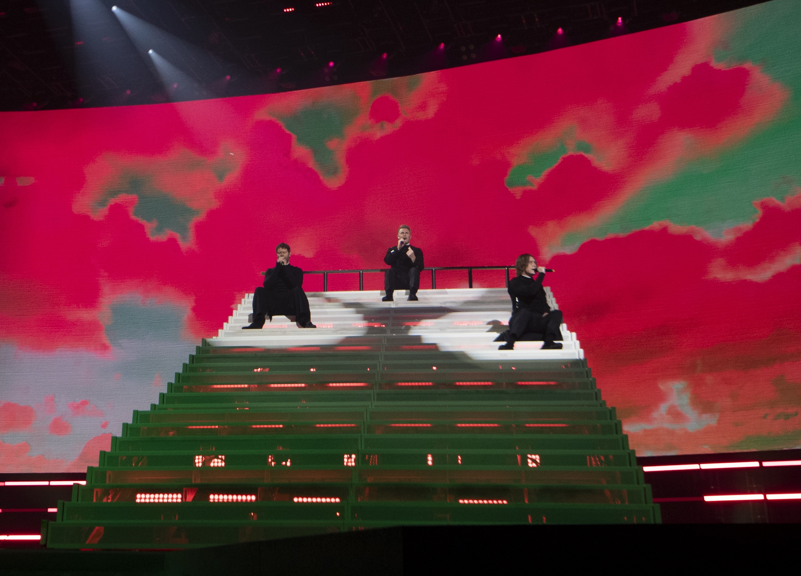
The twin staircases – each 9.5m long x 4m wide x 3.5m high – move around during the performance, coming to rest at times side by side, angled apart, and back to back, forming both a physical space for the performance and an ever-transforming backdrop and topography thanks to built-in screens with a combined 2 million pixels.
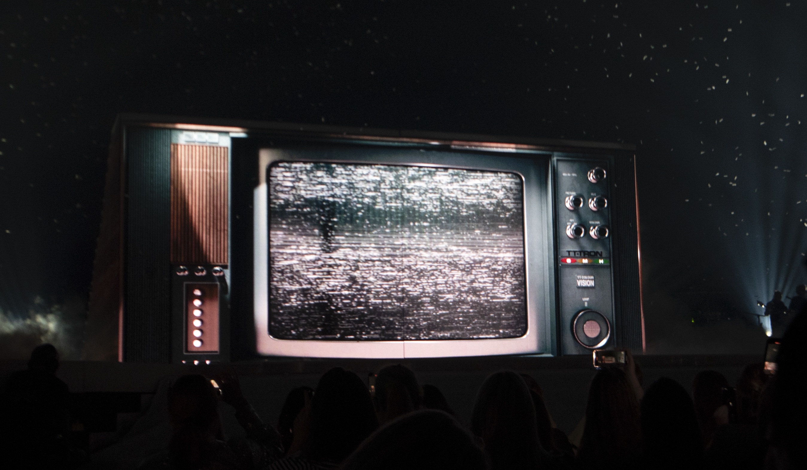
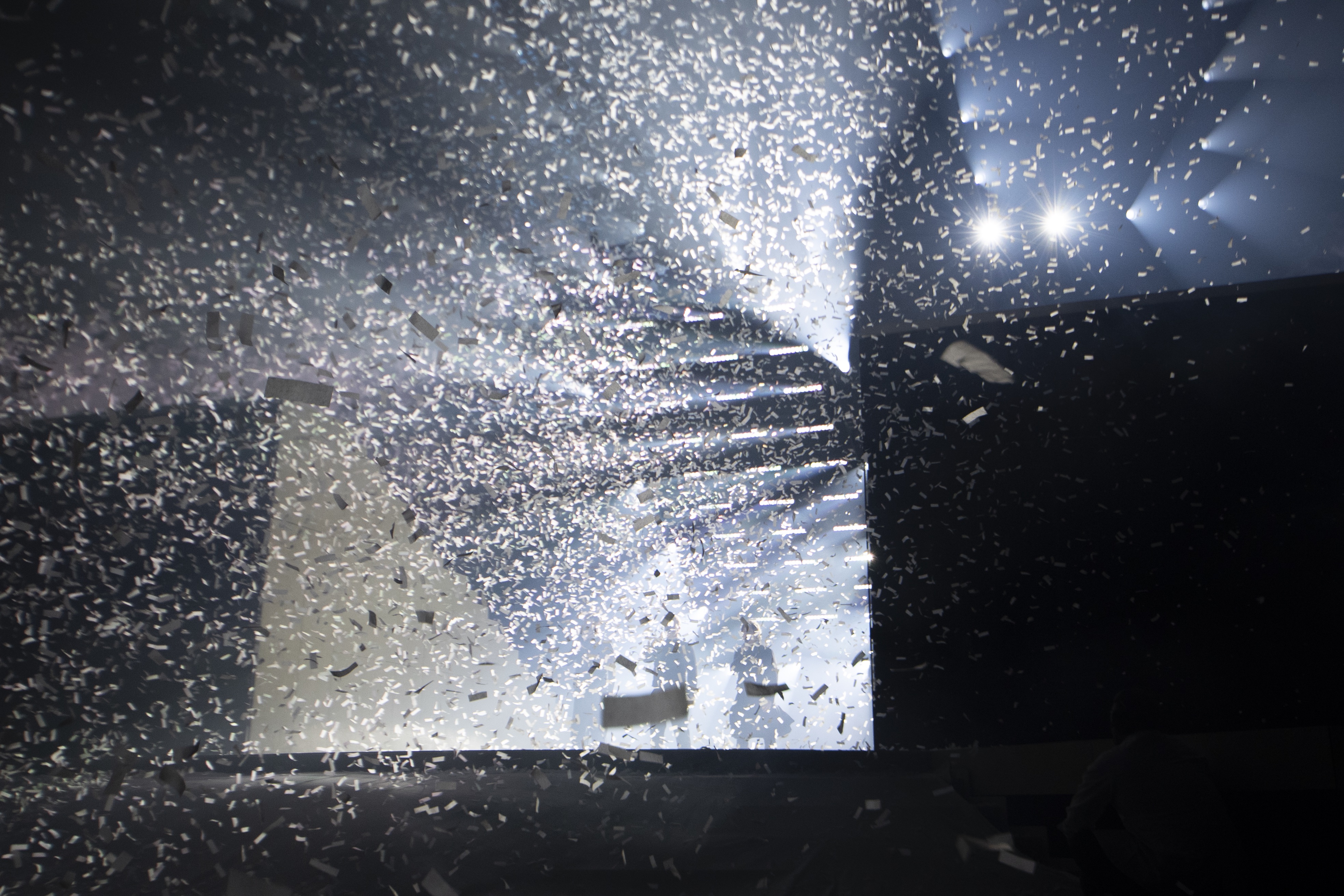
The show opens with the staircases side by side, as one, backs to the audience, ‘like a cliff face’, as Lipson puts it, taking the form of a giant retro television set, which gradually splits apart, accompanied by a frenzy of flying confetti, to reveal both the stairs and the band, as they launch into ‘Keep Your Head Up’.
Receive our daily digest of inspiration, escapism and design stories from around the world direct to your inbox.
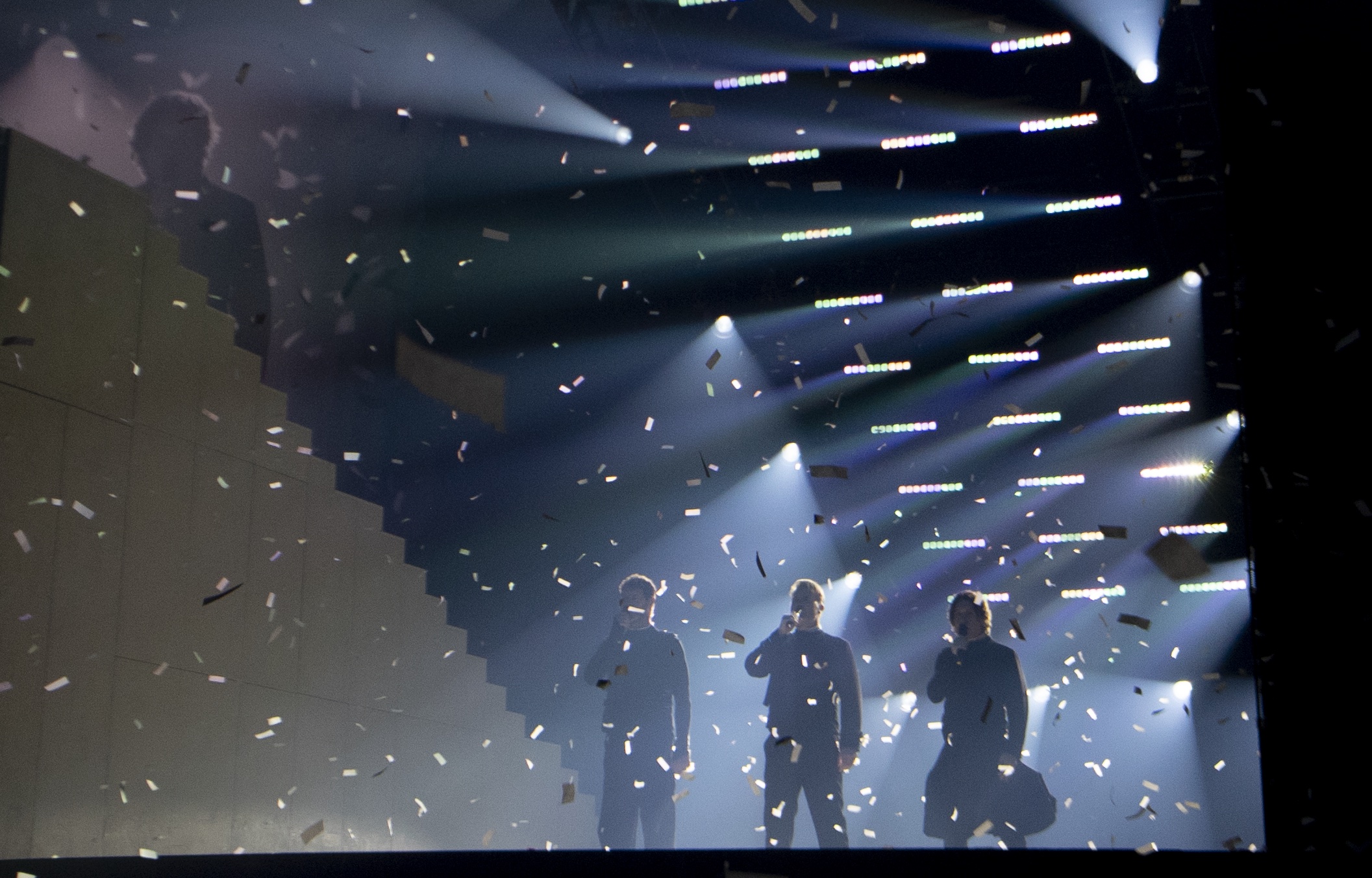
‘Each one is on a revolving mechanism,’ says the architect of the staircases. ‘There’s a very heavy-duty system that sits on the arena floor, and there's a column that goes up through the stage. It essentially holds these things floating in space, because the weight on the stage would cause a problem. Not only do the stairs rotate independently, they also track along a guide track. So they track, and they open and they can spin. [They can be] symmetrical, asymmetrical. And that’s all programmed through computer automation software.’
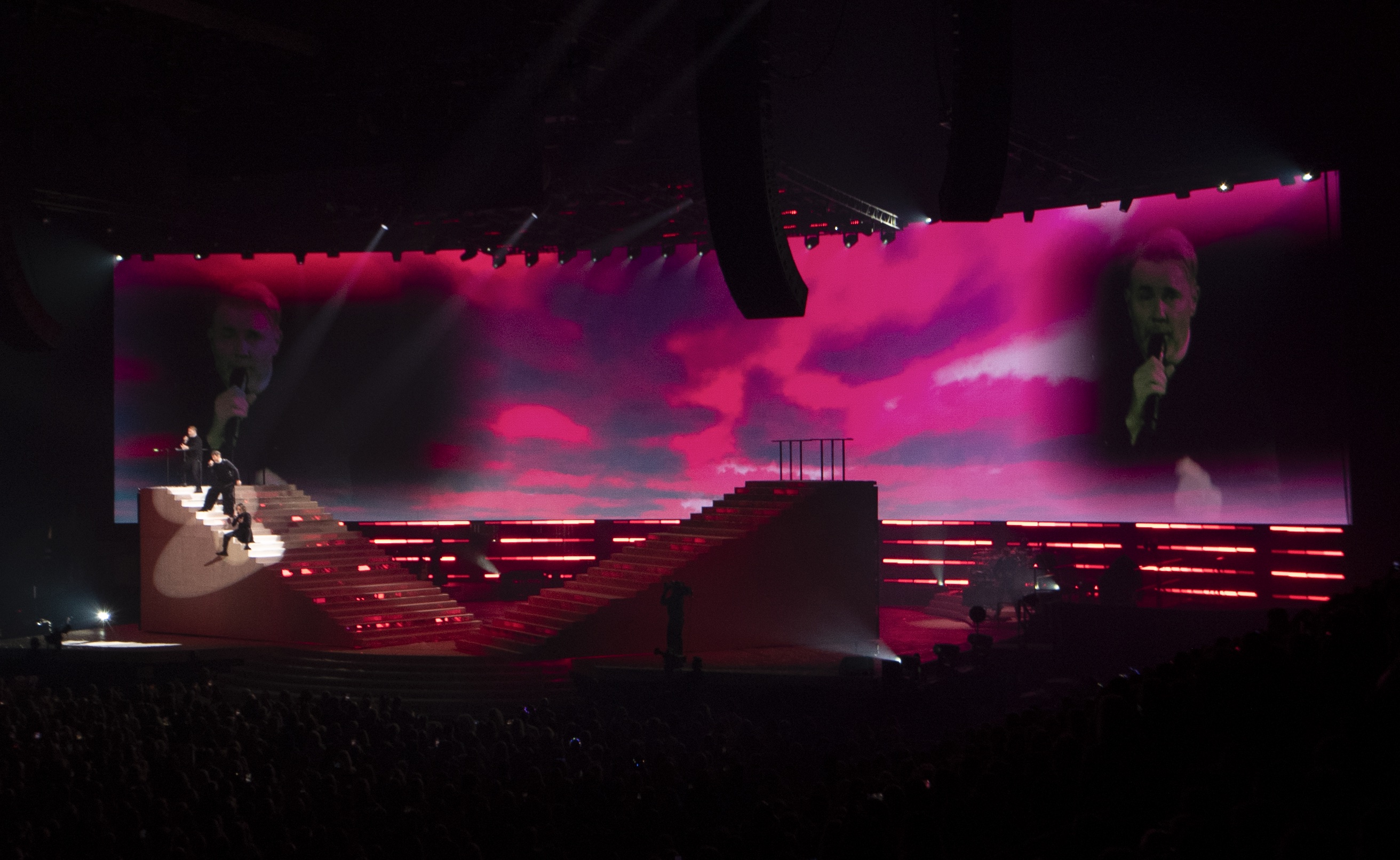
The stairs prove an apt device to narrate the story of the new album. Through the early part of the show, Lipson continues, ‘Take That do a lot of songs from the new album, which is all about being giants, being up and down, hating themselves some days, and so we go from the stairs being a mountain to being a valley to being a lawn, and this constant movement allows that to happen.’
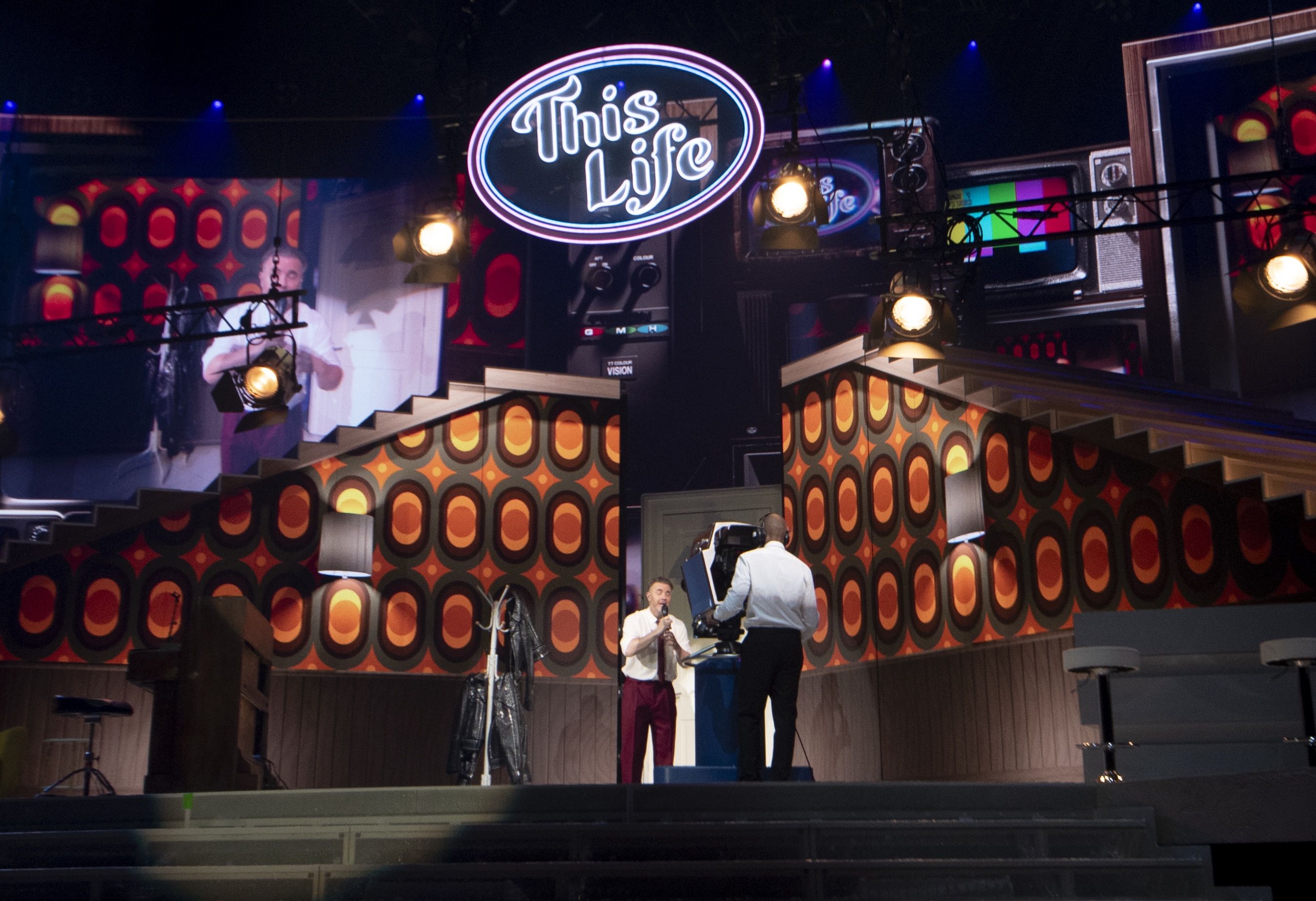
Later the stairs, angled apart, create the set of a living room, a recording studio, and a TV studio, as the show follows its tale from Take That’s beginnings in 1980s Manchester as a quintet (with Robbie Williams and Jason Orange) to 1990s global success, break-up, and 2006 reformation as a three-piece.
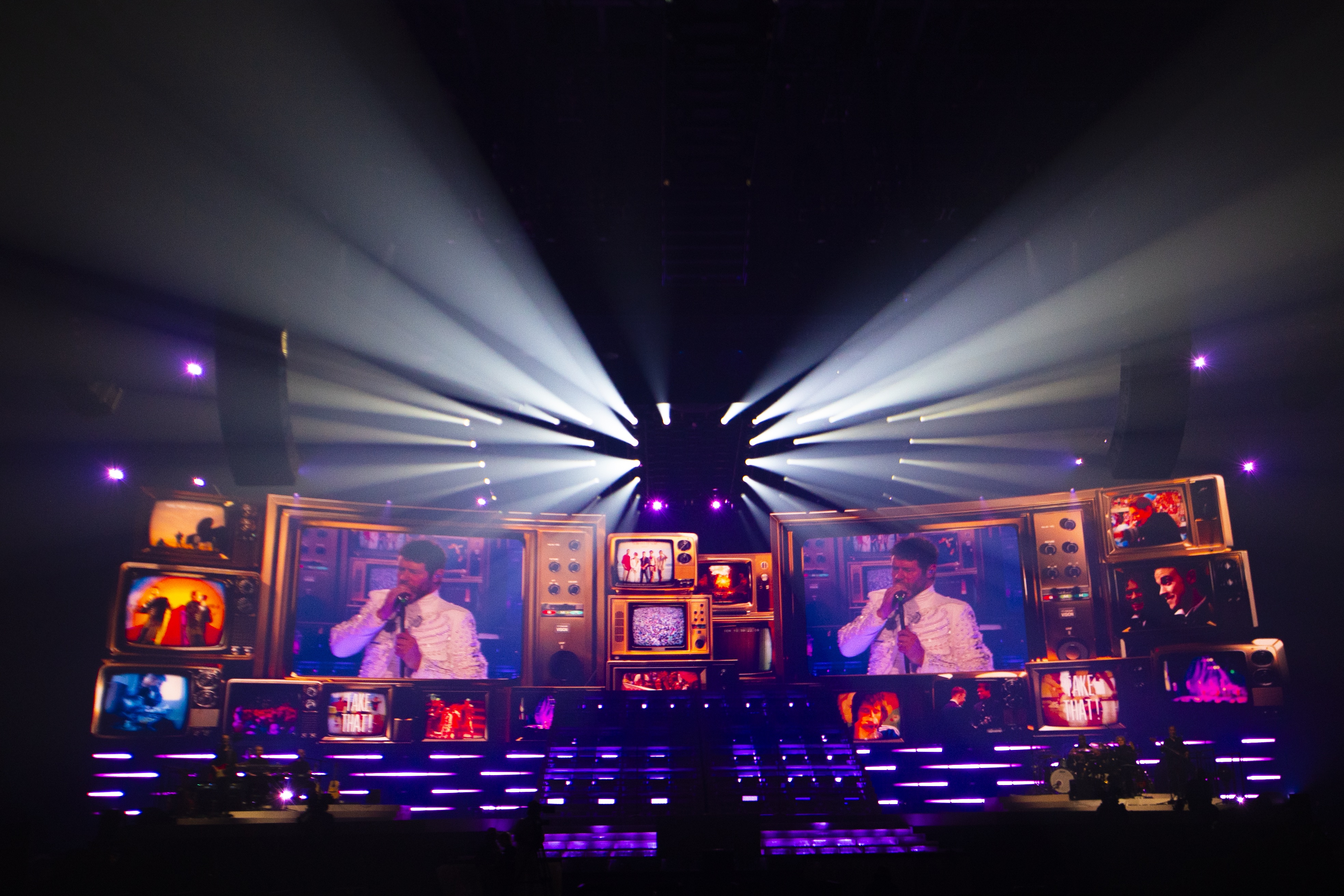
The retro TV from the show’s opening recurs as a motif throughout the show; multiple, differently sized tellies appear across the 40m-wide x 8.4m-high, 5 million-pixel panoramic screen that backs the stage, each showing a different shot of the action, adding to the idea that this is a telling of Take That’s tale.
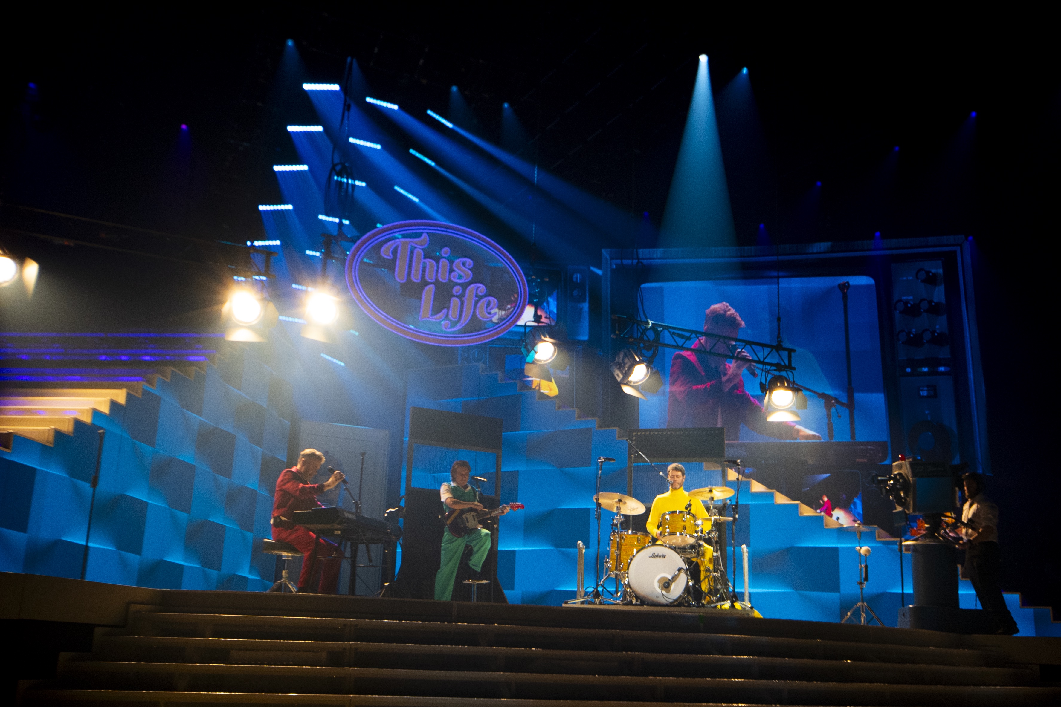
The performance and the set’s movements are choreographed to ensure Barlow, Owen and Donald are not in the wrong place at the wrong time, and ‘don’t get run over by the stairs’, notes Lipson. A safety rail pops out of the top of the stairs when needed and retracts back inside afterwards (so as not to ruin the aesthetics), as the band gamely dance up and down. ‘Down is good,’ quips Barlow, adding, ‘Whose idea were the stairs?’ as the trio sprawl in mock, or perhaps genuine, fatigue.
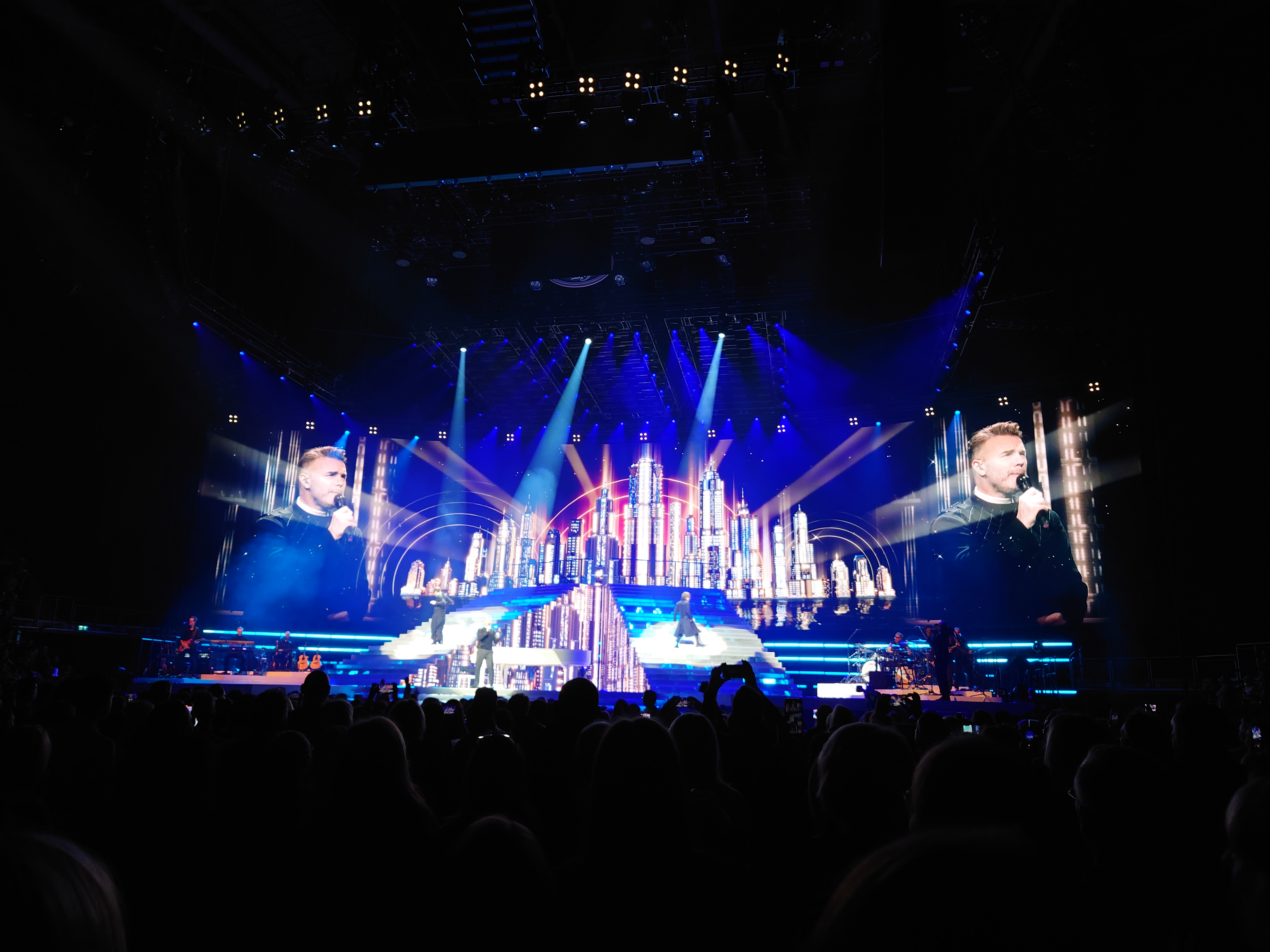
Camera-phone view from the audience at the O2, London
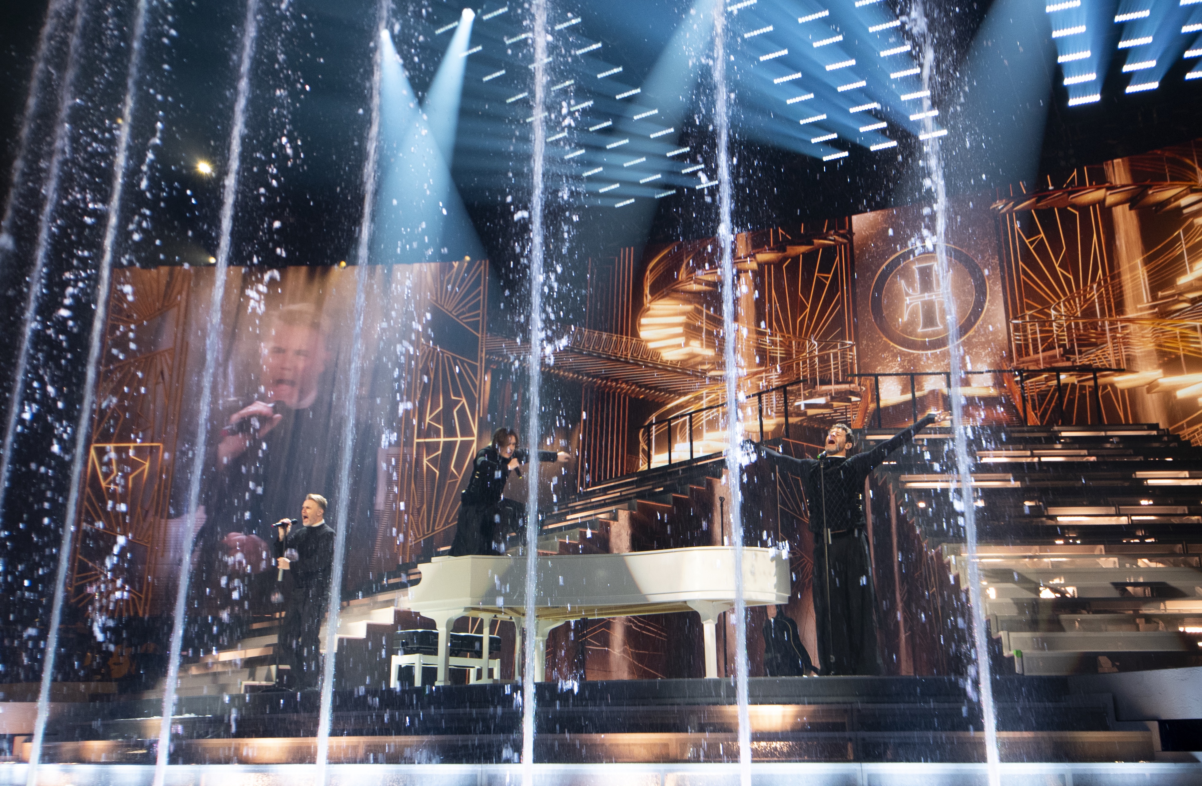
There are a lot more moving parts to the show – 50 axes of motion in total. They include automated risers that move the band’s accompanying musicians into wider or more intimate settings; moving lighting pods; and lifts that deliver the band into that giant TV set at the start, or directly to the top of the stairs at the back of the stage, and also bring a grand piano front of stage for Barlow.
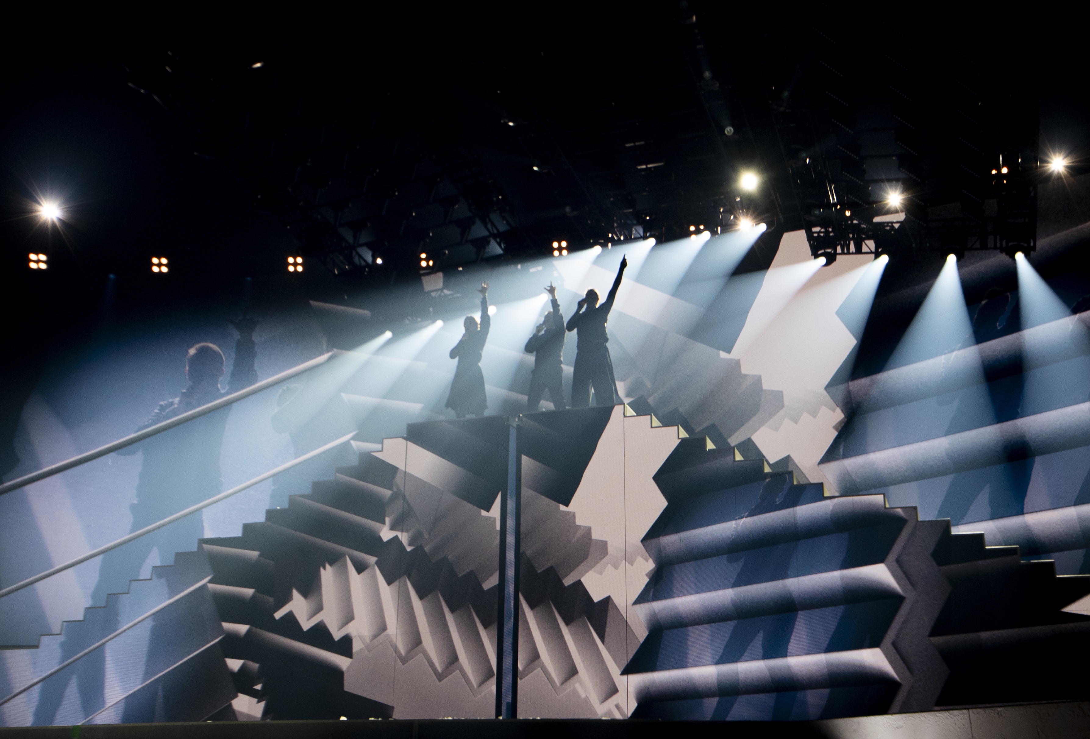
‘We started rehearsing even earlier than usual on the stage,’ says Donald of the set’s complexity, ‘just because there are so many parts to this show to get used to. It’s a lot more complicated, so we’ve needed that extra time with the stage.’
Perhaps it’s helpful that Take That chose to perform this tour without their usual cast of backing dancers, stripping back to focus the story on themselves. ‘I’m enjoying that feeling of being more open and vulnerable. It immediately means we have to think about everything differently,’ says Owen. For Lipson, it marks a point of difference in the storytelling that sees the band shift from the typical pop show to ‘something that's very grown up and quite touching, at times, and very funny’.
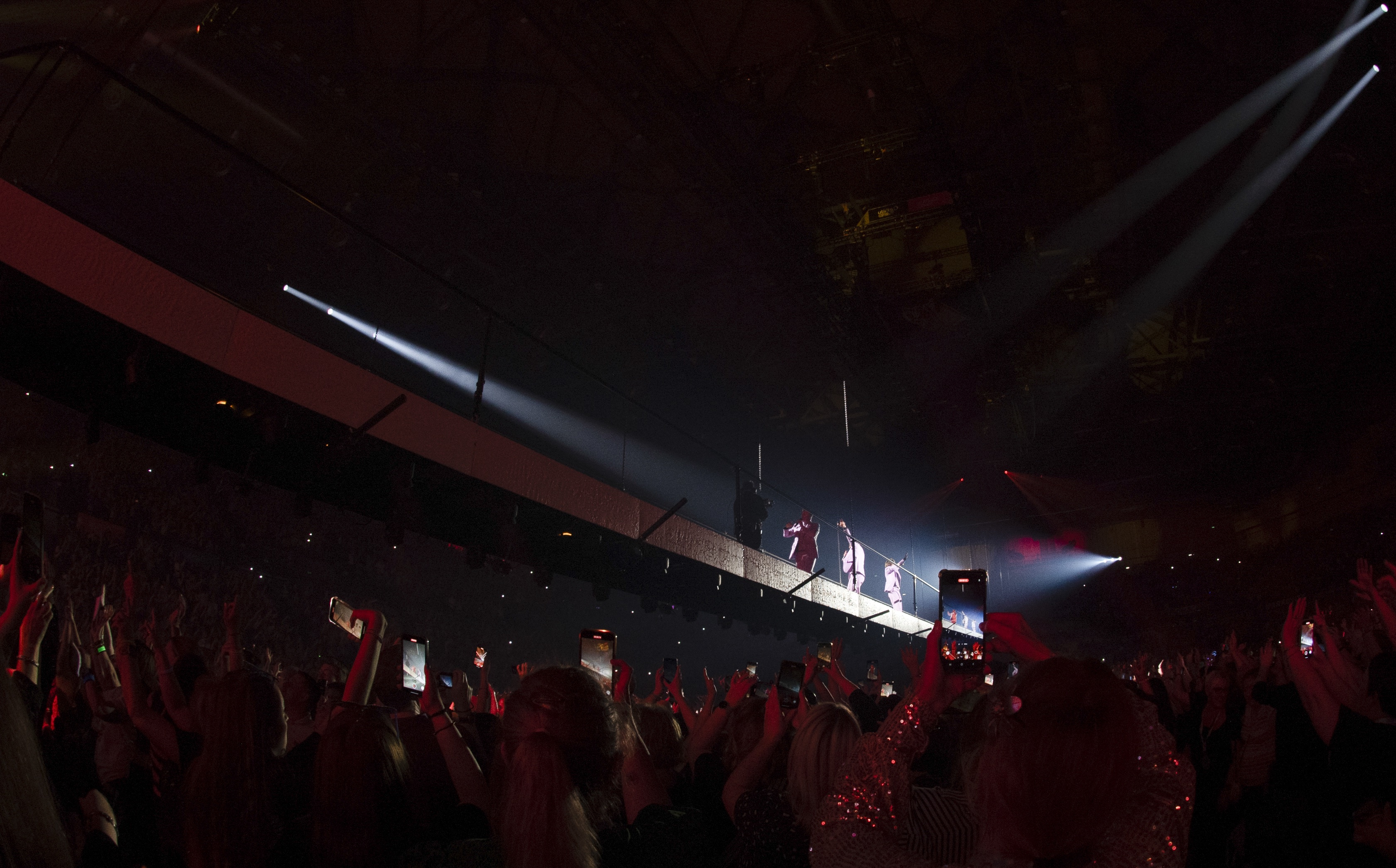
Around two-thirds of the way through the show, a 20m bridge descends from the ceiling, directly above the audience – ‘It isn't necessarily an unusual technology, but it’s still amazing to see a 20m-long bridge drop down from the sky,’ says Lipson. It comes to rest, allowing the band to cross from the main stage to a circular satellite stage amid the crowd that rises, falls, spins and tilts as they sing and dance upon it, while an aerial view is broadcast on the main stage screen. The bridge ascends, later reappearing to return the trio whence they came.
‘And then there’s fire in the stairs,’ adds Lipson.
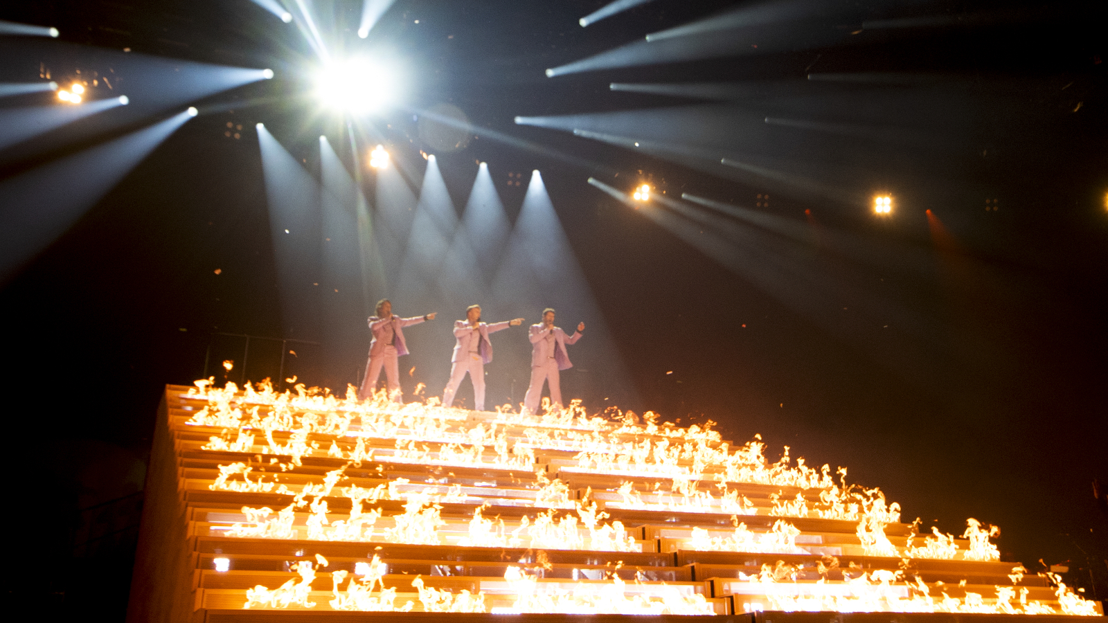
Ah yes, the fire. This spurts not just from the stage but from 72 controllable flame units within the steps of the staircases, including when the band are on them, during their cover version of ‘Relight my Fire’. The heat could be felt from 20 rows back.
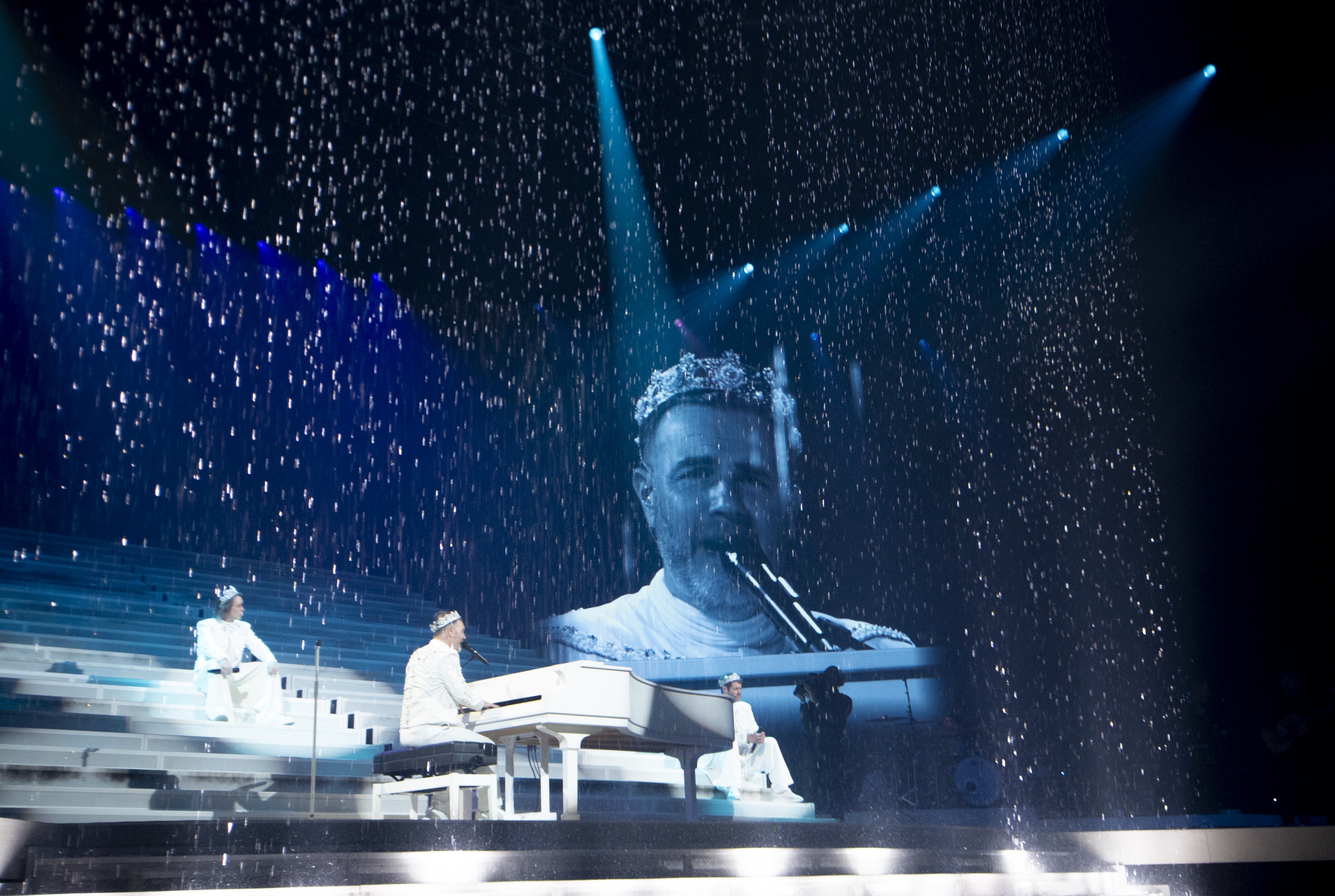
Given that the show began with, and later repeats, several minutes’ worth of paper confetti, and also includes upward-spouting fountains of water, as well as a curtain of water across the front of the stage, there’s a lot that could go wrong.
The integration of the show’s various complexities was one of its main challenges for Lipson. ‘We have fountains, and water curtains, and that all drops water exactly where all the electrics are for the lift, and exactly where the stairs are. We built a bund underneath the stage to collect the water and recycle it. And then just to make it even worse, right at the beginning of the show, we decided to drop tonnes of paper confetti all over the stage, which of course could make paper maché in the wrong environment. So there are filters and things that have to cover up other things so that you don't let in the water. And then, of course, there’s fire. Everything that could happen on top of itself is happening on top of itself, and the challenge is how to code that in an order that doesn't end up in a complete mess.’
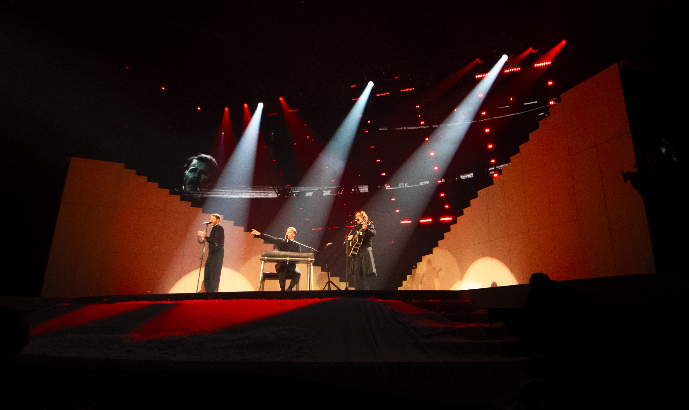
Asked if, with the ever-growing technological arsenal, artists approach Stufish for bigger, better and ever more spectacular effects, Lipson responds that ‘it depends on the artist’ and even then, ‘it might seem like an arms race – “we want the biggest dot dot dot” – but it never really is that and even if that's what they want, it's never really our MO. As designers, we're there to say, OK, if we're going to invent this new technology, or whatever it is, what is the story we're trying to tell? And how does it affect the audience?’
He emphasises that Stufish is interested in creating a connection between the performer and the audience in a physical space, and that in an era when ‘people are becoming visually saturated by video’ and can ‘make any image within five minutes with AI’, it’s the physical that can best help a performer push boundaries. ‘The ability to make something physical, that emotes something as part of live experience to the audience, is what artists are trying for.
As designers, we're there to say, OK, if we're going to invent this new technology, or whatever it is, what is the story we're trying to tell? And how does it affect the audience?
Architect and Stufish partner Ric Lipson
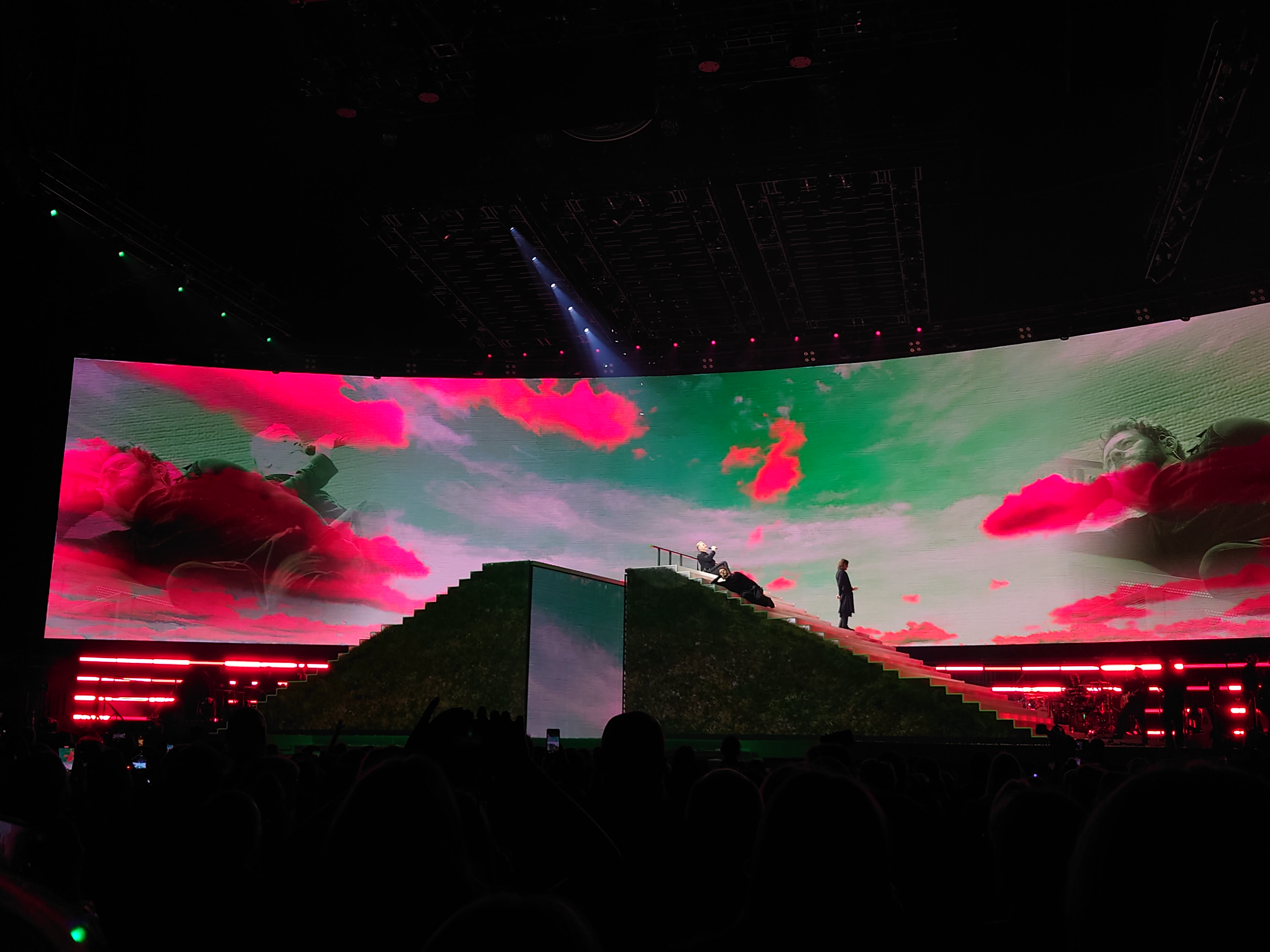
Camera-phone view from the audience at the O2, London
‘As architects, we understand space, we understand physical, we understand narrative, how you navigate people through a space, and a stage design,’ he says. ‘What's great about a band like Take That is that they are interested in that physical embodiment of a show that gives them something they can choreograph [around], be within […] a feeling that they're part of this live architecture.’
Gary Barlow: ‘how we make our audience go “wow”’
Barlow’s reflection on the inspiration process for this show underlines the band’s desire to reach and affect their audience. ‘Honestly, some of the conversations we have had are ridiculous. Like, “Shall we have a line of fire across the stage?” “‘Ooh yeah.” “What about huge fountains of water?” “Definitely.” The reality is that the three of us are sitting here dreaming about how we make our audience go “wow”, put their hands in the air and feel like they’re in another world.’
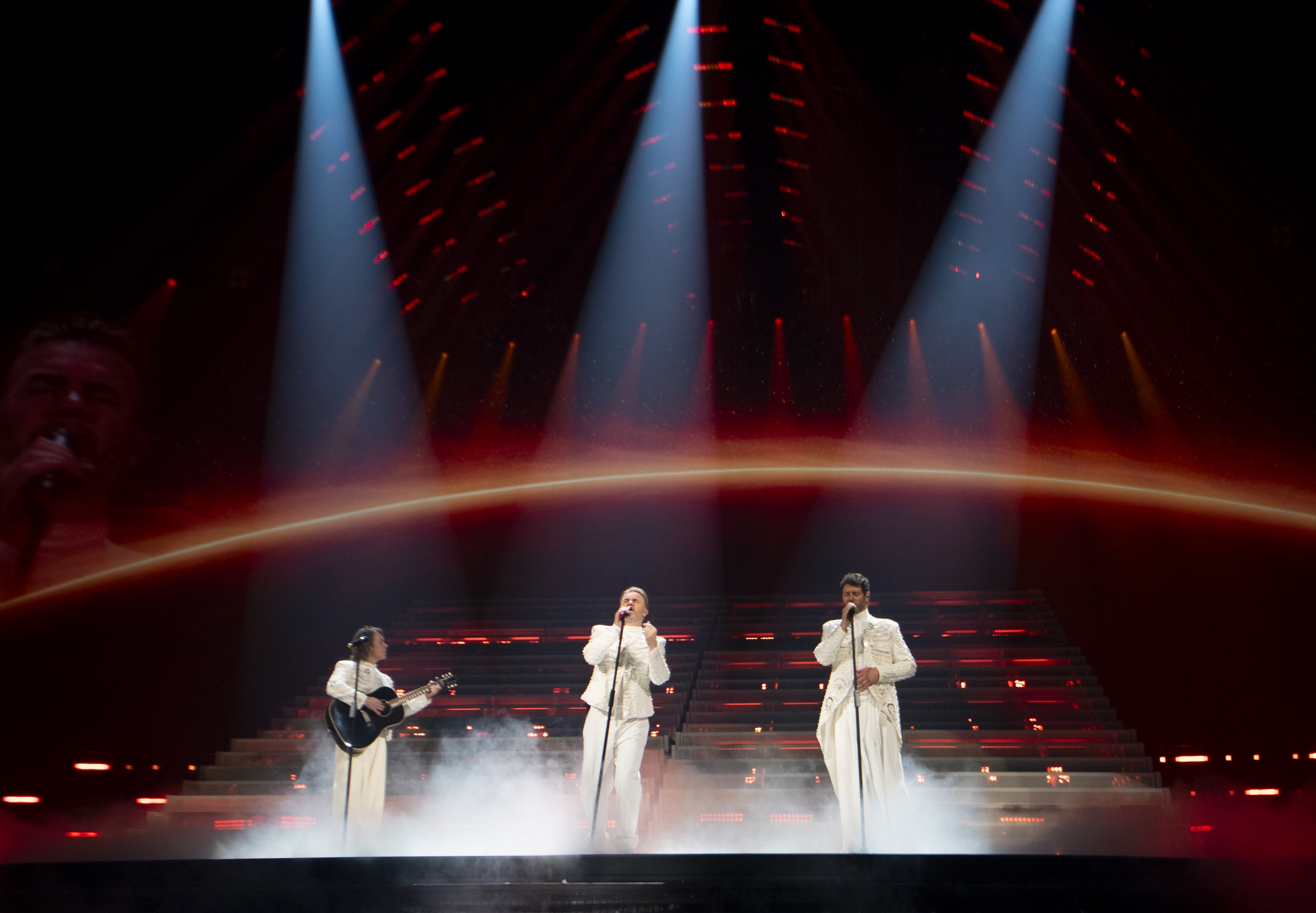
On Sunday night, as 16,000 people in the O2 waved their phone lights and sang along to ‘Rule the World’ at the show’s end, it felt like job done, Stufish and Take That.
For This Life on Tour dates and information, go to takethat.com/this-life-on-tour
On the Wallpaper* staff since 2004, Bridget Downing worked first as production editor and then chief sub editor on the print magazine. Executive editor since 2017, she turned to digital content-editing in 2021 and works with fellow editors to ensure smooth production on Wallpaper.com. With a BA in French with African and Asian Studies, she began her career in the editorial research library at Reader’s Digest’s UK edition, and has also worked at women’s titles. She is the author of the (2007) first editions of the Las Vegas and Cape Town Wallpaper* City Guides.