The 2015 Serpentine Gallery Pavilion, and its 14 predecessors
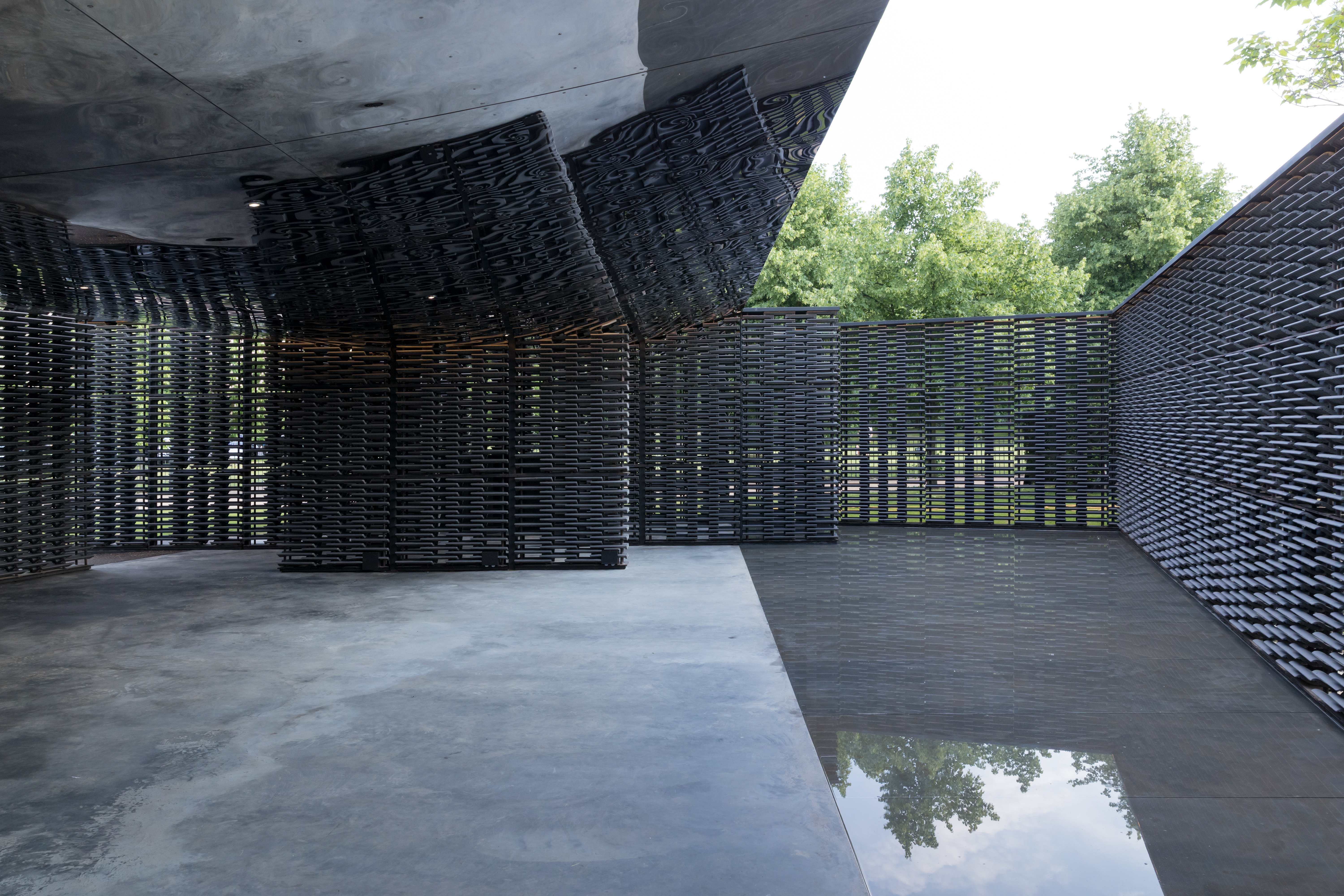
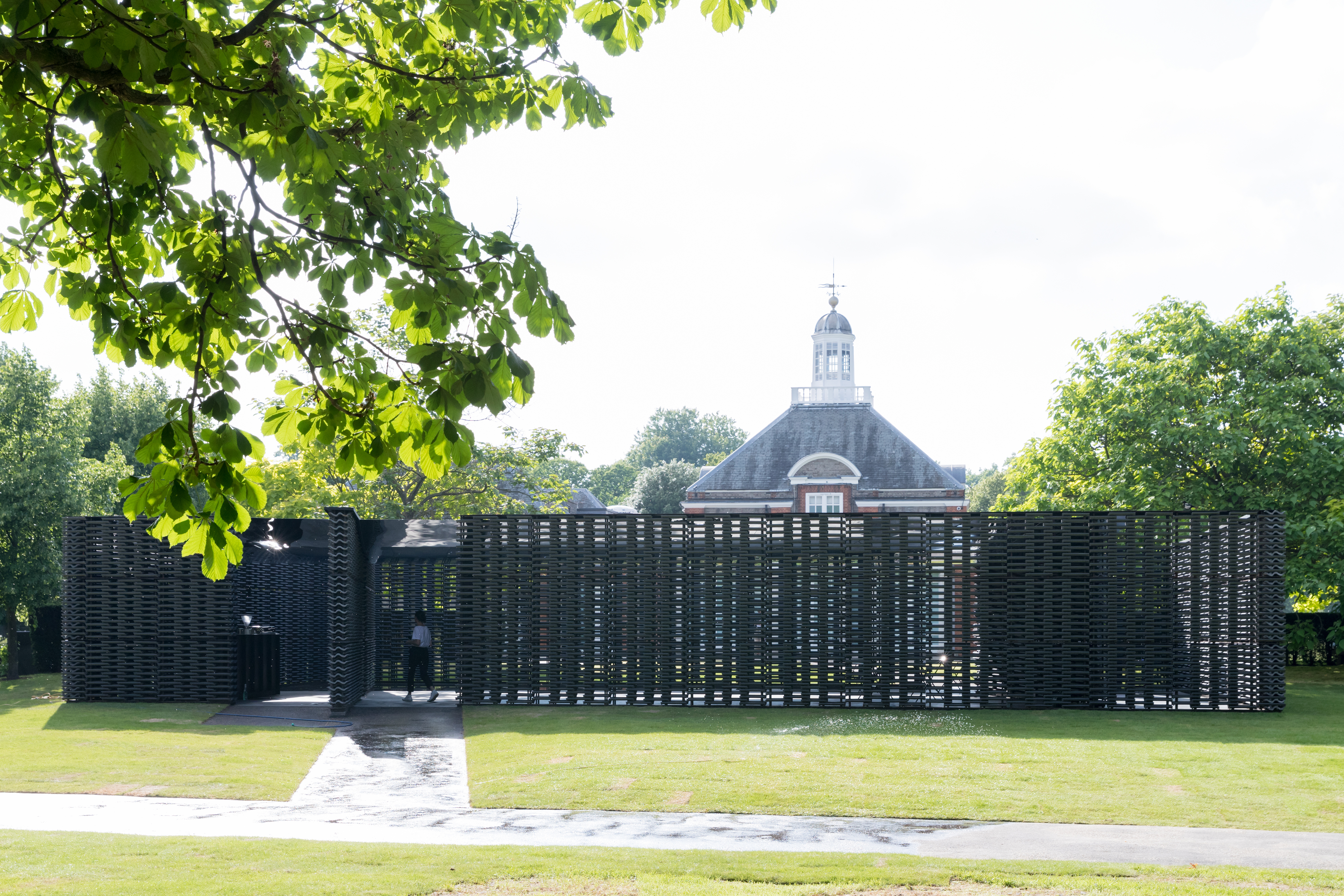
The pavilion’s pivoted axis aligns with the Prime Meridian line that was established in Greenwich, London in 1851 and later became the global standard for marking time and geographical distance
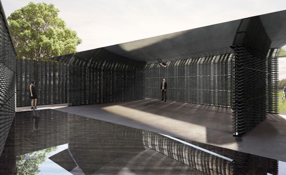
Escobedo considered the final installation site of her pavilion, focusing on time, temporality and personal experience during the design process. Inspired by La Mezquita [The Mosque] in Cordoba, the pavilion is a closed courtyard inside a park, within the city of London; a Russian doll of interiors. The pavilion’s polygonal structure creates three spaces – two smaller courtyards and a central one – constructed from porous walls and British roof tiles, creating a lattice.
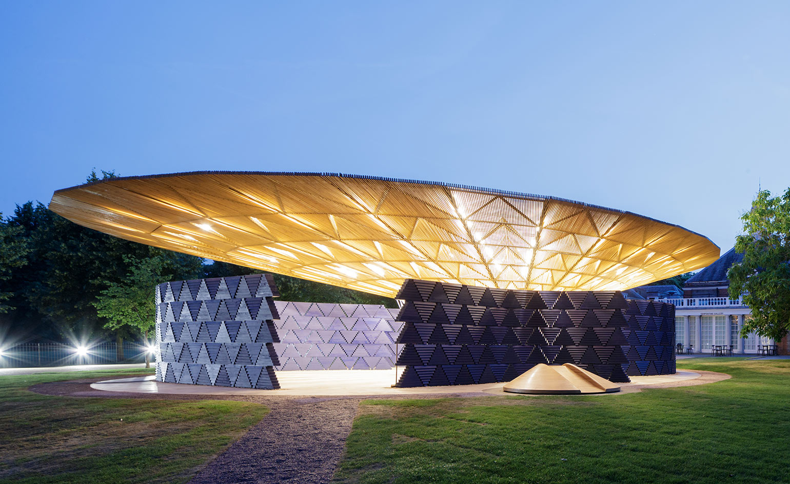
2016 – Francis Kéré: Kéré looked to village life for his design, and the notion of a paviliion as a shelter or meeting point. Supported by a light steel framed trunk, the structure has timber brise soleil eaves extending over like the canopy of a tree, creating a dappled light effect, while above, layers of clear polycarbonate panels shelter the internal space.
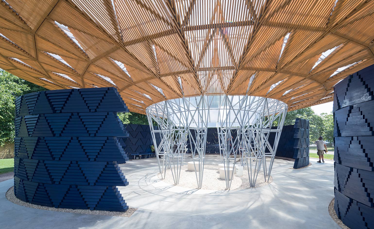
Four entrances naturally open up between the indigo walls, allowing a flow of people into the pavilion. The structure also paid respect to the British climate with rain water flowing from the polycarbonate roof, down into the central core where a waterfall will process water to be collected through drainage channels in the poured concrete.
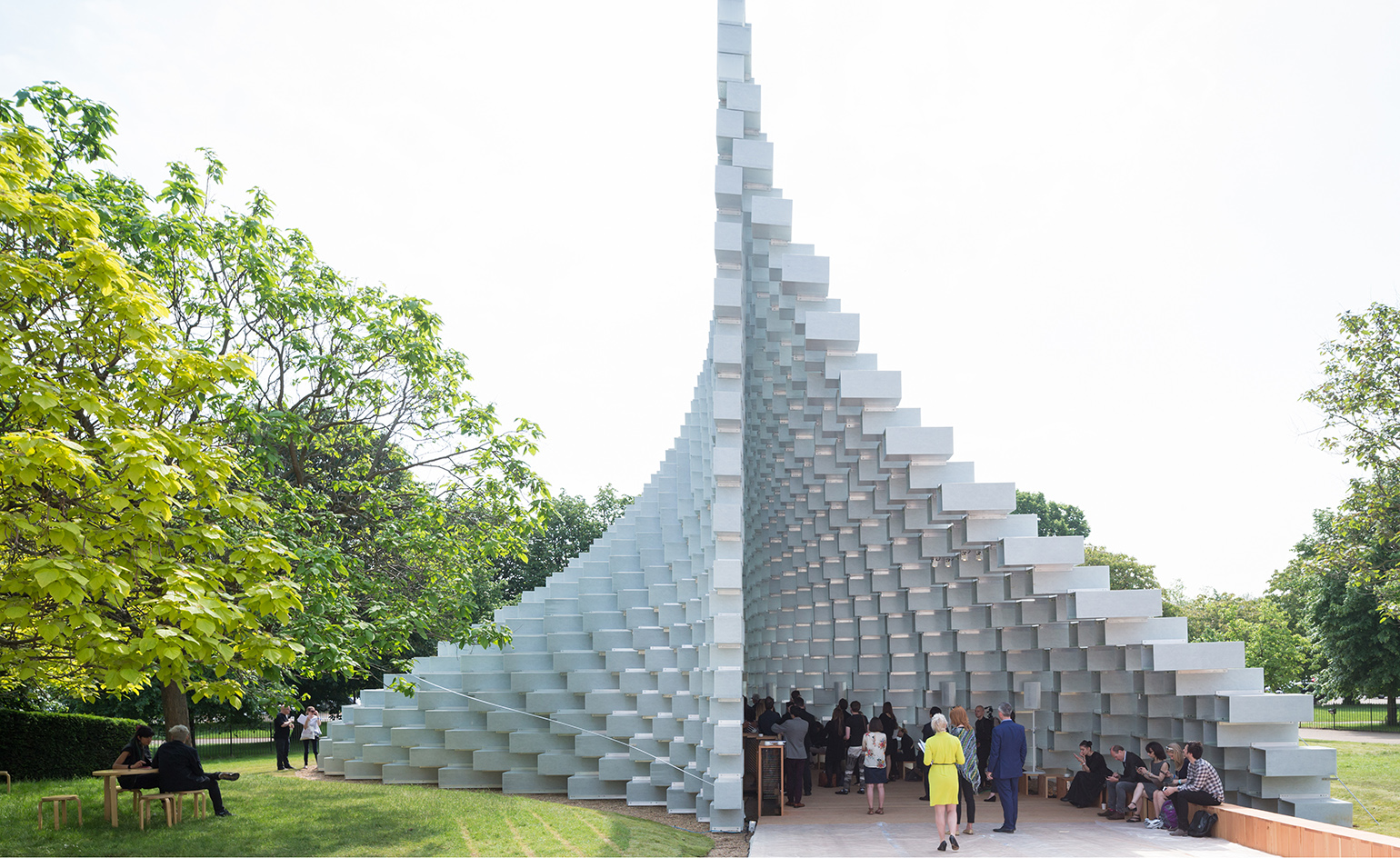
2016 – BIG: This year’s Serpentine pavillion, designed by Bjarke Ingels’ BIG, was built from extruded square tubes of glass fibre, reinforced and bolted together using hundreds of T-shaped aluminium brackets.
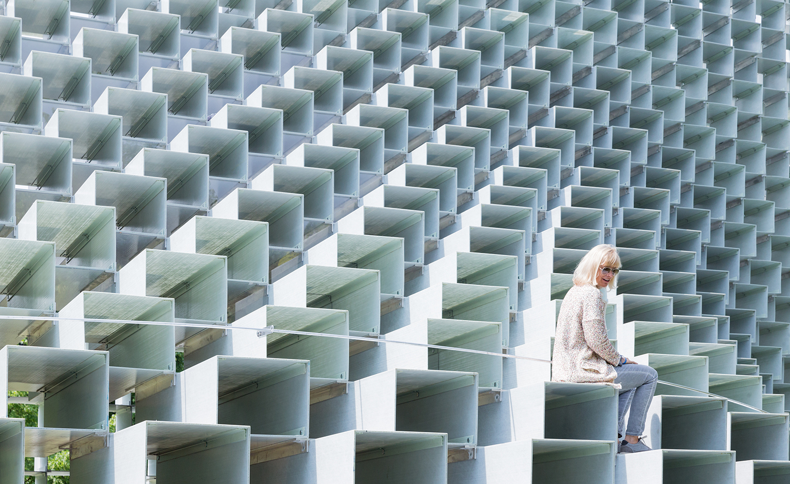
The wall of blocks is canted and sloped, rippled and twisted; playing with scale and creating a miniature realisation of the megastructural ziggurats the Danish studio is so adeptly building around the world.
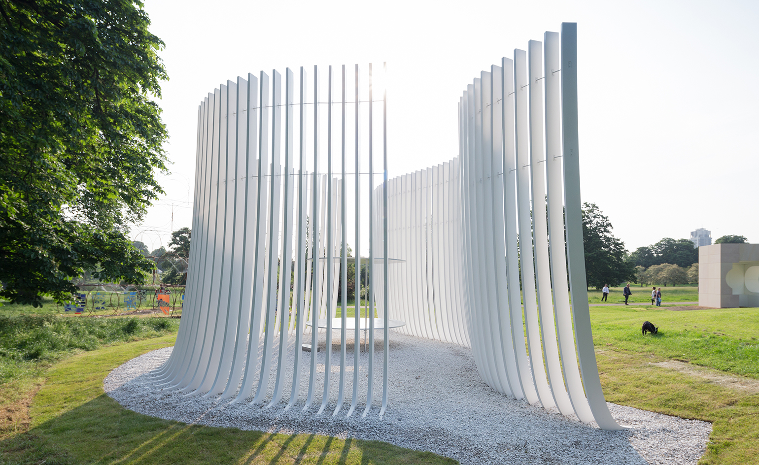
Accompanying the BIG pavilion are four 25 sq m summer houses created by Kunlé Adeyemi, Barkow Leibinger, Yona Friedman and Asif Khan. Pictured: Asif Khan's cool, calm spiky 'temple' is designed to align to the position of the sun on Queen Caroline's birthday, like William Kent's original...
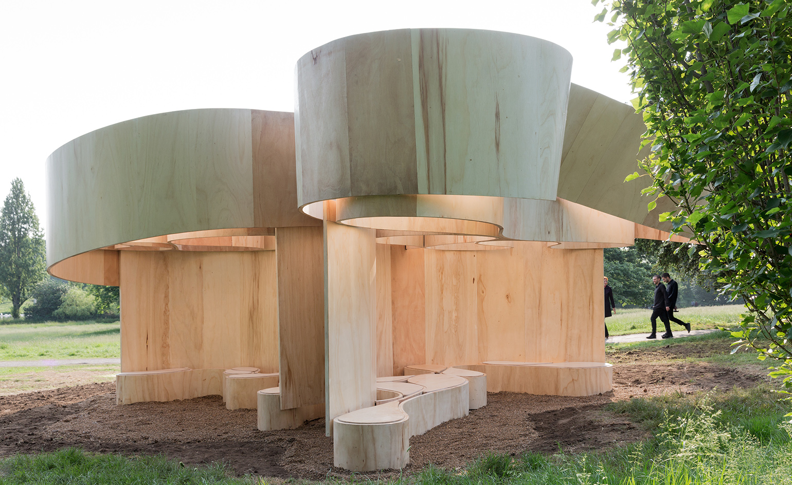
...Frank Barkow was explicit about the prototypical nature of Barkow Leibinger’s chunky curved wood extravaganza – ‘it has a resonance and will live beyond its four months here’, he says.
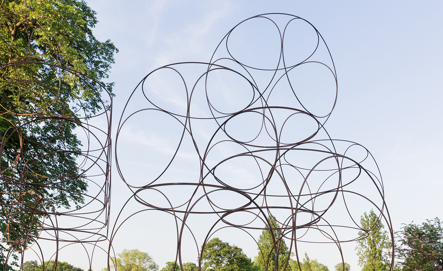
Yona Friedman’s contribution is a flexible modular structure which can be assembled and disassembled in a variety of ways...
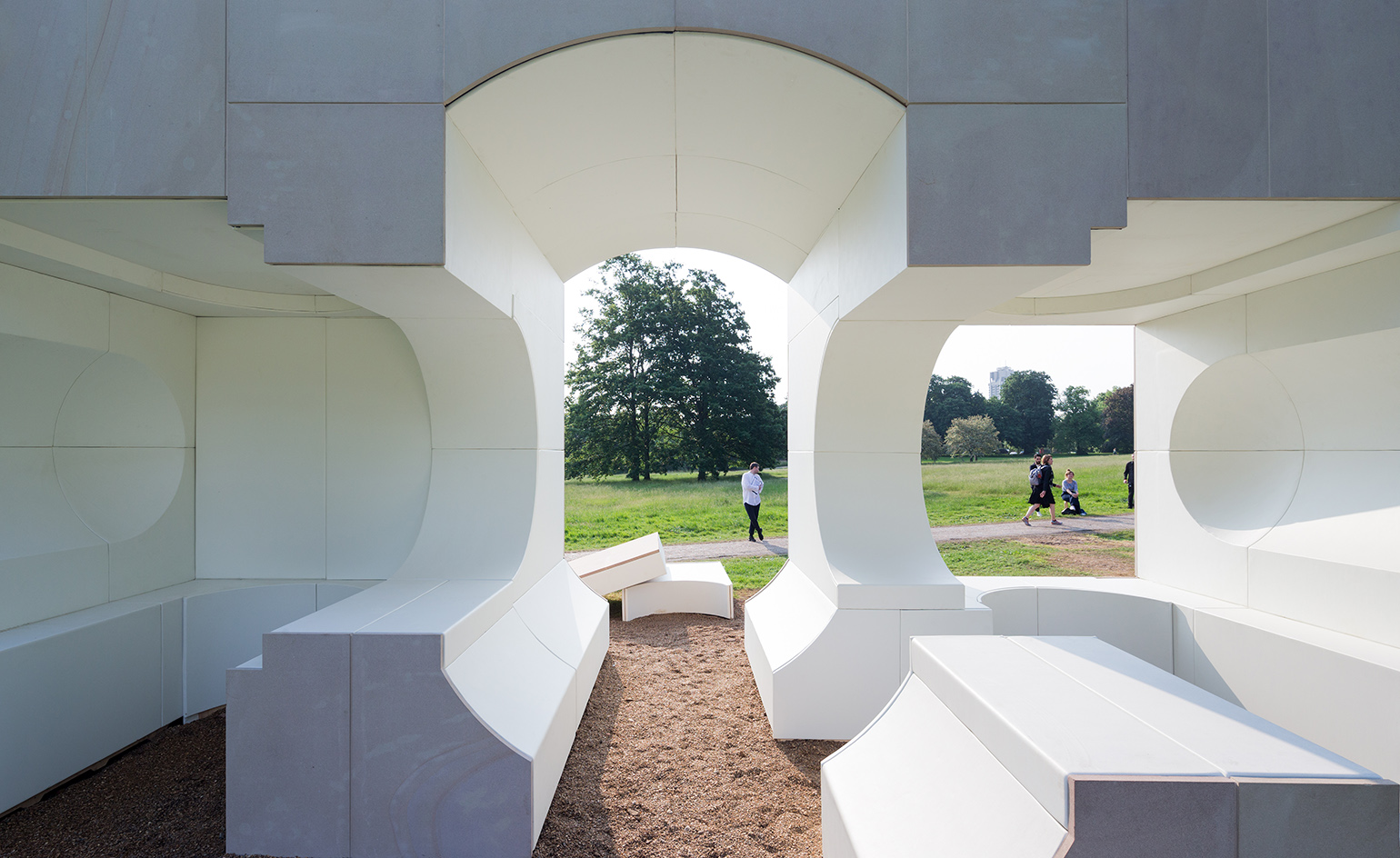
Kunlé Adeyemi’s structure is an inverse replica of Queen Caroline’s Temple, playing with its material space and form to create a new and exciting sculptural object
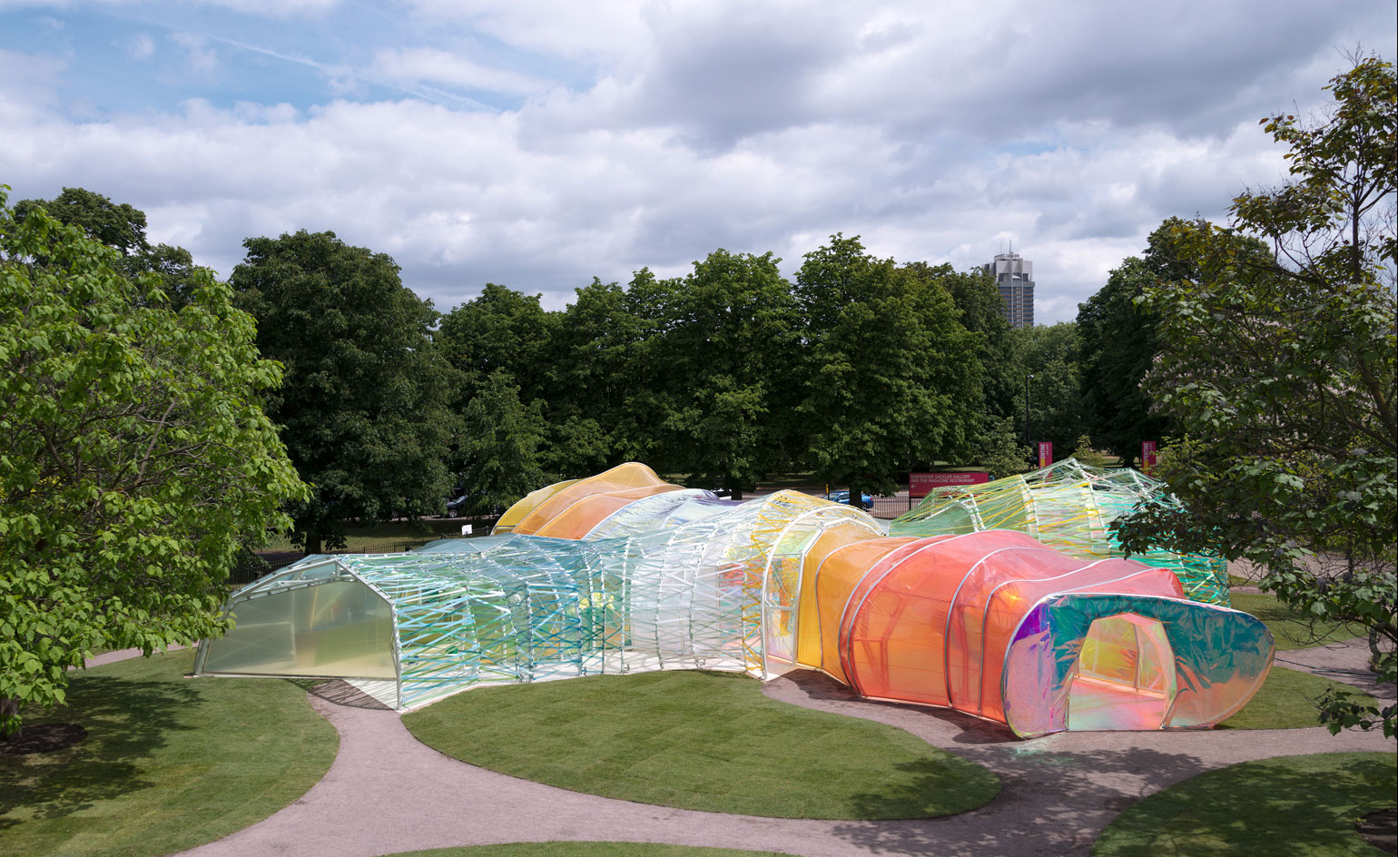
2015 – SelgasCano: Madrid-based architectural practice SelgasCano was behind the design for the 2015 pavilion, constructed from translucent layers of multicoloured membrane panels made from ETFE – a fluorine-based plastic
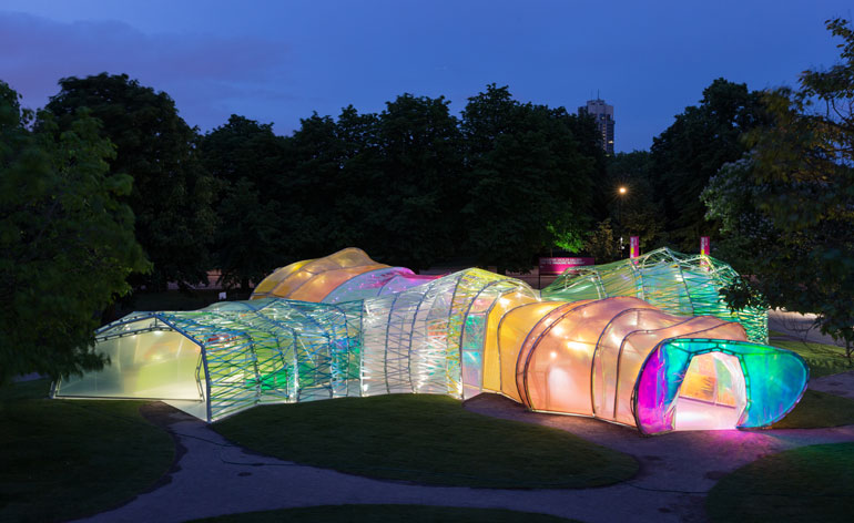
Co-directors José Selgas and Lucía Cano were seeking to provide an experience through 'simple elements: structure, light... change, surprise, colour and materials'
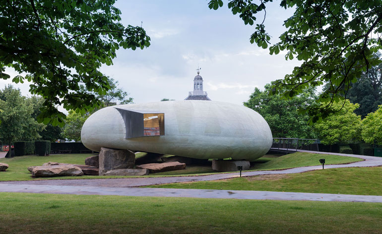
2015 – Smiljan Radić: The 2014 pavilion comprised a translucent, round shell made of glass-reinforced plastic, moulded in a ring shape that sat on boulders. It now resides at Hauser & Wirth Somerset
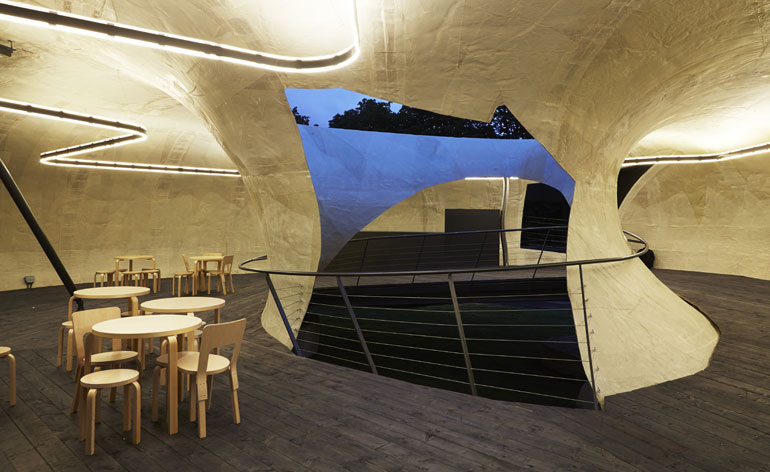
Soft light was filtered into the main, timber-floored area, thanks to the pavilion’s translucent shell, the construction of which was visible like the papier-mâché models Radić favours in the creative process
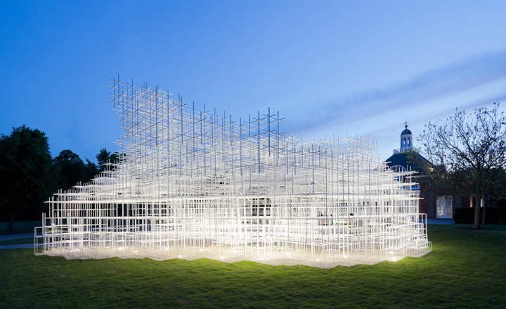
2013 – Sou Fujimoto: The pavilion for 2013 was designed by Japanese architect Sou Fujimoto
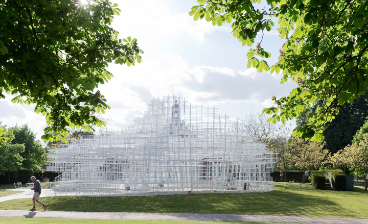
The 13th architect to design the summer pavilion for the Serpentine Gallery, Fujimoto described his aim to create a cloud-like construction that blended in with nature
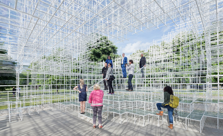
The pavilion featured an intricate composition of thin metal parts that created a white cloud-like mesh, covered in places with translucent panels to provide shelter for guests
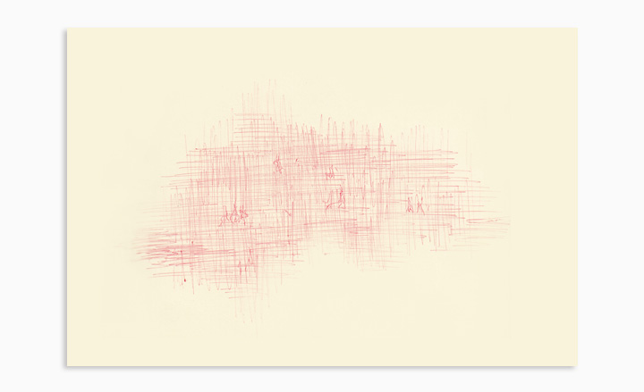
Fujimoto’s concept sketch for the 2013 pavilion.
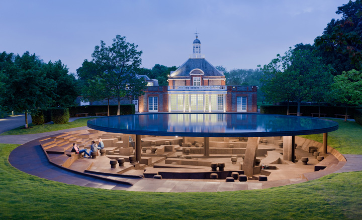
2012 – Herzog & de Meuron and Ai Weiwei: The 2012 pavilion was a collaboration, designed by Swiss architecture team Herzog & de Meuron and Chinese artist Ai Weiwei. It revealed the footprints of previous pavilions through an on-site excavation.
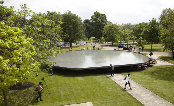
Herzog & de Meuron and Weiwei’s pavilion featured a reflective roof, which captured rainwater, and a low seating area underneath, clad in cork.
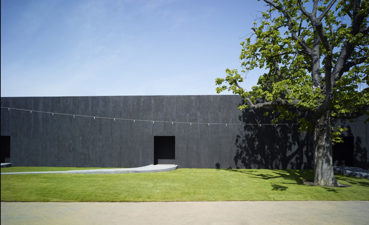
2011 – Peter Zumthor: The grey, minimalist 2011 pavilion was designed by Swiss architect Peter Zumthor; its interior revealed a tranquil planted courtyard by leading Dutch landscape gardener Piet Oudolf
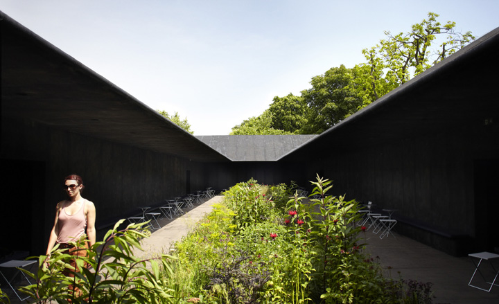
A lush garden hid at the heart of the Zumthor’s 2011 pavilion, making it an urban retreat for relaxation and contemplation.
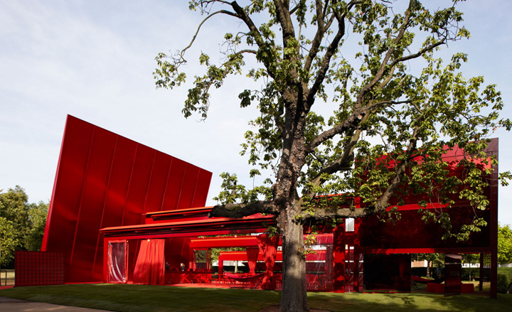
2010 – Jean Nouvel: French architect Jean Nouvel’s red pavilion, created in 2010, teamed a partly translucent façade with a cantilevered wall.
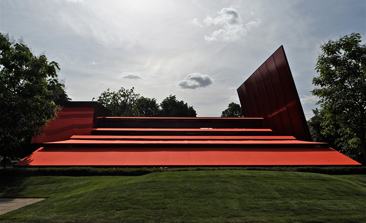
It also featured an auditorium for hosting events, such as the gallery’s annual two-day ‘marathon’ event
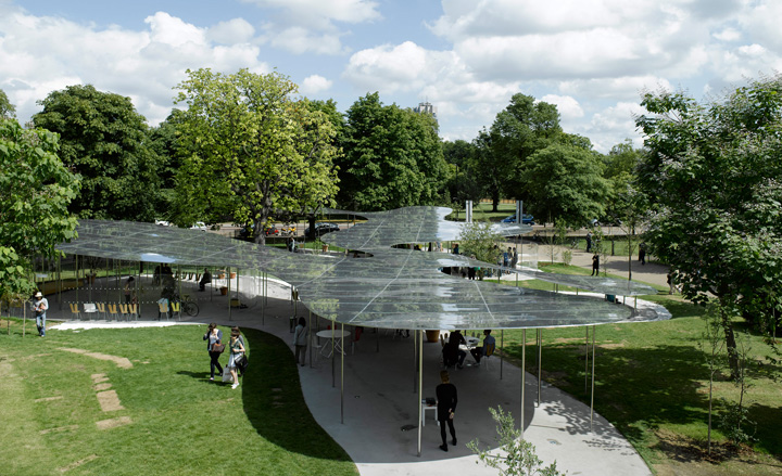
2009 – SANAA: A delicate, floating aluminium roof was the stand-out feature of the 2009 pavilion, designed by Kazuyo Sejima and Ryue Nishizawa of Japanese practice SANAA
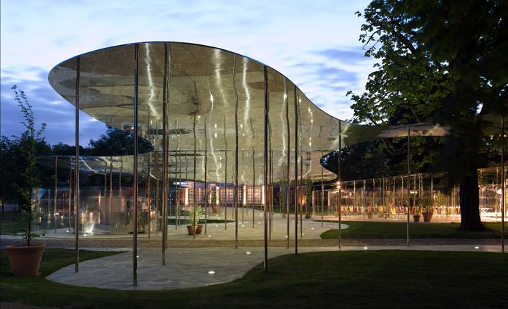
A series of slim metal columns support the reflective canopy
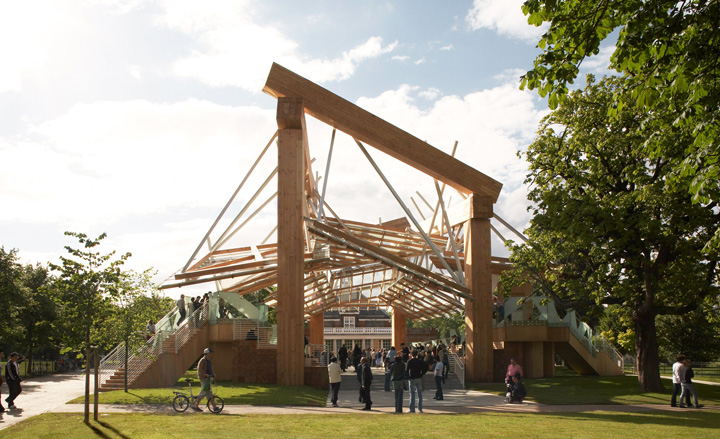
2008 – Frank Gehry: In 2008, US-based architect Frank Gehry collaborated with his son, Samuel Gehry for the first time, for the Serpentine Pavilion.
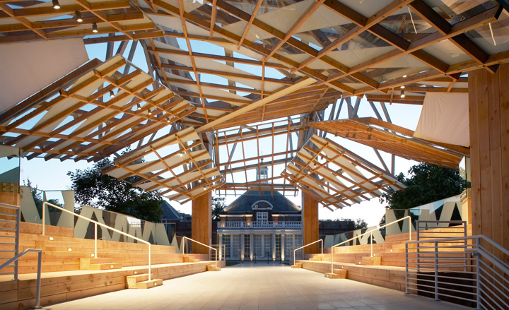
Gehry’s first-built structure in England, the 2008 pavilion was a composition of timber planks, steel columns and glass planes.
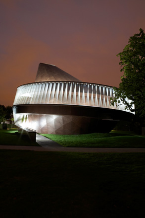
2007 – Olafur Eliasson and Kjetil Thorsen: A collaboration between artist Olafur Eliasson and Norwegian architect Kjetil Thorsen of Snohetta, the 2007 pavilion was clad in timber, while its top appeared to spin.
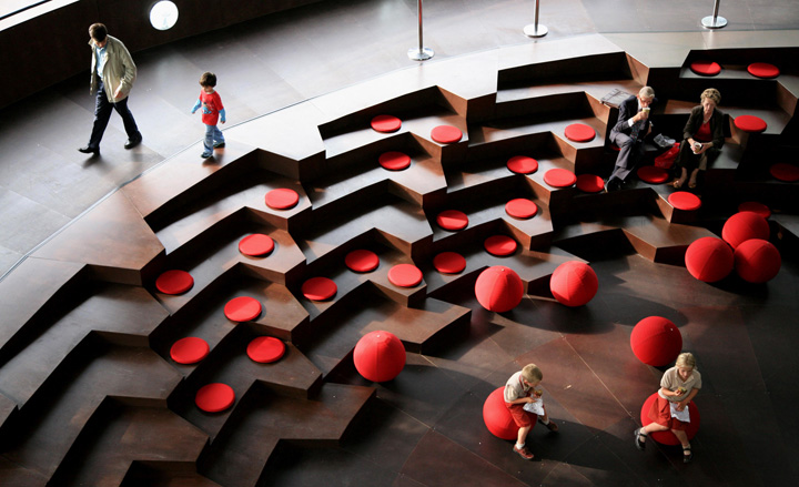
The timber-clad interior of the 2007 pavilion was ‘an exploration of vertical circulation’.
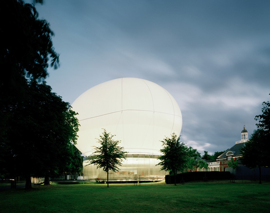
2006 – Rem Koolhaas and Cecil Balmond: Rem Koolhaas and Cecil Balmond united with Arup to create a pavilion constructed from a helium-filled roof that rose and fell with the changes in weather
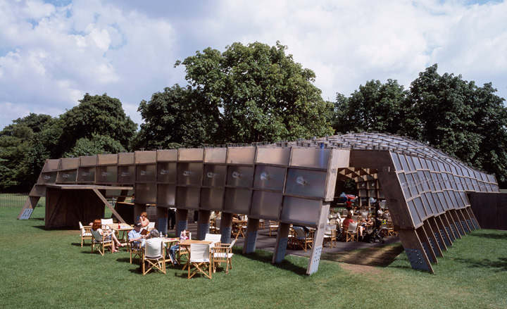
2005 – Álvaro Siza and Eduardo Souto de Moura: Portuguese architects Álvaro Siza and Eduardo Souto de Moura collaborated with British-based Cecil Balmond and Arup in 2005.
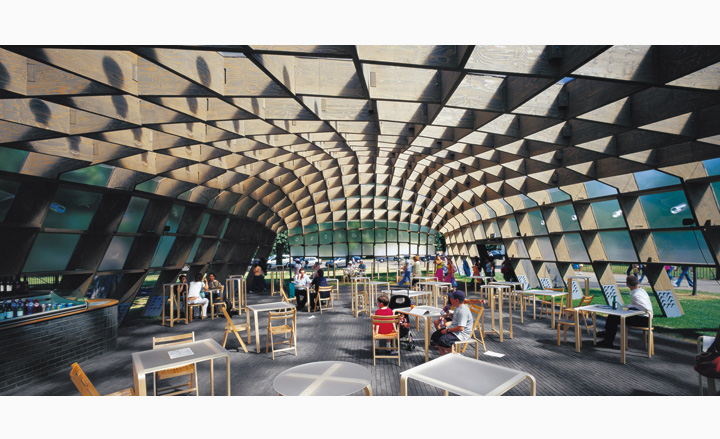
It was made from a frame of open, gently asymmetrical timber and metal and served as a café and seating area.
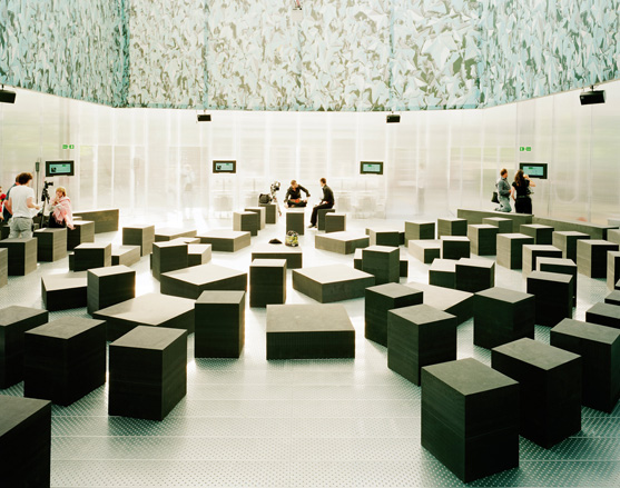
The pavilion offered ample seating inside. That same year, the Serpentine kick-started its annual ‘marathon’ lecture series inside the structure
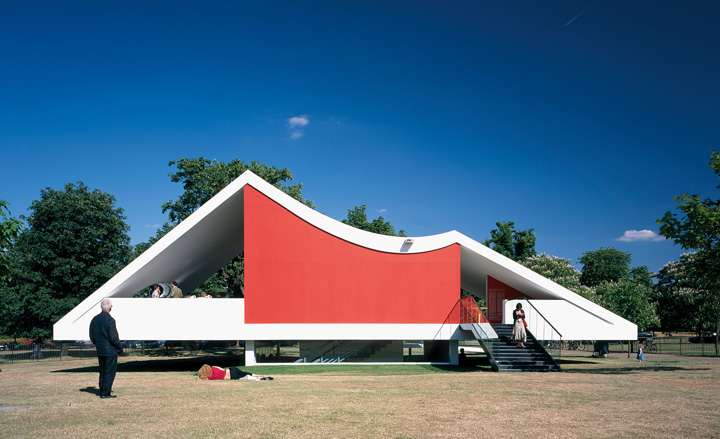
2003 – Oscar Niemeyer: Made from concrete yet appearing to float, this pavilion by Oscar Niemeyer showcased the master architect’s distinctive use of curves
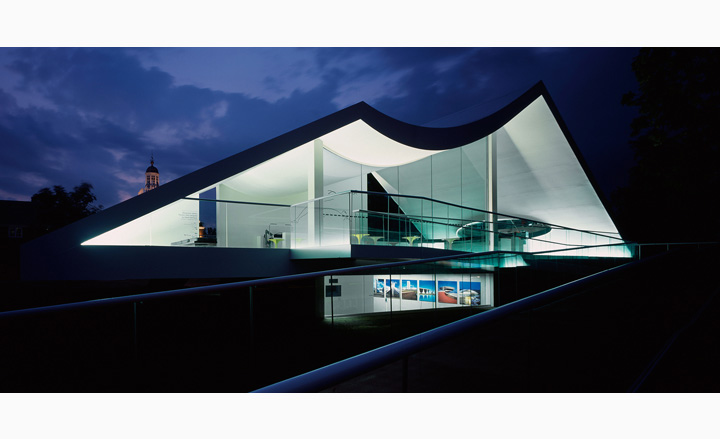
Niemeyer had never realised a building in the UK when he was invited, aged 96, to design the 2003 pavilion. Courtesy Taschen
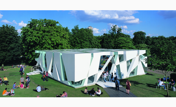
2002 – Toyo Ito and Cecil Balmond: The 2002 pavilion, by 2013 Pritzker Prize-winner Toyo Ito and Cecil Balmond (with Arup), featured a complex random pattern derived from an algorithm.
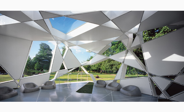
The pavilion’s unusual shapes created an ever-changing play of light and shadow inside the structure.
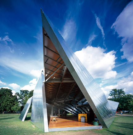
2001 – Daniel Libeskind: ‘Eighteen Turns’ was designed by architect Daniel Libeskind, with Arup and exhibited the signature metallic, reflective forms for which the architect became known.
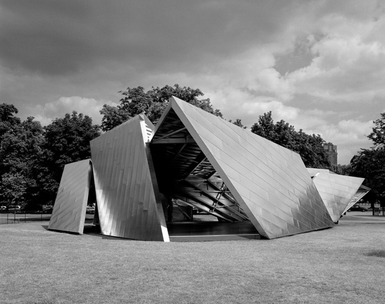
The anglular metal pavilion, clad in aluminium panels was reminiscent of a giant piece of origami
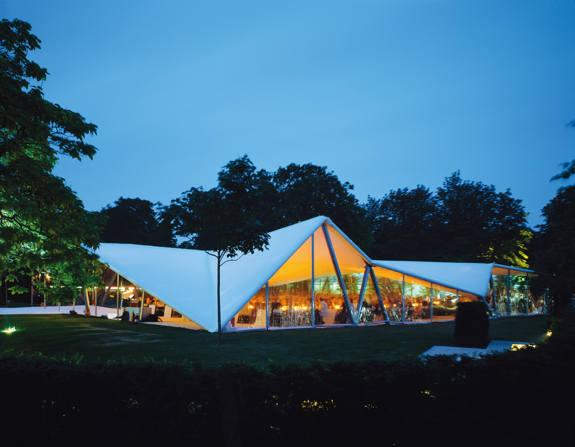
2000 – Zaha Hadid: The very first Serpentine Gallery Pavilion was created in 2000 and designed by London-based architect Zaha Hadid
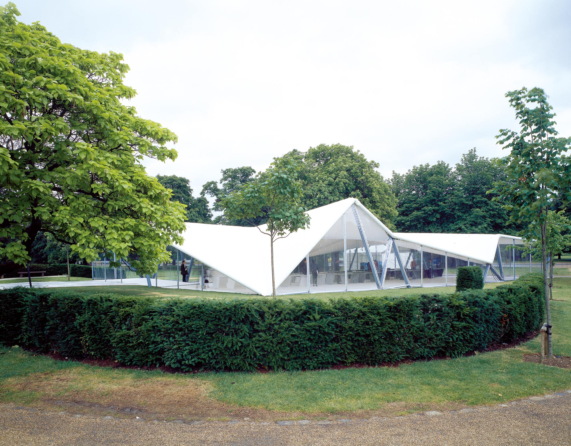
Hadid’s white geometric pavilion with is triangulated roof structure was a reinvention of the marquee and spanned 600 sqm
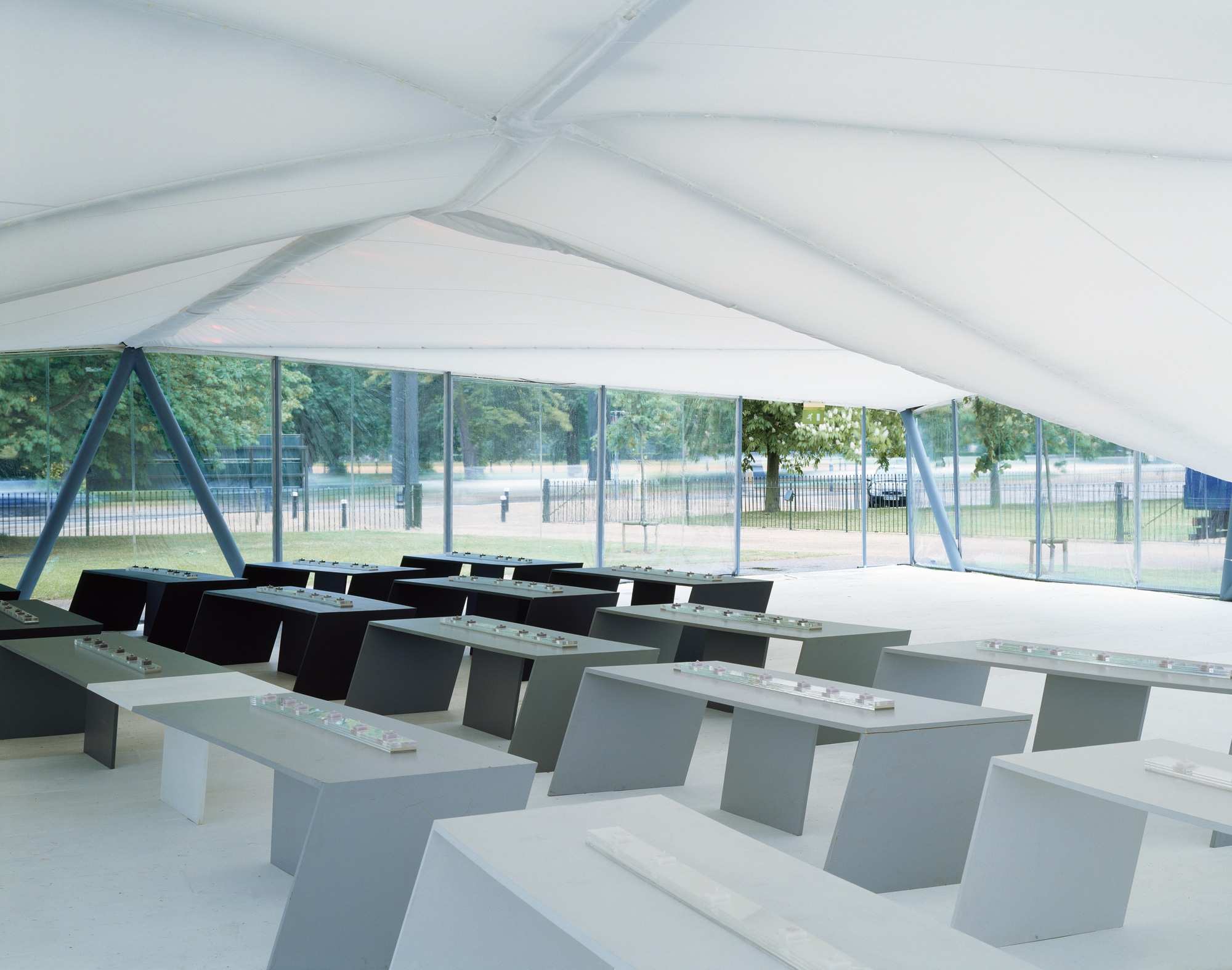
Inside the pavilion the Hadid also create pew-like characteristically angular seating
Wallpaper* Newsletter
Receive our daily digest of inspiration, escapism and design stories from around the world direct to your inbox.
-
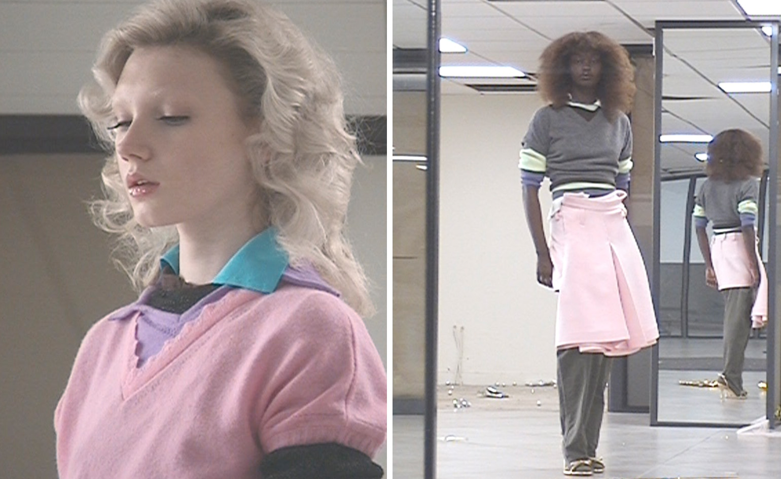 All-In is the Paris-based label making full-force fashion for main character dressing
Part of our monthly Uprising series, Wallpaper* meets Benjamin Barron and Bror August Vestbø of All-In, the LVMH Prize-nominated label which bases its collections on a riotous cast of characters – real and imagined
By Orla Brennan
-
 Maserati joins forces with Giorgetti for a turbo-charged relationship
Announcing their marriage during Milan Design Week, the brands unveiled a collection, a car and a long term commitment
By Hugo Macdonald
-
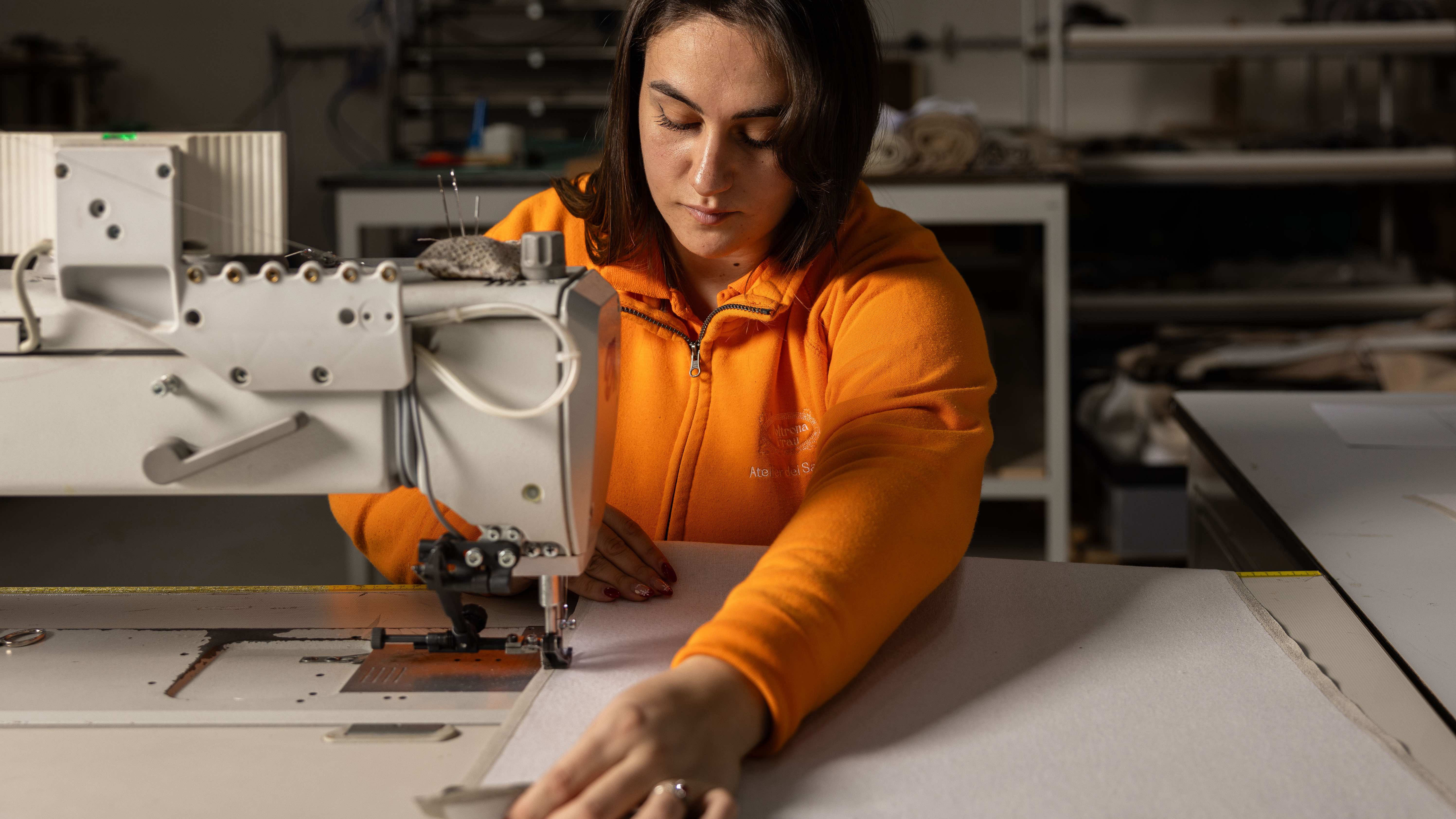 Through an innovative new training program, Poltrona Frau aims to safeguard Italian craft
The heritage furniture manufacturer is training a new generation of leather artisans
By Cristina Kiran Piotti
-
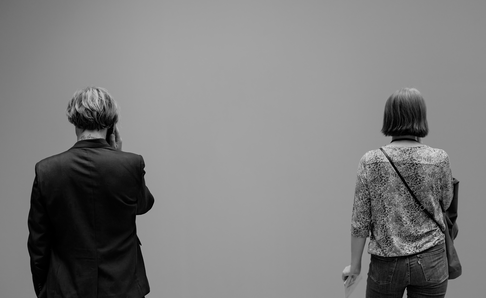 Looking at people looking at art: inside the mind of a gallery attendant
Visitor experience workers at London’s Tate Modern, Serpentine, Barbican and V&A share what it’s like to watch people looking at art during a time of changing attention spans and rising vandalism
By Kyle MacNeill
-
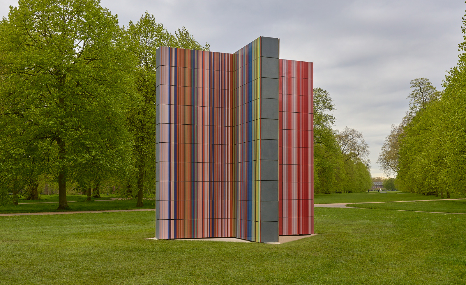 Gerhard Richter unveils new sculpture at Serpentine South
Gerhard Richter revisits themes of pattern and repetition in ‘Strip-Tower’ at London’s Serpentine South
By Hannah Silver
-
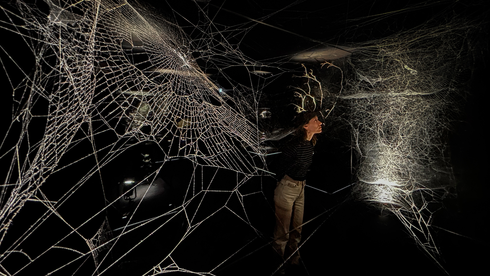 Tomás Saraceno’s spider-led show at Serpentine has legs, and lots of them
‘Web(s) of Life’, the first major UK show by Tomás Saraceno, is a living, collaborative and multi-species call to climate action involving everything from dog-friendly sculptures to ‘spider diviners’ – but no phones allowed
By Harriet Lloyd-Smith
-
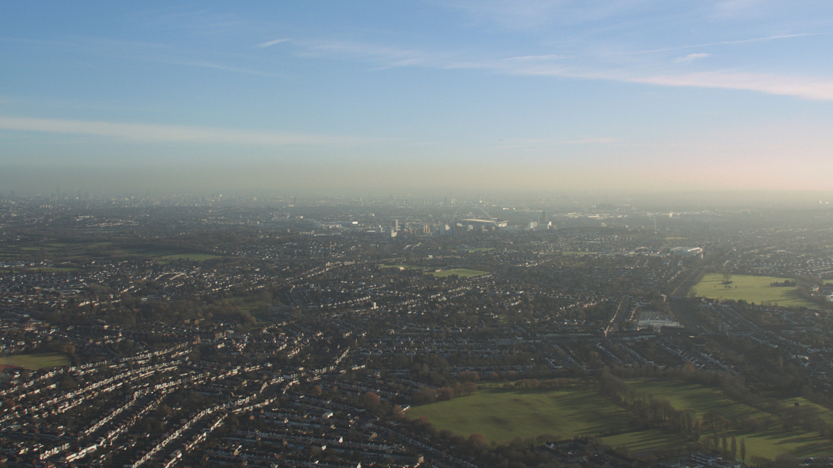 Steve McQueen to screen his harrowing film 'Grenfell' at London’s Serpentine
Acclaimed film director and artist Steve McQueen will screen his film, Grenfell, at London’s Serpentine South gallery (7 April-10 May 2023), six years after the Grenfell Tower block blaze killed 72
By Harriet Lloyd-Smith
-
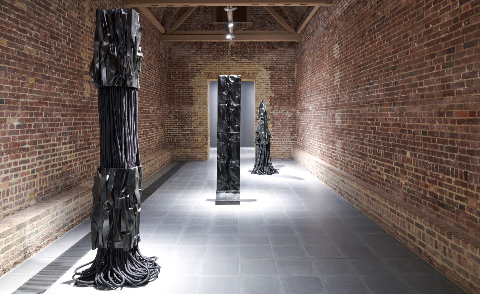 Barbara Chase-Riboud at Serpentine: alternative monuments, parallel histories
‘Infinite Folds’ at Serpentine North Gallery celebrates Barbara Chase-Riboud, the American artist, novelist and poet who has spent more than seven decades pondering history, memory, and the public monument
By MZ Adnan
-
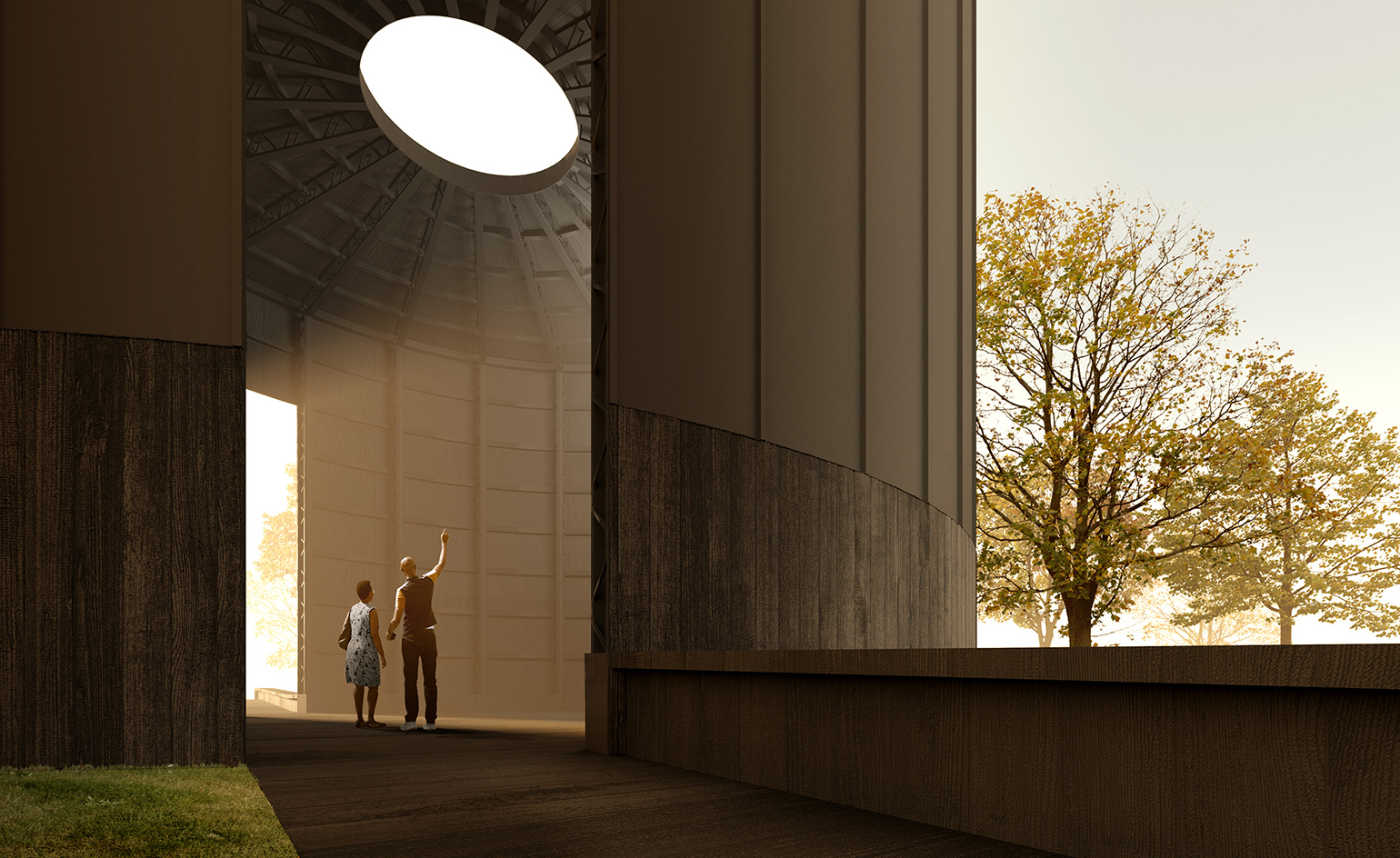 Theaster Gates’ design for Serpentine Pavilion 2022 revealed
The American artist and urban planner reveals his plans for the Serpentine Pavilion 2022. Black Chapel has spirituality, music and community at its heart
By TF Chan
-
Tom Hingston on designing for Serpentine Galleries, the V&A, and Wallpaper*
London-based art director and graphic designer Tom Hingston discusses his visual identities for Serpentine Galleries
By TF Chan
-
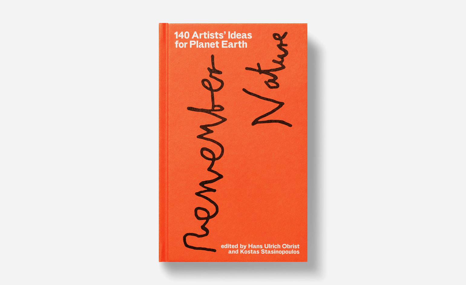 140 artists on saving Planet Earth
In the book 140 Artists’ Ideas for Planet Earth, Serpentine Galleries’ Hans Ulrich Obrist and Kostas Stasinopoulos, alongside leading artists offer innovative solutions to the climate crisis
By Nuray Bulbul
