The Renzo Piano Pavilion is unveiled at the Kimbell Art Museum in Fort Worth, Texas
When the Kimbell Art Museum embarked on commissioning an extension to its existing home designed by Louis Kahn in Texas, it was clear that the new architect would have a tough act to follow. Located in Fort Worth and inaugurated in 1972, the museum is an architecture classic made out of silky smooth concrete, a barrel vaulted roof and travertine and cork details, where (in its creator's words) 'light is the theme'. It is well known, of course for its iconic architecture, but also for its small yet carefully curated collection of some 350 artworks that span continents and ages, from antiquity to the 20th century.
By the early noughties however, its need for new space was pressing. 'Every time a temporary exhibition was on, we had to put into storage a big part of the collection', says the Kimbell Art Museum director Eric Lee. And while displays are a key part of the museum for obvious reasons, the project was not just about that. The library, previously snugly set across two of the old building's levels (the top, mezzanine level reaching right up to the iconic concrete vault), was bursting at the seams and new education and function rooms were needed.
The commission went to leading architect and museum design heavyweight Renzo Piano, who - as well as having a number of finished cultural projects under his belt (including the nearby Nasher Sculpture Center in Dallas) - has several museums currently in progress in the States; his design for the new Whitney in New York has been slowly taking shape next to the High Line, while his film museum at LACMA on the West Coast is also in development. By comparison, the Kimbell appears modest, set across some 101,130 sq ft (even smaller than Kahn's 120,000 sq ft). This, however, was part of the plan. 'It's becoming much larger, but we wanted it to still feel like a small museum,' explains Lee.
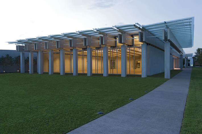
The new Pavilion contains in its light, low and deceptively spacious volume, three new galleries, education and multi-purpose rooms, a small café, a shop, a new library and archive space. An underground garage is located below the lawn that links the old and the new structures, while a generous auditorium at the back seats up to 298 guests. Made out of light-coloured concrete - it includes titanium in its blend, which adds a whiteness and shimmer, contrasting Kahn's darker concrete mix - wood beams and a swathe of glass, the pavilion is distinctly different to its older sibling.
At the same time, the new structure clearly pays respect to the Kahn masterpiece by discretely echoing its structure and proportions, albeit with a contemporary twist. Composed around two parallel wings connected by glass passageways and spanning two levels, the new structure delicately mirrors Kahn's design in several of its elements: its double stairs leading up from the underground car park; its clerestory side windows that bring subtle natural light into the displays; its roof structure that resembles vaults (a form also reminiscent of the Nasher Sculpture Center's galleries); its strategically placed courtyards and lightwells; and its twin galleries flanking the entrance lobby.
Above all, light is still a key protagonist, flooding the interior. 'You do feel like you are in the same museum,' says Lee. 'It speaks its own language but still complements the old very much.'
Clever technology has also been incorporated. A 'breathing' floor, for example, provides a smart way to allow fresh air to circulate without compromising the seamless timber flooring. A green roof covers part of the building, while its energy efficient design is expected to use about half the energy per sq ft of the Kahn Building.
Wallpaper* Newsletter
Receive our daily digest of inspiration, escapism and design stories from around the world direct to your inbox.
Gearing up for its official inauguration on the 27 November, the Kimbell is preparing for an exciting year ahead, with temporary exhibitions on show at the Renzo Piano Pavilion's southeast gallery and pieces from its permanent collection in the other exhibition rooms (although for the opening only, the Pavilion will feature its permanent colection in all galleries).
Another big plus for the museum is that the pavilion offers dedicated space for the museum's valuable Asian, Precolombian and African and Oceanic art collections, which up until now were often confined to the museum's storage. 'The non-western pieces actually look better in the new building,' says Lee. 'These works of art have never looked better.'
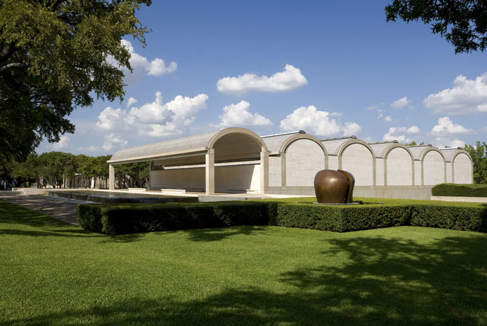
Inaugurated in 1972, the Kahn building is made from silky smooth concrete, a barrel vaulted roof and travertine and cork details.
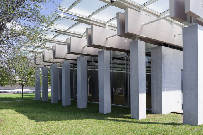
The new building was commissioned to alleviate the space constraints of the original museum. Made from light-coloured concrete (it includes titanium in its blend, which adds a whiteness and shimmer, contrasting Kahn's darker concrete mix), wood beams and a swathe of glass, the pavilion is distinctly different from its older sibling.
At the same time, the new structure clearly pays respect to the Kahn masterpiece by discretely echoing its structure and proportions, albeit with a contemporary twist. Composed around two parallel wings connected by glass passageways and spanning two levels, the new structure delicately mirrors the Khan building with its roof structure that resembles vaults.
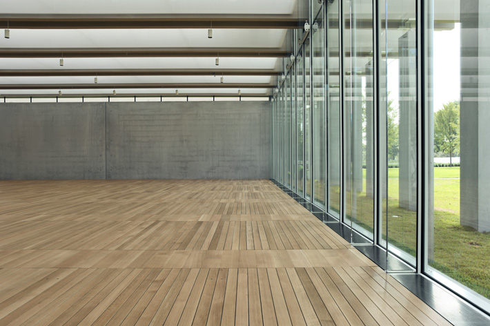
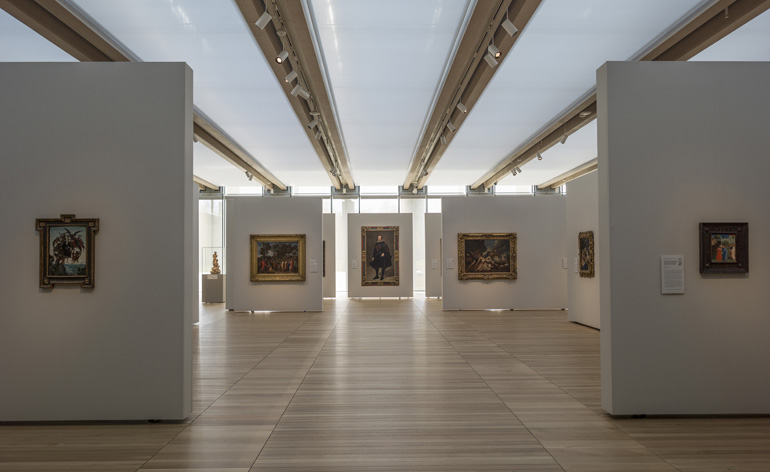
The new Pavilion contains in its light, low and deceptively spacious volume, three new galleries, which will showcase masterpieces from the permanent collection, but also temporary shows.
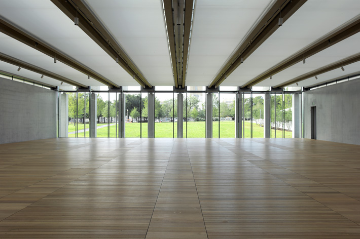
Khan had light as his theme in the existing building and, in Piano's new structure, light is still a key protagonist, flooding the interior.
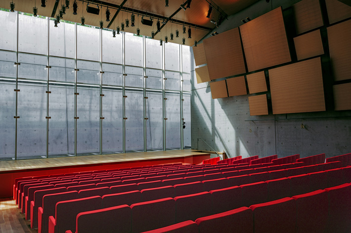
The Renzo Piano Pavilion also includes a generous auditorium that seats up to 298 guests.
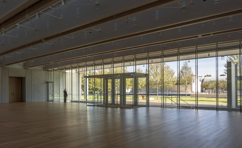
The pavilion's lobby is flanked by two galleries.
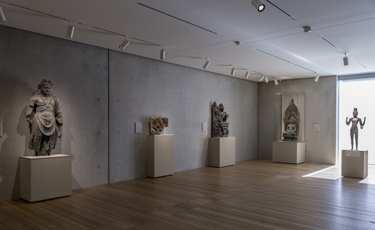
The pavilion's third gallery is dedicated to Asian art.
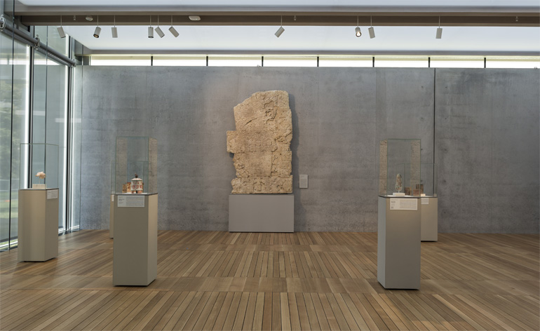
Another gallery hosts the African and Pre-Colombian art. 'The non-western pieces actually look better in the new building,' says the museum's director Eric Lee.
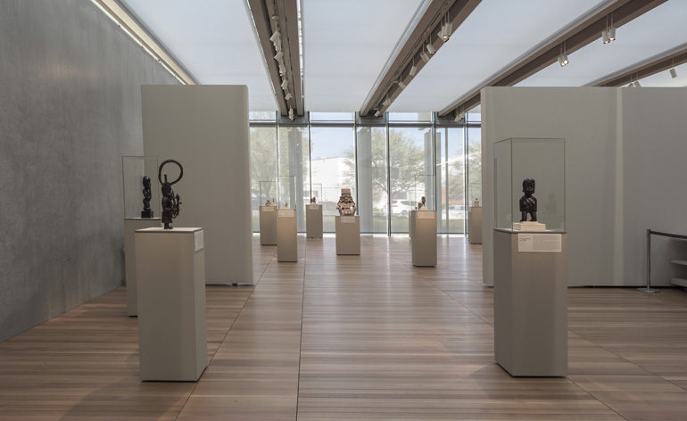
The generous exhibition space.
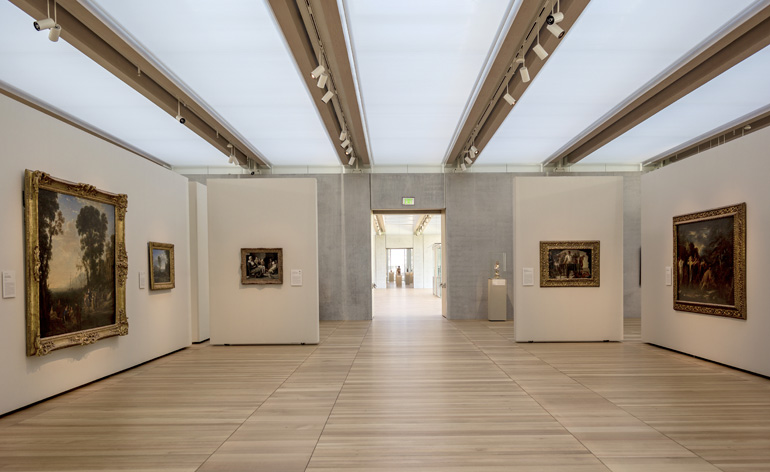
A 'breathing' floor provides a smart way to allow fresh air to circulate without compromising the seamless timber flooring.
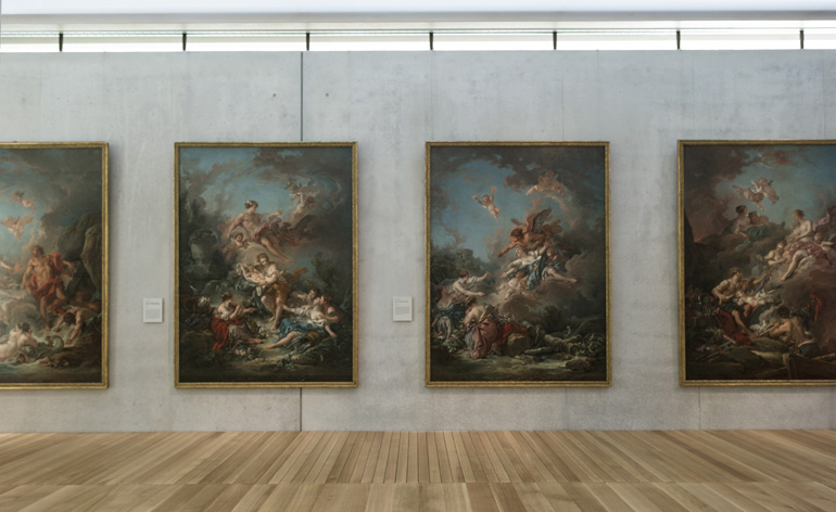
Gearing up for its official inauguration on the 27 November, the Kimbell is preparing for an exciting year ahead, with temporary exhibitions on show at the Renzo Piano Pavilion's southeast gallery and several of the collection's permanent collection pieces on display in the others.
Ellie Stathaki is the Architecture & Environment Director at Wallpaper*. She trained as an architect at the Aristotle University of Thessaloniki in Greece and studied architectural history at the Bartlett in London. Now an established journalist, she has been a member of the Wallpaper* team since 2006, visiting buildings across the globe and interviewing leading architects such as Tadao Ando and Rem Koolhaas. Ellie has also taken part in judging panels, moderated events, curated shows and contributed in books, such as The Contemporary House (Thames & Hudson, 2018), Glenn Sestig Architecture Diary (2020) and House London (2022).
-
 Warp Records announces its first event in over a decade at the Barbican
‘A Warp Happening,' landing 14 June, is guaranteed to be an epic day out
By Tianna Williams
-
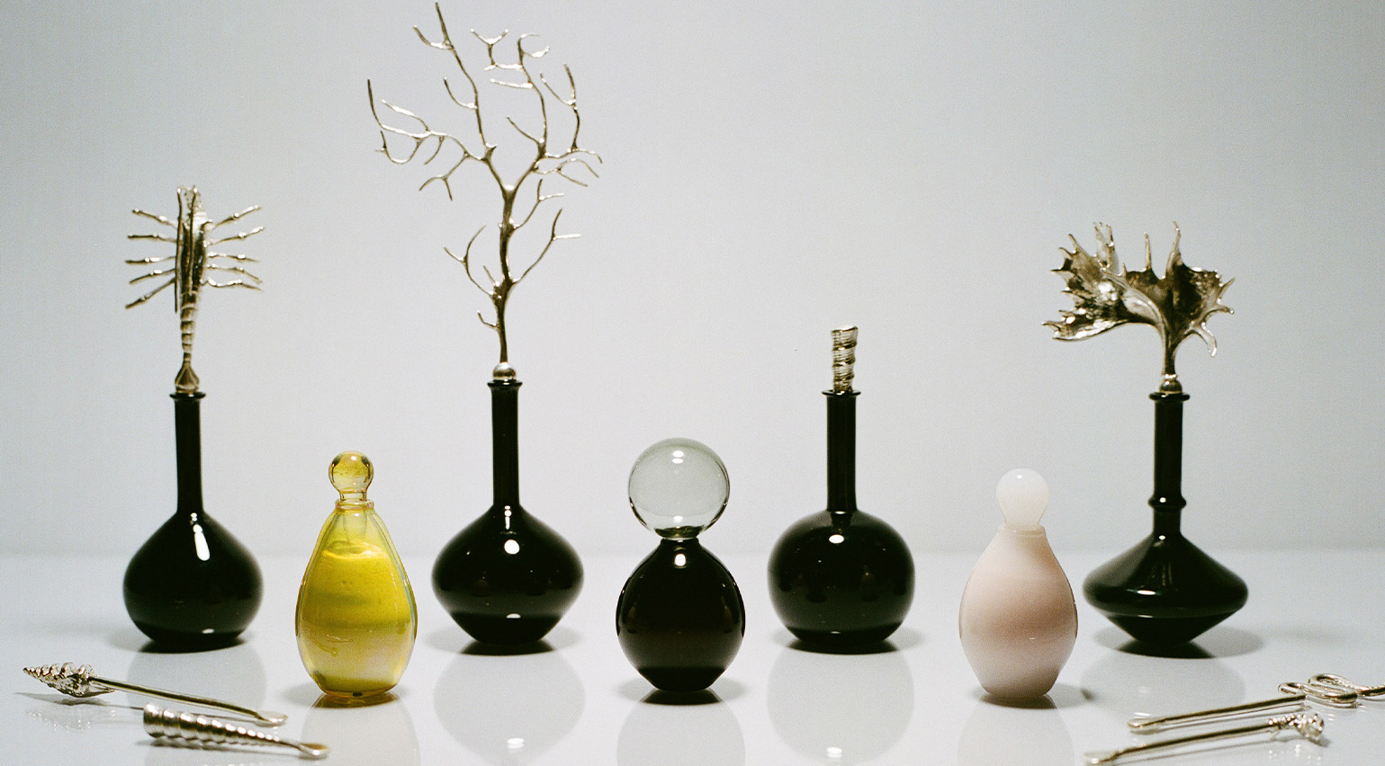 Cure your ‘beauty burnout’ with Kindred Black’s artisanal glassware
Does a cure for ‘beauty burnout’ lie in bespoke design? The founders of Kindred Black think so. Here, they talk Wallpaper* through the brand’s latest made-to-order venture
By India Birgitta Jarvis
-
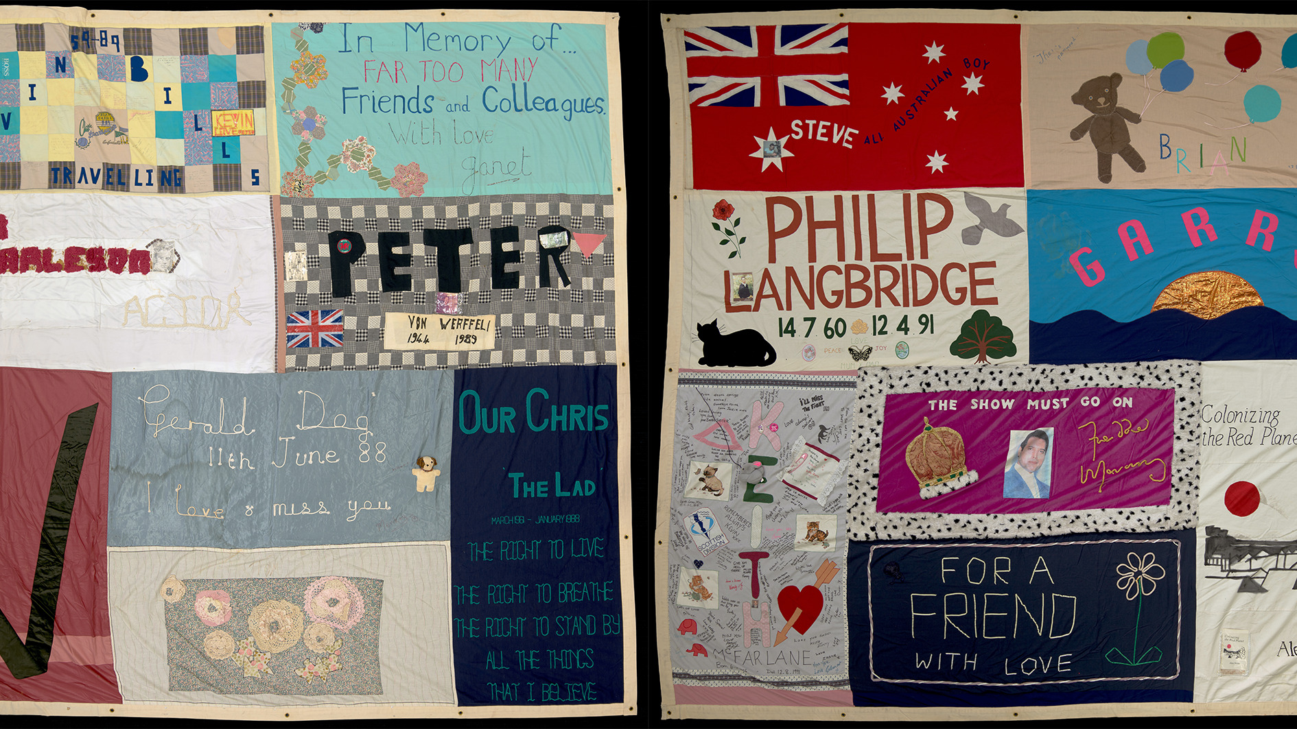 The UK AIDS Memorial Quilt will be shown at Tate Modern
The 42-panel quilt, which commemorates those affected by HIV and AIDS, will be displayed in Tate Modern’s Turbine Hall in June 2025
By Anna Solomon
-
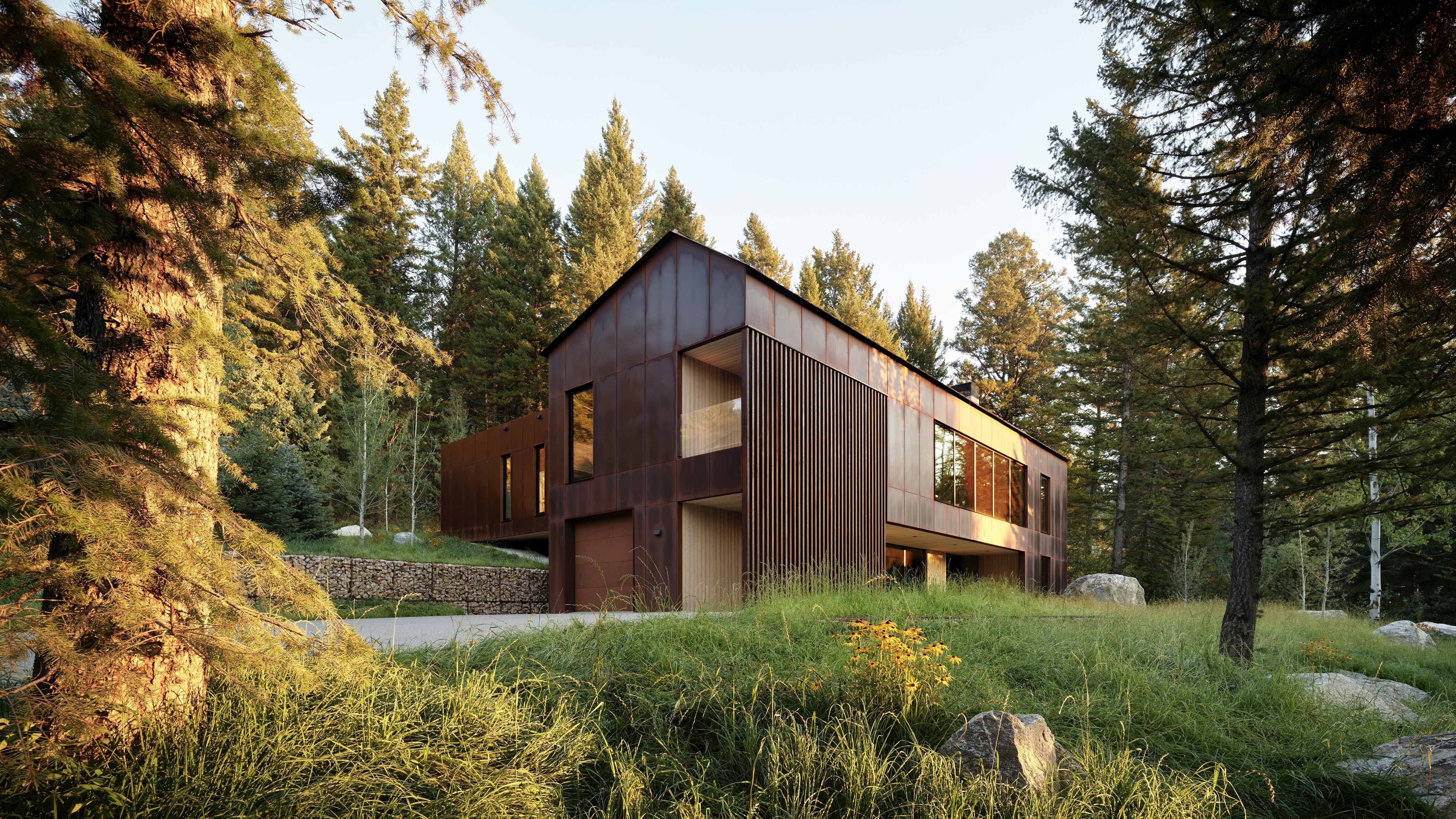 This minimalist Wyoming retreat is the perfect place to unplug
This woodland home that espouses the virtues of simplicity, containing barely any furniture and having used only three materials in its construction
By Anna Solomon
-
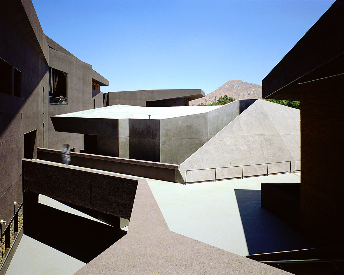 We explore Franklin Israel’s lesser-known, progressive, deconstructivist architecture
Franklin Israel, a progressive Californian architect whose life was cut short in 1996 at the age of 50, is celebrated in a new book that examines his work and legacy
By Michael Webb
-
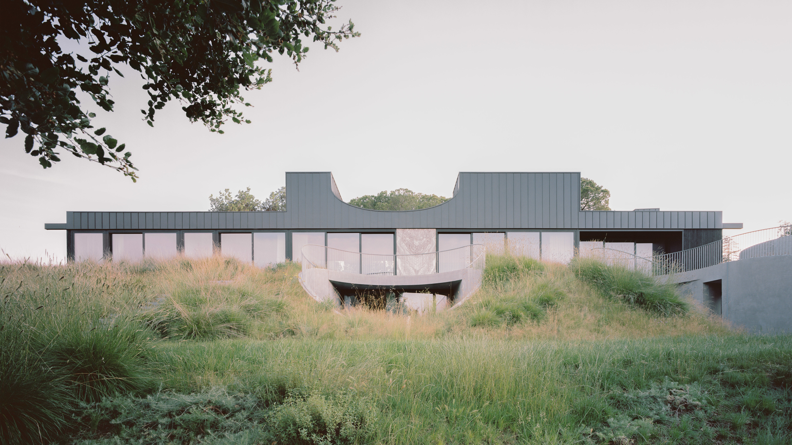 A new hilltop California home is rooted in the landscape and celebrates views of nature
WOJR's California home House of Horns is a meticulously planned modern villa that seeps into its surrounding landscape through a series of sculptural courtyards
By Jonathan Bell
-
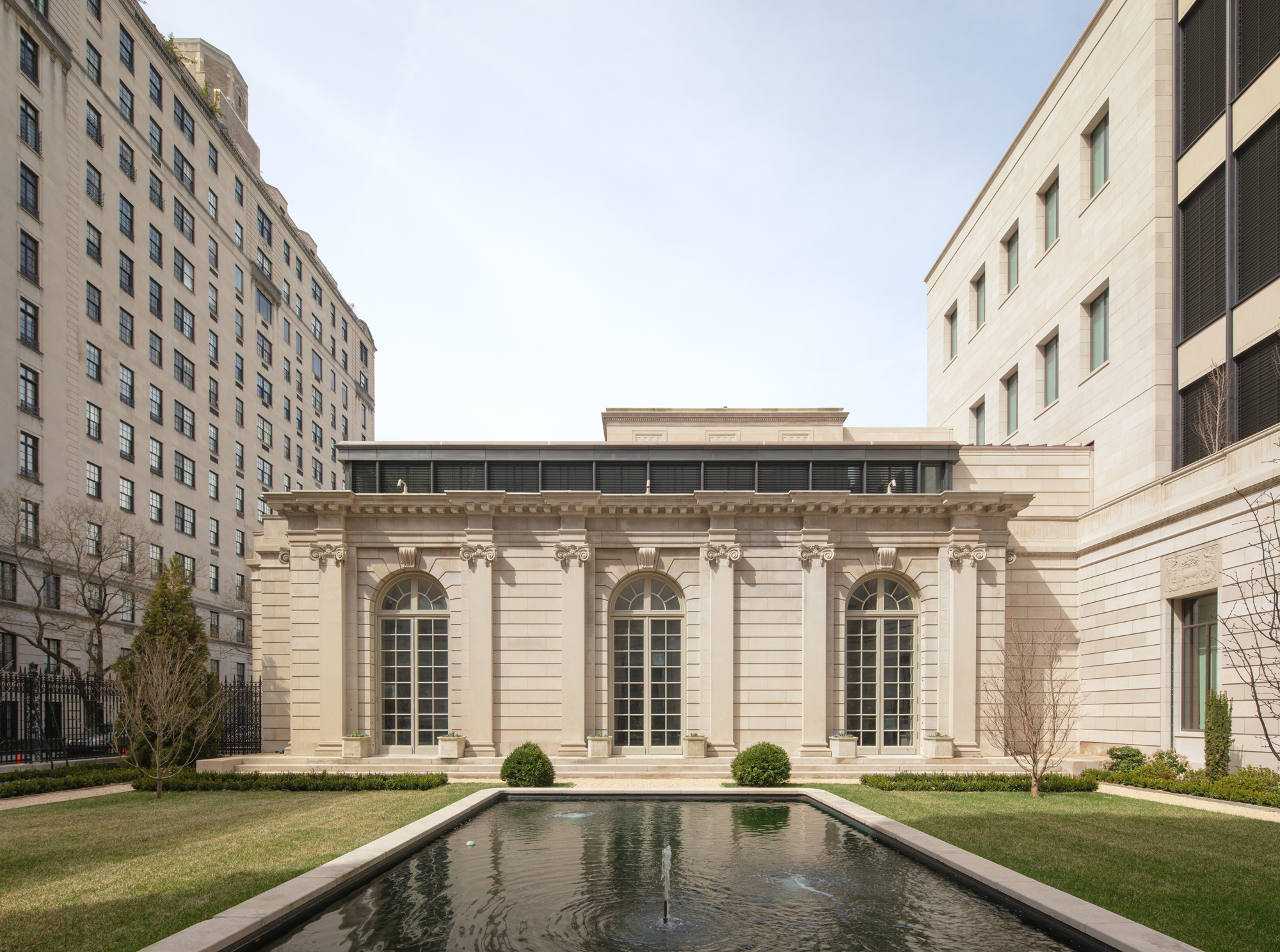 The Frick Collection's expansion by Selldorf Architects is both surgical and delicate
The New York cultural institution gets a $220 million glow-up
By Stephanie Murg
-
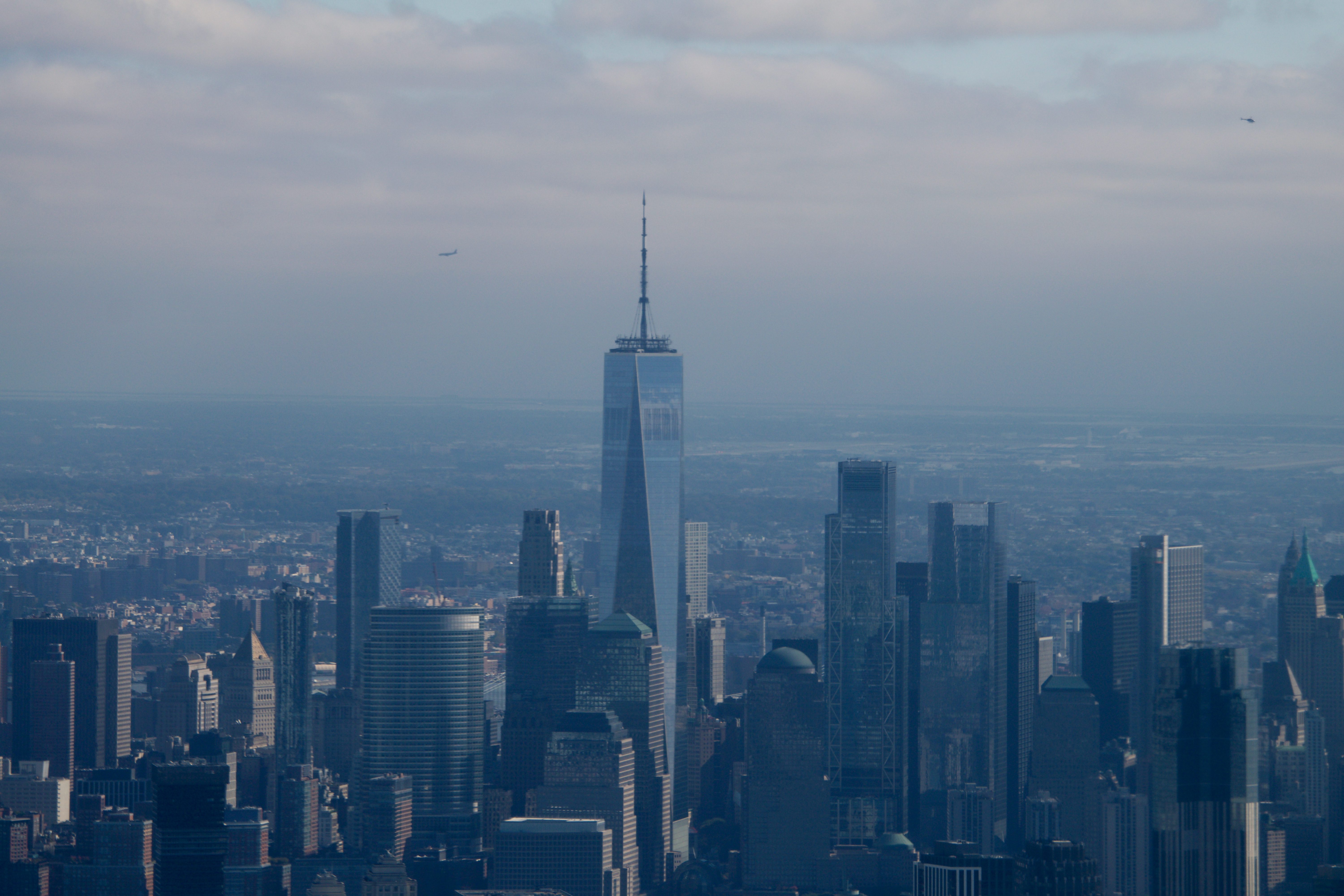 Remembering architect David M Childs (1941-2025) and his New York skyline legacy
David M Childs, a former chairman of architectural powerhouse SOM, has passed away. We celebrate his professional achievements
By Jonathan Bell
-
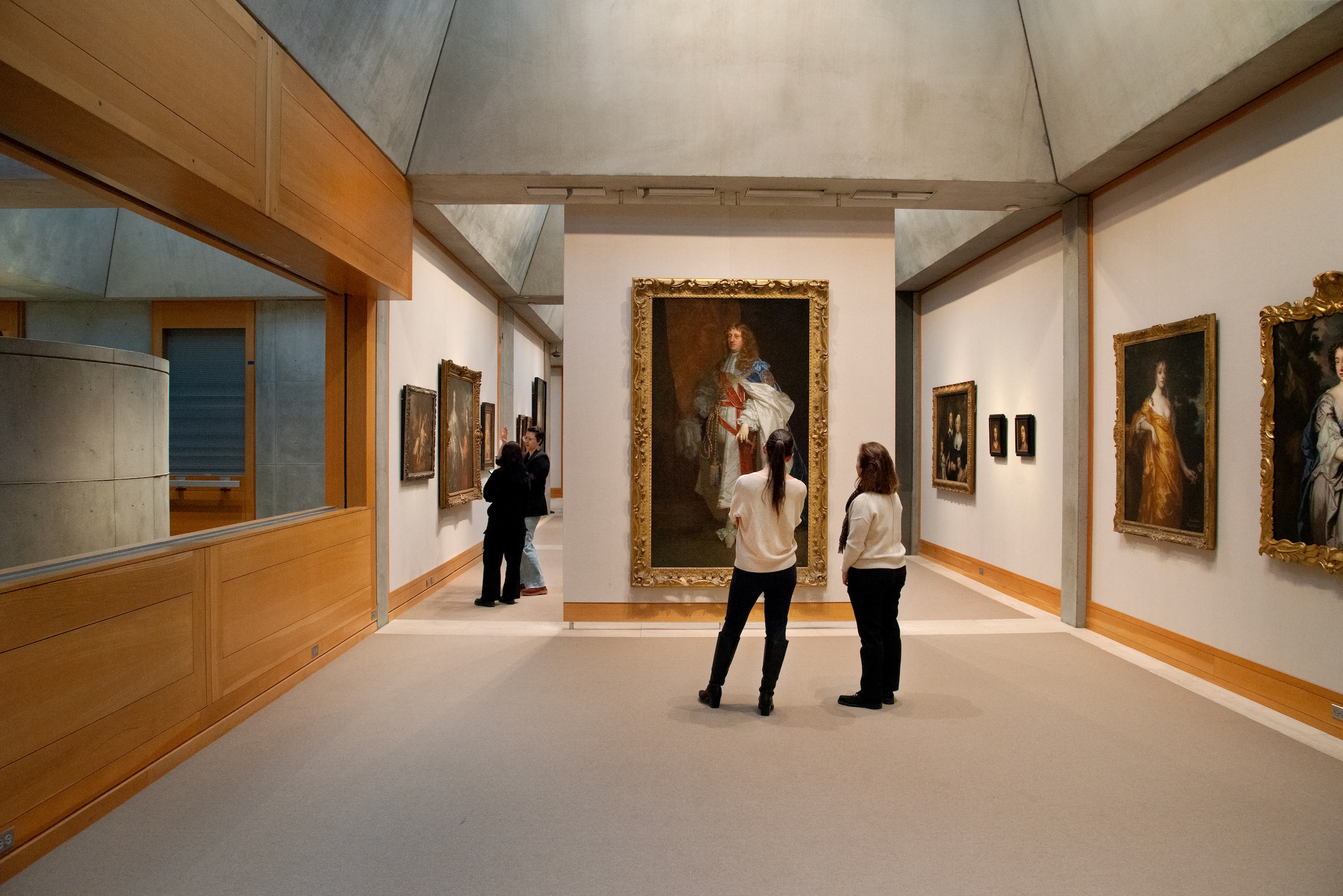 The Yale Center for British Art, Louis Kahn’s final project, glows anew after a two-year closure
After years of restoration, a modernist jewel and a treasure trove of British artwork can be seen in a whole new light
By Anna Fixsen
-
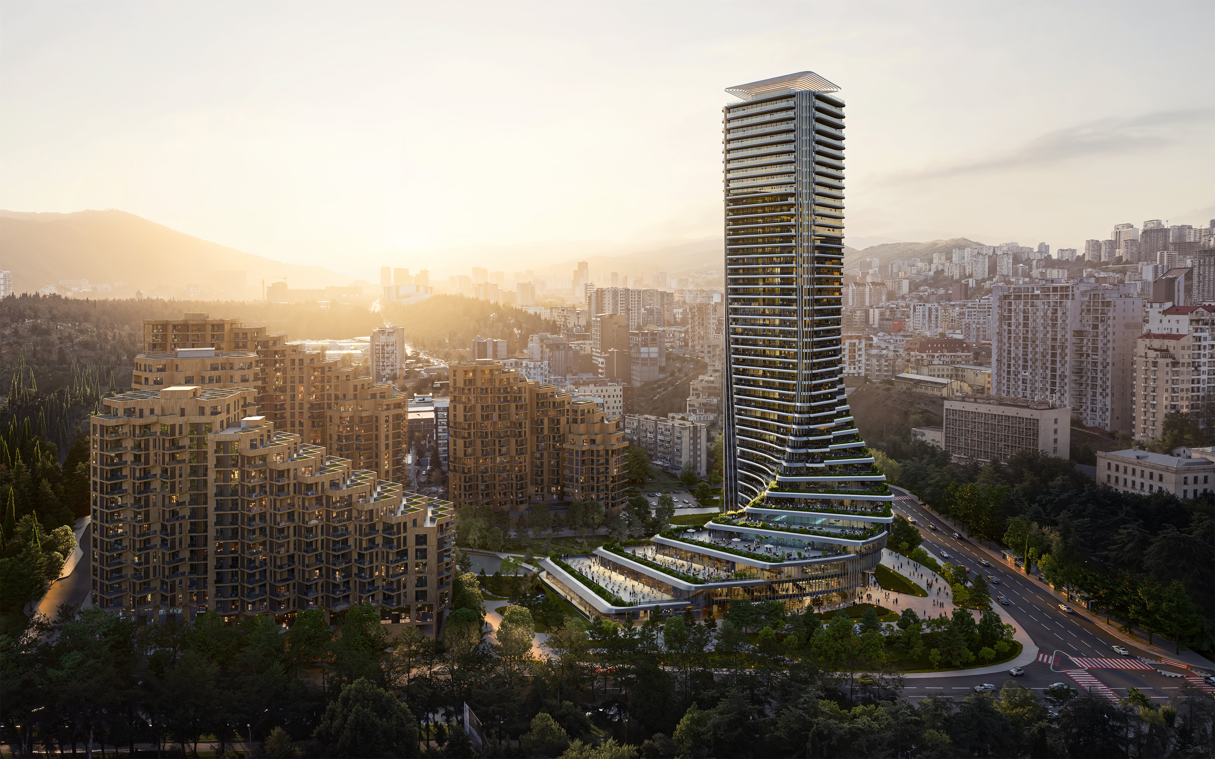 The upcoming Zaha Hadid Architects projects set to transform the horizon
A peek at Zaha Hadid Architects’ future projects, which will comprise some of the most innovative and intriguing structures in the world
By Anna Solomon
-
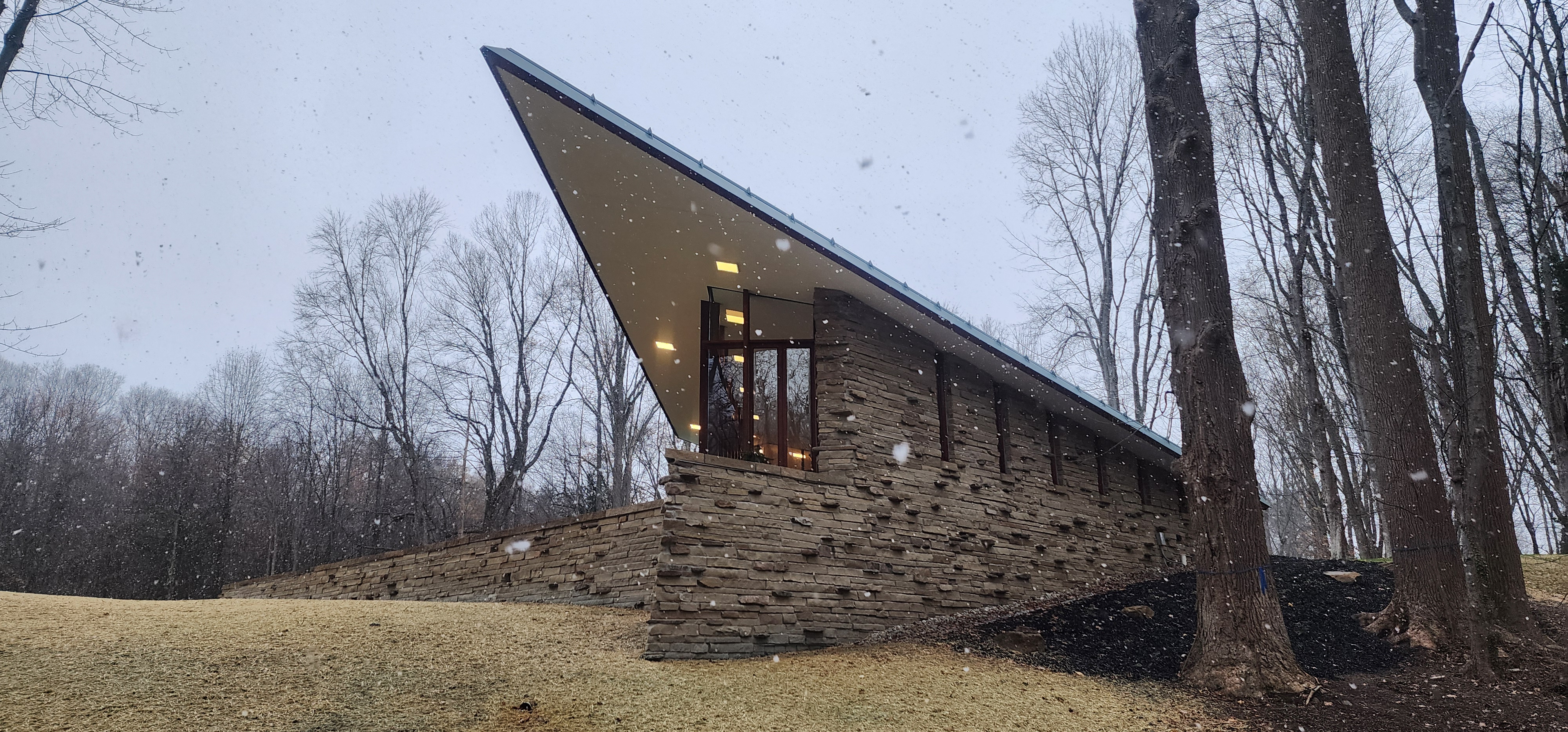 Frank Lloyd Wright’s last house has finally been built – and you can stay there
Frank Lloyd Wright’s final residential commission, RiverRock, has come to life. But, constructed 66 years after his death, can it be considered a true ‘Wright’?
By Anna Solomon