The Triple Folly: a pavilion that blurs boundaries between art and architecture
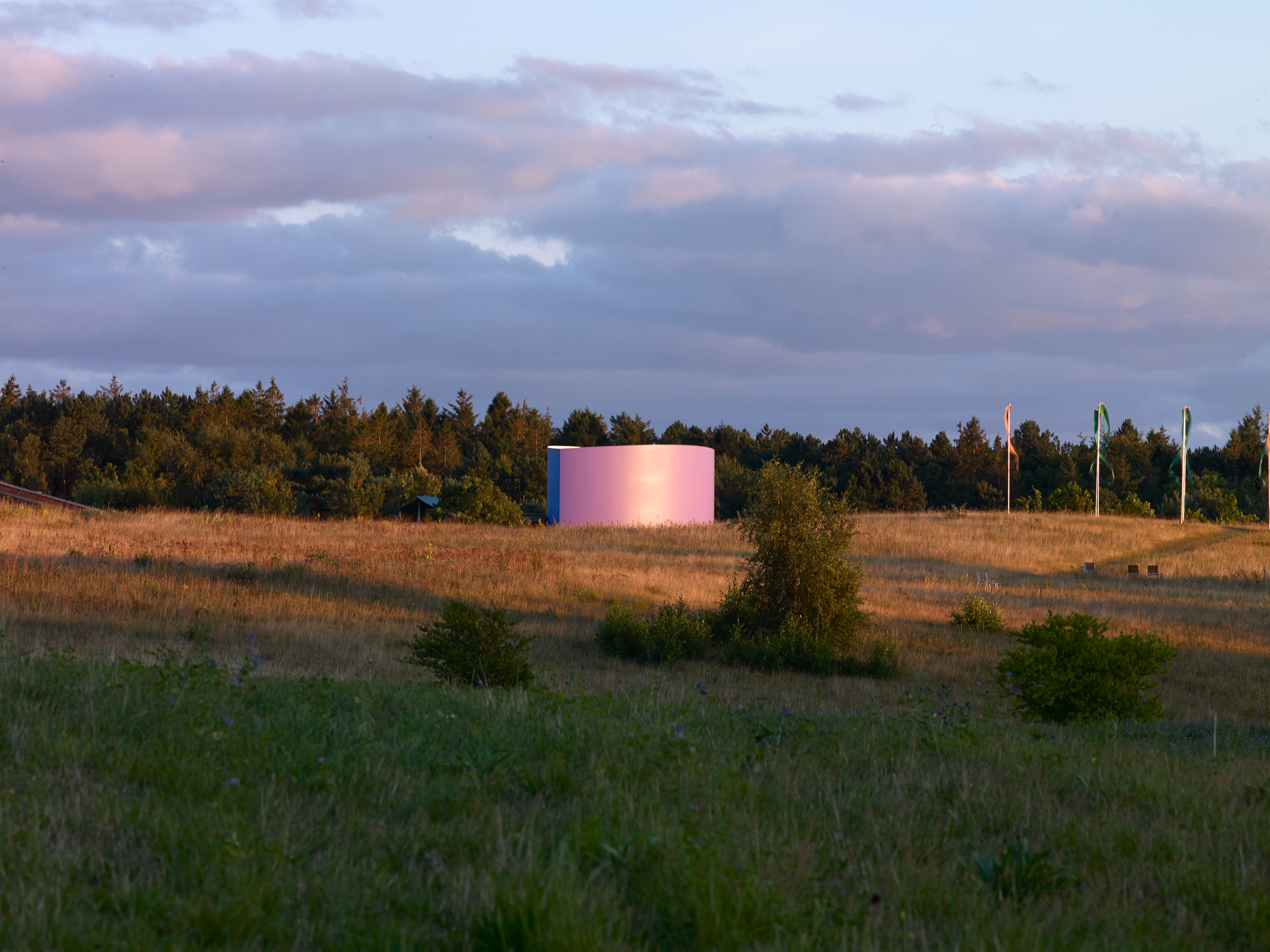
The Triple Folly pavilion by Thomas Demand and Caruso St John Architects for Kvadrat’s Danish HQ disassembles walls between art and architecture
Nic Tenwiggenhorn - Photography
When Kvadrat’s CEO Anders Byriel approached artist Thomas Demand with a special project in mind, the latter immediately agreed. The ensuing commission for the textile brand, a collaboration between Demand and London-based architects Caruso St John, gave birth to The Triple Folly; an architectural pavilion that has just been completed in Kvadrat's Ebeltoft headquarters in Denmark.
The Triple Folly collaboration
Both Kvadrat and Caruso St John Architects share years-long histories of working with Demand, and the already-established bond of trust allowed the parties to communicate in shorthand, executing the project with absolute confidence in each other's vision. Byriel afforded Demand a blank slate - a rarity in client briefs, especially for a project of such scale. Although determined to push the creative concept to its bounds, Demand explains: ‘Anders knows that I'm not going to waste good resources - I always try to make [a project] as reasonable as I can.’
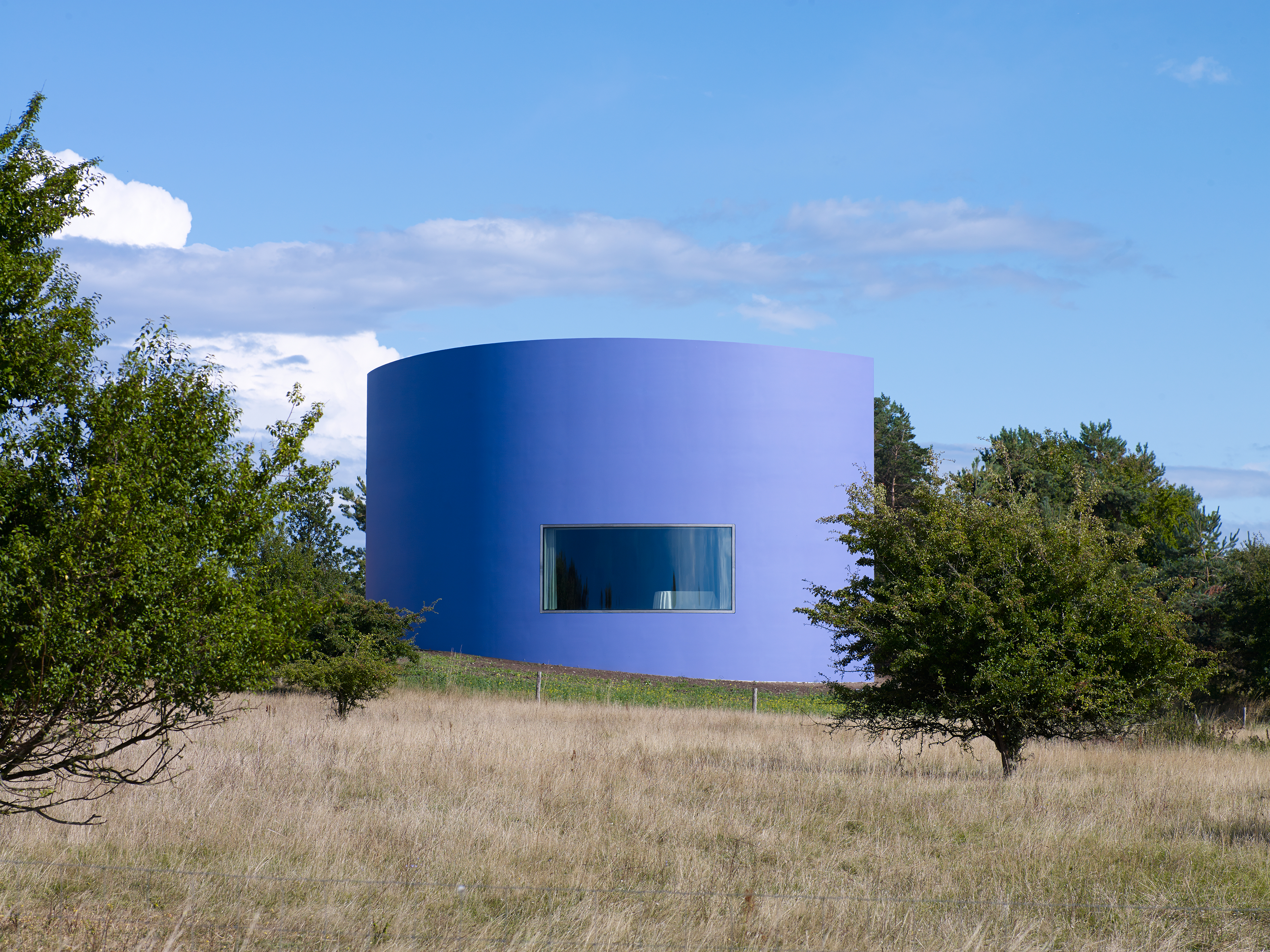
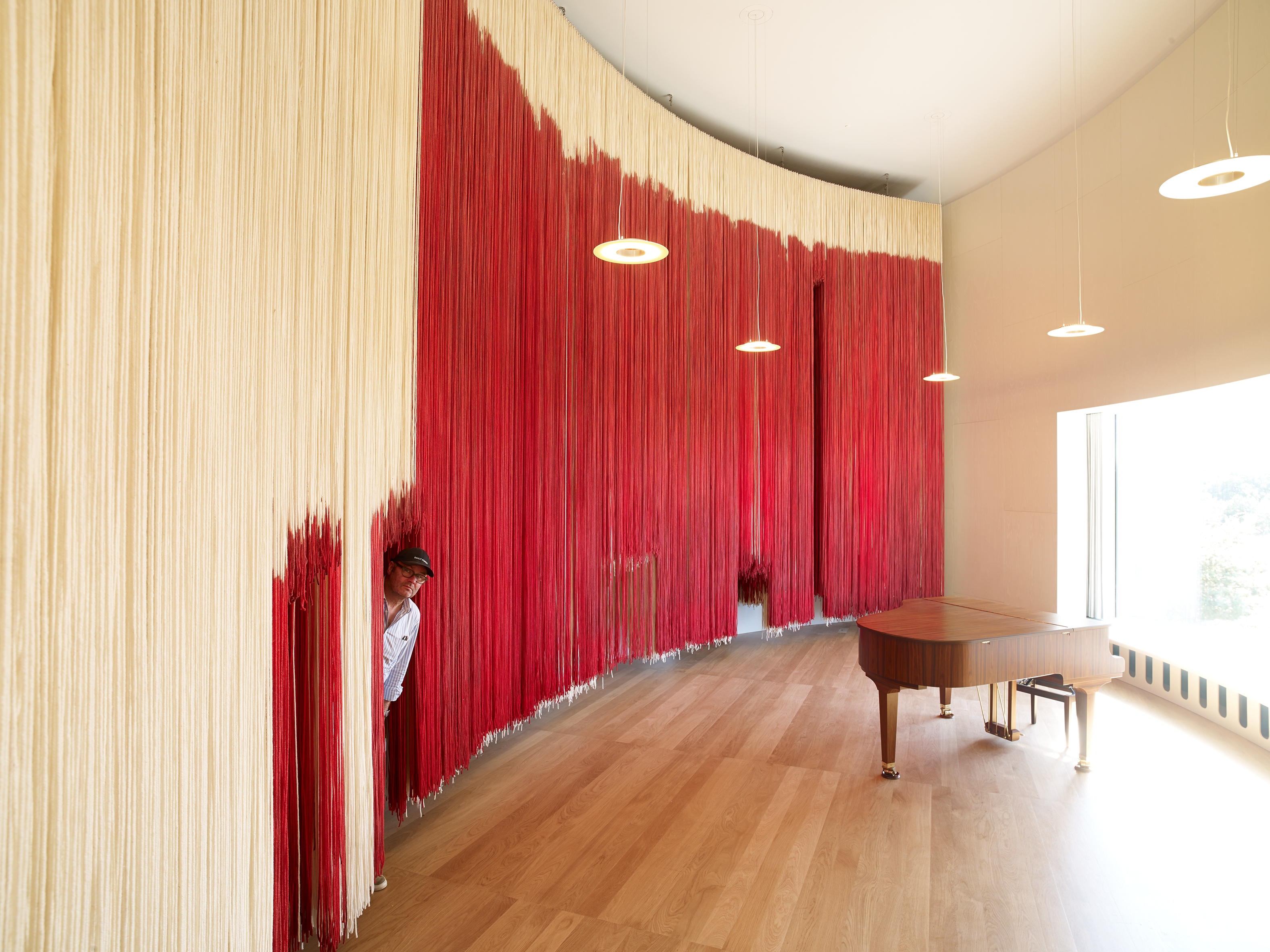
Indeed, the team inferred the building needed to be functional, not merely for show. Although its name borrows from a folly - a structure, typically, of little applied use other than symbolic reference or disguise - this building needed to house meetings, seminars, and even concerts (the acoustics were carefully considered for such purposes) and act as a breakout space from the main Kvadrat HQ close by.
A memorable experience, a meeting place… It's not a public space, it's not a corporate space, it's something in between
Thomas Demand
For Demand, one of the appeals of working with Caruso St John was the relatively compact scale of their team: ‘It's not a big office: I have worked with big offices, and that can be very tiring.’ Of course, their creative approach played a central role too: ‘They have an attitude of very bespoke working for their projects including furniture, woodwork, and everything else. They have access to craftsmanship.’ Demand adds: ‘Adam Caruso is very good in collaborating - there is no hierarchy, no point to prove. I needed somebody with experience in space and material to translate my design into architecture in terms of function… It has to stand, to withstand weather.’
A design of three parts
Demand was drawn to the long history of the folly, as it ‘allows you to experiment with shapes which are resembling something else.’ He landed on a design of three buildings integrated into one, largely inspired by his ongoing practice in which paper plays a central role. ‘Kvadrat is a textile company… You build a house for a textile company… What is the connection? A tent is the connection,’ he says of his starting point. He researched tents in the military, opera, history, public culture, cartoons, camping, and even the circus. ‘Very often it's associated with festivities, but also if you think of the refugee crisis, if you think of the Occupy London protests that took place in front of the Stock Exchange, it can sour too.’
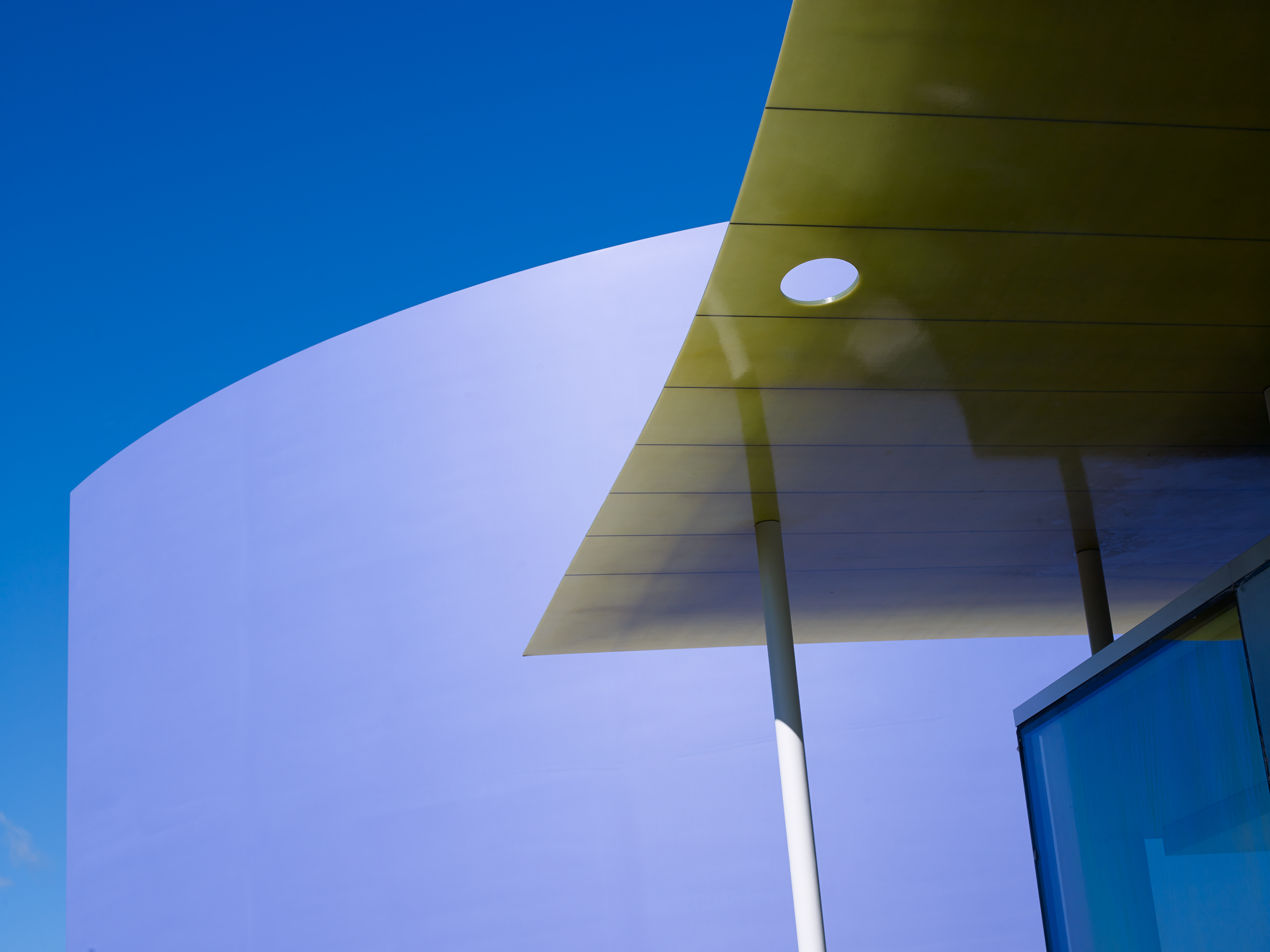
Starting from the concept of the tent, and developing the idea by following shapes in line with his fascination with paper, he ended up with three distinct buildings. The first has a roof shaped like a piece of folded paper (or tent), the fold becoming the ridge of the roof. It ‘floats’ above a glass cube. The translucent roof was constructed from two huge pieces of fiberglass and built onsite using the same technology used to craft surfboards.
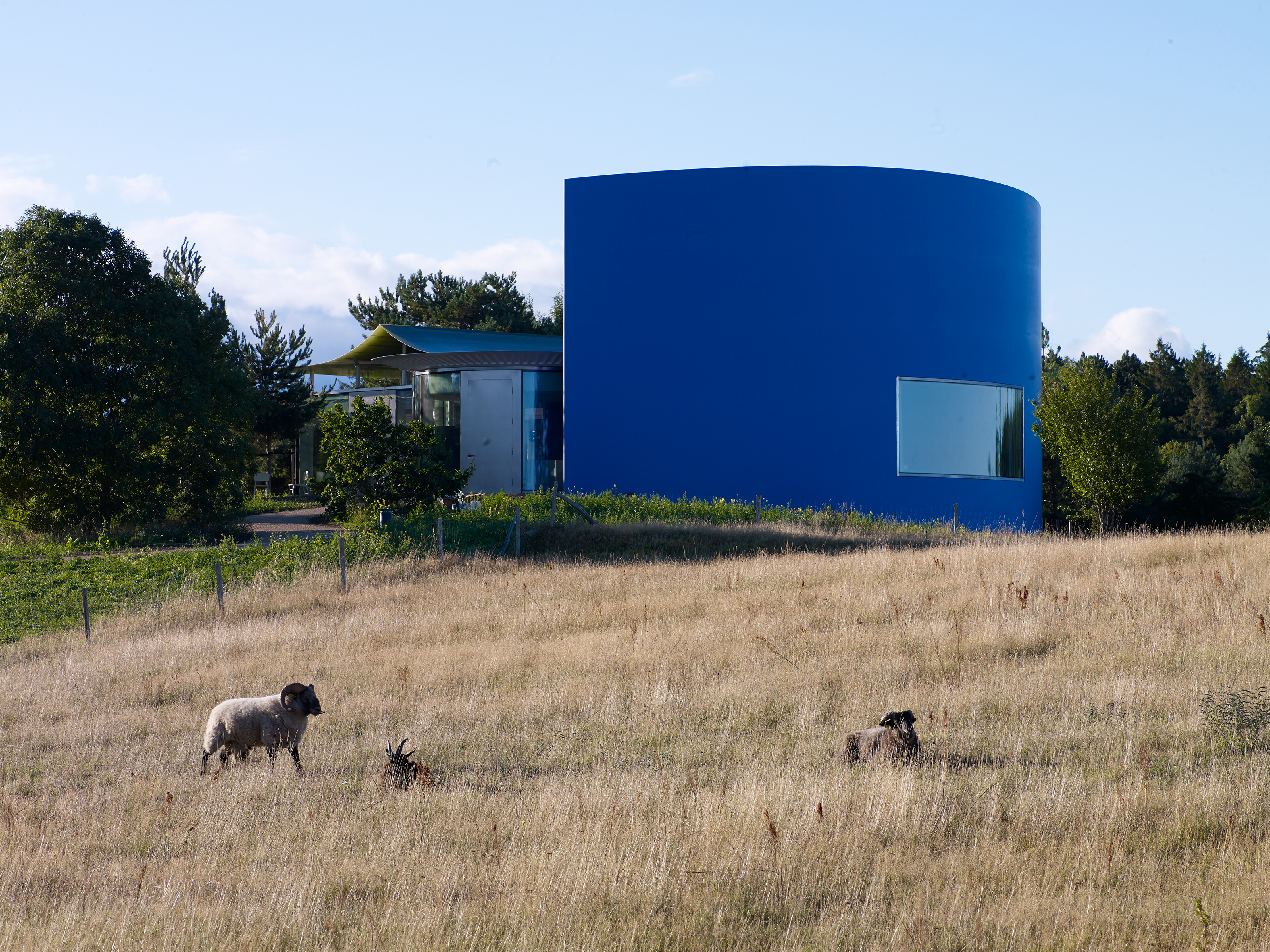
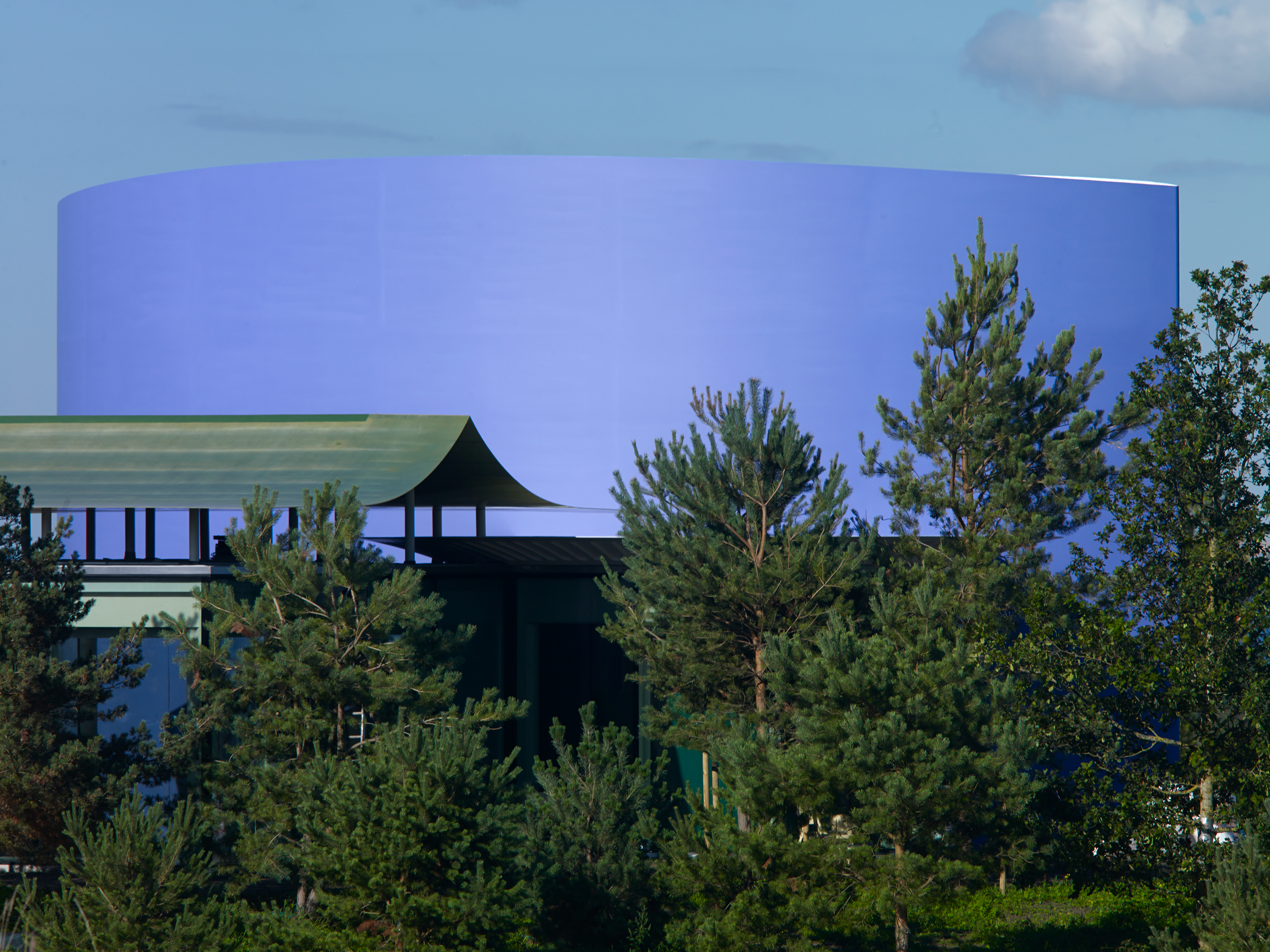
The second building replicates a paper plate, with undulations around the rim, which acts as a canopy. Fittingly, inside the ‘plate’ building he stationed a kitchen. The third structure has a long window overlooking the bay and is shaped like the elliptical silhouette of an American soda seller’s hat. ‘I envisioned a small concert space, a place for performances of cultural significance and brainstorming activities. And so, I thought of a hat, because the hat would be sitting on the brain,’ says Demand.
The artist as architect
The artist's hand can still be spotted despite the grand scale of the finished product. Demand worked from paper maquette models, then scanning or translating them into CAD files. ‘Very often you have small irregularities which come from the design process, something you might only notice after sitting in a meeting for some time and realising, ‘Oh, this is not regular.' I wanted that little afterthought.’
Caruso St John worked with Demand’s own inhouse architects, collaborating on smaller details such as door handles, benches, a Murano glass lamp and tables of different lengths that can be made into ‘different constellations.’ He says: ‘I wanted feedback on if it was all growing together in one entity or if it was 1000 ideas going in all directions.’
The colour purple
The violet façade of the elliptical structure is unusual and distinct. ‘I wanted to have this in a signature colour, a textile colour, because it's on the top of a hill, it's the highest point on the grounds and you see it from very far away, even from the aeroplane,’ says Demand. He developed the particular shade of purple over many months, painting the outside wall of his own studio in LA where he was based at the time every two or three days to see how the tone appeared on a large exterior scale. ‘I settled with a colour which you cannot mistake with a corporate colour - nobody has a purple like this. Also, it's not a colour which you usually would see on a building either. It's not exactly from their own range, but they had these colours in the 60s when they started out.’
Wallpaper* Newsletter
Receive our daily digest of inspiration, escapism and design stories from around the world direct to your inbox.
Creative collaboration
The work of two other creatives will be featured onsite. Inside the largest building will hang an artwork, Yes but, by Rosemarie Trockel, which Kvadrat purchased in 2006. ‘The length and height of the building will make it possible to install,’ explains Demand, who worked to specific dimensions to accommodate the artwork.
After months of working on chair design (he created chairs for the outside in bronze that will be permanently installed on the floor), he sourced a tried-and-tested chair by Max Bill; ‘a re-released design from the 1950s in a special colour combination.’ He admits: ‘I didn’t want to be blamed for people being uncomfortable in meetings.’
Built for the future
Demand often destroys much of his work after photographing it; the photograph remains as the work itself. How does he feel about this pavilion standing long into the future? ‘My work is basically a view into my studio. You have the documentation of it. And then the whole thing has to change and has to go,’ he says, referring to his process of destruction. ‘But the idea of something being only visible in photographs is still there. In a sense, the public will know about it, and I don’t have any control over the representation of it, so it has to work from all sides. And it has to have a visual logic to it. The dominating logic should be the one you take from paper. It’s larger in scale but it’s still visible as being a geometric straightforward form like you would build a cardboard model yourself.’
INFORMATION
Tilly is a British writer, editor and digital consultant based in New York, covering luxury fashion, jewellery, design, culture, art, travel, wellness and more. An alumna of Central Saint Martins, she is Contributing Editor for Wallpaper* and has interviewed a cross section of design legends including Sir David Adjaye, Samuel Ross, Pamela Shamshiri and Piet Oudolf for the magazine.
-
 All-In is the Paris-based label making full-force fashion for main character dressing
Part of our monthly Uprising series, Wallpaper* meets Benjamin Barron and Bror August Vestbø of All-In, the LVMH Prize-nominated label which bases its collections on a riotous cast of characters – real and imagined
By Orla Brennan
-
 Maserati joins forces with Giorgetti for a turbo-charged relationship
Announcing their marriage during Milan Design Week, the brands unveiled a collection, a car and a long term commitment
By Hugo Macdonald
-
 Through an innovative new training program, Poltrona Frau aims to safeguard Italian craft
The heritage furniture manufacturer is training a new generation of leather artisans
By Cristina Kiran Piotti