Elementary art and design: the Wonderlab opens at London’s Science Museum
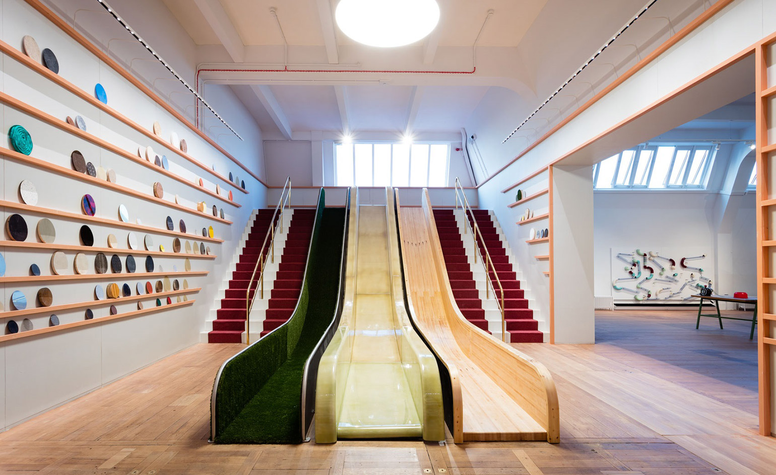
A new gallery at London’s Science Museum, designed by Muf Architecture/Art, combines science with craft, design and art. Wonderlab: The Statoil Gallery has been designed for school groups, yet bespoke details, contemporary art and comfortable seating make the experience adult-friendly too.
A contemporary reinvention of the Children’s Gallery which opened in 1931, the gallery was a part of the museum designated for children to play, experiment and learn in. The architects worked with the existing structure on the third floor. ‘We cut away the walls to make this long view, so it’s a bit like being in a city, you can always see another street to go down,’ says Liza Fior, partner at Muf architecture/art, who was hyper-aware of how each individual would use the space.
Divided into seven scientific zones, there are over 50 different exhibits uniquely designed by a whole range of collaborators for children to explore. ‘There’s always somewhere for people to gather around. There’s never a sense of a queue, even if there is the maximum of 500 people in here,’ she continues.
A sense of history and narrative has been embedded through the choice of materials. ‘There’s a tendency [in] modern school design [to] all white, clean and colourful,’ says Fior, who wanted to bring dreaming and curiosity back into education architecture. Deep red quilted undercroft is paired with brass in the theatre, while in the more industrial gallery, air con vents are painted sparkly white and crystals are set into smooth wooden benches.
The team at Muf selected the craftspeople and artists to work with, so while there is a plethora of materials and styles, a sense of cohesion is maintained. A light installation by Front picks out the 500 stars closest to the earth while ex-Droog designer Arnout Visser’s glass creations decorate the Chemistry Bar, an exhibit where live experiments can be ordered.
‘It’s a learning space, so we wanted every exhibit to perform’, said Toby Parkin, Wonderlab's curator, who wanted to recreate the excitement that was ignited by the Great Exhibition of 1851. The attention to detail makes the gallery an incredible place to be for an adult as well. ‘It’s all here for adults,’ says Parkin, ‘We wanted to add these beautiful pieces in so adults felt comfortable in the space as well.’
A series of still life photographs by artist Siobhan Liddell are exhibited above a seating area where building blocks are arranged into puzzles, their colours chosen by Liddell to create a continuous aesthetic journey. ‘Where do architecture and design stop and start?’ questions Fior. ‘Everytime you sit down you feel like somebody’s been thinking of you, whether it’s a rail that you touch or finding a crystal in a seat. It’s an incredibly luxurious place to be.’
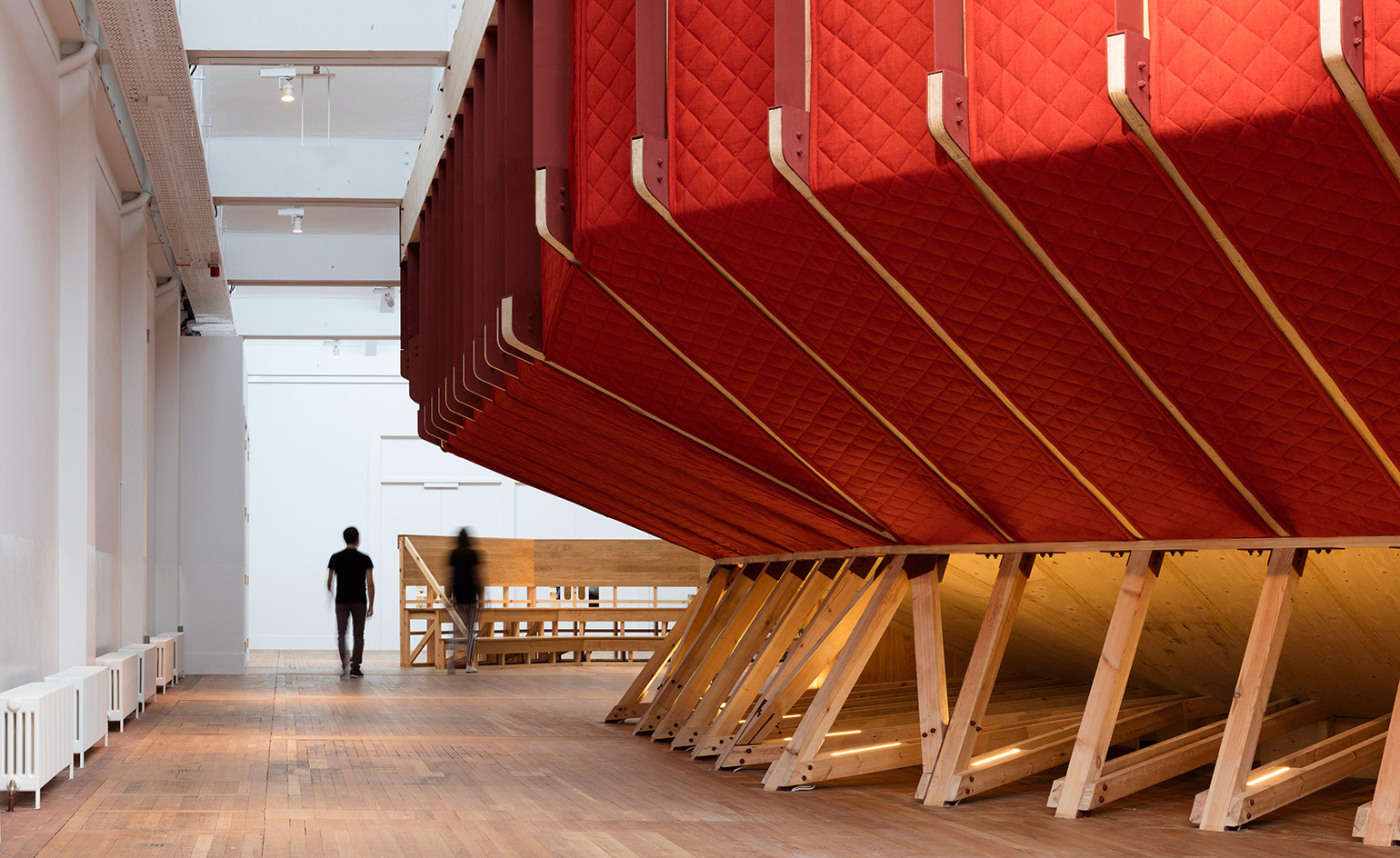
The 120-seat theatre is built within a larger room that welcomes children before they enter the Wonderlab. Acoustics were important for Liza Fior, co-founder at Muf Architecture/Art, who wanted to create a sense of calm in this space to build anticipation
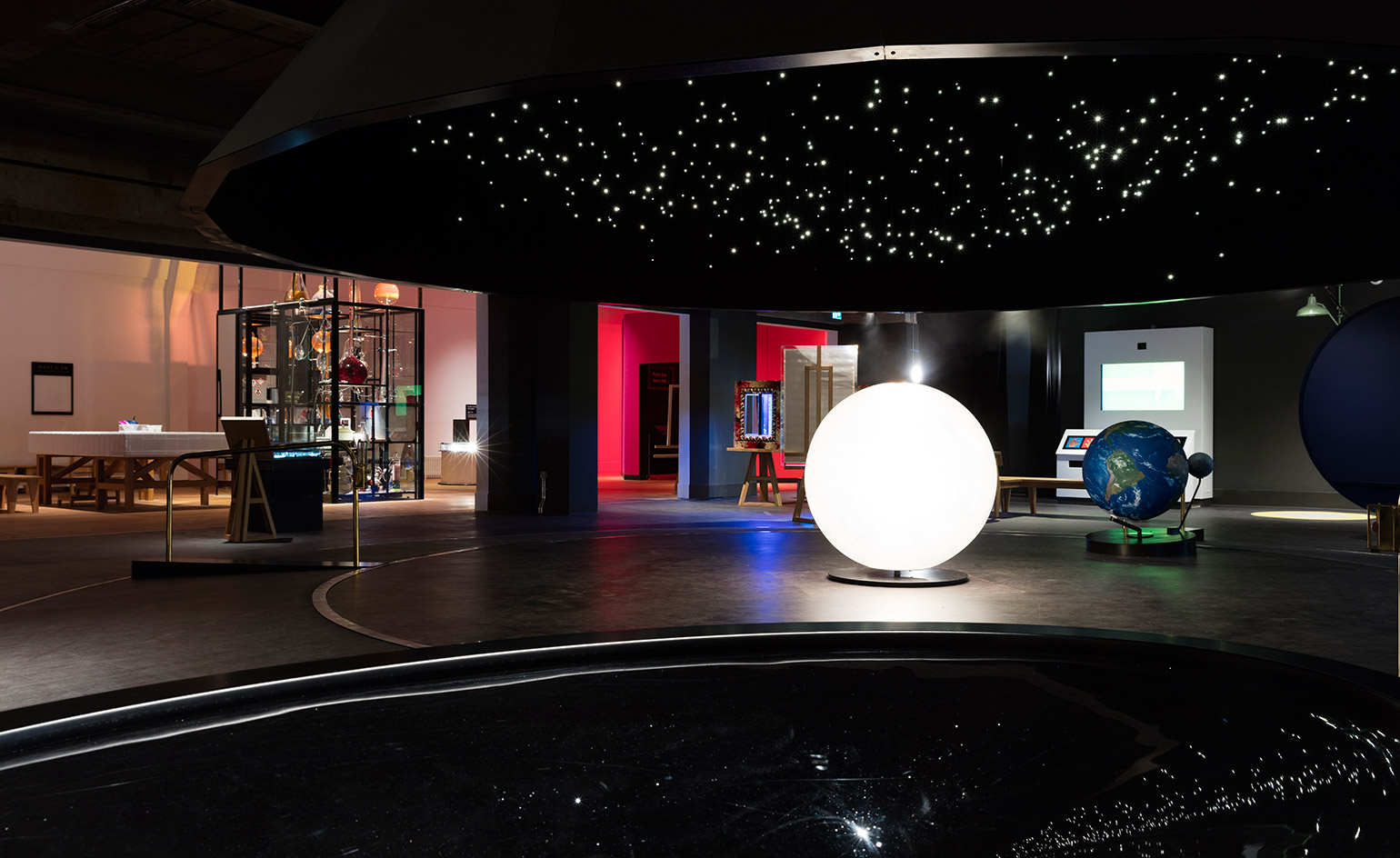
A rotating solar system, which can be ridden by visitors, is a central focus of the Wonderlab
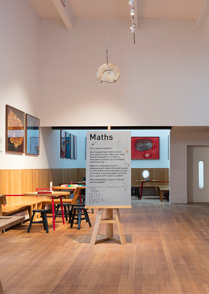
The gallery’s texts have been designed by graphic designers Objectif and illustrator Andrew Rae, who worked with different materials to reflect each scientific zone
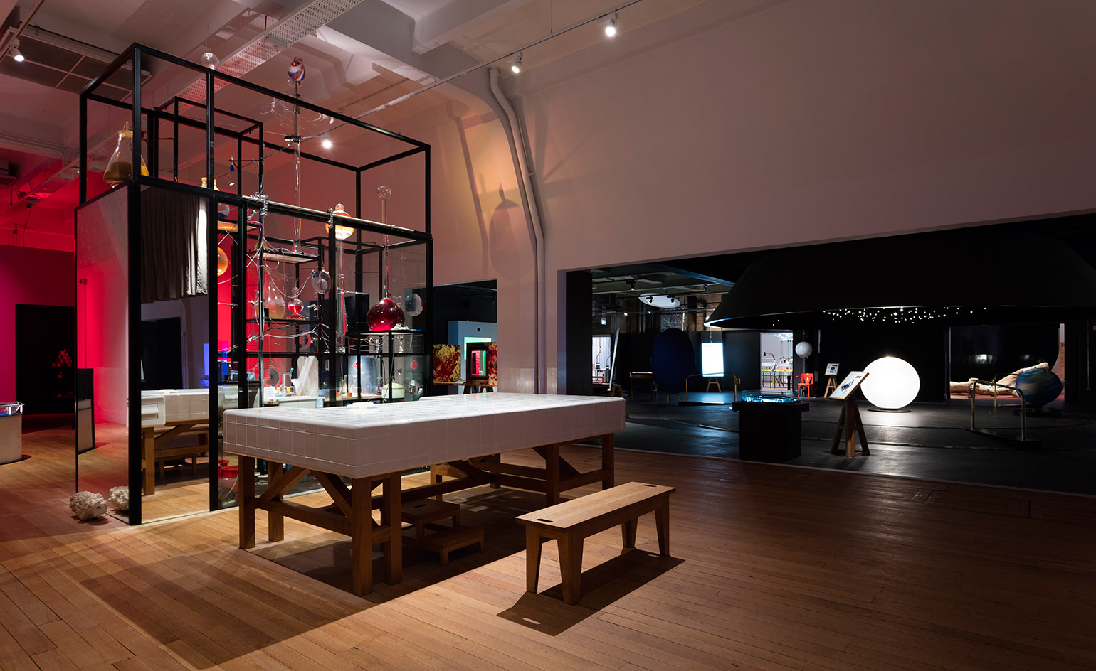
Arnout Visser, a former designer at Droog, worked with Czech makers to create oversized glass pieces for the Chemistry Bar, where children can order up some slime or liquid nitrogen
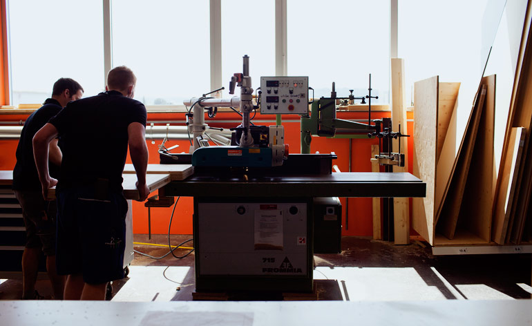
A little window gives children a peek into the gallery before they go in, heightening their sense of excitement
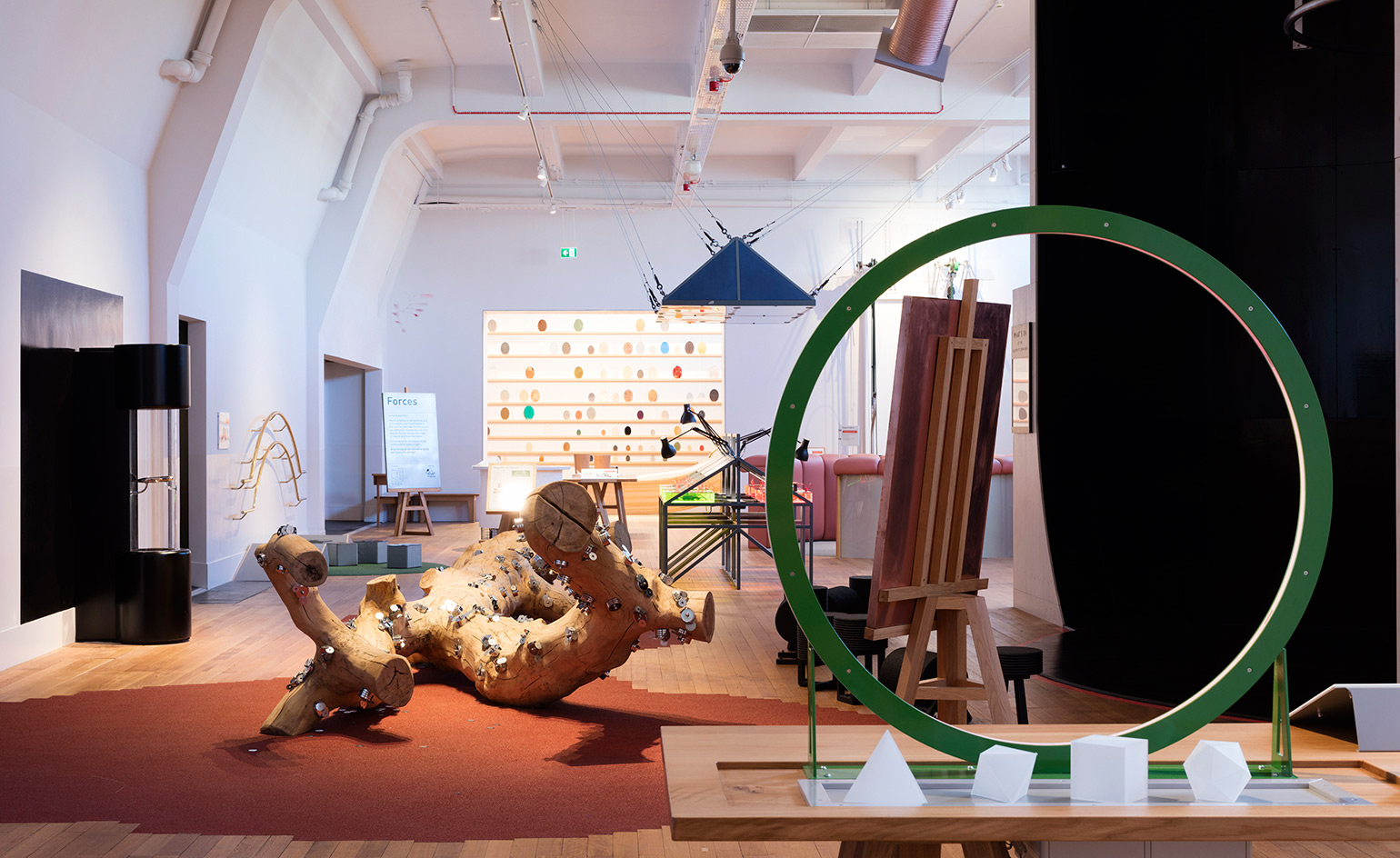
The gallery is designed for school groups, providing space for exploring, experimenting, gathering and eating
INFORMATION
For more information, visit the Muf Architecture/Art website
ADDRESS
Science Museum Exhibition Road London SW7 2DD
Receive our daily digest of inspiration, escapism and design stories from around the world direct to your inbox.
Harriet Thorpe is a writer, journalist and editor covering architecture, design and culture, with particular interest in sustainability, 20th-century architecture and community. After studying History of Art at the School of Oriental and African Studies (SOAS) and Journalism at City University in London, she developed her interest in architecture working at Wallpaper* magazine and today contributes to Wallpaper*, The World of Interiors and Icon magazine, amongst other titles. She is author of The Sustainable City (2022, Hoxton Mini Press), a book about sustainable architecture in London, and the Modern Cambridge Map (2023, Blue Crow Media), a map of 20th-century architecture in Cambridge, the city where she grew up.