Line of work: we visit Thonik's stripy Amsterdam headquarters
Graphic design studio thonik unveils its new, custom-made office building in Amsterdam, having collaborated in its design with MMX Architects
Ossip - Photography
Receive our daily digest of inspiration, escapism and design stories from around the world direct to your inbox.
You are now subscribed
Your newsletter sign-up was successful
Want to add more newsletters?
When Amsterdam-based graphic design collective thonik embarked on the project to build a new HQ, they never thought the process would take 12 long and arduous years. ‘Designing and building your own workspace is still an experimental alternative in our current economic system,' say the practice’s founding duo, Thomas Widdershoven and Nikki Gonnissen. ‘Because the system is full of rules and regulations designed to prevent that sort of experimentation.' The more challenging it became however, the more thonik pushed, managing to lease a plot of land from the city and learning how to operate within a tangled web of municipal and national rules, regulations and constraints and how to negotiate with multiple institutions and experts.
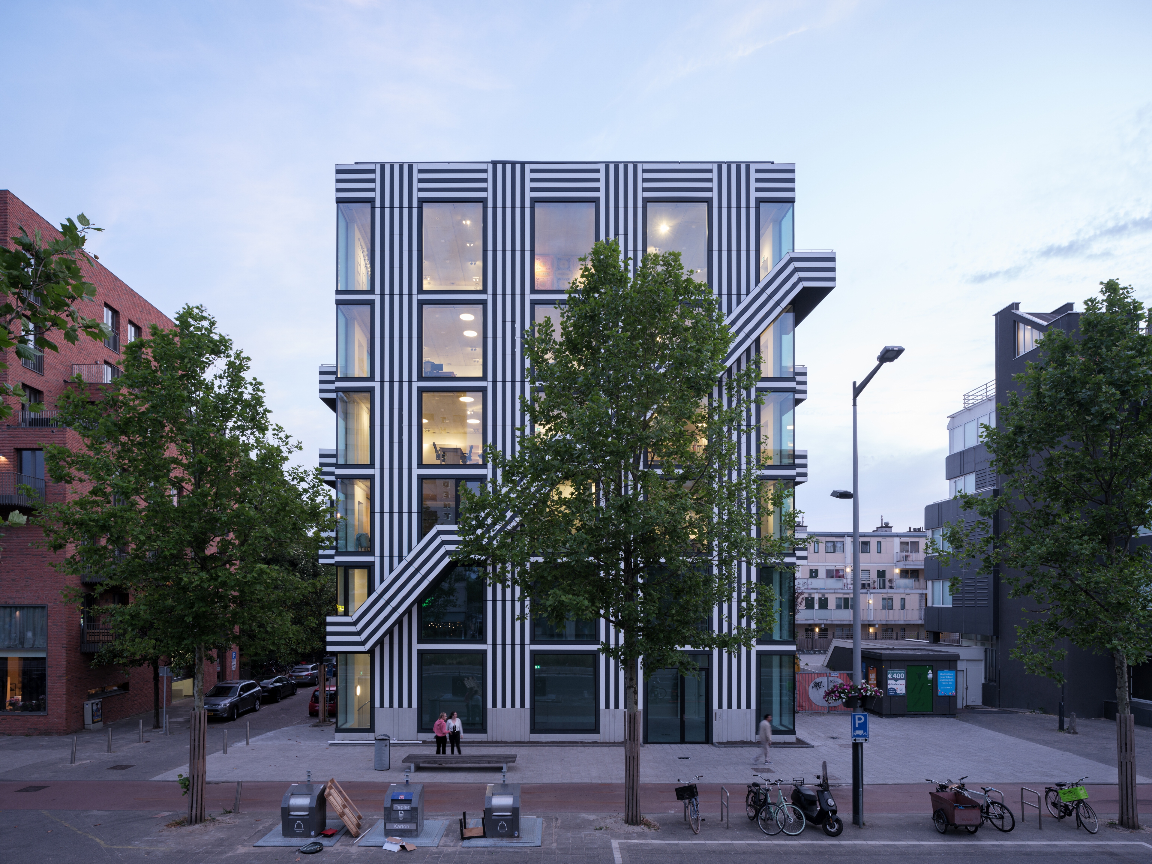
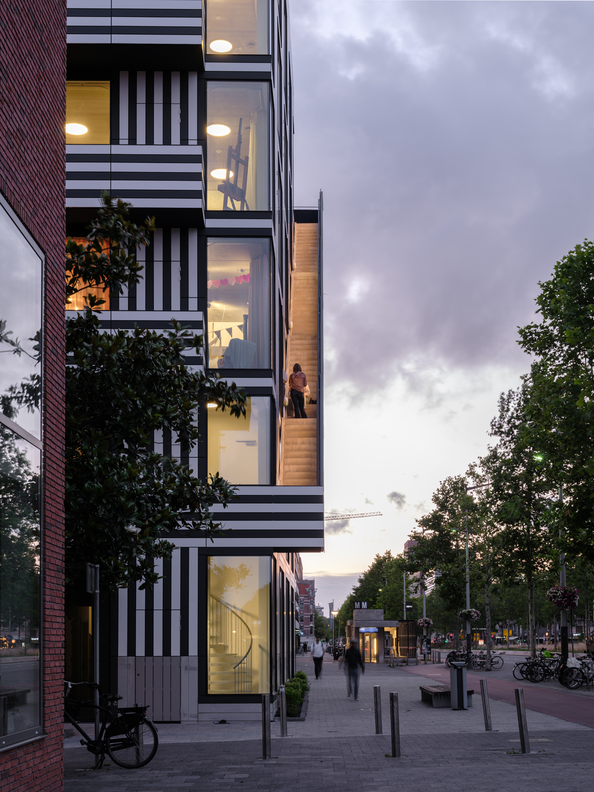
The long-awaited result is a highly graphic six storey building on the city centre’s only post-war urban boulevard – the Wibautstraat – designed by Widdershoven in collaboration with Arjan van Ruyven of Amsterdam-based MMX Architects. Three floors are dedicated to the practice, two to a high-end Omakase restaurant and sake bar that draws you in at ground floor level, and the top floor (and rooftop) is soon to become an events and discussion space.
The most striking thing about the building is the combination of floor-to-ceiling windows that bring the city in and the interiors out, and the façade's stripes – the effect is dazzling and far from subtle, but it’s also radical in its simplicity and highly detailed and elegant in its execution. That the lines on the facade reference the tri-linear striped Mexcellent font designed for the 1968 Olympic Games in Mexico is an extra playful flourish that characterises the project and the people behind it.
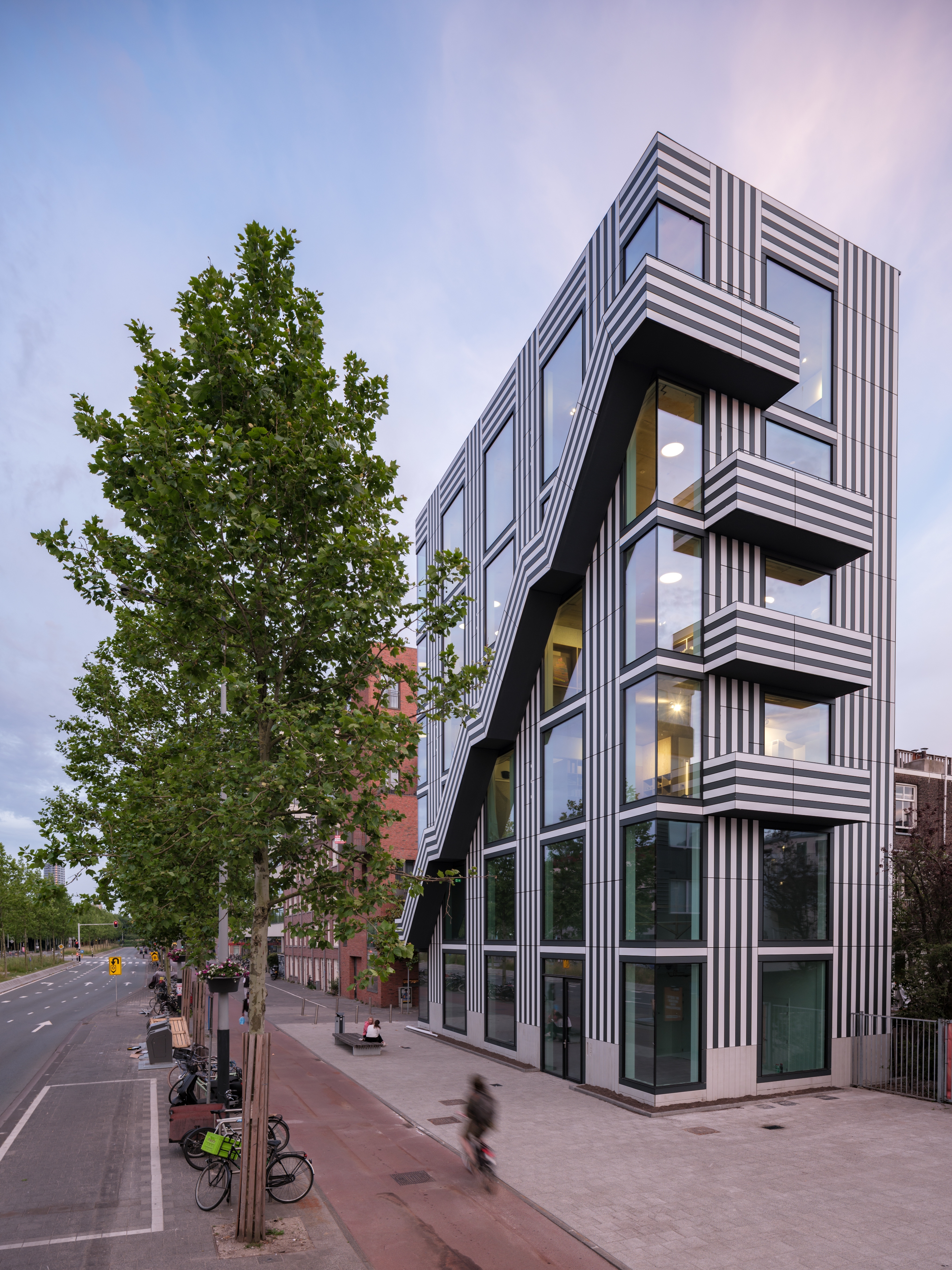
For the bold but refined exterior thonik turned to Trespa, a high-pressure compact laminate made in the south-east of the Netherlands. The practice frequently uses it in graphic design projects (it has a dark core that is useful to create signs and lettering when you mill off the top layer) and it is commonly used in social housing and renovations in the Netherlands because it is sturdy, easy to apply and extremely durable. Here, they used slats of the brand’s Meteon Lumen range in a deep matt grey and slightly off-white and their rich and textured appearance help to create the building’s defined, somewhat cartoonish, alluring aesthetic.
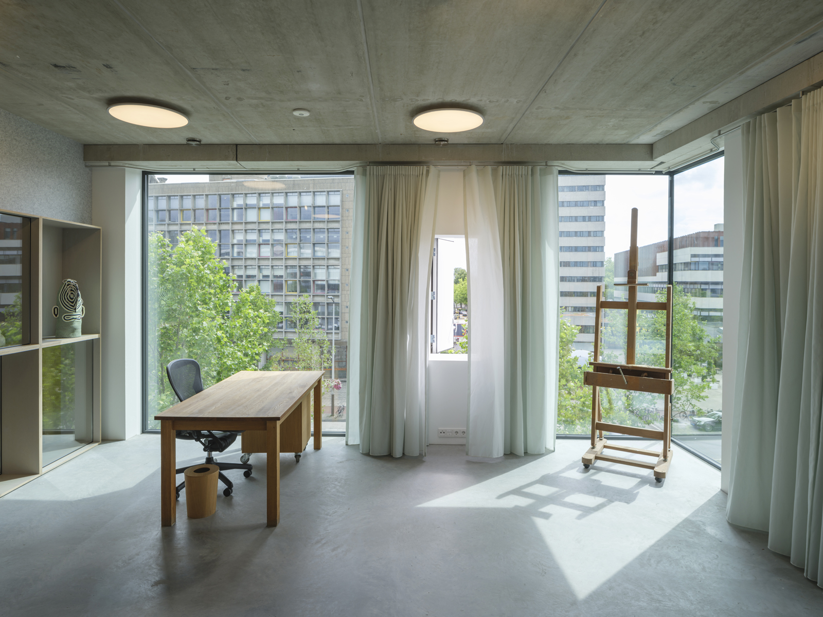
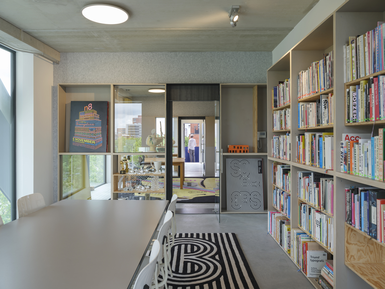
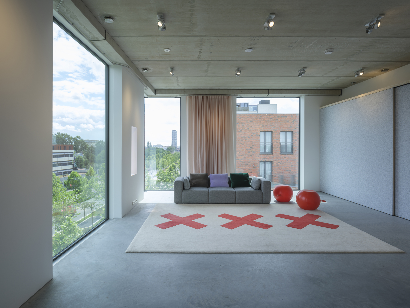
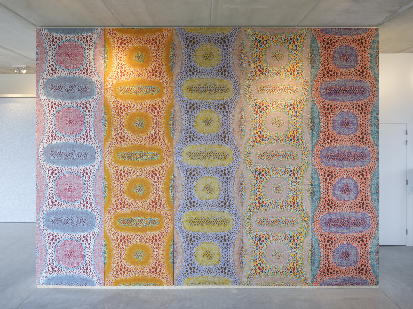
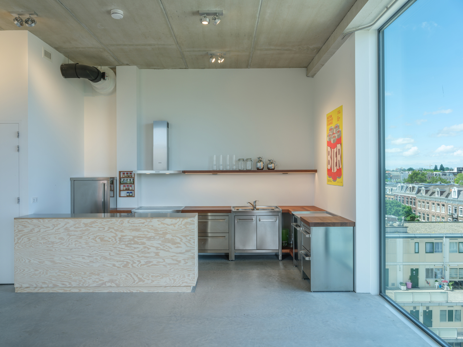
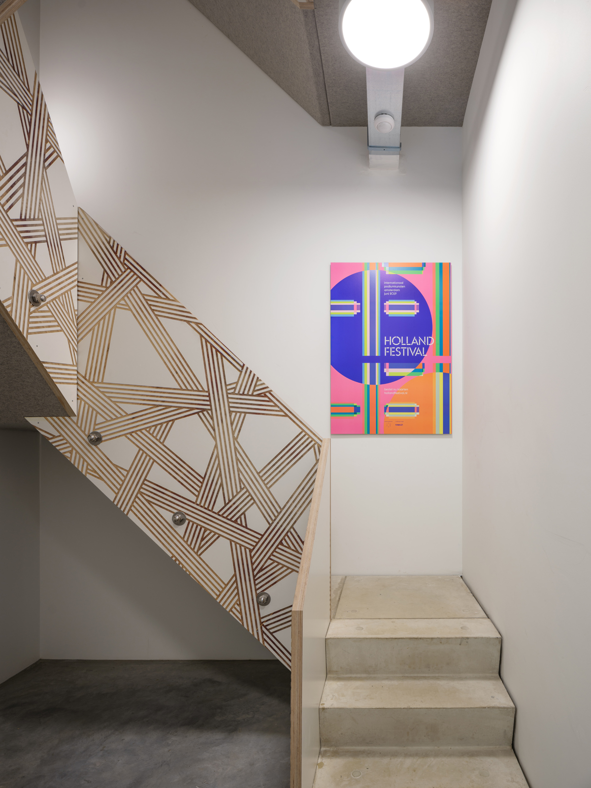
Inside the building, the approach is no less unconventional. Raw concrete ceilings and floors and painted concrete walls contrast with softer elements such as floor-length curtains, large graphic carpets (designed by thonik and featuring motifs taken from past projects) and an acoustic wall wrapped in a wax-printed fabric by Dutch company Vlisco. For the interior Gonnissen and Widdershoven enlisted a plethora of Dutch designers and brands such as Hans Lensvelt, Bart Guldemond, Simone Post and Bas van Tol; the pattern of intermingling geometric lines on the internal staircase was conceived by Dutch design collective Envisions.
Ultimately thonik hopes their new HQ can provide a blueprint for a new mode of production, a more flexible approach to zoning (Widdershoven went to the ‘highest court in the land’ to ensure the building could have multiple uses in the future, office and residential in the upper floors, and hospitality or retail on the two bottom floors) and a future prototype for self-builds by creatives who want to stay in expensive inner cities. ‘The creative sector almost never owns the spaces it works in as almost all of them are owned by big corporations,' explains Gonnissen. ‘If the cultural sector could create its own spaces the quality of the architecture and buildings would almost certainly go up and the sector would become stronger economically and more robust.'
INFORMATION
Receive our daily digest of inspiration, escapism and design stories from around the world direct to your inbox.
Giovanna Dunmall is a freelance journalist based in London and West Wales who writes about architecture, culture, travel and design for international publications including The National, Wallpaper*, Azure, Detail, Damn, Conde Nast Traveller, AD India, Interior Design, Design Anthology and others. She also does editing, translation and copy writing work for architecture practices, design brands and cultural organisations.