Production values: 3 companies reinventing the modern working space

Receive our daily digest of inspiration, escapism and design stories from around the world direct to your inbox.
You are now subscribed
Your newsletter sign-up was successful
Want to add more newsletters?
The world of manufacturing has always been a hotbed for innovation and experimentation, often veering towards extremes, from the industrial revolution’s steampunk mess and hierarchical layouts, to modernism’s clinical tidiness and utopian dreams. In contrast, today’s factory is a much more elegant, informal and welcoming affair. Open and egalitarian, the 21st-century production facility promotes interaction and conviviality for its staff, but also invites the outside world in. Heralding a new architecture for the genre, here are three companies reinventing the way we approach, design and experience the modern making space.
Swarovski, Austria
Architects: Snøhetta
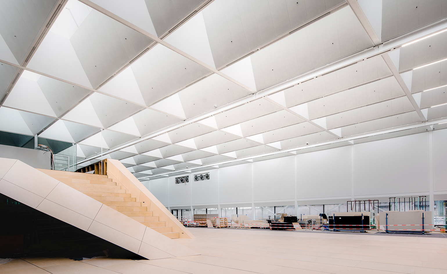
The new building is linked to Campus 311 by a footbridge. Inside, an innovative open-ceiling structure floods the space with natural light, and features lighting design by Sally Storey.
A busy, efficient factory can be an extraordinary thing to experience. More than a production facility, it can be a production in its own right; a choreographed dance between man and machine on constant repeat. This has never been more apparent than at Snøhetta’s extraordinary new building for Swarovski in Wattens. Here, high in the Austrian Alps, the manufacture of all the crystal conglomerate’s products will now be prominently on display in a vast, open space, which is more cultural destination than dark industrial park.
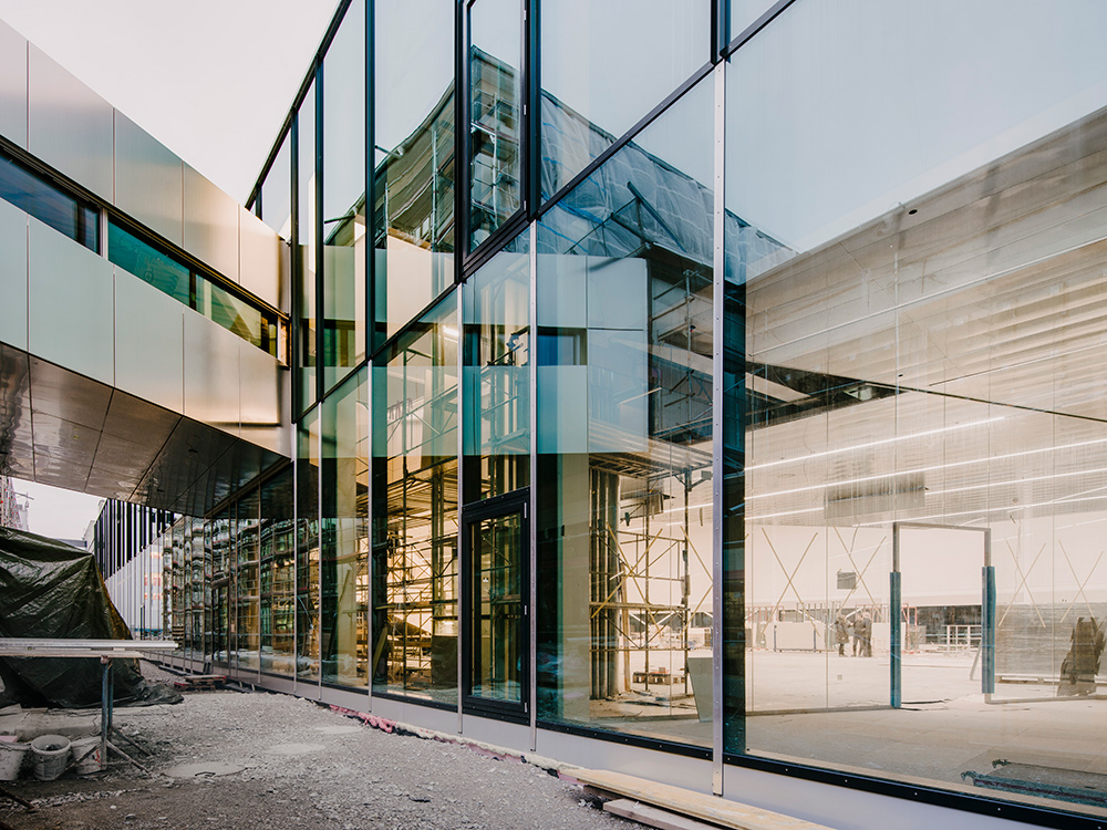
The Manufaktur building, which will officially open this spring, will include product showrooms, prototyping machinery and meeting spaces. Part of a €100m investment by Swarovski into a scheme to transform its manufacturing procedures and client relationships, it is one of three key new or revamped buildings. Campus 311, a former crystal-cutting factory, is being transformed into the new product development and innovation centre; while Focus Factory 2.0 is a new crystal-cutting centre that brings the entire production process under one roof.
With its sweeping central staircase, a Snøhetta hallmark, suspended floors and angular viewing platforms, the Manufaktur building has been designed in a way that will encourage its occupants to expand their view both literally and philosophically. Flooded with natural light, thanks to its innovative open-ceiling structure, and with expansive floors housing much of the machinery, the space is energising and elegant – a long way from the traditional industrial shop floor.
The vision, according to the Swarovski Group chairman Markus Langes-Swarovski, was to design the crystal workshop of the future. ‘The Manufaktur is a totally new typology,’ he says. ‘It’s a manufacturing facility, a showroom, a co-working space, a cathedral. Not because it’s a place of worship, but because when you’re in that building, it has a scale which I think creates a lot of humbleness in relation to the body, and yet, also, intimacy.’
The brief for the building, which is linked by a new footbridge to Campus 311, was to create a customer collaboration and co-creation centre that will see Swarovski’s clients, including major fashion houses, work directly with the product development teams. It fell naturally to long-time collaborator Snøhetta. The architecture practice, best known for the Oslo Opera House and Egypt’s Bibliotheca Alexandrina, also designed Swarovski’s Kristallwelten, a tourist destination that has become one of Austria’s most popular attractions since it opened in 1995.
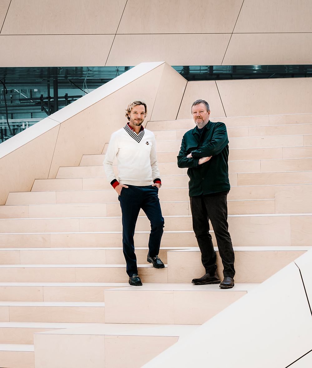
Langes-Swarovski and Trædal Thorsen on the Manufaktur staircase. Looking to expansion, Swarovski will invest €100m in three key new buildings at its Wattens Base by 2020.
Kjetil Trædal Thorsen, Snøhetta founding partner, is passionate about the new project’s potential. ‘It really is setting a new standard for inclusive fabrication facilities,’ he says. ‘Bringing clients, designers, artists, researchers, machine operators, technicians and the public under one roof is going to change how we think about these relationships in the future.’
The new facility will enable Swarovski to fast-track product development and collaboration with clients, allowing them to come up with product concepts and deliver them in a quarter of the time it would have taken in the past. ‘It’s a very holistic A-Z set-up, where people can see what happens in other departments,’ explains Langes-Swarovski. Considering it is a factory, it is indeed a surprisingly human-centric space. ‘We are not trying to use humans as machines. Machines can do that job much better now. So we wanted to build a context in which the human can become human again.’ The open design of the building will allow a ‘much higher hit rate for coincidences’, says Langes-Swarovski. ‘The architecture is forcing this kind of collaboration more than before. I’m really excited about what kind of things will happen in there.’
It is possible that in the not too distant future, the campus will become a stage for productions of an altogether different sort, engaging not just local but wider communities, too. ‘In keeping with gently opening up the company culture, we could think about opening it to the public 50 times per year,’ moots Langes-Swarovski. ‘Just with a small number of people – nothing dramatic.’ As we wait for his plans to crystallise, there’s no doubting Wattens is increasing its cultural clout.
Writer: Henrietta Thompson
Kvadrat, Denmark
Architects: SevilPeach
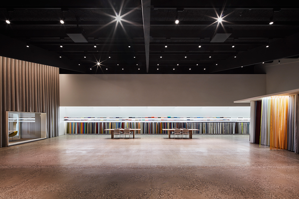
Housed in a former warehouse, the 320 sq m new showroom features a display area large enough to present Kvadrat’s full range of fabrics, the display wall accommodating 60 linear metres of product. The showroom, lined in retractable fabric that also creates a partition across the space, is accessed through a 7m-tall glass curtain wall.
A small flock of Icelandic sheep gambol in a field, dodging artwork embedded in the turf. Hardly the view from most international HQs, but this is the seaside resort of Ebeltoft, Denmark, where Kvadrat has been based since 1968. The company operates from a 1980s Poulsen & Therkildsen-designed home, which has just been updated and extended by London-based architect firm SevilPeach to cope with a spectacular surge in sales – Kvadrat has tripled its revenue over the past seven years, and ships 14.4km of textiles each working day.
SevilPeach has created a visual link between a new showroom space and those staff working on Kvadrat’s future products. ‘We’ve knocked through the walls so that the new product development department has internal windows with vistas of the product,’ explains architect Sevil Peach. ‘It’s an emotional connection.’ In the main red-brick building, she and her team opened up the building to establish connections with the countryside. Desk-based staff are now in bright, airy rooms rather than small offices. And with the demolition of yet another wall, a former office was turned into a library, again with views of the landscape.
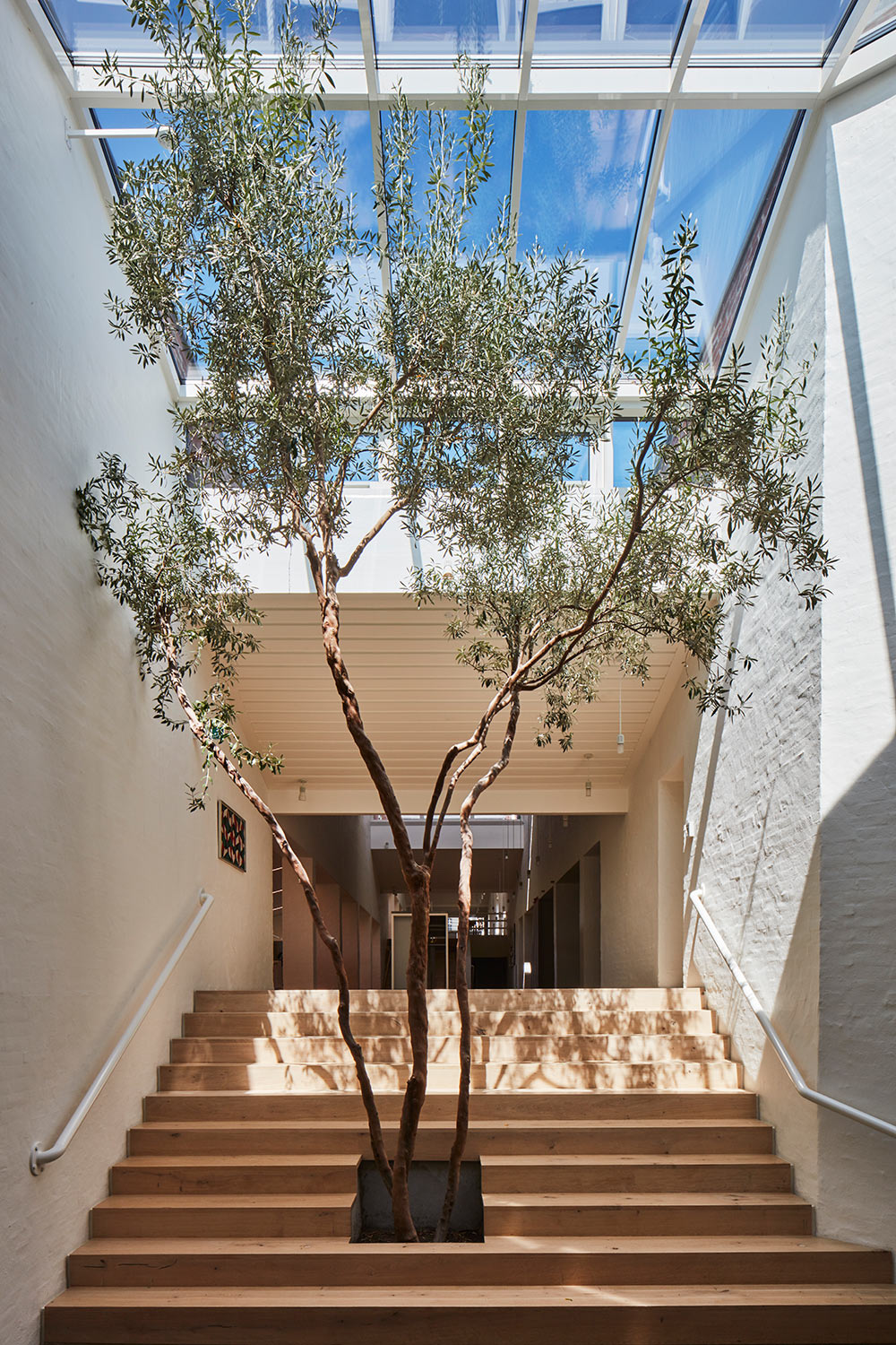
The Dinesen-clad staircase leading to the canteen and communal space, within the 12,000 sq m space.
Peach has also unified the spaces by introducing swathes of colourful textiles, ‘almost like a coloured thread woven through the building’. Fabrics are used for their acoustic properties, draped on an extreme scale on three sides of the room and as 7m-tall doorways. ‘It’s about using textiles as an architectural intervention rather than just decorative,’ she adds.
Kvadrat’s 140 or so staff now have just over 12,000 sq m across the HQ. And as for the sheep, they have direct access to installations by landscape architect Günther Vogt, and artists Olafur Eliasson and Roman Signer. So everyone’s happy.
Writer: Clare Dowdy
Receive our daily digest of inspiration, escapism and design stories from around the world direct to your inbox.
Charlie Bigham’s, UK
Arhitects: Feilden Fowles
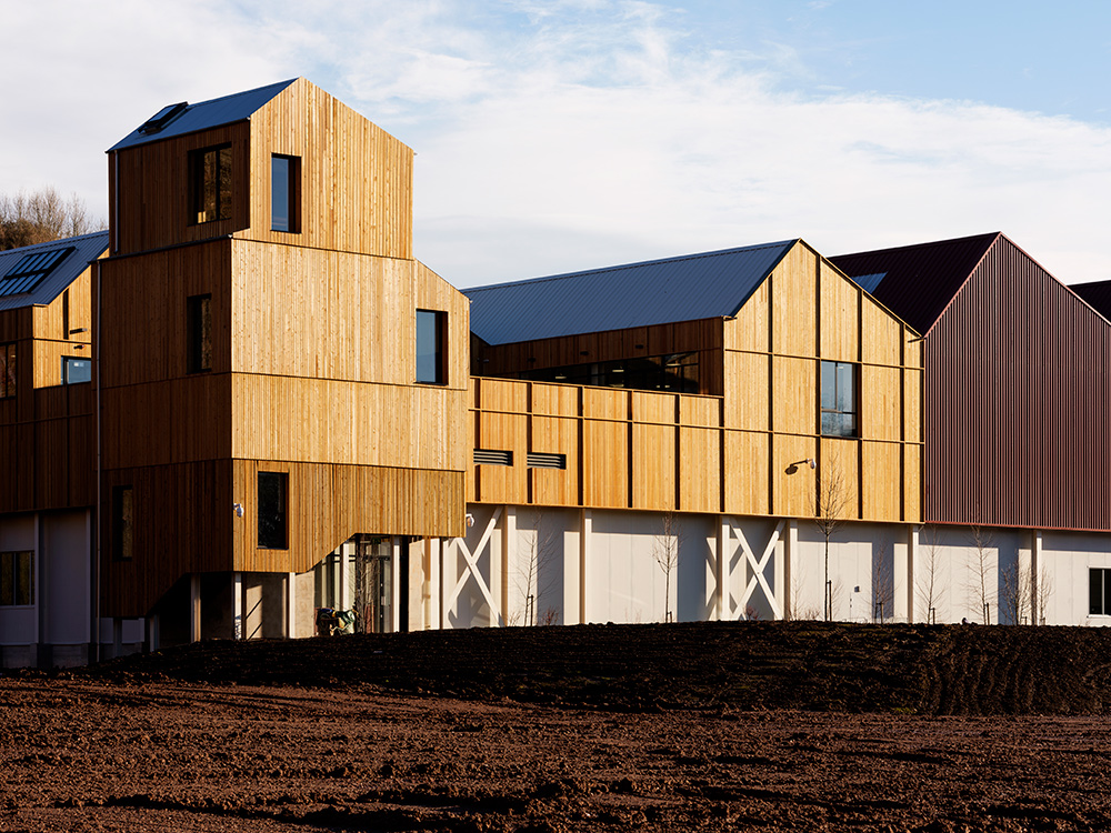
The new 6,500 sq m Charlie Bigham’s West Production Facility is located in a former limestone quarry in Somerset, and is constructed from a steel frame and insulated kingspan panels. The facility is clad in rough-sawn Siberian larch for the office space; grey micro-rib panel for the production space; and red Sinusoidal panels for the plant and storage space. Unusually for such a building, all staff use the same entrance, situated at the foot of a timber-clad tower.
A typical location for a food processing plant is a vast out-of-town industrial estate, but for a company trying to stand out from the ready-meal crowd, an anonymous shed doesn’t cut the mustard. Which is why Charlie Bigham’s, which prides itself on preparing fresh ingredients by hand, took the audacious decision to bring in the architects and build a new home. The brand’s fish pies and chicken tikkas, marketed as the antidote to low-grade convenience food, are now made in a timber-clad, pitched-roofed, light-filled ‘kitchen’ courtesy of young London firm Feilden Fowles.
Charlie Bigham, who founded the business in his own kitchen in 1996, believes that the highest-quality food can only be produced in a high-quality working environment. But rather than extend his existing site on west London’s Park Royal Trading Estate, he has moved part of the business to a disused limestone quarry near his Somerset home. Here, Feilden Fowles’ £21m building has a backdrop of 50m-tall cliff walls of iron-rich stone, and shares the 18-acre site with peregrine falcons and great crested newts.
‘We wanted to get away from the standardised shed, which is low-ceilinged and windowless,’ explains project architect Elli Farrant. Instead, the firm turned to typical quarry vernacular, and found inspiration in Bernd and Hilla Becher’s iconic images of industrial buildings. Bigham wanted to foster a collaborative, non-hierarchical dynamic between the office and production staff. So Feilden Fowles set out to create a 6,500 sq m structure on a human scale and to make it as good a place to work as possible. Hence the asymmetric pitched roof line, with north-facing roof openings that let natural light into the building.
That structure means the ground-floor production facilities have 5m-high ceilings, a good 2m higher than those in standard sheds. Feilden Fowles’ involvement took the architects right on to the production floor, to make the flow of goods ‘as linear and efficient as possible’, with storage, cooking, assembling, chilling and dispatch all positioned in their logical order.
Instead of being located on the mezzanine, the open-plan office space overlooks the nearby quarry wall. That means suited staff are not peering down on to the shop floor through glass walls. Rather, the mezzanine houses a light-filled canteen, used by all. At the centre of the plan is the development kitchen, where Bigham concocts new recipes.
At the macro scale, the architects have considered the whole campus layout, grouping the buildings on the southern edge of the plot to leave the northern edge and its ecosystem in peace. The intention is to encourage yet more wildlife by eventually adding lagoons. Also on the drawing board are another two kitchens, a dispatch centre, visitors’ centre, pavilions in the landscape for the eventual 1,000 employees to take their lunch breaks, and a Bigham’s Academy.
‘To be a long-term business, you need to retain the best people, and to do that you need to create the best possible working environment,’ says Bigham. ‘For us, that’s about making a bit of a statement with our environment. And that means good architecture and a uniform you are proud to put on.’ Long-term for the founder means 20 years, a timescale he can work to, as the business owns the site. Gratifyingly, Feilden Fowles has also taken the long view. Hence the building’s rough-sawn Siberian larch timber exterior, which will take on a silver hue over time.
Writer: Clare Dowdy
INFORMATION
For more information, visit the Swarovski website;
the Snøhetta website;
the SevilPeach website;
the Kvadrat website;
the Feilden Fowles website;
the Charlie Bigham website
Ellie Stathaki is the Architecture & Environment Director at Wallpaper*. She trained as an architect at the Aristotle University of Thessaloniki in Greece and studied architectural history at the Bartlett in London. Now an established journalist, she has been a member of the Wallpaper* team since 2006, visiting buildings across the globe and interviewing leading architects such as Tadao Ando and Rem Koolhaas. Ellie has also taken part in judging panels, moderated events, curated shows and contributed in books, such as The Contemporary House (Thames & Hudson, 2018), Glenn Sestig Architecture Diary (2020) and House London (2022).
