Toranomon Hills Station by OMA adds dynamism to the Tokyo skyline
Toranomon Hills Station is OMA's first tower in Tokyo - as well as a project expanding and evolving the high rise typology
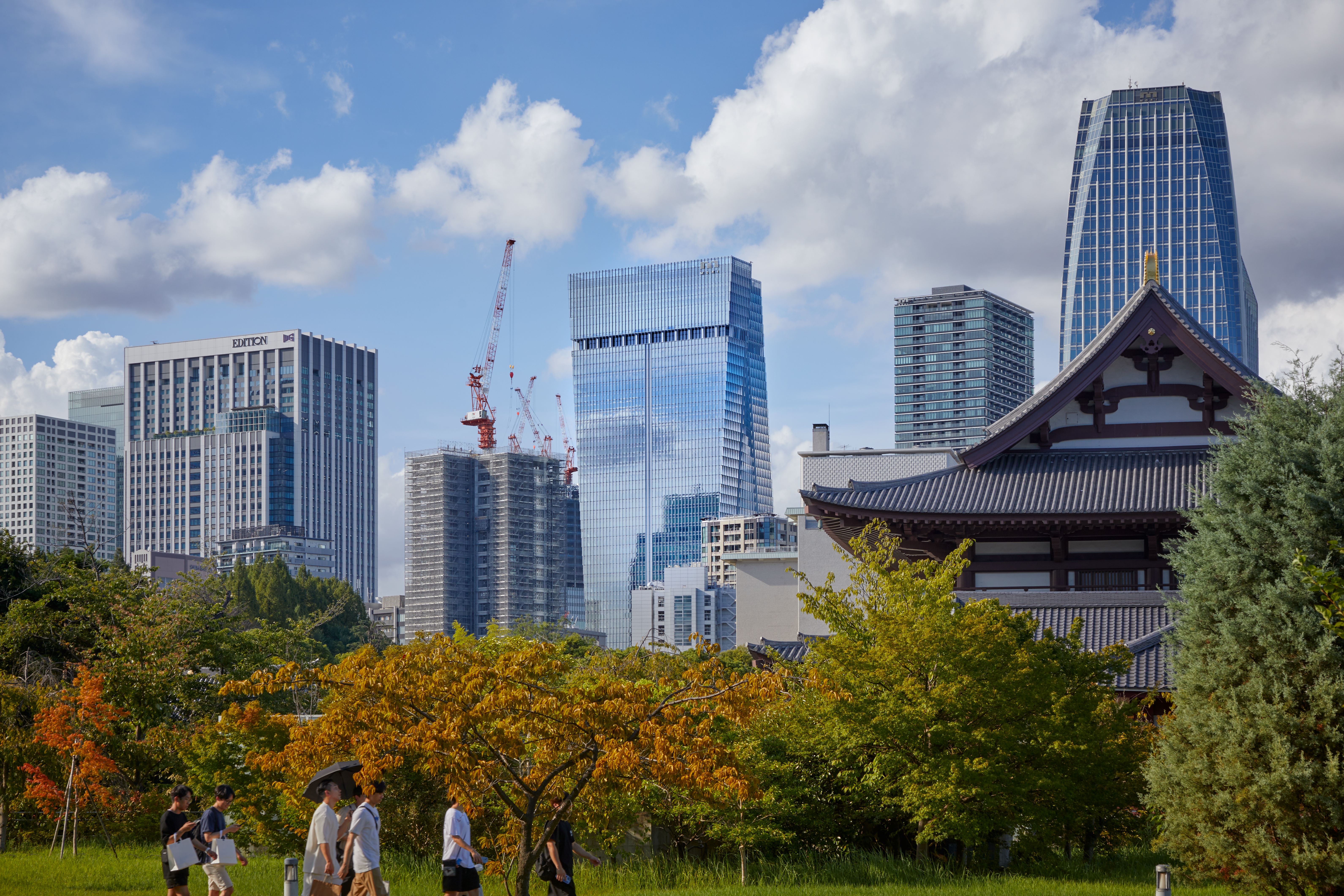
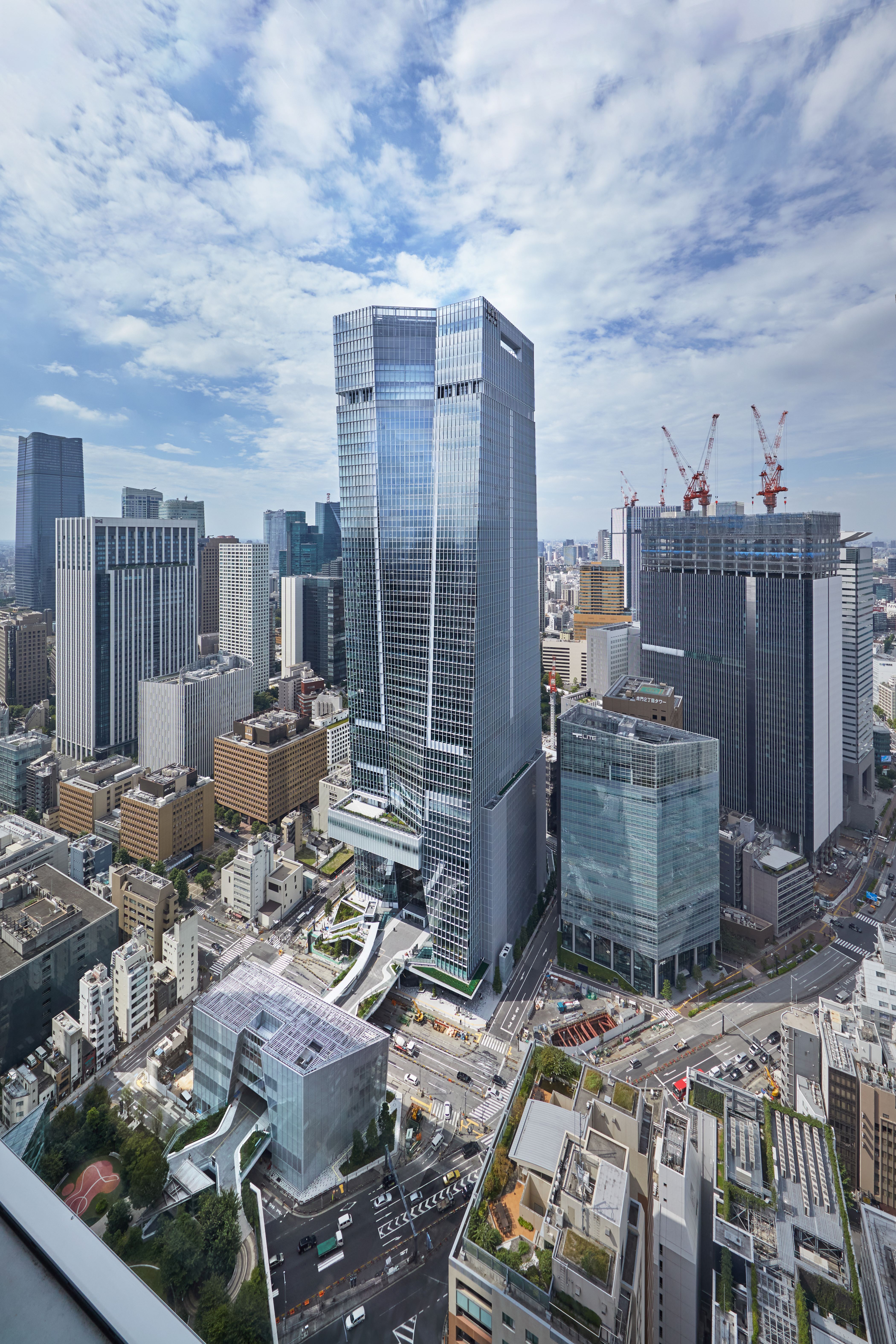
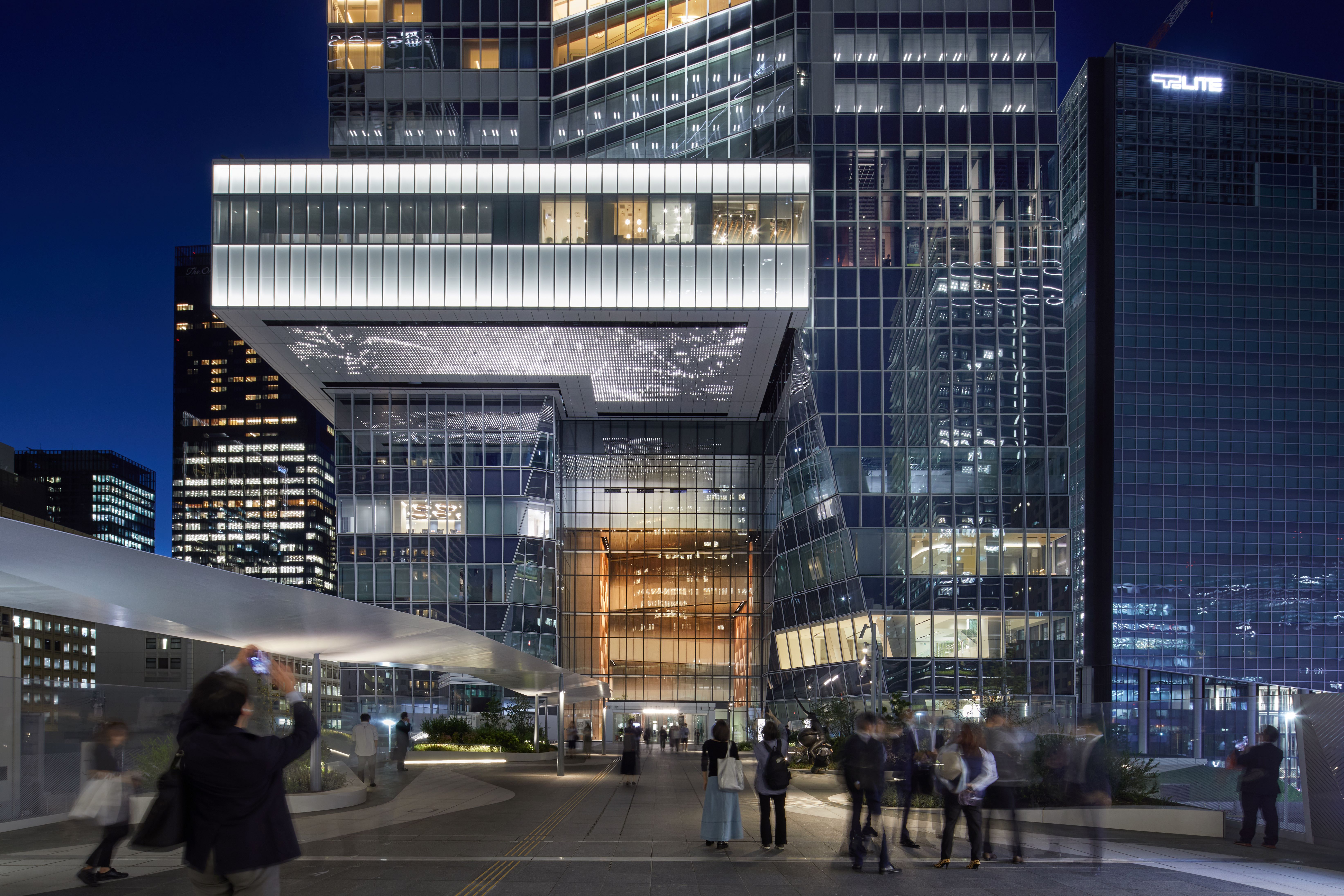
Toranomon Hills Station is not a typical skyscraper formula. Instead of a rectangular tower, picture two parallel trapezoid slabs, one inverted 180 degrees, with a connective band between the two – resulting in a playfully twisted façade of glass and steel rising into the skies.
This unique structural form, with its tapering edges and softly warped central panels, underpins the identity of the design, the latest skyscraper by Mori Building to join Tokyo’s light-reflecting sea of towers.
Tokyo's Toranomon Hills Station by OMA
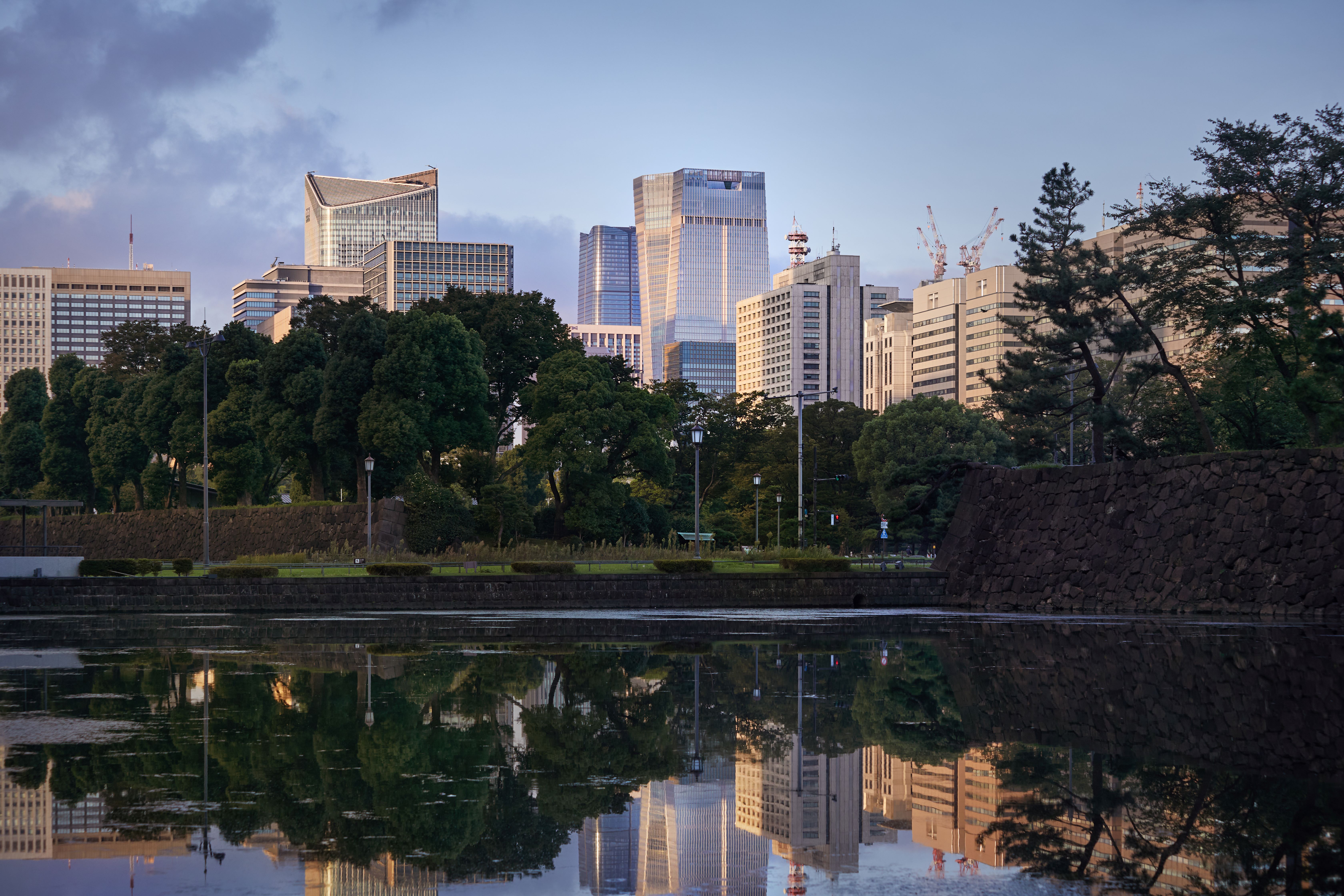
Rising 266-metres high, it’s the first skyscraper in Japan designed by architecture studio OMA and joins an expanding constellation of towers in the Toranomon district, an emerging business, cultural and transport hub.
In an interview on the eighth floor, Shohei Shigematsu, its designer and partner at OMA New York Office, tells Wallpaper*: 'I always thought that the skyscraper looks exactly the same from different angles. I thought that ours could look different or look dynamic, within its context.'
Its context is key: it sits between two other major Mori Building developments - Toranomon Hills and Ark Hills - at the terminus of Shintora-dori, a newly configured axial street that flows from the city centre to Tokyo Bay.
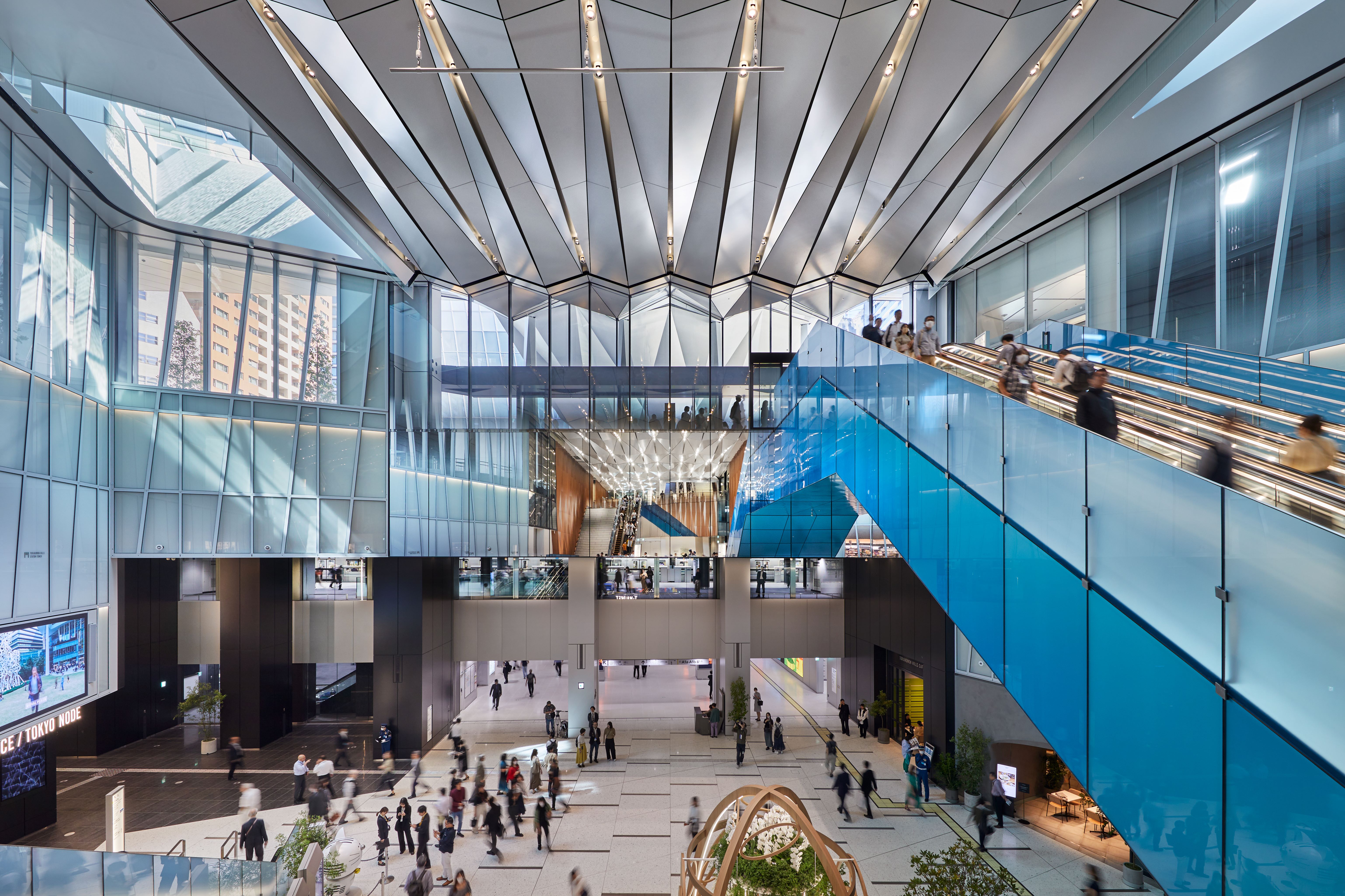
The new multi-use skyscraper – OMA’s largest Japan project – spans 49 levels above ground and four below, complete with a light-flooded four-storey atrium and its very own new Tokyo Metro station, Toranomon Hills (the first stop to be added to the Hibiya line in 56 years).
There are also 30 levels of office space, each with identical footage, despite the twisting structural form. There is also an expansive retail atrium, restaurants, a new hotel from Unbound Collection by Hyatt, with interiors by Space Copenhagen (opening in December), plus, at its apex, Tokyo Node, a major culture and arts hub.
Wallpaper* Newsletter
Receive our daily digest of inspiration, escapism and design stories from around the world direct to your inbox.
Highlighting the sensitive balance between standing out and harmonising with an already tower-packed setting, Shigematsu says: 'One side is tapering down, the other side is flipped – so it looks different from different angles. For me, that’s a feature that doesn’t really exist in the city.'
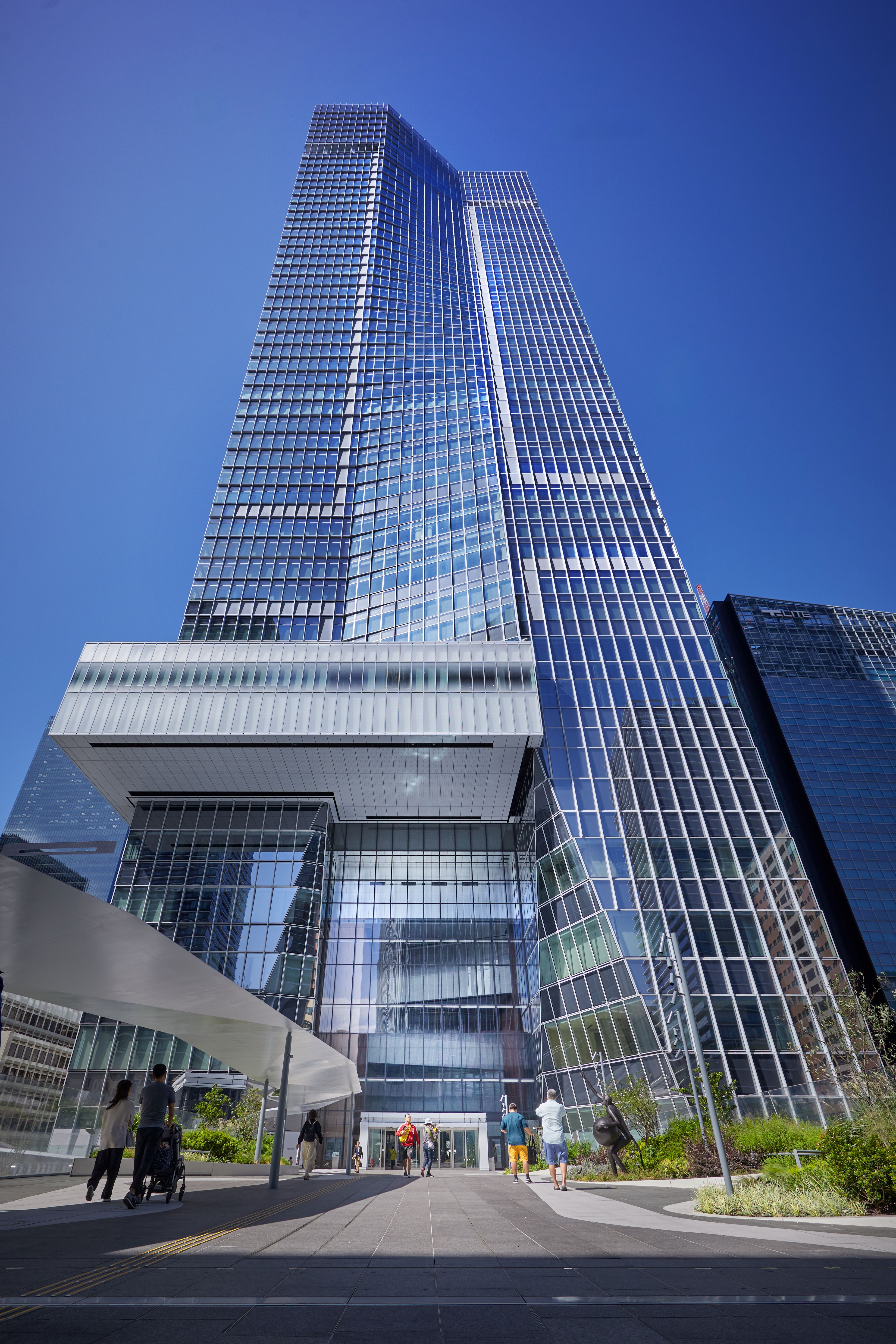
'I actually like the fact that it looks kind of normal at first glance from far away. But when you are here and experiencing it, it’s very different. We didn’t want to stand out for the sake of it. Also, we had to think of the towers that already existed. […] I wanted to design a tower that really thinks of its relationship to other towers – not a freestanding, selfish tower, but more a tower that thinks of the others around it.'
Innovation underpins its dynamic form. Two trapezoid side slabs – one north, one south – are tilted at 3.6 degrees, with a seemingly twisted central band flowing between the two, its sweeps of glass panes contained in a geometric grid of steel frames.
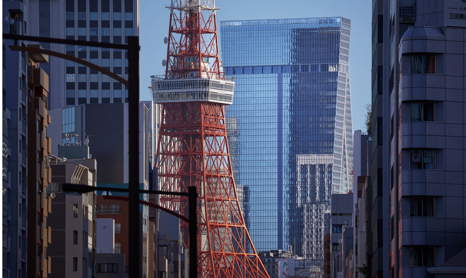
'It was about creating a relationship between the two bars which are opposite each other – consequently we connect them – and that creates a dynamic warping,' says Shigematsu. 'We often like slightly edgy faceted look in our design.'
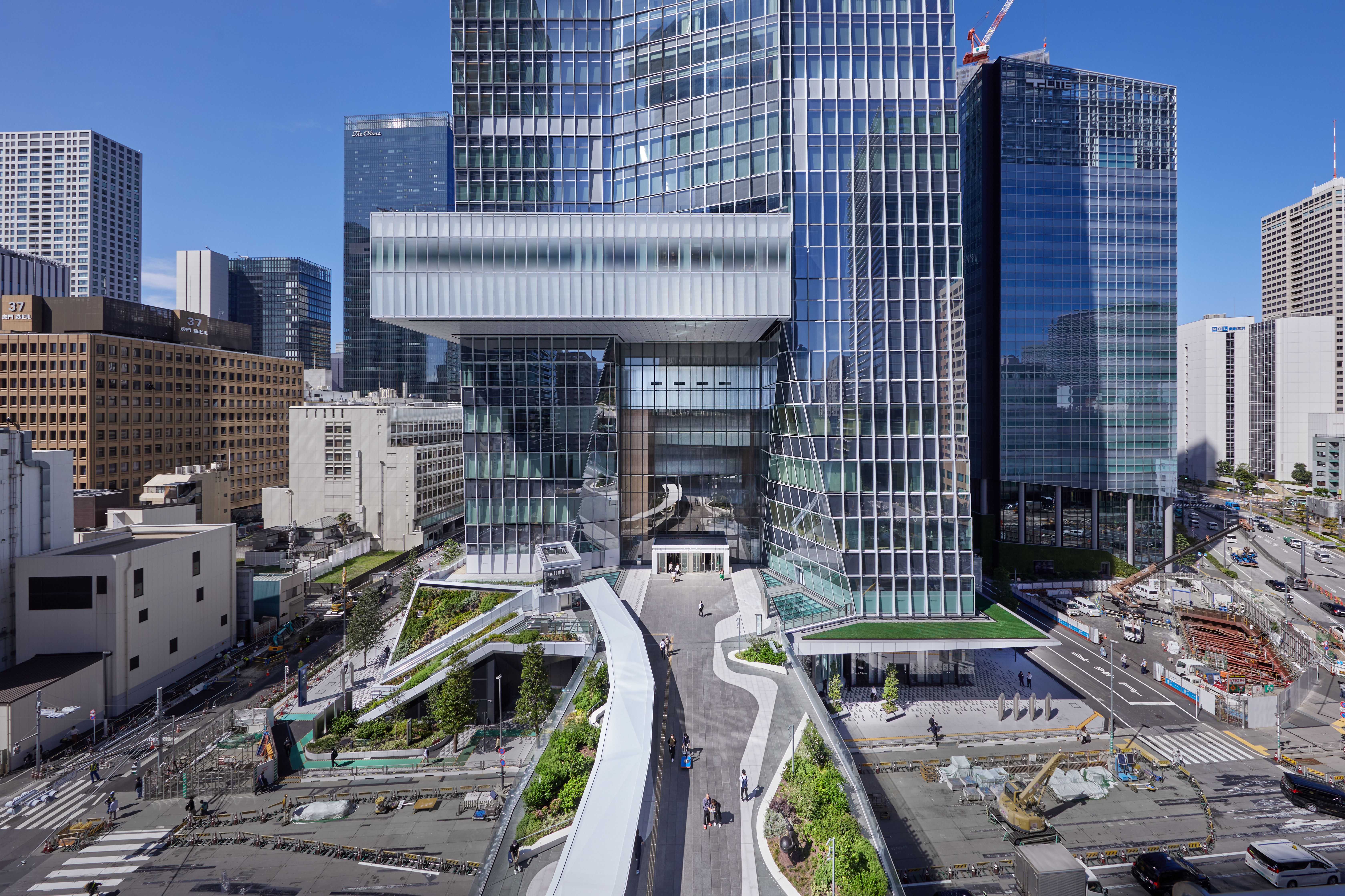
In another signature touch, the skyscraper’s core is lifted and split at its base, fluidly drawing the public inwards, while T-Deck, a 20m-wide pedestrian bridge, hovers above street level, connecting the new tower to Glass Rock, a new four-level retail hub with an angular cold-bent glass facade, which then flows into the adjacent Toranomon Hills complex.
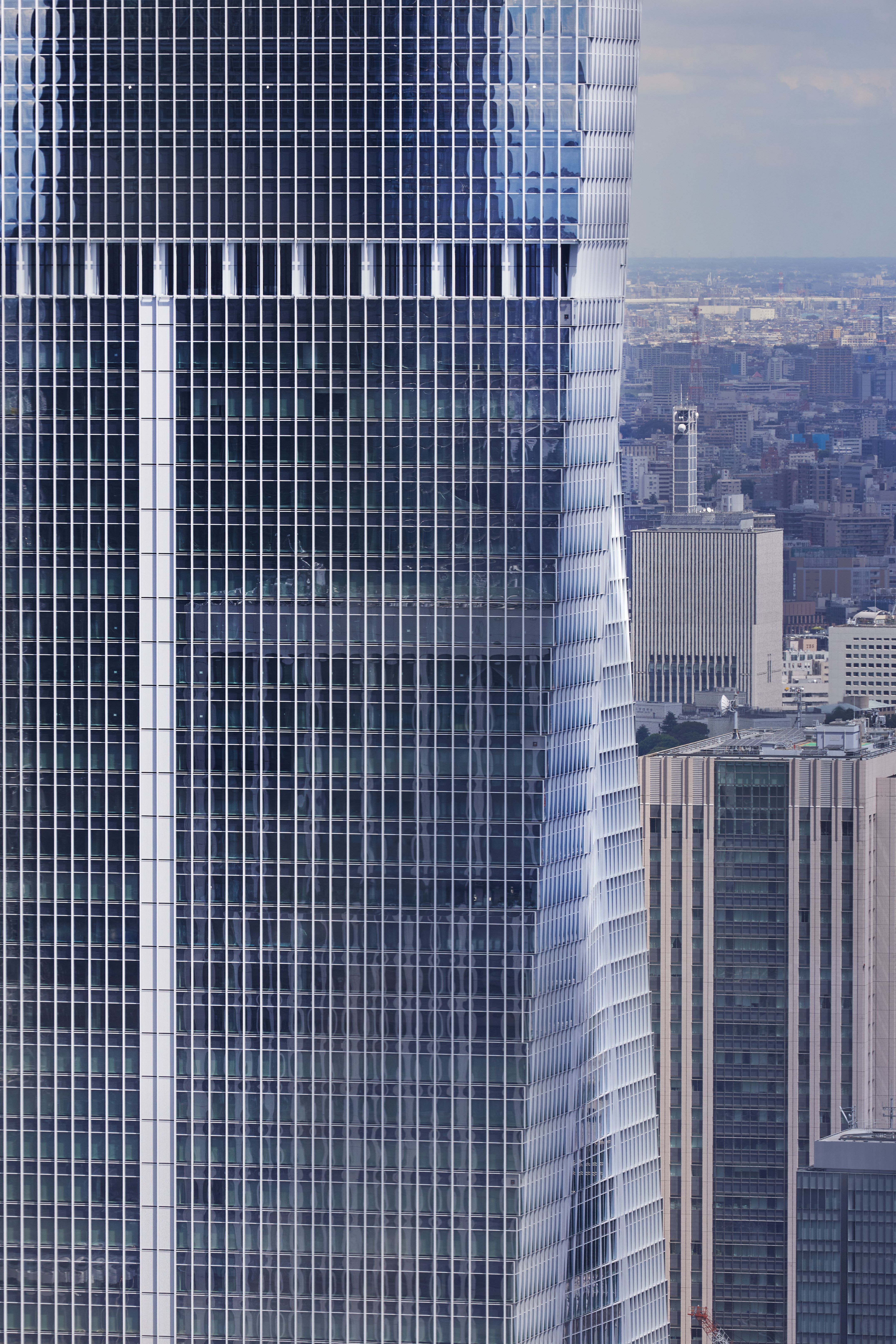
Inside, its levels are interconnected by a series of elevators that slowly gradate in colour, from blue at the base to red rising up – a warming effect created by OMA in collaboration with Dutch colour artist Sabine Marcelis. A hub of 10 light-flooded lifts-with-a-view also spans one side of the building, wrapped in perforated metal and glass.
Art is another key element – from the ever-changing Leo Villareal LED installation on the entrance façade and Larry Bell’s 'Pinky', a scattering of translucent installations in the Sky Lobby to Tokyo Node, which spans the top six floors.
Tokyo Node is an urban cosmos of culture, with its Lab, restaurants and three galleries, with a head-turning debut installation of futuristic robot-inspired dancers by Rhizomatiks x Elevenplay.
It’s also home to Tokyo Node Hall, an auditorium, with programmable LED panelled surfaces and 46th floor views across the Imperial Palace; plus Sky Garden with an infinity pool floating 49 levels above the ground.
Balancing the challenges of its vast scale (it spans 2.55 million square feet) was an unusually holistic design approach: 'All the interior public spaces – the atriums, the office lobbies, the Node, all those escalators – we designed everything. We don’t normally do this. […] We even designed the information panels, the kiosks, the lecture counter – it was kind of fun to design the whole building and the details.'
New York-based Shigematsu, who was born in the southern city of Fukuoka and joined OMA in 1998, cites the fact that he has never lived in Tokyo as offering an objective perspective of the Japanese capital and its skyscrapers.
In a city already crowded with tall buildings, Shigematsu is pragmatic about the value of the typology in post-pandemic times, particularly in terms of vacant office spaces and home working - emphasising the need for a flexible approach to function.
'If you limit to commercial office space, then yes, it’s becoming too many,' he says. 'But if you think creatively and actually allocate different scenarios for a tower, then I think that instantly, new possibilities will emerge. I don’t think the tallness or bigness is a bad thing. It’s how people are using it that is limiting. It could be a stack of museums and parks.'
He adds: 'The skyscraper was born only 150 years ago. For me, it’s a typology that can still evolve. I think there is room to evolve. I’m excited to demonstrate that it can evolve. I hope that something like this can set a new standard, so other developers do something even more exciting.'
Danielle Demetriou is a British writer and editor who moved from London to Japan in 2007. She writes about design, architecture and culture (for newspapers, magazines and books) and lives in an old machiya townhouse in Kyoto.
Instagram - @danielleinjapan
-
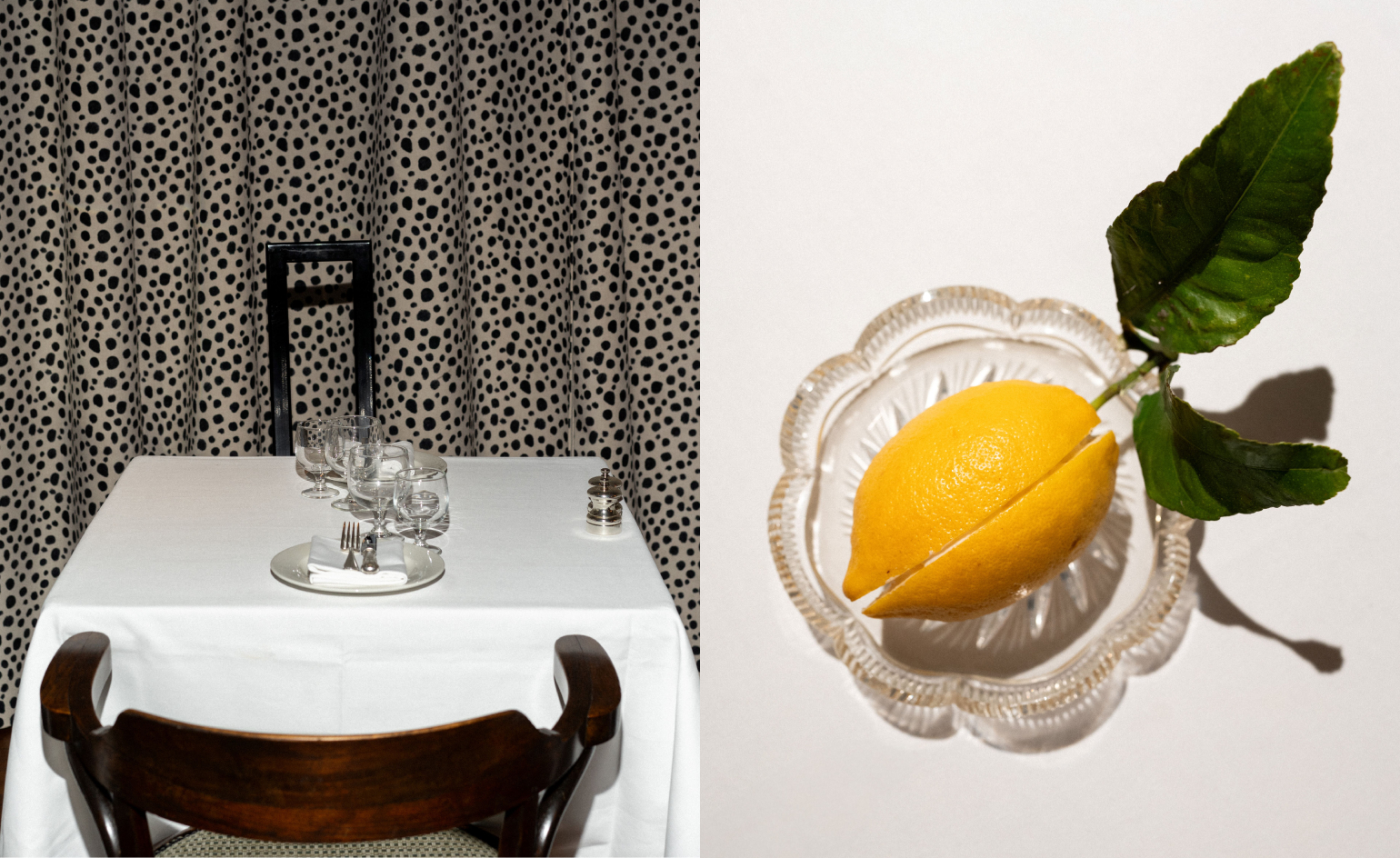 Marylebone restaurant Nina turns up the volume on Italian dining
At Nina, don’t expect a view of the Amalfi Coast. Do expect pasta, leopard print and industrial chic
By Sofia de la Cruz
-
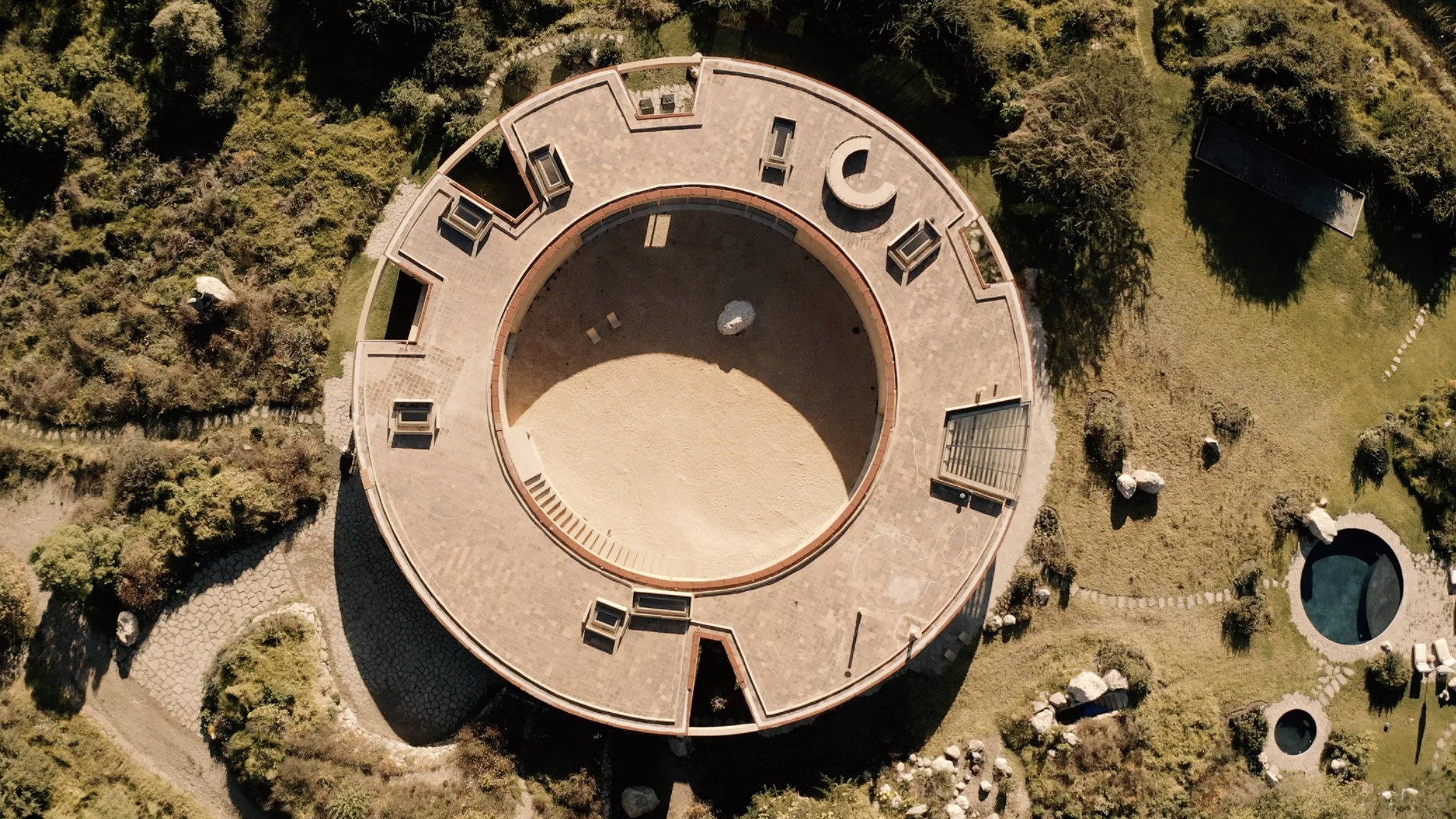 Tour the wonderful homes of ‘Casa Mexicana’, an ode to residential architecture in Mexico
‘Casa Mexicana’ is a new book celebrating the country’s residential architecture, highlighting its influence across the world
By Ellie Stathaki
-
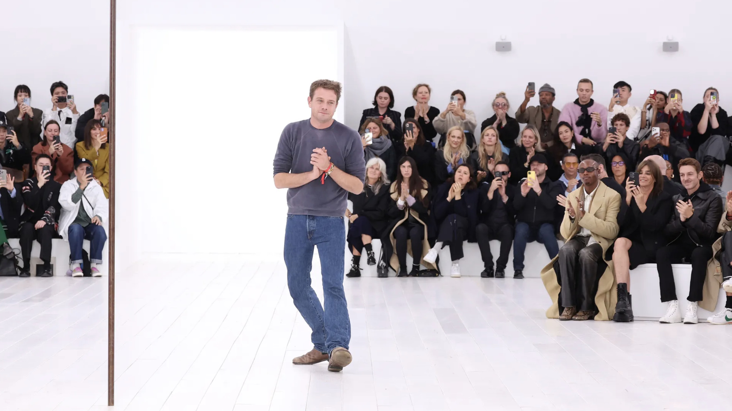 Jonathan Anderson is heading to Dior Men
After months of speculation, it has been confirmed this morning that Jonathan Anderson, who left Loewe earlier this year, is the successor to Kim Jones at Dior Men
By Jack Moss
-
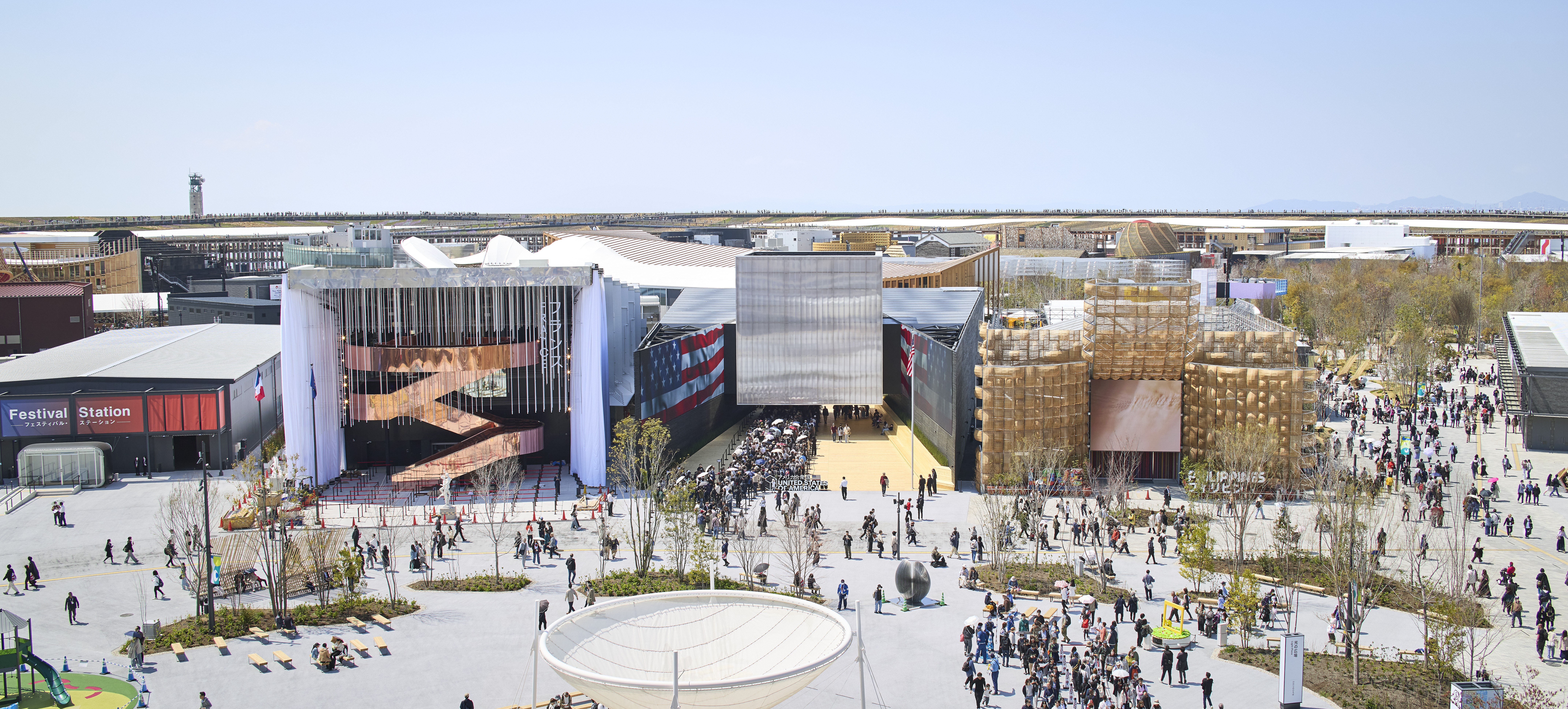 Giant rings! Timber futurism! It’s the Osaka Expo 2025
The Osaka Expo 2025 opens its microcosm of experimental architecture, futuristic innovations and optimistic spirit; welcome to our pick of the global event’s design trends and highlights
By Danielle Demetriou
-
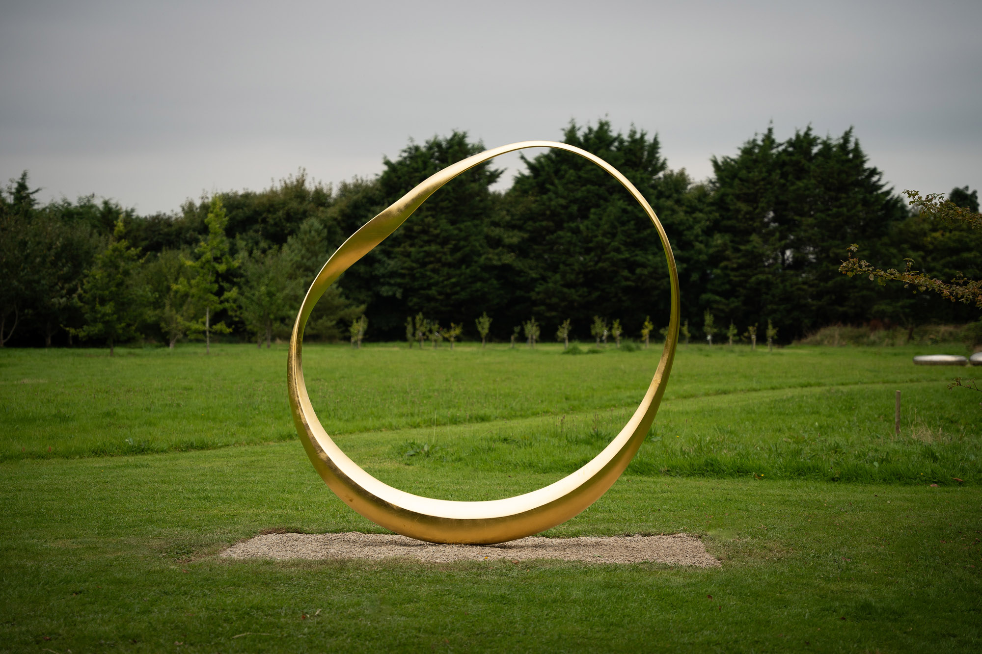 2025 Expo Osaka: Ireland is having a moment in Japan
At 2025 Expo Osaka, a new sculpture for the Irish pavilion brings together two nations for a harmonious dialogue between place and time, material and form
By Danielle Demetriou
-
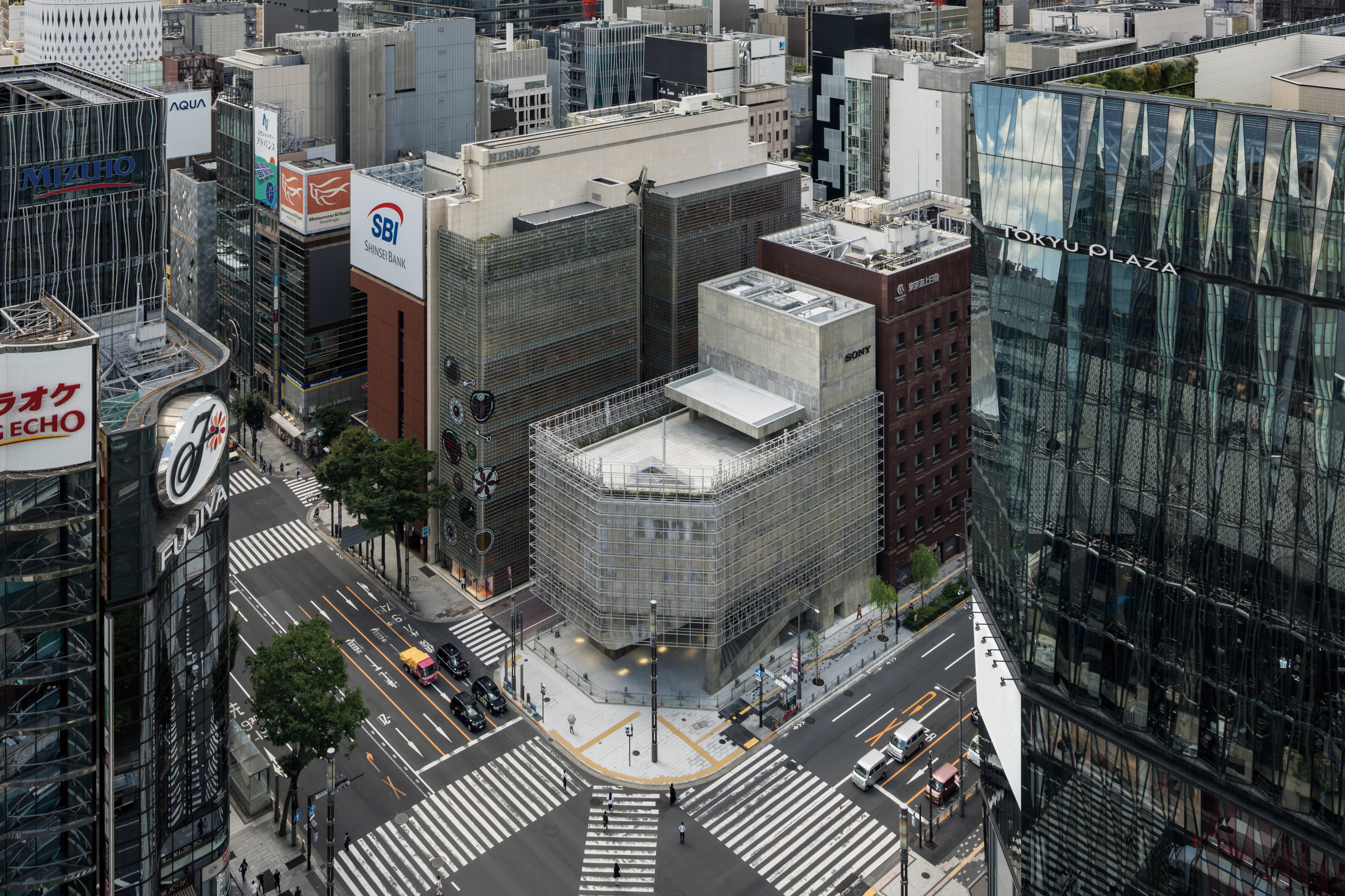 Tour the brutalist Ginza Sony Park, Tokyo's newest urban hub
Ginza Sony Park opens in all its brutalist glory, the tech giant’s new building that is designed to embrace the public, offering exhibitions and freely accessible space
By Jens H Jensen
-
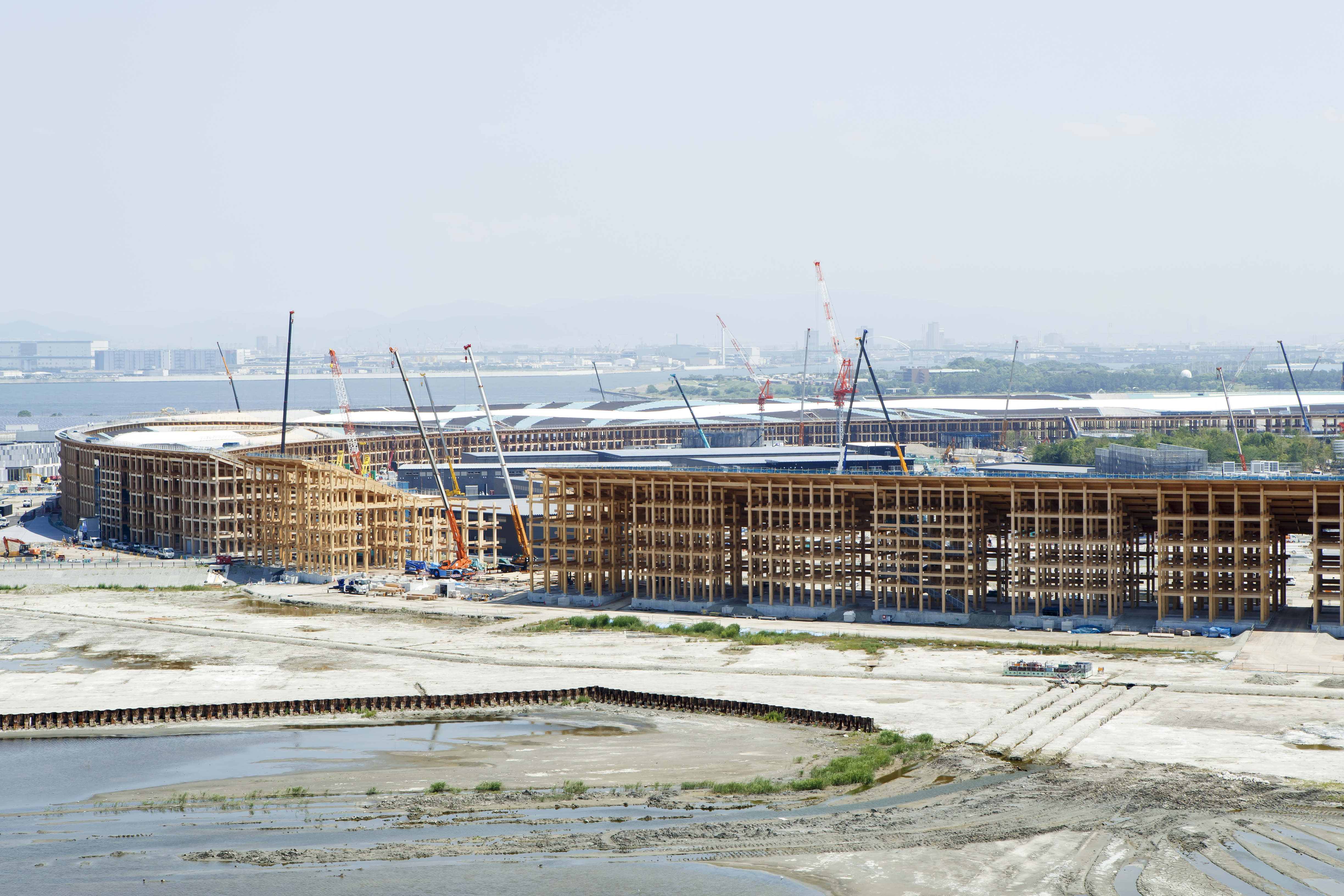 A first look at Expo 2025 Osaka's experimental architecture
Expo 2025 Osaka prepares to throw open its doors in April; we preview the world festival, its developments and highlights
By Danielle Demetriou
-
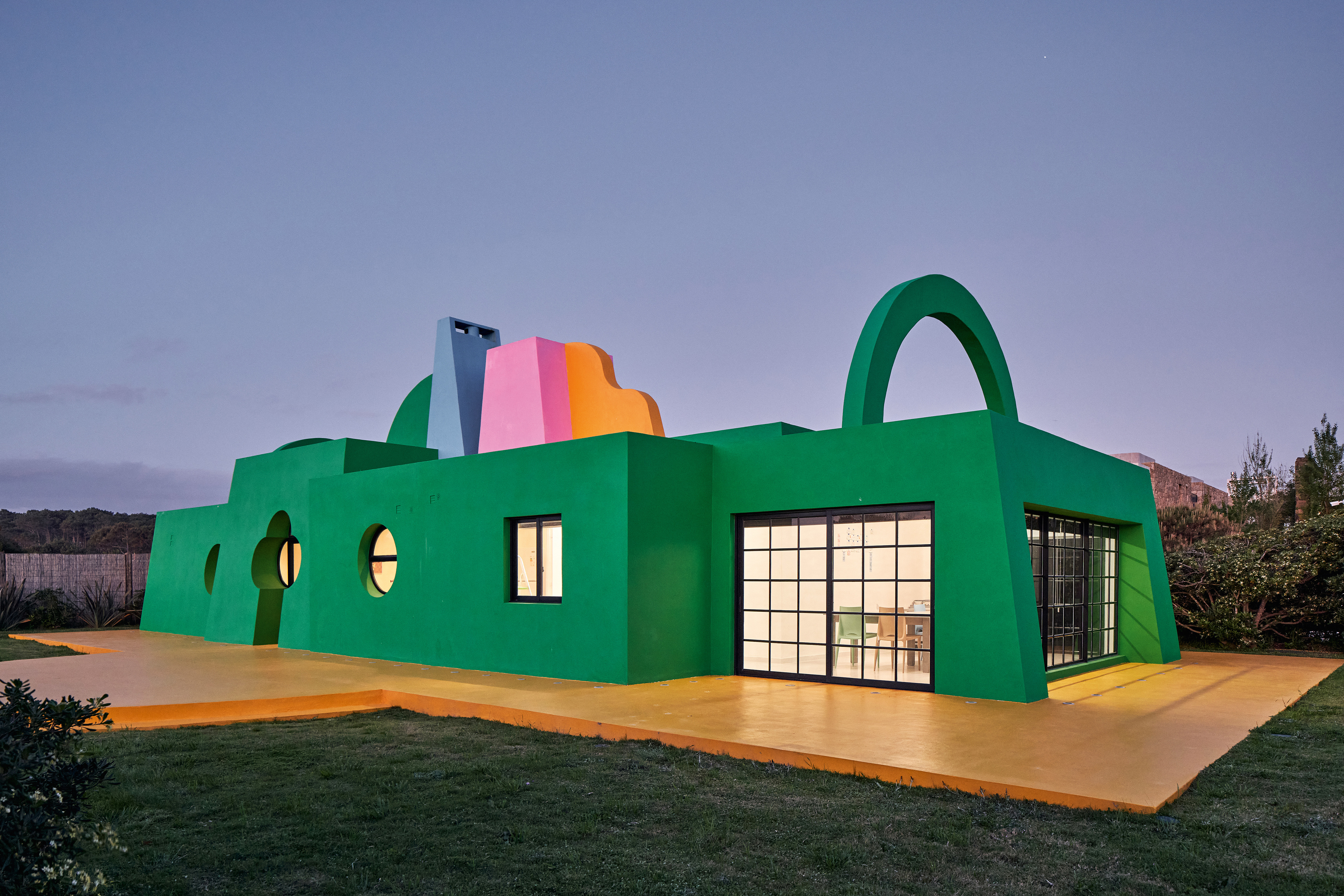 Ten contemporary homes that are pushing the boundaries of architecture
A new book detailing 59 visually intriguing and technologically impressive contemporary houses shines a light on how architecture is evolving
By Anna Solomon
-
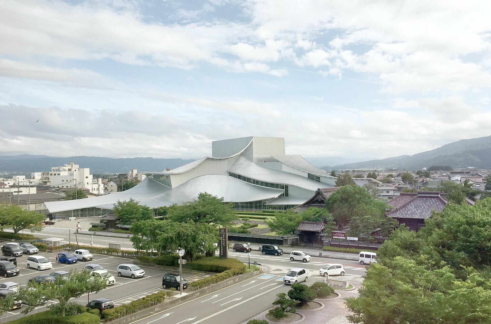 And the RIBA Royal Gold Medal 2025 goes to... SANAA!
The RIBA Royal Gold Medal 2025 winner is announced – Japanese studio SANAA scoops the prestigious architecture industry accolade
By Ellie Stathaki
-
 Architect Sou Fujimoto explains how the ‘idea of the forest’ is central to everything
Sou Fujimoto has been masterminding the upcoming Expo 2025 Osaka for the past five years, as the site’s design producer. To mark the 2025 Wallpaper* Design Awards, the Japanese architect talks to us about 2024, the year ahead, and materiality, nature, diversity and technological advances
By Sou Fujimoto
-
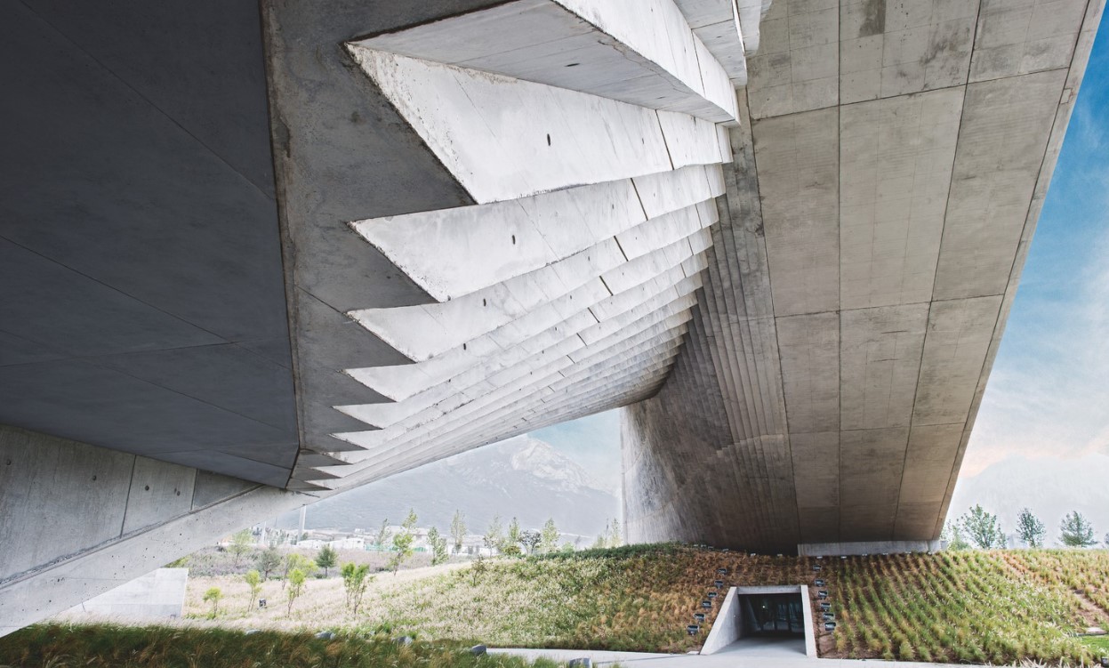 Tadao Ando: the self-taught contemporary architecture master who 'converts feelings into physical form’
Tadao Ando is a self-taught architect who rose to become one of contemporary architecture's biggest stars. Here, we explore the Japanese master's origins, journey and finest works
By Edwin Heathcote