Turner Contemporary shop gets minimalist revamp
Spending is distinctly soothing at Turner Contemporary shop in Margate, with its elegant, minimalist new look by London studio Daytrip

Ståle Eriksen - Photography
The Turner Contemporary in Margate is one of the country's leading cultural destinations outside London, and now there's one more reason to visit the David Chipperfield Architects-designed, world-renowned centre for art – the launch of a brand-new minimalist shop interior, courtesy of London-based studio Daytrip. The retail architecture project marks ten years after the Margate seafront art hub's grand opening.
Invited by cultural consultancy The Seeking State, the design studio devised careful plans to refresh the Turner Contemporary's shop area, which sits right by the main entrance and next to the gallery spaces. Daytrip drew inspiration from Chipperfield's majestic, pared-down architectural approach, as well as the wider context.
‘It was felt that the new renovation should not only relate to the architecture but should reflect JW Turner’s admiration for Margate, and the surrounding landscape and light qualities, as well as speak to the community and enhance a local narrative that is rich with creativity,' say Daytrip founders Iwan Halstead and Emily Potter.

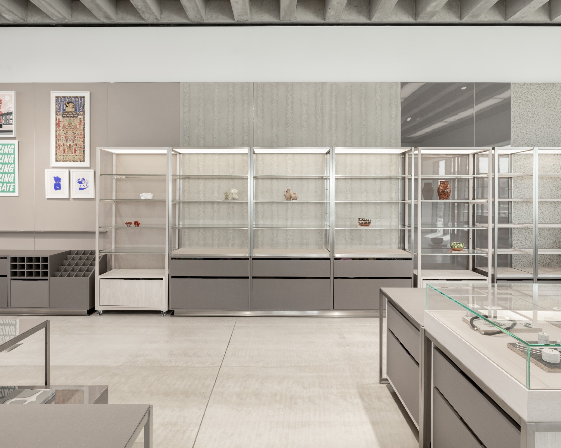
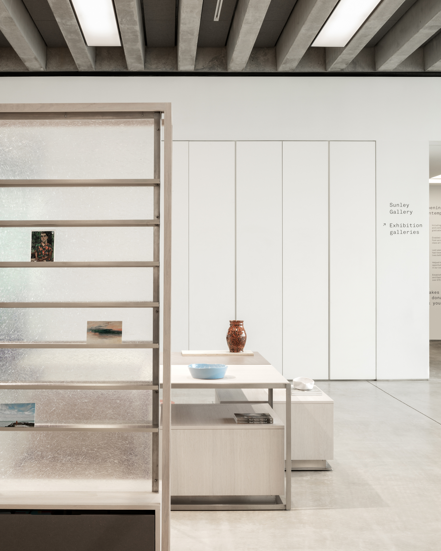
The building's poetic minimalism is reflected in the shop's interior concept. A neutral colour palette and sleek, unfussy materials make up the internal envelope, while the large openings, with long views of the sea, remain a key protagonist in the space. The existing poured screed flooring, linear glazing and prominent ribbed concrete ceiling were taken as cues for the interior's new composition, internal arrangement and overall rhythm.
A series of bespoke display tables, shelving and plinths are moveable around the space to provide flexibility. The uncluttered look feels calm and even ethereal, using soft, dappled grey veneer panels, metal frameworks in brushed stainless steel and rippled textured glass. A specially designed workbench that nods to a maker's workshop sits at the space’s heart – though everything can be rearranged as needs dictate.
More humble materials in muted tones, including matt, white oiled oak (‘chosen for its sandy tonality and honest craftsmanship', explain the designers), grey Valchromat, and a lacquered wood fibre board set the mood that was conceived to celebrate Turner Contemporary's architecture and the seaside setting's colour and tones.


INFORMATION
Wallpaper* Newsletter
Receive our daily digest of inspiration, escapism and design stories from around the world direct to your inbox.
Ellie Stathaki is the Architecture & Environment Director at Wallpaper*. She trained as an architect at the Aristotle University of Thessaloniki in Greece and studied architectural history at the Bartlett in London. Now an established journalist, she has been a member of the Wallpaper* team since 2006, visiting buildings across the globe and interviewing leading architects such as Tadao Ando and Rem Koolhaas. Ellie has also taken part in judging panels, moderated events, curated shows and contributed in books, such as The Contemporary House (Thames & Hudson, 2018), Glenn Sestig Architecture Diary (2020) and House London (2022).
-
 All-In is the Paris-based label making full-force fashion for main character dressing
Part of our monthly Uprising series, Wallpaper* meets Benjamin Barron and Bror August Vestbø of All-In, the LVMH Prize-nominated label which bases its collections on a riotous cast of characters – real and imagined
By Orla Brennan
-
 Maserati joins forces with Giorgetti for a turbo-charged relationship
Announcing their marriage during Milan Design Week, the brands unveiled a collection, a car and a long term commitment
By Hugo Macdonald
-
 Through an innovative new training program, Poltrona Frau aims to safeguard Italian craft
The heritage furniture manufacturer is training a new generation of leather artisans
By Cristina Kiran Piotti
-
 A new London house delights in robust brutalist detailing and diffused light
London's House in a Walled Garden by Henley Halebrown was designed to dovetail in its historic context
By Jonathan Bell
-
 A Sussex beach house boldly reimagines its seaside typology
A bold and uncompromising Sussex beach house reconfigures the vernacular to maximise coastal views but maintain privacy
By Jonathan Bell
-
 This 19th-century Hampstead house has a raw concrete staircase at its heart
This Hampstead house, designed by Pinzauer and titled Maresfield Gardens, is a London home blending new design and traditional details
By Tianna Williams
-
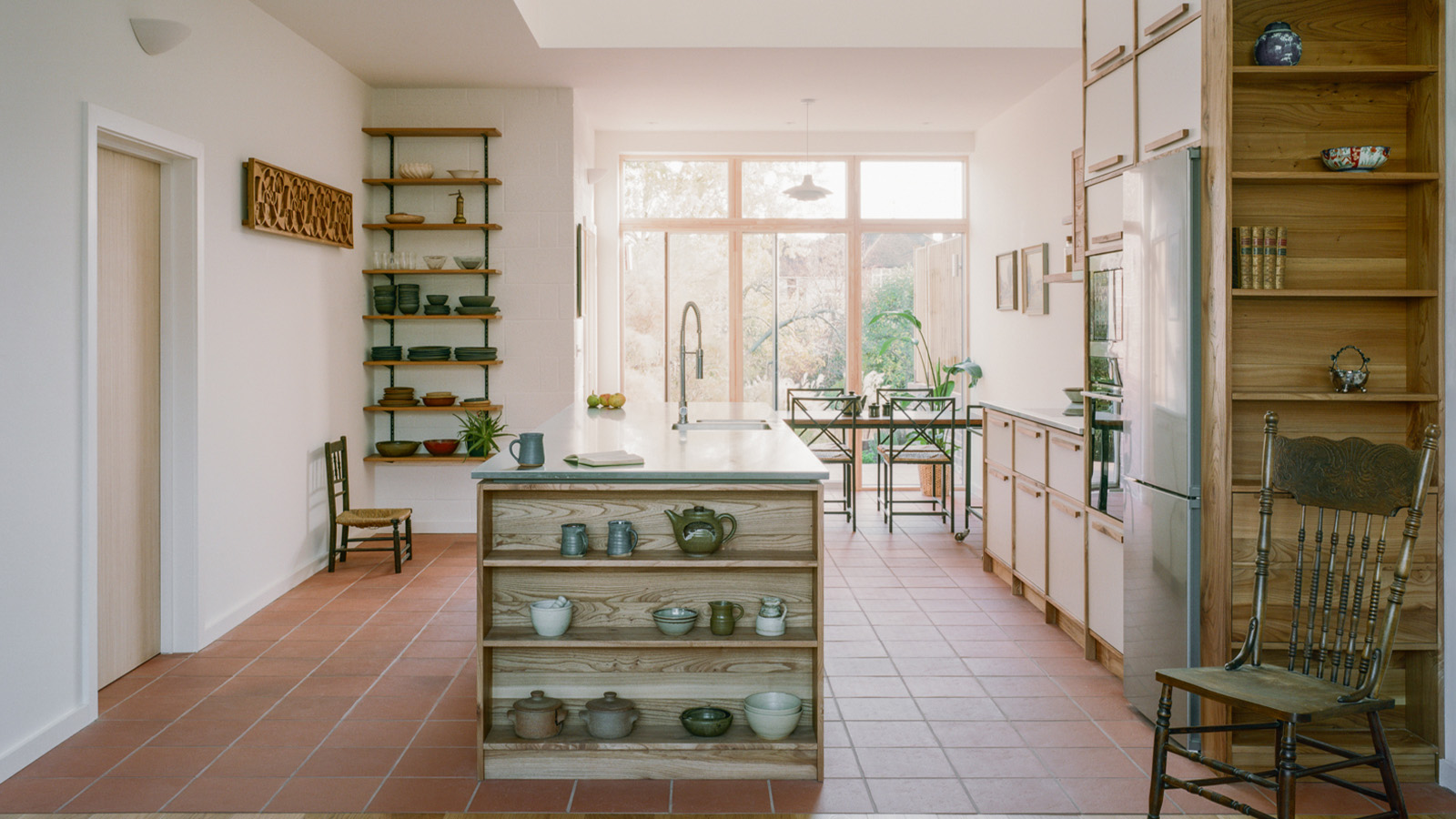 An octogenarian’s north London home is bold with utilitarian authenticity
Woodbury residence is a north London home by Of Architecture, inspired by 20th-century design and rooted in functionality
By Tianna Williams
-
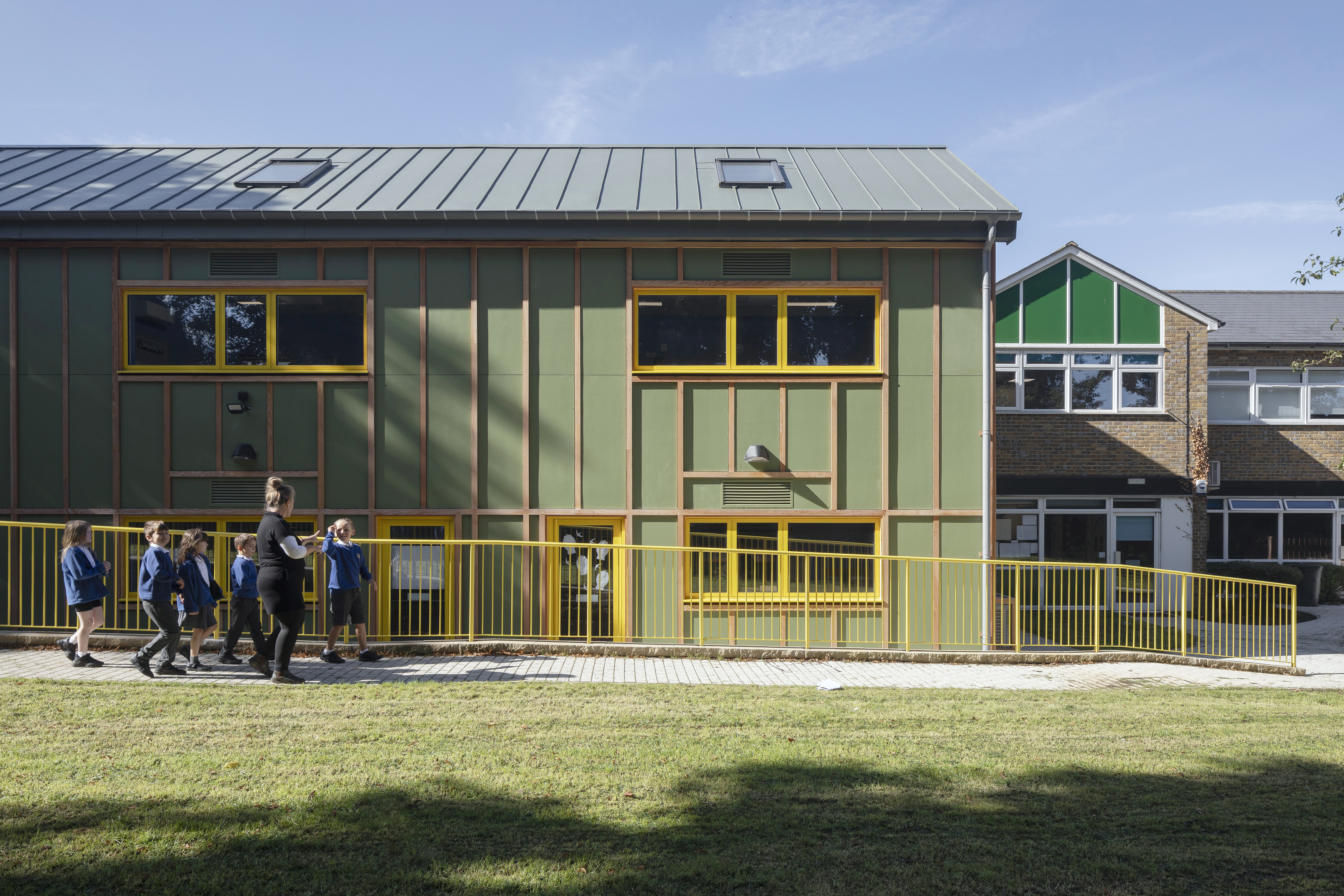 What is DeafSpace and how can it enhance architecture for everyone?
DeafSpace learnings can help create profoundly sense-centric architecture; why shouldn't groundbreaking designs also be inclusive?
By Teshome Douglas-Campbell
-
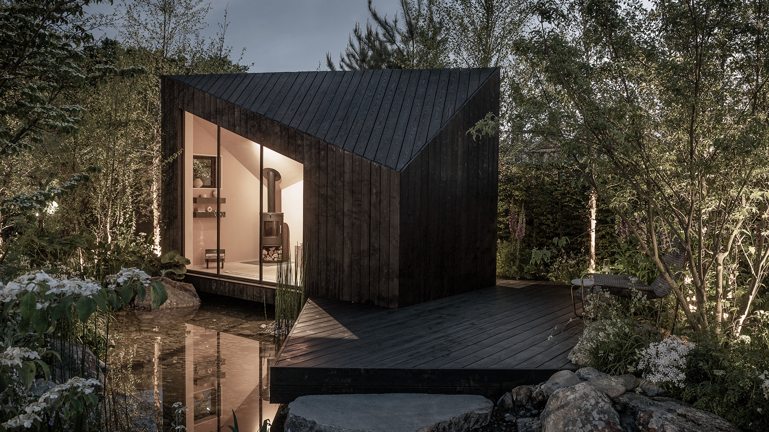 The dream of the flat-pack home continues with this elegant modular cabin design from Koto
The Niwa modular cabin series by UK-based Koto architects offers a range of elegant retreats, designed for easy installation and a variety of uses
By Jonathan Bell
-
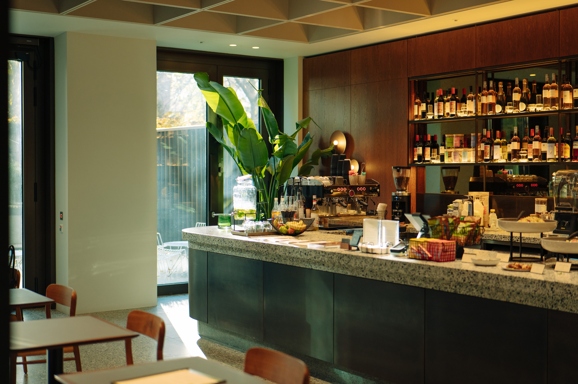 Are Derwent London's new lounges the future of workspace?
Property developer Derwent London’s new lounges – created for tenants of its offices – work harder to promote community and connection for their users
By Emily Wright
-
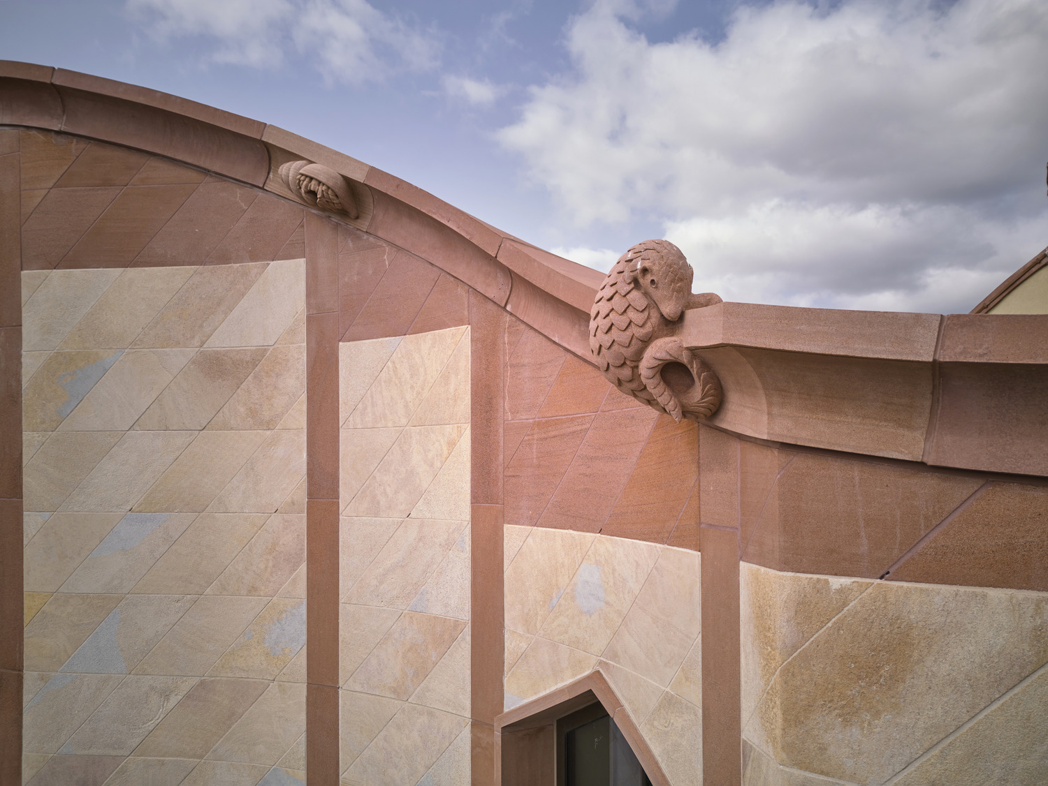 Showing off its gargoyles and curves, The Gradel Quadrangles opens in Oxford
The Gradel Quadrangles, designed by David Kohn Architects, brings a touch of playfulness to Oxford through a modern interpretation of historical architecture
By Shawn Adams