Unveiled: The Broad art museum by Diller Scofidio + Renfro opens
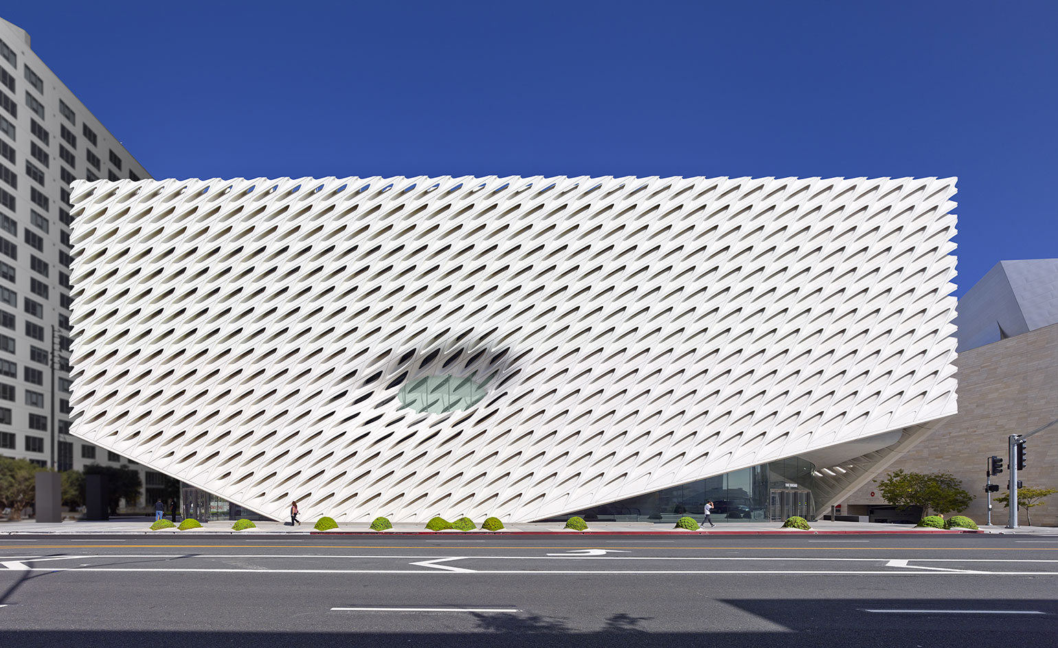
After years of hype, development and anticipation, philanthropist Eli Broad's contemporary art museum, The Broad, is finally opening this weekend on Grand Avenue in Downtown Los Angeles. The 120,00 square foot, $140 million project, designed by New York architects Diller Scofidio + Renfro, contains almost 2,000 of Broad's contemporary art pieces as well as storage, conservation facilities, offices, an auditorium, and an adjacent restaurant and park.
It's arguably the most significant new building - both culturally and architecturally - in the city since its neighbour, Frank Gehry's Disney Hall, opened in 2003. And in many ways, the Broad is a direct response to Disney's riotous, gleaming form. How could a new edifice try to out-Gehry Gehry? Instead it's a very different, eroded structure, covered by a 'veil' of tapered, honeycomb-shaped fiberglass reinforced concrete panels. That form - and pretty much everything else about the building - wraps around its heart, known as the 'vault', which contains storage for the prodigious collection behind heavy concrete walls. DSR Project Director Kevin Rice calls the vault the 'protagonist' of the design, despite the fact that the veil gets all the attention.
On the underside of the vault is the lobby, a carved out, (relatively) dimly lit first floor space with smooth, cool walls evocative of a cave. Its organic shape was concieved to contrast with the rigid, computer-produced uniformity of the veil. 'Throwing you off your expectations with its organic form is the perfect way to transition from the street to taking in the art itself,' says Joanne Heyler, Director of the Broad Art Foundation. The entrance level also contains simple but spacious galleries - in most museums their 18-foot height would be formidable - for temporary exhibitions.
The third floor contains the building's highlight: the 35,000 square foot, 23-foot-tall gallery space, glowing with rhythmic, controlled natural light from huge scooped and angled skylights, and from repeated cuts in the veil. The dinosaur-like scale of the skylights, and the lack of any columns - thanks to giant steel girders hidden above - has a mesmerizing impact, especially coming from the darker, more compressed spaces below. 'I'm incredibly pleased with how the collection lives under the diffuse light,' says Heyler.
Connecting varied spaces through dramatic transition is a particular specialty of Diller Scofidio + Renfro, and they follow through deftly here, creating moments like the veil lifting up to welcome visitors at ground level, the tube-like escalator (and magical glass cylinder elevator) cutting through the bulk of the vault to the main galleries, and the voyeur-like peeks into the vault along the winding stairs back down. 'We like to think of our projects as cinematic,' said DSR principal Charles Renfro. 'There's a kind of narrative unfolding. There's foreshadowing. There are glimpses ahead. Things get stitched together to form a complete experience.' Rice adds, 'It's not a secret we always wanted to be filmmakers.'
The pierced solidity of the veil excels inside, where slivers of glowing light create a radiating, mysterious effect. From the street it takes on a more solid appearance, albeit lightened by the fact that (thanks to what Rice calls an "epic" second floor cantilever) it only touches the ground once on Grand Avenue. Still the relentless patterns and sharp edges can be mesmerizing as you walk closer to, and around, the building. In the upper gallery, the necessary measure of dividing art through temporary walls breaks up what is a glorious space, perhaps minimizing its potential. The dividing walls are still a few feet from the ceiling, connecting you to the whole.
But in all this is a spectacular addition the city; a dynamic, fluid, and cohesive, if not radical, monument to L.A.'s quickly ascending place in the cultural universe. While it won't singlehandedly mend the scorched earth urbanism of Bunker Hill, it has already infused an already white-hot downtown Los Angeles with more energy, clout, and, of course, attention.
We have explored the brand new Broad in a bespoke photoshoot in our October 2015 issue, where Liz Diller, of Diller Scofidio + Renfro, is one of our two esteemed Guest Editors. In the issue you can also find Diller's conversation with graphic designer Stefan Sagmeister, where she reflects on the practice's significant body of work and, of course, the Broad.
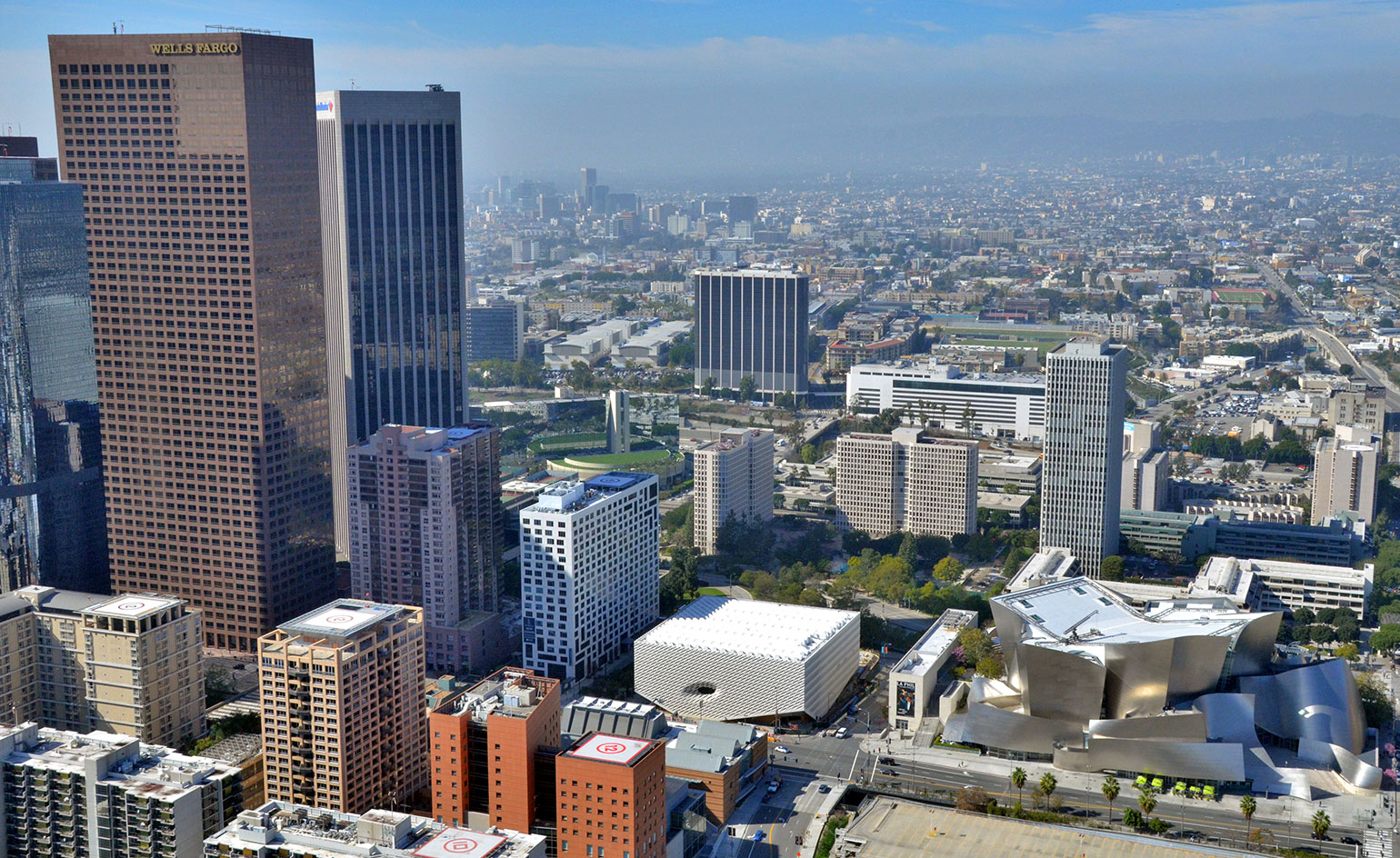
The new Broad is in good company in its Downtown Los Angeles location - next door sits Frank Gehry's 2003 Dinsey Hall. courtesy of The Broad and Diller Scofidio + Renfro
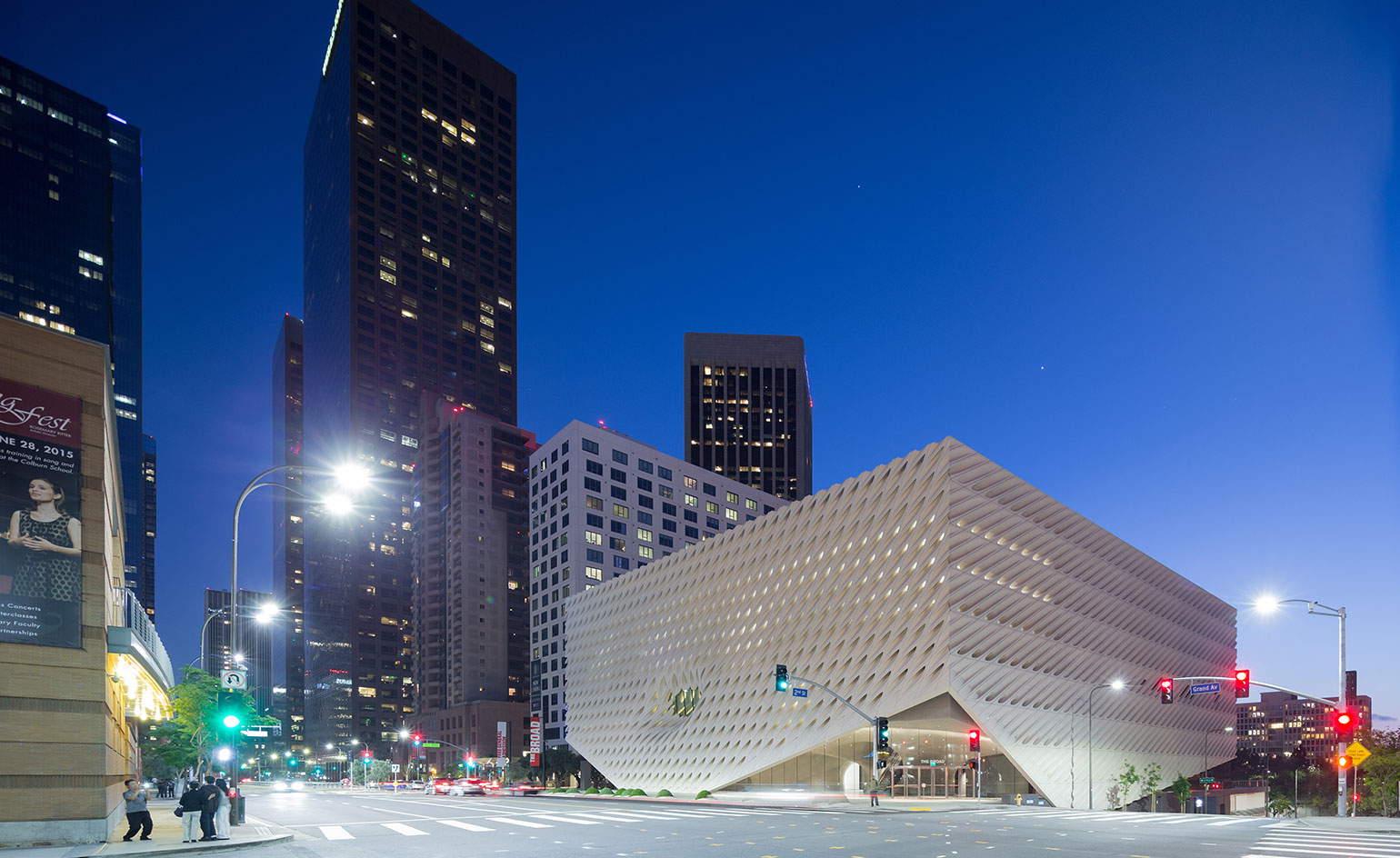
Covered in the 'Veil', its external skin made of honeycomb-shaped fibreglass reinforced concrete panels, the new building holds the 'vault' at its heart, a space where the gallery's art collections are stored. courtesy of The Broad and Diller Scofidio + Renfro
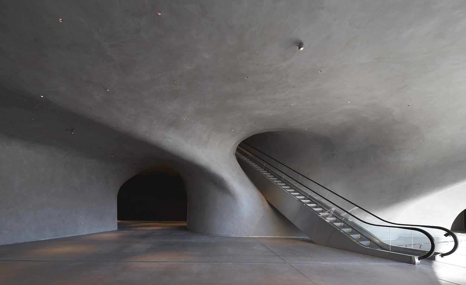
The gallery's striking lobby and escalator areas are made of sculptural concrete, which was designed to contrast the exterior's structured effect. courtesy of The Broad and Diller Scofidio + Renfro
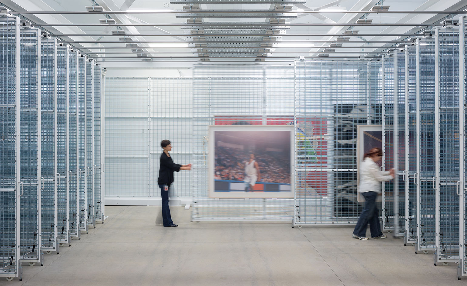
The Broad's storage room was designed with as much attention as its public galleries - here showing a work by Paul Pfeiffer. courtesy of The Broad and Diller Scofidio + Renfro
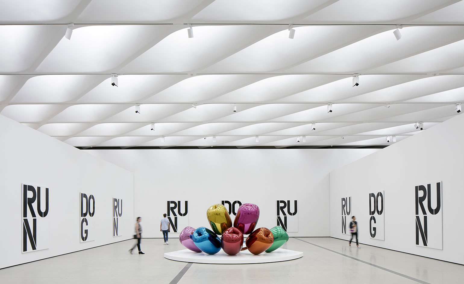
The Broad's impressive column-free display areas also feature a honeycomb shaped ceiling; here showing an installation of works by Christopher Wool and Jeff Koons in the third floor galleries. courtesy of The Broad and Diller Scofidio + Renfro
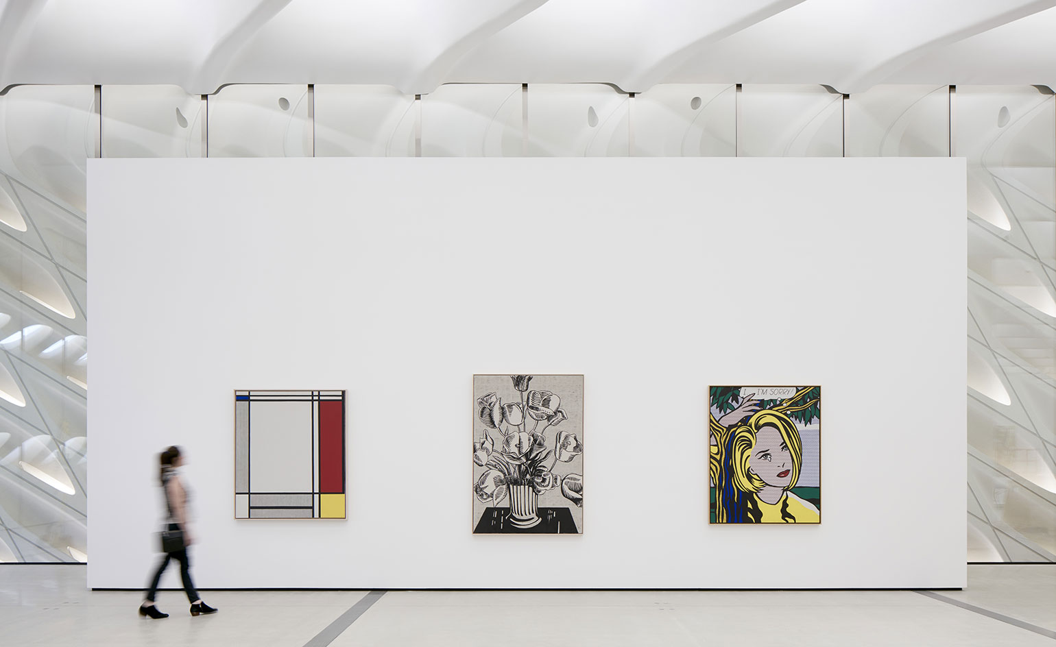
Light is filtered in through skylights and the external skin's perforation. Here, showing the installation of three works by Roy Lichtenstein in the third floor galleries. courtesy of The Broad and Diller Scofidio + Renfro
Wallpaper* Newsletter
Receive our daily digest of inspiration, escapism and design stories from around the world direct to your inbox.
-
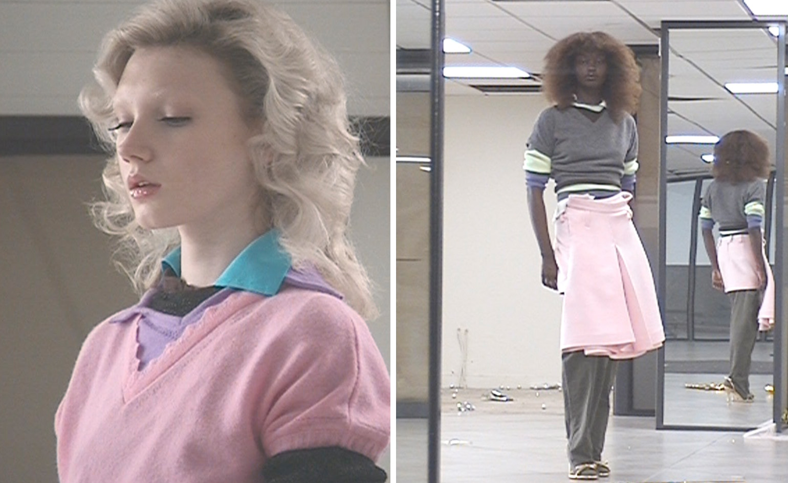 All-In is the Paris-based label making full-force fashion for main character dressing
Part of our monthly Uprising series, Wallpaper* meets Benjamin Barron and Bror August Vestbø of All-In, the LVMH Prize-nominated label which bases its collections on a riotous cast of characters – real and imagined
By Orla Brennan
-
 Maserati joins forces with Giorgetti for a turbo-charged relationship
Announcing their marriage during Milan Design Week, the brands unveiled a collection, a car and a long term commitment
By Hugo Macdonald
-
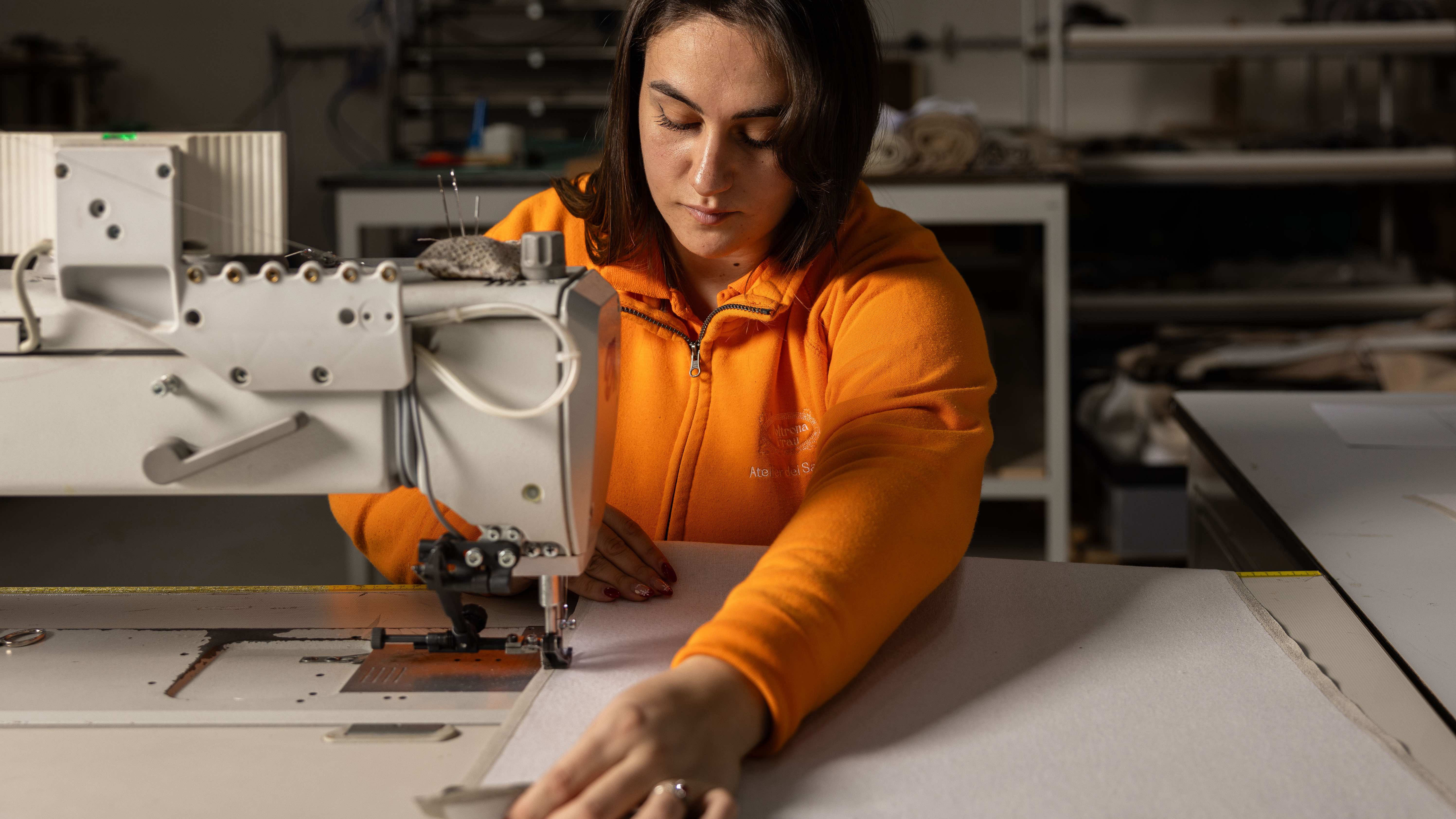 Through an innovative new training program, Poltrona Frau aims to safeguard Italian craft
The heritage furniture manufacturer is training a new generation of leather artisans
By Cristina Kiran Piotti
-
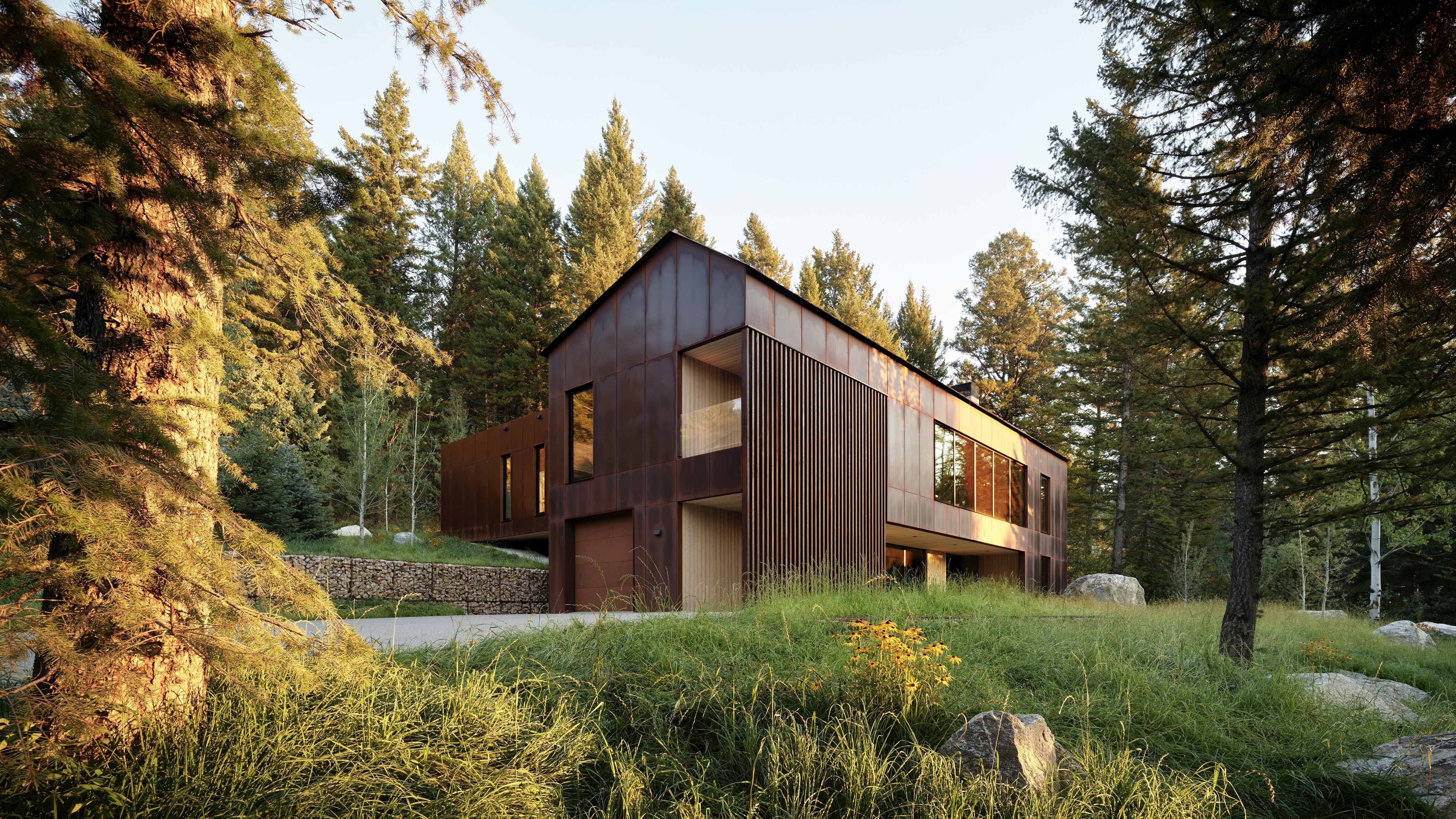 This minimalist Wyoming retreat is the perfect place to unplug
This woodland home that espouses the virtues of simplicity, containing barely any furniture and having used only three materials in its construction
By Anna Solomon
-
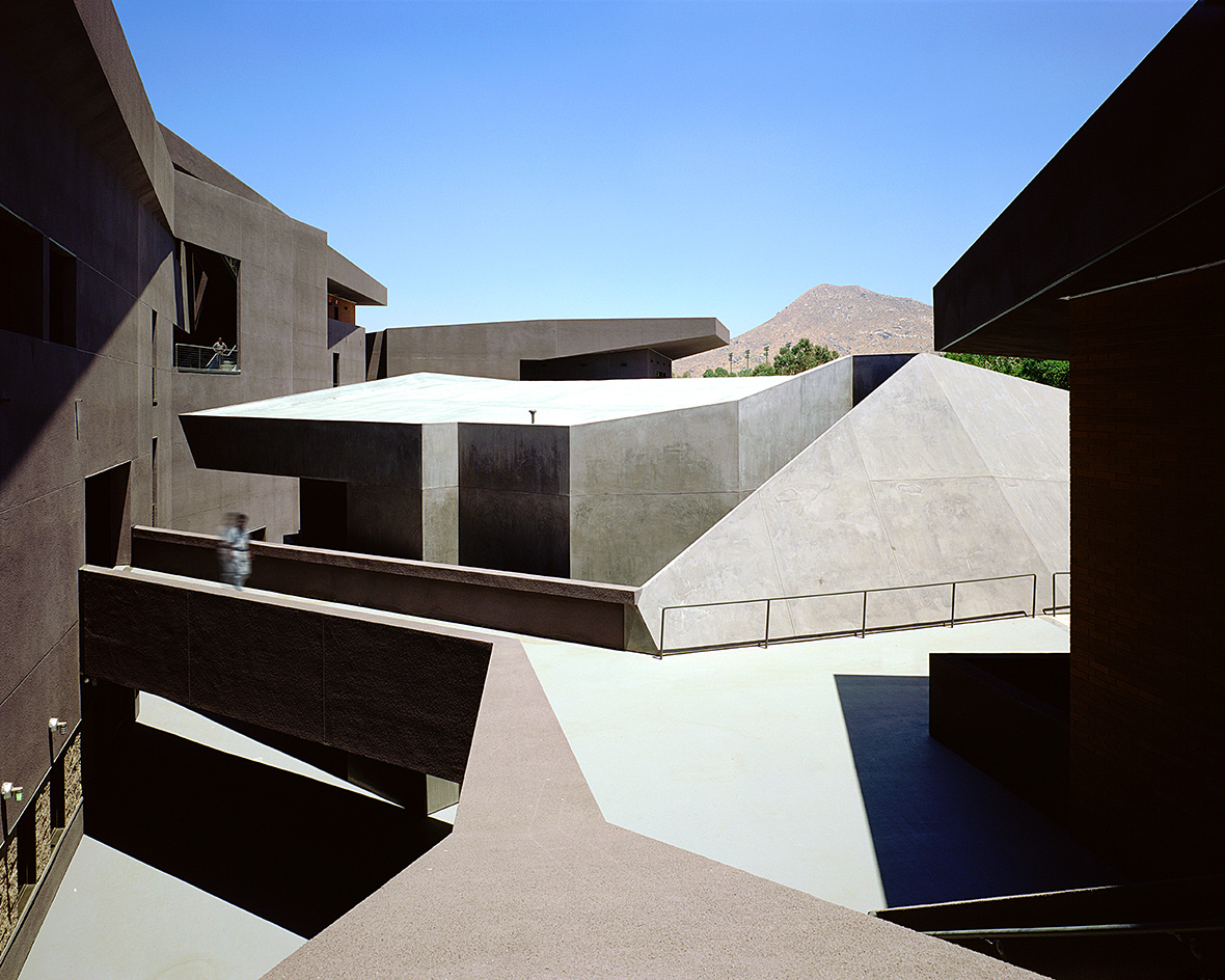 We explore Franklin Israel’s lesser-known, progressive, deconstructivist architecture
Franklin Israel, a progressive Californian architect whose life was cut short in 1996 at the age of 50, is celebrated in a new book that examines his work and legacy
By Michael Webb
-
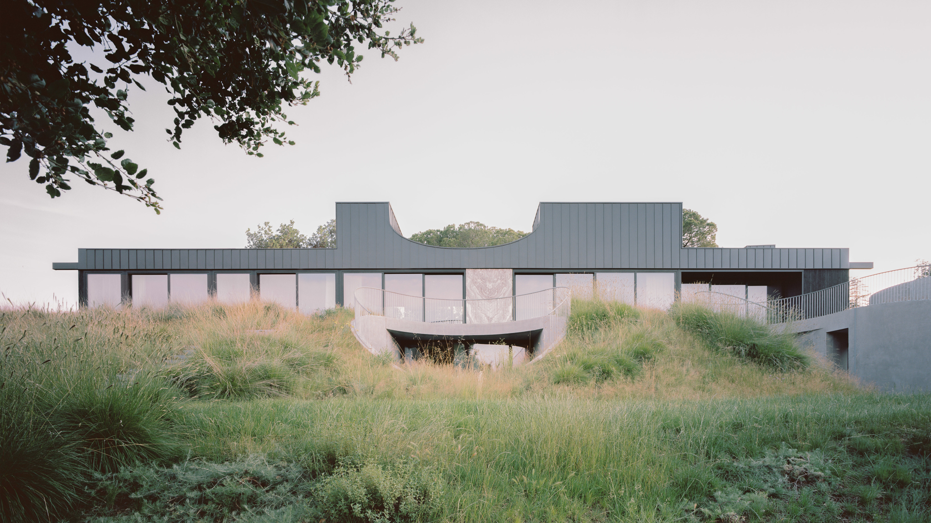 A new hilltop California home is rooted in the landscape and celebrates views of nature
WOJR's California home House of Horns is a meticulously planned modern villa that seeps into its surrounding landscape through a series of sculptural courtyards
By Jonathan Bell
-
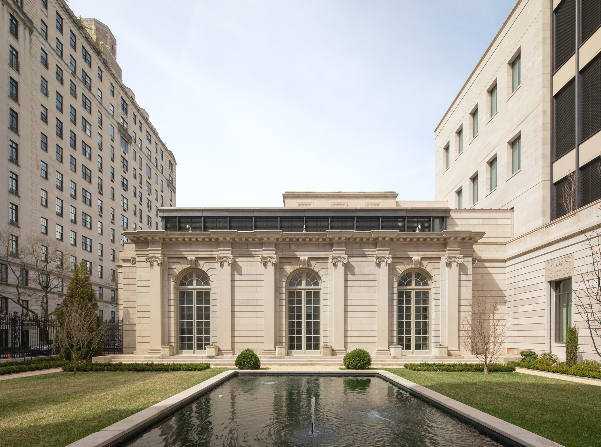 The Frick Collection's expansion by Selldorf Architects is both surgical and delicate
The New York cultural institution gets a $220 million glow-up
By Stephanie Murg
-
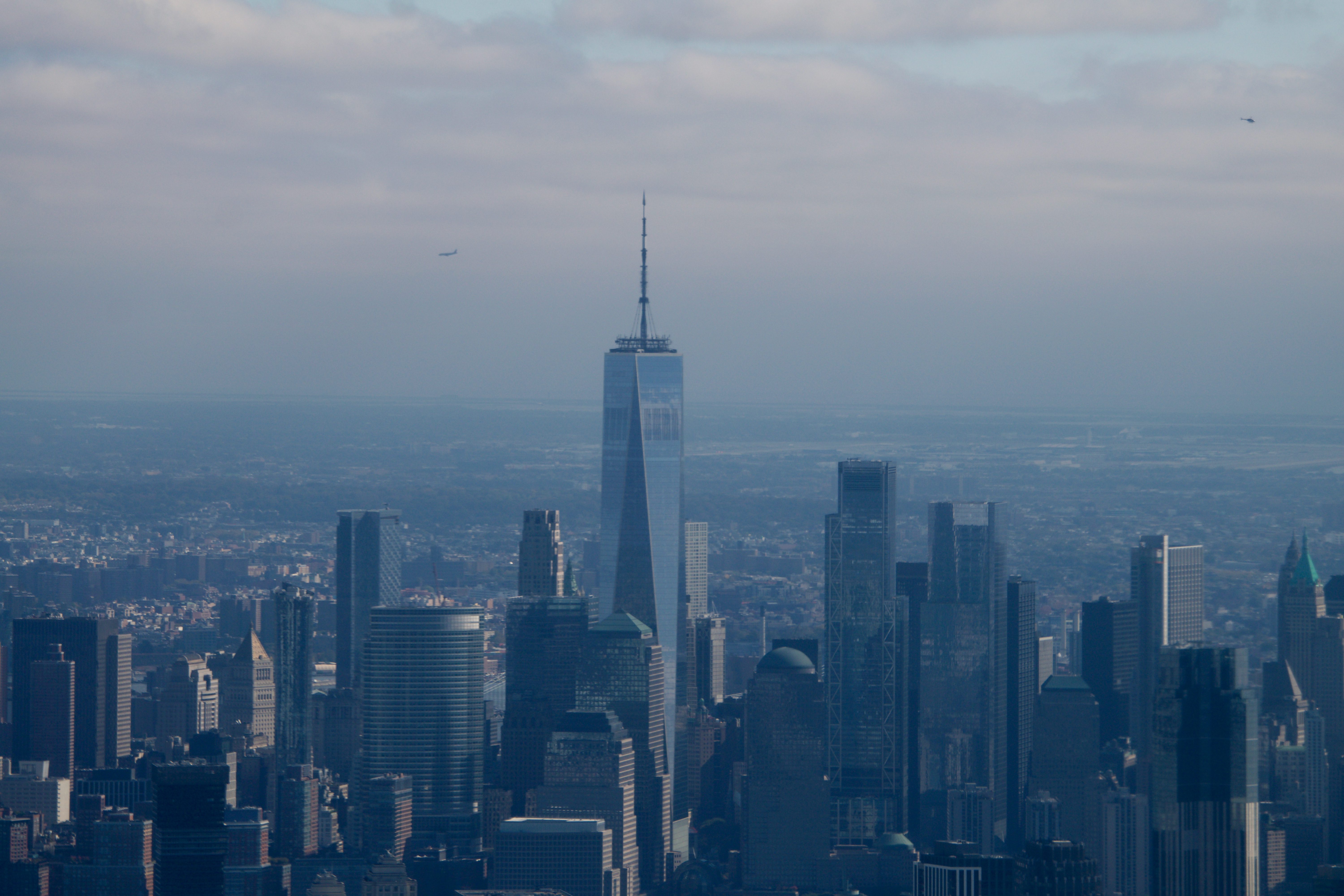 Remembering architect David M Childs (1941-2025) and his New York skyline legacy
David M Childs, a former chairman of architectural powerhouse SOM, has passed away. We celebrate his professional achievements
By Jonathan Bell
-
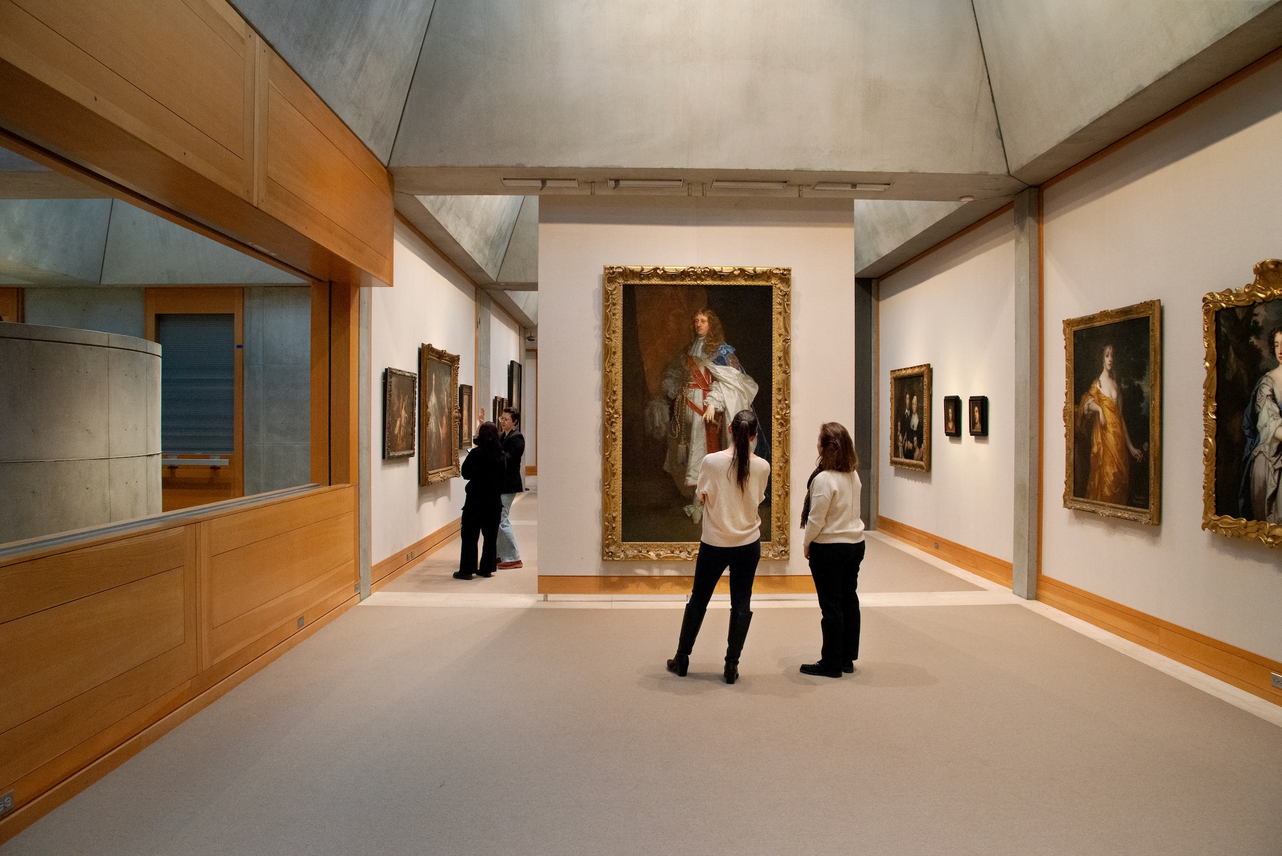 The Yale Center for British Art, Louis Kahn’s final project, glows anew after a two-year closure
After years of restoration, a modernist jewel and a treasure trove of British artwork can be seen in a whole new light
By Anna Fixsen
-
 The upcoming Zaha Hadid Architects projects set to transform the horizon
A peek at Zaha Hadid Architects’ future projects, which will comprise some of the most innovative and intriguing structures in the world
By Anna Solomon
-
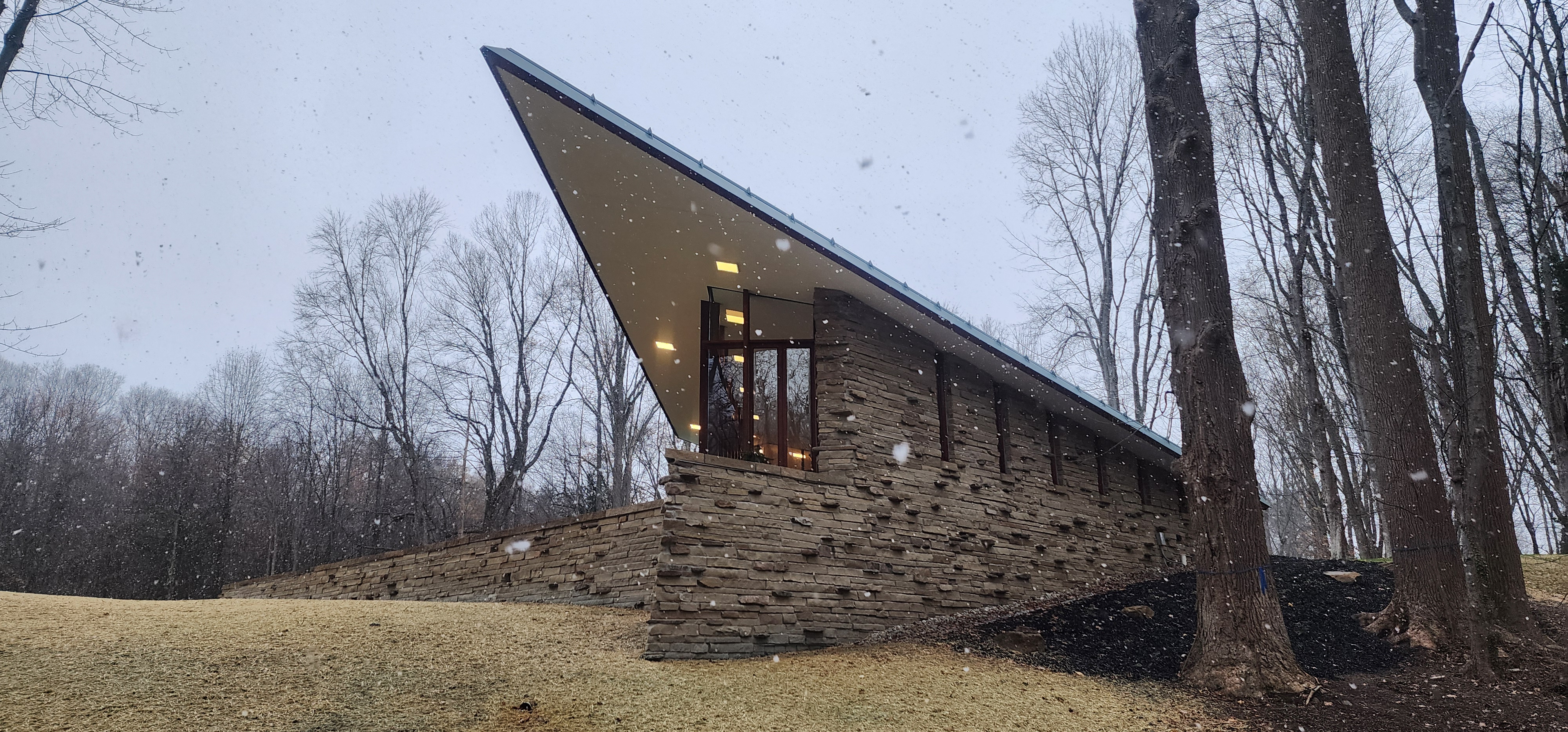 Frank Lloyd Wright’s last house has finally been built – and you can stay there
Frank Lloyd Wright’s final residential commission, RiverRock, has come to life. But, constructed 66 years after his death, can it be considered a true ‘Wright’?
By Anna Solomon