Venice Architecture Biennale 2012: the highlights
Ellie Stathaki
And so we see another Venice Architecture Biennale, this time with a bit more backroom machinations and a more overt architectural emphasis than 2010's 'People Meet in Architecture'. David Chipperfield is for many people a natural choice for curator. The British architect is at the forefront of a sensitive architecture that eschews starry structural gymnastics in favour of a more contemplative approach. His rich connections with Japan, where much of his studio's early work was built, and Europe, especially Spain and Germany, makes him a natural bridge for the cross-cultural world of modern architecture.
Chipperfield chose ‘Common Ground’ as his theme, proclaiming that this was a strategy of open arms, embracing architects whatever their background or approach, in order to find the methodologies and concerns that unite them.
Spread through the cavernous halls of the Arsenale and amongst the verdant, pavilion-scattered landscape of the Giardini, Common Ground was inevitably read by many as a bold statement about where progressive architecture is today, where it is going and the ways in which it must engage with the people that commission it and, above all, the people that have to use it.
The Arsenale itself is the centrepiece of the Venice Architecture Biennale, its vast halls offering plenty of scope for full-scale architectural interventions, as well as any number of installations and exhibitions. Chipperfield's chosen team of co-curators and collaborators was sizeable, meaning that many shared rooms, ensuring a cross-pollination of ideas and visuals that went some way to justify the ‘Common Ground’ thread.
Chipperfield began by defining architecture as a ‘coincidence of forces’, an apt description of the Architecture Biennale itself, while ‘Common Ground’ – a phrase with many interpretations – would hopefully bring about an examination of ‘what we share over what distinguishes us from one another.’
See our top ten highlights from the Venice Architecture Biennale and take a whistle-stop tour of the best of the rest
Part of the process was a celebration of hitherto unsexy aspects of architecture like pragmatism, history, chance and collaboration, all a long way from the heroic vision of iconic architecture. Hence the whole show was threaded through with photographs by Thomas Struth, an established chronicler of the unconventional beauty of the ordinary. Struth stood in stark contrast to Norman Foster’s Gateway installation, in which hundreds of images and a crawling, insectoid animation gave an alternative vision of what some architects find so thrilling – and hopefully disturbing – about modern life.
The following room was dominated by O’Donnell Tuomey’s Vessel, a towering wooden structure that was supported by the Irish firm's attempts to intellectualise their work through a memento-filled vitrine of cultural props and acquisitions. Everywhere one looks there are collections and collaborations, as the invited firms rose to Chipperfield’s challenge to unite their approach with others.
Naturally, this was more successful in some places than others. The display of the precise but sterile façades at the Swiss pharmaceutical company Novartis’ HQ revealed the seductive results of a client with taste and deep pockets, but it was hard to gauge if it was being presented as an example of best practice or just a stark warning. On the other hand, the cascade of models and iconography accompanying the display of the Ruta del Pelligrino (winner of Wallpaper’s Life-enhancer of the Year award, no less) essayed architecture's playful side, even in the service of the spiritual. Luigi Snozzi’s display showed the architect as devoted citizen, dedicated to practically one town for an entire career.
The British contingency showed impressive work. FAT’s Museum of Copying had as its centrepiece a cast of the Villa Rotunda, ringed by displays and films that explored architectural influence over the century. We especially liked the timeline of the life of Adolf Loos, from the boudoirs of Vienna to the Mongolian Steppes. Against all this the signature stripped classicism of Hans Kollhoff looked rather brutal and bleak, while Farshid Moussavi’s vast room of projected imagery seemed to speak purely of form and not of any semblance of function.
Herzog & de Meuron gamely presented models of the ongoing Elbphilharmonie in a room ringed by newspaper clippings chronicling the project's long gestation, with exultation and anticipation turning slowly sour over the years. There's every indication that the building will ultimately be one of Germany's most significant modern structures, but the journey is not proving easy.
Back to Brits, we saw Sergison Bates showcasing their most recent social housing around Europe, focusing in particular on how the people who live in the projects change the way the spaces are perceived. In the next room Zaha Hadid paid homage to Pier Luigi Nervi, with a structure of her own and some historical imagery, including spectacular engineering models built to illustrate the strength of Nervi's thin shelled structures.
The Wall House by Anupama Kundoo was another stand-out display. A 1:1 recreation of a house in Auroville, India, the Wall House was built in situ by Indian and Venetian craftsmen, its brick walls and idiosyncratic detailing beautifully complimenting the Arsenale itself.
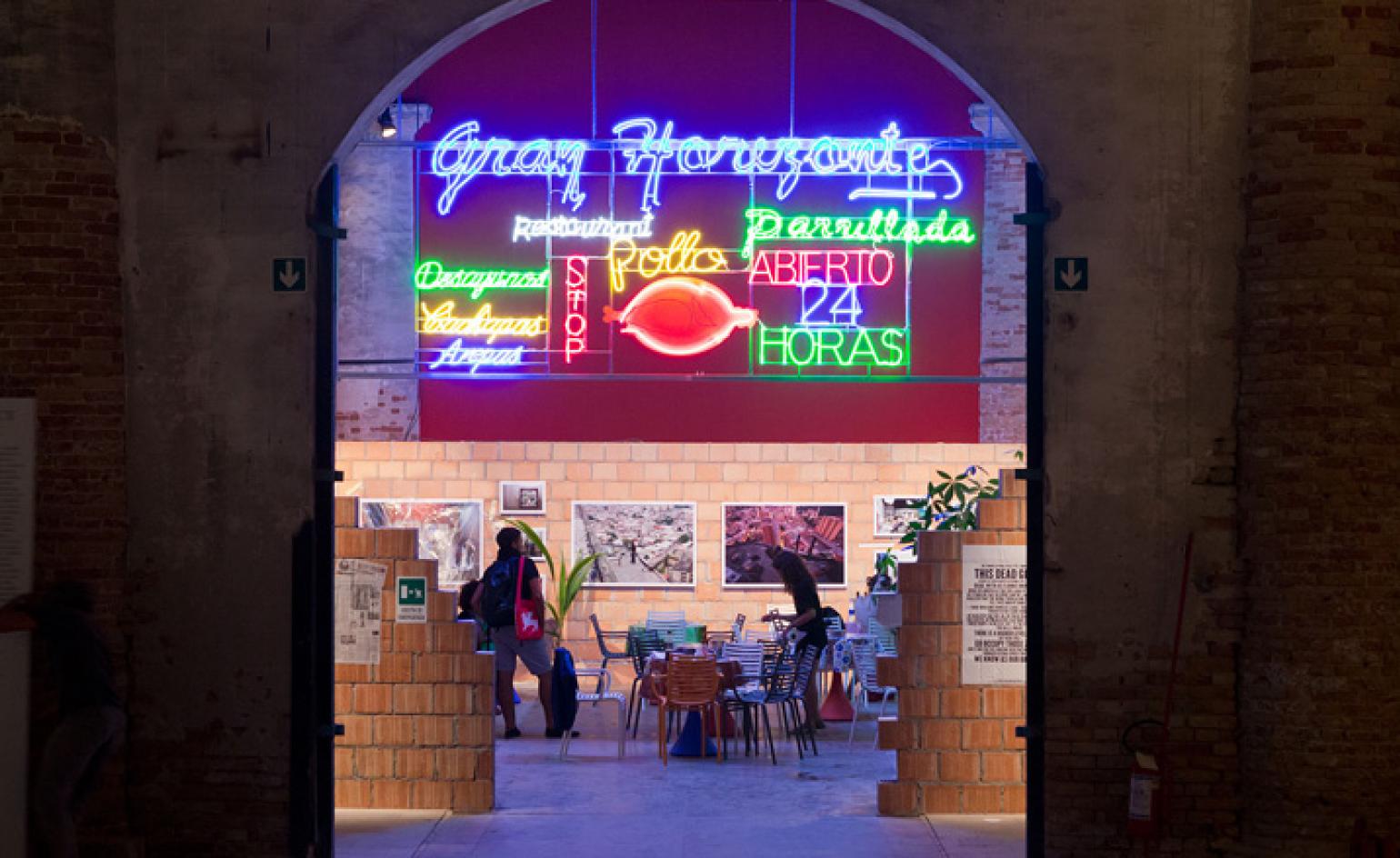
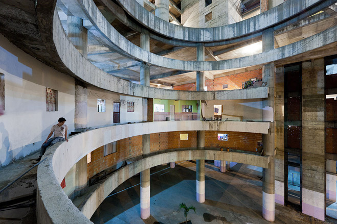
Immediately adjacent to this fully realised building was another structure out of place. The Torre David / Gran Horizonte by Urban-Think Tank and Justin McGuirk transposed a slice of Venezuelan culture into the Arsenale in the form of a fully functioning restaurant. Created in homage to the Torre Confinanzas, or Torre David – an unfinished concrete shell in Caracas that has been colonised by homes, shops, and a whole ad-hoc community – the gaudy signage, great food and evocative photography by Iwan Baan told of the flipside of modern architecture. A worthy winner of the Golden Lion.
In contrast, the Valerio Olgiati-organised brain dump, Pictographs, did little more than answer the question, ‘What if Steven Holl et al had a Tumblr?’ The rich tapestry of visual material has become a modern cliché and our eyes slide off large aggregations of individually fascinating things. In comparison, the three façade reproductions assembled by Eric Parry, Lynch Architects and Haworth Tompkins were ambitiously realised and backed-up with strong material, including an installation by Jake Tilson, grainy enough to make one nostalgic for South London.
Economic woes were tackled in 13178 Moran Street, an installation that took Detroit’s housing collapse as a platform for textural experiments, and Spain Mon Amour, a glum theatre of the crumpled Spanish architectural scene (in stark contrast to the techno-optimism of the Spanish Pavilion in the Giardini). This stood next to SANAA’s reconstruction project for post-tsunami Miyato-Jima, and both were a pointed contrast to a bold, old-school display of imaginary, unbuildable ideas for a redefined Chicago.
There were more gems to come, including a quirky concept for an Arctic Museum from Ukraine, a spacious installation by Bahrain and a suite of delicate models from Thailand. Croatia brought the sound and fury with an installation about protest and change (notably absent from Egypt), while Heneghan Peng’s installation for Ireland saw tilts and balances that it was impossible not to equate with the countryÆs precipitous economy.
Italy spread the eco-message at the Venice Biennale with a vast show of indoor greenery and the belated discovery of a green economic message, while the Artemide-sponsored Wunderkammer exhibition by Tod Williams Billie Tsien Architects saw 35 architects supply Cornell-like boxes of their predilections and preoccupations.
China made the most of their traditionally dingy space with a sculptural trio of installations drawn from new buildings in the country, and Wim Wenders showed how architectural film should be done with a luminous short portrait of Peter Zumthor. Similarly, Alvaro Siza and Eduardo Souto de Moura contributed two open air pavilions, framing devices for the gardens and canal-side views at the far end of the Arsenale.
Did this Biennale have enough to hold it in the esteemed of legendary shows like the first Biennale back in 1980, overseen by Philip Johnson and Paolo Portoghesi as a high point of post-modernism’s most intellectual stage? The world is a far more complex place and architectural representation is a rich and often impenetrable world. ‘Common Ground’ didn't hold together as well as its title might suggest – some of the Giardini installations in particular went way off-message. Chipperfield was at pains to point out that this wasn’t a talent competition, but such intentions have to fight against a culture where the talent competition has become the dominant mode of expression.
Wallpaper* Newsletter
Receive our daily digest of inspiration, escapism and design stories from around the world direct to your inbox.
Jonathan Bell has written for Wallpaper* magazine since 1999, covering everything from architecture and transport design to books, tech and graphic design. He is now the magazine’s Transport and Technology Editor. Jonathan has written and edited 15 books, including Concept Car Design, 21st Century House, and The New Modern House. He is also the host of Wallpaper’s first podcast.
-
 Nikos Koulis brings a cool wearability to high jewellery
Nikos Koulis experiments with unusual diamond cuts and modern materials in a new collection, ‘Wish’
By Hannah Silver
-
 A Xingfa cement factory’s reimagining breathes new life into an abandoned industrial site
We tour the Xingfa cement factory in China, where a redesign by landscape specialist SWA Group completely transforms an old industrial site into a lush park
By Daven Wu
-
 Put these emerging artists on your radar
This crop of six new talents is poised to shake up the art world. Get to know them now
By Tianna Williams
-
 2026 Olympic and Paralympic Torches: in Carlo Ratti's minimalism ‘the flame is the protagonist’
The 2026 Olympic and Paralympic Torches for the upcoming Milano Cortina Games have been revealed, designed by architect Carlo Ratti to highlight the Olympic flame
By Ellie Stathaki
-
 Anni Albers' weaving magic offers a delightful 2-in-1 modernist showcase in Milan
A Milan Design Week showcase of Anni Albers’ weaving work, brought to life by Dedar with the Josef & Anni Albers Foundation, brings visitors to modernist icon, the BBPR-designed Torre Velasca
By Ellie Stathaki
-
 Milan Design Week: ‘A Beat of Water’ highlights the power of the precious natural resource
‘A Beat of Water’ by BIG - Bjarke Ingels Group and Roca zooms in on water and its power – from natural element to valuable resource, touching on sustainability and consumption
By Ellie Stathaki
-
 This Milan Design Week installation invites you to tread barefoot inside a palazzo
At Palazzo Litta, Moscapartners and Byoung Cho launch a contemplative installation on the theme of migration
By Ellie Stathaki
-
 The upcoming Zaha Hadid Architects projects set to transform the horizon
A peek at Zaha Hadid Architects’ future projects, which will comprise some of the most innovative and intriguing structures in the world
By Anna Solomon
-
 Is biodesign the future of architecture? EcoLogicStudio thinks so
We talk all things biodesign with British-Italian architecture practice ecoLogicStudio, discussing how architecture can work with nature
By Shawn Adams
-
 Meet Carlo Ratti, the architect curating the 2025 Venice Architecture Biennale
We meet Italian architect Carlo Ratti, the curator of the 2025 Venice Architecture Biennale, to find out what drives and fascinates him ahead of the world’s biggest architecture festival kick-off in May
By Ellie Stathaki
-
 The brutal harmony of Villa Caffetto: an Escheresque Italian modernist gem
The Escheresque Italian Villa Caffetto designed by Fausto Bontempi for sculptor Claudio Caffetto
By Adam Štěch