
My design is inspired by chain mail. I felt it was a fitting symbol of Madame Clicquot’s courageous spirit. She took hold of the company and transformed it into something incredible, creating a champagne empire

Referencing the Gatsby-esque sophistication of the art deco era, my creative combines traditional craft motifs with Machine Age imagery and materials, rich colour and bold geometry

Our concept is a play on the visible and invisible, expressed by the use of a kinetic illusion. It links to the idea of opening a surprise package

This design is intended to highlight important stages in the history of Veuve Clicquot, using colour and type

‘If the bee disappeared from the surface of the Earth, man would have no more than four years left to live,’ as Albert Einstein once said. This project is a celebration of our existence, of life and happiness, of everything that makes us happy

In creating my concept, I was inspired by Veuve Clicquot’s anchor, the symbol of hope. When one thinks of hope, birds immediately come to mind – also representing freedom and ideas. I envisioned paper birds, or paper planes, flying into Madame Clicquot’s mailbox. Blue was chosen in addition to the brand yellow to symbolise Veuve Clicquot’s historical contribution to the city of Reims

This project was inspired by a letter written by Madame Clicquot to her great-granddaughter offering wisdom as relevant today as it was then: ‘The world is in perpetual motion, and we must invent the things of tomorrow. Act with audacity!’ In 1816 Madame Clicquot invented the first riddling table, a way of clarifying champagne that is still in use today. This design references her riddling table and celebrates all those who act with audacity in inventing the world of tomorrow

This design uses overlapping lines to create a moiré effect in the form of a Veuve Clicquot bottle outline that is eye-catching and playful

‘Pigeons Voyageurs’ focuses on the main elements of the Veuve Clicquot brand identity, the colour and the logo. In the design, pigeons and paper serve as a metaphor for correspondence. A flock settles on the mailbox and creates abstracted forms of the Veuve Clicquot logo. The individual fragments combine to form a sheet of ‘paper’ that wraps around the housing

This mailbox is covered in digitised champagne bubbles, representing the change in correspondence style since Madame Clicquot’s day to 2015. With e-mail, people are contactable instantaneously, anytime, anywhere. However, the essence of getting in touch and sharing feelings with another person is as unchanged over time as Veuve Clicquot champagne

‘Mosaic Clicquot’ is inspired by the artisanal elements in both Modernista architecture and the champagne-making process. While retaining the colours and identity of the Veuve Clicquot brand, I’ve created a unique and exclusive mailbox.

The hexagon logo of Veuve Clicquot is used as a mosaic to partially surround the mailbox. It is a commitment to sensuality and discretion

Our mailbox is inspired by unexpected accidents in the industrial process. The unforeseen enhances the idea of uniqueness. That’s why we focused on the inside. We paid homage to Madame Clicquot, who was able to concentrate her knowledge on the champagne – the contents of her bottles. The raw box leads you to be curious. You feel like opening it to reveal what’s hidden

Veuve Clicquot’s history and reputation is the result of exceptionally dedicated and skilled people. People who strive for the highest quality in creativity. The detail of the brush mark, made by a master’s hand, is what makes a picture. I chose this design because I believe one quality art form belongs with another

My design creates the effect of a champagne bottle inside a textured pattern of diamonds emblazoned with the Veuve Clicquot logo. The image is created from a field of triangles varied only by colour, with the scale of the texture giving the image clarity from a distance and a more accentuated pattern up close. Line sketches provide visual cues connecting the design to the iconic Veuve Clicquot signature

‘Metrics’, referring to France’s invention of the metric system, symbolises the country’s history of precision and high standards. The mailbox allows customers to lose themselves for a moment, to imagine the endless continuation of the grid. They may wonder how many others are enjoying the same delicately crafted champagne at the same moment
-
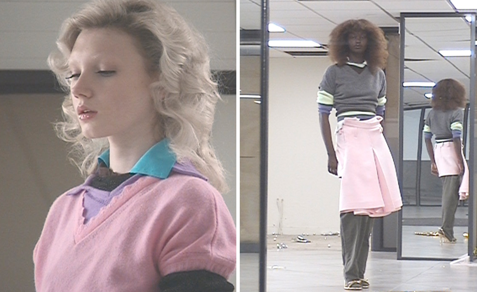 All-In is the Paris-based label making full-force fashion for main character dressing
Part of our monthly Uprising series, Wallpaper* meets Benjamin Barron and Bror August Vestbø of All-In, the LVMH Prize-nominated label which bases its collections on a riotous cast of characters – real and imagined
-
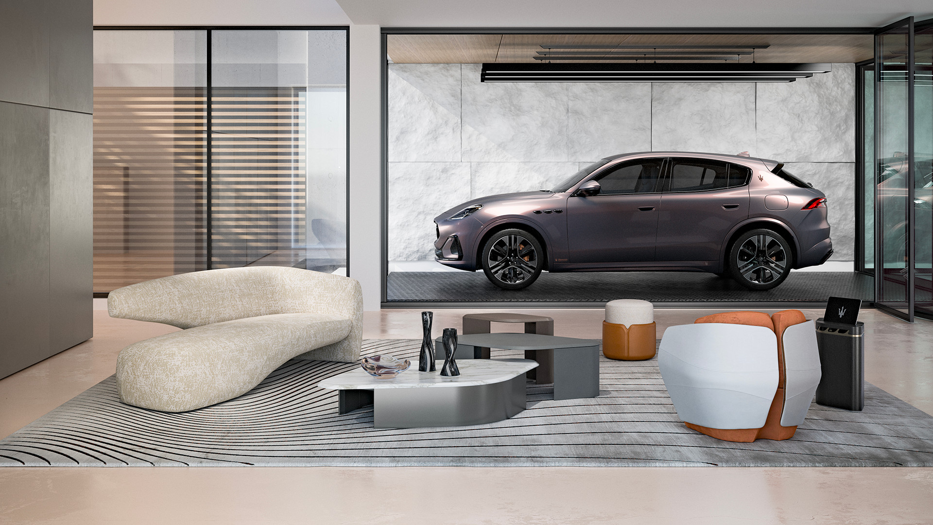 Maserati joins forces with Giorgetti for a turbo-charged relationship
Announcing their marriage during Milan Design Week, the brands unveiled a collection, a car and a long term commitment
-
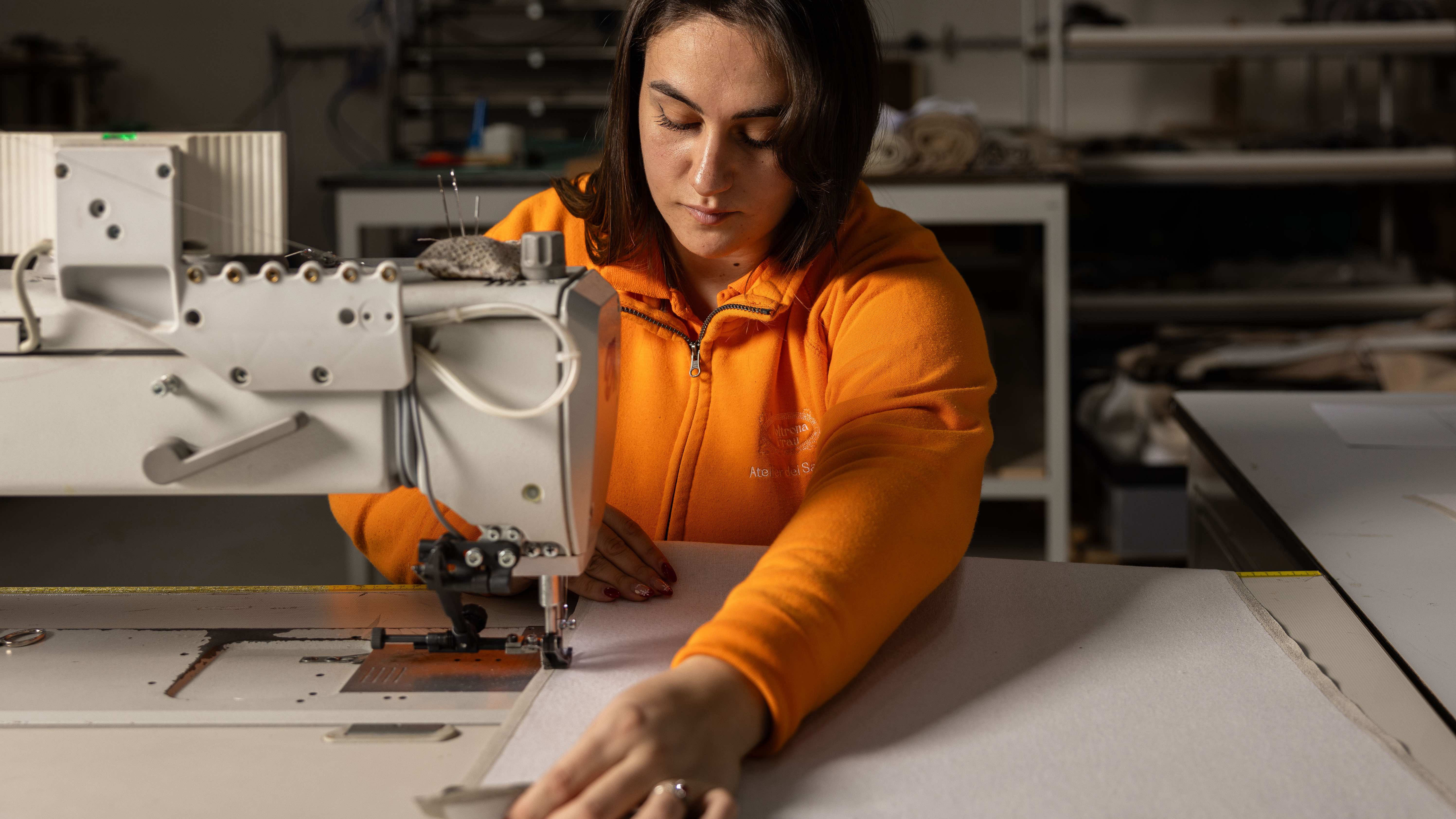 Through an innovative new training program, Poltrona Frau aims to safeguard Italian craft
The heritage furniture manufacturer is training a new generation of leather artisans


