Temple of Steps named Best New Public Building: Wallpaper* Design Awards 2021
The shortlist for the Wallpaper* Design Award for Best New Public Building 2021 includes world-leading culture, community and infrastructure spaces
WINNER
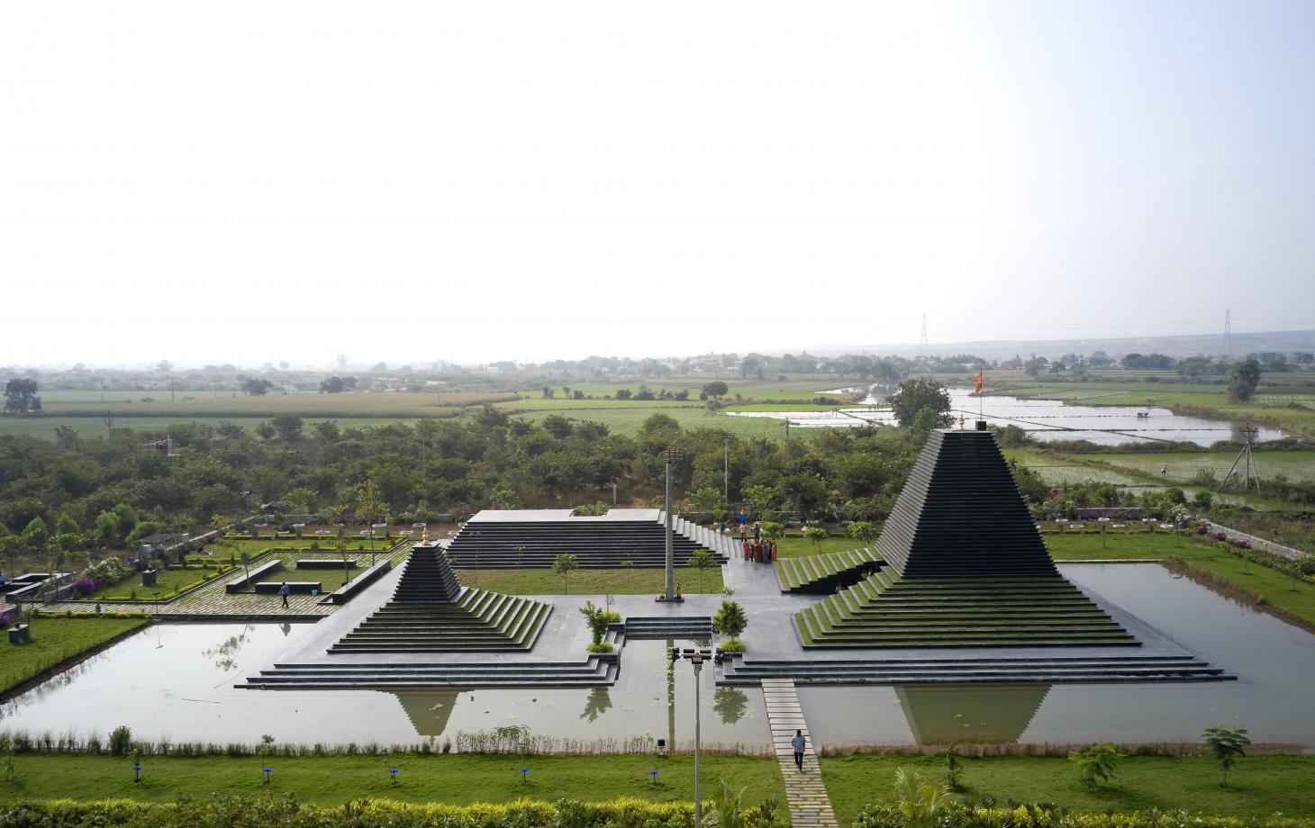
Temple of Steps, Andhra Pradesh, India
Pictured top, Mumbai-based architect Sameep Padora was commissioned to create this temple for the residents of a number of villages around Nandyal in India’s Andhra Pradesh. The architect’s aim was to try to connect ‘the socio-cultural expectations of a temple with the ecological framework and dynamics of and around the site’. A nearby canal, previously used to irrigate the surrounding cotton and chilli fields, was dried up, so the architect went to work bringing water back into the landscape, flowing from the ground through neighbouring limestone quarries to form a pond. The temple’s volumes were imagined as a traditional ghat; a flight of steps leading down to a waterbody. This is a nod to the country’s particular historical typology, found for example in the city of Benares. India’s rich cultural heritage was a key source of inspiration for Padora in more ways than one; he also drew on a Tirupati 10th-century temple to plan his design that combines water and manmade structures. The building is made using black limestone slabs, profiled to form the steps and the roof. The structure incorporates soil and planting to help with cooling, to negotiate the region’s intense heat.
KEY FEATURES: water, historical references, stone architecture, planted architecture
ARCHITECT’S PREVIOUS WORK: school library, Kopargaon, India; Lattice House, Jammu, India; Shiv Temple, Wadeshwar, Maharashtra, India
SHORTLIST
MEETT, Toulouse, France
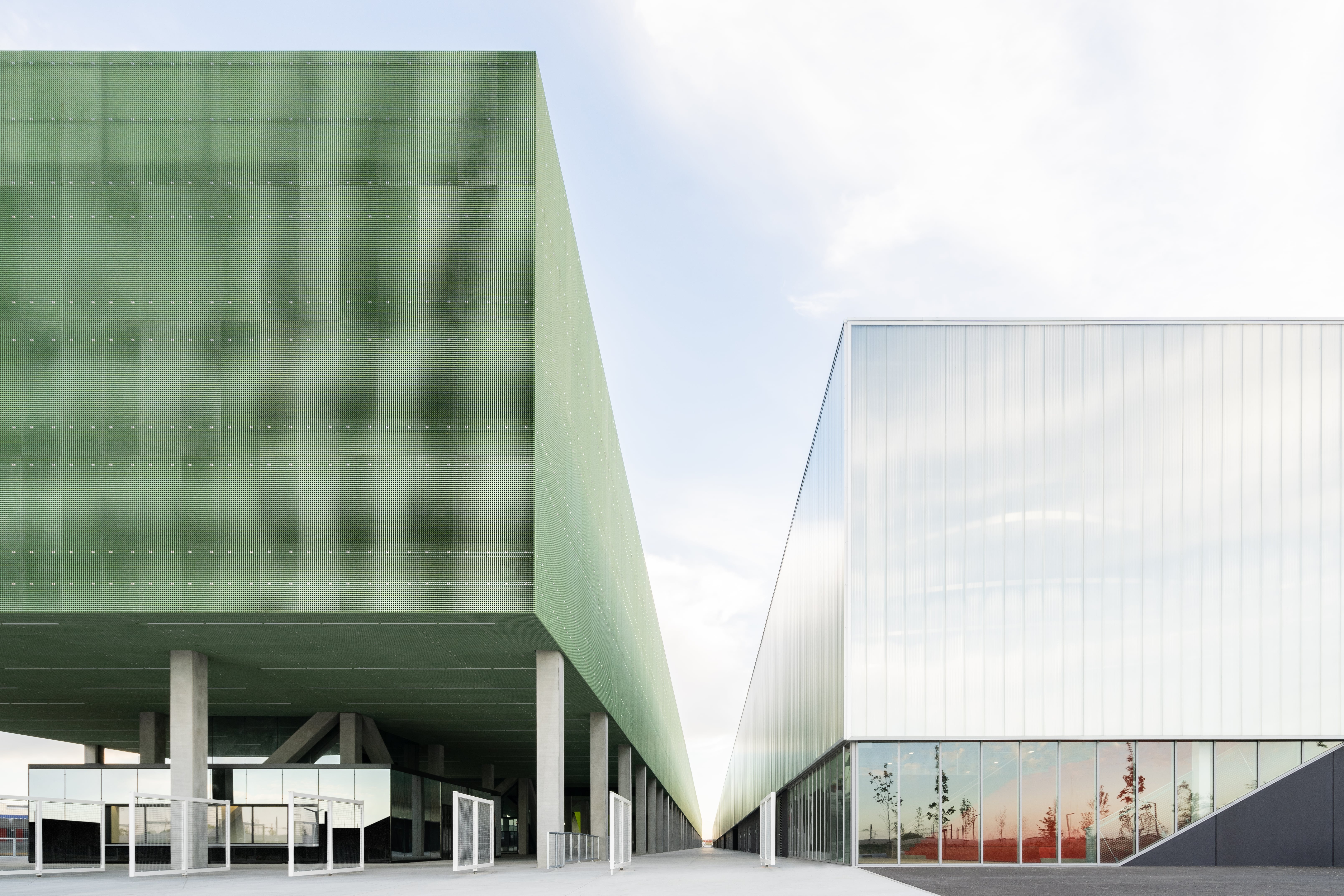
OMA’s MEETT Exhibition and Convention Centre in Toulouse links the city and the countryside; an industrial part of town and the agricultural landscape to the north; and through its function as an expo site, Toulouse and the rest of the world. Located to the city’s north, in its new ‘innovation zone’, the complex is planned around three main volumes, created in parallel to each other: a row of modular exhibition halls; a convention centre and multifunction event hall; and a reception area, including a silo car park for some 3,000 cars. The last is placed at the centre of the composition, leading visitors to the volumes flanking it and their respective functions. Seen as an ‘extrovert’ structure by its creators – a team led by OMA partners Chris van Duijn, Ellen van Loon and Rem Koolhaas – MEETT is ‘not an architectural intervention, but an urban machine. Both monumental in its scale and subtle in its overall impact, it will be a new gateway to Toulouse.’ French practices PPA Architectures and Taillandier Architectes Associés were associated designers. The structure has a fairly limited colour and material palette, alluding to a functional, pared down approach that is simple – yet carefully thought out – and easy to navigate. A series of black boxes, white-coloured steel and a polycarbonate skin make up the exhibition halls. Inside, vast, flexible, impressive spaces with a utilitarian feel are filled with natural light.
KEY FEATURES: urban campus, functionality, pared down aesthetic, polycarbonate skin
ARCHITECTS’ PREVIOUS WORK: Fondazione Prada, Milan, Italy; Garage Museum of Contemporary Art, Moscow, Russia; CCTV Tower, Beijing, China
He Art Museum, Shunde, China
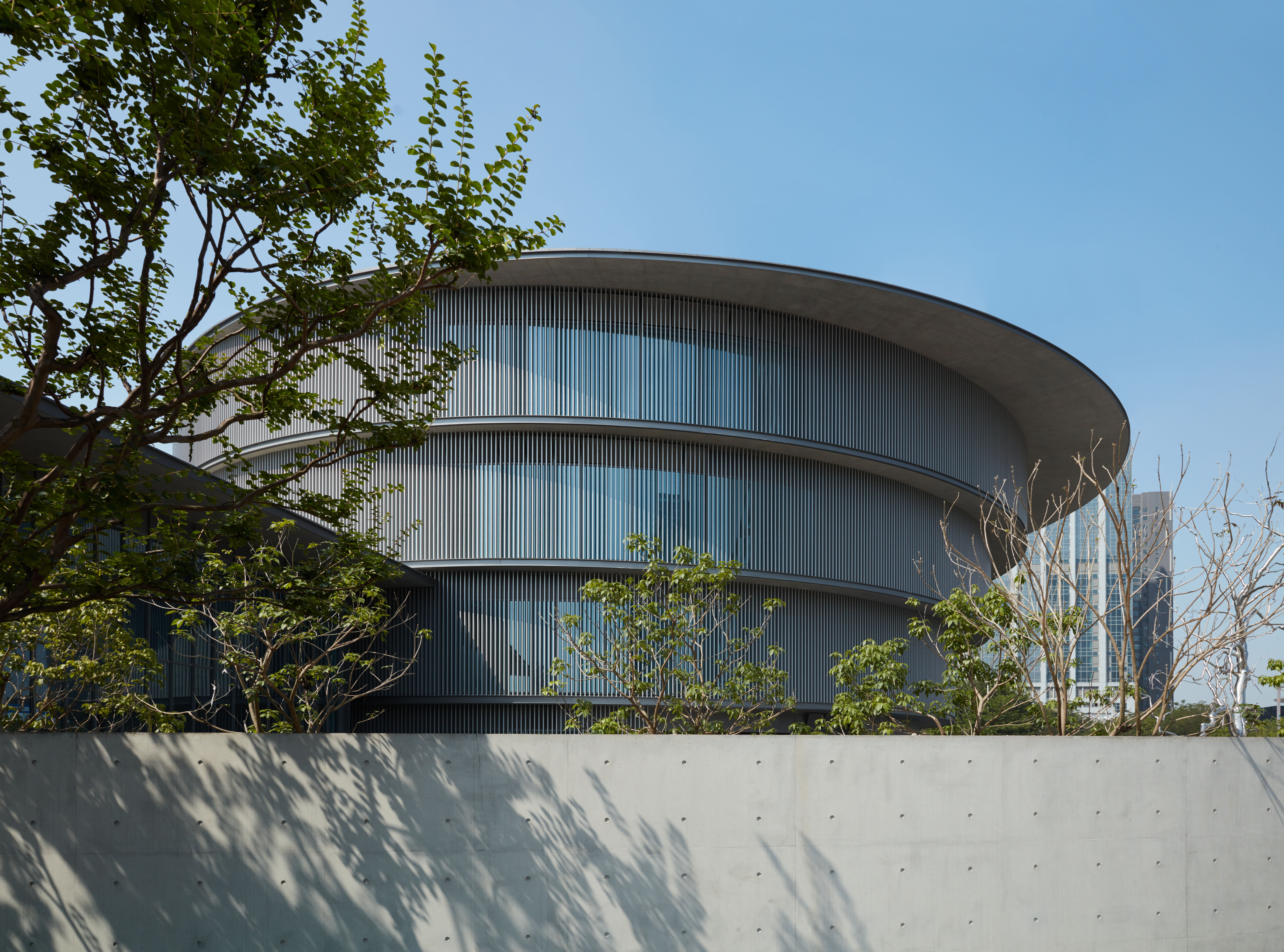
Southern China’s traditional distinctive round buildings reflect the ancient belief that the sky is round and divine, and the Earth is square. Pritzker Prize-winning Japanese architect Tadao Ando has reinterpreted this vernacular and the region’s famed waterside architecture for the new contemporary He Art Museum (HEM) in Shunde. The founder, He Jianfeng, who owns industrial investment group Infore, one of the region’s most successful businesses, hopes the museum’s striking architecture, Western works of art, and focus on southern China’s Lingnan culture will spark serious interest in culture and the arts. The entrance to the 16,000 sq m spiral-shaped pavilion, situated adjacent to Infore’s headquarters and plaza in the central business district, is by a path that crosses the pond encircling the museum. Inside, a monumental central skywell and floor-to-ceiling windows with aluminium alloy louvres flood the interior with daylight. An imposing pair of double-helix staircases in Ando’s signature smooth silvery-grey concrete create a dramatic Guggenheim-esque feel emphasised by the slightly cantilevered ascending four-storeys. There is a square ground-floor gallery, bookstore and café, and circular exhibition spaces above.
Wallpaper* Newsletter
Receive our daily digest of inspiration, escapism and design stories from around the world direct to your inbox.
KEY FEATURES: circular shape, concrete architecture, traditional vernacular references
ARCHITECT’S PREVIOUS WORK: Punta della Dogana, Venice, Italy; Church of the Light, Osaka, Japan; Naoshima Contemporary Art Museum, Naoshima, Japan
Town House, Kingston, UK
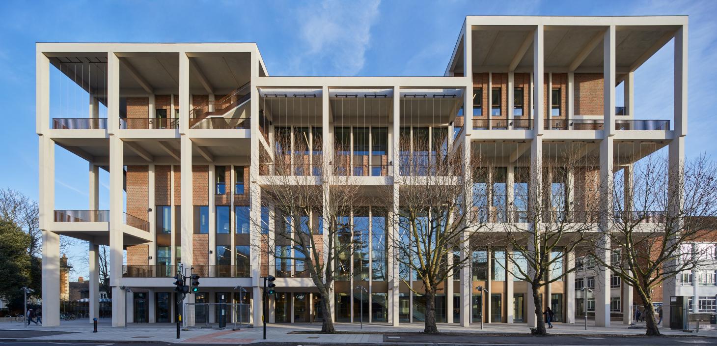
Community was a key factor in the design decisions of RIBA Gold Medal-winning Grafton Architects, which won the commission to create Town House, a structure to combine a library and dance studios for Kingston University under a single roof. Stepping inside, the architects’ intention becomes instantly apparent through the sheer openness of the building – both physical and symbolic. There are no barriers towards the street, so anybody can walk in and stroll around the library or get a coffee at the canteen. The interior is composed of large, interconnected halls and double- and triple-height spaces, adding a sculptural touch. Nothing seems hidden away, although clever niches were created for privacy. The street-facing colonnade and a continuation of the floor material from the outside in are designed to encourage people to step inside. For a building that is primarily made out of concrete – constructed by the multi-award-winning contractor Willmott Dixon using prefabricated elements – the whole feels extraordinarily light. This sense is increased by large openings throughout and the elegant but hardwearing, everyday materials, such as wood, which help create a sophisticated but comfortable atmosphere, entirely fit for purpose. At the building’s heart sits an auditorium. Partitions can be drawn back to allow natural light to pour in, through the glass expanses of the façade. The building has achieved a BREEAM Excellent rating for sustainability. Roof gardens allow the use of brown roof technology to absorb water and to enhance biodiversity.
KEY FEATURES: prefabricated concrete elements, sense of light and space, high sustainability rating, roof gardens
ARCHITECTS’ PREVIOUS WORK: Universita Luigi Bocconi School of Economics; Milan, Italy; Venice Architecture Biennale 2018; Universidad de Ingeniería y Tecnología (UTEC), Lima, Peru
US Olympic & Paralympic Museum, Colorado, USA
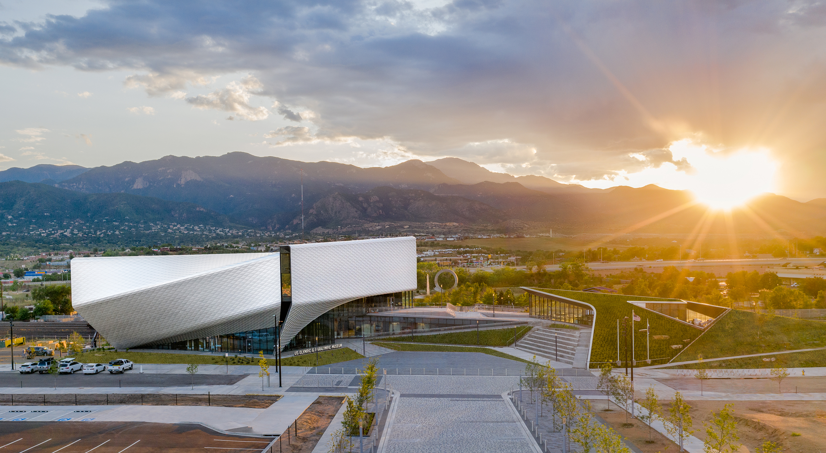
Conceived to pay tribute to the Olympic and Paralympic movements in America, the latest Diller Scofidio + Renfro design opened in summer 2020 in Southwest Downtown, Colorado Springs. The US Olympic & Paralympic Museum is a striking piece of architecture defined by a soaring roof, clad in aluminium scales, that sweeps and folds impressively against its Rocky Mountains backdrop and glistens in the extraordinary local sunlight. Even with its commanding presence and picturesque setting, the architects say they have placed ‘Team USA athletes at the centre of the experience’. The building features 20,000 sq ft of galleries, a state-of-the-art theatre, event space and café, all celebrating the athletes’ ‘energy and grace’ and the much-loved international event’s values. The architect and client team also proudly state that this cultural offering is ‘amongst the most accessible museums in the world’, as DS+R paid special attention to this in the design, ensuring all areas and events are equally accessible to people of all abilities – and they all share a common path through the building. While the impressive façade consists of over 9,000 unique folded anodised diamond-shaped aluminium panels, inside, a crisp, white colour palette creates a fitting context for rotating shows and various displays. A terraced, covered plaza sits at the heart of the complex, leading to exhibition halls and café area.
KEY FEATURES: a roof clad with aluminium scales, accessibility, reflective volumes, irregular shapes
ARCHITECTS’ PREVIOUS WORK: Berkeley Art Museum and Pacific Film Archive, University of California, Berkeley, USA; The Broad, Los Angeles, USA; High Line, New York, USA
SEE MORE FROM WALLPAPER* DESIGN AWARDS 2021
Ellie Stathaki is the Architecture & Environment Director at Wallpaper*. She trained as an architect at the Aristotle University of Thessaloniki in Greece and studied architectural history at the Bartlett in London. Now an established journalist, she has been a member of the Wallpaper* team since 2006, visiting buildings across the globe and interviewing leading architects such as Tadao Ando and Rem Koolhaas. Ellie has also taken part in judging panels, moderated events, curated shows and contributed in books, such as The Contemporary House (Thames & Hudson, 2018), Glenn Sestig Architecture Diary (2020) and House London (2022).
-
 Put these emerging artists on your radar
This crop of six new talents is poised to shake up the art world. Get to know them now
By Tianna Williams
-
 Dining at Pyrá feels like a Mediterranean kiss on both cheeks
Designed by House of Dré, this Lonsdale Road addition dishes up an enticing fusion of Greek and Spanish cooking
By Sofia de la Cruz
-
 Creased, crumpled: S/S 2025 menswear is about clothes that have ‘lived a life’
The S/S 2025 menswear collections see designers embrace the creased and the crumpled, conjuring a mood of laidback languor that ran through the season – captured here by photographer Steve Harnacke and stylist Nicola Neri for Wallpaper*
By Jack Moss
-
 The Yale Center for British Art, Louis Kahn’s final project, glows anew after a two-year closure
After years of restoration, a modernist jewel and a treasure trove of British artwork can be seen in a whole new light
By Anna Fixsen
-
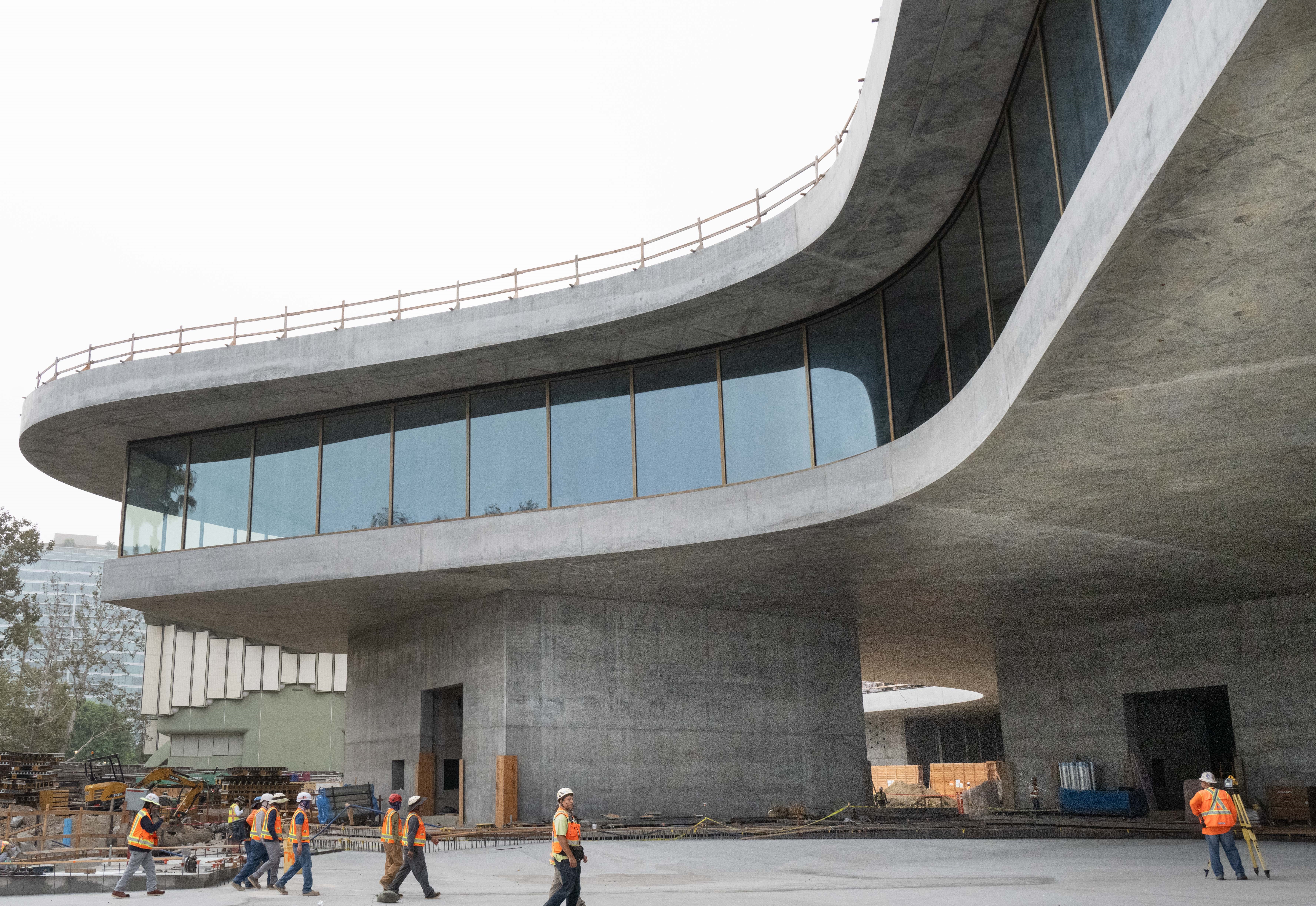 You’ll soon be able to get a sneak peek inside Peter Zumthor’s LACMA expansion
But you’ll still have to wait another year for the grand opening
By Anna Fixsen
-
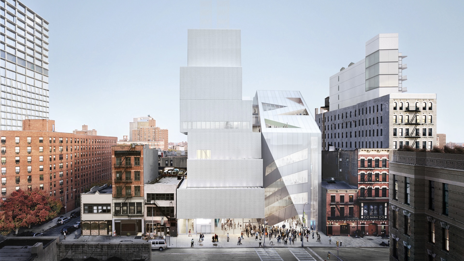 NYC's The New Museum announces an OMA-designed extension
OMA partners including Rem Koolhas and Shohei Shigematsu are designing a new building for Manhattan's only dedicated contemporary art museum
By Anna Solomon
-
 Architect Sou Fujimoto explains how the ‘idea of the forest’ is central to everything
Sou Fujimoto has been masterminding the upcoming Expo 2025 Osaka for the past five years, as the site’s design producer. To mark the 2025 Wallpaper* Design Awards, the Japanese architect talks to us about 2024, the year ahead, and materiality, nature, diversity and technological advances
By Sou Fujimoto
-
 Lesley Lokko reviews 2024's wins, shifts, tensions and opportunities for 2025
Lesley Lokko, the British-Ghanaian architect, educator, curator, and founder and director of the African Futures Institute (AFI), has been an inspirational presence in architecture in 2024; which makes her perfectly placed to discuss the year, marking the 2025 Wallpaper* Design Awards
By Lesley Lokko
-
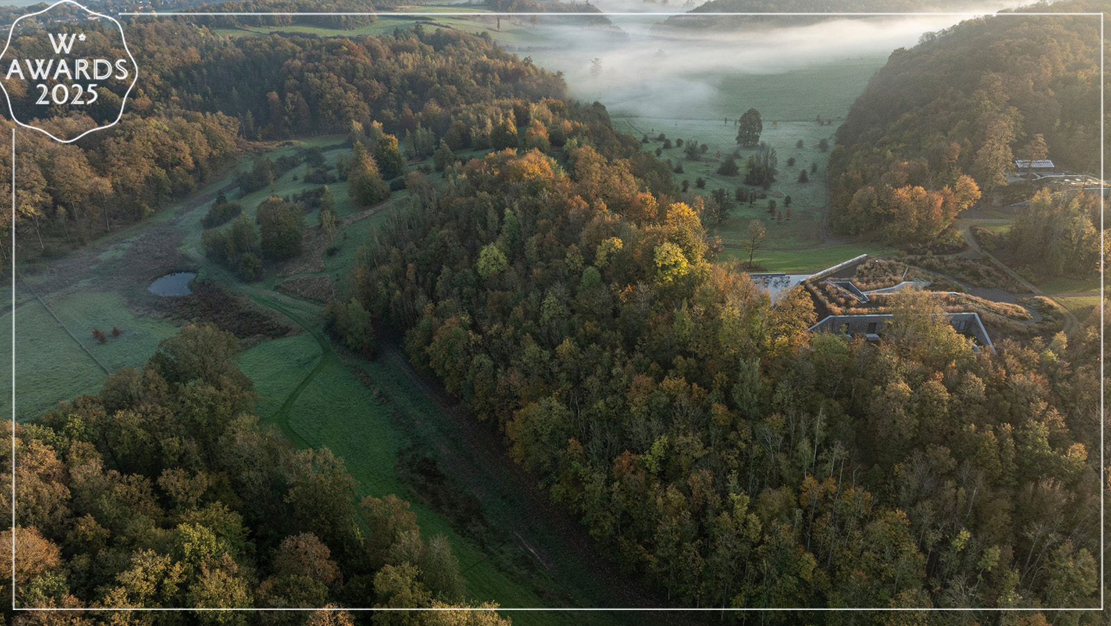
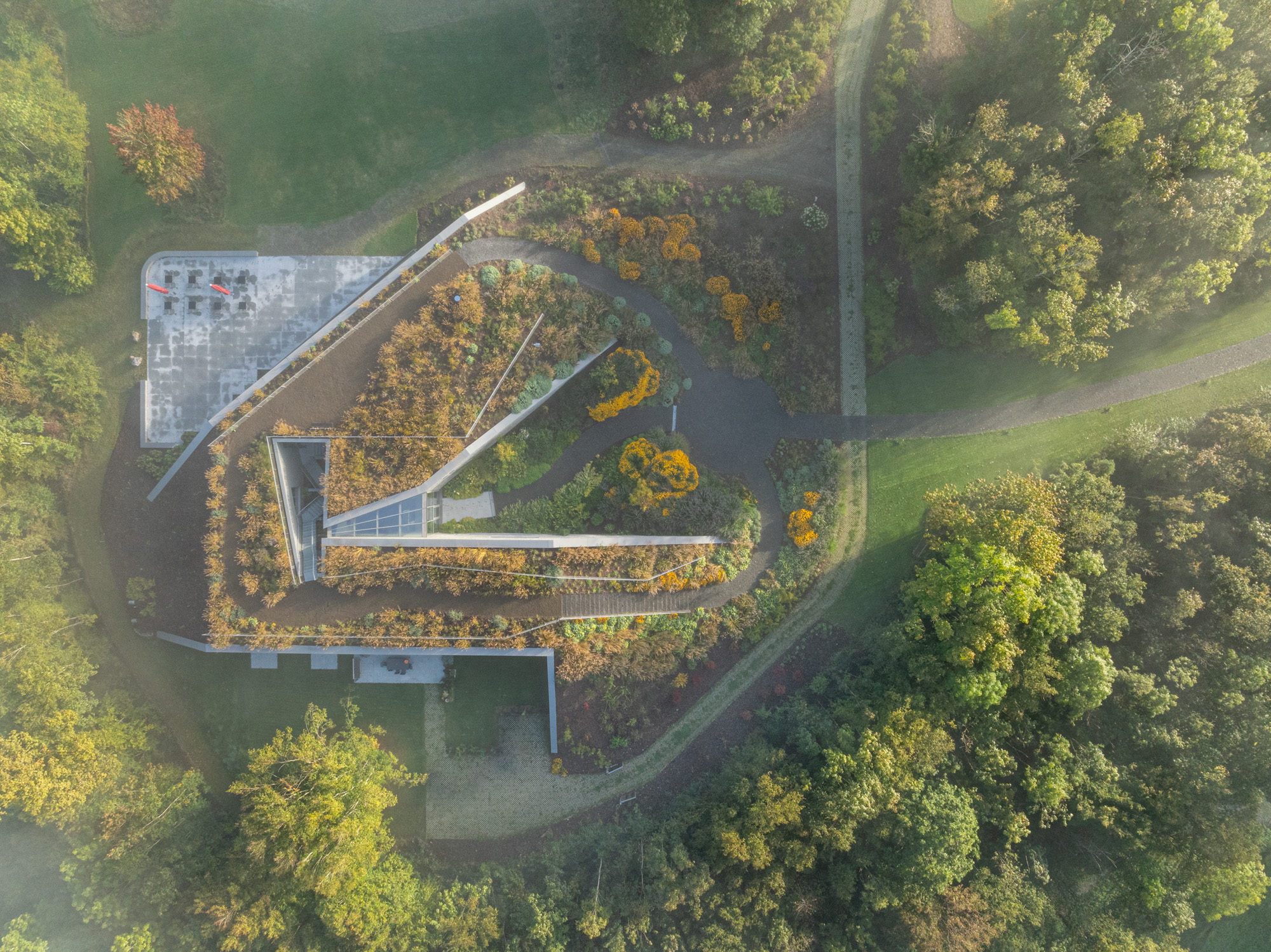 Tour Marche Arboretum, a new 'museum' of plants in Belgium
Marche Arboretum is a joyful new green space in Belgium, dedicated to nature and science – and a Wallpaper* Design Award 2025 winner
By Ellie Stathaki
-
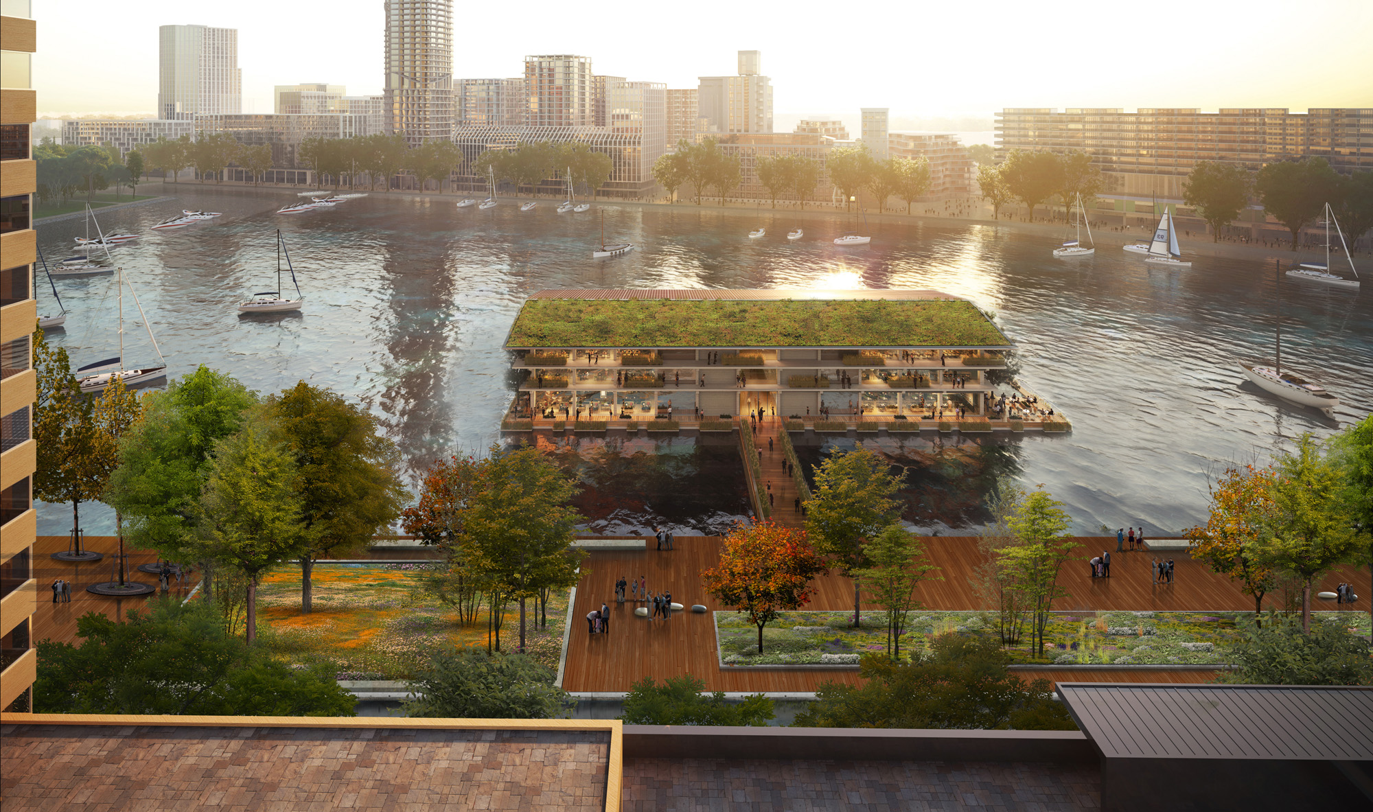 Rotterdam’s urban rethink makes it the city of 2025
We travel to Rotterdam, honoured in the Wallpaper* Design Awards 2025, and look at the urban action the Dutch city is taking to future-proof its environment for people and nature
By Ellie Stathaki
-
 Wallpaper* Design Awards 2025: celebrating architectural projects that restore, rebalance and renew
As we welcome 2025, the Wallpaper* Architecture Awards look back, and to the future, on how our attitudes change; and celebrate how nature, wellbeing and sustainability take centre stage
By Ellie Stathaki