Architects SAW transform San Francisco home
Spiegel Aihara Workshop (SAW) and interior designer White Space Design creates Wraparound House, the transformation of a San Francisco Spanish Revival house into a bright and open 21st-century family home
Paul Dyer - Photography
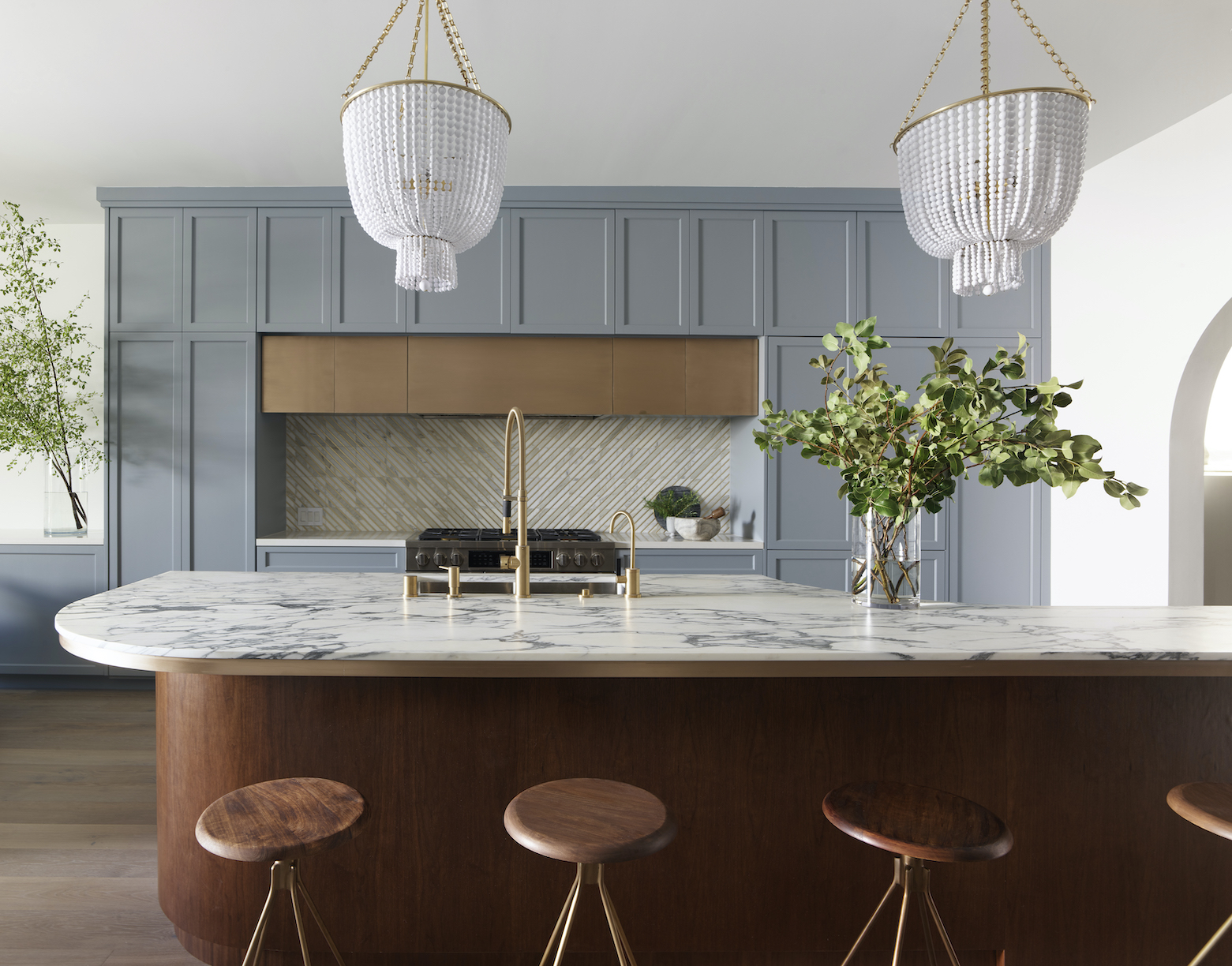
A Spanish Revival home in San Francisco has been given a 21st-century makeover, courtesy of architects Spiegel Aihara Workshop (SAW). Wraparound House, the commission for a family of five, involved updating an existing home, adding space to accommodate group activities and entertaining, and also stabilising and tackling the land below, which was contaminated and in need of remediation. The architects obliged, transforming this San Francisco home into a light filled, generous, six-bedroom abode that bridges past and present, while reclaiming its site.
The architects worked on the design both ‘vertically and horizontally', they say. ‘Rather than simply building upon the new ground, we saw the challenge as redistributing the ground vertically across the site, throughout the building. While many buildings have terraces, or balconies, or things like that, we set out to maintain a complete continuity of a new ground across the entire house, ensuring that every roof was not so much the top of something, but the bottom of something – a new ground,’ says SAW's Dan Spiegel.
San Francisco home with curve appeal
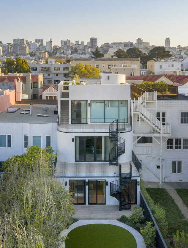
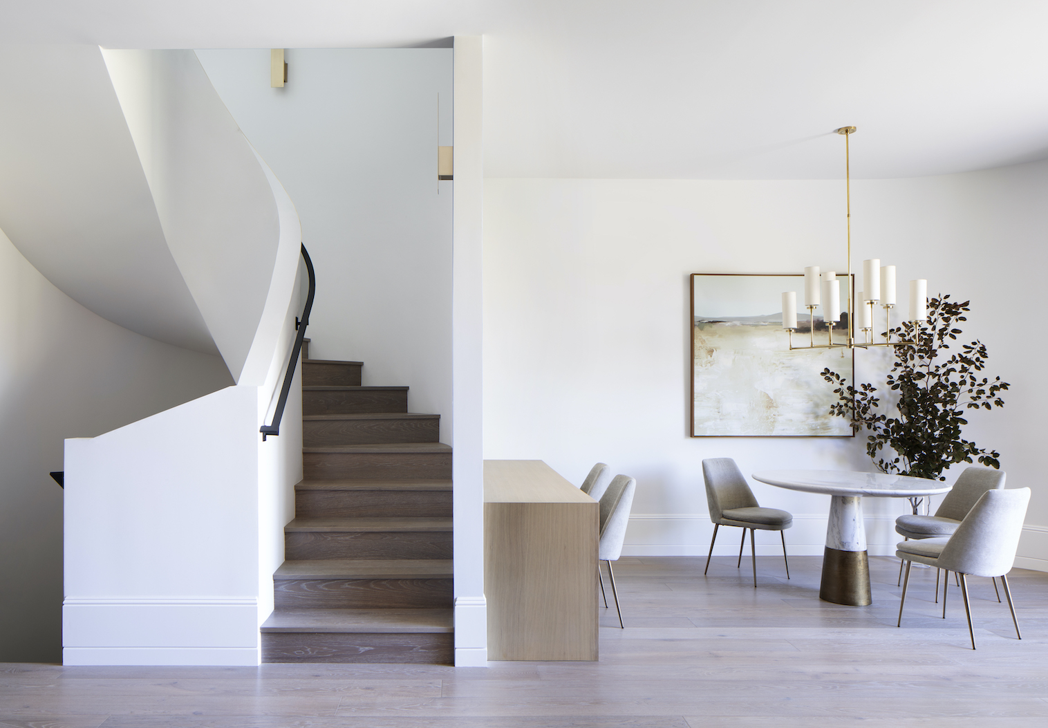
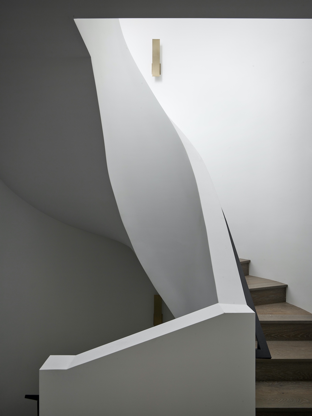
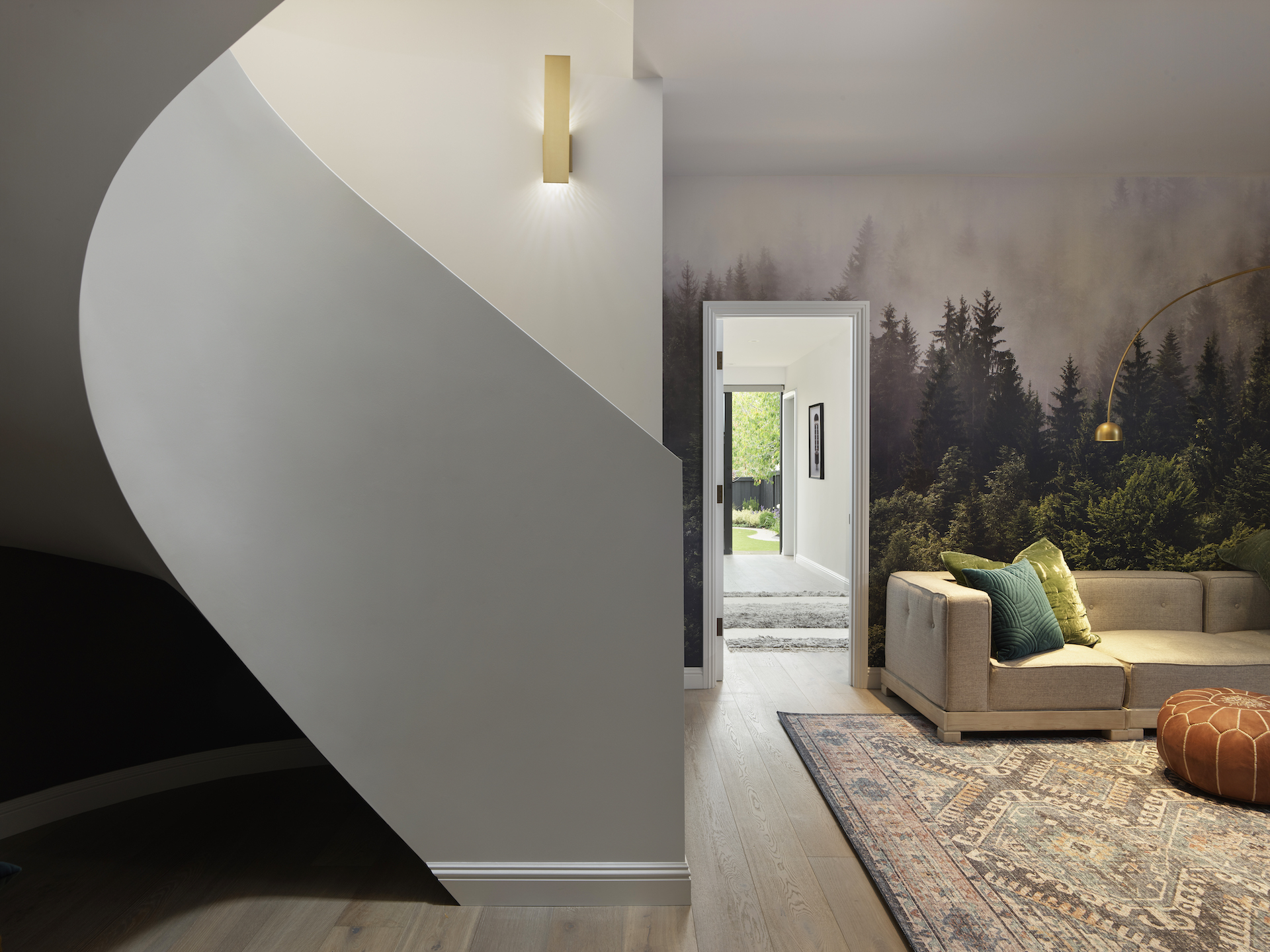
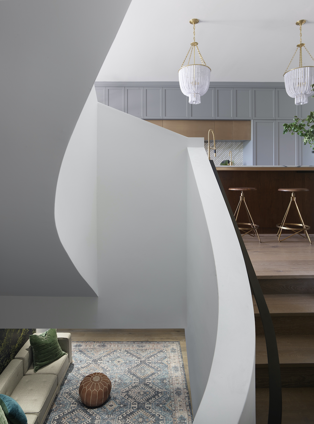
Inside, a central staircase becomes not only a connector between levels, but also a sculptural accent. A second, exterior stair links the different floors via the outdoor terraces. This access and relationship to the outdoors takes place on every level, in different ways; connecting the indoors with the garden, and allowing for long vistas of the bay and the Golden Gate Bridge were a key part of the clients' brief.
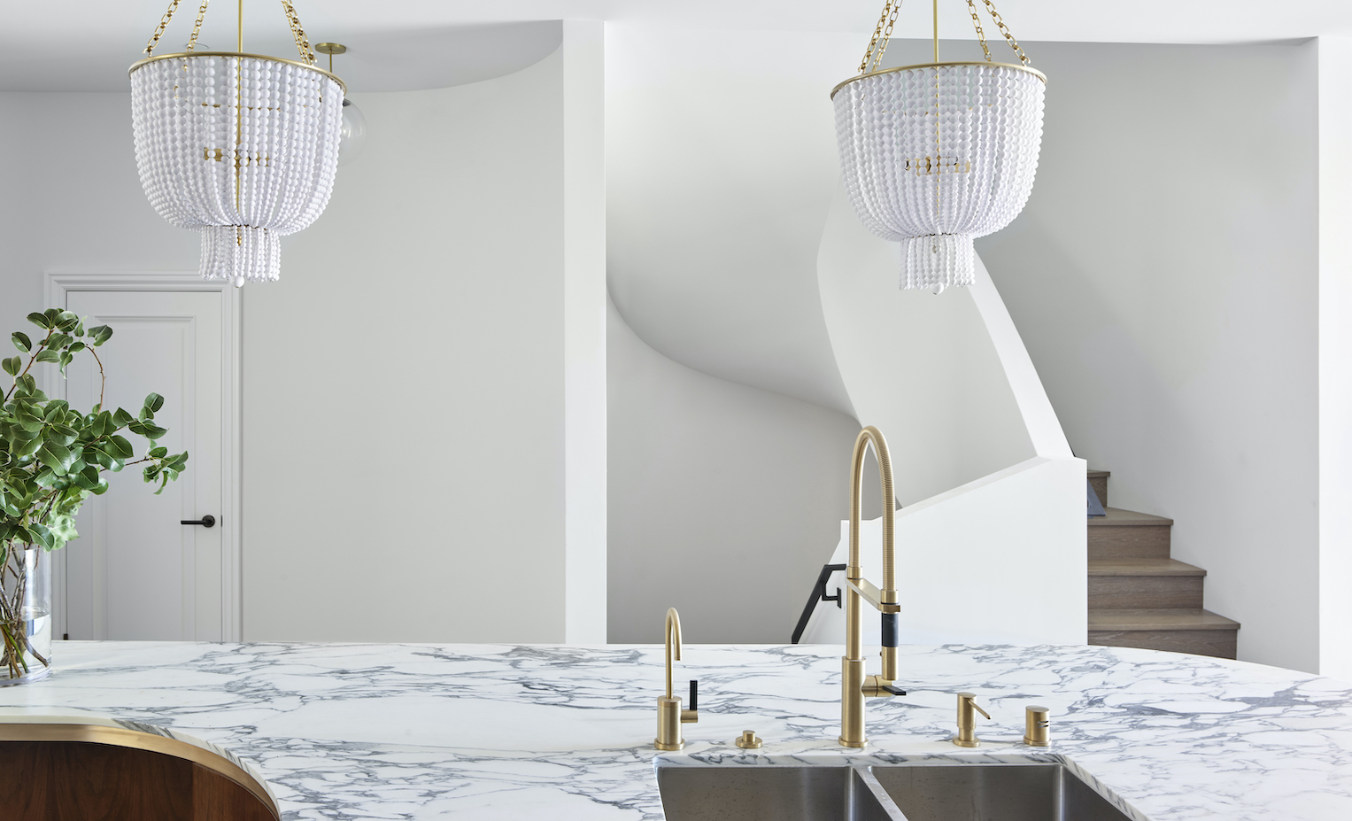
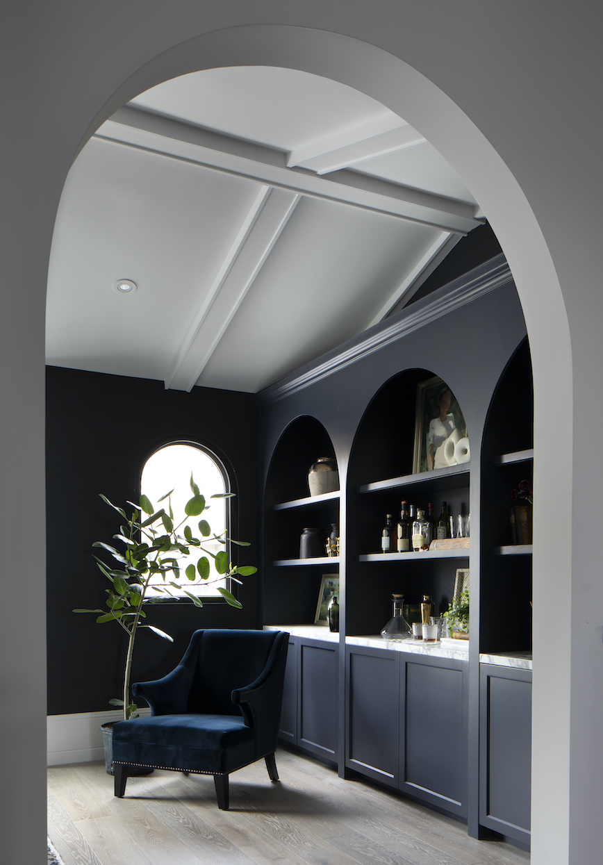
Meanwhile, soft, rounded corners, light colours, crisp surfaces and large openings ensure the interior of this San Francisco home feels fresh and open, creating a sense of calm, while highlighting the views. Meanwhile design studio White Space, headed by Heidi Kim, worked on the interior.
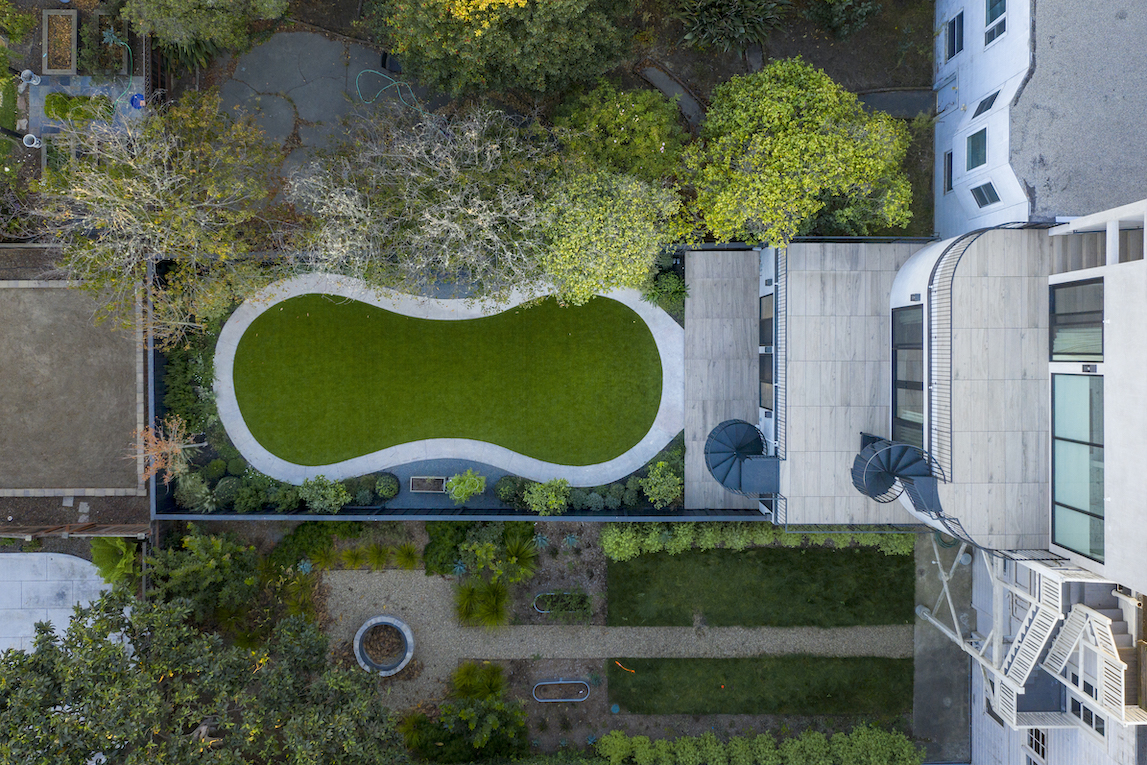
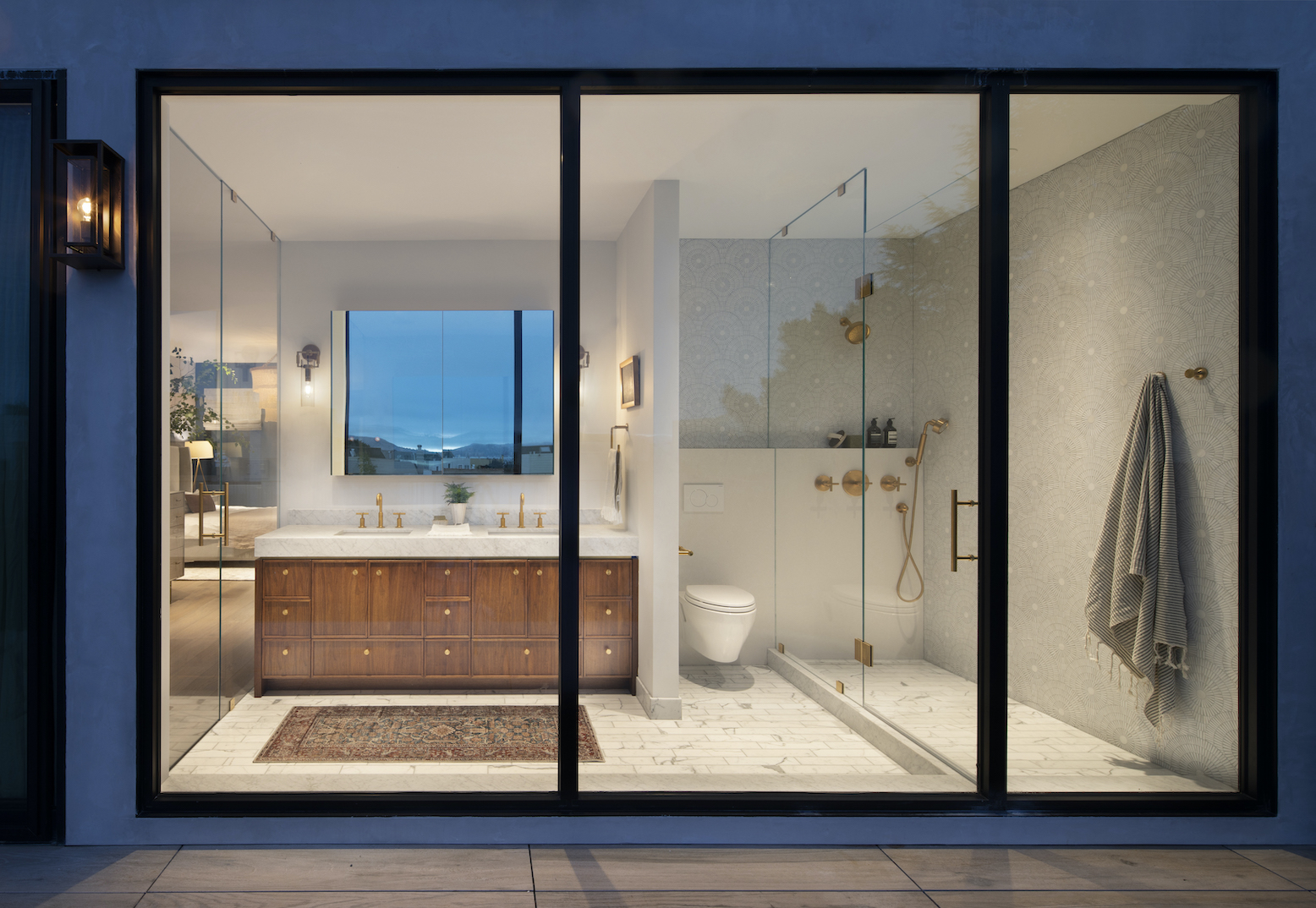
The rounded edges play another role too, Spiegel explains: ‘It sort of works as a gradient: the spaces are more public, more outward looking at the top, and more private, more inward looking at the bottom. The rounded edges of the garden path form a scooter/bike track; the rounded corners of the family room gradually guide you out to the terrace; the master bathroom is conceived as a thickened window for the bedroom, balcony-like and perched over the bay. On most days, I’m just as likely to take the exterior stairs as the interior stairs to move between rooms. It doesn’t quite look like it, but it works a bit like a mobius strip in that way.' The house's name – Wraparound – is inspired by this too.
SAW's Megumi Aihara, a landscape architect, spearheaded the ground's remediation, starting from scratch with the garden to compose a design that accommodates new soil for planting and new trees, including two majestic October Glory Red maples placed on site. This way, modern architecture is balanced by rich, leafy nature in this San Francisco home.
INFORMATION
Wallpaper* Newsletter
Receive our daily digest of inspiration, escapism and design stories from around the world direct to your inbox.
Ellie Stathaki is the Architecture & Environment Director at Wallpaper*. She trained as an architect at the Aristotle University of Thessaloniki in Greece and studied architectural history at the Bartlett in London. Now an established journalist, she has been a member of the Wallpaper* team since 2006, visiting buildings across the globe and interviewing leading architects such as Tadao Ando and Rem Koolhaas. Ellie has also taken part in judging panels, moderated events, curated shows and contributed in books, such as The Contemporary House (Thames & Hudson, 2018), Glenn Sestig Architecture Diary (2020) and House London (2022).
- Paul Dyer - PhotographyPhotographer
-
 Inside the Shakti Design Residency, taking Indian craftsmanship to Alcova 2025
The new initiative pairs emerging talents with some of India’s most prestigious ateliers, resulting in intricately crafted designs, as seen at Alcova 2025 in Milan
By Henrietta Thompson Published
-
 Tudor hones in on the details in 2025’s new watch releases
Tudor rethinks classic watches with carefully considered detailing – shop this year’s new faces
By Thor Svaboe Published
-
 2025 Expo Osaka: Ireland is having a moment in Japan
At 2025 Expo Osaka, a new sculpture for the Irish pavilion brings together two nations for a harmonious dialogue between place and time, material and form
By Danielle Demetriou Published
-
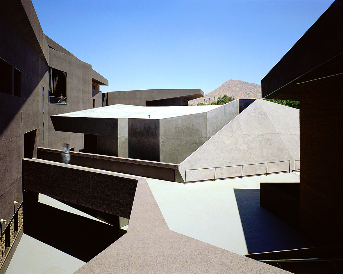 We explore Franklin Israel’s lesser-known, progressive, deconstructivist architecture
Franklin Israel, a progressive Californian architect whose life was cut short in 1996 at the age of 50, is celebrated in a new book that examines his work and legacy
By Michael Webb Published
-
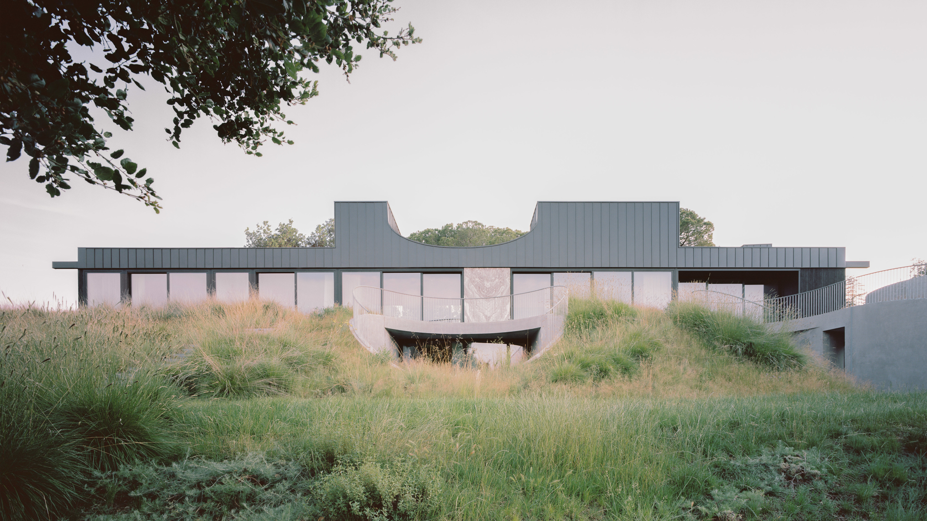 A new hilltop California home is rooted in the landscape and celebrates views of nature
WOJR's California home House of Horns is a meticulously planned modern villa that seeps into its surrounding landscape through a series of sculptural courtyards
By Jonathan Bell Published
-
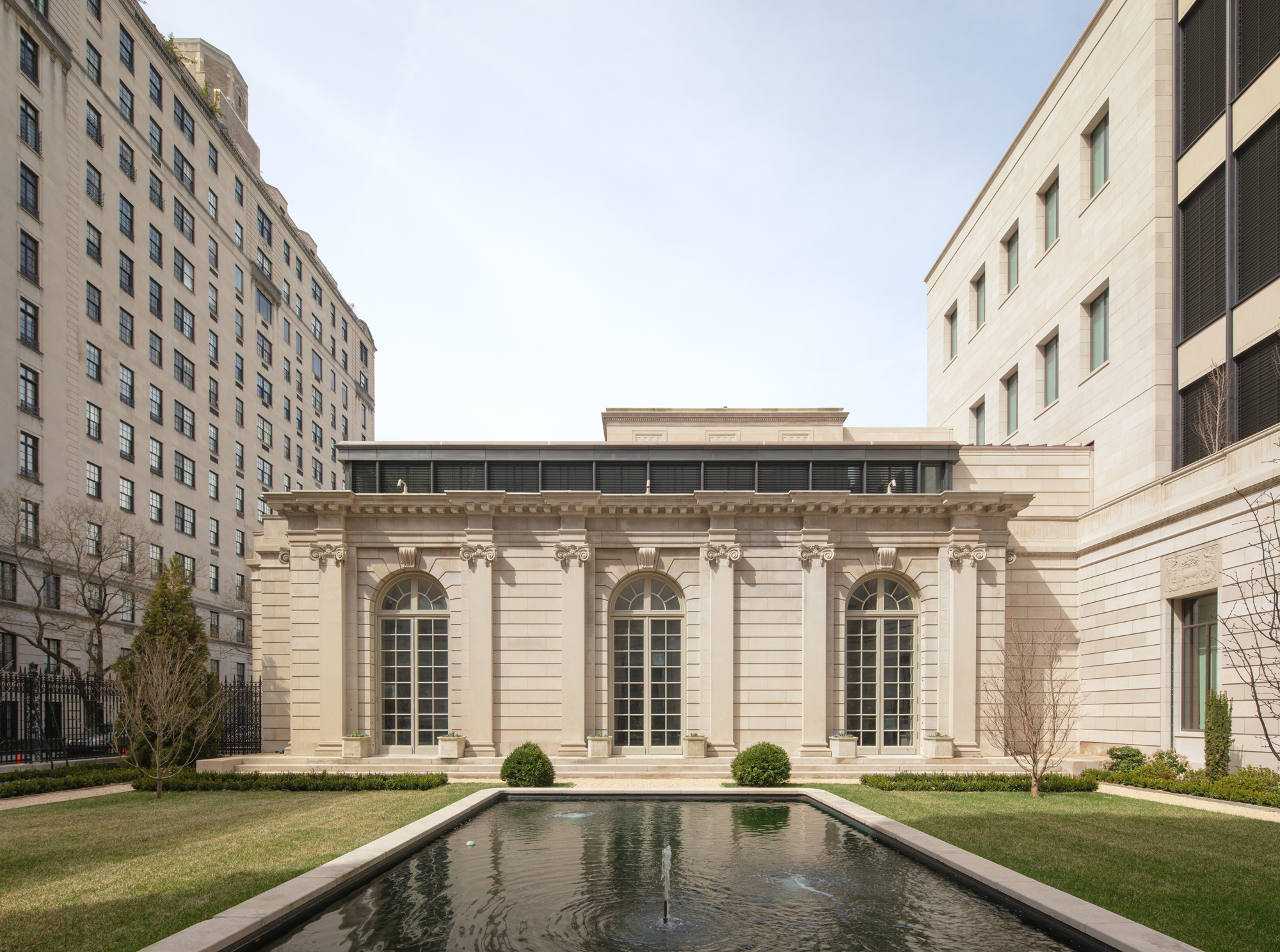 The Frick Collection's expansion by Selldorf Architects is both surgical and delicate
The New York cultural institution gets a $220 million glow-up
By Stephanie Murg Published
-
 Remembering architect David M Childs (1941-2025) and his New York skyline legacy
David M Childs, a former chairman of architectural powerhouse SOM, has passed away. We celebrate his professional achievements
By Jonathan Bell Published
-
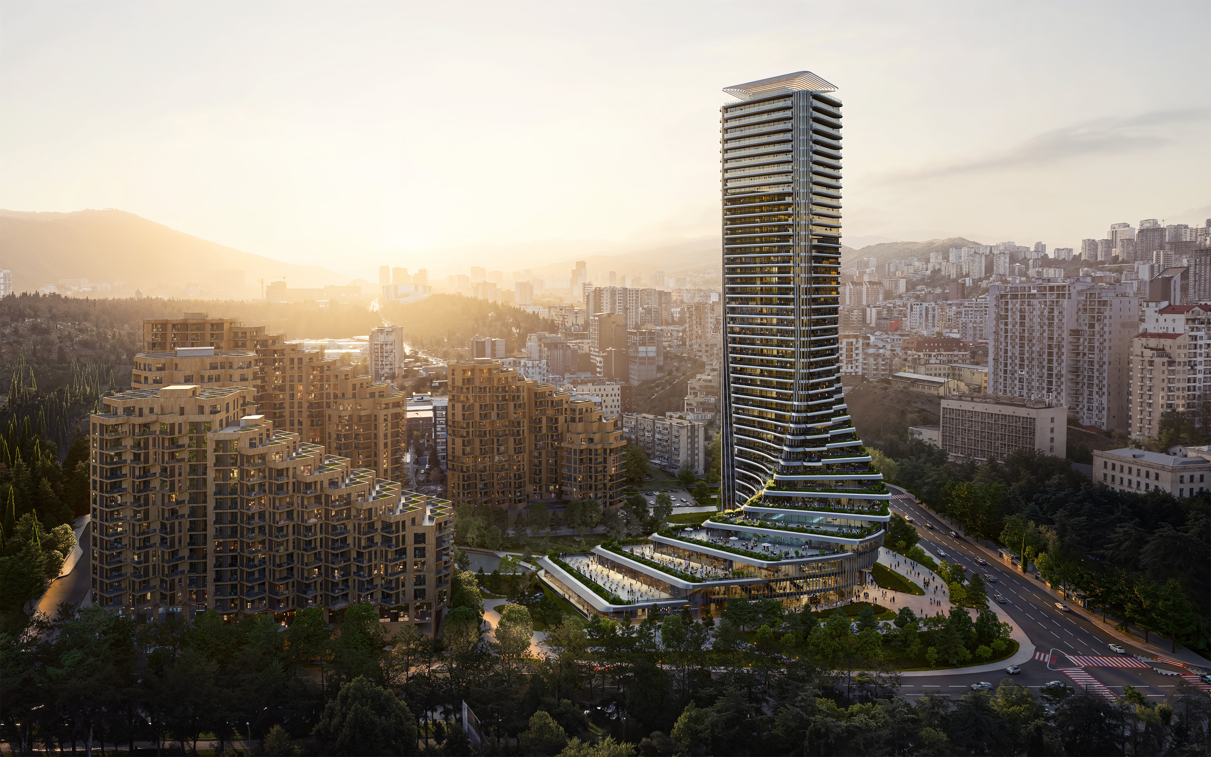 The upcoming Zaha Hadid Architects projects set to transform the horizon
A peek at Zaha Hadid Architects’ future projects, which will comprise some of the most innovative and intriguing structures in the world
By Anna Solomon Published
-
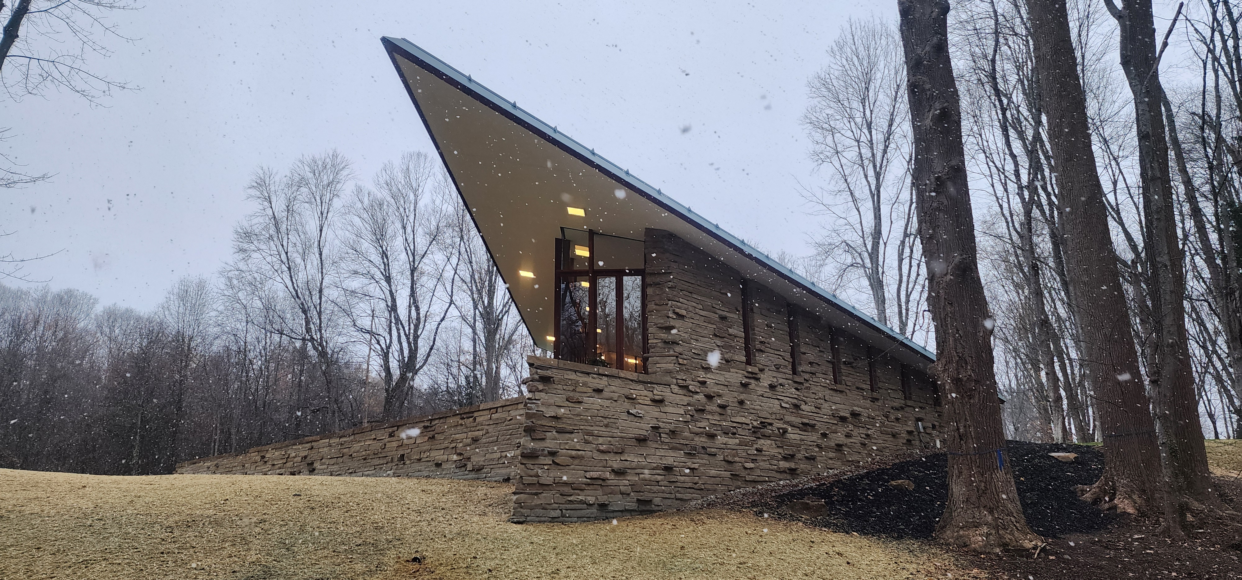 Frank Lloyd Wright’s last house has finally been built – and you can stay there
Frank Lloyd Wright’s final residential commission, RiverRock, has come to life. But, constructed 66 years after his death, can it be considered a true ‘Wright’?
By Anna Solomon Published
-
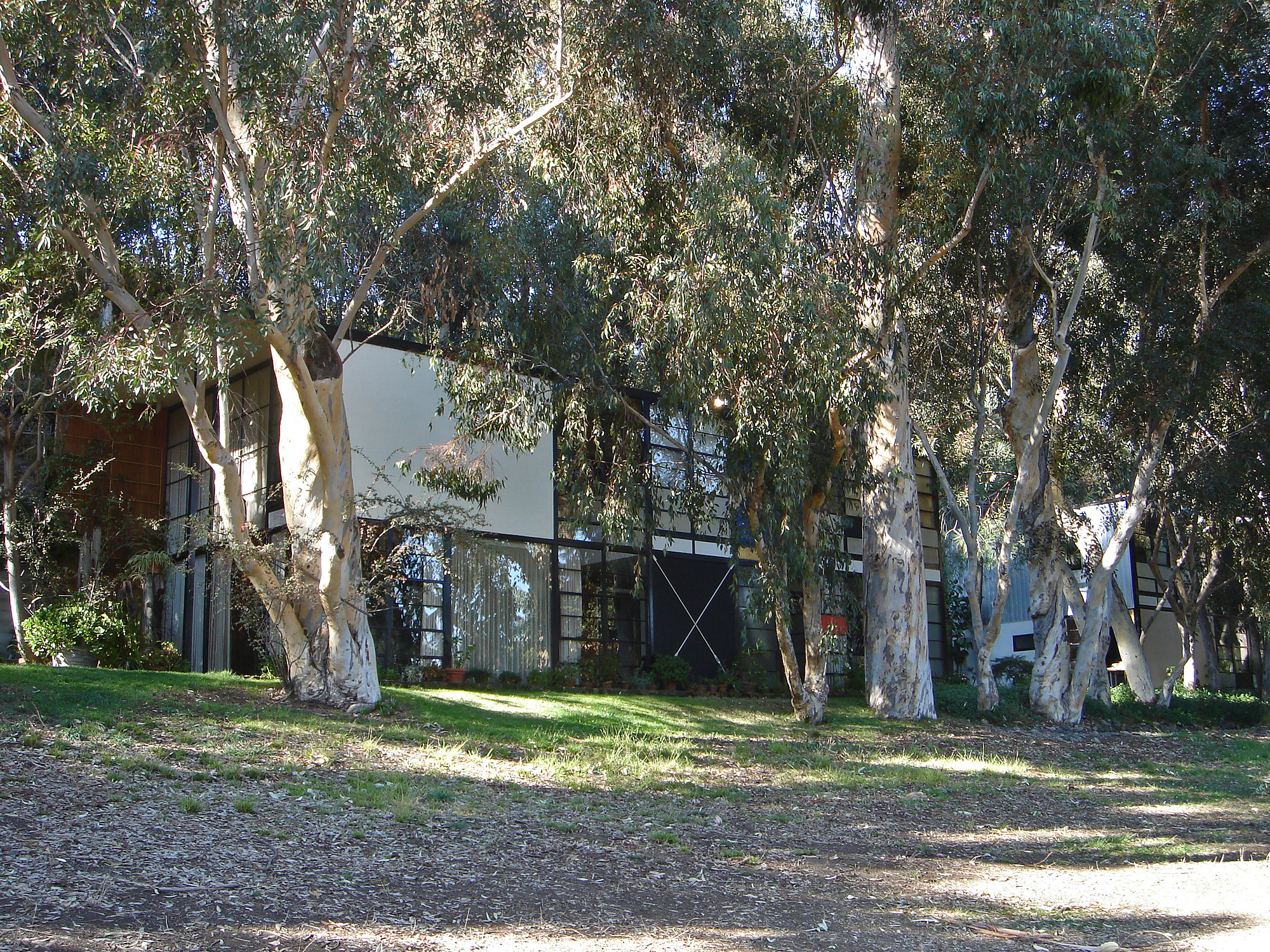 Heritage and conservation after the fires: what’s next for Los Angeles?
In the second instalment of our 'Rebuilding LA' series, we explore a way forward for historical treasures under threat
By Mimi Zeiger Published
-
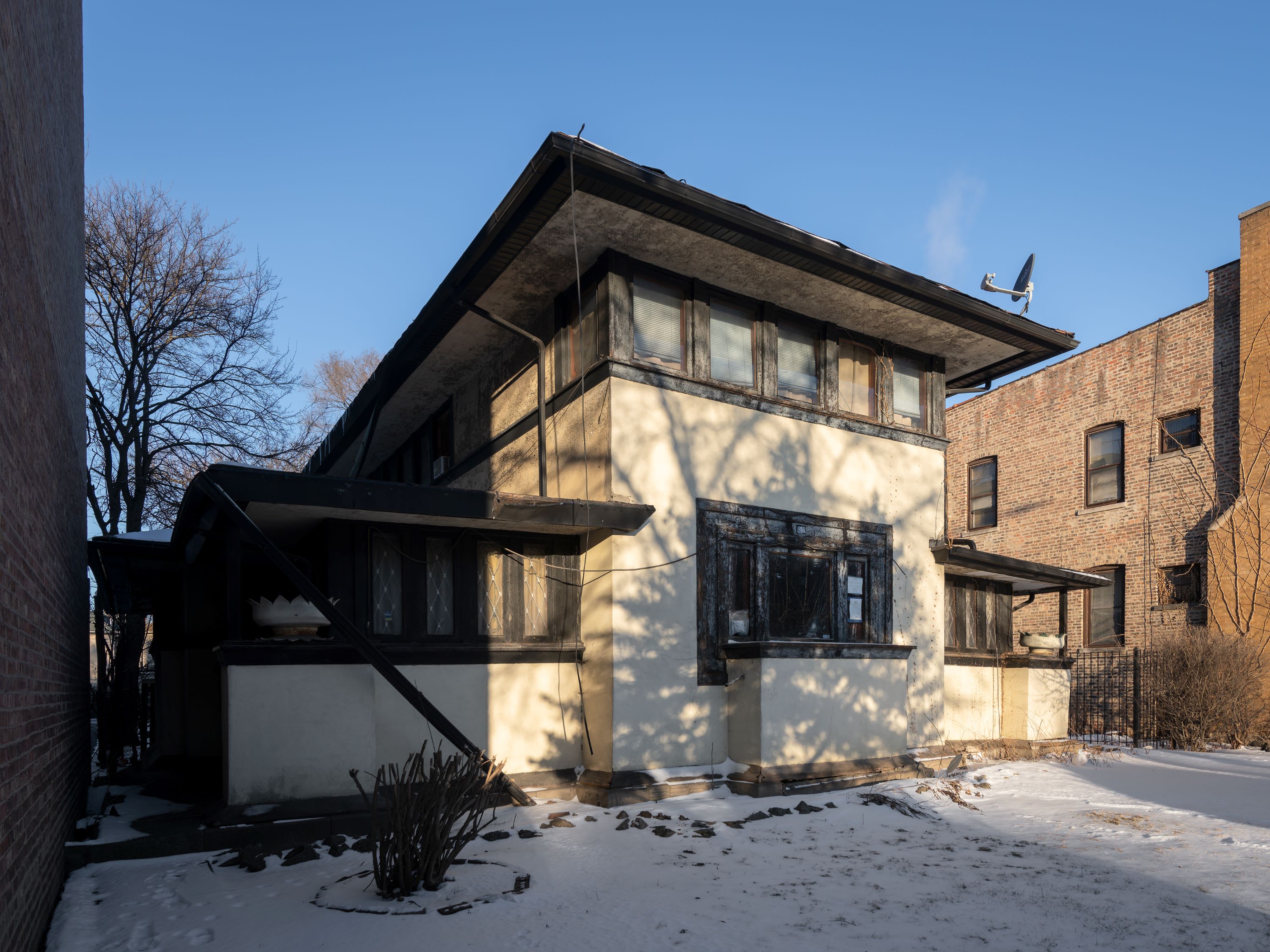 Why this rare Frank Lloyd Wright house is considered one of Chicago’s ‘most endangered’ buildings
The JJ Walser House has sat derelict for six years. But preservationists hope the building will have a vibrant second act
By Anna Fixsen Published