Craft store Nakagawa Masashichi Shoten at Narita airport is an ode to travel
The Japanese homewear and craft store Nakagawa Masashichi Shoten wows with bright interior made of moveable ‘trunks’ by Tokyo-based studio 14sd designs
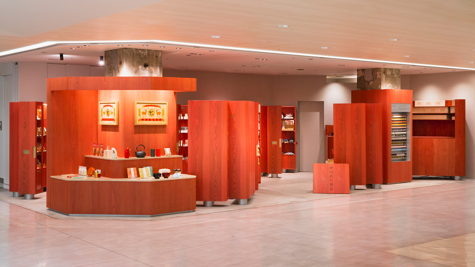
Long-established Japanese craft retailer Nakagawa Masashichi Shoten’s latest outpost celebrates the beauty of travel. The retail interior, set inside one of Japan’s busiest airports, Narita, was created by Yosuke Hayashi of Tokyo-based design studio 14sd – also known as Fourteen Stones Design – and focuses on the sense of discovery and anticipation the start of a journey brings.
Japanese craft retailer Nakagawa Masashichi Shoten at Narita airport
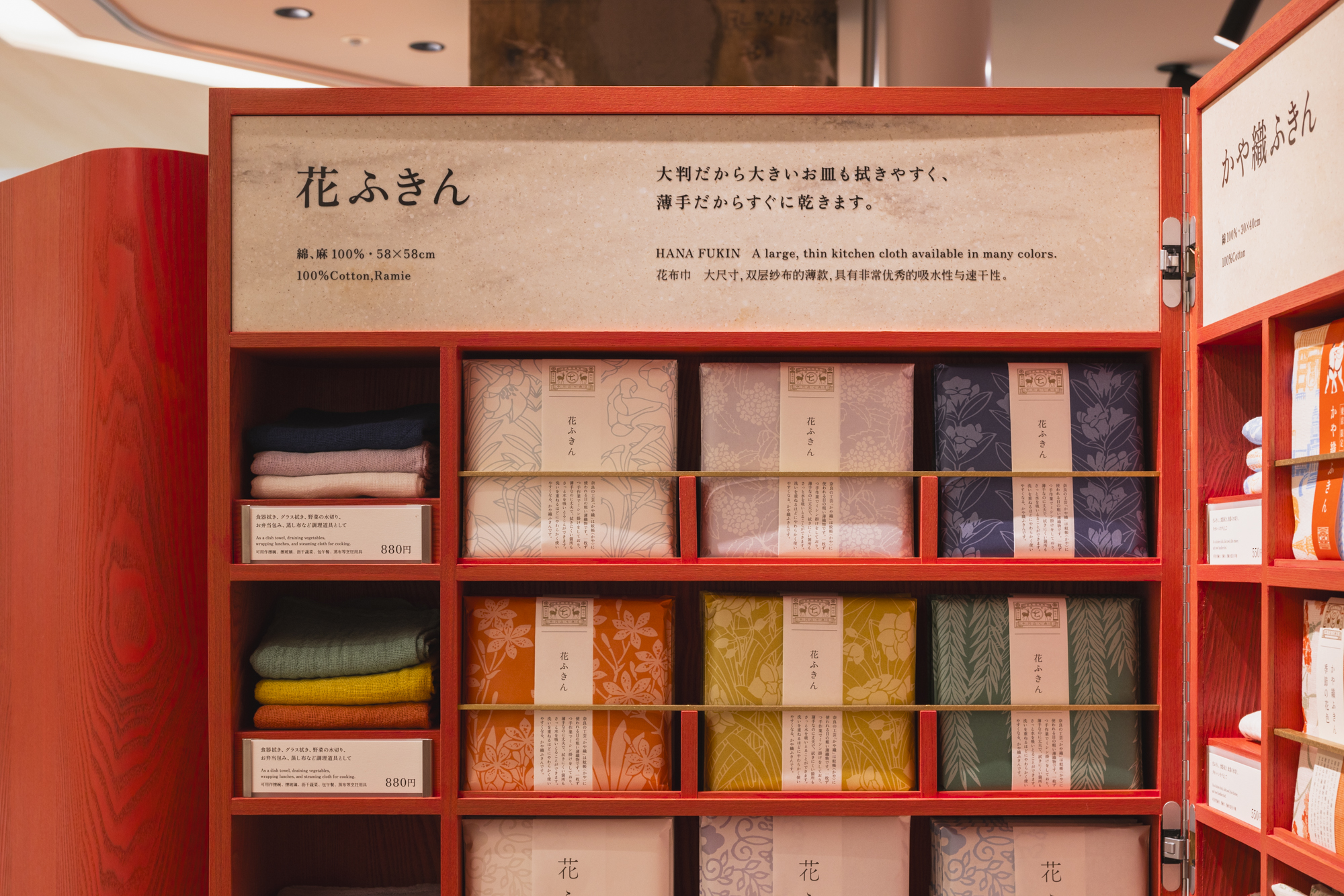
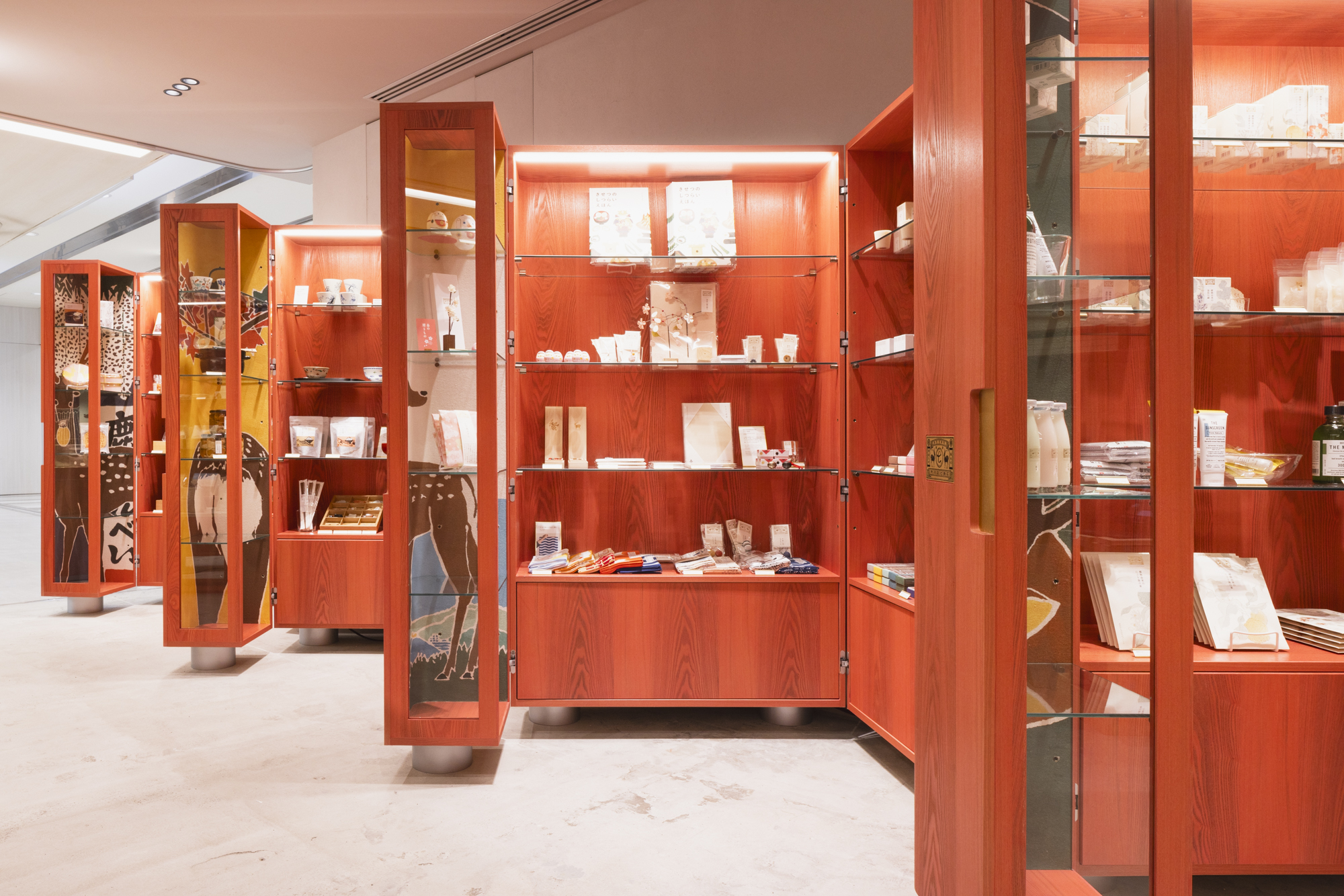
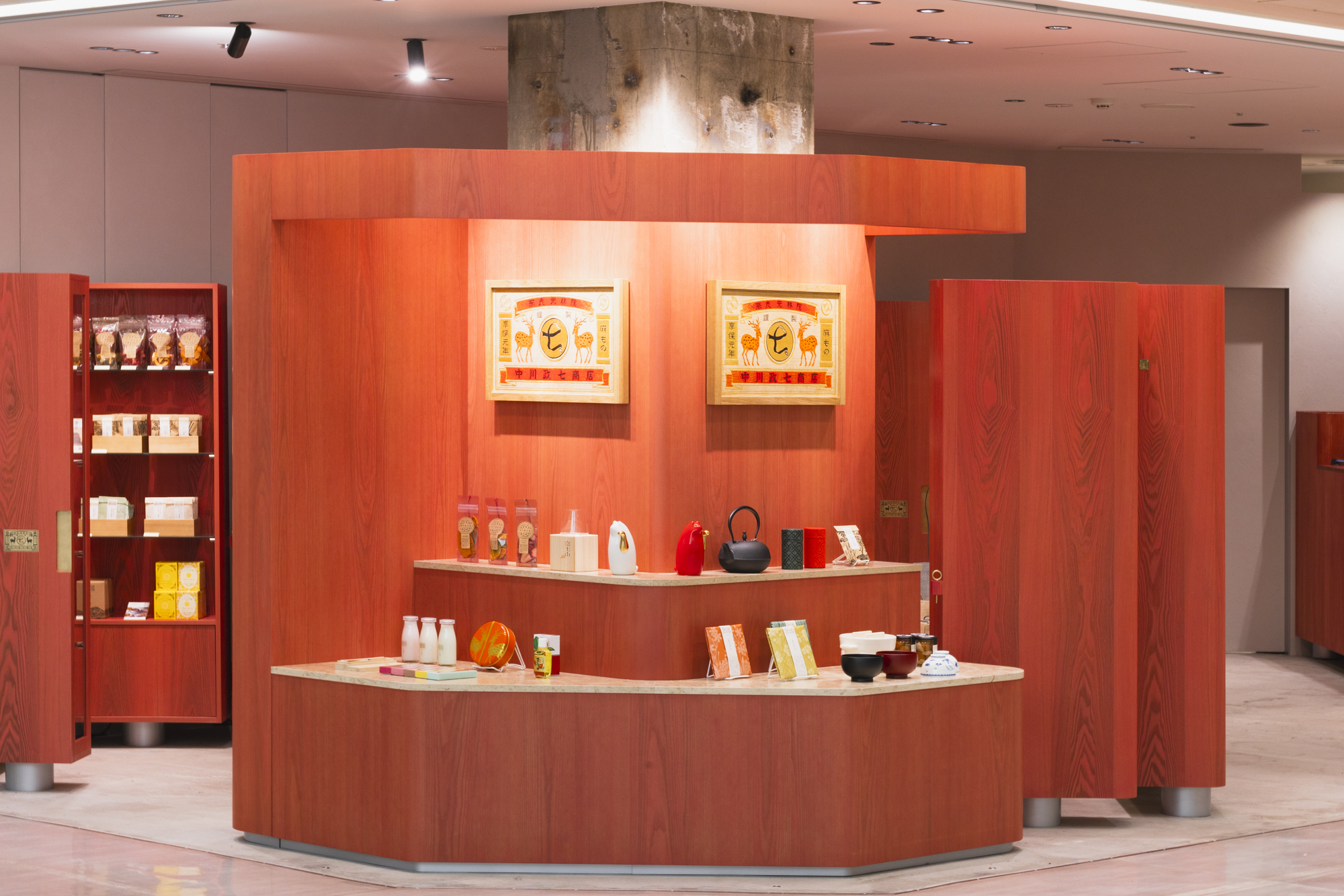
Comprising a series of bold vermillion wooden display volumes designed as oversized trunks, the store, located in Narita Airport’s Terminal 1, features eight striking, red volumes that act as cabinets and shelving for the store’s traditional handcrafted products and souvenir items sourced from across Japan.
‘It is a journey,’ said Hayashi. ‘The concept was based on the story of Nakagawa Masashichi Shoten's travels, which is also compatible with the environment of an airport. We proposed a store interior format consisting only of trunks as a way of creating a sense of travel.’
Constructed with Japanese tamo ash wood veneer selected for its light-coloured grain, the trunks were then painted in vermillion red ‘to give it the character of a traveling trunk.' These elements each feature limestone information panels and brass handle detailing and display artwork depicting Nara’s iconic deer, illustrated by Kutani ware potter Keigo Kamide.
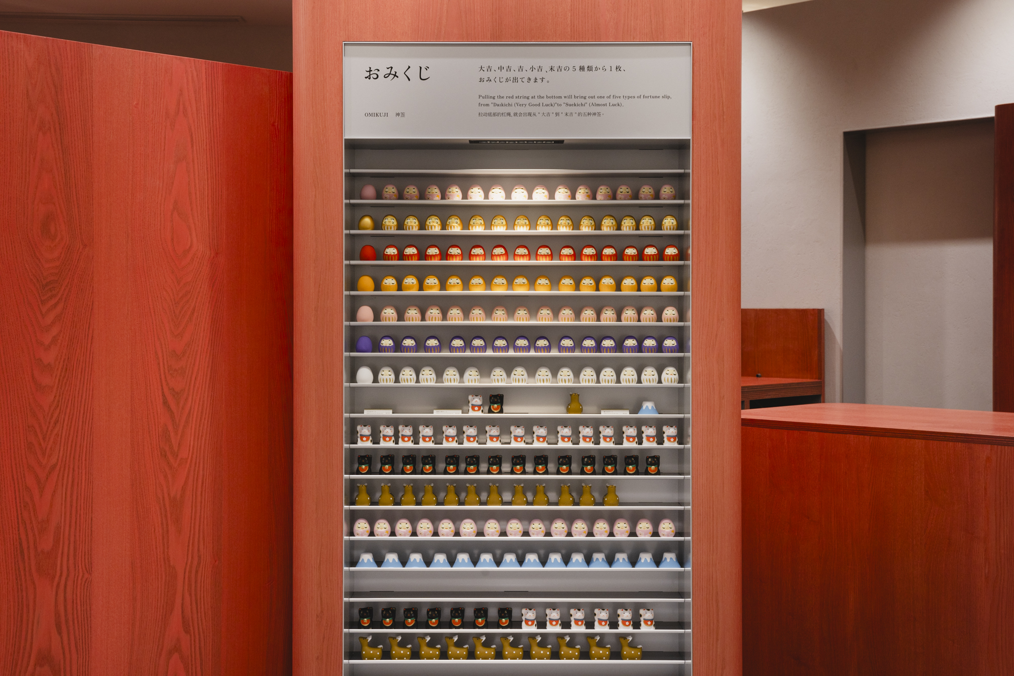
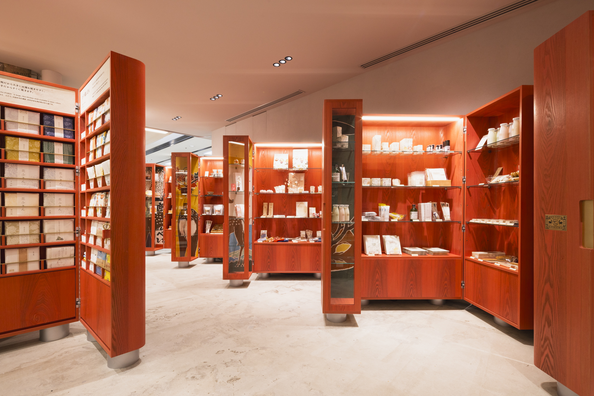
Across the store’s compact 48 sq m footprint, Hayashi optimised the site by designing a layout focused on flexibility. Alongside a retail counter and two larger timber volumes enveloping two permanent exposed concrete pillars, the independent ‘trunks’ feature cylindrical legs with inbuilt casters that allow for moveability. The three-sided trunks can also be easily individually closed unto themselves – akin to a real trunk.

From the outside, only the rear side of the trunks is visible, creating a sense of ambiguity and mystery. By positioning the individual trunks like so, Hayashi intended to create an unassuming store design to inspire curiousity in visitors. Once inside, the interior's rich retail range is revealed.
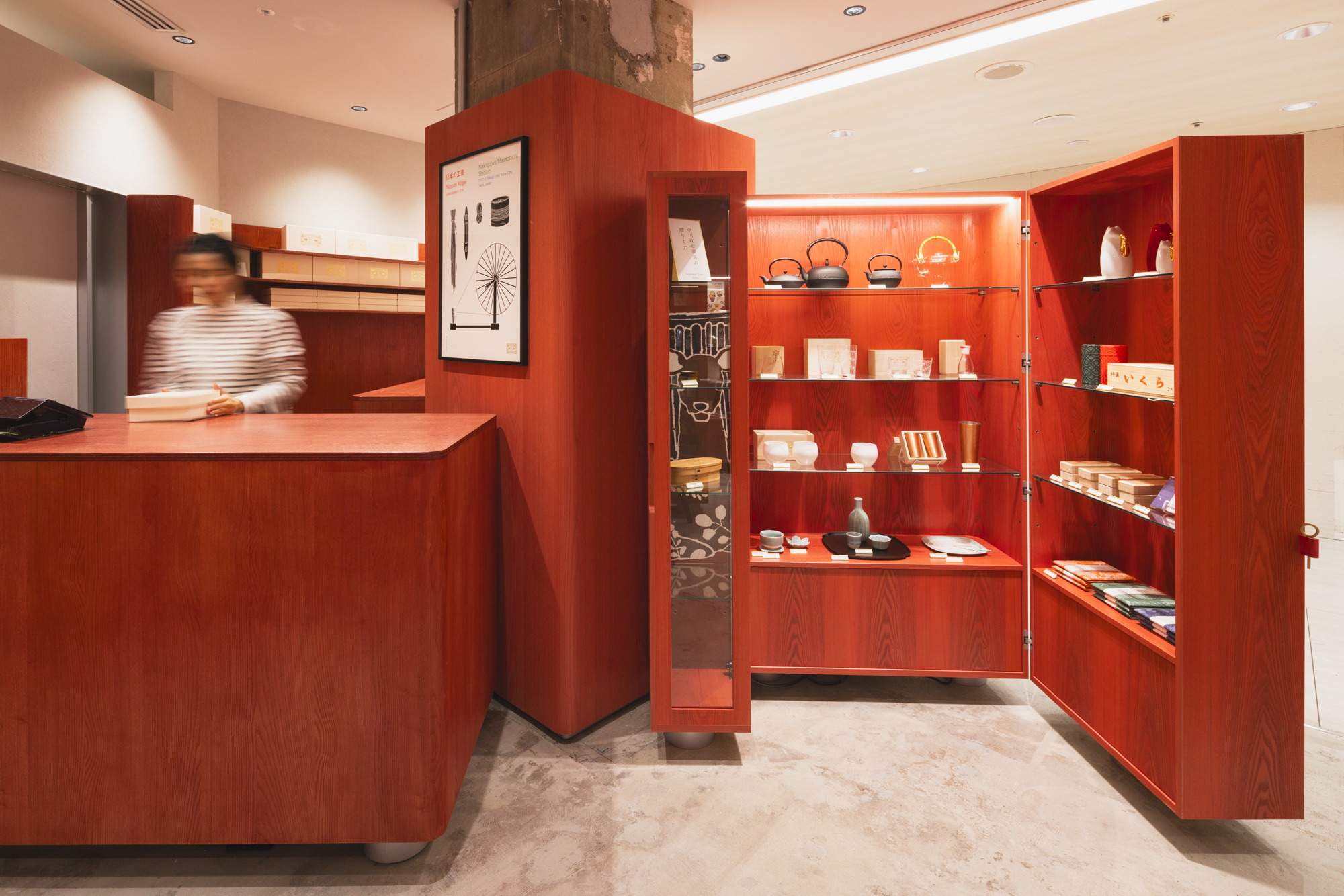
Hayashi said: ‘We thought about how we could attract people's interest in these fascinating and unique Japanese products and get them to stop and visit our store. We also intended the trunk format to make it difficult for visitors to get a full picture of what is being sold there. Many people are wondering how they can use the time they have before their flight due to the location of the airport.
Wallpaper* Newsletter
Receive our daily digest of inspiration, escapism and design stories from around the world direct to your inbox.
'We felt that people would not stop by a store where they could see the whole picture without even entering the store. This is a method that makes people want to enter the store to find out what kind of products are in the many trunks.’
Joanna Kawecki is a Tokyo-based design journalist and consultant. Living in Japan since 2013, she writes extensively about architecture, design and travel, interviewing leading industry figures such as Kengo Kuma and Naoto Fukasawa. She is co-founder of Ala Champ Magazine and design brand IMI Japan, working with craftspersons across the country’s 47 prefectures exploring traditional artisans to innovation entrepreneurs.
-
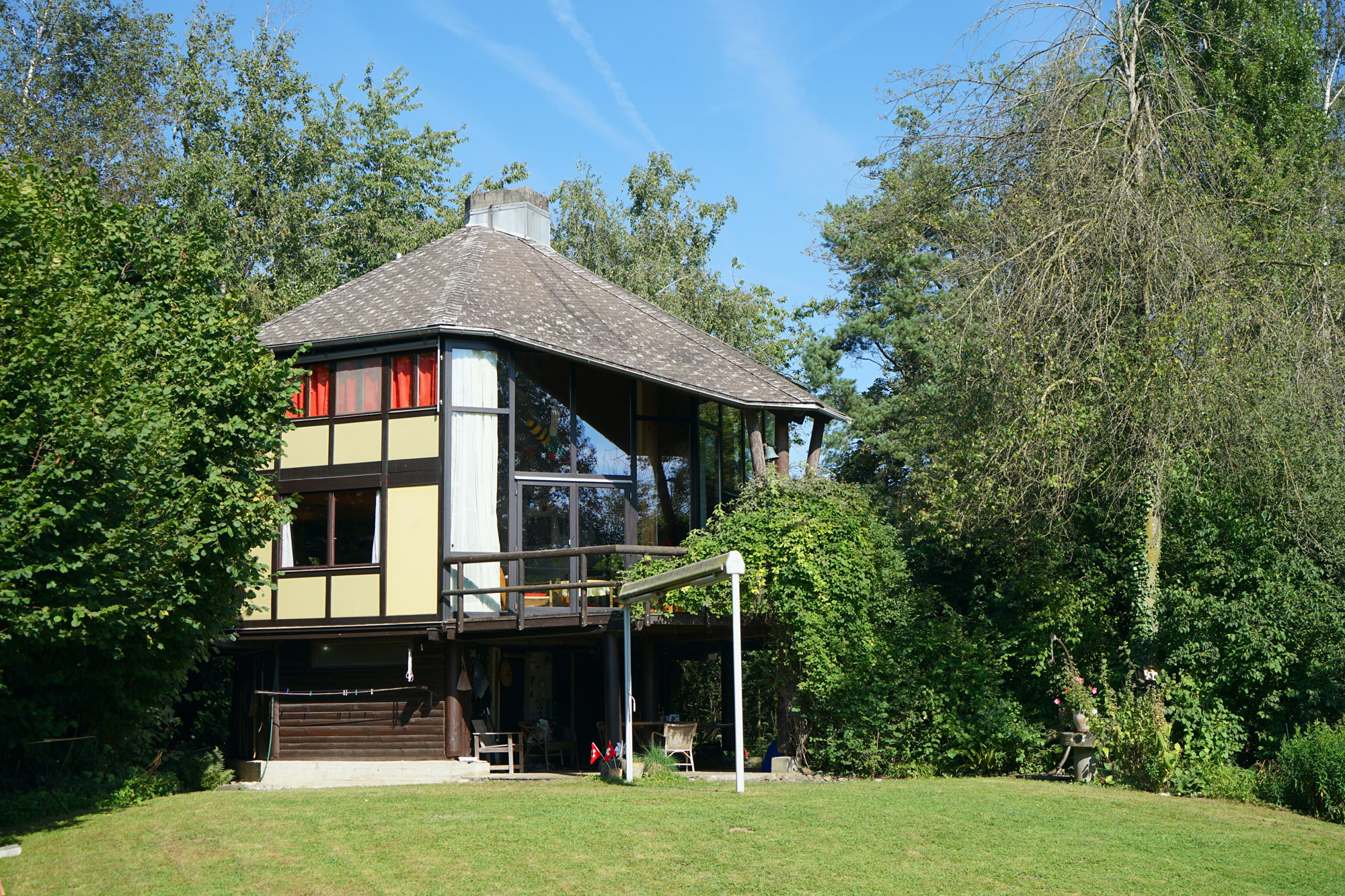 Meet Lisbeth Sachs, the lesser known Swiss modernist architect
Pioneering Lisbeth Sachs is the Swiss architect behind the inspiration for creative collective Annexe’s reimagining of the Swiss pavilion for the Venice Architecture Biennale 2025
By Adam Štěch
-
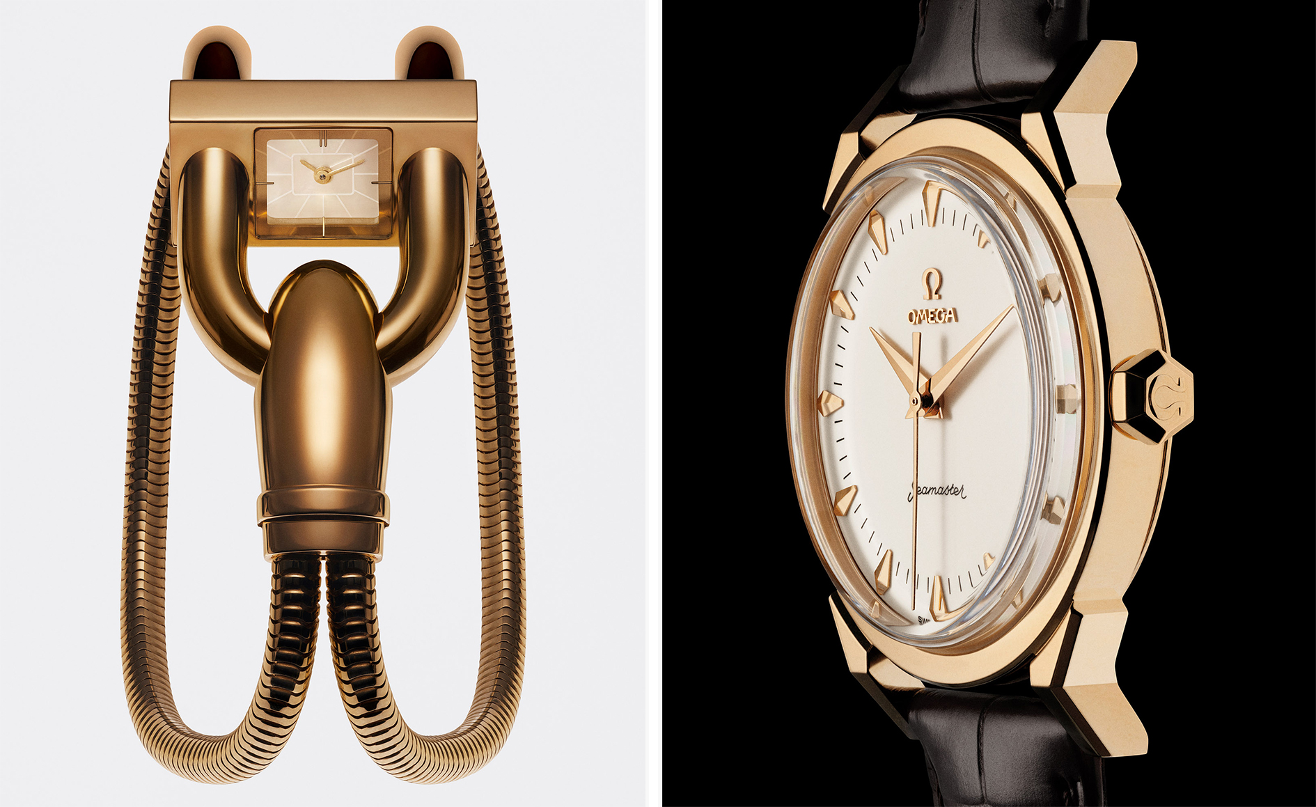 A stripped-back elegance defines these timeless watch designs
Watches from Cartier, Van Cleef & Arpels, Rolex and more speak to universal design codes
By Hannah Silver
-
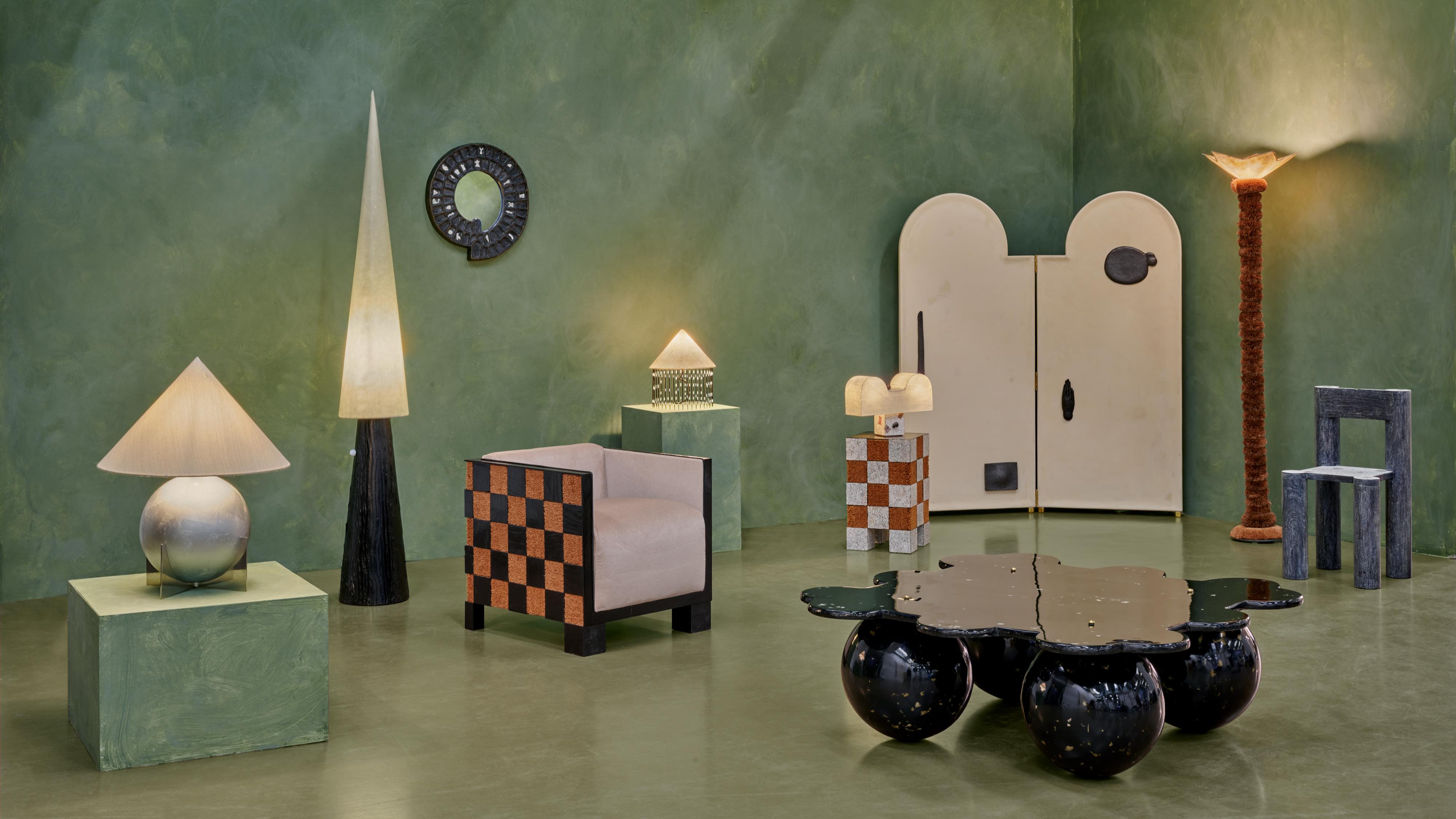 Postcard from Brussels: a maverick design scene has taken root in the Belgian capital
Brussels has emerged as one of the best places for creatives to live, operate and even sell. Wallpaper* paid a visit during the annual Collectible fair to see how it's coming into its own
By Adrian Madlener
-
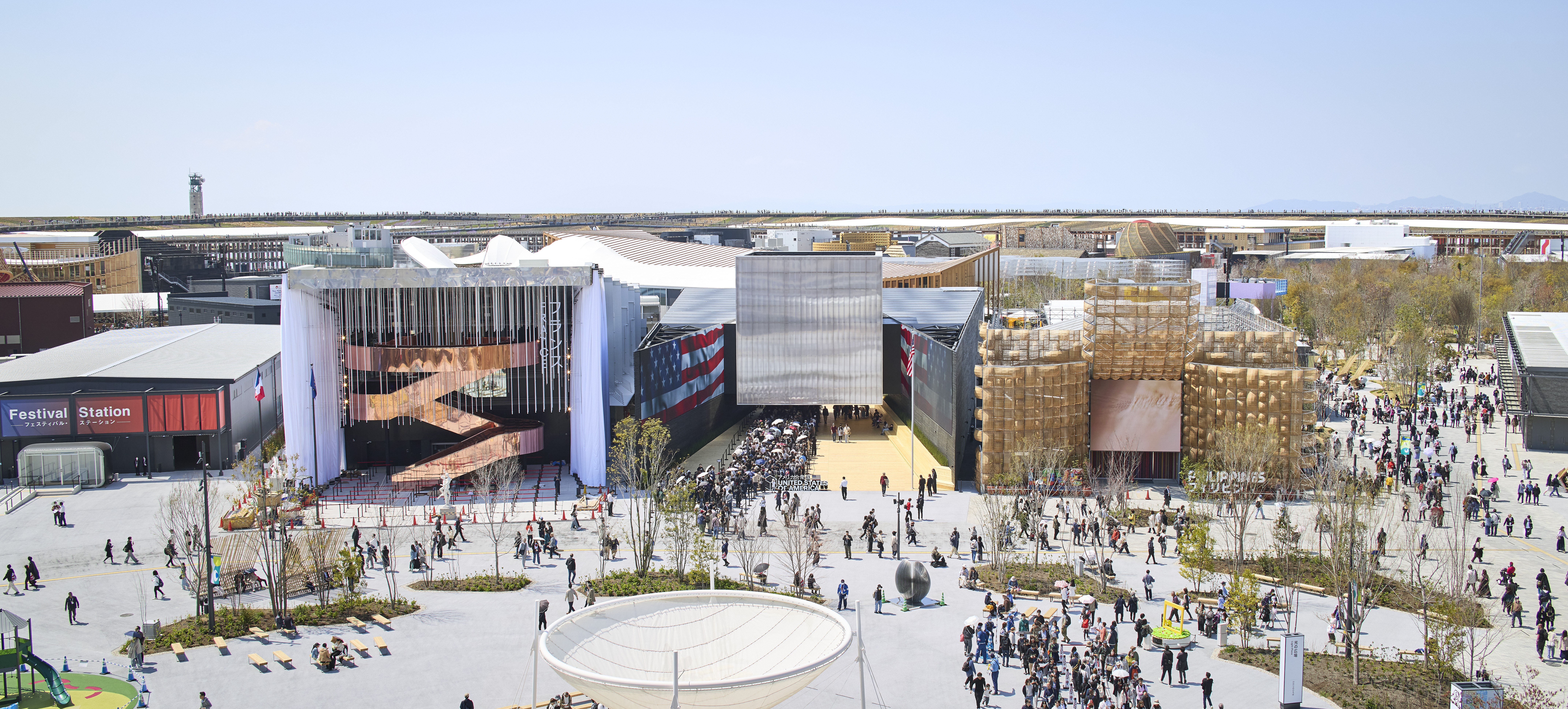 Giant rings! Timber futurism! It’s the Osaka Expo 2025
The Osaka Expo 2025 opens its microcosm of experimental architecture, futuristic innovations and optimistic spirit; welcome to our pick of the global event’s design trends and highlights
By Danielle Demetriou
-
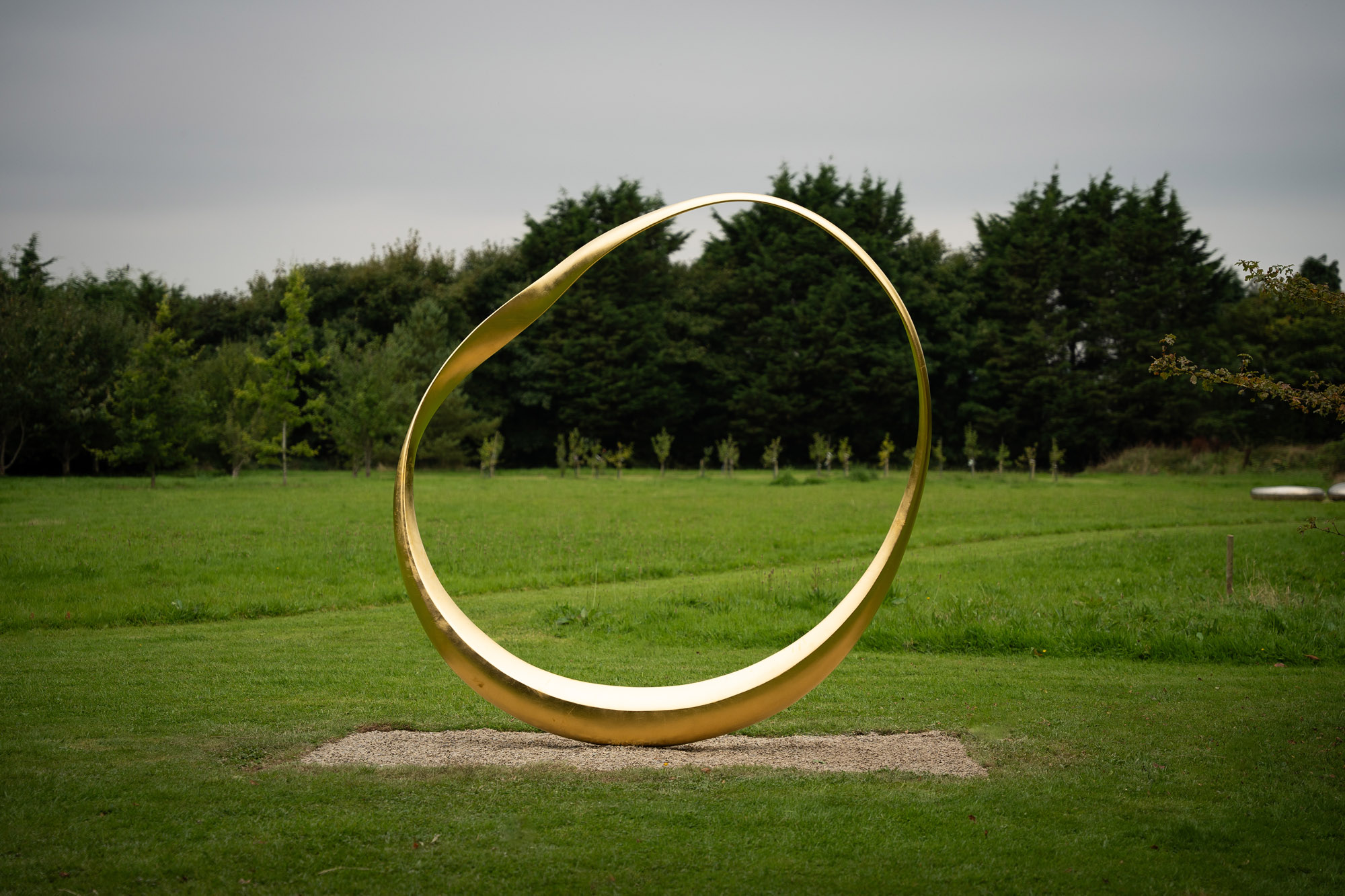 2025 Expo Osaka: Ireland is having a moment in Japan
At 2025 Expo Osaka, a new sculpture for the Irish pavilion brings together two nations for a harmonious dialogue between place and time, material and form
By Danielle Demetriou
-
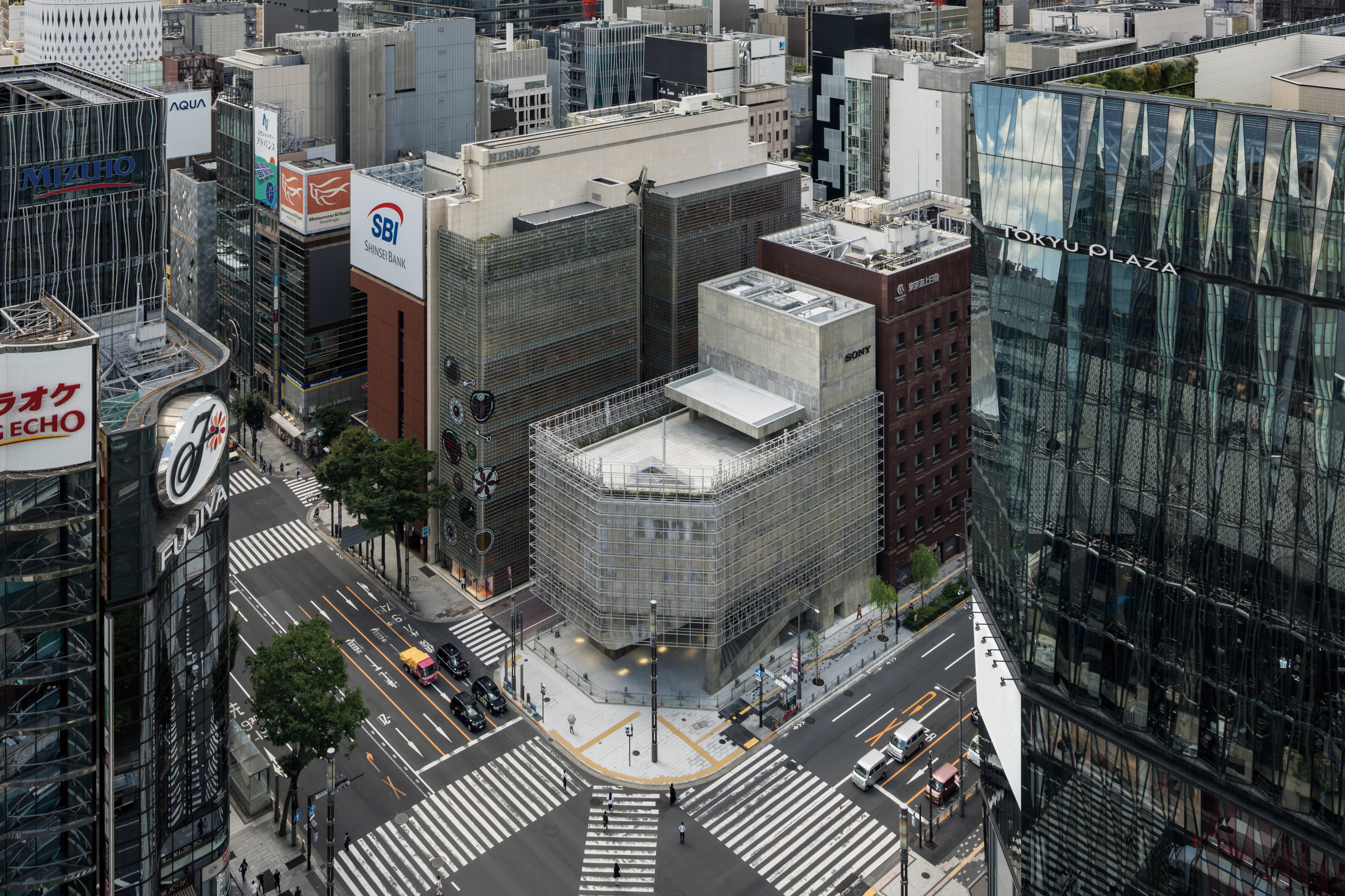 Tour the brutalist Ginza Sony Park, Tokyo's newest urban hub
Ginza Sony Park opens in all its brutalist glory, the tech giant’s new building that is designed to embrace the public, offering exhibitions and freely accessible space
By Jens H Jensen
-
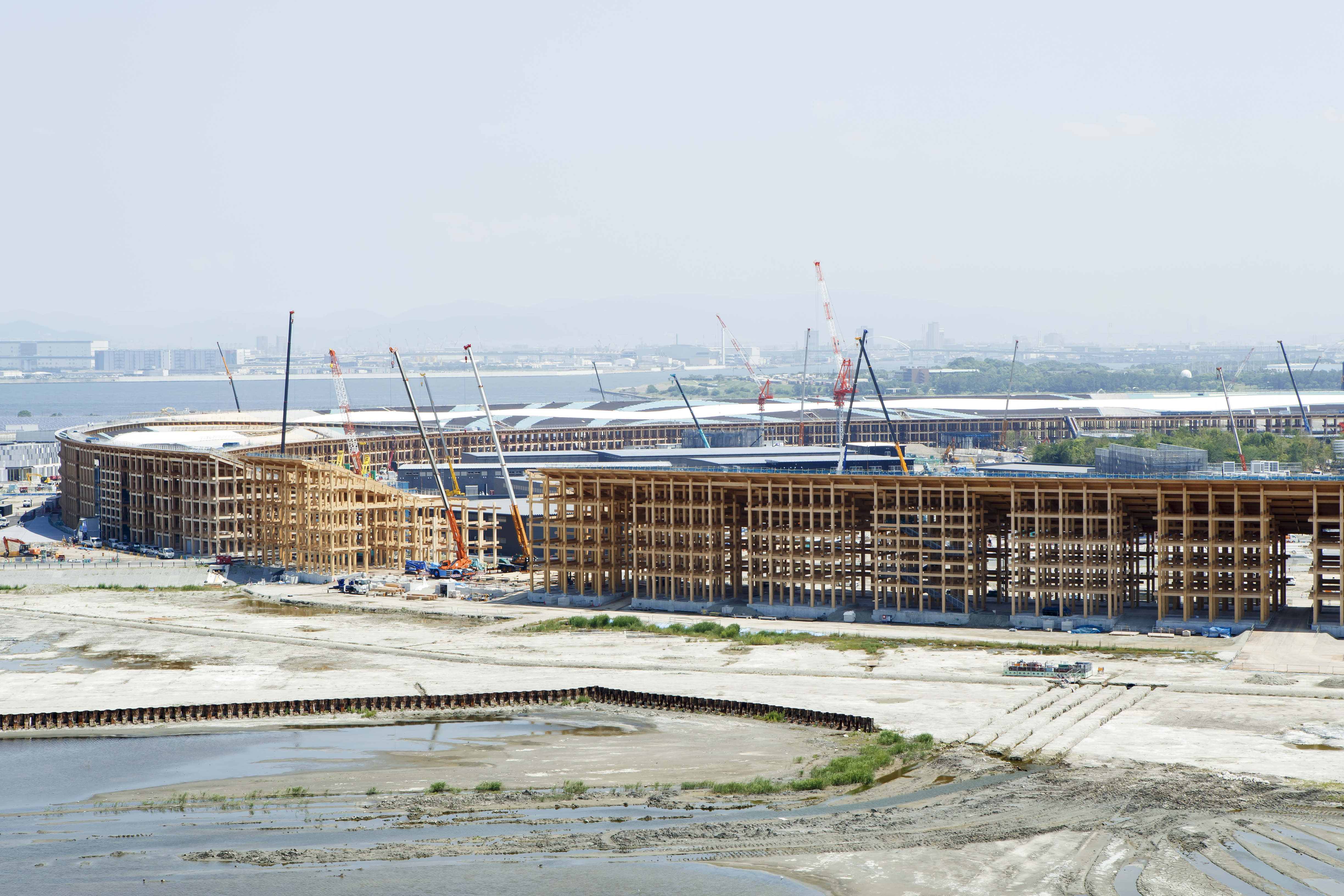 A first look at Expo 2025 Osaka's experimental architecture
Expo 2025 Osaka prepares to throw open its doors in April; we preview the world festival, its developments and highlights
By Danielle Demetriou
-
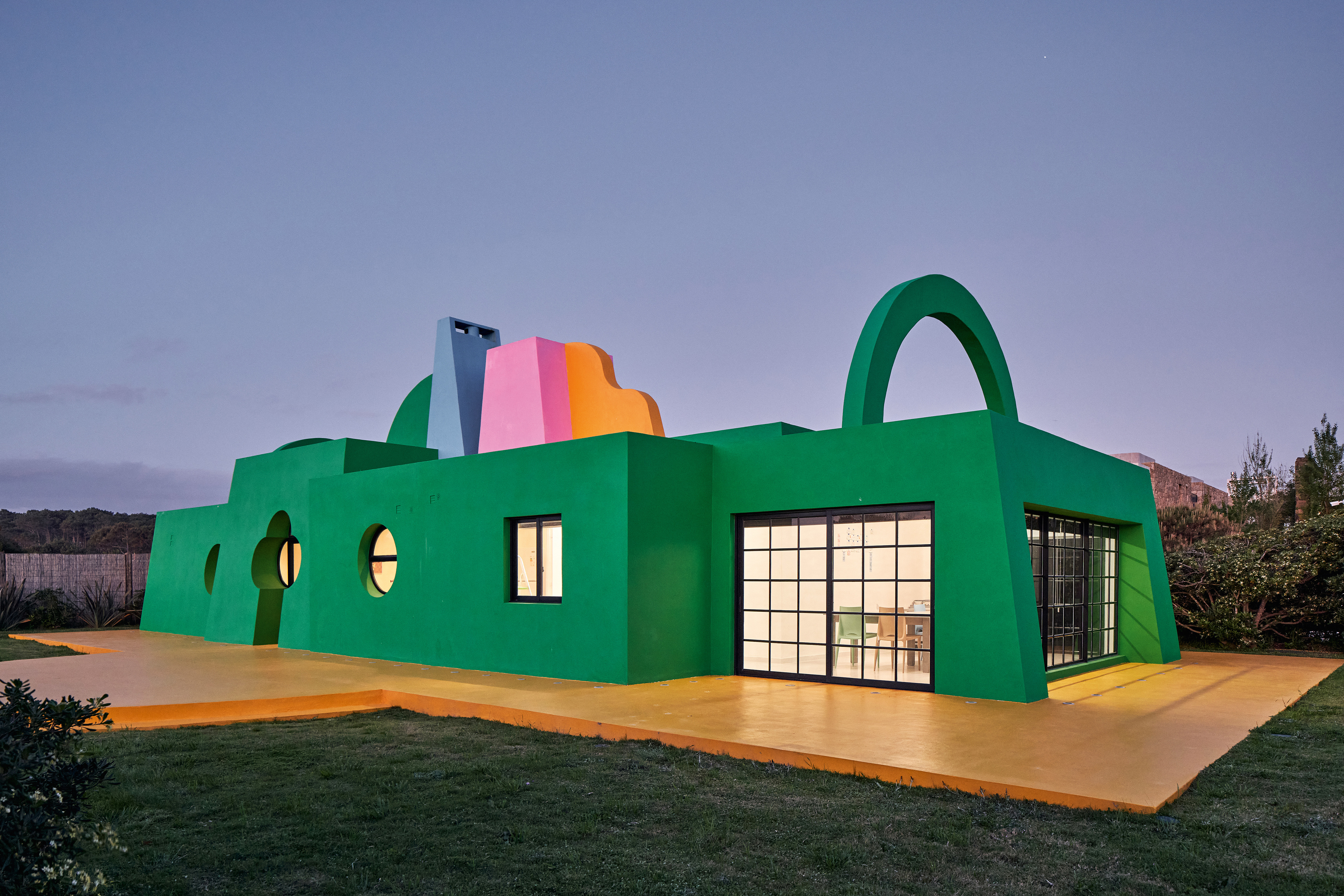 Ten contemporary homes that are pushing the boundaries of architecture
A new book detailing 59 visually intriguing and technologically impressive contemporary houses shines a light on how architecture is evolving
By Anna Solomon
-
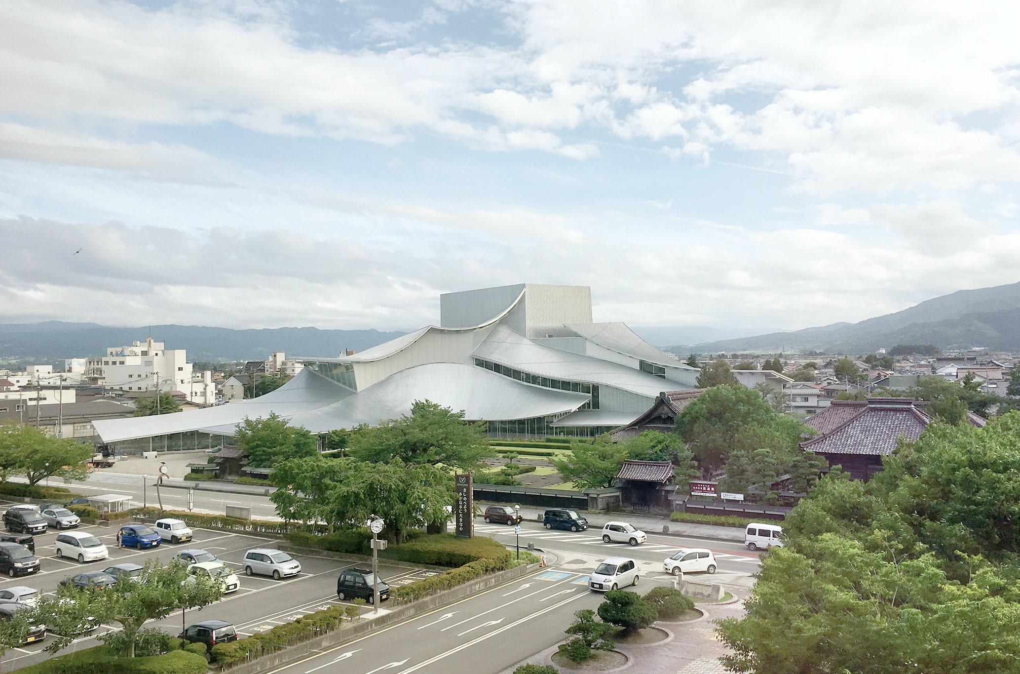 And the RIBA Royal Gold Medal 2025 goes to... SANAA!
The RIBA Royal Gold Medal 2025 winner is announced – Japanese studio SANAA scoops the prestigious architecture industry accolade
By Ellie Stathaki
-
 Architect Sou Fujimoto explains how the ‘idea of the forest’ is central to everything
Sou Fujimoto has been masterminding the upcoming Expo 2025 Osaka for the past five years, as the site’s design producer. To mark the 2025 Wallpaper* Design Awards, the Japanese architect talks to us about 2024, the year ahead, and materiality, nature, diversity and technological advances
By Sou Fujimoto
-
 Tadao Ando: the self-taught contemporary architecture master who 'converts feelings into physical form’
Tadao Ando is a self-taught architect who rose to become one of contemporary architecture's biggest stars. Here, we explore the Japanese master's origins, journey and finest works
By Edwin Heathcote