A guide to Zaha Hadid: from architecture to making 'a big hole' in Wallpaper*
Dame Zaha Hadid was a global, Pritzker Prize-winning architect and a force of nature; in this ultimate guide to her work, we celebrate her life, career and legacy
Matthew Collings
Receive our daily digest of inspiration, escapism and design stories from around the world direct to your inbox.
You are now subscribed
Your newsletter sign-up was successful
Want to add more newsletters?
Dame Zaha Hadid was known globally for her dynamic public buildings. She was the first female architect to receive the Pritzker Prize, in 2004, and the RIBA Royal Gold Medal, in 2016. Her singular career was abruptly cut short when she passed away suddenly on 31 March 2016 in Miami, aged just 65.
Yet her legacy lives on. So powerful was her impact on the world that she is still, nearly a decade after her death, hugely influential, often cited in discussions, publications and events across the field, affectionately often by her first name only, 'Zaha'; and always alongside the greatest of the 20th and early 21st century, such as Frank Gehry, Renzo Piano, Tadao Ando and Rem Koolhaas. Her radical design work includes furniture, products and art (indeed, her famous deconstructivist paintings and drawings helped propel her career to stardom, way before her first built project was ever realised).
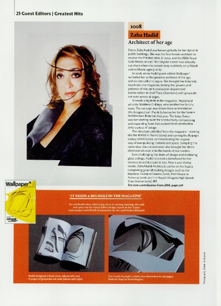
In 2008, Hadid guest-edited Wallpaper* (W*115). We hailed her as the greatest architect of the age, and no one called to argue. She brought her futuristic touch into the magazine, testing the ‘powers and patience of the print production department’ with grey-scale cut-outs across 16 pages.
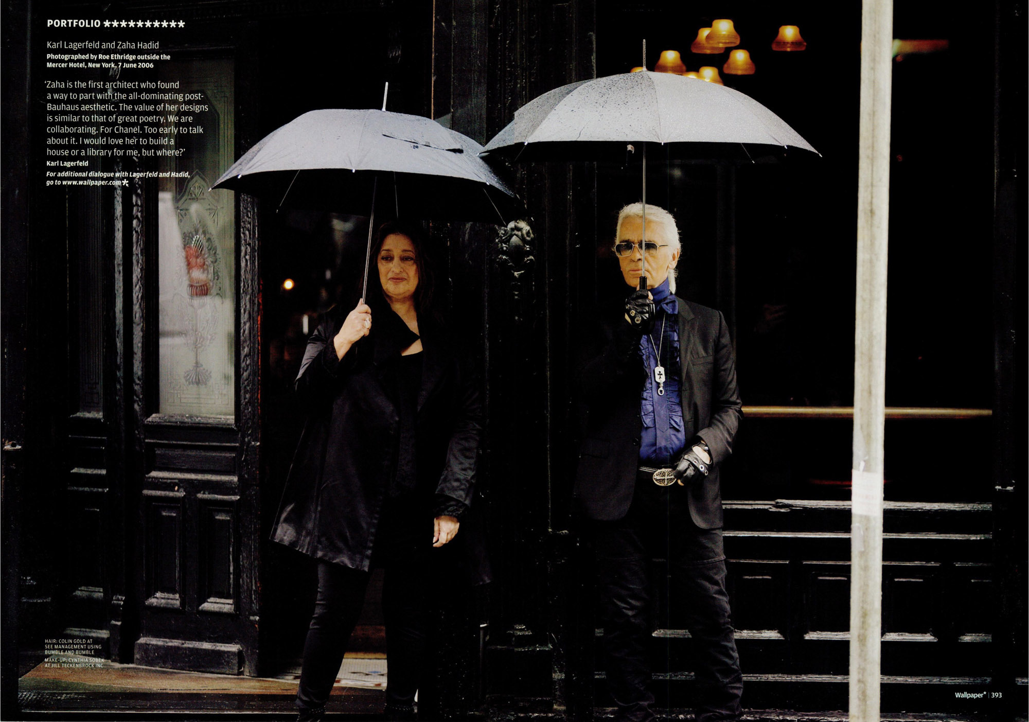
Zaha Hadid and Karl Lagerfeld shot outside the Mercer Hotel in New York in 2006 in celebration of Wallpaper's 10th anniversary
Just a couple of years before that, in 2006, Hadid was shot as a creative pair together with Karl Lagerfeld outside the Mercer Hotel in New York as part of a celebratory edition of Wallpaper's 10th anniversary. In that issue, Lagerfeld said on Hadid: 'Zaha is the first architect who found a way to part with the all-dominating post-Bauhaus aesthetic. The value of her designs is similar to that of great poetry. We are collaborating. For Chanel. Too early to talk about it. I would love her to build a house or a library for me, but where?'
Here, to highlight her lasting legacy, we look back at Zaha Hadid's profile from the Guest Editors 2008 issue, when art critic David Collings visited her in her London HQ; we track some of her greatest hits; and take an expansive look into her inimitable career and her studio, Zaha Hadid Architects (ZHA).
10 of Zaha Hadid's most notable buildings
Vitra Fire Station, Weil Am Rhein, Germany (1993)
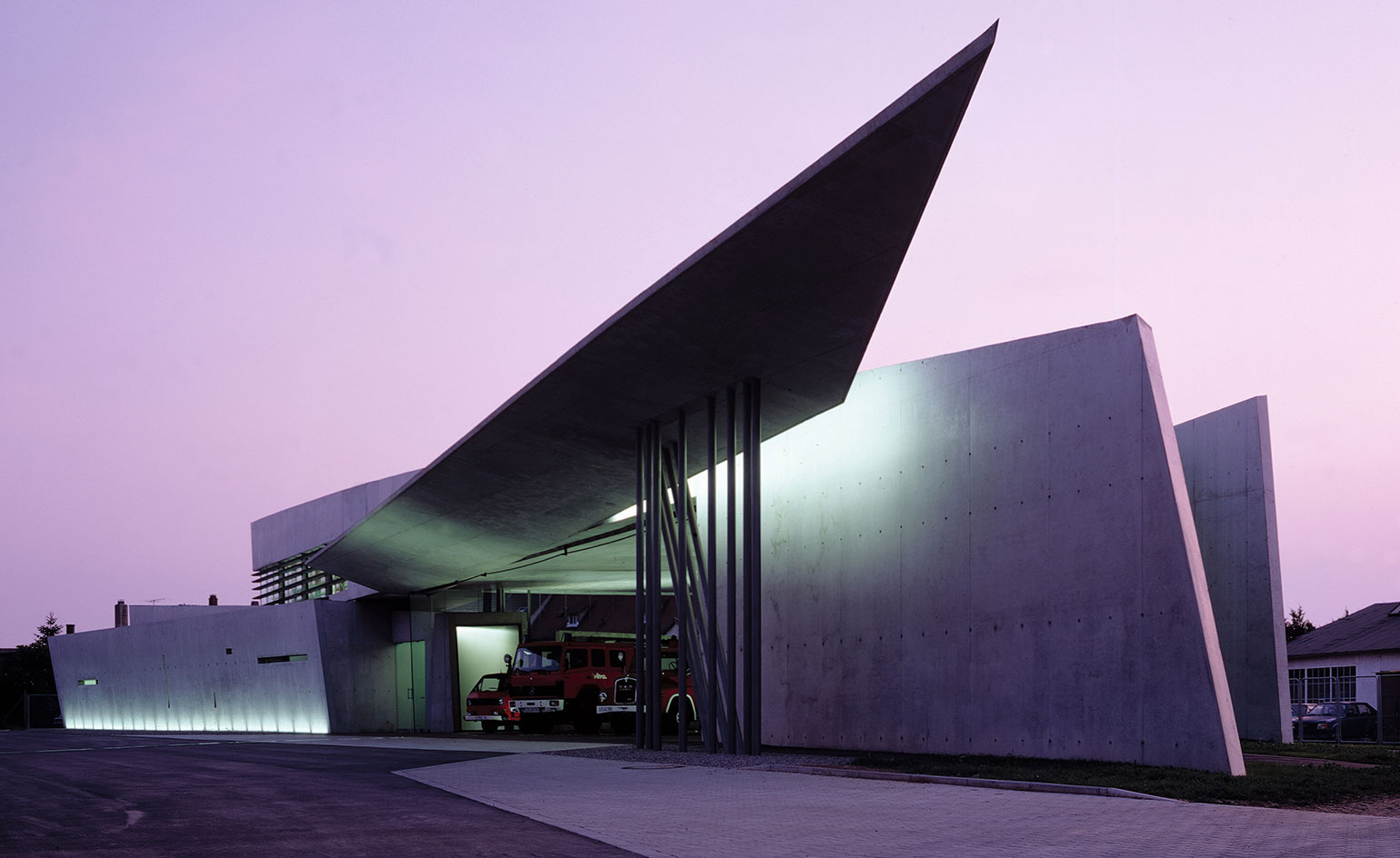
Zaha Hadid’s first built project was the fairly modest (in size, at least) Vitra Fire Station in Weil Am Rhein, Germany as part of the Vitra Campus there. At the time of opening, the architect spoke about its unusual, angular forms saying: ‘The whole building is frozen motion ready to explode into action at any moment.’
Phaeno Science Centre, Wolfsburg, Germany (2005)
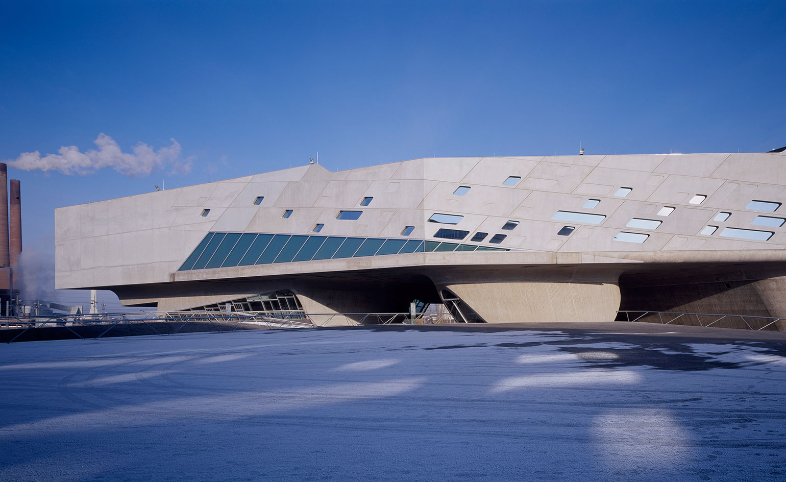
One of the earliest completed Hadid buildings, the Phaeno Science Centre in Wolfsburg is decidedly futuristic - perhaps more akin to a spaceship than a building design. In 2005, when it opened, it was also the very first science museum of its kind in Germany. A cultural centre and exhibition space, it's defined by its flowing concrete shape and series of irregularly shaped windows.
Receive our daily digest of inspiration, escapism and design stories from around the world direct to your inbox.
BMW Central Building, Leipzig, Germany (2005)
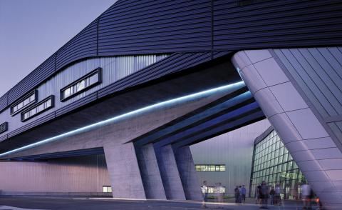
Another early Hadid building, the BMW Central Building in Leipzig was a competition win for a central building in the car manufacturer's German campus. 'BMW's bold objective was to translate functional industrial architecture into a new aesthetic,' Hadid's website describes the building, and true enough, this is a structure that defies categorization.
MAXXI Museum of XXI Century Art, Rome, Italy (2009)
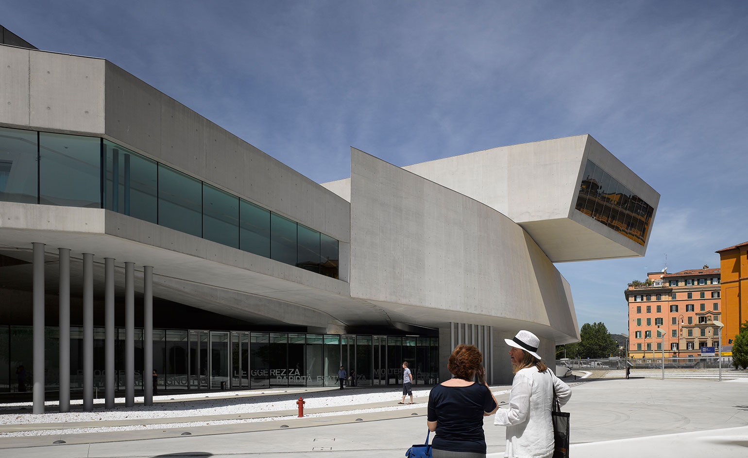
The MAXXI Museum of XXI Century Art in Rome is Italy's first public museum entirely dedicated to contemporary creativity, spanning arts and architecture. Going beyond showcasing the displays inside it, it becomes an object to show off in its own right, defined by its flowing forms and signature cantilever concrete viewing platform that juts out its top.
Guangzhou Opera House, Guangzhou, China (2010)
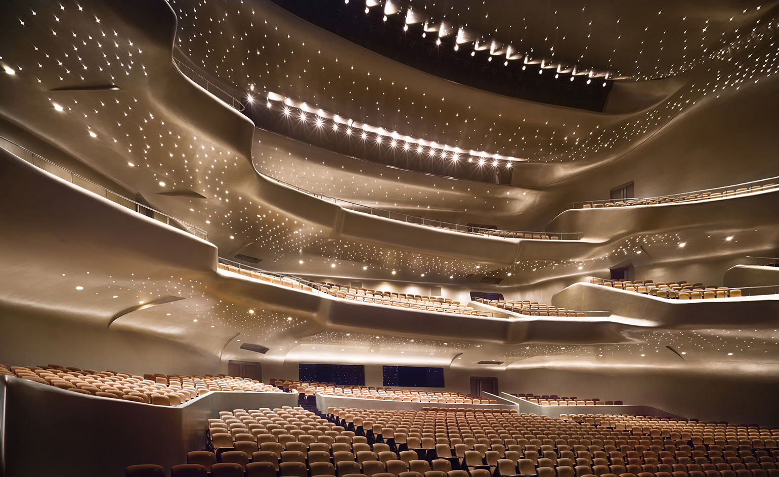
Set at the foot of Zhujiang Boulevard in the Chinese city of Guangzhou, this is an opera house like no other. Creating a contoured landscape around it that connects it with its site, it's also a true spectacle inside too, offering an interior that rivals the ambitious performances taking place within.
London Aquatics Centre, UK (2012)
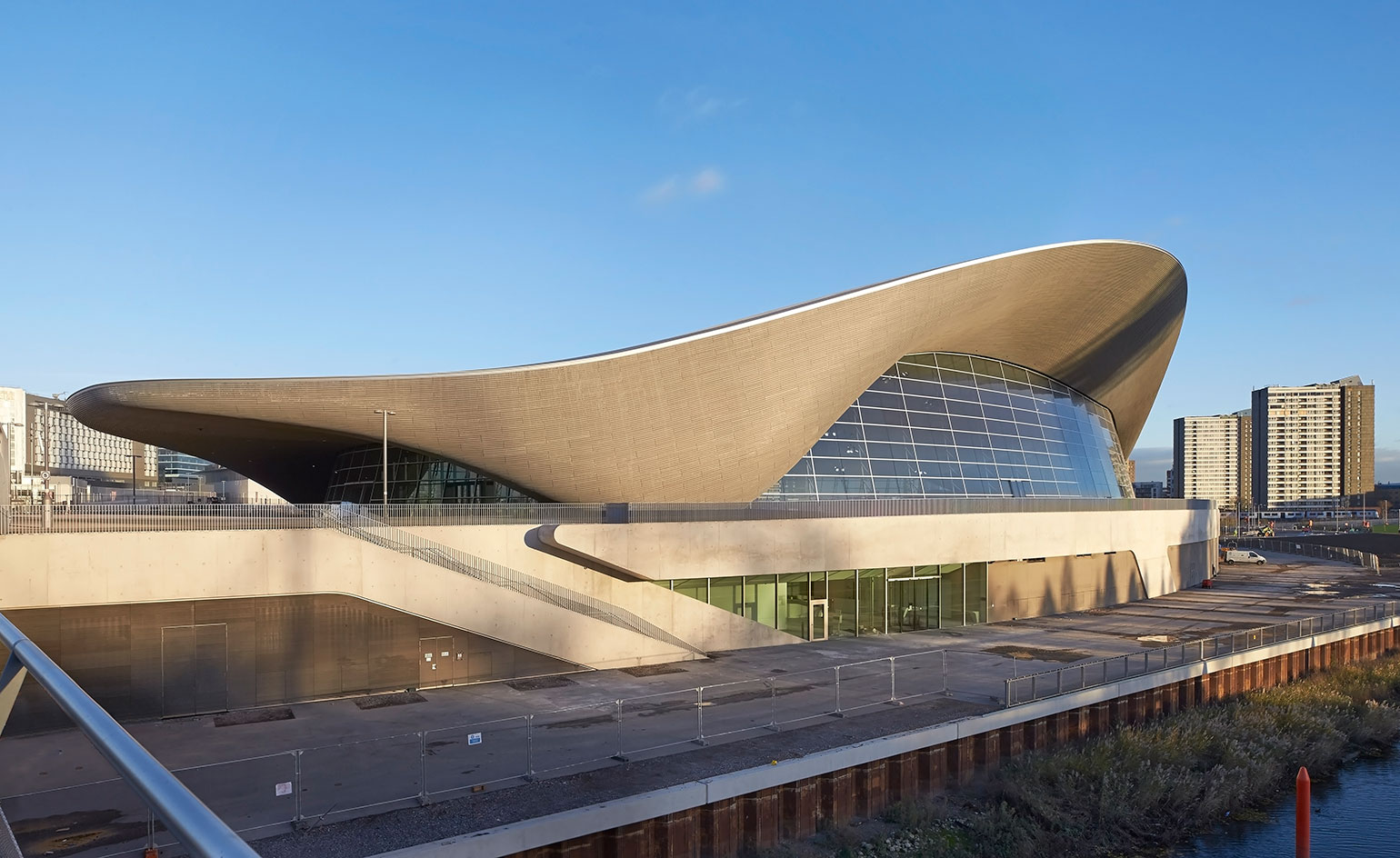
Fittingly inspired by 'waves, the water, sea life and sea life creatures,' according to its architect British-based Zaha Hadid, the Aquatics Centre was completed in time for the official start of the London 2012 Olympic Games. Situated within the East London Olympic site, near the Park's south entrance, the Aquatics Centre is 'positioned as a gateway and the lifting entrance canopy will invite the visitors in,' explains lead architect Jim Heverin. Its aerodynamic, aquatic-creature-inspired form is distinct, boasting a curvaceous roof and slowing volume.
Heydar Aliyev Centre, Baku, Azerbaijan (2012)
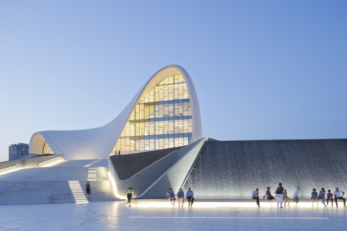
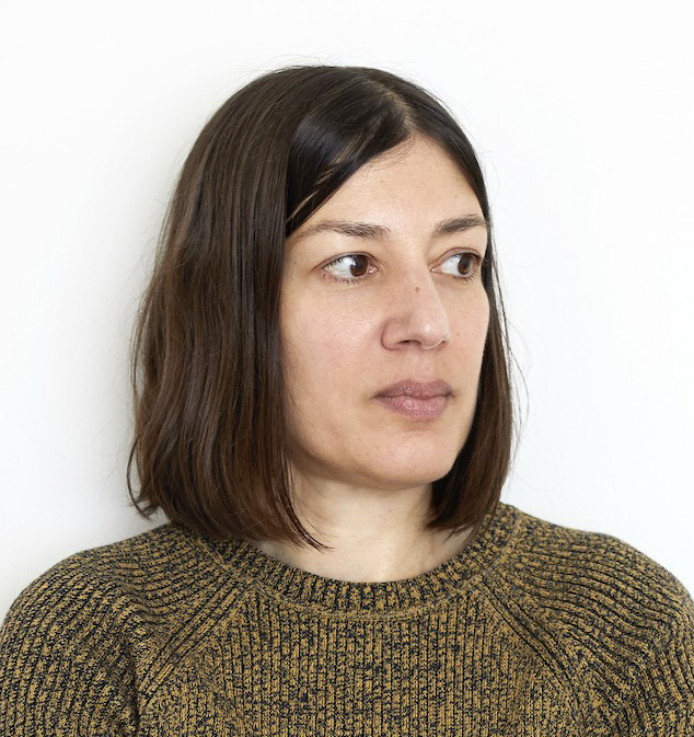
Hadid's Heydar Aliyev Centre in the Azerbijani capital is a vast and curvaceous building - which, while under construction, won 'Best Building Site' in our 2011 Design Awards. It contains 101,000 m2 of floor area, and sits on a 111,292 m2 graphically landscaped site beneath which there is parking for 1,500 cars. Under its 39,000 sq m of fluid roof, it houses a 1,000-seater auditorium, a conference centre, a library, a museum, cafes, restaurants and expansive meeting points between all these where Bakuvians can hang out and mingle. It is, in reality, a massive new chunk of civic realm.
The Serpentine Sackler Gallery, London, UK (2013)
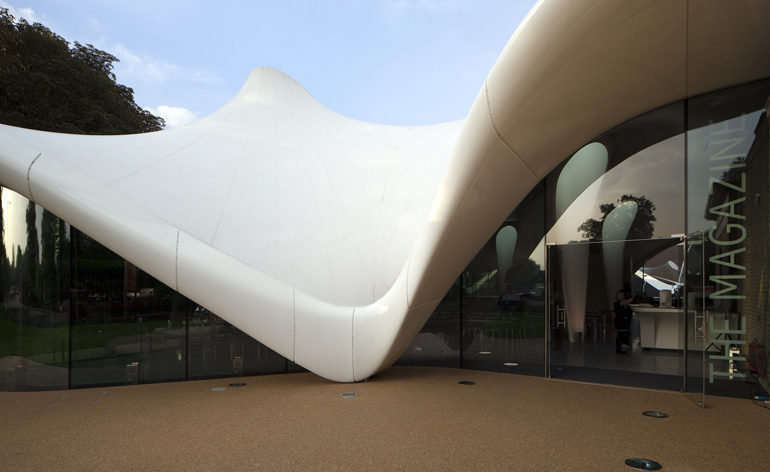
The Serpentine Sackler Gallery opened in 2013 within a Grade II*-listed building located a stone's throw from the original gallery in Hyde Park. Pritzker Prize-winning architect Zaha Hadid has transformed the interior of the Magazine building - a 200-year-old former gunpowder store - and added a curvaceous new extension as a contemporary counterpoint. 'We wanted to use a new materiality,' says the architect, who opted for a PTFE coated, glass-fibre woven fabric membrane for the exterior skin. 'It looks temporary but is actually attached to the [existing] building in a really light way.'
Dongdaemun Design Park & Plaza, Seoul, South Korea (2013)
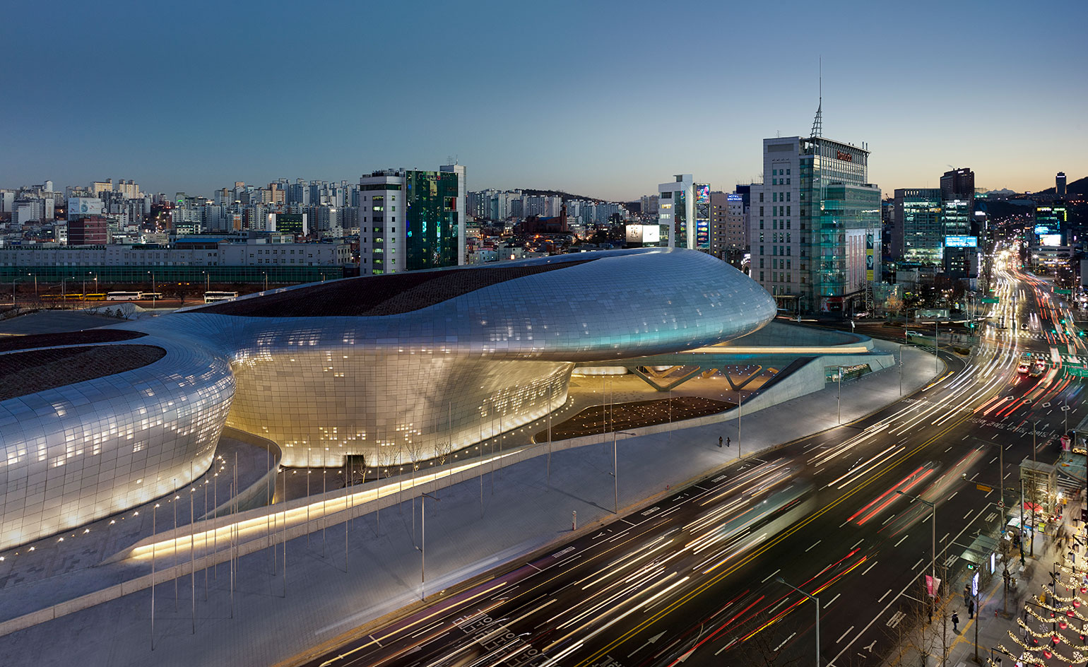
A major urban development landmark in Seoul, South Korea, Dongdaemun Design Plaza is the work of Zaha Hadid Architects together with Samoo. Conceived as a cultural hub for its neighbourhood, it features its architect's signature sweeping lines and intriguing forms. It includes gallery space, exhibition areas, a media centre and a conference hall, among others.
One Thousand Museum, Miami, USA (2020)
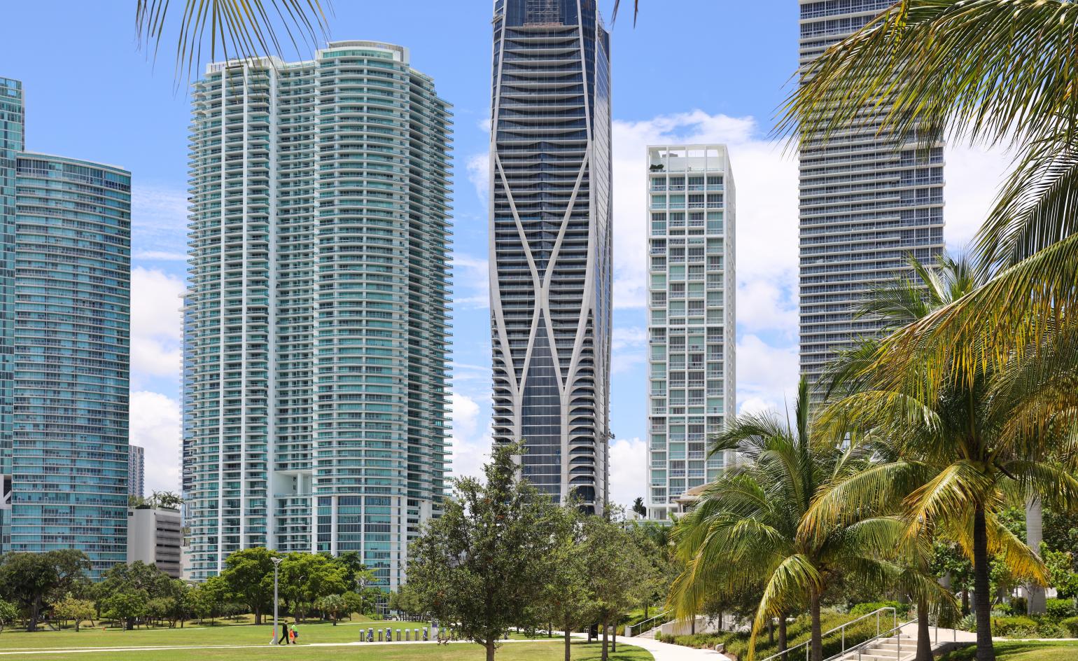
This is Zaha Hadid Architects' debut residential tower in the USA. One Thousand Museum is a glamorous and organic high-rise in downtown Miami. Completed posthumously by ZHA in 2020, it features a range of amenities, as well as bespoke landscaping by specialist Enzo Enea. The property's 84 units have been designed as half-floor, full-floor and duplex residences. Each boasts oversized terraces and East-West views of Biscayne Bay, the Atlantic Ocean and the Miami skyline, and comes fitted with a bounty of custom-designed features ranging from walk-in closets by Poliform and kitchens and cabinetry by Gatto Cucine.
Wallpaper* meets Zaha Hadid: a profile from 2008
Zaha Hadid – greatest architect of the age. What has she done, what does her stuff look like, why is it good? Post-modern deconstruction, forms always surprising but never silly, responding differently to different sites, cities and societies, never allowing a mere style or brand to stand for her, but always being incredibly stylish, making you feel amazed and uplifted by the sight of, say, tower blocks. The two blocks she’s done in Dubai, for example, where curving organic speed lines merge with minimal rectangles, so the towers look like they’re flickering or bending. It’s no mirage: they really are built like that. Or at least they will be, when they’re completed in 2011. And so is architecture the greatest art form of the present? It can often seem more uplifting than art, which seems to want to ditch the one thing that made it great in the past: beauty. Contemporary architecture says a big yes to amazing visual impact, while contemporary art just kind of grunts a weary ‘Uh?’.
With such buzzing thoughts in my head, I step into an old school building in London’s Clerkenwell, which has been turned into the great architect’s practice. The spaces haven’t been done up outrageously – just white paint. It still looks like a school. Only, instead of children at desks, it’s 20-somethings and 30-somethings at computer screens, nearly 200 of them in all, the architect’s employees. They’re churning out the supplementary magic stuff that is needed to finalise the architect’s designs. The primary stuff comes out of the architect’s head. I wonder if they’ve all got degrees in architecture, or what it is you actually need to work here: if, like the boss, you need originality, vision, energy, difference, attitude, but also wisdom and a sense of history and an ability to communicate and to impress and to please people. Even though you have the reputation of being incoherent and a bit frightening.
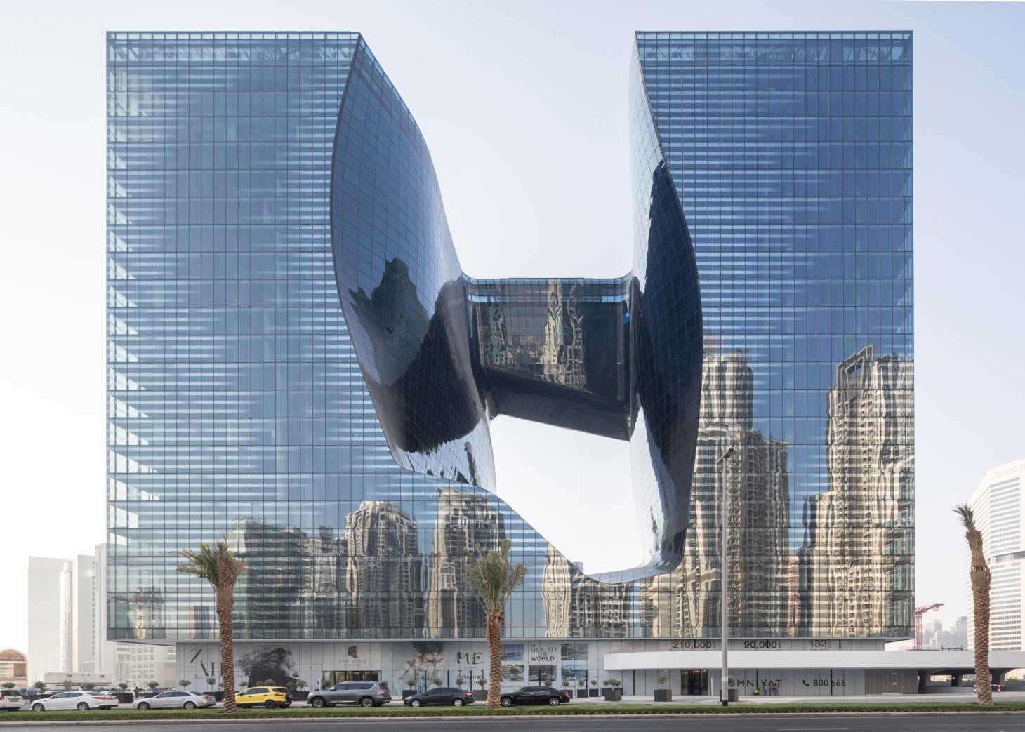
Opus Dubai is another project in the UAE by the ZHA studio, set in the city's Burj Khalifa district and completed in 2020.
Having arrived at the appointed time I’ve been asked to wait, maybe for a long time, and maybe – Roger the press officer says – even to expect to have to come back on a different day. On the other hand, it might be OK: ‘She might like you.’
After glasses of water and a longish browse through magnificent publications featuring Zaha Hadid’s work, with the sound of muted keyboard tapping all around – as well as the worker-geniuses at their computers, there’s a bank of beautiful male and female receptionists with bright friendly faces – and occasionally an interesting musical growling coming from somewhere on the opposite side of the large light-filled space, I’m taken to a big room and ushered a couple of feet inside the door.
Far away the Big Z sits in black at a white table. A plate of biscuits and a Diet Coke before her, some men in suits standing nearby. Roger consults, Zaha speaks, and, as I suspected, this is the source of the growling sounds I’ve been aware of. Roger returns across the room: ‘She says not today.’ When I say ‘OK’, I’m genuinely not offended – I really think she is magnificent.
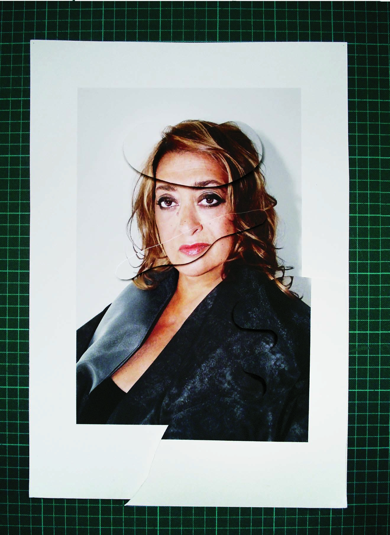
Zaha Hadid photographed for Wallpaper* in July 2017
In the art world, all you ever meet are preposterous poseurs whose achievements are dubious, but here’s someone who really has done something. On the other hand, I can’t say relief wasn’t entirely absent. Now I can swot up more on the kinds of things her work is about, its super-modern terminology and weird and wonderful aims – not just to provide protection for fire engines or industry people or works of art or trains whizzing in and out of cities, but to express the moment, define what we are, leave an imprint for the future of what bugs us and fires us up today.
I look at a picture of her first built building, the Vitra fire station in Germany (built on the Vitra premises and manned by Vitra volunteers; it was considered necessary following a fire at the factory). I laugh at her great comment on it from the time: ‘The whole building is frozen motion ready to explode into action at any moment.’ It really does look like it is ready to take off, all dynamic swerves, slants and angles; as if expressing the mind of someone whose very being is synonymous with action and willpower. Reassuring for a place that is in charge of putting fires out.
From Zaha Hadid's Guest Editorship in Wallpaper* magazine's October 2017 edition
Roger says, as he guides me back to the reception area with a fresh armload of Hadid-glorifying glossy publications, ‘You probably know more about her than I do.’ I say no, I wish, ha ha, and nervously get down to studying the articles, just in case I am called back today.
What does ‘deconstruction’ in architecture mean? Like fashion at the end of the 20th century: a sense of something ordered and classical, but an elegant unravelling of the same thing, so you feel you’re getting both, neither stuffy nor silly. She has a sense of an ordered building, she undermines it by inserting a whole new set of contemporary values, and the result is convincing.
Her design for the compressed spaces of Cincinnati’s Rosenthal Contemporary Art Center, built for nearly $30m in 2003, causes city life to flow in and out and even through the building. A glass-walled public area on the ground level, with a lot of electric light strips, seems to stand for a kind of staged everyday city space: a delightful architectural metaphor for the cliché of blurred boundaries between art and life.
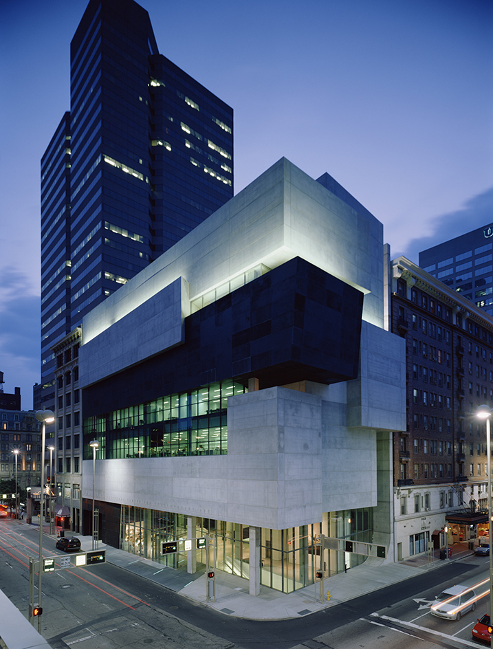
Contemporary Arts Center, Cincinnati
Inside, on different stages, are the galleries – eight of them – a series of changing spaces, appropriate to an art centre that has no permanent collection of its own, and is devoted to a constant stream of changing exhibitions. Some are taller than others, some have daylight, some have none, but most have a sloping or zigzag shape, few are ‘ordinary’ spaces. They’re all connected by a kind of trick staircase that appears to be tilting. As a visitor, you’re not allowed to forget the space; you’re under attack in a way. But it’s a pleasurable way. In Abu Dhabi, she’s got a museum of performing arts being constructed on a pleasure island full of museums created by architectural hot shots: hers is easily the most striking, like a low-lying reptile the size of a small town.
It’s only an hour or so later. Roger appears: ‘She’s been talking about cement all day; she wants something different.’ (As if it might be something different to eat.) I gulp and we return together to the big room, where she is telling off a lot of assistants who dart in and out of the door. They vaporise and telling-off merges into interview.
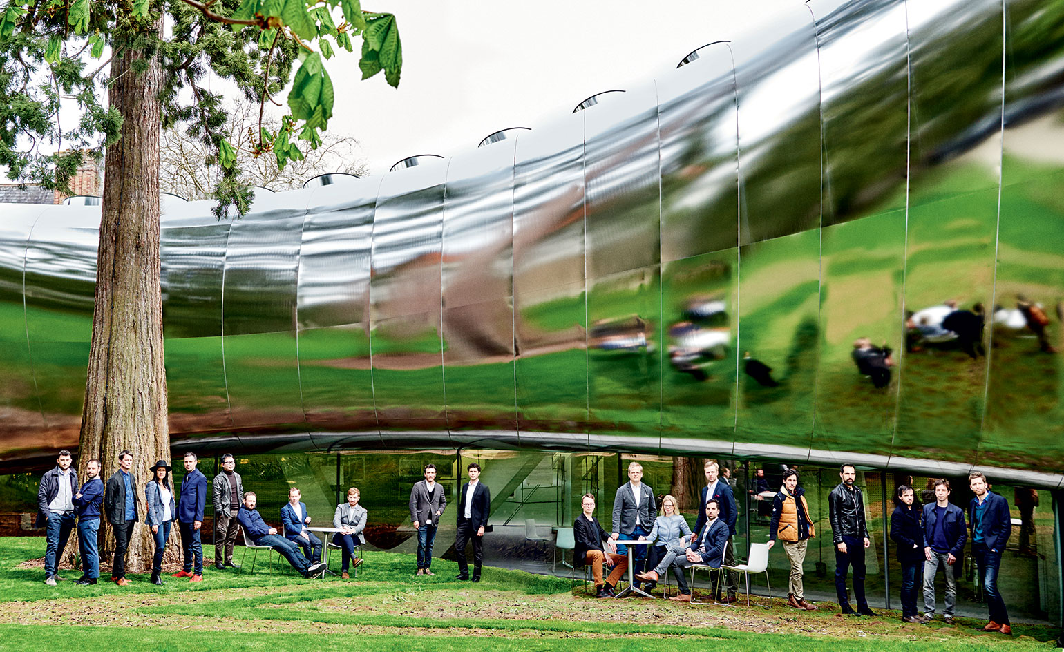
A group portrait of studios featured in the 2016 Architects’ Directory was photographed outside the just-completed Investcorp Building at the Middle East Centre in Oxford, honouring Hadid's passing the same year
Born in Baghdad in 1950 (to a liberal democratic Muslim family who left Iraq in the 1960s), she has lived and worked in London for more than 40 years. But it turns out that, as well as the low growling speaking voice that often makes her hard to understand, she has a peculiar way of talking in solid concepts, just serving up meaning-clusters and not bothering with grammar. I know what an axonometric drawing is and what topology is and, of course, what complexity and voids are, but when they are just stuck together in a clump, I don’t know where I am. But I sincerely believe that she does. She is not at all pretentious; she knows about something difficult, her area, and she appreciates someone wanting to hear about it, even if they are a bit bewildered by what comes out.
It reminds me a little of interviewing Andy Warhol a few months before he died. I only realised much later how out of my depth I was and that he was actually being quite kind in tolerating me. He was doing something new that had a lot of complicated levels, and if he needed his verbal mode to be ‘wow’ and ‘gee’ that didn’t mean he wasn’t a formidable thinker. He had the right. And, likewise, if Hadid doesn’t go in for verbs and tenses, it’s petty to complain.
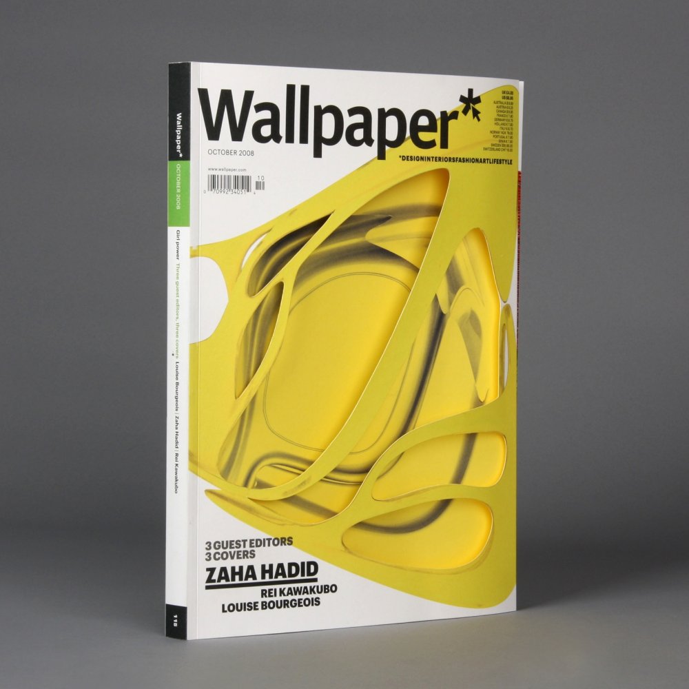
I ask her about the original artwork she’s making for Wallpaper*. She wants a shape cut out of the magazine, literally a cavity in the middle. I don’t know if this is exactly what’s going to happen in the end – I thought of my friend in the publications department at the Guggenheim Museum in New York, who told me that when Hadid had her 30-year retrospective there in 2006, she wanted a similarly logic-defying circular catalogue. She also said that Hadid used to shout at her staff in front of the publications team, and now here she was doing exactly that in front of me – I’m not sure they really minded that much, though.
She is the real thing, my friend had thought, and I do too: this amazing-looking figure, like a female Wizard of Oz, a wizard of the night, in striking black and gold Prada, with her big eyes and deep, growling voice. The artwork for Wallpaper* relates to a set of ideas about space and fluidity that she’s been developing for the last ten years. She says these ideas include all sorts of notions, but, while I understand their literal meanings, I don’t exactly know how they all add up: carving, layering, the void, space, archaeology and landscape (which certainly sounds how her buildings look). ‘But it needs a big hole in the magazine,’ she rumbles.
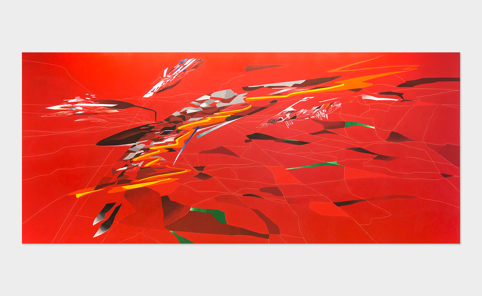
Metropolis, by Zaha Hadid, 1988, is one of many early works by the late architect, which has been on view in the past at Serpentine Sackler Gallery in London
We get on to her paintings. She’s famous for doing them – geometric abstracts. I like them because of their balance of forms, not so much for the handling of paint, which is rather anonymous. But I’m impressed by the sense of pattern, the play of shapes, the balanced asymmetric distribution of intensities and more muted bits: what it says to me is sensitivity, experience, knowledge, feeling and a genuine mental-jumping-about energy (all rare in the Turner Prize world).
The paintings are not really abstract art, but plans for architecture; they’re her personal way of working through ideas. She started doing them in the 1970s at the Architectural Association (AA) School of Architecture when she was studying there under the architects Rem Koolhaas and Bernard Tschumi. Hadid is thought of as a postmodernist, but at the same time as someone for whom modernism is a burning issue, not something to be merely ironic about or jokey towards. Modernism was progressive and optimistic, but we’re all a bit more jaded now, is the postmodernist received idea: nothing is more true than anything else, and everything is relative. Hadid’s architectural spirit was formed at a time when anyone creative was on fire with postmodernist cleverness. But while she mines modernism for forms, she doesn’t use them to laugh at the days of sincerity and belief. She is a great believer in progress herself.
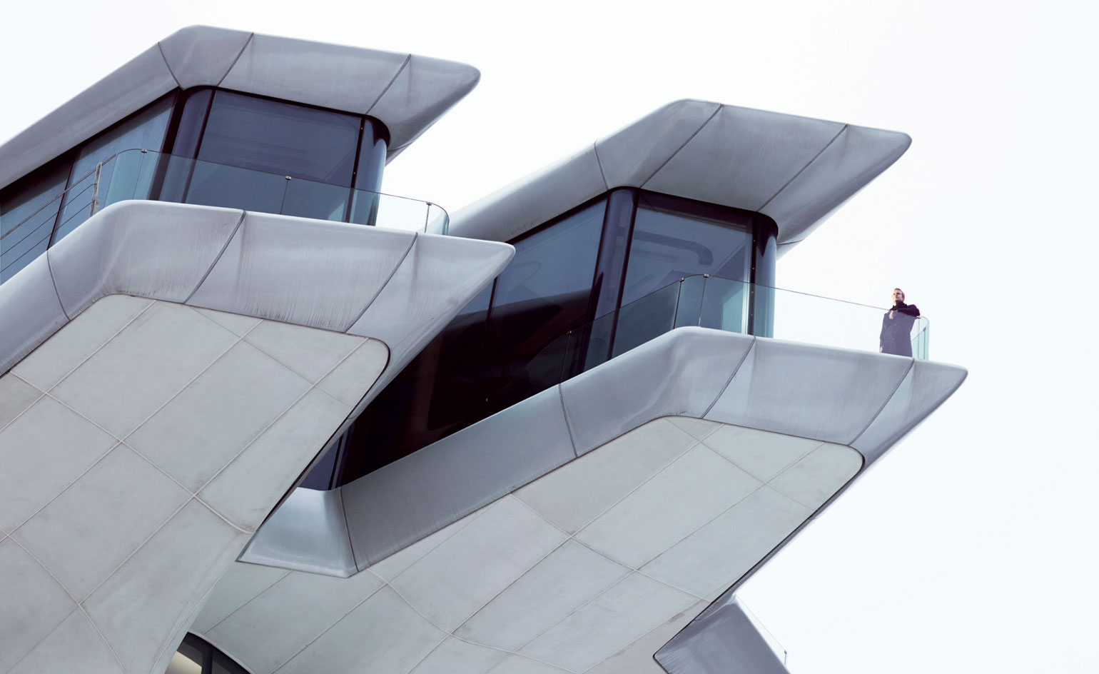
Featured in the April 2015 issue of Wallpaper*, Vladislav Doronin’s $160m Hadid-designed space rocket/private home
Painting, the influence of Russian constructivist Kasimir Malevich and her first sense that she really might have something the world might want, all happened at once for her, with Koolhaas presiding. He gave her a project, solving some problem of space, and her solution was to re-employ spatial ideas that Malevich had come up with in the run-up to the Russian revolution.
Malevich was a visionary. He wanted Russia and the whole world to move into the future, with him in the lead. He called himself The President of Space. But his ideas were too hot for the new regime, and under Stalin – after Malevich died in 1935 – they were simply banned. Now Hadid, the hot student, was going to revive them. The first blast of Malevich-return, or neo-modernism, was going to be a project on Hungerford Bridge: a hotel spanning the Thames, made of pure white, geometric, modern-art forms (similar to the ones in white relief on the wall in the room I’m sitting in with Hadid now, which turn out to be her original plans for Cincinnati).
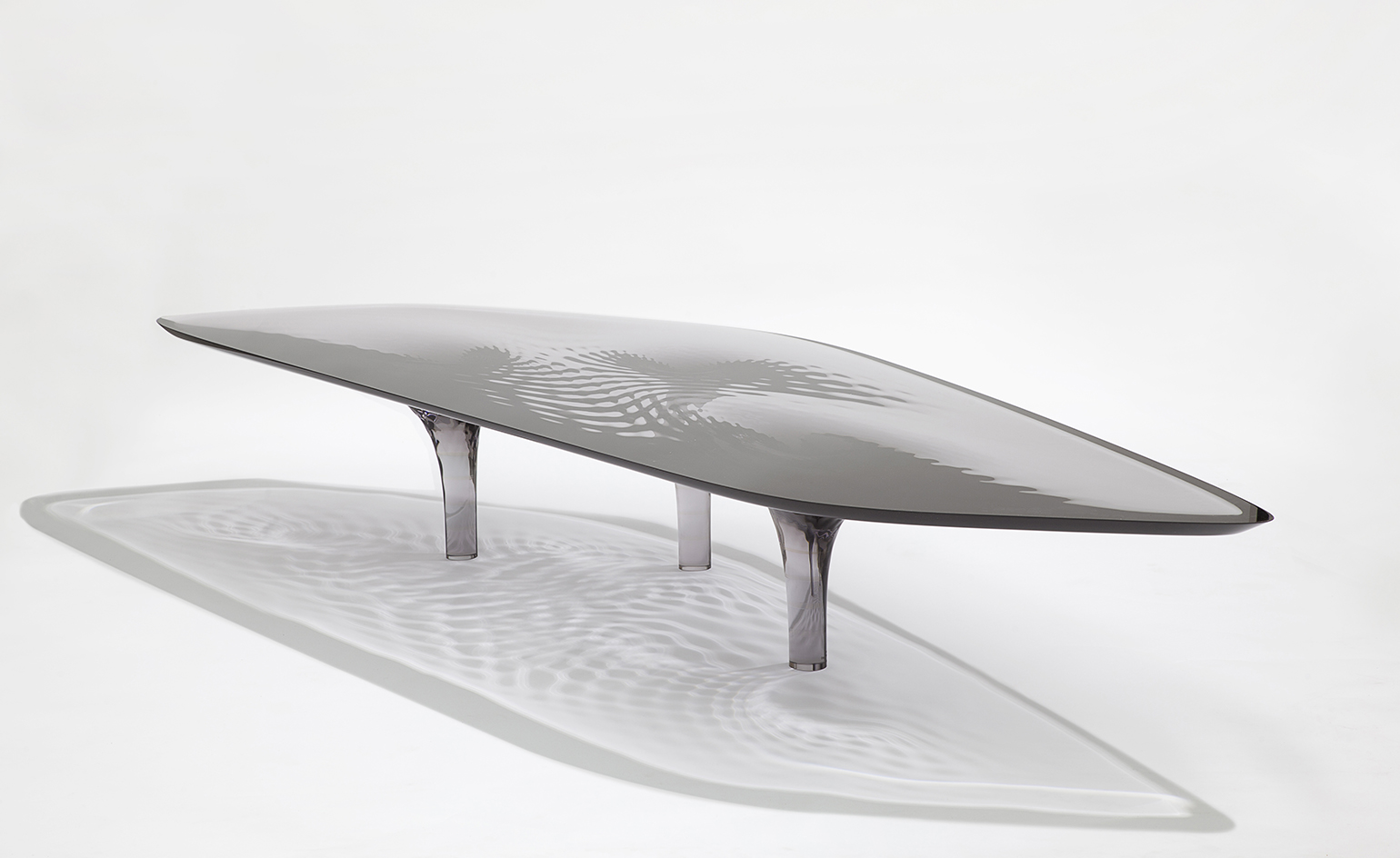
David Gill Gallery and ZHA paid tribute to Zaha Hadid at Masterpiece London in 2016 showing a series of 'Liquid Glacial' tables
It was just a student project, and although it earned Hadid a prize, and eventual employment by Koolhaas when she left the AA, there was never any expectation of it actually being built. However, the 1970s was a funny time at the AA, because no one actually expected anything to be built. The big architectural stars designed buildings and towns that challenged all existing buildings and towns, and were really a kind of heroic conceptual-art version of architecture. Then, in the following decade, the same iconoclasts gradually became real builders.
For Hadid it was very gradual. She won a stream of prizes, but none of the designs were realised: she was considered too radical and difficult by the powers that be. The most prestigious prize was in 1983 for a design for a leisure centre in Hong Kong, called The Peak, but then another architect was given the gig instead (perhaps because she proudly called her design for The Peak ‘a suprematist geology’). Even as late as 1994, she had a major prize-winning design (the Cardiff Bay Opera House) turned down for actual building by a board of conservative bores.

In a 2021 show in Zürich’s Galerie Gmurzynska: On the walls are three drawings from Hadid’s ‘The Peak’ project proposal, while the floor is covered in the Cellular Hand-Tufted Rug by Zaha Hadid Design, shown with the Liquid Glacial Stool
She was used to being put down by such types, but convinced she would get somewhere in the end. She kept going on about ‘complexity’, she was big and bold, she really went for it, and eventually she won. Her first built building, the fire station, went up ten years after The Peak rejection. Ten years later, she had buildings under construction all over the world, and now she’s a byword for Now.
She laughs when I ask her if Malevich is too simple for her these days, and says, ‘Yes!’ She has the greatest respect for him, but her mind is more her own now. If the typical Hadid look is elegant, slinky, organic and flowing, there is still a great range to how those characteristics are manifested: one building does something, while another one does something else. (Her predecessor, both as great guru of the art of building and great beneficiary of information technology, Frank Gehry, does a sort of computer-generated knitting, which is fun, but it’s the same knitting each time.)
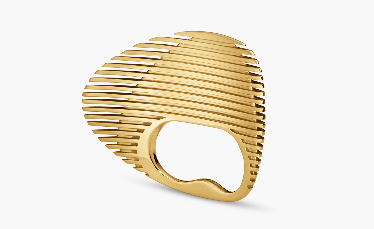
Zaha Hadid’s experimental volumes and sweeping curves also inspired a contemporary jewellery collection that the architect created with Danish jeweller Georg Jensen prior to her untimely passing
What is greatness? All the past art and architecture styles that go into the Zaha Hadid product – constructivism, futurism, expressionism – have had their original ideologies taken away as they (kind of) merge with what we might call computerism. Is it that they just fit, as everything must, into the new global ideology: consumerism? The information age’s big belief is: no belief, just buy. But this is a social change that Hadid – whose overriding preoccupation right now, she tells me as we end the interview, is social housing – cannot be attacked for.
'Her ambition was to push forward her ideas about space, to make fluid forms even more stately and surprising and moving, in order to offer society models of change'
Matthew Collings
You could ask where she stands on the emptiness of our age, its emotional flatness and lack of ambition to do anything about social injustice, but does art really work like that? Her architecture is the greatest art of the moment. It expresses the age, but that means it has contradictions, too. Just as Malevich didn’t paint the revolution, but expressed a vision of change in abstract forms, or by abstract allegory and abstract metaphors, so Hadid’s buildings are metaphors for new rising optimistic ideals that fight apathy: especially a new fascination with nature, not just lovely trees, but nature’s intricacy and deep structures, its internal complexity, its processes. Her ambition is to push forward her ideas about space, to make fluid forms even more stately and surprising and moving, in order to offer society models of change. And the power and joy of the way she goes about all that is what makes her great.
Ellie Stathaki is the Architecture & Environment Director at Wallpaper*. She trained as an architect at the Aristotle University of Thessaloniki in Greece and studied architectural history at the Bartlett in London. Now an established journalist, she has been a member of the Wallpaper* team since 2006, visiting buildings across the globe and interviewing leading architects such as Tadao Ando and Rem Koolhaas. Ellie has also taken part in judging panels, moderated events, curated shows and contributed in books, such as The Contemporary House (Thames & Hudson, 2018), Glenn Sestig Architecture Diary (2020) and House London (2022).
