Alexander Calder mobiles reimagined as gravity-defying still lifes
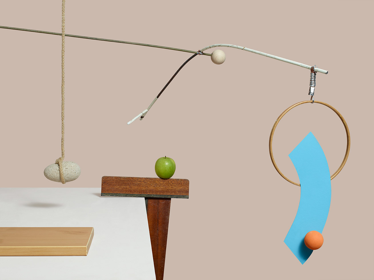
Alexander Calder’s iconic kinetic mobiles originated after a visit to Piet Mondrian’s studio in 1930. Inspired by a particularly dazzling room in the apartment – light was streaming in from both sides of the room illuminating a wall with coloured cardboard tacked on – the American sculptor suggested to his artist-friend that ‘perhaps it would be fun to make these rectangles oscillate’. A dour Mondrian retorted that it would be unnecessary, as his painting was ‘already very fast’. Inspired, Calder left the studio and within a year had done what Mondrian declined to: made abstract art move.
So we were tickled to see the American sculptor’s pioneering works upended and reimagined as modern-day still lifes by photographer William Bunce and Lisa Jahovic, an art director and set designer. The London-based pair have been collaborating for six months – predominantly working on a conceptual film about their protagonist, a ball named Lee – but took time out of their schedules to pay homage to the Calder with a personal series of whimsical sculptures of their own.
We caught up with Bunce and Jahovic to find out more about their balancing act...
W*: What prompted you to create this series inspired by Calder?
WB/LJ: The idea of objects being animate and inanimate, which we have been developing in our film project, and Calder being an artist who always came up in regards to his kinetic sculptures. It was a swift turnaround – maybe a week. We played around quite organically on the day.
Your mobiles incorporate real objects such as apples and rocks – how did you go about selecting these and is there any sort of fun meaning behind them?
A few ‘real’ objects are interspersed within the series, playing with domesticity and reality, which are regular themes within our work. The apple, lemon and stone are matters of life that we can relate and scale to. Also, there’s a cheeky nod to Magritte – the master of utilising the humble apple.
The yellow and blue elements are signature Calder, but it appears you’ve excluded red. Was this purely an aesthetic choice?
Engaging with colour palettes is key to Lisa’s style and something that together we recognise as important within the work we make together and try to refine and consider as much as possible. Calder is predominantly known for his use of monochrome and primary colours, but we chose to have a more natural, tonal approach to correspond with our use of organic set and props. We used a fleshy tone and then adopting two of Calder’s primary colours to be the bright shapes. There was no place for red – sorry, red.
Are there any Calder works in particular that you looked at for reference?
We both had visited the Calder retrospective in 2015 at the Tate Modern, and had discussed how we had been so drawn in by the seemingly simple and gravity-defying sculptures. One of our main references for the series was Untitled, 1937, which appears elementary in its design with strong shapes and striking primary colours – it’s an icon.
What was the trickiest part of the shoot?
It was quite the balancing act. The scale of the sculptures that Lisa made were actually rather large, and although the final aesthetic appears flat to camera, in reality the set was pretty deep, with the arms shooting off in all directions, dancing around – it was a game, taming the wildness of the sculpture. We wanted the sculptures to be freestanding and shot in camera without supports. We learned that gravity is a pain – as we’re sure Calder did too!
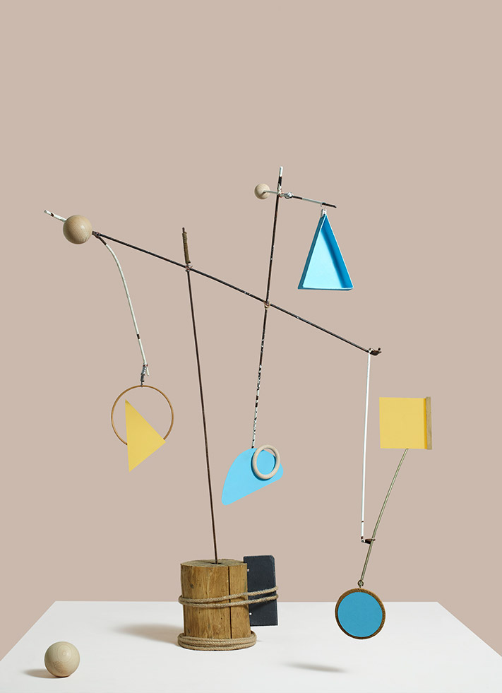
Set design: Lisa Jahovic
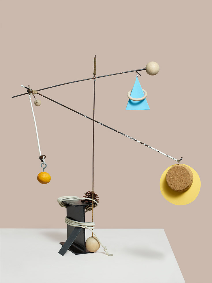
Set design: Lisa Jahovic
Information
For more information, visit William Bunce’s website and Lisa Jahovic’s website
Wallpaper* Newsletter
Receive our daily digest of inspiration, escapism and design stories from around the world direct to your inbox.
-
 A Xingfa cement factory’s reimagining breathes new life into an abandoned industrial site
We tour the Xingfa cement factory in China, where a redesign by landscape specialist SWA Group completely transforms an old industrial site into a lush park
By Daven Wu
-
 Put these emerging artists on your radar
This crop of six new talents is poised to shake up the art world. Get to know them now
By Tianna Williams
-
 Dining at Pyrá feels like a Mediterranean kiss on both cheeks
Designed by House of Dré, this Lonsdale Road addition dishes up an enticing fusion of Greek and Spanish cooking
By Sofia de la Cruz
-
 Inside Jack Whitten’s contribution to American contemporary art
As Jack Whitten exhibition ‘Speedchaser’ opens at Hauser & Wirth, London, and before a major retrospective at MoMA opens next year, we explore the American artist's impact
By Finn Blythe
-
 Frieze Sculpture takes over Regent’s Park
Twenty-two international artists turn the English gardens into a dream-like landscape and remind us of our inextricable connection to the natural world
By Smilian Cibic
-
 Harlem-born artist Tschabalala Self’s colourful ode to the landscape of her childhood
Tschabalala Self’s new show at Finland's Espoo Museum of Modern Art evokes memories of her upbringing, in vibrant multi-dimensional vignettes
By Millen Brown-Ewens
-
 Wanås Konst sculpture park merges art and nature in Sweden
Wanås Konst’s latest exhibition, 'The Ocean in the Forest', unites land and sea with watery-inspired art in the park’s woodland setting
By Alice Godwin
-
 Pino Pascali’s brief and brilliant life celebrated at Fondazione Prada
Milan’s Fondazione Prada honours Italian artist Pino Pascali, dedicating four of its expansive main show spaces to an exhibition of his work
By Kasia Maciejowska
-
 John Cage’s ‘now moments’ inspire Lismore Castle Arts’ group show
Lismore Castle Arts’ ‘Each now, is the time, the space’ takes its title from John Cage, and sees four artists embrace the moment through sculpture and found objects
By Amah-Rose Abrams
-
 Gerhard Richter unveils new sculpture at Serpentine South
Gerhard Richter revisits themes of pattern and repetition in ‘Strip-Tower’ at London’s Serpentine South
By Hannah Silver
-
 Peter Blake’s sculptures spark joy at Waddington Custot in London
‘Peter Blake: Sculpture and Other Matters’, at London's Waddington Custot, spans six decades of the artist's career
By Hannah Silver