Chiachi Chao’s typography blends Western and Eastern writing styles
Our Next Generation 2022 showcase shines a light on 22 outstanding graduates from around the globe, in seven creative fields. We profile Taiwanese type and graphic designer Chiachi Chao, a graduate of ECAL, Lausanne
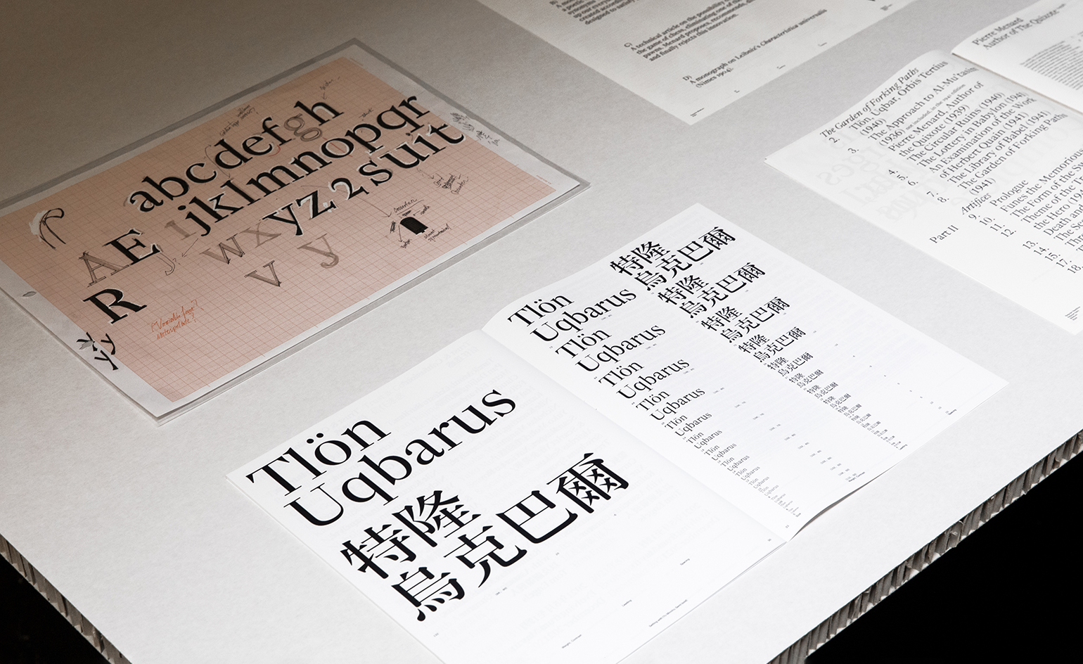
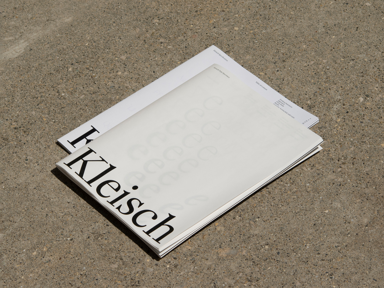
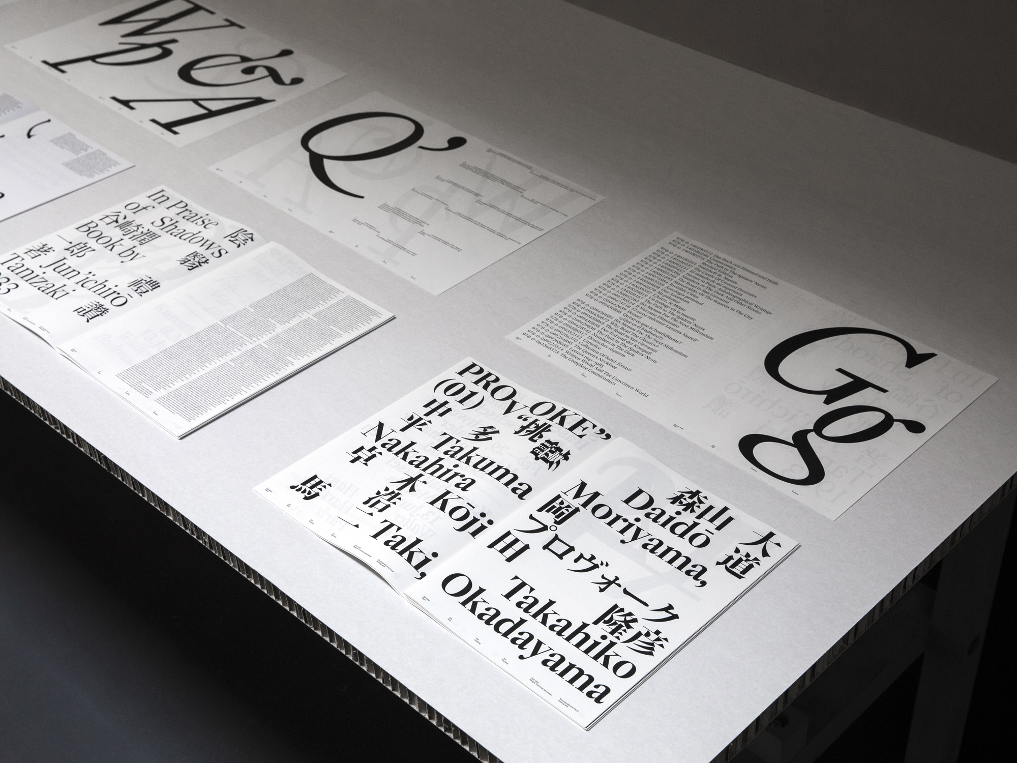
A graduate of the master’s in Type Design at ECAL, Chiachi Chao is currently living in Lausanne. The Taiwanese designer created the Kleisch typeface as part of his final studies, describing it as a Latin serif typeface developed for bi-scriptural typesetting. ‘As a typographic designer with a background in Latin and Chinese, Kleisch is my attempt to bridge the connection between the Serif Latin typefaces with Ming typefaces,’ he says, asking ‘what are the similar traits that can bring together two different typefaces from different scripts?’
By blending Baroque and Neoclassical styles, Chao has created a flexible set of modern letterforms that can accommodate the varying weights of different Ming characters.
Research took him from the history of Western and Eastern writing styles, from the technical limitations of early printing to the speed of brushed Chinese calligraphic writing. The evolution of a moveable type version of Ming made the fluid marks and forms of each character much more formalised, while still remaining very distinct and different from conventional Latin lettering. ‘Inspired by the story of Caslon, I imagined myself as a punchcutter in the early 18th century, cutting a typeface based on the Baroque model, but adding the neoclassical taste of Neoclassical time. This is a transitional face between two transitional models,’ he says.
‘Kleisch consists of 16 styles with a variable font that offers adjustable axes (weight and contrast) to adapt with different Ming typefaces accordingly.’ The final typeface was based on the cuts of the 17th-century designers Miklós Tótfalusi Kis and Christoffel van Dijck and the 18th-century German-Dutch typographer Johann Michael Fleischmann.
Dream collaborators: François Rappo, Radim Peško and Kasper Florio.
Wallpaper* Next Generation 2022
More young talents to watch – dubbed ‘22 rising stars for 2022’ and from creative fields spanning design, jewellery, transport, architecture, photography, fashion, and visual communication – can be discovered in the January 2022 Next Generation issue of Wallpaper*, and in this ongoing series at Wallpaper.com.
INFORMATION
Wallpaper* Newsletter
Receive our daily digest of inspiration, escapism and design stories from around the world direct to your inbox.
Our Next Generation showcase of outstanding new talents appears in the January 2022 issue of Wallpaper* (W*273). Subscribe today!
Jonathan Bell has written for Wallpaper* magazine since 1999, covering everything from architecture and transport design to books, tech and graphic design. He is now the magazine’s Transport and Technology Editor. Jonathan has written and edited 15 books, including Concept Car Design, 21st Century House, and The New Modern House. He is also the host of Wallpaper’s first podcast.
-
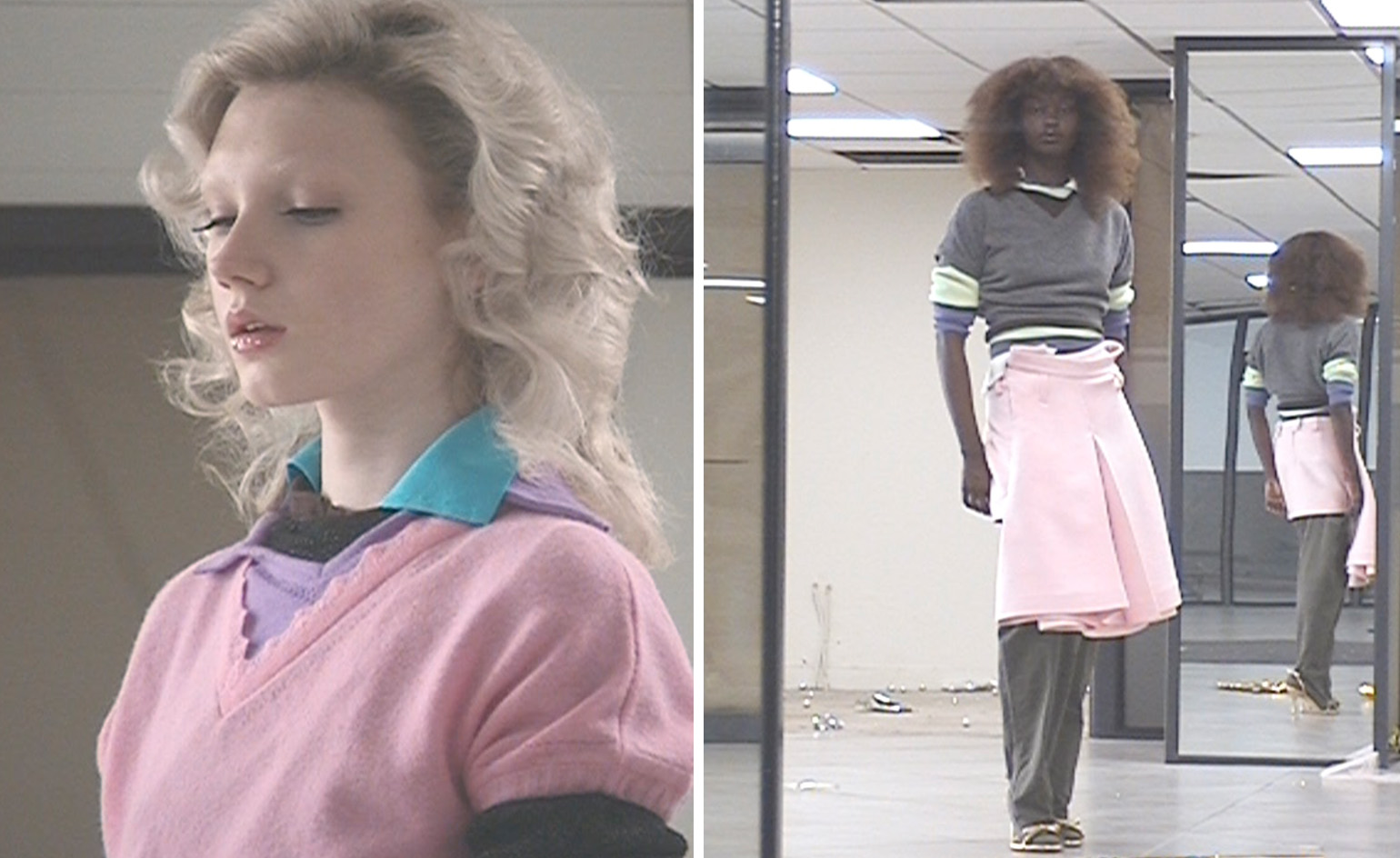 All-In is the Paris-based label making full-force fashion for main character dressing
Part of our monthly Uprising series, Wallpaper* meets Benjamin Barron and Bror August Vestbø of All-In, the LVMH Prize-nominated label which bases its collections on a riotous cast of characters – real and imagined
By Orla Brennan
-
 Maserati joins forces with Giorgetti for a turbo-charged relationship
Announcing their marriage during Milan Design Week, the brands unveiled a collection, a car and a long term commitment
By Hugo Macdonald
-
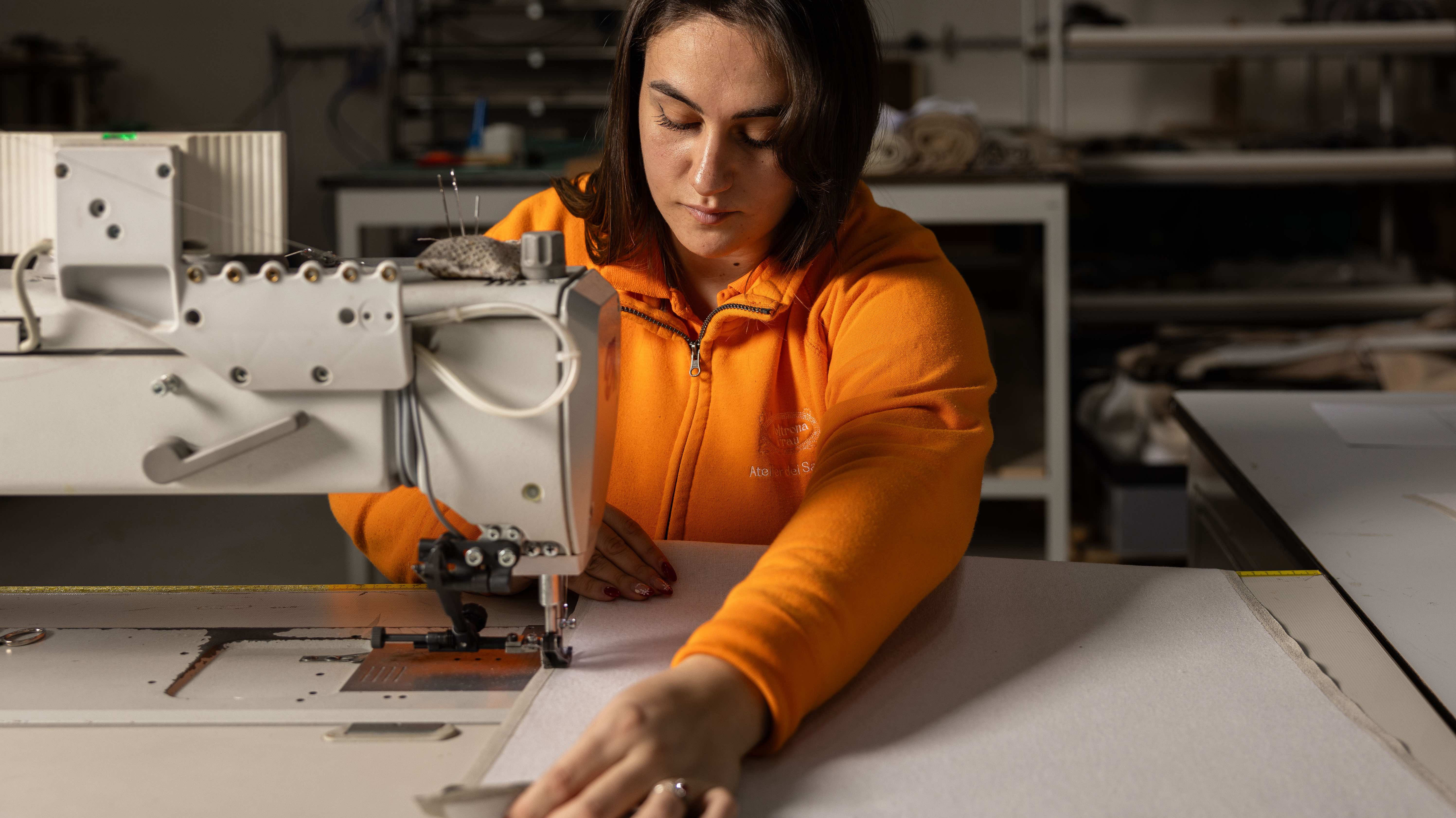 Through an innovative new training program, Poltrona Frau aims to safeguard Italian craft
The heritage furniture manufacturer is training a new generation of leather artisans
By Cristina Kiran Piotti
-
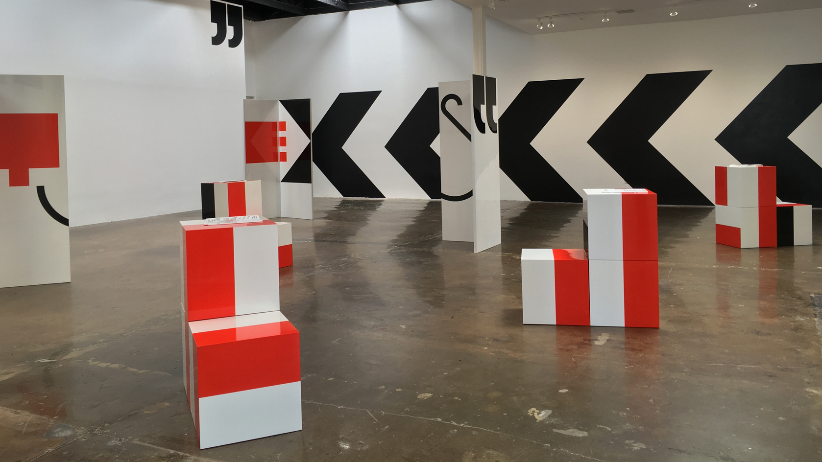 Supergraphics pioneer Barbara Stauffacher Solomon: ‘Sure, make things big – anything is possible'
94-year-old graphic designer Barbara Stauffacher Solomon talks radical typography, motherhood, and her cool welcome for St Moritz
By Jessica Klingelfuss
-
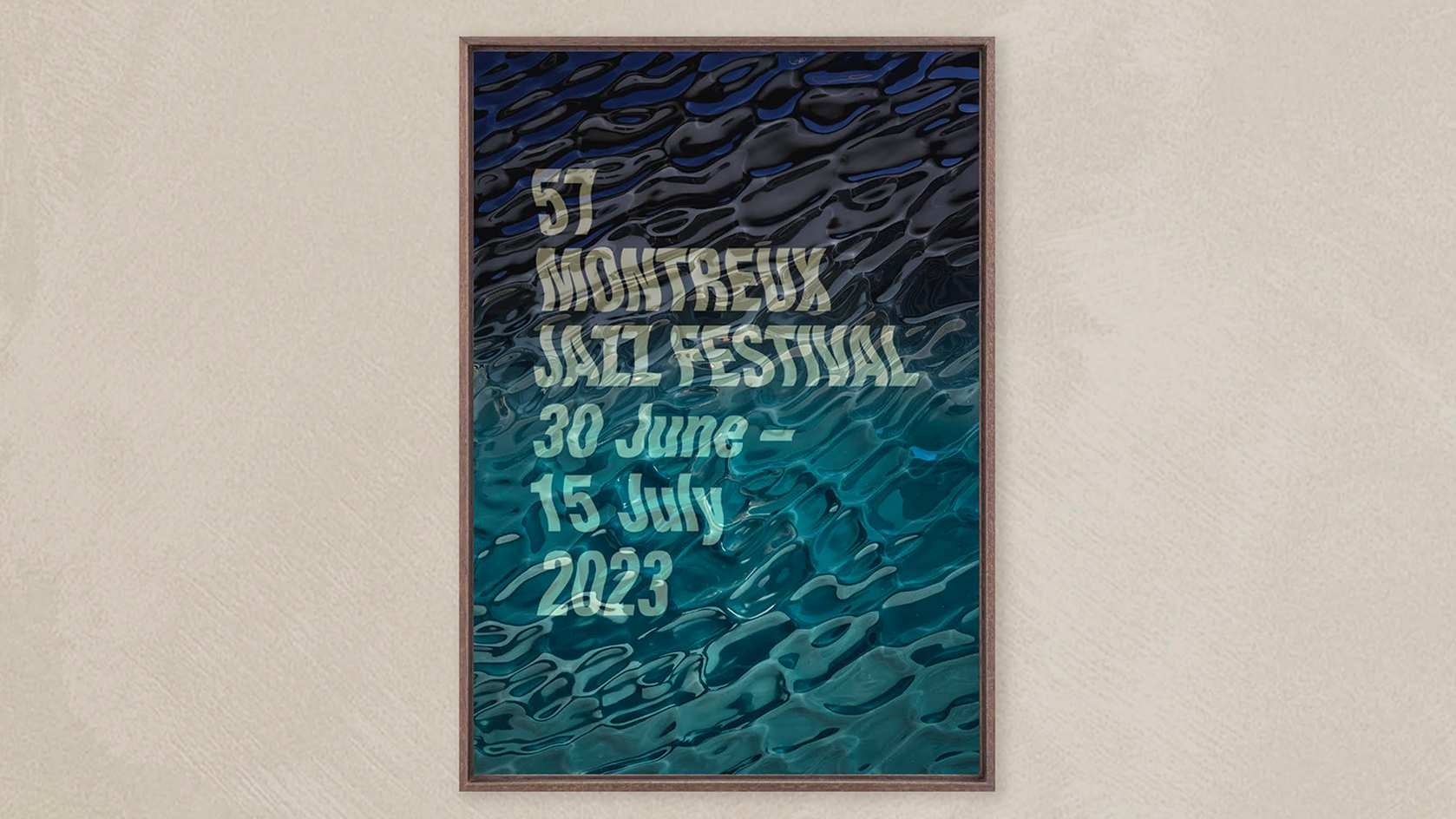 Montreux Jazz Festival posters: a visual history
As artist Guillaume Grando (SupaKitch) unveils his poster for the 57th Montreux Jazz Festival (30 June - 15 July 2023), we reflect on the most memorable designs since 1967, including from David Bowie to Andy Warhol and Camille Walala
By Harriet Lloyd-Smith
-
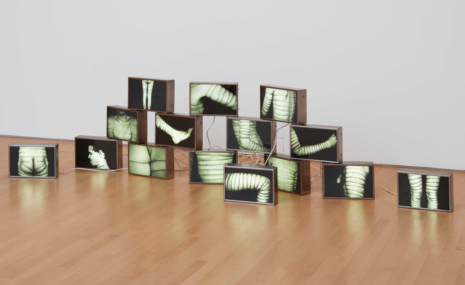 AA Bronson on the radical, enduring legacy of General Idea
General Idea, an art group that pioneered a queer aesthetic, is celebrated in a retrospective at the National Gallery of Canada (opened during Pride Month and running until 20 November 2022). Surviving member AA Bronson speaks about their origins, and impact on art and social justice
By Benoit Loiseau
-
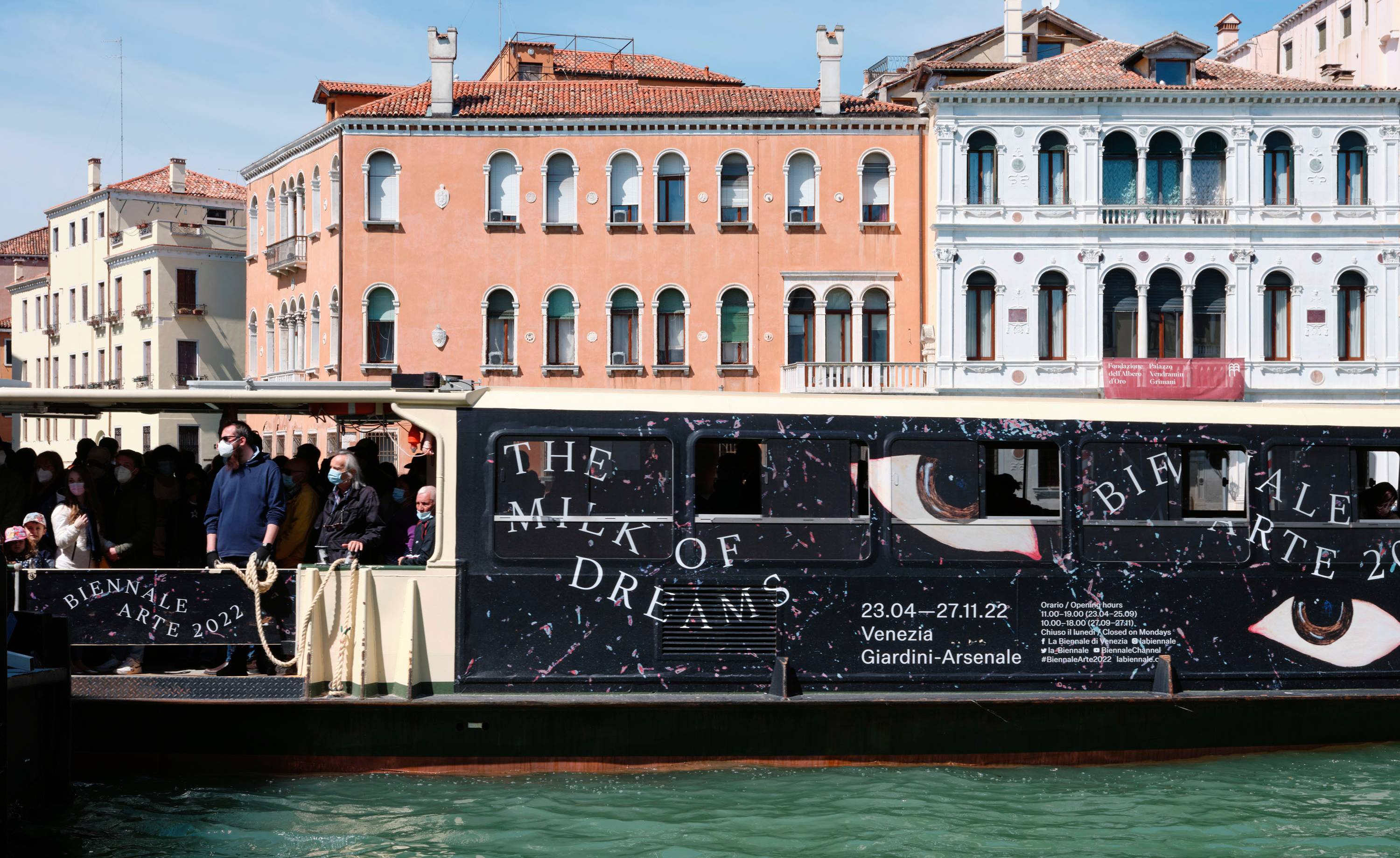 A Practice for Everyday Life gives 59th Venice Biennale a richly surreal graphic identity
London-based graphic design studio A Practice for Everyday Life (APFEL) gives an otherworldly identity to the surrealism-infused 59th Venice Biennale theme ‘The Milk of Dreams’
By Jonathan Bell
-
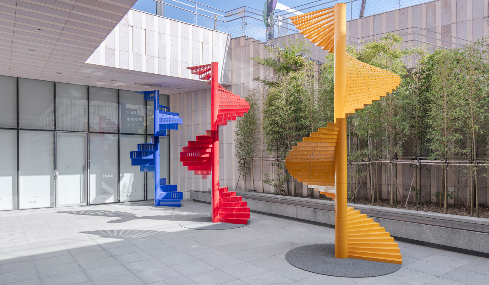 Inside Na Kim's vibrant playground for all ages
South Korean graphic designer Na Kim's ‘Bottomless Bag’, installed at Buk-Seoul Museum of Art, is a vivid, geometrical exploration of memory and everyday objects. We offer a virtual tour and find out how the concept came to be
By Andy St Louis
-
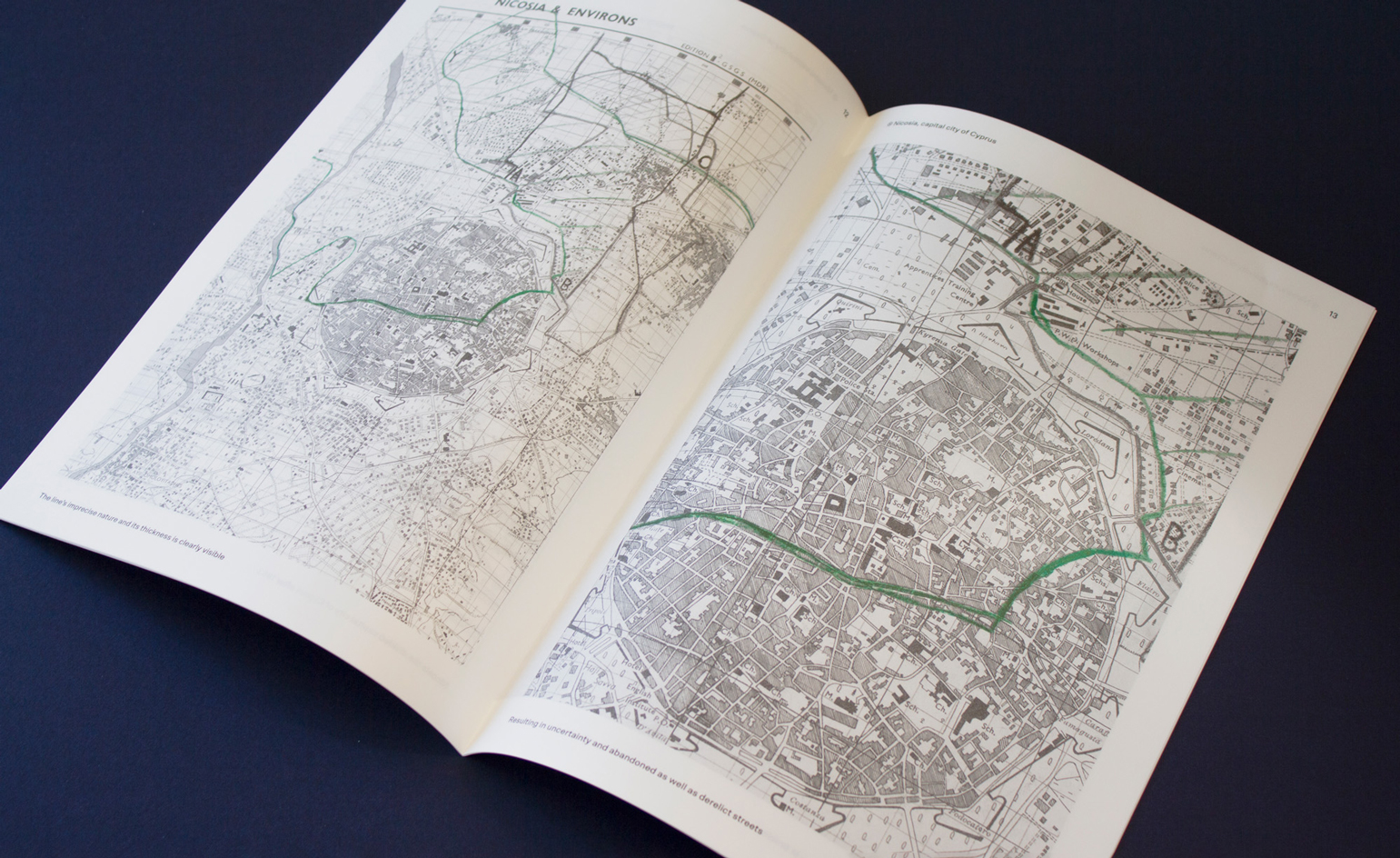 Philipp Doringer’s cartographic design: from Bob Dylan to Vienna’s Second District
Our Next Generation 2022 showcase shines a light on 22 outstanding graduates from around the globe, in seven creative fields. Here, we present Austrian Philipp Doringer, a graduate of Design Academy Eindhoven
By Jonathan Bell
-
Tom Hingston on designing for Serpentine Galleries, the V&A, and Wallpaper*
London-based art director and graphic designer Tom Hingston discusses his visual identities for Serpentine Galleries
By TF Chan
-
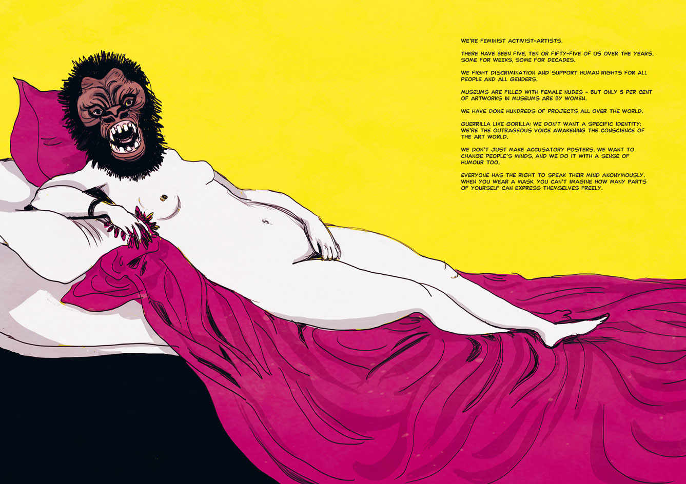 Feminist art: a graphic history
A new graphic novel, The Women Who Changed Art Forever, by Valentina Grande and Eva Rosetti, tells the story of feminist art through four pioneers: Judy Chicago, Faith Ringgold, Ana Mendieta and the Guerrilla Girls
By Harriet Lloyd-Smith
