David Carson’s experimental typographic collage for The Macallan whisky
American graphic designer, art director and surfer David Carson unveils striking hand-crafted collage design for The Macallan Concept No. 3 whisky
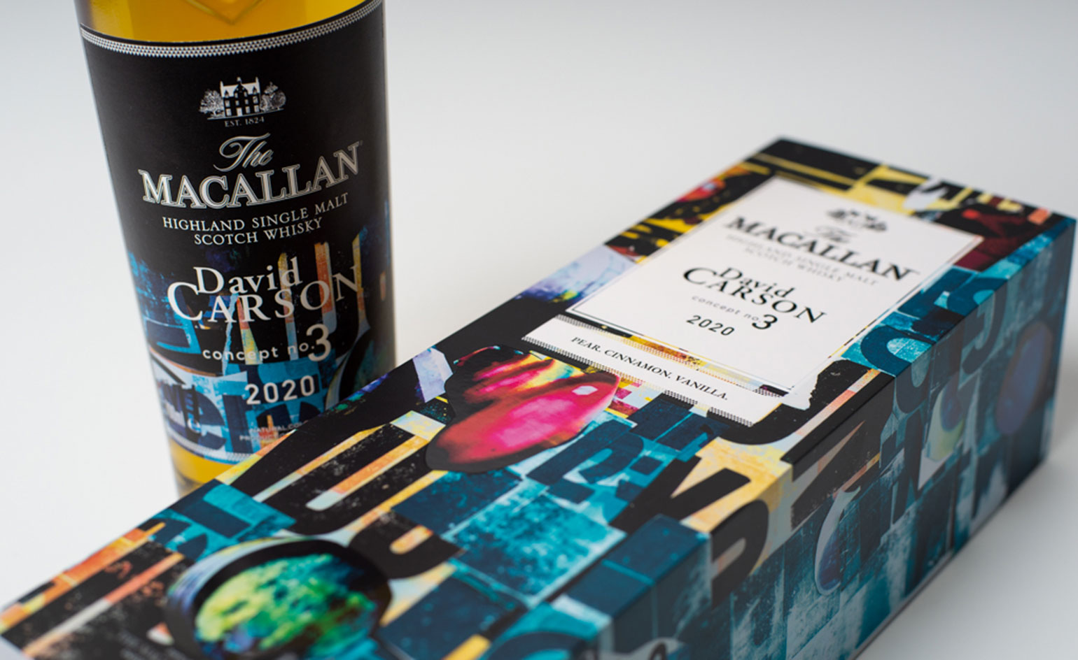
American graphic designer David Carson knows how to execute a project with unconventional, hand-crafted flair; his latest for The Macallan Concept No. 3 whisky is no exception.
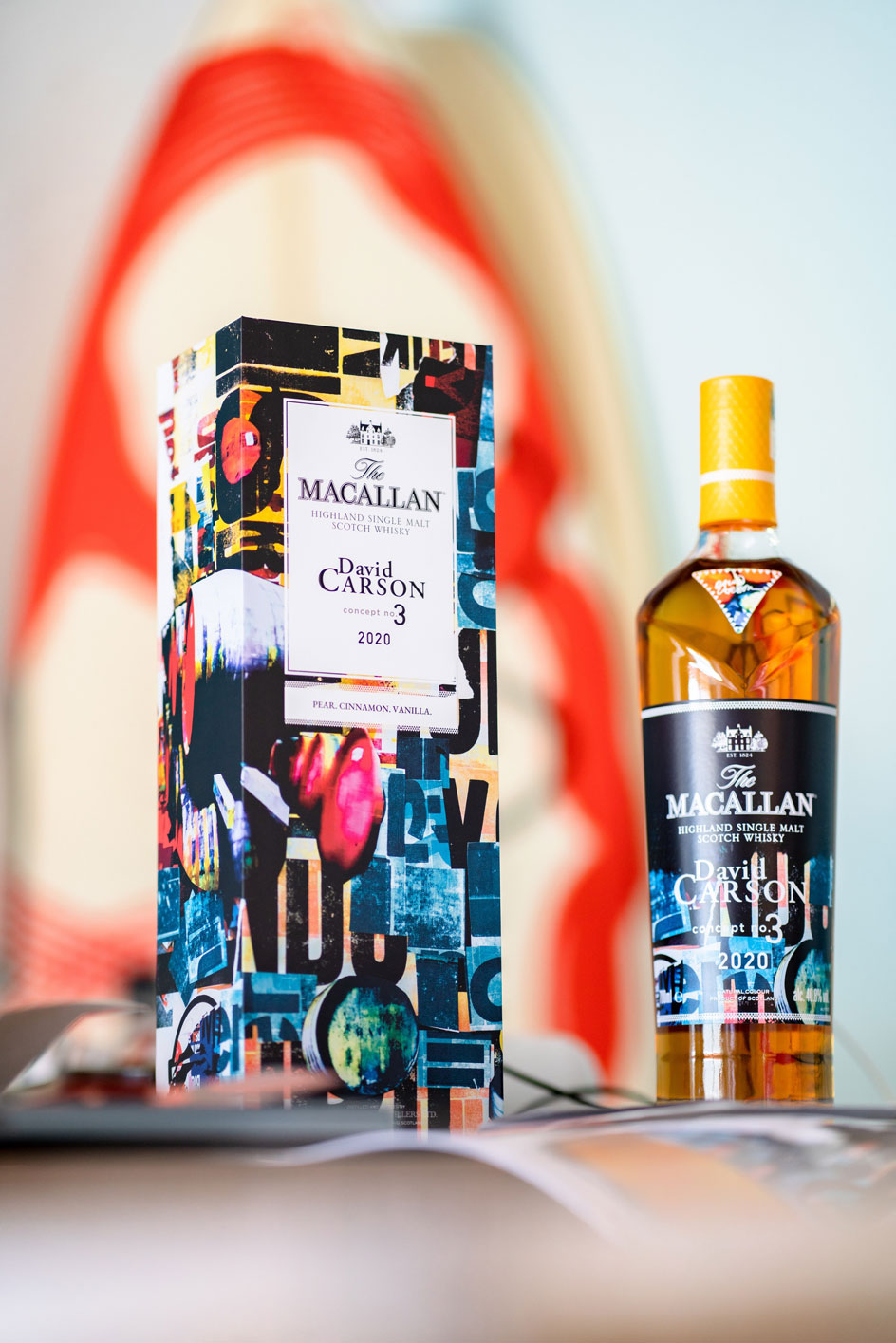
Concept No. 3 is the latest launch in The Macallan Concept Series, a limited collection of annual release whiskies that blend creativity and the art of whisky-making. Carson’s intervention on the luxury single malt scotch whisky involves a bold new take on the bottle’s label and presentation box.
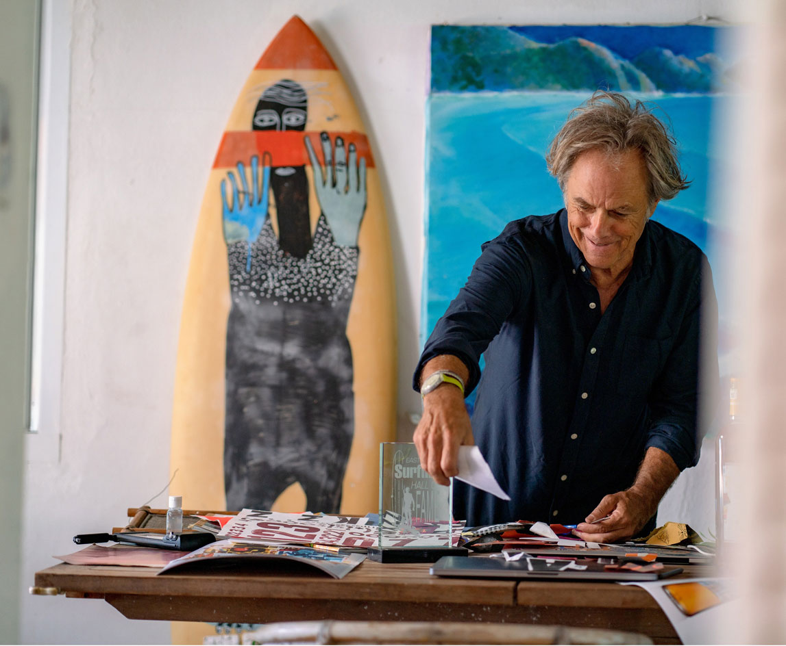
Carson’s career has not been short of accolades, or variation. He’s created campaigns for the likes of Ray-Ban, and Omega, art-directed 1990s alternative rock-and-roll magazine Ray Gun, designed a Wallpaper* Handmade limited-edition subscriber cover and was named one of only two graphic designers selected by Apple as part of its iconic ‘30 most innovative users’ list. Alongside pushing the boundaries of art direction and revolutionising typography, he’s also a professional surfer.
Wallpaper*: How did your collaboration with The Macallan whisky come about?
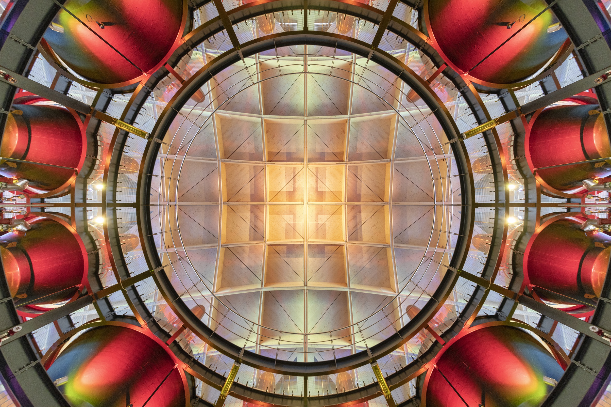
To gather inspiration for the project, Carson visited The Macallan’s 485-acre estate in Scotland’s Speyside – with a distillery designed by Rogers Stirk Harbour + Partners – where he spent time immersed in his surroundings and picked the expert brains of The Macallan whisky maker Polly Logan (he even incorporated the letter ‘P’ for Polly into his final creation). Inspiration for the collaboration swung both ways: the whisky’s pale yellow colour, named Californian Gold, reflecting both the blend’s citrus notes, but also Carson’s sun-soaked days on the West Coast surf.
We speak to David Carson about the creation of The Macallan Concept No. 3, and the beauty of ‘hand-doneness’.
David Carson: I was visiting an artist friend in Barcelona, Ramon Enrich. Ramon had been invited to take part in a ’creativity day’ organised by The Macallan, and he suggested that I be included. This was my first introduction to working with the brand, and during the experience, I gave a presentation on branding, design, and my work. The day was a huge success and eventually led to our collaboration. It was an unexpected pleasure and rare opportunity to collaborate with such a unique and respected brand on The Macallan Concept No. 3.
Wallpaper* Newsletter
Receive our daily digest of inspiration, escapism and design stories from around the world direct to your inbox.
RELATED STORY
W*: How did your time spent on The Macallan estate inform the direction of your work?
DC: The amazing architecture of the distillery really stood out, especially the way it blends in so well with the landscape. The extraordinary grounds, trees and open spaces, the River Spey, and really just the whole environment on the estate seemed to whisper freedom, creativity, nature, colours and humanity. And, like all great experiences, the people helped make it – amazing, warm, friendly people, who are passionate about life and what they do.
Everything provided inspiration – the rich colours of the buildings, the handwritten type which was written in various colours, parts of the casks, and the people who checked on the casks daily. Overall, I think the colours and the humanness of the process influenced me a lot in wanting to do the artwork by hand.
I also used photos I’d taken as we visited the various areas of the estate, weaving them into my work. I took such a warm feeling from the whole experience, and I hope my design for the project gives people a bit of the same feeling.
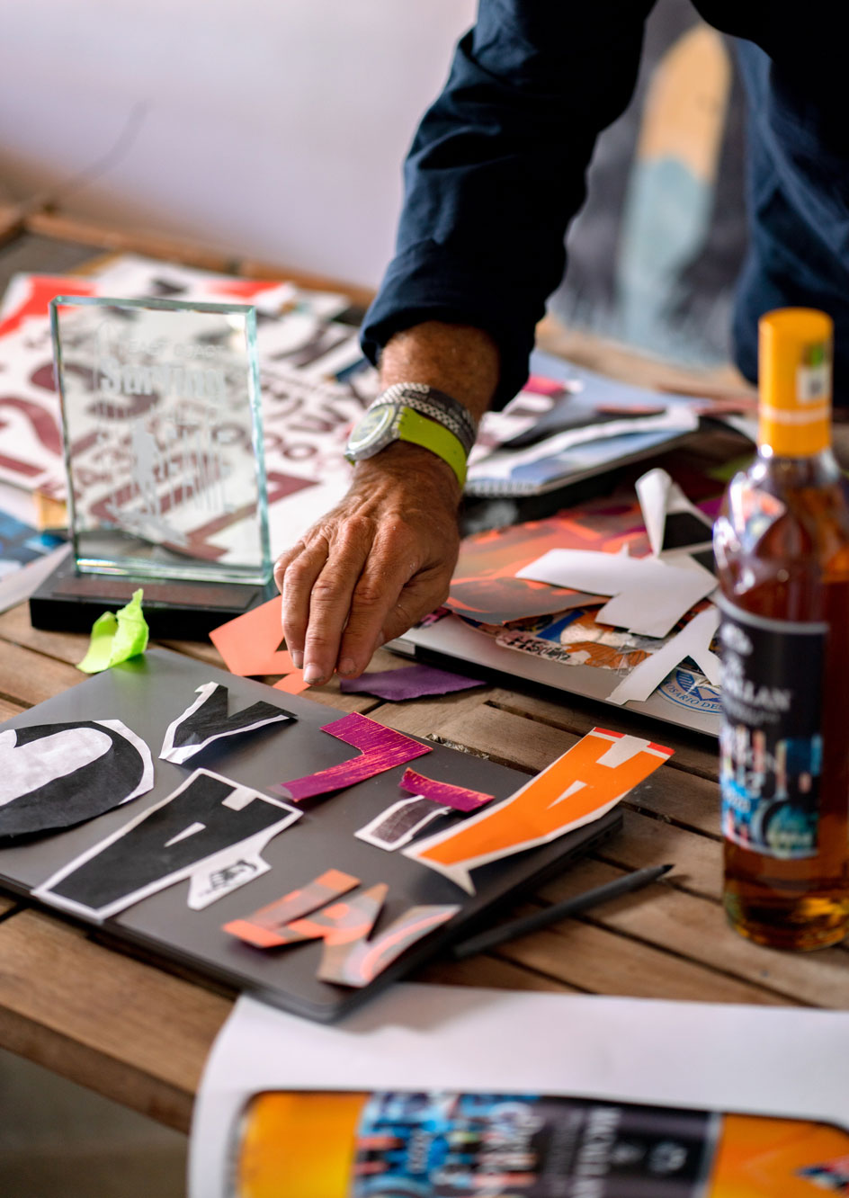
W*: Can you describe your approach to creating the collage?
DC: I took a lot of photos with my phone, and was especially intrigued with the warehouses where the whisky matures in the casks. The Macallan estate is one of the few distilleries able to store and age all whisky on site.
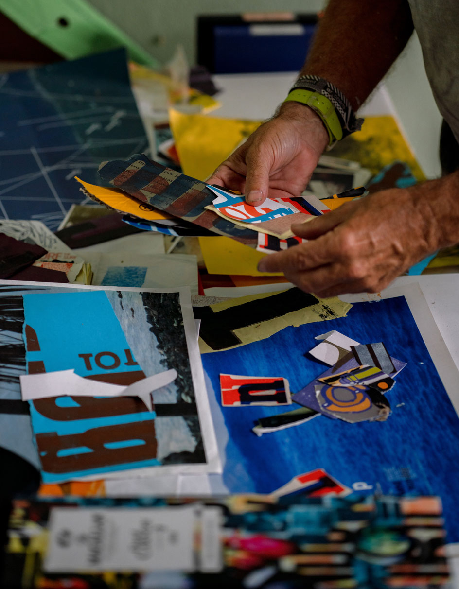
Taking in the entire experience of my visit, I started working with printouts of my photos combined with various screen prints I had made over the years. It’s a very intuitive, subjective process. I often arrange elements on the floor, with many tweaks, until I am happy, then I photograph the end result with my phone. This allows me to get some depth and texture, even shadows, that a scanner wouldn't do. The very last process is to actually glue the elements down to the art board.
INFORMATION
Harriet Lloyd-Smith was the Arts Editor of Wallpaper*, responsible for the art pages across digital and print, including profiles, exhibition reviews, and contemporary art collaborations. She started at Wallpaper* in 2017 and has written for leading contemporary art publications, auction houses and arts charities, and lectured on review writing and art journalism. When she’s not writing about art, she’s making her own.
-
 Marylebone restaurant Nina turns up the volume on Italian dining
At Nina, don’t expect a view of the Amalfi Coast. Do expect pasta, leopard print and industrial chic
By Sofia de la Cruz
-
 Tour the wonderful homes of ‘Casa Mexicana’, an ode to residential architecture in Mexico
‘Casa Mexicana’ is a new book celebrating the country’s residential architecture, highlighting its influence across the world
By Ellie Stathaki
-
 Jonathan Anderson is heading to Dior Men
After months of speculation, it has been confirmed this morning that Jonathan Anderson, who left Loewe earlier this year, is the successor to Kim Jones at Dior Men
By Jack Moss
-
 Culinary power couple Margot and Fergus Henderson serve up fresh surprises
Margot and Fergus Henderson, British culinary legends, turn Wallpaper* guest editors. Here, they discuss new ventures, in Somerset and Marylebone, and reflect on their extraordinary careers as creators, respectively, of Rochelle Canteen and St John
By Caroline Roux
-
 Jon Gray judges Wallpaper* Design Awards 2022
Jon Gray, co-founder of Black culinary collective Ghetto Gastro, talks disruption, inclusion, shaking up Museum Mile, and his pick of the Wallpaper* Design Awards 2022
By Pei-Ru Keh
-
 Luxury vodka brand X Muse: refined by art, aquifers and amethysts
Blended-barley vodka brand X Muse is an adventure with art and alchemy, created by Jupiter Artland co-founder Robert Wilson and alcohol expert Vadim Grigoryan, as featured in the October 2021 25th Anniversary Issue of Wallpaper*, on sale from 9 September
By Harriet Lloyd-Smith
-
 Talking art with Russell Tovey, champion of emerging talents
We speak to the actor, art advocate and podcaster about discovering up-and-coming artists, helping them grow, and his latest curatorial endeavour with Bombay Sapphire
By TF Chan
-
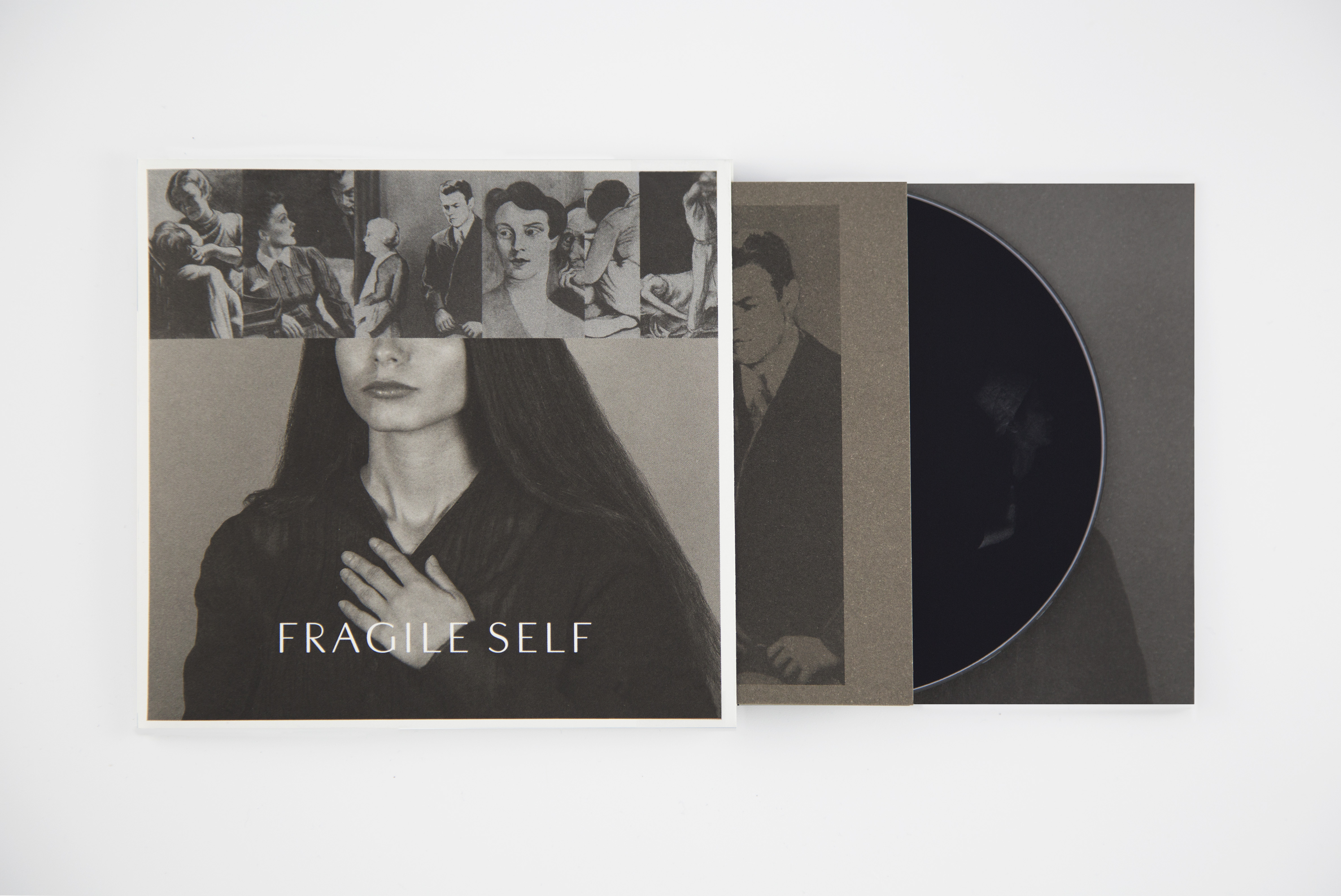 Fragile Self’s multi-platform debut album is a fervent fusion of sound and vision
The designer behind David Bowie's album covers has released a multimedia album exploring the history of psychology and the definition of ‘normality'
By Harriet Lloyd-Smith
-
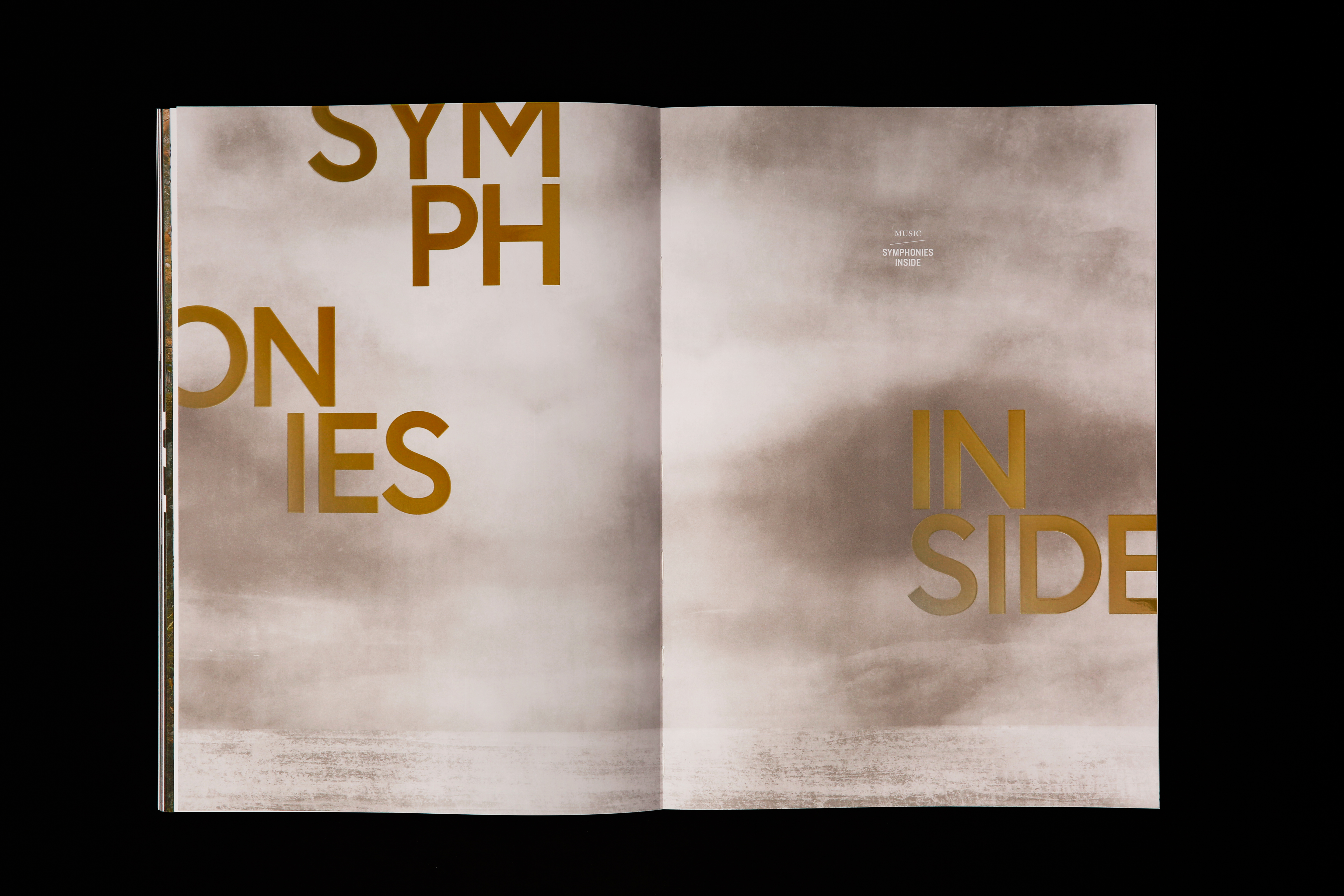 The inaugural Hieronymus Journal savours slow publishing in the digital age
By Elly Parsons
-
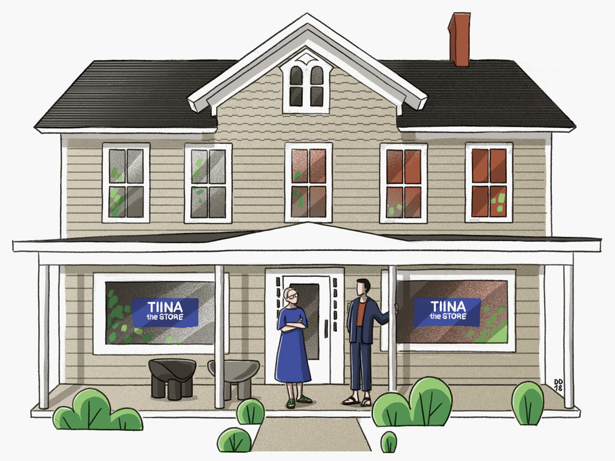 Hamptons tastemaker Tiina Laakkonen talks Picky Nicky through her favourite things
By Nick Vinson - Art Direction
-
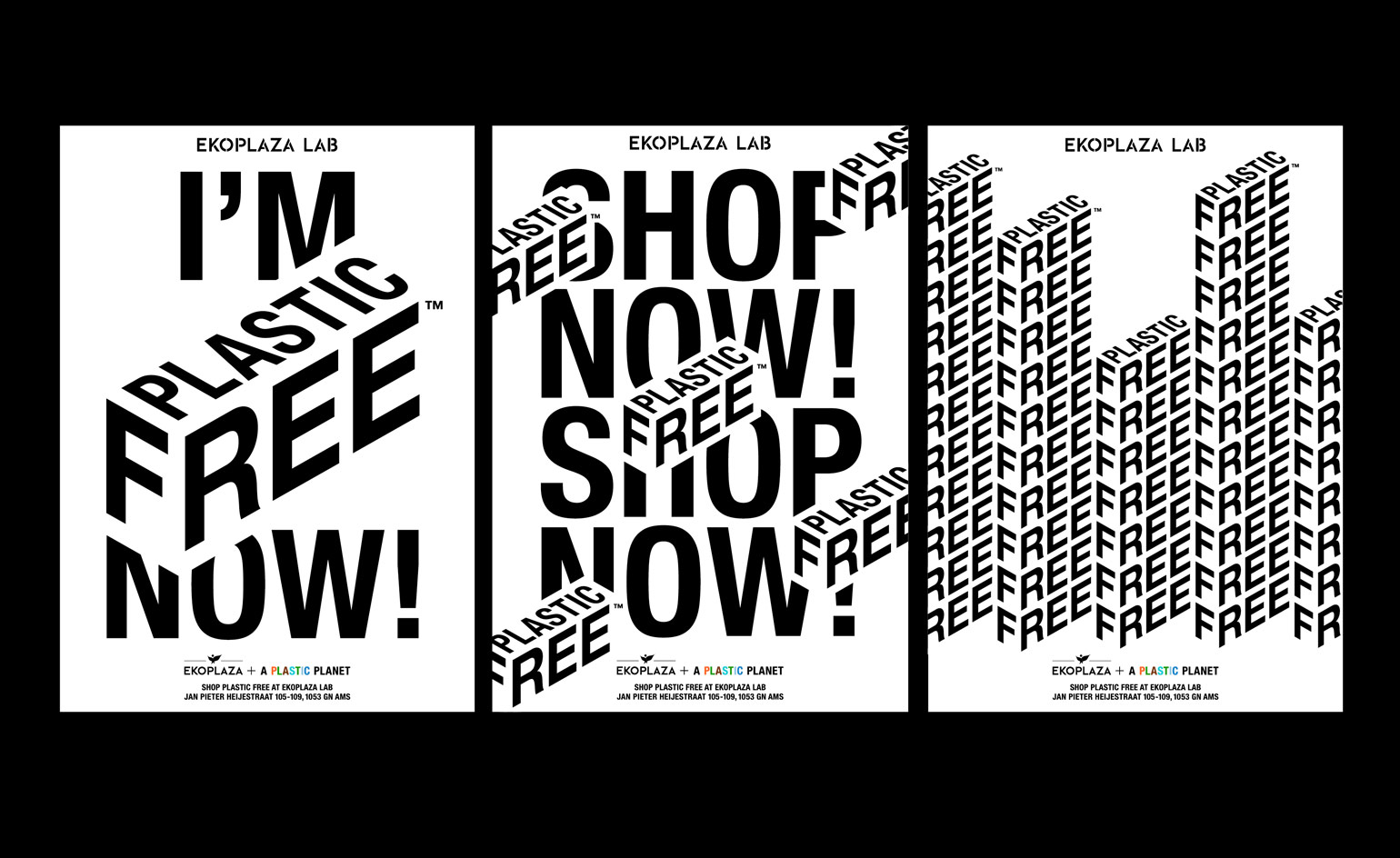 Meet the designer-activists using graphics to fight supermarket plastics
By Jonathan Bell