Mapping the future: Diller Scofidio + Renfro present EXIT at Palais de Tokyo
There are high hopes and low expectations about COP21, depending on who you talk to. Few would argue though that the latest UN Climate Change Conference, now up and running in Paris, is a potentially pivotal moment. And more than a sealed off talking shop/echo chamber, it is engaging a city in need of a positive engagement.
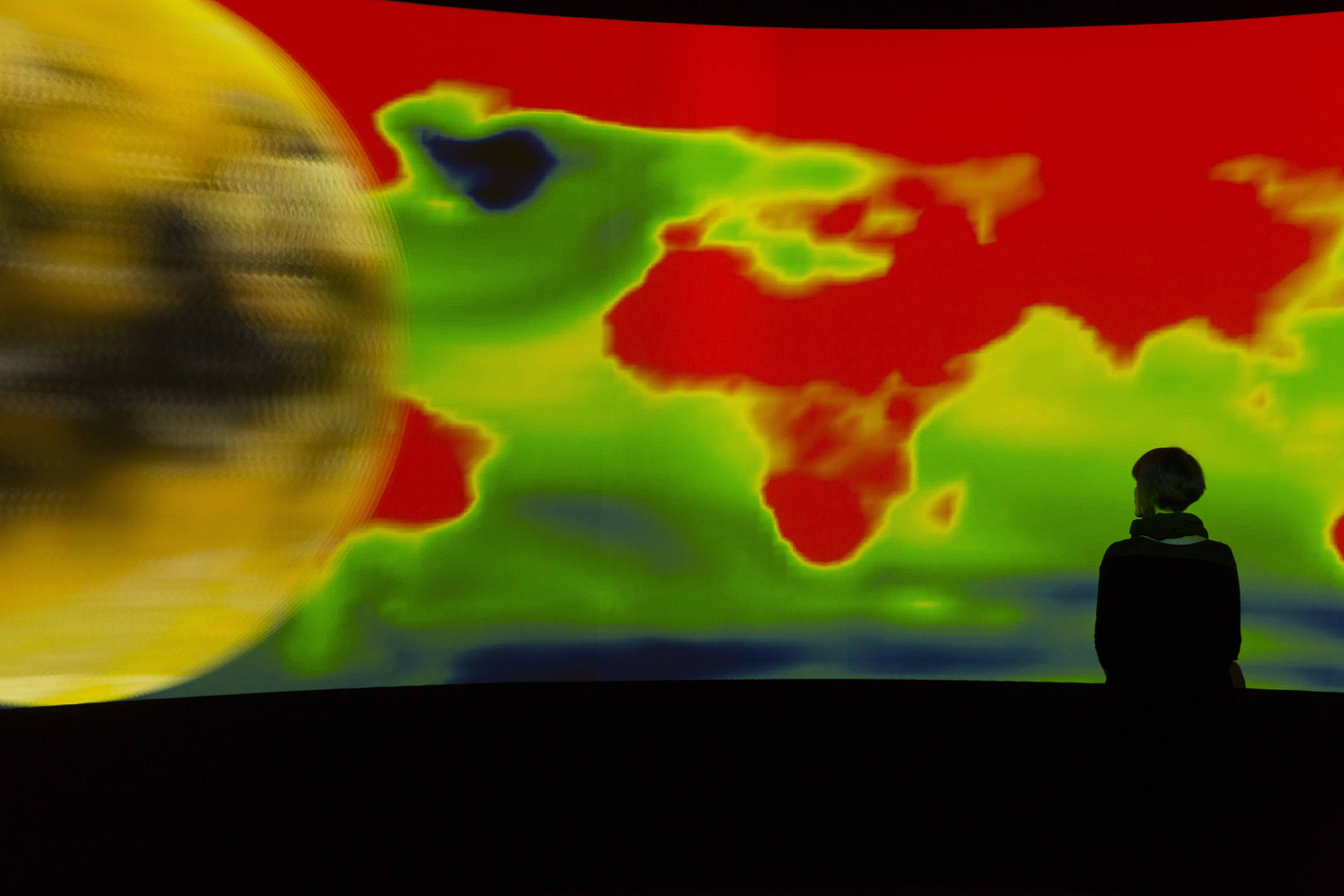
The Fondation Cartier is making its contribution to the debate with the presentation of EXIT, a multi-media installation, devised by architecture and design studio Diller Scofidio + Renfro and based on an idea by the French information theorist Paul Virilio. The piece, on display at the Palais de Tokyo until January 2016, in an immersive 360 degree animation of six thematic maps, offering the latest geo-coded data on population shifts, remittances (the amount of money immigrants send back home), forced migration and the movement of political refugees, natural disasters, rising seas and deforestation. This is data-visualisation of huge imagination and inventiveness, intent of making ‘big data’ engaging and understandable.
In amongst this deluge of bad numbers, some startling stats stand out. There are, for instance, currently 19.5 million refugees worldwide and more than 38 million internally displaced people, the highest figure since the Second World War. In 2014, migrants sent more than €389bn to developing countries, three times the money received in foreign aid. Just for instance.
While some of these stats seem only tangentially related to climate change, the installation makes clear that it is impossible to talk about climatic disruption without talking about economic development and movements of people, particularly from rural areas to urban areas.
The piece was first presented in 2008 at the Fondation Cartier but all the data has been updated. And it seems more urgent now than ever, as if it were designed for this particular moment. Needless to say, the bad news of 2008 has only got worse. We caught up with Liz Diller to discuss the inspiration behind EXIT and how it has developed since the original.
Wallpaper*: What inspired or prompted the project?
Liz Diller: EXIT began while speaking to Paul Virilio about the complexities of global migration in relation to political, economic and environmental causes. We wanted to expose these issues without resorting to narrative media—whose familiarity and realism is often desensitising. So, we challenged ourselves to use only data—the driest and most abstract information—to create an immersive experience.
What were you trying to accomplish or make sense of through data visualisation?
Environmental information about human migration is typically seen in isolation from political information, and from economic information. Using panoramic projection of geo-coded data and an immersive soundtrack, Exit aims to expose relations about their interconnectivity, which is otherwise invisible.
Did you work on updating the piece or is it a matter of just feeding in new data?
It’s a different world from when we originally produced EXIT in 2007—the global population has grown by a billion and the number of refugees has increased fivefold. The 2015 update to Exit was about feeding in new data to reflect these types of dramatic changes.
Are you optimistic about COP21? Some people see this as a pivotal moment?
COP21 was an opportunity to speak to a more diverse audience, but we’re not pushing any particular agenda. Exit exposes inconvenient truths that are relevant to people outside of policy making.
We hope the show attracts others, maybe people who wouldn’t usually go to art museums. This project began with philosophers and grew to a collaborative team of artists, geographers and statisticians. Similarly, I think the world needs to think and work across disciplines when addressing these issues.
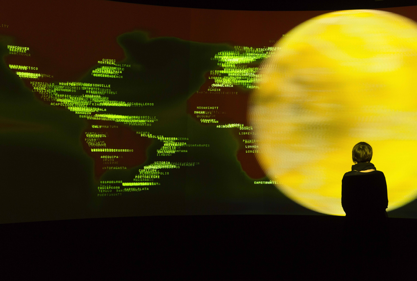
EXIT was created by American artists and architects Diller Scofidio + Renfro, in collaboration with architect-artist Laura Kurgan and statistician-artist Mark Hansen

The maps highlight some startling stats. Currently, there are 38 million internally displaced people, the highest number since the Second World War
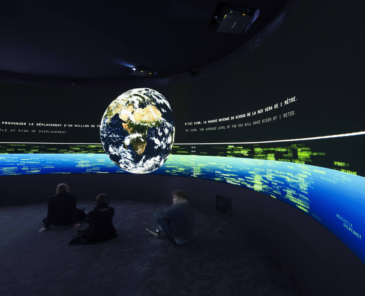
Each pixel of the multi-media map is designed to represent a single human experience – they appear to shift around the screen, representing the movement of populations
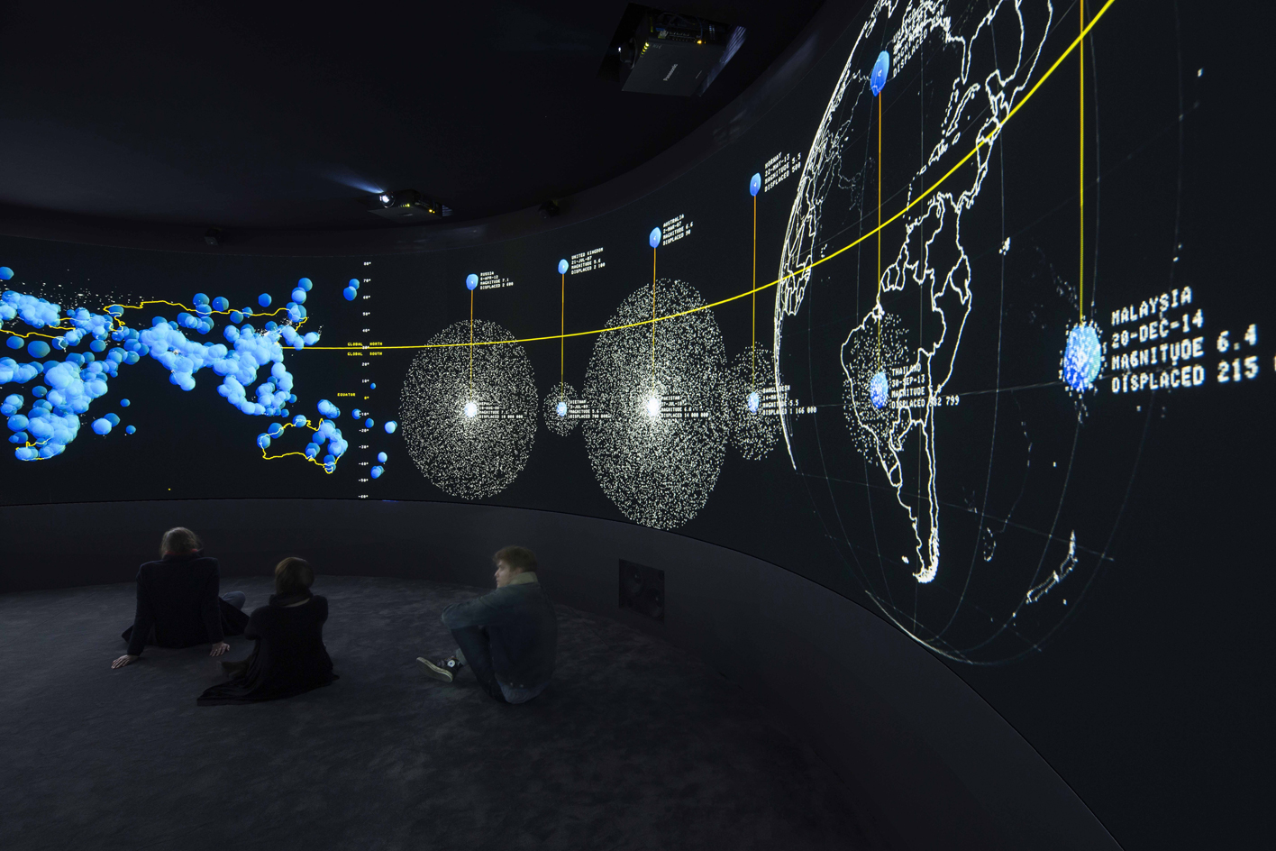
As well as migration statistics, the maps artistically represent the effects of natural catastrophes, rising sea levels, sinking cities and deforestation
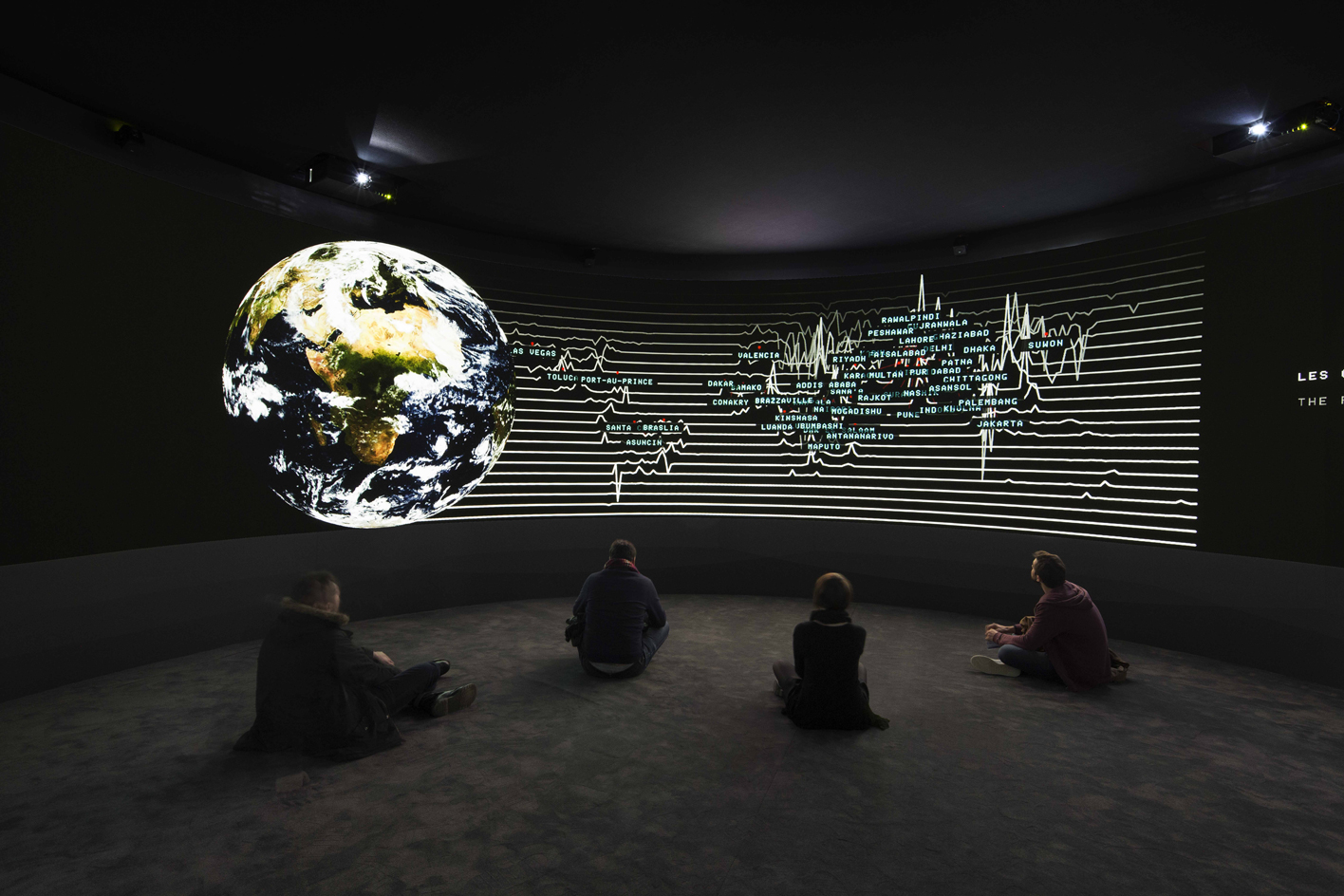
Aptly named, it seems EXIT couldn't have come at a more poignant or important time
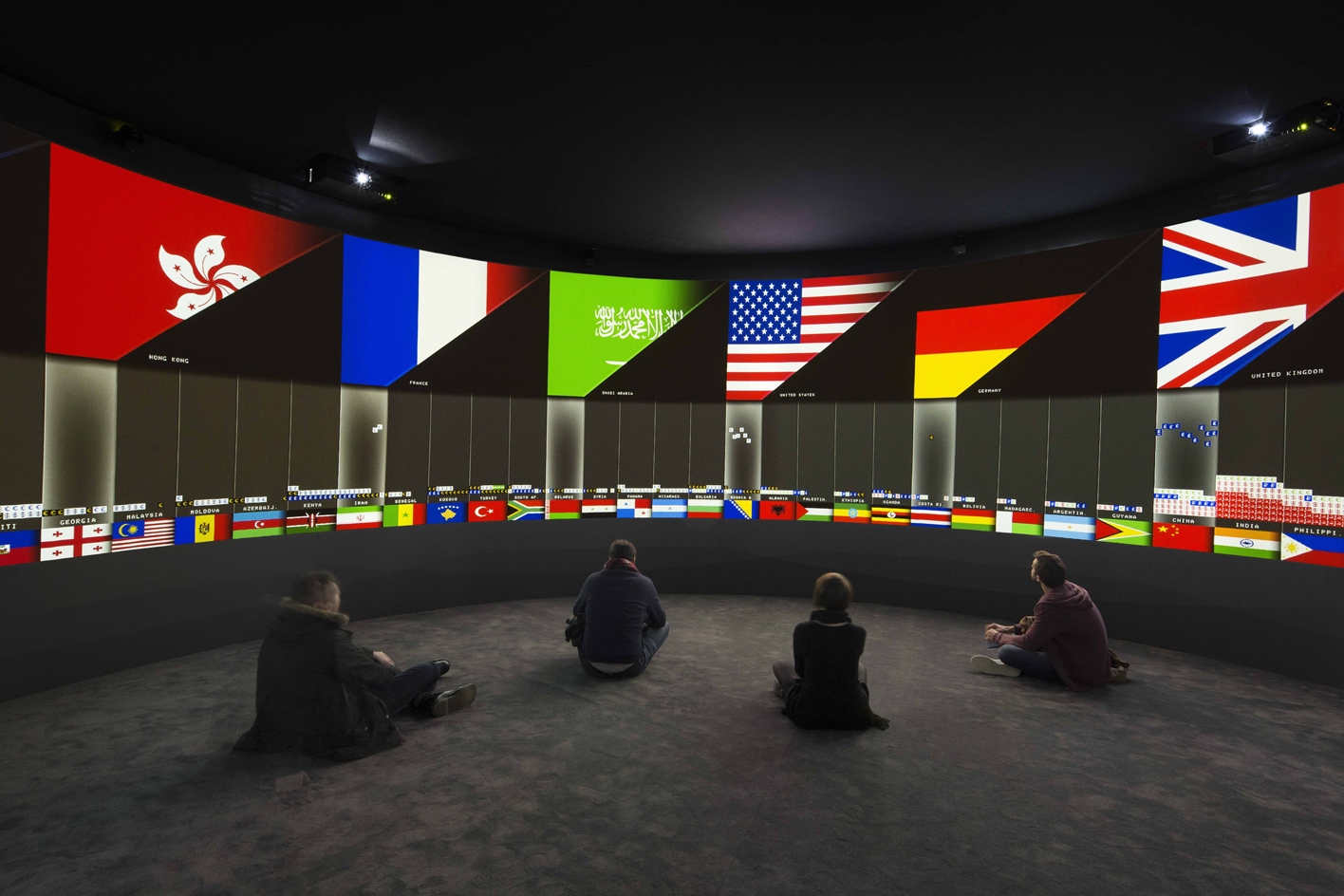
Just as the data displayed in 2008 is now a distant memory, action taken as a result of COP21 will determine how much the statistics will change in the coming years
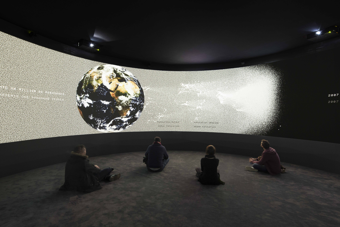
This installation presents vital information in an immersive, visual way – so you don't need to be an art buff, or an environmental campaigner to understand it
INFORMATION
EXIT is on view until 10 January 2016. For more information, visit Palais de Tokyo’s website
Photography: © Luc Boegly © Diller Scofidio + Renfro, Mark Hansen, Laura Kurgan and Ben Rubin. In collaboration with Robert Gerard Pietrusko and Stewart Smith.
ADDRESS
Palais de Tokyo
13 Avenue du Président Wilson
75116 Paris
Wallpaper* Newsletter
Receive our daily digest of inspiration, escapism and design stories from around the world direct to your inbox.
-
 A Xingfa cement factory’s reimagining breathes new life into an abandoned industrial site
We tour the Xingfa cement factory in China, where a redesign by landscape specialist SWA Group completely transforms an old industrial site into a lush park
By Daven Wu
-
 Put these emerging artists on your radar
This crop of six new talents is poised to shake up the art world. Get to know them now
By Tianna Williams
-
 Dining at Pyrá feels like a Mediterranean kiss on both cheeks
Designed by House of Dré, this Lonsdale Road addition dishes up an enticing fusion of Greek and Spanish cooking
By Sofia de la Cruz
-
 Deathmatch wrestling’s behind-the-scenes moments and bloody glory
A new limited-edition book explores the intersection between art and deathmatch wrestling at a sold-out show held in Tokyo
By Anne Soward
-
 Heads up: art exhibitions to see in January 2024
Start the year right with the Wallpaper* pick of art exhibitions to see in January 2024
By Hannah Silver
-
 Olafur Eliasson inaugurates Azabudai Hills Gallery in Tokyo
Olafur Eliasson marks launch of Azabudai Hills Gallery, in Tokyo’s major new district, with a show of elemental strength
By Danielle Demetriou
-
 John Pawson unveils first-ever sculpture in Tokyo exhibition
At The Mass, Tokyo, British architect John Pawson stages his first solo exhibition in Japan, revealing his first sculpture and a new photography series
By Harriet Lloyd-Smith
-
 Remote Antarctica research base now houses a striking new art installation
In Antarctica, Kyiv-based architecture studio Balbek Bureau has unveiled ‘Home. Memories’, a poignant art installation at the remote, penguin-inhabited Vernadsky Research Base
By Harriet Lloyd-Smith
-
 Ryoji Ikeda and Grönlund-Nisunen saturate Berlin gallery in sound, vision and visceral sensation
At Esther Schipper gallery Berlin, artists Ryoji Ikeda and Grönlund-Nisunen draw on the elemental forces of sound and light in a meditative and disorienting joint exhibition
By Harriet Lloyd-Smith
-
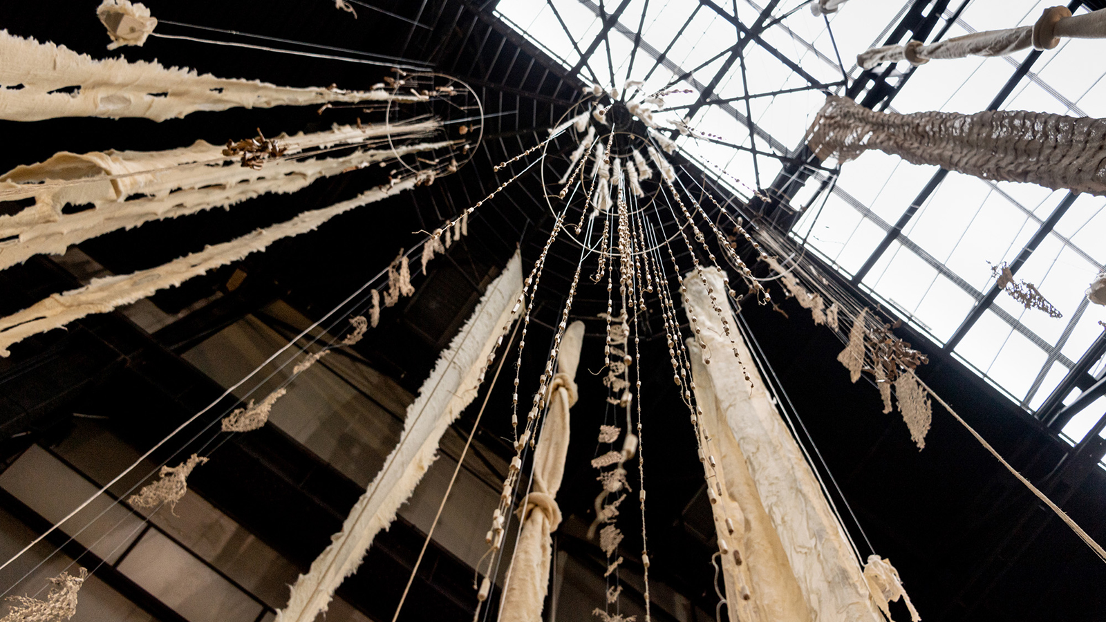 Cecilia Vicuña’s ‘Brain Forest Quipu’ wins Best Art Installation in the 2023 Wallpaper* Design Awards
Brain Forest Quipu, Cecilia Vicuña's Hyundai Commission at Tate Modern, has been crowned 'Best Art Installation' in the 2023 Wallpaper* Design Awards
By Harriet Lloyd-Smith
-
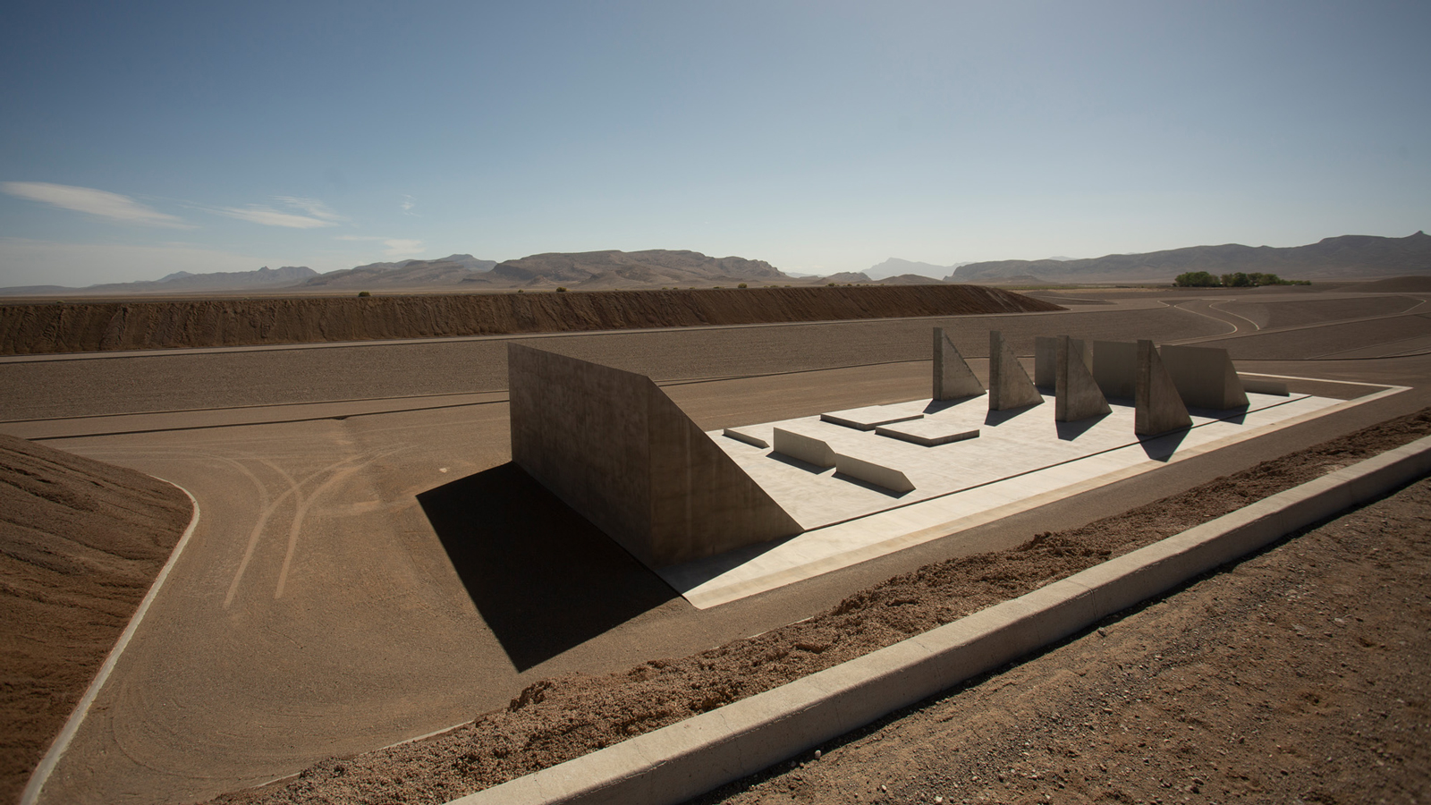 Michael Heizer’s Nevada ‘City’: the land art masterpiece that took 50 years to conceive
Michael Heizer’s City in the Nevada Desert (1972-2022) has been awarded ‘Best eighth wonder’ in the 2023 Wallpaper* design awards. We explore how this staggering example of land art came to be
By Harriet Lloyd-Smith