Franco Grignani’s paintings reveal a hidden side of the graphic design legend
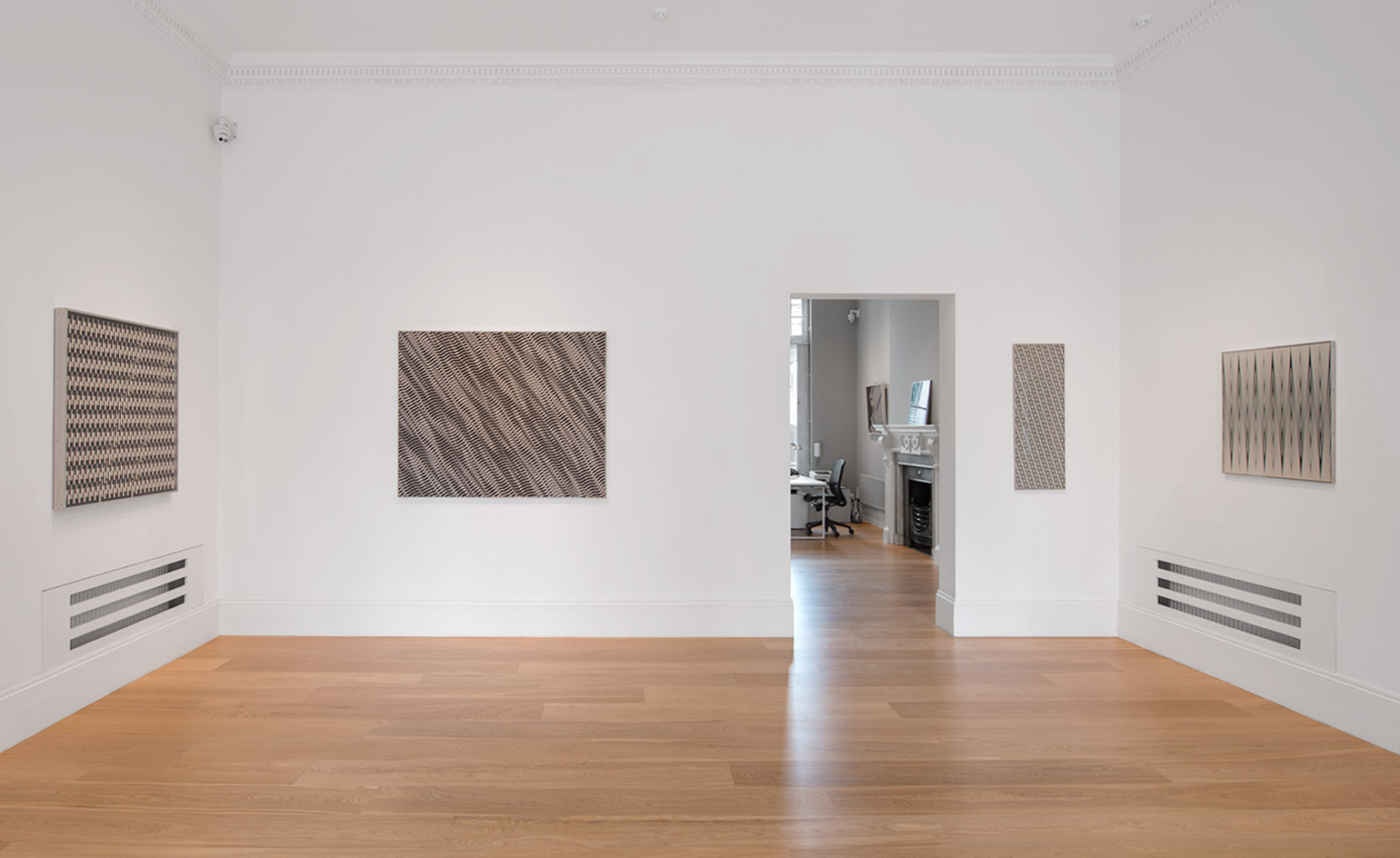
Everyone owns a Franco Grignani design – he’s the man behind the iconic Woolmark logo. A forefather of visual communication, and a successful graphic designer and art director, (notably at Pubblicità in Italia, an annual on Italian graphic design, where he worked for 26 years) Grignani was both a prolific creator and a supporter of the emerging graphic design scene in Italy. Yet as a painter, his work has perhaps been less explored in recent years.
In London, Grignani has not been seen for 60 years. ‘Grignani did not have gallery representation abroad despite having exhibited in many countries across Europe,’ explain M&L Fine Art partners Luca Gracis and Matteo Lampertico, who are bringing Grignani back this month. ‘In his case, being considered by many as a talented graphic designer meant that his paintings remained on the sidelines of critical debate around his work, as was the case with Bruno Munari, who also straddled the worlds of visual art and design.’
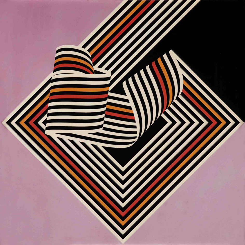
Dissociazione dal bordo,1967
The exhibition at M&L focuses solely on Grignani’s paintings, with 20 carefully selected works from 1952 up to 1975. The works chart, among other things, Grignani’s first use of colour, in 1967—with paintings such as Deriva and Dissociazione dal bordo, but his experiments with Op Art go back even further. ‘Grignani’s role and importance as one of the first Op Art artists of the period is still to be fully recognised. He was already experimenting with an Op aesthetic and techniques ten years before François Morellet or Bridget Riley,’ Gracis and Lampertico say.
Looking at paintings from the later period, such as Vibrazioni (1975) with their warping, distorting lines, it’s easy to see how ahead of his time Grignani really was – in painting as much as in design. Other innovations in his painting work include the introduction of textured industrial glass and emulsified canvases – giving the opportunity for further optical effects, never seen before.
His aesthetic wasn’t popular at the time – but perhaps now resonates with the new taste for ‘digital handmade’ in contemporary painting, merging traditional technique with the visual vocabulary of advanced technology. ‘His artistic language – a strong graphic presence – fits today’s tastes, especially among young people.’ It seems as though Grignani is long overdue a comeback – and this might only be the beginning.
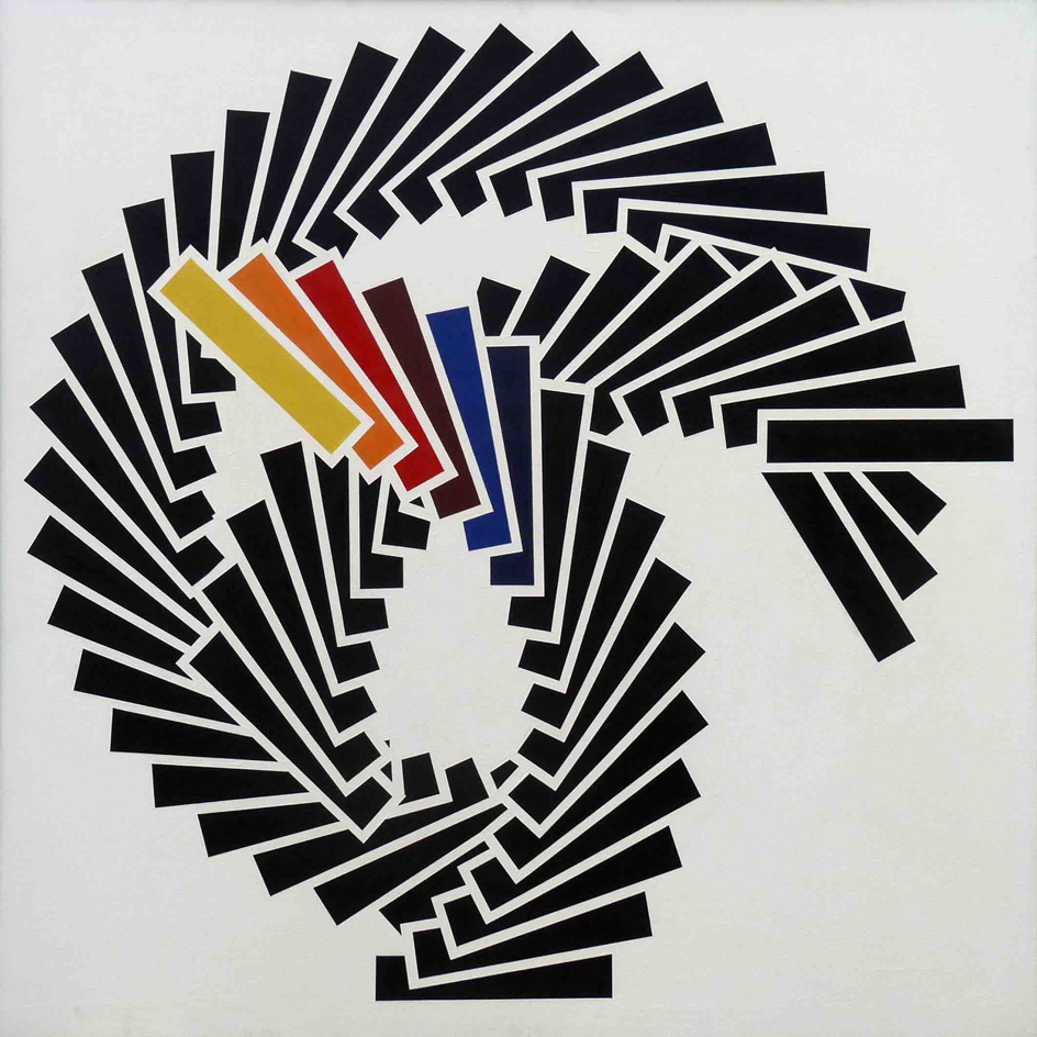
Deriva, 1967
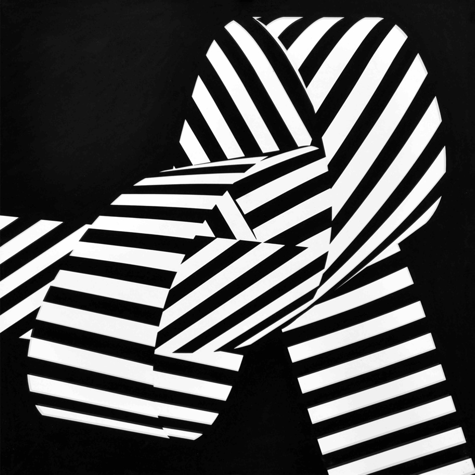
Dissociazione dal bordo, 1969
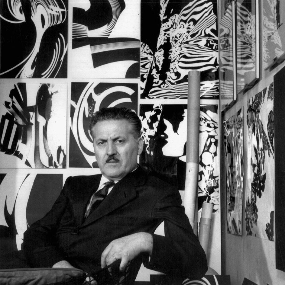
Franco Grignani in his studio
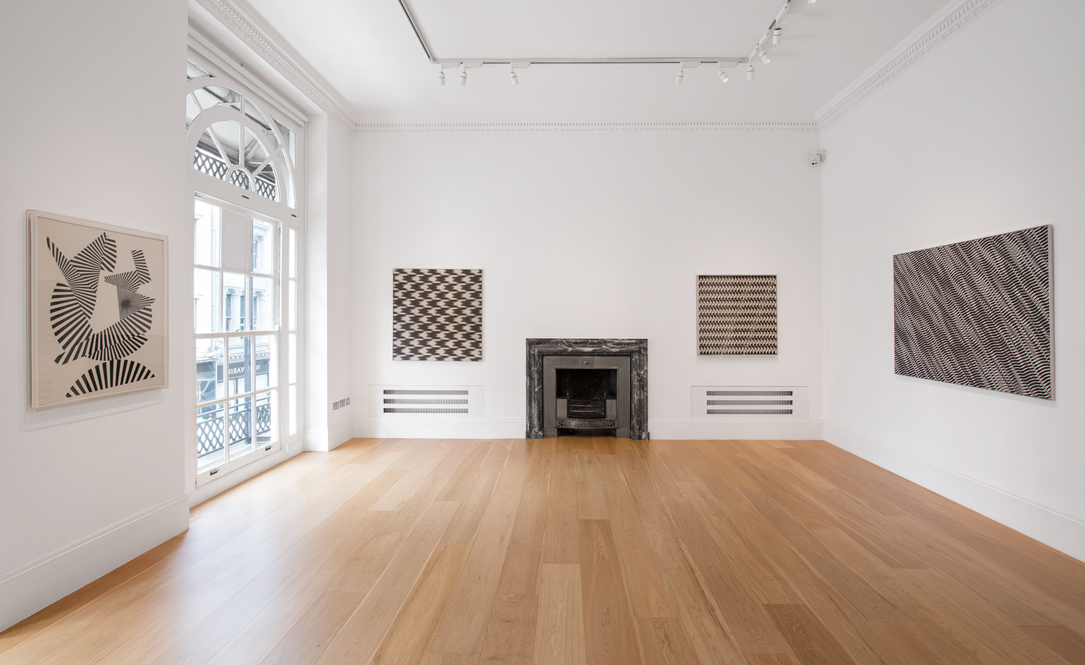
Installation view of ‘Franco Grignani’ at M&L Fine Art
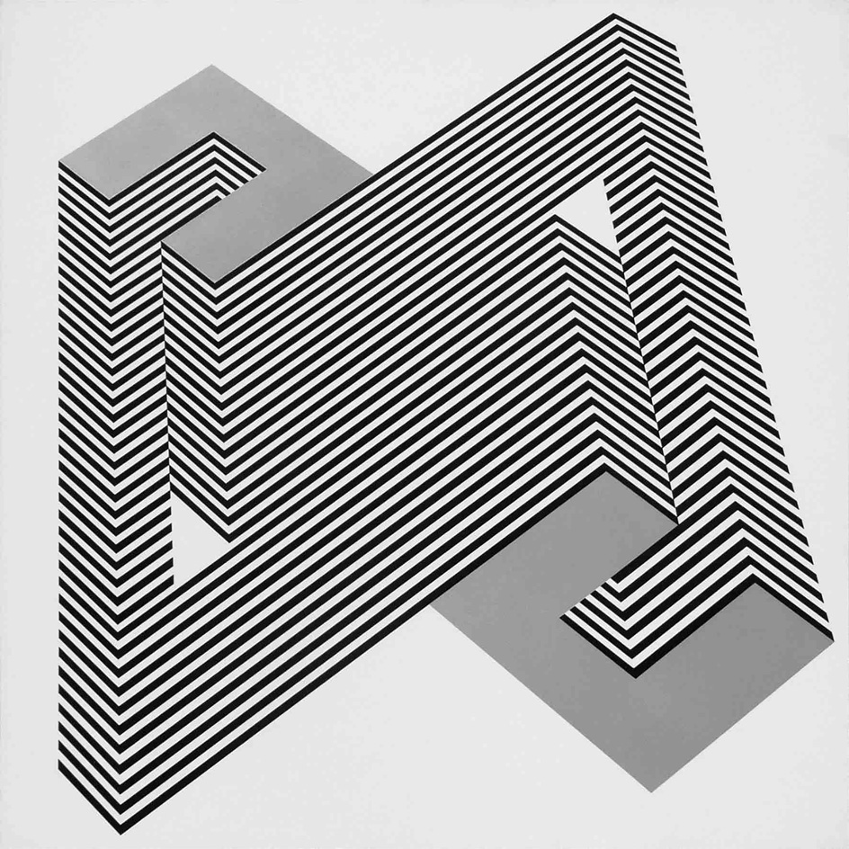
Psicoplastica, 1970
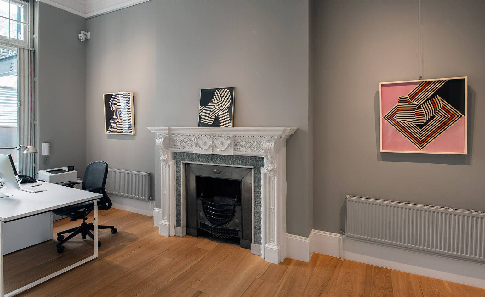
Installation view of ‘Franco Grignani’ at M&L Fine Art
INFORMATION
‘Franco Grignani’ is on view until 28 July. For more information, visit the M&L Fine Art website
ADDRESS
M&L Fine Art
15 Old Bond Street
London W1S 4AX
Wallpaper* Newsletter
Receive our daily digest of inspiration, escapism and design stories from around the world direct to your inbox.
Charlotte Jansen is a journalist and the author of two books on photography, Girl on Girl (2017) and Photography Now (2021). She is commissioning editor at Elephant magazine and has written on contemporary art and culture for The Guardian, the Financial Times, ELLE, the British Journal of Photography, Frieze and Artsy. Jansen is also presenter of Dior Talks podcast series, The Female Gaze.
-
 Marylebone restaurant Nina turns up the volume on Italian dining
At Nina, don’t expect a view of the Amalfi Coast. Do expect pasta, leopard print and industrial chic
By Sofia de la Cruz
-
 Tour the wonderful homes of ‘Casa Mexicana’, an ode to residential architecture in Mexico
‘Casa Mexicana’ is a new book celebrating the country’s residential architecture, highlighting its influence across the world
By Ellie Stathaki
-
 Jonathan Anderson is heading to Dior Men
After months of speculation, it has been confirmed this morning that Jonathan Anderson, who left Loewe earlier this year, is the successor to Kim Jones at Dior Men
By Jack Moss
-
 The art of the textile label: how British mill-made cloth sold itself to Indian buyers
An exhibition of Indo-British textile labels at the Museum of Art & Photography (MAP) in Bengaluru is a journey through colonial desire and the design of mass persuasion
By Aastha D
-
 Artist Qualeasha Wood explores the digital glitch to weave stories of the Black female experience
In ‘Malware’, her new London exhibition at Pippy Houldsworth Gallery, the American artist’s tapestries, tuftings and videos delve into the world of internet malfunction
By Hannah Silver
-
 Ed Atkins confronts death at Tate Britain
In his new London exhibition, the artist prods at the limits of existence through digital and physical works, including a film starring Toby Jones
By Emily Steer
-
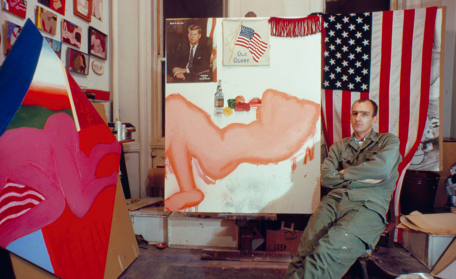 Tom Wesselmann’s 'Up Close' and the anatomy of desire
In a new exhibition currently on show at Almine Rech in London, Tom Wesselmann challenges the limits of figurative painting
By Sam Moore
-
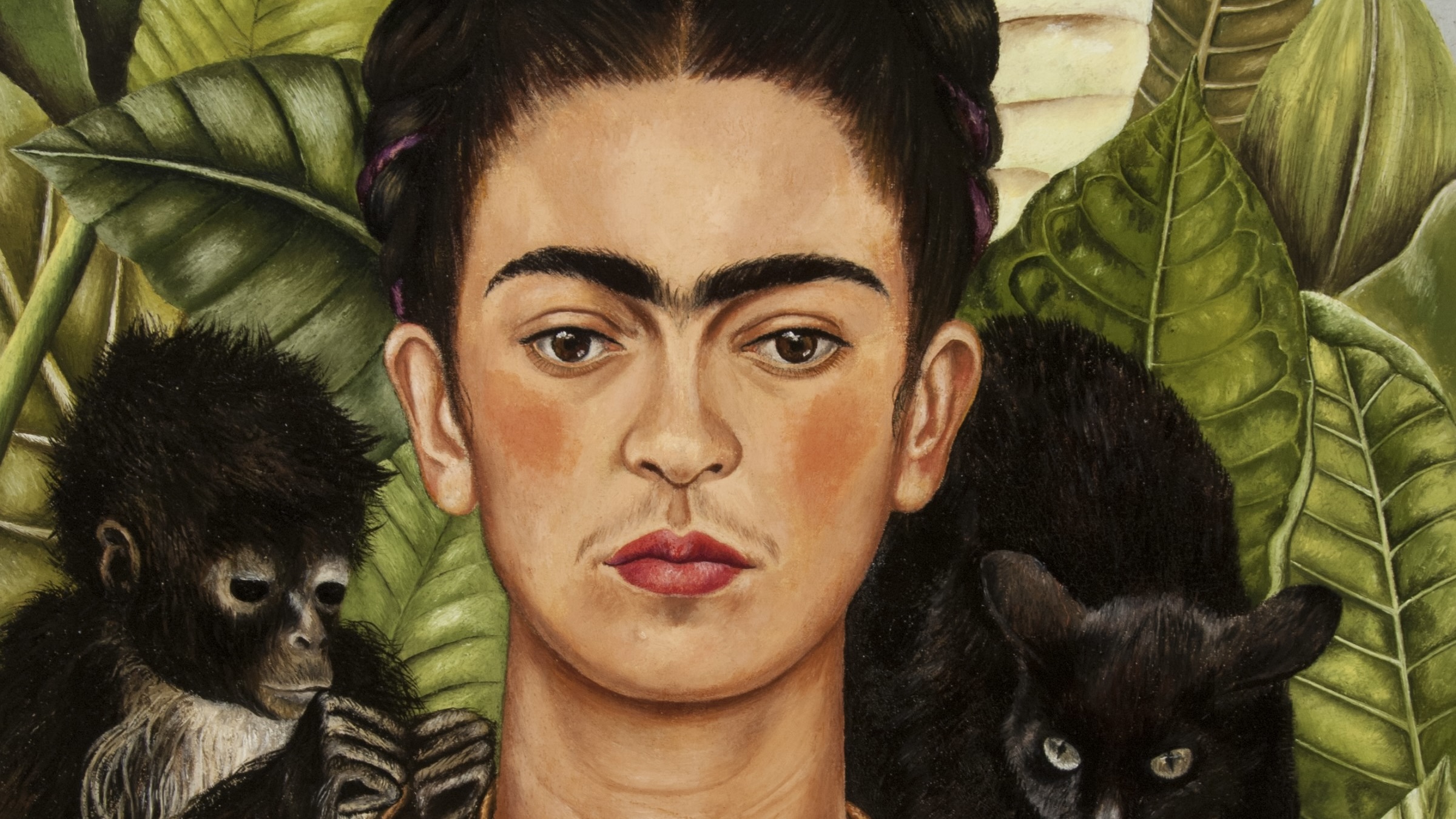 A major Frida Kahlo exhibition is coming to the Tate Modern next year
Tate’s 2026 programme includes 'Frida: The Making of an Icon', which will trace the professional and personal life of countercultural figurehead Frida Kahlo
By Anna Solomon
-
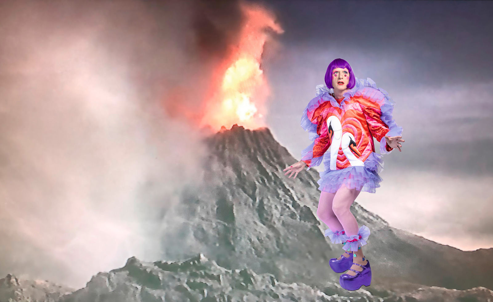 A portrait of the artist: Sotheby’s puts Grayson Perry in the spotlight
For more than a decade, photographer Richard Ansett has made Grayson Perry his muse. Now Sotheby’s is staging a selling exhibition of their work
By Hannah Silver
-
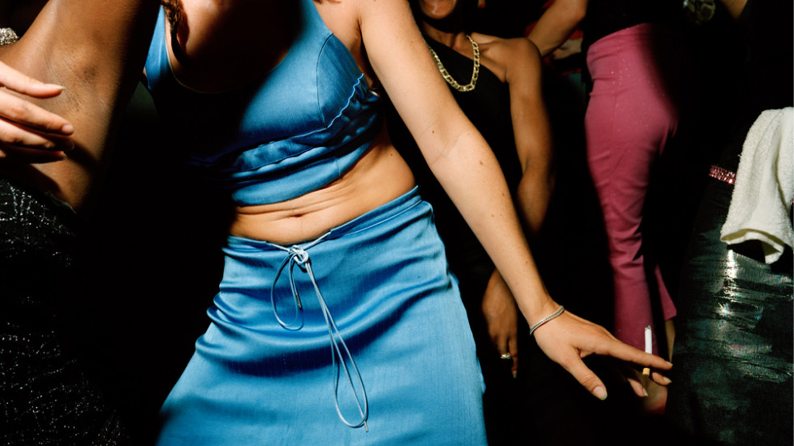 From counter-culture to Northern Soul, these photos chart an intimate history of working-class Britain
‘After the End of History: British Working Class Photography 1989 – 2024’ is at Edinburgh gallery Stills
By Tianna Williams
-
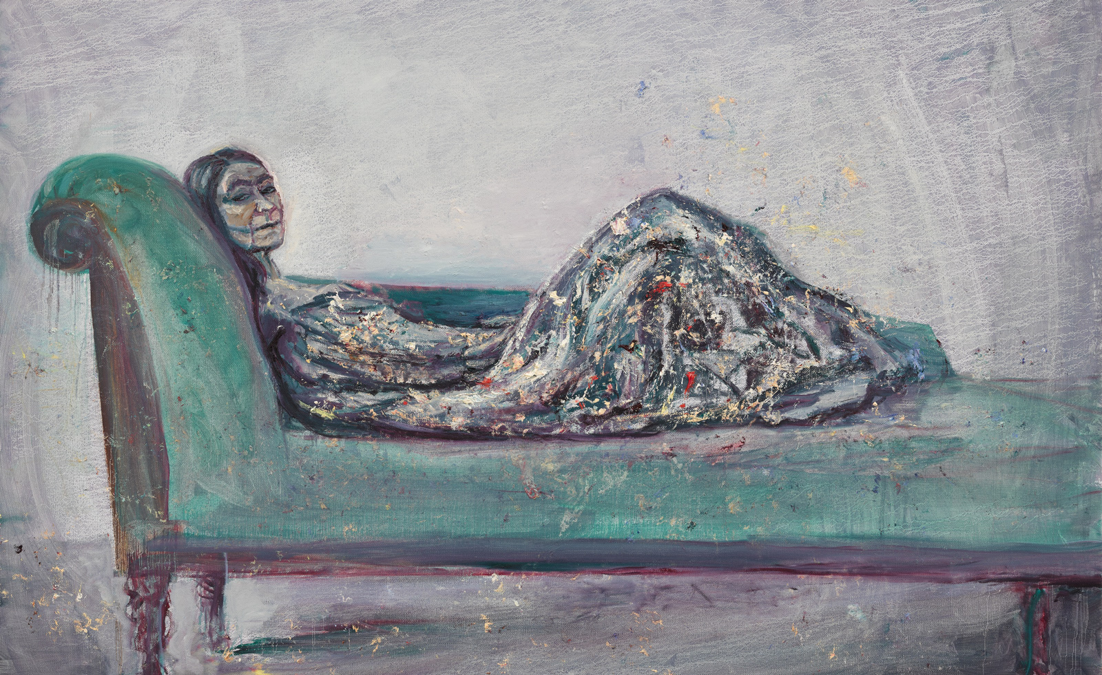 Celia Paul's colony of ghostly apparitions haunts Victoria Miro
Eerie and elegiac new London exhibition ‘Celia Paul: Colony of Ghosts’ is on show at Victoria Miro until 17 April
By Hannah Hutchings-Georgiou