Go underground: 100 years of Edward Johnston’s seminal London typeface
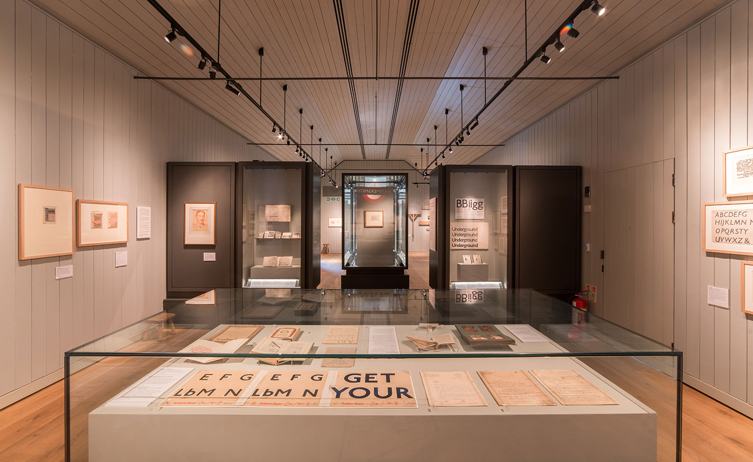
It seems ironic, if not mildly amusing, that one of the most urban of signifiers of all – the famous London Underground typeface – was dreamt up in a small Sussex village. And yet it was. That same lettering is celebrating its 100 anniversary this year, so in tribute, the Ditchling Museum of Art + Craft is putting on a show.
'Underground: 100 years of Edward Johnston’s Lettering from London' tells the tale of calligrapher Edward Johnson and traces the evolution of his sans serif alphabet, now known as Johnston Sans, through a series of working drawings and early prototypes.
Commissioned in 1913 by Frank Pick, the commercial manager for the London Underground Railway, the typeface aimed for nothing more than consistency and clarity. ‘The bold simplicity of the authentic lettering of the finest periods and yet belonging unmistakably to the 20th century,’ as Pick put it.
At the time, disparate companies and identities made up the tube network and Edwardian London was plastered with competing commercial slogans in increasingly elaborate scripts. Ever the purist, Johnston went back to his calligraphy roots and simplified the Roman letters down to their very essence, distilling along the way a visual identity that endures today. (The font was only updated once, and ever so slightly, in 1979.)
The exhibition looks at Johnston's work and his role in the Arts and Crafts movements which was, at the time, in full swing in the Sussex countryside. The relationship between Johnston and Eric Gill, a friend and former student of Johnston’s, comes under scrutiny too. Gill Sans – another popular sans serif font – was inspired by Johnston Sans, after all. But it is the enduring character of Johnston Sans that steals the spotlight.
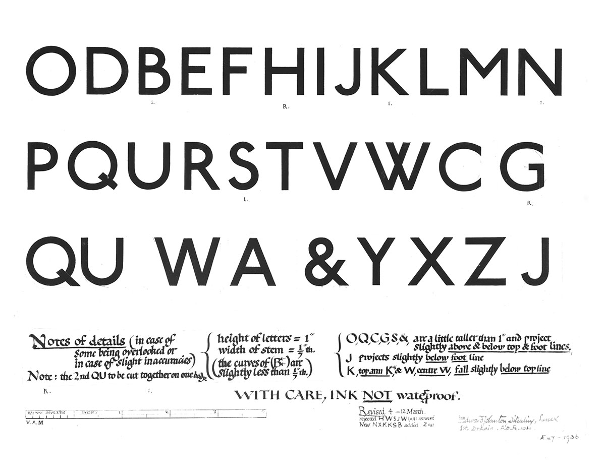
Johnston’s design for an alphabet, 1916. Courtesy Victoria and Albert Museum, London
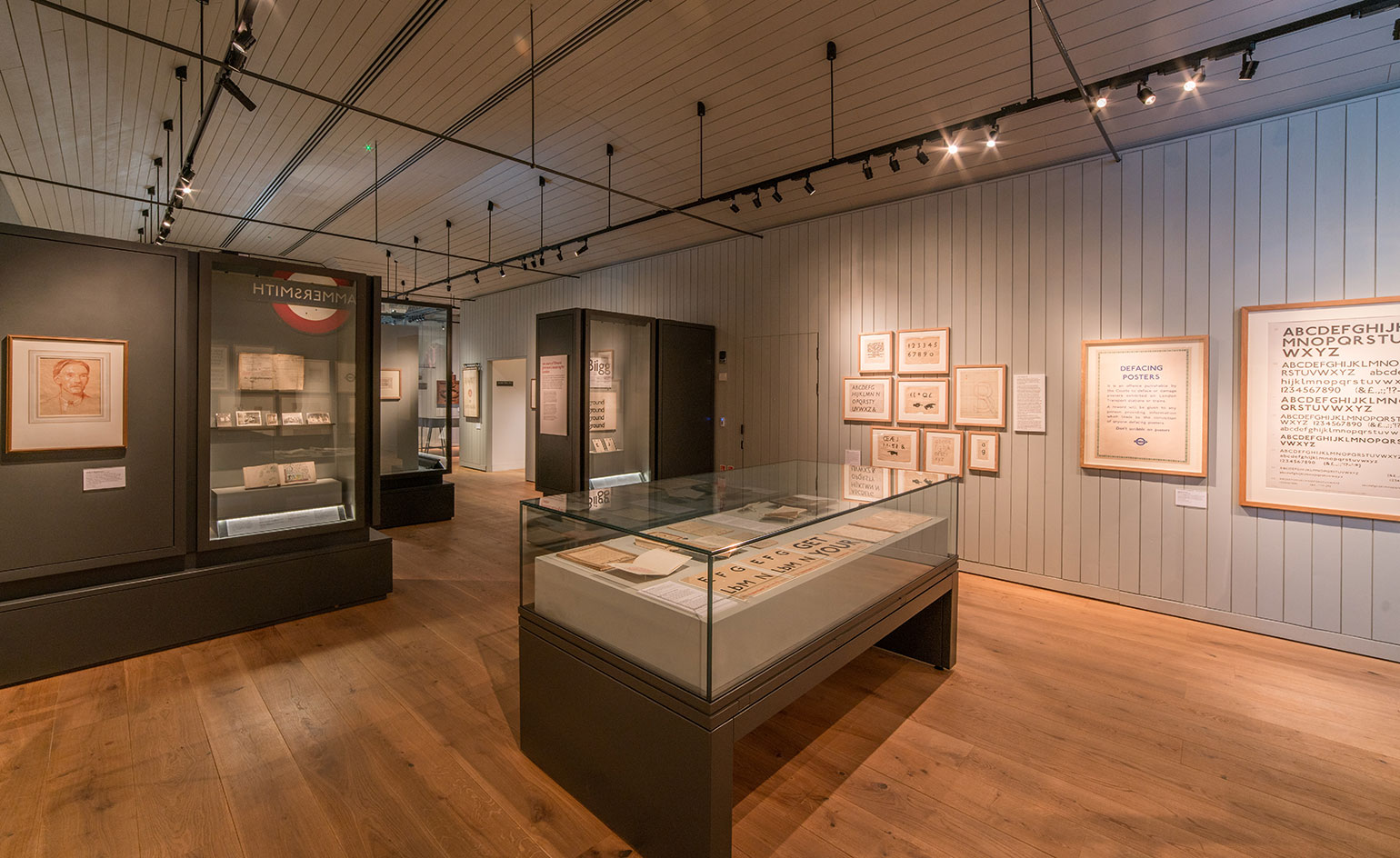
The exhibition traces the evolution of Johnston’s sans serif alphabet through a series of working drawings and early prototypes
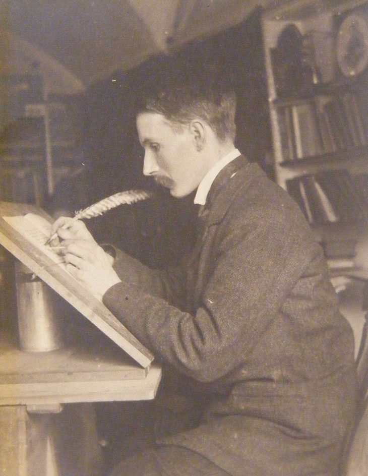
Edward Johnston at his desk. Courtesy Ditchling Museum of Art + Craft
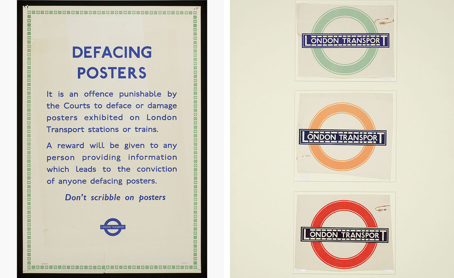
Pictured left: ’Defacing Posters’ notice. Courtesy Victoria and Albert Museum, London. Pictured right: the now iconic ’Bulls Eye’. Courtesy Crafts Study Centre
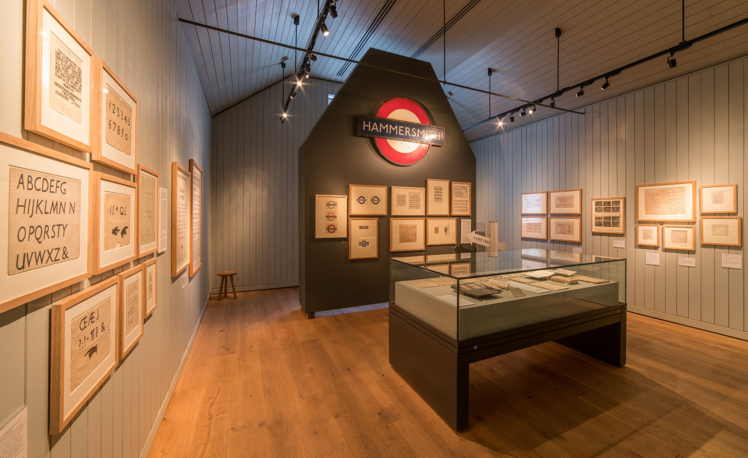
Johnston Sans aimed for nothing more than consistency and clarity – ‘the bold simplicity of the authentic lettering of the finest periods and yet belonging unmistakably to the 20th century,’ as Pick put it
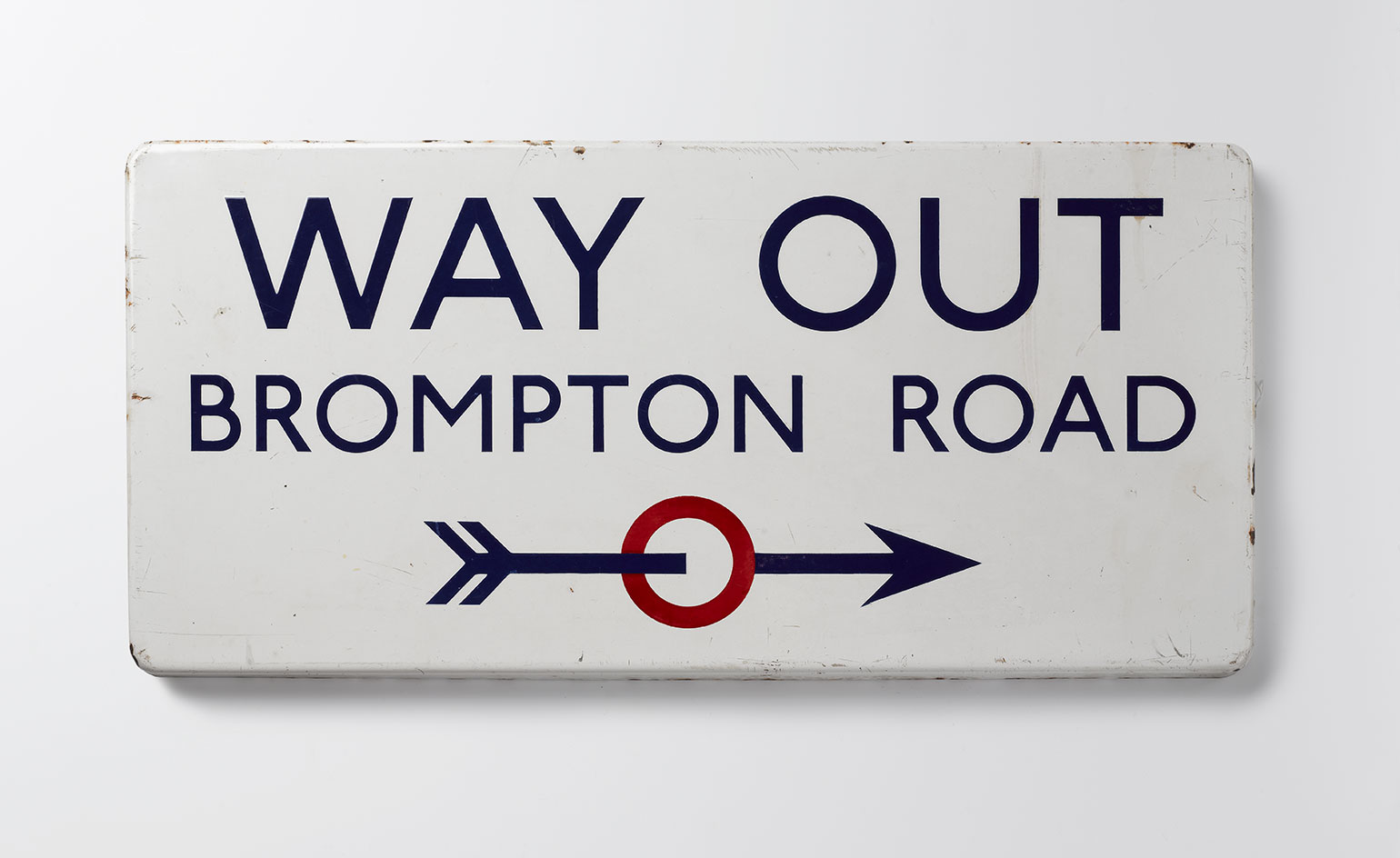
’Way Out’ sign at Brompton Road, 1916. Courtesy Victoria and Albert Museum, London
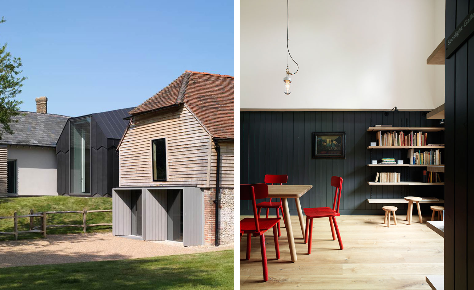
The Ditchling Museum of Art + Craft was redeveloped in 2013 and was an ArtFund Museum of the Year finalist in 2014. Photography: Brotherton and Lock
INFORMATION
'Underground: 100 years of Edward Johnston’s Lettering for London' is on view until 11 September. For more information, visit the Ditchling Museum of Art + Craft's website
ADDRESS
Ditchling Museum of Art + Craft
Lodge Hill Lane
Ditchling
Hassocks
BN6 8SP
Wallpaper* Newsletter
Receive our daily digest of inspiration, escapism and design stories from around the world direct to your inbox.
-
 What not to miss at Frieze New York 2025
Frieze New York 2025 runs 7-11 May, showcasing over 65 galleries from more than 25 countries; from $250 plates by leading artists to quirky performances, here’s what not to miss
-
 Discover architect Ico Parisi’s modernist sanctuaries on the banks of Lake Como
A string of sculptural sanctuaries by architect Ico Parisi on the banks of Lake Como helped cement the area as the heartland of Italian modernism; we explore his work in an article from the Wallpaper* archives
-
 Under pressure: Apple applies skill, science and true grit to get the most out of its electronics
Apple’s Cork HQ is home to a sophisticated R&D lab. Wallpaper* took a tour behind the scenes to see how longevity is baked in to new products
-
 For the 2025 Eurovision theme art, Swiss design principles get a glow-up
London-based branding agency NOT Wieden+Kennedy marries graphic design history and exuberance in its theme art for this year's song contest
-
 The UK AIDS Memorial Quilt will be shown at Tate Modern
The 42-panel quilt, which commemorates those affected by HIV and AIDS, will be displayed in Tate Modern’s Turbine Hall in June 2025
-
 Meet the Turner Prize 2025 shortlisted artists
Nnena Kalu, Rene Matić, Mohammed Sami and Zadie Xa are in the running for the Turner Prize 2025 – here they are with their work
-
 ‘Humour is foundational’: artist Ella Kruglyanskaya on painting as a ‘highly questionable’ pursuit
Ella Kruglyanskaya’s exhibition, ‘Shadows’ at Thomas Dane Gallery, is the first in a series of three this year, with openings in Basel and New York to follow
-
 The art of the textile label: how British mill-made cloth sold itself to Indian buyers
An exhibition of Indo-British textile labels at the Museum of Art & Photography (MAP) in Bengaluru is a journey through colonial desire and the design of mass persuasion
-
 Artist Qualeasha Wood explores the digital glitch to weave stories of the Black female experience
In ‘Malware’, her new London exhibition at Pippy Houldsworth Gallery, the American artist’s tapestries, tuftings and videos delve into the world of internet malfunction
-
 Ed Atkins confronts death at Tate Britain
In his new London exhibition, the artist prods at the limits of existence through digital and physical works, including a film starring Toby Jones
-
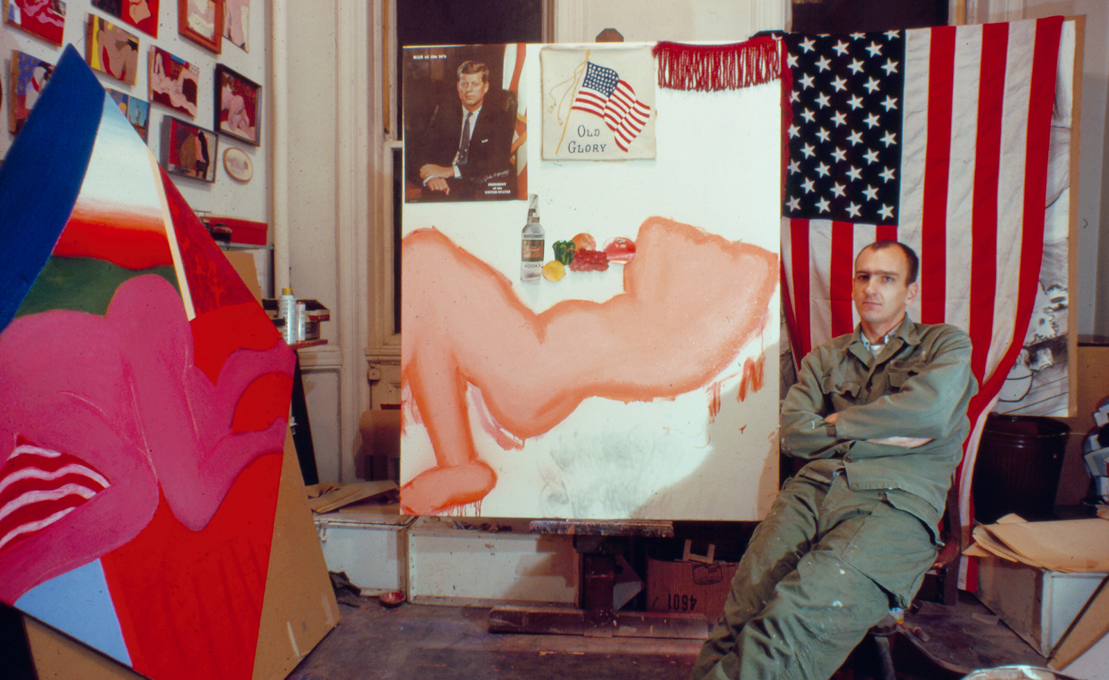 Tom Wesselmann’s 'Up Close' and the anatomy of desire
In a new exhibition currently on show at Almine Rech in London, Tom Wesselmann challenges the limits of figurative painting