Graphic Design and Advertising by Geigy 1940-1970
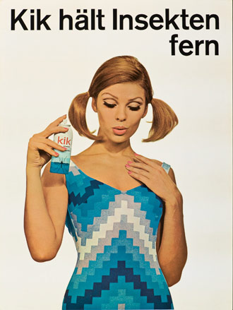
In its heyday in the 1960s, Basel-based company Geigy (now part of Novartis, one of the world’s biggest pharmaceutical multinational) was not just at the forefront of drugs research – it was also one of the leading proponents of the International Typographic Style, Switzerland’s influential post-war graphic design movement (recently celebrated in an exhibition, entitled Types We Can Make by Lausanne design school ECAL at the MIT Museum).
With their asymmetrical designs, sans-serif typography and block colours, the brand’s Swiss Style advertising and packaging have inspired generations of designers. Now a new exhibition, ‘Good Design, Good Business – Graphic Design and Advertising by Geigy 1940-1970’, is opening in Le Lieu du Design, in Paris’ 12ème arrondissement. Curated by Andres Janser of Zurich’s Museum of Design, it explores Geigy’s innovative brand identity with the help of over 400 objects – including posters, leaflets, promotional gifts and postcards.
‘The design studio at Geigy was crucial for the development and, subsequently, for the international reception of Swiss Style in graphic design,’ explains Janser. ‘Geigy’s typography was as playful as it was controlled, and its design department was known for its use of scarce but strong visual elements, as well as bold colours – unsurprisingly, given that colours, in the form of fabric dyes, were some of Geigy’s most important products.’ Geigy’s packaging, produced in the late 1950s, also broke new ground: ‘It promoted the company brand instead of the product brand, which was a revolutionary step at the time.’
In the 1960s, the chemical company had over 150 employees working solely on the firm’s advertising campaigns, packaging and exhibition stands. Its large design team, which included modernist pioneers such as Karl Gerstner and Herbert Leupin, worked in collaboration with Armin Hofmann’s renowned Allgemeine Gewerbeschule school in Basel. It became a real launch pad for many talented local creatives, including Fred Troller, who worked in Geigy’s New York bureau and went on to design posters for Exxon and American Airlines.
‘Geigy’s design team wanted to avoid a too narrow idea of style, and so focused on the idea of “corporate diversity” as the basic principle of the brand’s corporate identity,’ says Janser. And this is evident in the exhibition’s varied displays, which include Gerstner’s Geigy Heute, a book featuring infographics, bold colours and unjustified text (hardly known-of at the time); Victor Vasarely’s Mitin poster (1947) with colourful tartan and typography; and Max Schmid’s packaging for the Pertofran antidepressant (1962), with a black and white ball-and-chain design that the user had to break to open the box.
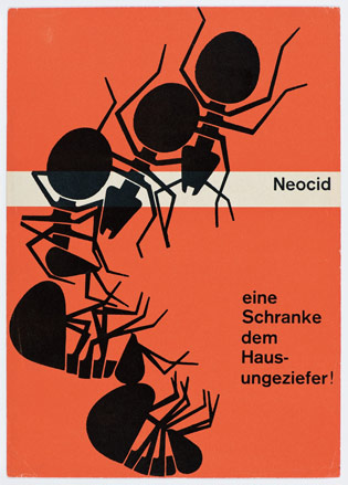
Neocid, A Gate for House Pests poster, 1953, by Karl Gerstner, from Museum of Design, Zurich
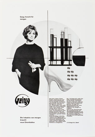
Geigy’s Research for Tomorrow press advertising, 1960-62, typographic print by anonymous designer, from Museum of Design, Zurich
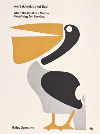
You Said a Mouthful, Bub! Geigy Dyestuffs advertising, 1963, by Fred Troller, from Museum of Design, Zurich
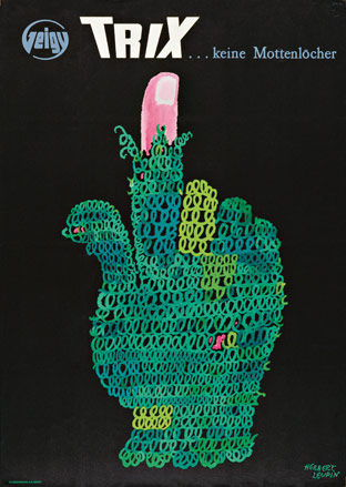
ZurichTrix…no Moth Holes poster, 1952, lithograph by Herbert Leupin, from Museum of Design, Zurich
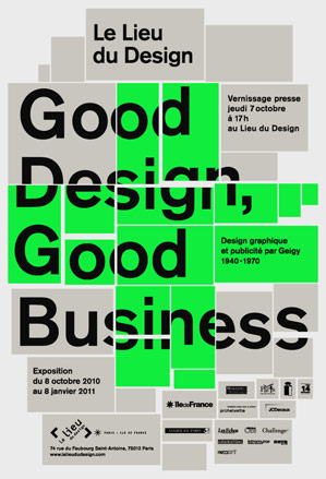
Flyer for ‘Good Design, Good Business – Graphic Design and Advertising by Geigy 1940-1970’, 8 October 2010 – 8 January 2011, Le Lieux du Design, 74 rue du Faubourg Saint-Antoine
Wallpaper* Newsletter
Receive our daily digest of inspiration, escapism and design stories from around the world direct to your inbox.
Léa Teuscher is a Sub-Editor at Wallpaper*. A former travel writer and production editor, she joined the magazine over a decade ago, and has been sprucing up copy and attempting to write clever headlines ever since. Having spent her childhood hopping between continents and cultures, she’s a fan of all things travel, art and architecture. She has written three Wallpaper* City Guides on Geneva, Strasbourg and Basel.
-
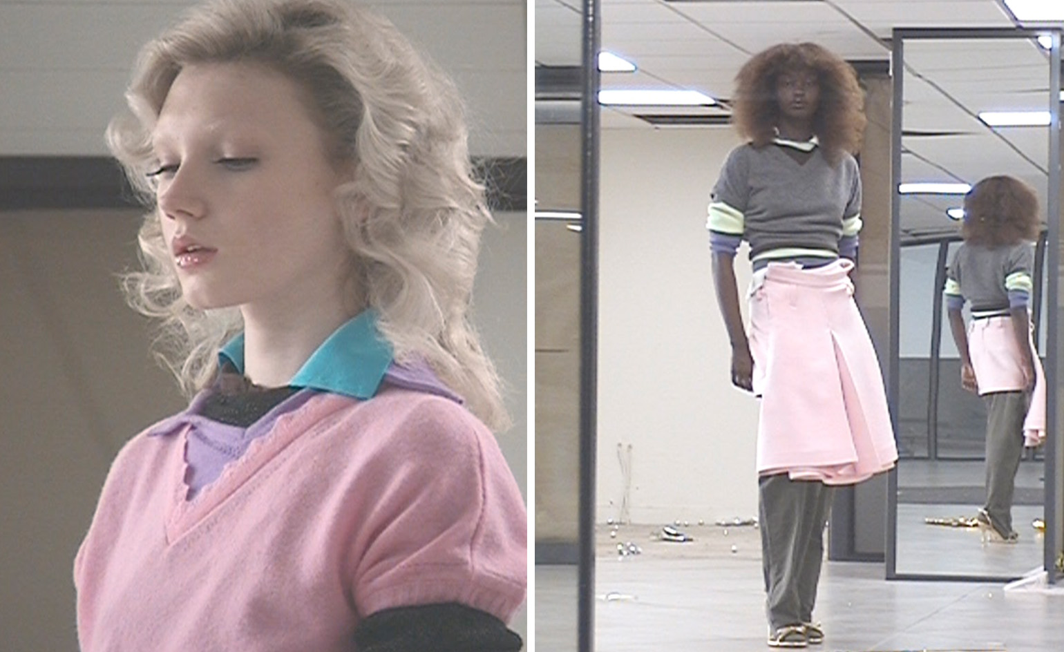 All-In is the Paris-based label making full-force fashion for main character dressing
Part of our monthly Uprising series, Wallpaper* meets Benjamin Barron and Bror August Vestbø of All-In, the LVMH Prize-nominated label which bases its collections on a riotous cast of characters – real and imagined
By Orla Brennan
-
 Maserati joins forces with Giorgetti for a turbo-charged relationship
Announcing their marriage during Milan Design Week, the brands unveiled a collection, a car and a long term commitment
By Hugo Macdonald
-
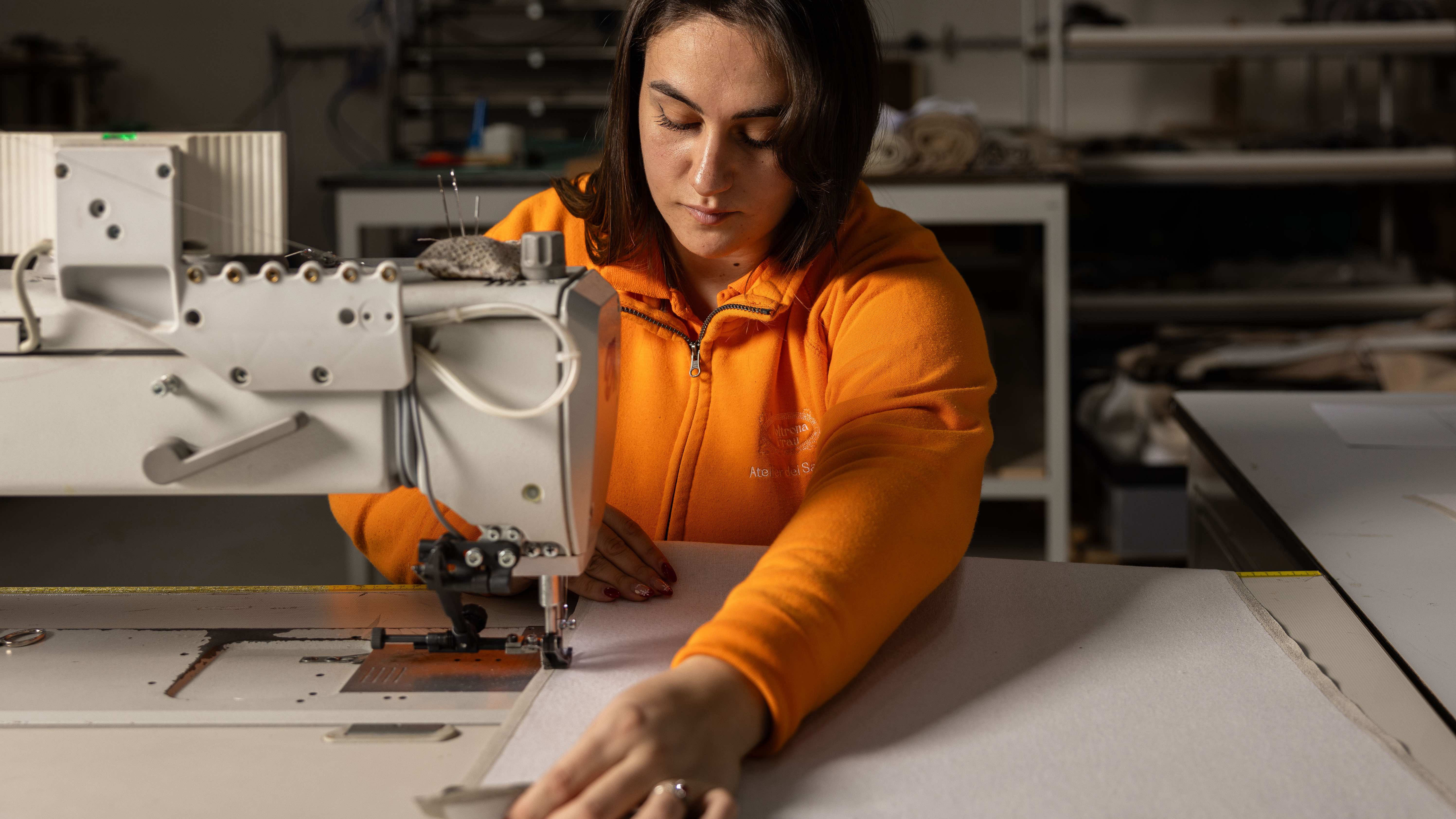 Through an innovative new training program, Poltrona Frau aims to safeguard Italian craft
The heritage furniture manufacturer is training a new generation of leather artisans
By Cristina Kiran Piotti