Group design show at Artists’ House
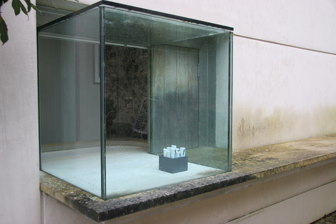
Founded in 1958, Madeleine Bessborough’s New Art Centre has been a haven of contemporary creativity since its inception. Relocated from London to Wiltshire’s Roche Court in 1994, the grounds of the centre have, over the years, played host to outdoor exhibitions from sculptors ranging from Barbara Hepworth to Michael Craig-Martin.
In 2001, award-winning architect Stephen Marshall built an airy, self-contained Artists' House in the courtyard of Roche Court – his second contemporary addition to the residence.
Conceived as a place for artists to stay whilst working in the sculpture park, a further third 'Courtyard Pavilion' was adjoined in 2008. And this month, the Artists' House itself will play host to Roche Court’s first exhibition dedicated to design.
Curated by Guggenheim alumnus, Sarah Griffin, the show reinterprets the notion of the Artists' House, taking the opportunity to undercut more traditional modes of exhibition, displaying art and design in an unexpected domestic setting.
Griffin’s own ‘version of a home for living, thinking and making,’ the space will house work from seven ‘makers’ including Richard Hamilton, Edmund de Waal, and Matthew Hilton, until May 7.
For the show, Griffin has chosen to exhibit a series of Hamilton’s prints – which she describes as the ‘most prosaic of the works in the exhibition’ - alongside functional, solid silver vessels by Chien-Wei Chang; a ‘wall’ of pots by de Waal, and precisely sculpted oak, brown oak and walnut chairs by Hilton.
We caught up with Griffin during preparations for the forthcoming exhibition, and quizzed her on her motivation for the show; how the artists responded to the space; and being handpicked for the job by Lady Bessborough herself.
Wallpaper* Newsletter
Receive our daily digest of inspiration, escapism and design stories from around the world direct to your inbox.
The Artists' House was conceived as somewhere for artists to stay whilst they were installing in the park, but also as an additional gallery space - how has it worked attempting to combine two quite opposite functions in one building?
They are opposite functions, but scale is a unifying factor - the Artists' House was built to be used as a private living space, and also to provide an opportunity for exhibiting smaller scale work - for people to see art in a context and proportion which relates to life outside the commercial gallery space. These two co-existing functions provide a brilliant in-between place - so that what people see in the house can shift between function, representation, decoration, design, craft - and I have purposefully chosen artists, designers and makers who are interested in that idea and speak about it in their work.
This is the first design show to be held in The Artists' House - where did the idea come from?
Madeleine has always used the house to show smaller scale work, prints, drawings, macquettes, and also work like Sarah Staton's or Stephanie Bergman's which is hard to categorise in any one discipline. Last year was the 10th anniversary of the house being commissioned and I think she wanted go forward with more of a definite statement and curatorial plan. I was invited by Madeleine.
Is it an intentional riff on the nature of the property - blurring the boundaries between private and public, domestic and display?
I haven't really thought of it like that - I have approached it more as a self-contained private place for one artist - an opportunity for retreat as well as a fertile productive environment. A domestic narrative about the person living in the house emerged as the show was taking shape.
How did you reach the final selection of designers, and what were their immediate reactions to the project?
Kate Blee wanted to give the impression of arrested movement in a textile - the feeling of an absent presence in the house; with Edmund, his interventions at Kettle's Yard were very much in mind, where he substituted pots for books in the bookshelves, and I began to think of his pots as repositories of knowledge and information, a group of them could be a library, or an escape for the mind, as well as a portal - they bring the outside into the house with their suggestion of movement and light.
I wanted there to be a decorative element for the person in the house, as that is a natural human impulse in a domestic environment, and chose Marthe Armitage because in her wallpaper making she has always pushed mass production as far away from her practice as possible and, to me, is more of a serial printmaker.
Furniture is a key product of the design world, did you try to avoid explicitly including it in the exhibition?
Furniture is a domestic requisite, but I wanted to avoid either highly engineered design objects masquerading as furniture or the self-consciously hand-made, and Matthew Hilton's chairs, which he exhibited at Milan in 2008, struck the right balance between enormous skill and experience in the processes of industrial design and awareness of natural materials - computer-aided design is translated into a hand-built product.
We began to think of the two dining chairs he designed for the Artists' House as the 'art' element as they almost demand to be read as anthropomorphic and sculptural. Chien-Wei Chang's vessels are made of silver but speak of routines in daily life - eating, drinking, there is a prayer element in the large ladle relating to the tools of Buddhist prayer rituals, and the scale of the large shovel calls to mind physical labour - another essential component.
How did you approach the project?
I looked at the idea of the Artists' House - a house for an artist - and thought about how one could represent that in a non-literal way. I also wanted to respond to the place - there is an almost indescribable feeling about Roche and the Artists' House which overwhelms you when you get there - I know this from long personal experience but also from seeing the reactions of the artists in the show who had not been there before, on their first visit.
How did it come about that Lady Bessborough invited you to curate?
Madeleine Bessborough invited me to curate the exhibition knowing that I was familiar with the sort of content she was aiming for. The brief from Madeleine was to make an exhibition out of the best of contemporary makers and designers - a world I have been moving around in for the last 10 years or so. Those three things were my starting place.
The spine of the exhibition is Richard Hamilton's work - his prints are the only clear visual indicators of what a room or area might mean or be used for - that is, they are what indicate that it is still a house and not just an exhibition space. I have also included him because I think he is the greatest living artist certainly in this country, if not internationally.
Also at the back of my mind has been the ideal of a completely crafted living environment – based on the 1930s/40s Japanese craft movement – a room from a very influential exhibition was partly recreated at the V&A International Arts and Crafts exhibition a few years ago.
How have the designers responded to the very particular setting and nature of the house?
Edmund knows the space very well and he responded particularly to the light, and also in collaboration with Matthew for the table piece. Kate responded to being in a self-contained space downstairs, as well as the light and the function of the room. Upstairs her textiles have more of an architectural quality in that they create a boundary. Chien-Wei wanted to emphasise the materiality of his vessels and modified the content of his contribution after having seen Roche – he has made some pieces specifically for Roche as well as some large-scale pre-existing work.
Marthe clapped her hands when she saw the house, and together we looked at what we thought the best prints would be. Matthew responded to the architecture and to the inescapable feeling of nature there – the marriage of modernist form, nature and material - glass, oak, stone.
Showing designs as an exhibition in a house - does this imbue the things on show with a different character?
I think it possibly allows for a freedom of interpretation by the viewer - they can look at everything as literally, or not, as they wish and move through the house making connections and experiencing each element in a series of layers. The Artists' House itself has beautiful natural light and the countryside around is very much in evidence even when you are inside, which emphasises the material qualities of the work exhibited there and has also influenced the makers I have selected.
Why do you think there's such a long-standing fascination with the environment of the artist?
That is a huge question - something to do with the cult of the artist?
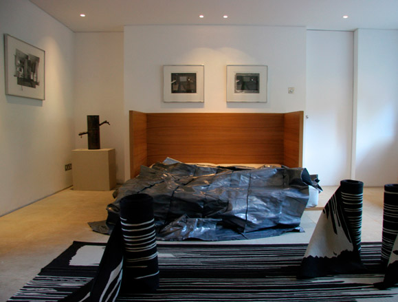
Kate Blee’s ’Lead Bed’, and ’Carpets x 5’ both from 2010, on the lower floor of the Artists’ House
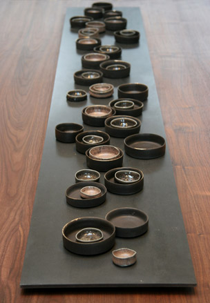
’A Different Word for Dark’ by Edmund de Waal, 2010
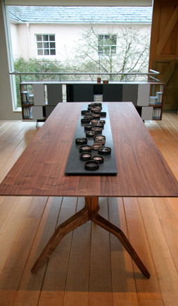
The porcelain vessels of Edmund de Waal’s ’A Different Word for Dark’ on the upper floor of the Artists’ House
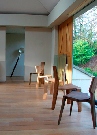
Matthew Hilton’s chairs, in-situ
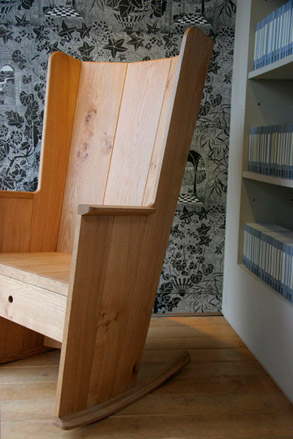
’Geranium’ wallpaper by Marthe Armitage,1994, sets a suitable backdrop for Matthew Hilton’s ’Irish Chair’, 2010

’Cadmus’ by Edmund de Waal, 2010
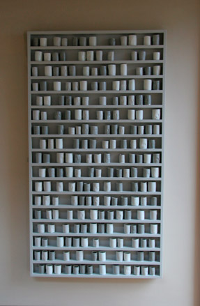
’The Leeward Side’ by Edmund de Waal, 2010
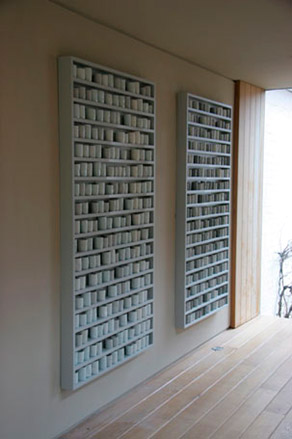
Edmund de Waal’s wall-based ’An Ebb Tide’, alongside ’The Leeward Side’, both from 2010
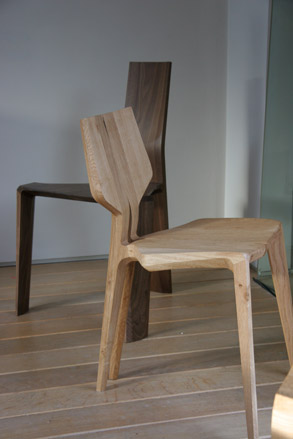
Matthew Hilton’s ’Mary’s Chair’ (front) and ’Roche Chair’, both from 2010
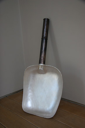
’Large Serving Bowl’ by Chien-Wei Chang, 2007
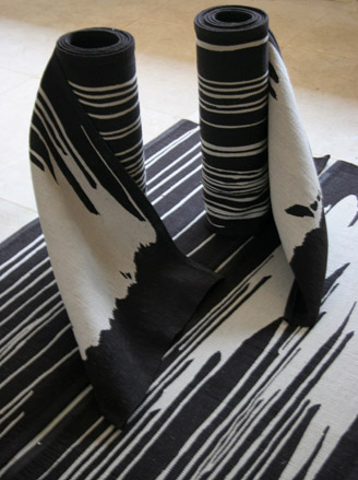
’Carpets x 5’ by Kate Blee, 2010.
ADDRESS
New Art Centre
Roche Court
East Winterslow
Salisbury
Wiltshire SP5 1BG
-
 All-In is the Paris-based label making full-force fashion for main character dressing
Part of our monthly Uprising series, Wallpaper* meets Benjamin Barron and Bror August Vestbø of All-In, the LVMH Prize-nominated label which bases its collections on a riotous cast of characters – real and imagined
By Orla Brennan
-
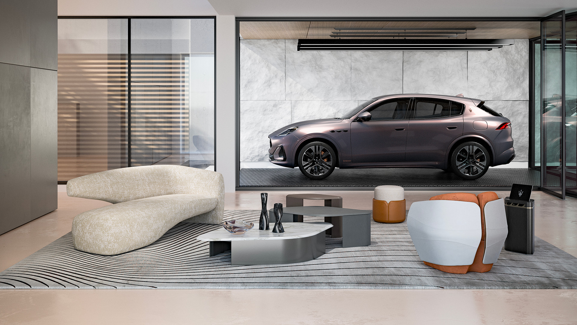 Maserati joins forces with Giorgetti for a turbo-charged relationship
Announcing their marriage during Milan Design Week, the brands unveiled a collection, a car and a long term commitment
By Hugo Macdonald
-
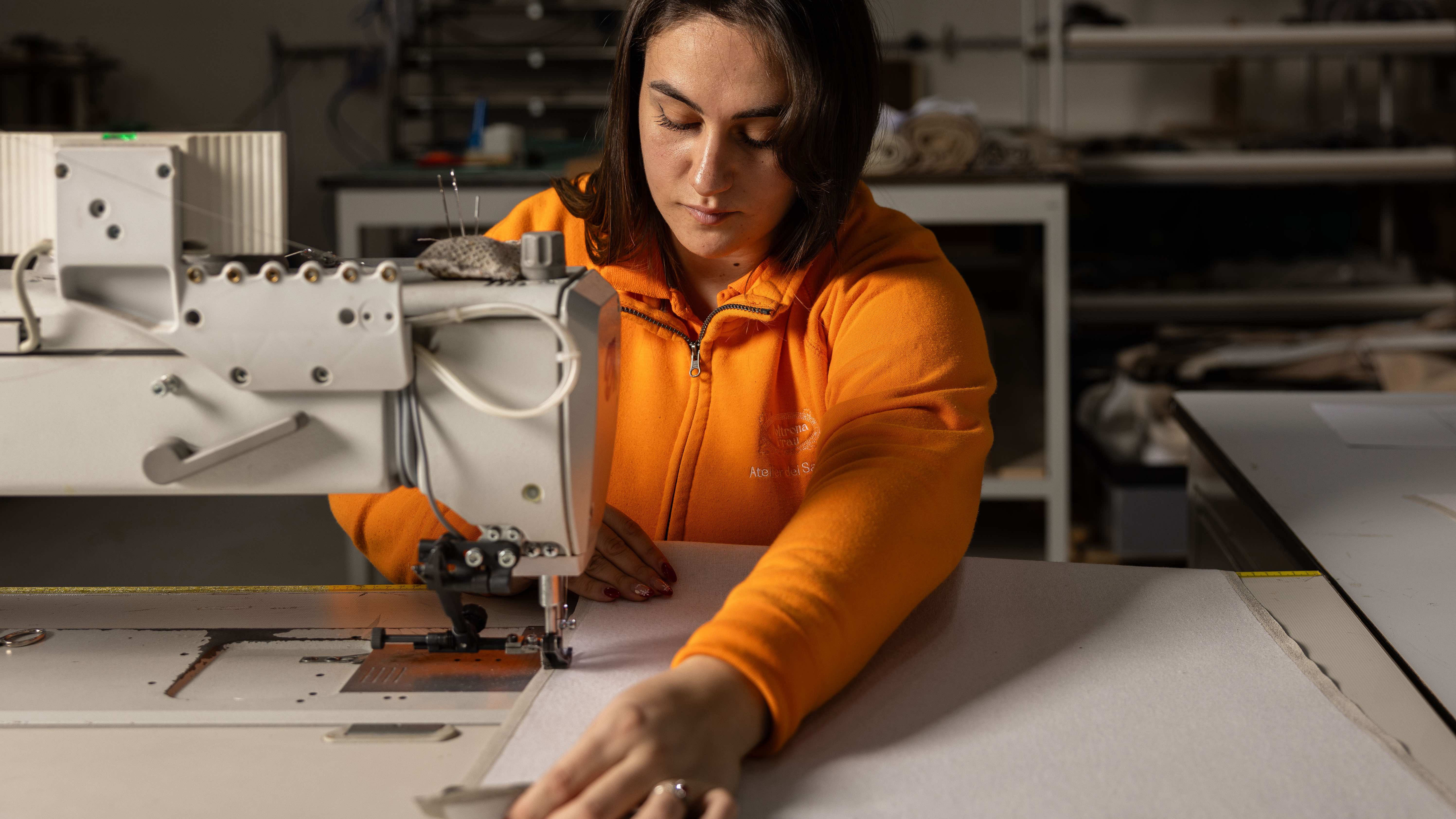 Through an innovative new training program, Poltrona Frau aims to safeguard Italian craft
The heritage furniture manufacturer is training a new generation of leather artisans
By Cristina Kiran Piotti