Bringing the audience in: why artists are building their homes on stage
From Sabrina Carpenter to Rex Orange County, artists are reimagining their stage sets as extensions of their own homes. Lisa Wright meets set designers Stufish to find out why
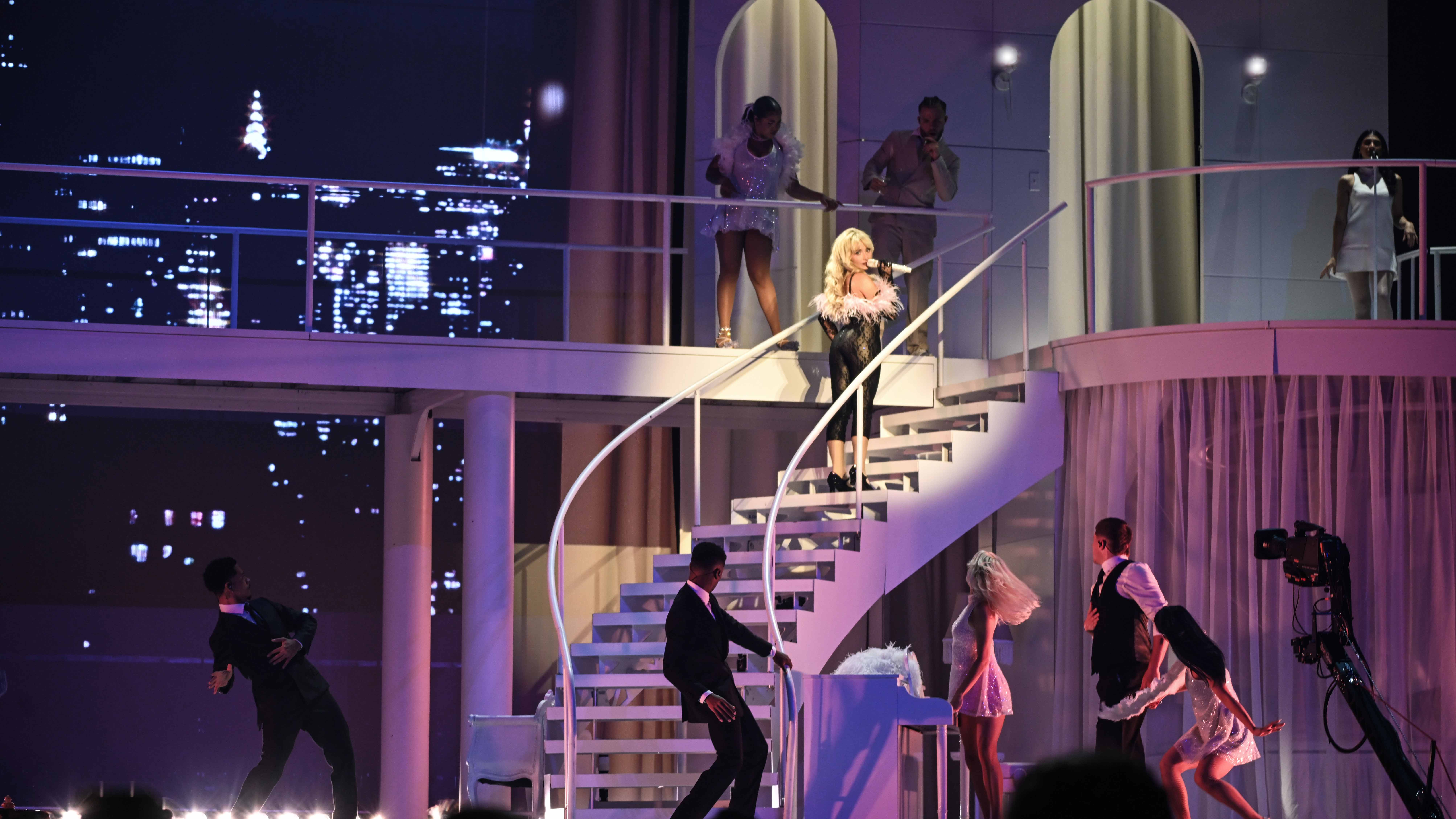
Sabrina Carpenter’s Short n’ Sweet Tour has become one of 2024’s most widely talked-about shows and not just because of the GRAMMY-nominated pop star at its helm. Like many artists in recent years, Carpenter and entertainment architects Stufish opted to bring the audience in, building a domestic world based on the layout of a penthouse apartment.
An elevated next step from Carpenter and Stufish’s celebrated Coachella 2024 collaboration, for which the architects built a pastel-blue motel exterior for the Pennsylvania singer, the immensely detailed and referentially kitsch bedroom, bathroom, living room and 1960s conversation pit made for images that have been shared and pored-over online: a successful stoking of the internet fandom that’s but one facet of the increasing trend.
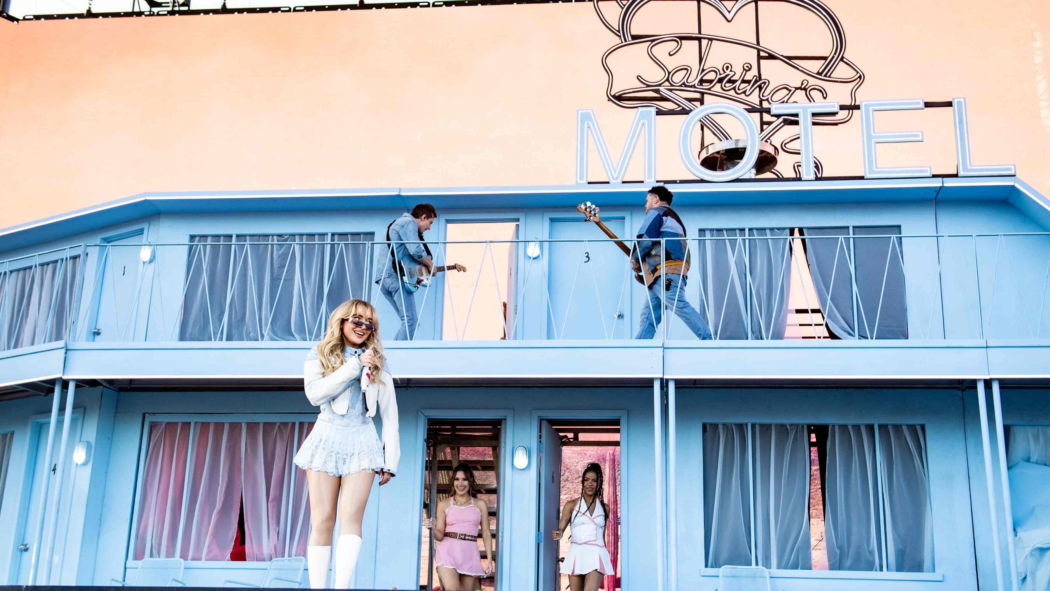
Sabrina Carpenter's Coachella 2024 stage design
Earlier this autumn, Stufish (the design team behind, among other projects, Madonna’s Celebration Tour, Take That’s This Life Tour and U2’s hugely ambitious residency at Las Vegas’ Sphere) also worked alongside English bedroom pop singer Rex Orange County to turn his stage into a Japanese-inspired room featuring rice paper panels and birch plywood surfaces. Last year, The 1975’s At Their Very Best Tour set the chart-topping indie band within their own two-level house replete with scaleable roof, while other musicians, from Taylor Swift to Lana Del Rey, have all played with unique takes on the theme over the last 12 months.

Rex Orange County's set design
For Ric Lipson, a partner at Stufish and the lead on Carpenter’s tour brief, the idea began as a way to create a tangible experience less reliant on screens that also embraced and highlighted the singer’s unique, retro pin-up-influenced brand. 'In the last few years, set design for pop shows and rock shows has become so much about video screens and content and there’s nothing wrong with that – there’s some beautiful content out there – but we all spend all day looking at screens,' he begins. 'When you have an artist who has a real message or a real point of view, they can work well in these really scenic set-ups that are very restrictive in some ways.
'On a video screen, you can go from a forest to outer space to wherever, but when you’re in a house, you can’t really leave the house. So then [you start to play with what’s available],' he continues. 'At one point, she’s on a heart-shaped toilet crying about a boy, ripping up tissue paper with kiss marks on, throwing it into a clam shell sink. Every single detail there is set up to make the world we’re building uniquely Sabrina.'
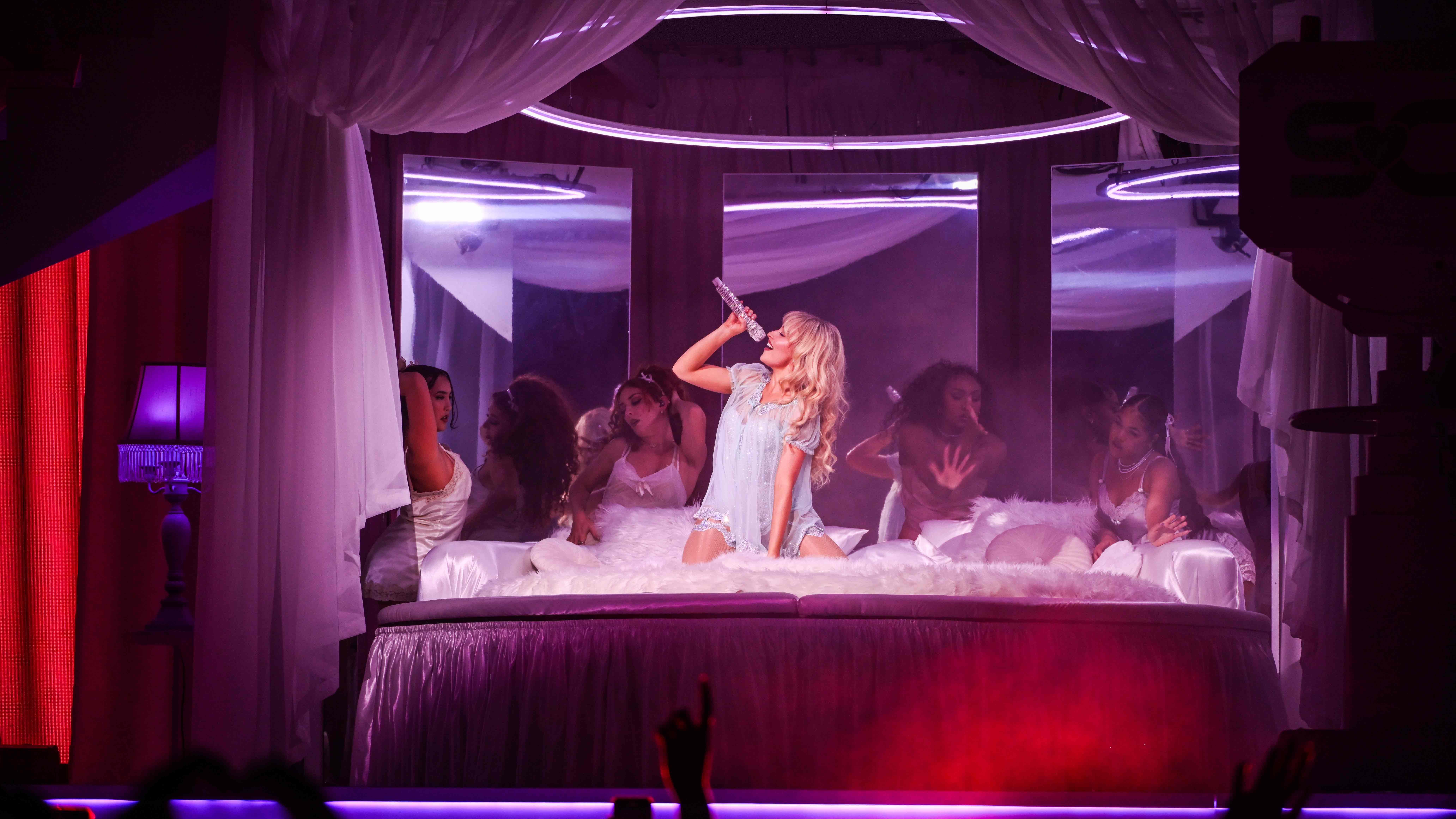
Sabrina Carpenter in her 'bedroom' on the Short n' Sweet tour
Combining elements of midcentury modern design and incorporating vintage nods, from a 1960s Malm-inspired fireplace to 1950s TV cameras that follow the singer around the stage, creating a show-within-a-show format, Lipson worked alongside the artist and creative directors Sarah Carpenter (Sabrina's sister) and Dannah Gottlieb to really lean into this idea of world-building. There are elements, such as the heart-shaped second stage that sinks down into the conversation pit, that are designed to foster intimacy between performer and audience. 'A lot of penthouses in the 1970s would have them for people to sit around and chat in. There’s something comfortable about it being upholstered and soft,' Lipson explains. But as well as literally inviting her fans into her home, it also provides a theatrical framework for the show to operate within.
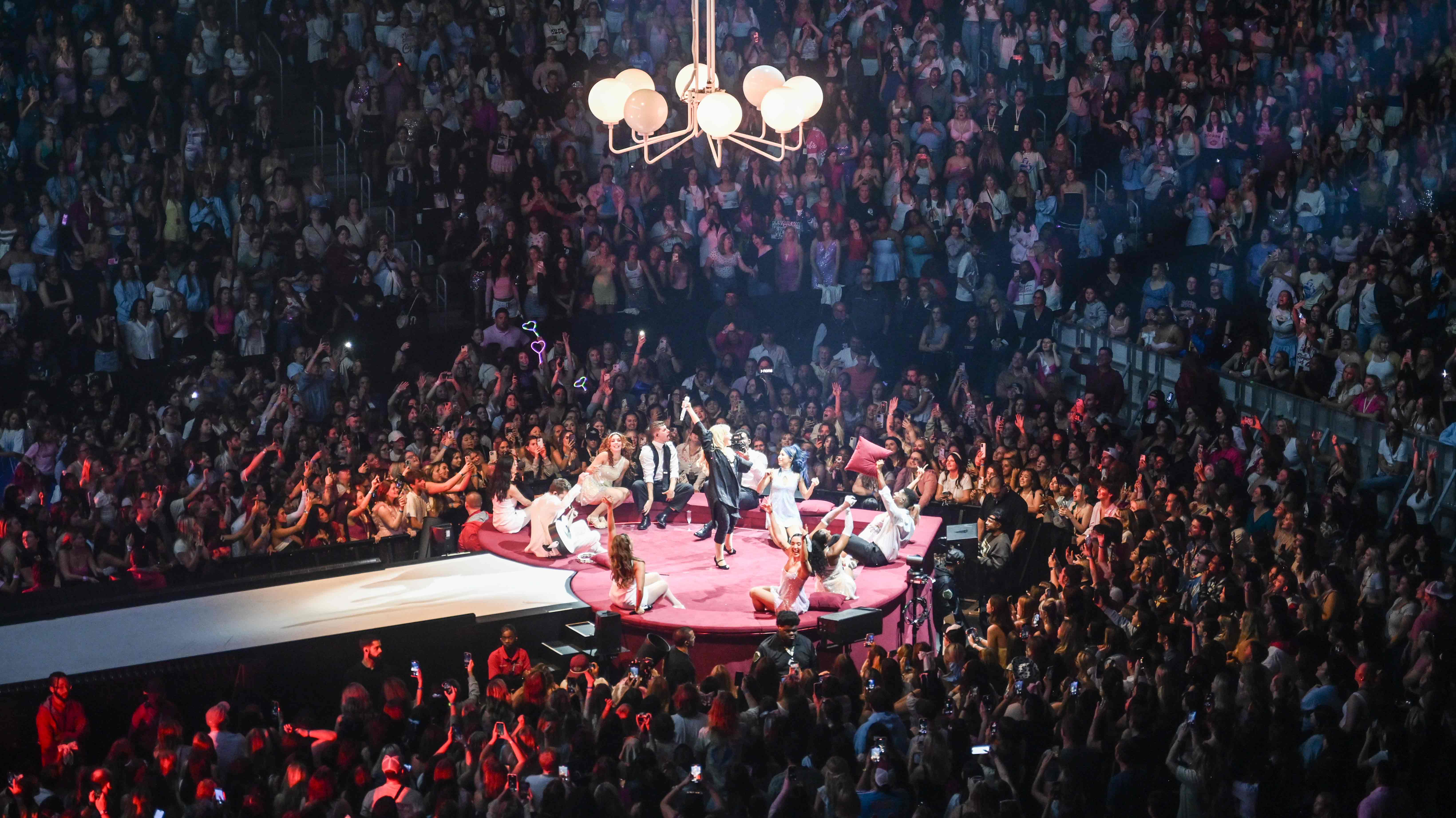
The heart-shaped conversation pit on Sabrina Carpenter's Short n' Sweet Tour
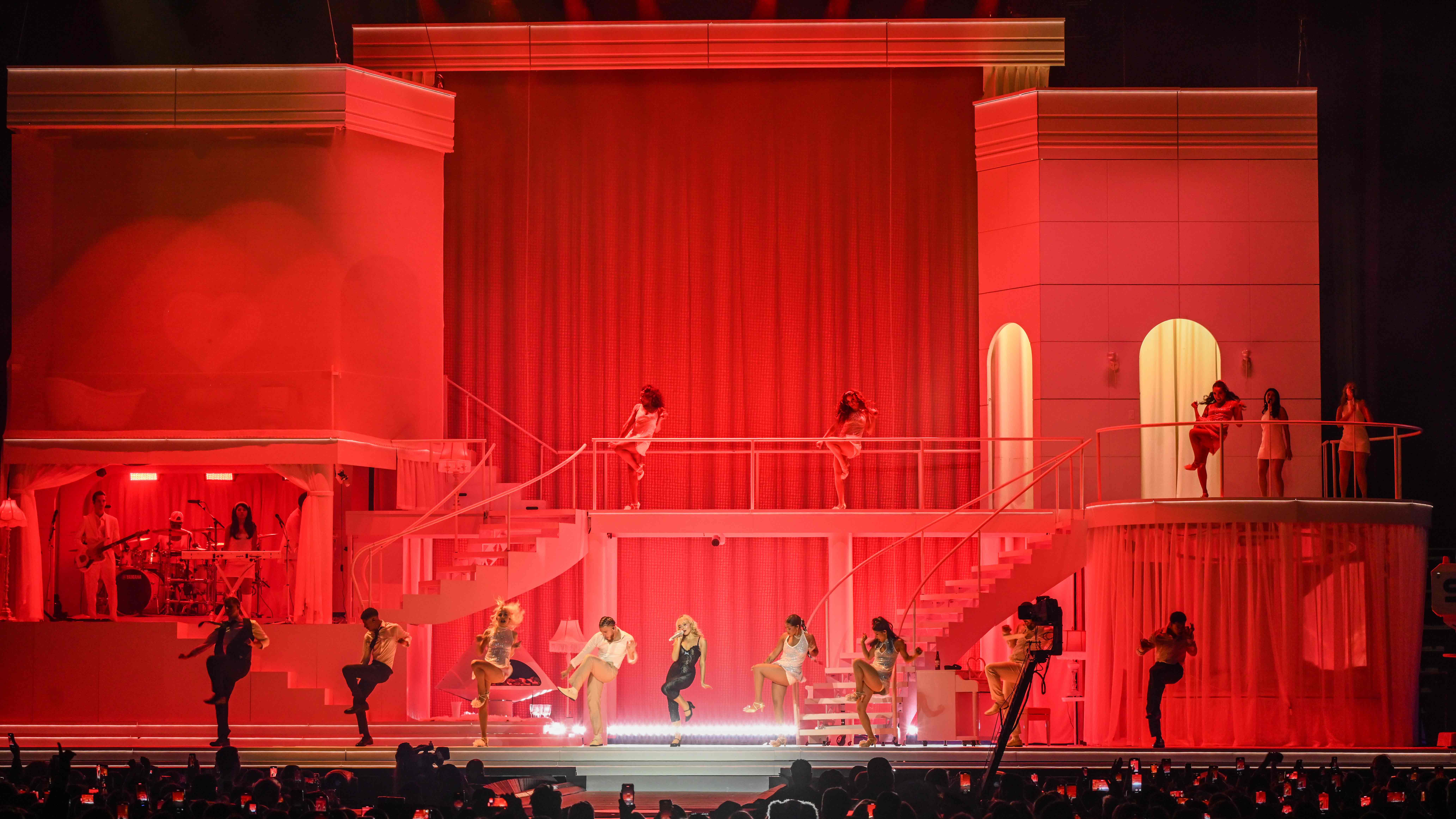
Sabrina Carpenter's Short n' Sweet Tour
On The 1975’s tour, singer Matty Healy used the various sets within their house to enact dramatic, often controversial scenes that became some of the show’s most discussed moments. At one point he watches commercials before climbing into the TV set; at another, he performs a series of press-ups on the living room floor before gnawing on a piece of raw meat.
Wallpaper* Newsletter
Receive our daily digest of inspiration, escapism and design stories from around the world direct to your inbox.
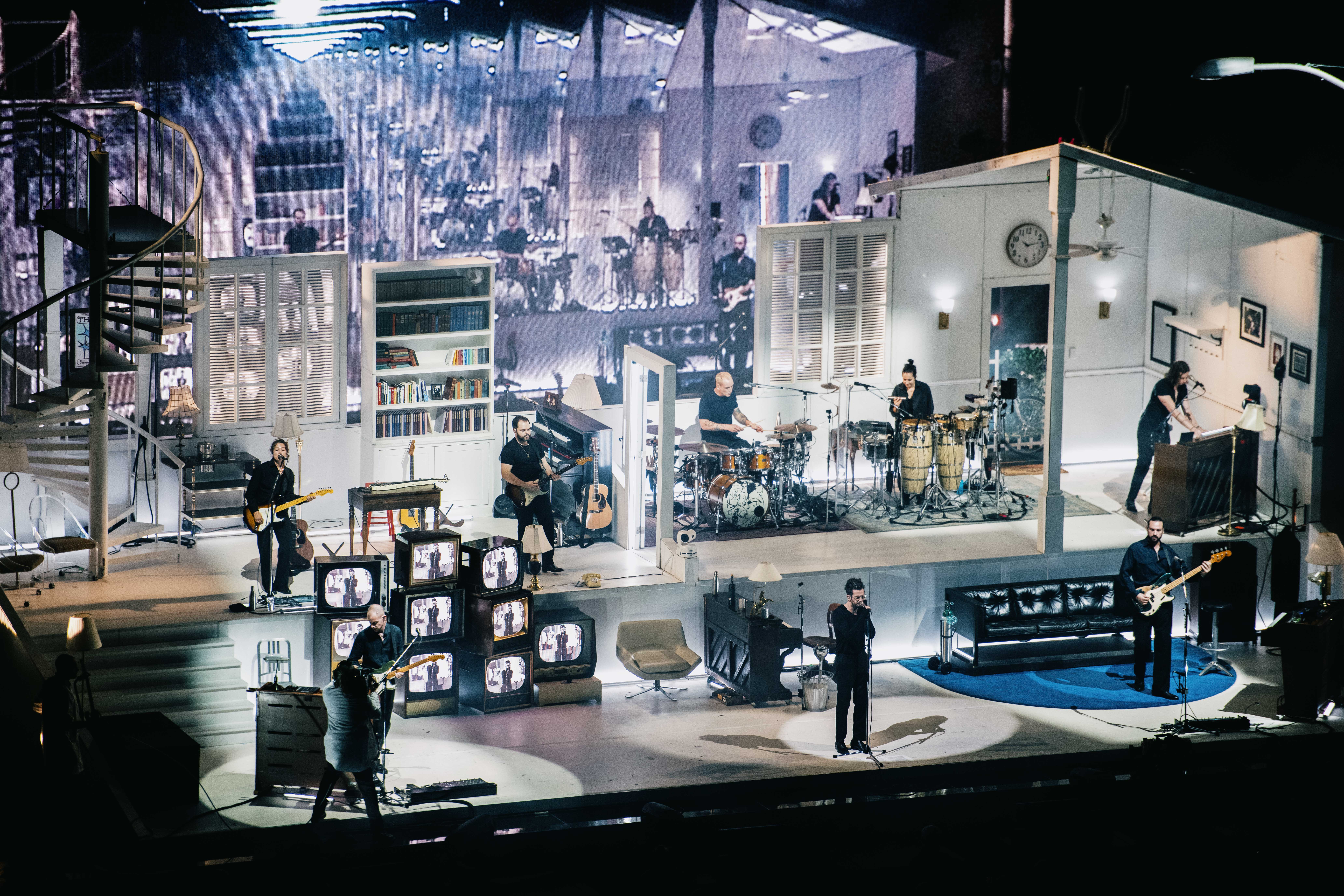
The 1975's At Their Very Best set design
Designer Tobias Rylander told Wallpaper* at the time that the layout of the house was designed with these linking set-pieces in mind. ‘They wanted it to feel very natural and to have a flow on stage where we could tell a story,’ he says. ‘So, we then started to think about doors and windows, and these different platforms.’ Likewise, for Lipson, the framework of the penthouse allowed them to create a narrative for the show that had a distinct beginning, middle and end. The lighting echoes the story arc of the performance, showing 'a literal evening, starting before sunset, to a slumber party, going through cocktail hour, and then to a party'.
'We want to give [Sabrina] the architecture and geography to allow her to be her, and that allows for these intimate moments and grand moments to come out,' he explains.
Tailoring this idea to different environments, from stadium to indoor show to festival, is something that’s enabled a varying scale of interpretations to emerge even under the umbrella of on-stage domesticity. Swift’s global Eras Tour was a huge-scale production that saw creative director Ethan Tobman create a succession of home-like structures, from a doll’s house to a wooden shack, that echoed different tonal moments of the show; at one crescendo point, the main house structure burns down.
For her Reading and Leeds Festival headline sets in summer 2024, meanwhile, Del Rey performed inside a set designed to echo the architecture of an old glass house, inspired by the Villa Marina in Italy and London’s Barbican Conservatory. ‘We gave her a physical environment so she and her dancers could have levels and things to interact with that give purpose,’ explains Lipson. 'The conceit of it being in a house again grounded that performance in a really beautiful way.'
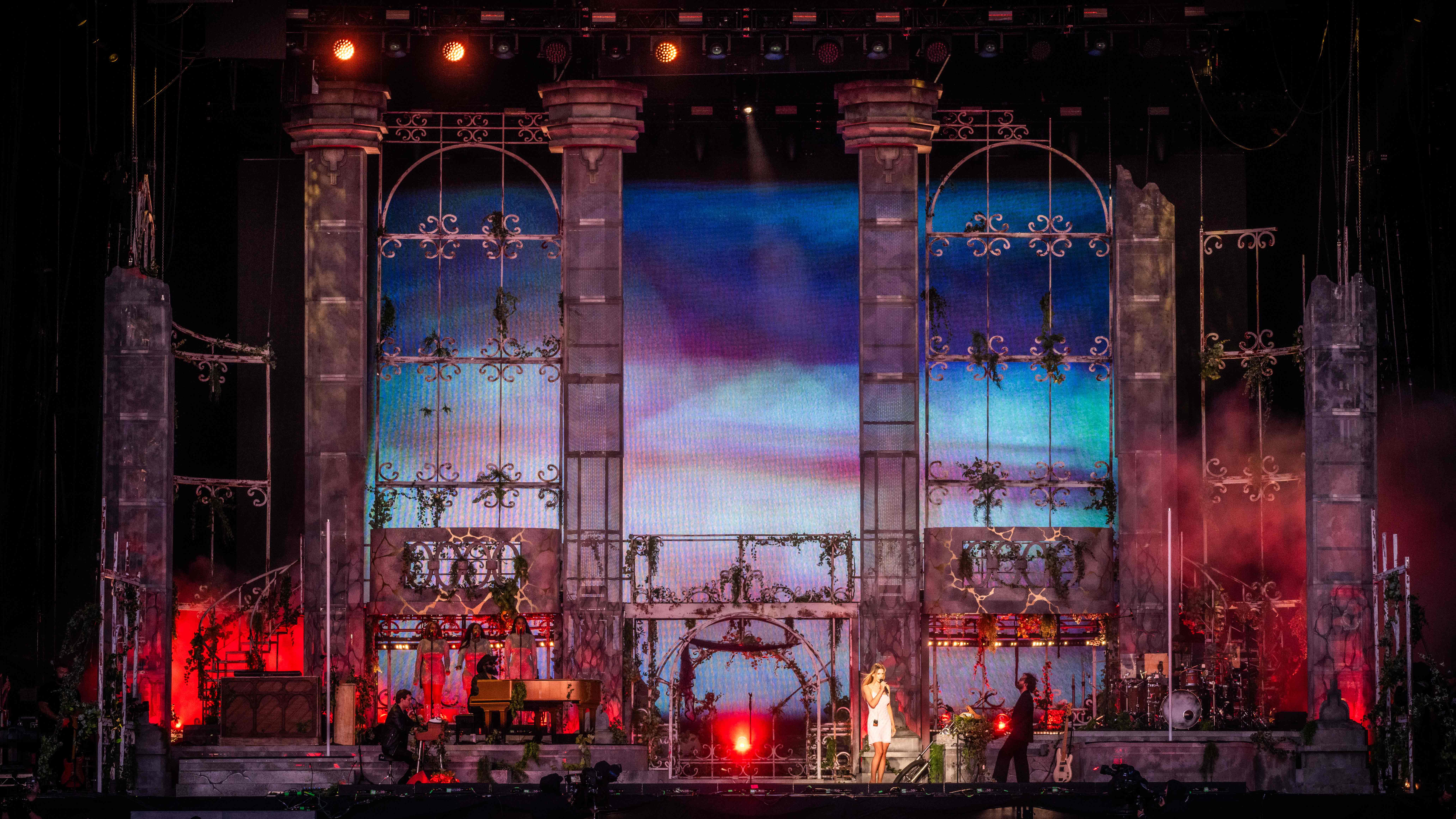
Lana Del Rey at Reading and Leeds 2024
Playing in smaller theatre spaces, Rex Orange County’s stage design necessitated a more minimal, simple aesthetic for which the 'calm and serene qualities' of Japanese architecture were perfectly placed. 'The concept for “Finally” tour was a time-based show taking the audience through a calendar year,' explains designer Rachel Duncan. 'The artist wanted a framework that could seamlessly shift between the mundane and the surreal, which influenced our choices in crafting the interior and exterior elements.
'The layering of the set allows the space to feel contained and intimate,' she continues. 'The translucent window frames allow light and texture to permeate the space, giving the illusion of the world outside the box. The sliding panels can open to reveal the outside landscape imagery created with a digital backdrop. The combination of the scenic blossom lit within and above the main stage structure allows the monolithic sculpture of the stage design to be softened by the more organic form.'

Inside Rex Orange County's Japanese-inspired tour set
At a time when artists are expected to give more of themselves online than ever, it makes sense that audiences also want this level of intimacy reflected from the stage too. But more than just a means of breaking the fourth wall and inviting people in, these structures are allowing performers to stage a story instead of just a pop show.
'Architecture isn’t just buildings; architecture is a manipulation of space. So for us, manipulating that space which is well known – everyone knows the size of a stage – is about creating something that is uniquely tailored to the artist,' says Lipson. 'Artists like Sabrina or Lana or Rex understand that there’s nothing wrong with the traditional way of making a show. But they also go, what if it was a little more scenic or narrative-driven so people feel like they’ve gone on an interesting journey?'
Lisa Wright is a freelance food, travel and culture journalist who has written for titles such as The Observer, NME, The Forty-Five, ES Magazine and DIY.
-
 Warp Records announces its first event in over a decade at the Barbican
‘A Warp Happening,' landing 14 June, is guaranteed to be an epic day out
By Tianna Williams
-
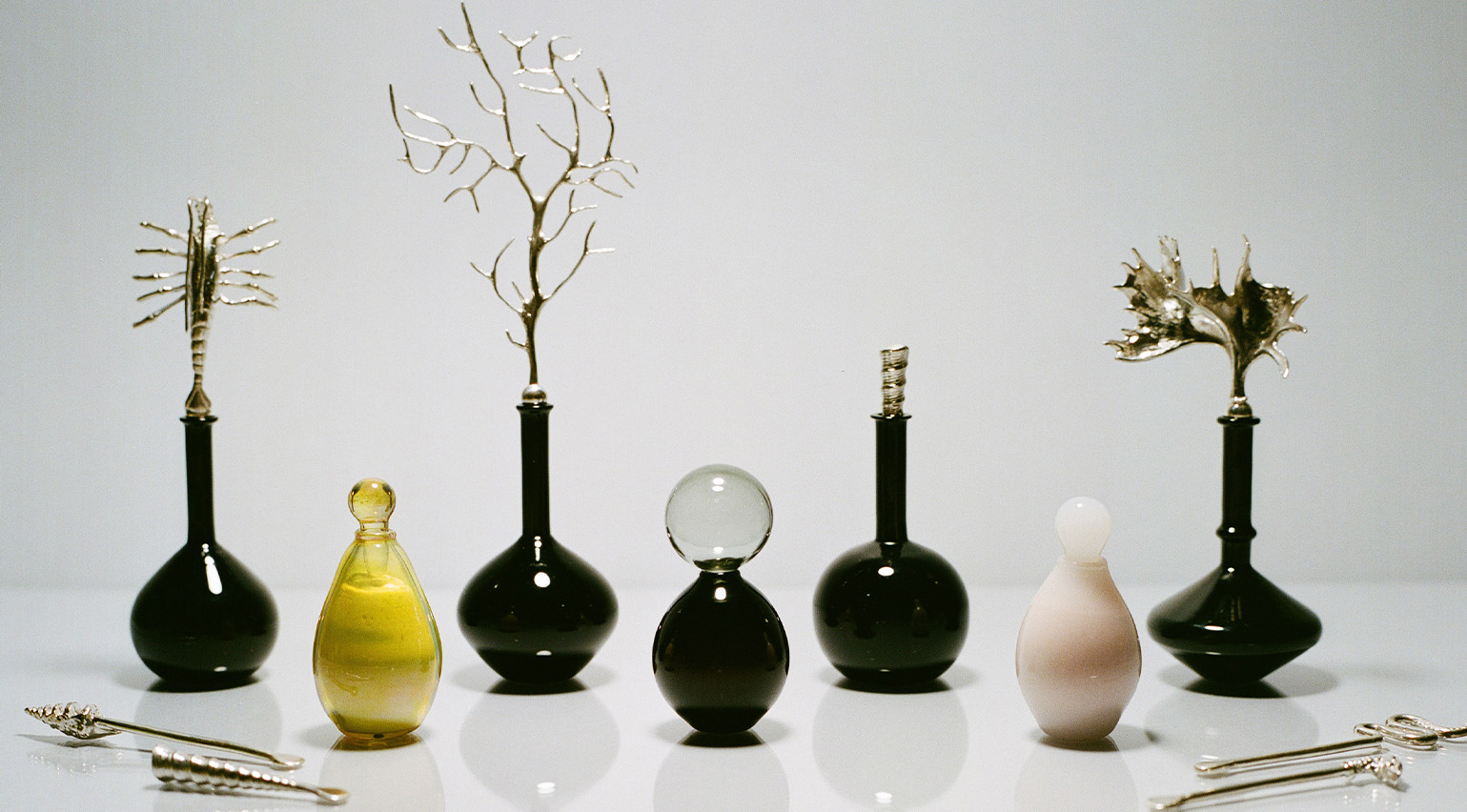 Cure your ‘beauty burnout’ with Kindred Black’s artisanal glassware
Does a cure for ‘beauty burnout’ lie in bespoke design? The founders of Kindred Black think so. Here, they talk Wallpaper* through the brand’s latest made-to-order venture
By India Birgitta Jarvis
-
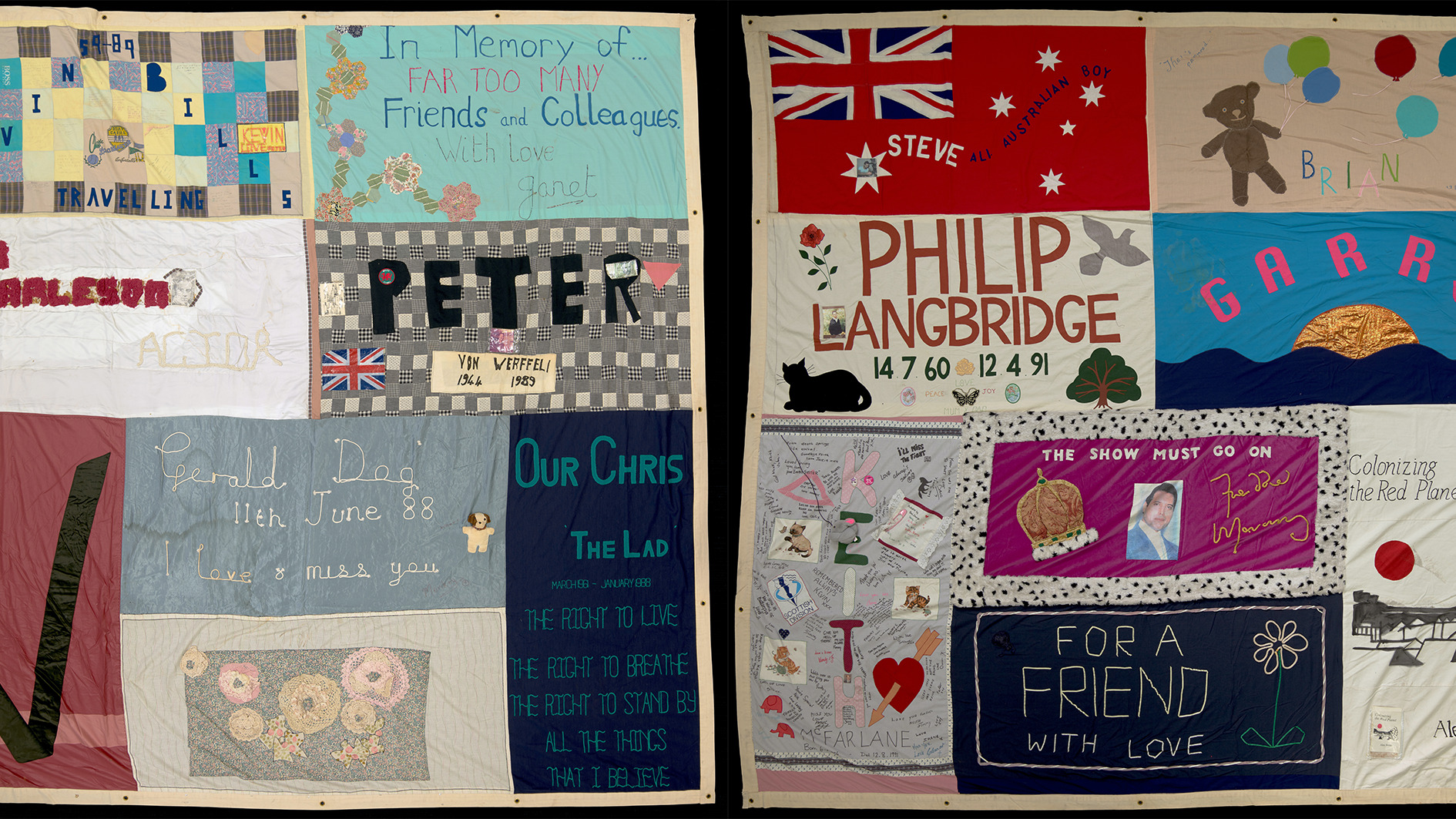 The UK AIDS Memorial Quilt will be shown at Tate Modern
The 42-panel quilt, which commemorates those affected by HIV and AIDS, will be displayed in Tate Modern’s Turbine Hall in June 2025
By Anna Solomon
-
 Brutalism in film: the beautiful house that forms the backdrop to The Room Next Door
The Room Next Door's production designer discusses mood-boarding and scene-setting for a moving film about friendship, fragility and the final curtain
By Anne Soward
-
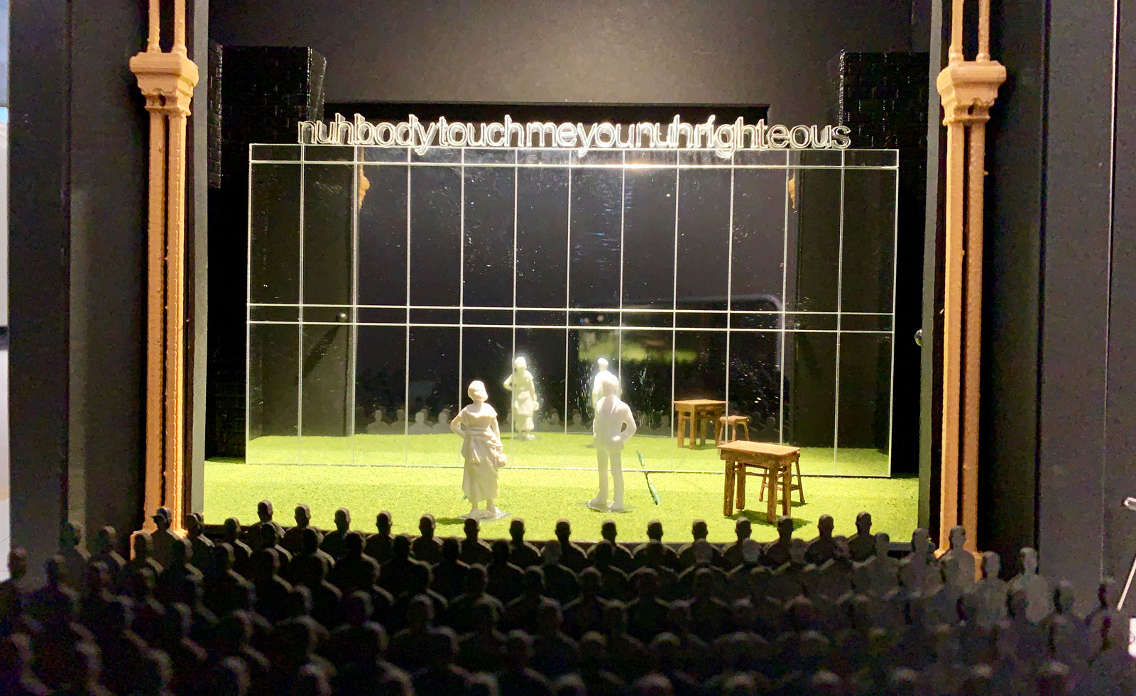 ‘A gentleness in the hard truths’: behind the scenes at Slave Play
Slave Play, London is on at the Noël Coward theatre – Amah-Rose Abrams reports on a ‘hilarious, tender, confronting’ performance and its masterful mirrored set
By Amah-Rose Abrams
-
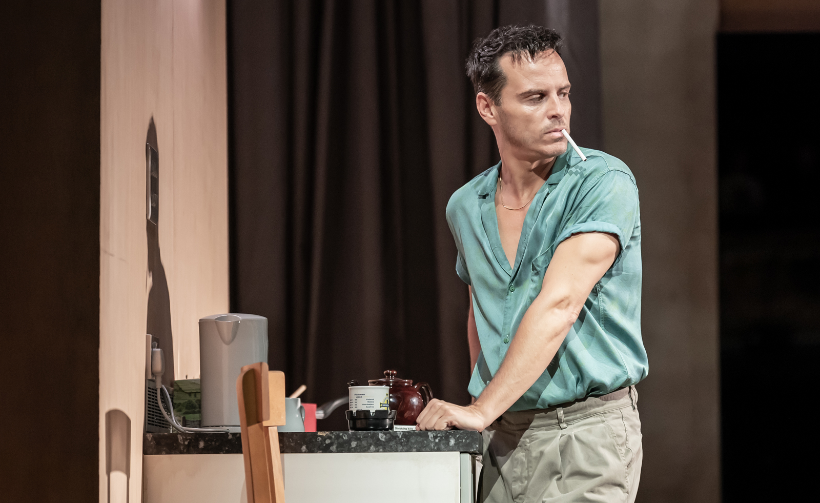 How Vanya’s set design went from stage to NT Live screen
As Vanya, starring Andrew Scott, hits the big screen with NT Live, set designer Rosanna Vize describes retaining the intimacy of London’s Duke of York's show
By Hannah Silver
-
 How to conquer the Atomic City: the story behind U2 at the new Las Vegas Sphere
U2:UV Achtung Baby Live At Sphere redefines the 21st-century rock concert. We spoke to the band and its team about the genesis of this expansive art and music experience that marks the opening of the high-tech venue
By Jonathan Bell
-
 Star cast produces Merce Cunningham’s centenary ballet
Night of 100 solos is an intimate yet far-reaching performance event, with set design by the late Richard Hamilton, and music in part by Christian Marclay
By Elly Parsons