Paper Artworks by German artist Simon Schubert
Simon Schubert's remarkable Paper Artworks provided the unconventional sets for Wallpaper's October interiors story, 'Beyond The Pale'. The Cologne-based artist creates these architectural scenes by taking a single sheet of paper and folding, denting and creasing it to create an illusion of 3D space. On to 12 of these extraordinary works, we transposed a series of white furniture and objects, which were then digitally manipulated to look as natural as possible in the setting.
The idea was conceived by freelance creative director and Wallpaper* editor-at-large Michael Reynolds, who was drawn to Schubert's work by its ghostly, palimpsest-like quality. 'I realised we had a fantastic opportunity to create a new level of visual confusion,' explains Reynolds. 'We were basically dropping 3D objects onto a 2D object that is a rendering of a 3D space. It messes with your brain. The big challenge for us was shooting the objects from exactly the right angle to make them fit the perspective of the Paper Artworks. But the thing I love about Simon's work is that it's not flawless or perfect. Sometimes we inherited a shooting angle from a perspective that didn't actually exist. It creates a truly unsettling effect.'
Reynolds was concerned about remaining true to the original aims of Schubert's art, while taking it to a new level. But thankfully, the artist was delighted with the results. Here he tells us his side of the story, and gives us a glimpse into the rest of his oeuvre.
Have your works ever been used in this kind of context before?
No. First I was not sure about the idea, but when I saw the initial results, I was really excited. The final images are an interesting collage, like a different artwork altogether.
What inspired you to use paper as a medium and was origami a reference?
I approached paper more from the point of a sculptor than in the tradition of origami. The first picture was a portrait of Samuel Beckett. I was looking for a way to make a portrait on different levels. The reduction of the material, the pureness of the white paper and the minimal technique in reference to Samuel Beckett's work was as important as the folds in the paper resembling the wrinkles in the face.
Wallpaper* Newsletter
Receive our daily digest of inspiration, escapism and design stories from around the world direct to your inbox.
Describe the process of creating your Paper Art?
The actual process is a secret. I make sketches of the pictures and fold the paper by using some special tools. Through the positive and negative folds in the paper and the reflections of light and shadow on these folds, the picture becomes visible.
Some scenes are based on literature, others on themes I am currently working on.
What scale are your paper art pieces?
Most works are in the sizes of 75cm by 50cm or 100cm by 75cm, but there are also some smaller in about 35cm by 24cm and the largest are around 180cm by 150cm.
Tell us about some of your other works?
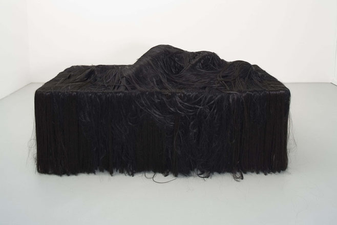
My other works are realistic, figurative sculptures. For these I use all kinds of material like hair, clothes and plaster. Some figures are only rear sides. You can walk around them, but you won´t find the face or the front side. Often there´s something between the face/front of the figure and the observer, like the hair, feathers or a mirror. The hair is like an impenetrable barrier - like a curtain you can´t lift.
Your non-paper art tends to be a little darker and more unsettling. Why is this?
I think the paper works are a bit more abstract. The figures seem to exist and become alive and the distance between the observer and the work is very close. Both, paper works and sculptures are different approaches to similar themes.
Hair seems to play a major role in your art. Is there any particular reason for this?
Hair is a fantastic material, which is revolting, erotic, beautiful and aesthetic at the same time.
Your previous exhibitions have dealt with themes like disappearance and erasure. Are your paper works an extension of this?
Some paper works also deal with these themes. In other works I also try to find something, which I would describe like looking for something infinite in the finite. I try to approach this through combining mirrors, panels and complicated architecture into pictures, which seem to be folded and repeated in themselves. In these works I try to tie in philosophy dealing with baroque theories like Leibniz, Deleuze or Hofstadter.
What can we expect from you in the future?
I´ve just returned from a scholarship and will be working on some major paper installations for the next exhibitions. For these I combine my folded paper pictures, the sculptures and folded wall elements, such as panels, picture frames and baroque sceneries into whole room installations.
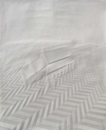
'Untitled (house in planes)' by Simon Schubert, 2009
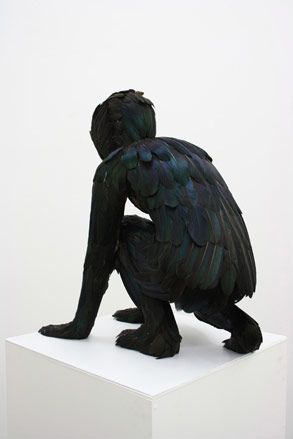
'Feathered Boy' by Simon Schubert, 2010
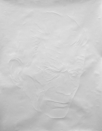
'Portrait, Samuel Beckett' by Simon Schubert, 2008
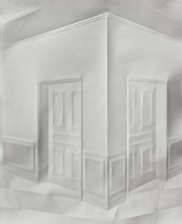
'Untitled (hallways)' by Simon Schubert, 2010
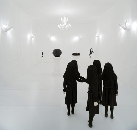
Installation at Upstairs Berlin Gallery by Simon Schubert, 2009
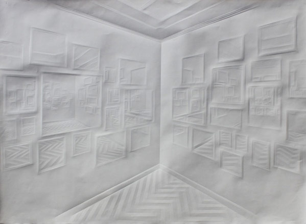
'Untitled (mirrors and mirrors)' by Simon Schubert, 2010
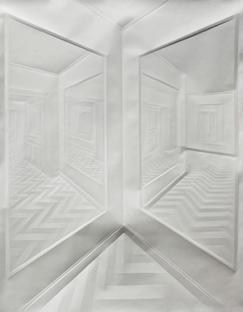
'Untitled (mirrored hallways)' by Simon Schubert, 2010
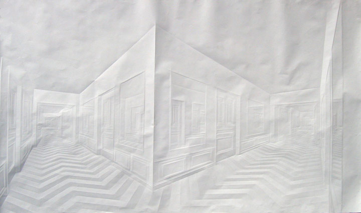
'Untitled (mirrored hallways)' by Simon Schubert, 2010
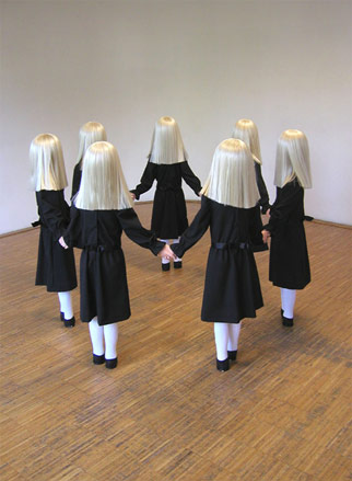
'The Roundel' by Simon Schubert, 2006
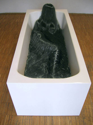
'Woman bathing her hair' by Simon Schubert, 2006
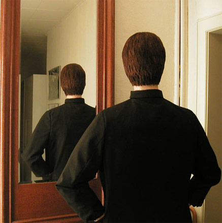
'Le el' by Simon Schubert, 2005
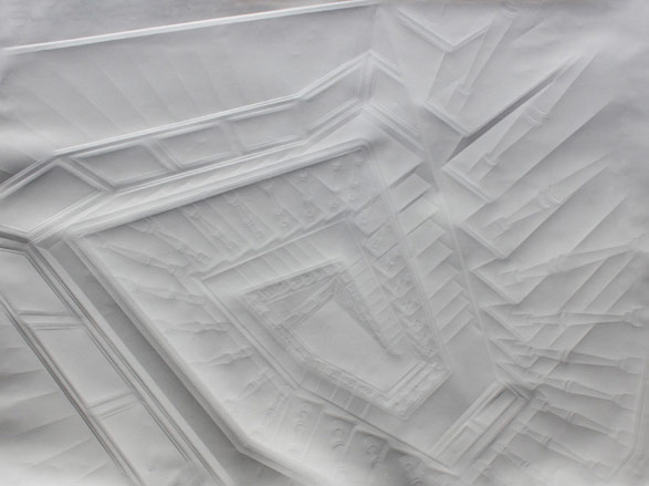
'Untitled (stairwell)' by Simon Schubert, 2010
-
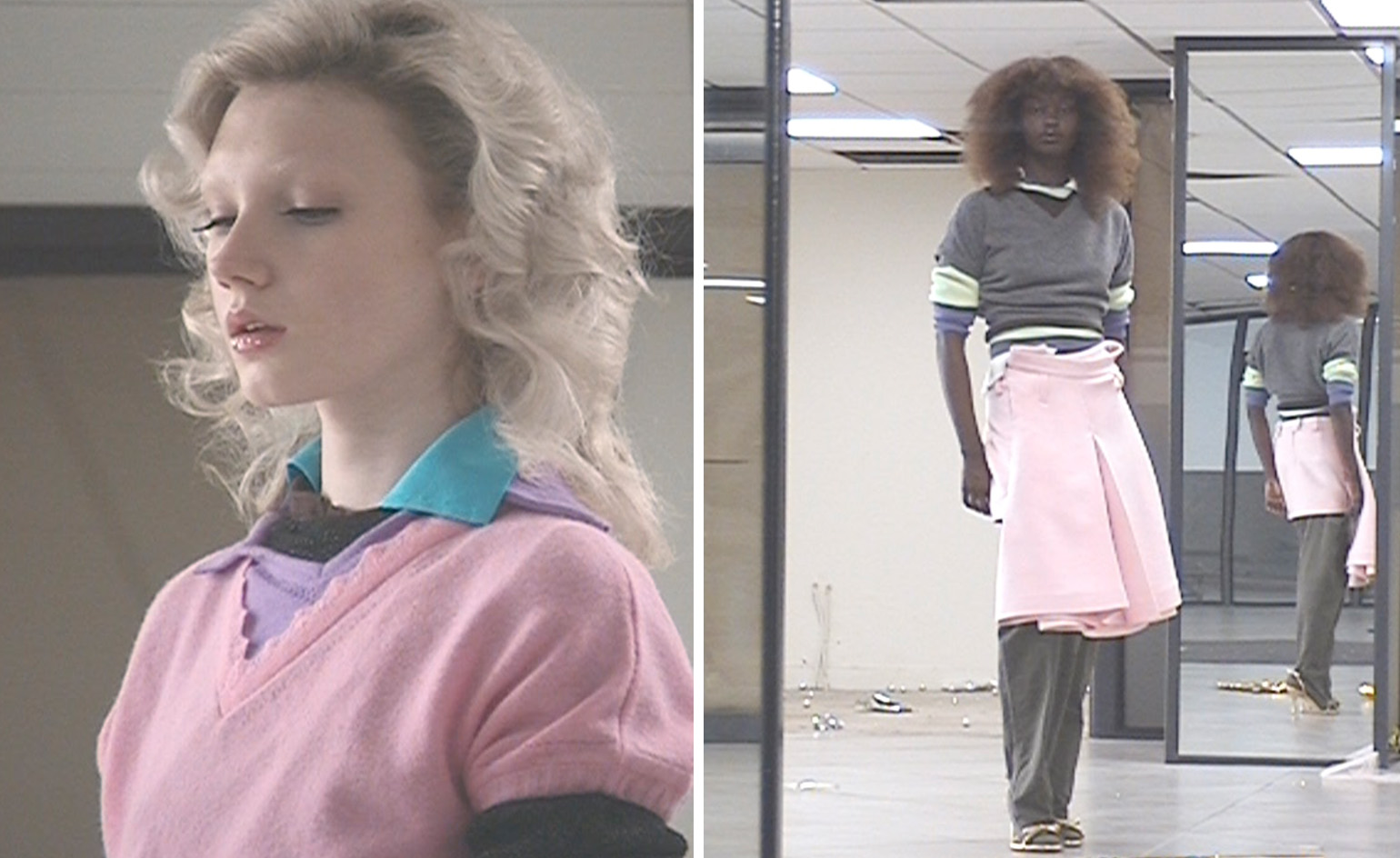 All-In is the Paris-based label making full-force fashion for main character dressing
Part of our monthly Uprising series, Wallpaper* meets Benjamin Barron and Bror August Vestbø of All-In, the LVMH Prize-nominated label which bases its collections on a riotous cast of characters – real and imagined
By Orla Brennan
-
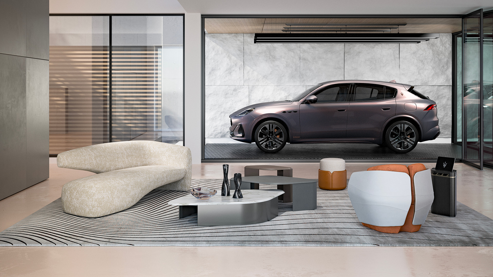 Maserati joins forces with Giorgetti for a turbo-charged relationship
Announcing their marriage during Milan Design Week, the brands unveiled a collection, a car and a long term commitment
By Hugo Macdonald
-
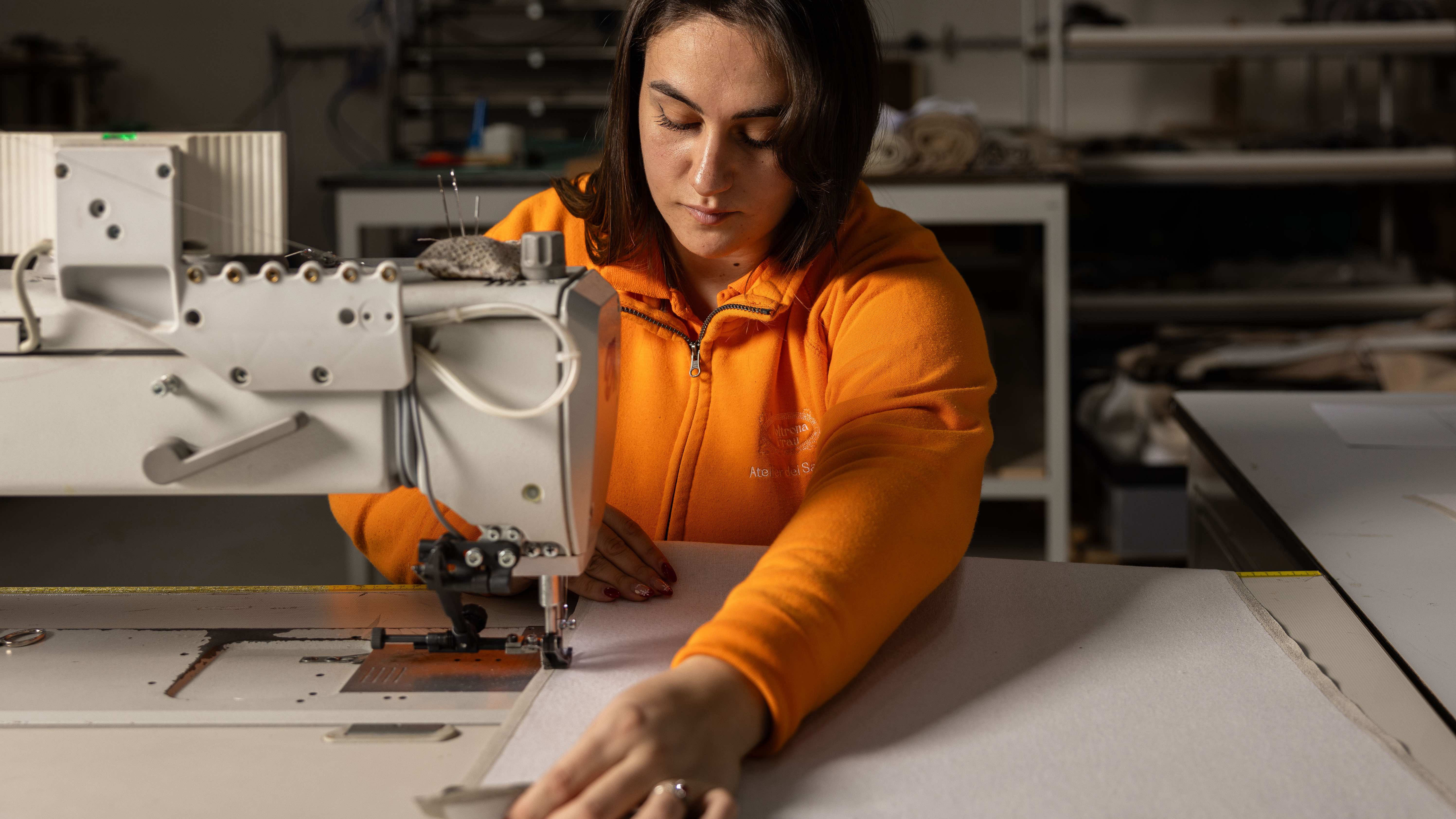 Through an innovative new training program, Poltrona Frau aims to safeguard Italian craft
The heritage furniture manufacturer is training a new generation of leather artisans
By Cristina Kiran Piotti