Poster code: a Tokyo gallery pays homage to Philippe Apeloig’s graphic expertise
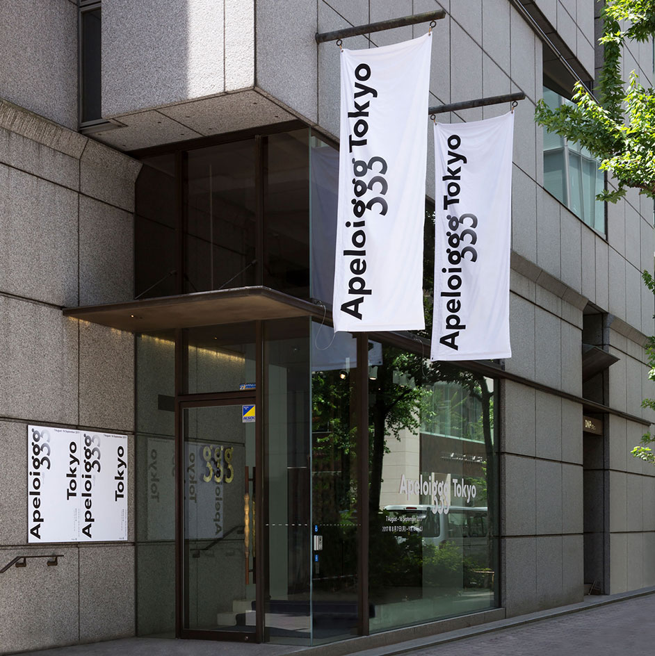
Philippe Apeloig’s new show at Tokyo’s Ginza Graphic Gallery marks a full circle for the Parisian designer. Almost 20 years ago in 1998, Apeloig presented ‘Posters in the context of French culture’ – first at the DNP Duo Dojima (DDD) Gallery in Osaka, and then at the Ginza Graphic Gallery. Curated by the late Japanese graphic master Ikko Tanaka, who passed away in 2002, the exhibition showcased a poster designed by Apeloig that received the Gold Award from the Tokyo Type Directors Club in 1995.
The name of the new show – ‘Apeloiggg’ – is a nod to the Ginza Graphic Gallery’s GGG acronym that was immortalised in a logotype created by Tanaka. ‘I thought it made a lot of sense to connect my name to his logotype. It’s a kind of homage to him,’ reflects Apeloig, who continues to be inspired by Japan. ‘And I like that it echoes the repetition that you see in my work also.’
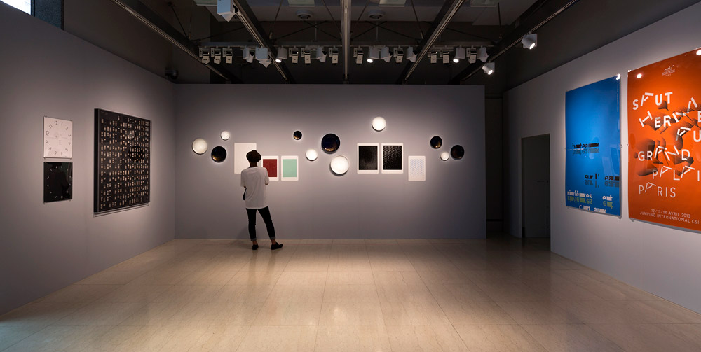
Installation view of ‘Apeloiggg’ at Ginza Graphic Gallery
The new survey follows on from three important solo shows for Apeloig: his retrospective, ‘Typorama’, at the Museum of Decorative Arts in Paris (2013–14); ‘Using Type’, a solo exhibition of his typographic posters, at the Stedelijk Museum in Amsterdam (2015); and ‘TypoApeloig’ at Cité du Livre d'Aix-en-Provence (2014).
Displayed across the ground floor and the basement of the Ginza Graphic Gallery, the Tokyo show brings together Apeloig’s recent forays into product and packaging work: a line of porcelain for La Manufacture Nationale de Sèvres, a scarf and watch for Hermès, and packaging designs for Issey Miyake Parfums – a trio of 3D objects that Apeloig says came along ‘by chance’. ‘I wanted to show the different ways in which graphic design can be used,’ he explains. ‘Not only on printed matter like posters and books but also on objects packaging and ceramics.’
Split into two, half of the basement space is given over to the designer’s motion graphic pieces, which are projected onto a vast screen that spans the entire wall. In the other half, a series of books and brochures occupies one wall, while six posters showcase Apeloig’s bespoke fonts. Another three posters are portraits of writers Philip Roth, Kenzaburō Ōe and Mario Vargas Llosa, and a fourth is a blue portrait of fashion designer Yves Saint Laurent, which Apeloig designed for the Yves Saint Laurent retrospective at the Petit Palais, Paris in 2010.
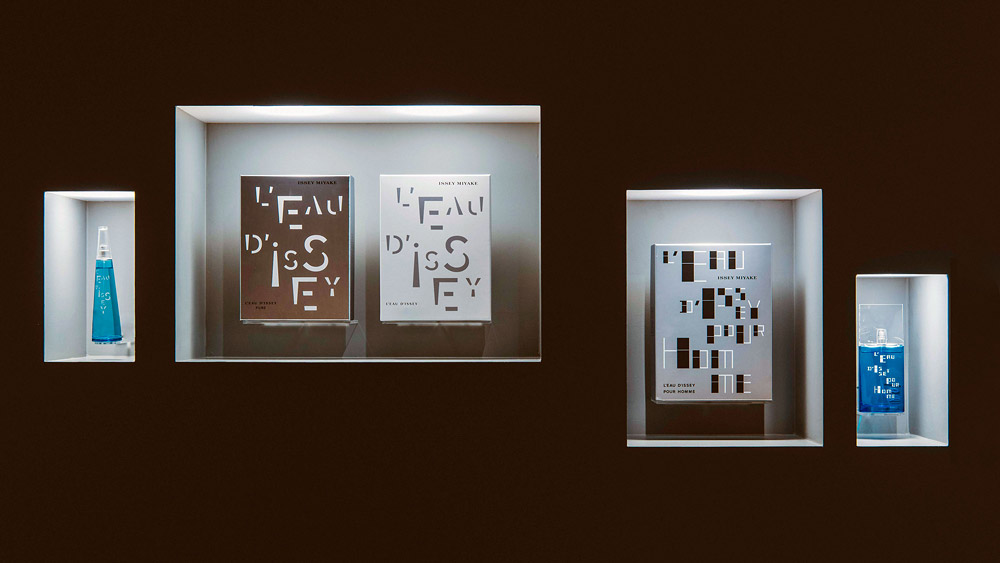
Apeloig’s packaging designs for Issey Miyake Parfums
Upstairs on the ground floor, Apeloig’s Issey Miyake packaging is displayed in a series of illuminated recessed alcoves that glow in the exhibition’s darkness. ‘Issey Miyake was the most commercial project that I’ve ever done but I didn't forfeit my creativity – not at all,’ says Apeloig, who took the fragrance’s streamlined bottle silhouette and transformed it into a set of geometric letters that he describes as ‘playful forms, dancing in movement’.
‘It’s a very abstract design,’ continues Apeloig, ‘Movement is at the centre of my work. As you understand, modern dance was perhaps the entrance door for me to the contemporary approach in art and design. First of all by watching performances. I still think that today I kept this magical choreography as an influence in my work, as one can see in the motion graphic pieces that I present today.’
Opposite the packaging, the ceramic plates for La Manufacture Nationale de Sèvres – featuring minimalist patterns that nod to Japanese artist Hokusai – are exhibited like artworks on the wall alongside Apeloig’s numerous dynamic posters that specifically feature landscapes, scenery and architecture crafted from type.
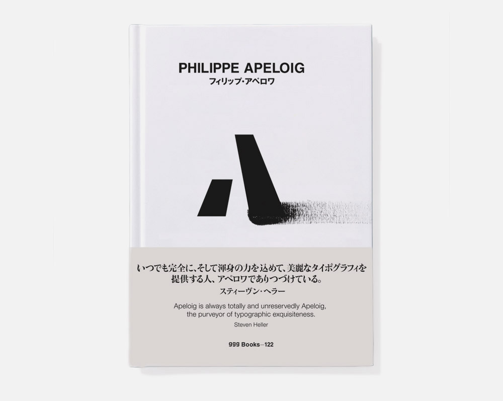
The exhibition is accompanied by a catalogue edited by art critic Steven Heller
To complete the showcase, Apeloig worked with American art critic Steven Heller on a 64-page catalogue in Japanese and English. A quote from Heller on its cover reads, ‘Apeloig is always totally and unreservedly Apeloig, the purveyor of typographic exquisiteness.’ It’s a perfect sentence to sum up this exhibition, demonstrating Apeloig’s innate ability to apply his distinctive graphic style to whichever medium he touches.
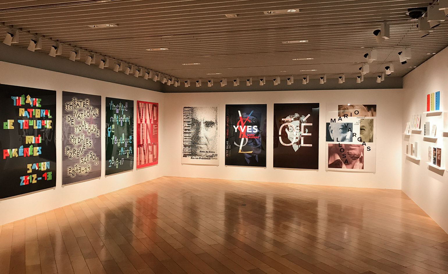
Installation view of Philippe Apeloig’s exhibition at Ginza Graphic Gallery in Tokyo. © DNP Foundation for Cultural Promotion
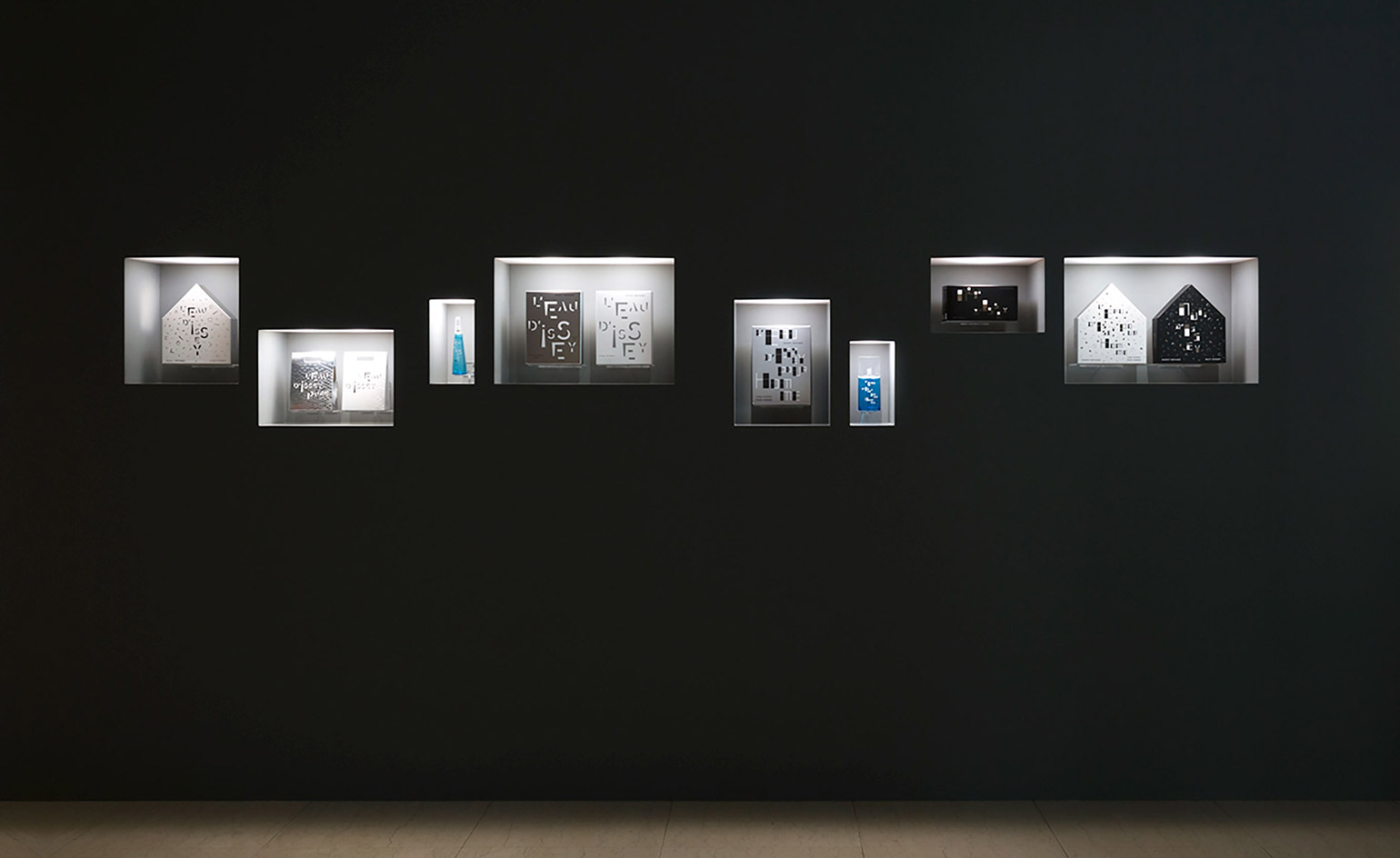
Installation view of Philippe Apeloig’s exhibition at Ginza Graphic Gallery in Tokyo. © DNP Foundation for Cultural Promotion
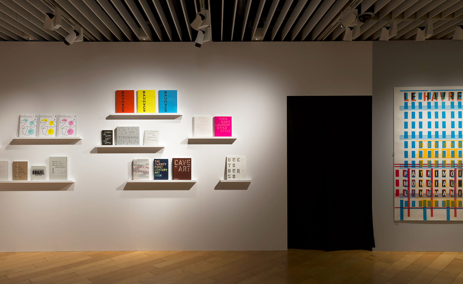
Installation view of Philippe Apeloig’s exhibition at Ginza Graphic Gallery in Tokyo. © DNP Foundation for Cultural Promotion
INFORMATION
‘Apeloiggg’ is on view until 16 September. For more information, visit the Ginza Graphic Gallery website
ADDRESS
Receive our daily digest of inspiration, escapism and design stories from around the world direct to your inbox.
Ginza Graphic Gallery
DNP Ginza Building
7-7-2 Ginza
Chuo-ku
Tokyo 104-0061
Ali Morris is a UK-based editor, writer and creative consultant specialising in design, interiors and architecture. In her 16 years as a design writer, Ali has travelled the world, crafting articles about creative projects, products, places and people for titles such as Dezeen, Wallpaper* and Kinfolk.