Colour artist Sophie Smallhorn may be trained as a designer and be at ease collaborating with architects on major public projects like London's Olympic Stadium (for which she served as colour consultant) but she is most in her element when messing about in her studio, 'playing with paint and leading through ideas very quickly'. Happily then, her latest series - on show at London's Great Western Studios, gave her time to indulge. 'Notes on colour and form' saw Smallhorn get back to basics for a spell of 'getting paint under my fingernails'.
For the project, Smallhorn embarked on what she calls 'an illustrated thought process', making purely abstract colour decisions on 200 identical sheets of paper. Some of the results simply focus on one solid, saturated colour, while one of the more complex prints employs 15. And, of the 100 one-off prints that made the cut into the show, none took more than a day to create.
The untitled works have undeniable shades of Op Art, echoing works by the likes of Bridget Riley and Donald Judd, but Smallhorn says her colour decisions are purely intuitive, unguided by trends. 'They're not all that predictable,' she says, 'and some are quite uncomfortable and ugly. You've got to have some comfortable and some less comfortable tones in a composition, to upset the balance a bit.'
Presciently, her tendency towards yellows, oranges and reds have accompanied today's fashion for sunnier colours - such as the covetted tableware she designed in collaboration with Sebastian Bergne (see W*151). Yet, while one journalist has called her a 'colour alchemist', Smallhorn would say there's nothing magical about her palette. 'It's the basis of everything I do.'
Having recently finished an exterior mural on a home in Basel and now taken on a glass-canopy project for a building in Victoria, Smallhorn is already feeling nostalgic for that brief stint in the studio this summer. 'I will miss the freedom of the past six months,' she says. But, she must find some solace in the fact that, literally, much bigger things lay ahead.

As seen with No.16, the collection includes colours that are very ’flat, solid, saturated’

The relationships between forms are rather formal, but ’within that, there are quite a few surprises’, says Smallhorn

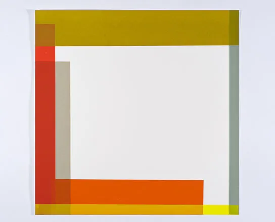
No.22 is a ’story of combinations... and cool juxtapositions’

The artist often returns to yellow in all its variations, as she did here with No.26

Every image in the series is 400mm by 400mm. No.33, like the rest of the series, took no more than a day to produce

Smallwood’s 21-colour mural on a private home in Basel, Switzerland
ADDRESS
The Project Space
Great Western Studios
65 Alfred Road
London
W2 5EU