Tom Hingston on designing for Serpentine Galleries, the V&A, and Wallpaper*
London-based art director and graphic designer Tom Hingston discusses his visual identities for Serpentine Galleries
Visual identity for the V&A exhibition ’Alice: Curious and Curiouser’, by Hingston Studio. Video courtesy of Hingston Studio
Art director and graphic designer Tom Hingston is best known for his work with the world’s top musical artists, including Nick Cave, Grace Jones, The Chemical Brothers, The Rolling Stones, Lady Gaga and Massive Attack. He’s also widely respected in the world of Wallpaper*, creating visual identities and campaigns for the likes of Christian Dior, Orlebar Brown and Veuve Clicquot. Here, he tells us about three recent projects: visual identities for the Serpentine Galleries and the ‘Alice: Curious and Curiouser’ exhibition at the V&A museum, as well as the newsstand cover of our August 2021 issue, dedicated to Design for a Better World.
Tom Hingston and Serpentine Galleries
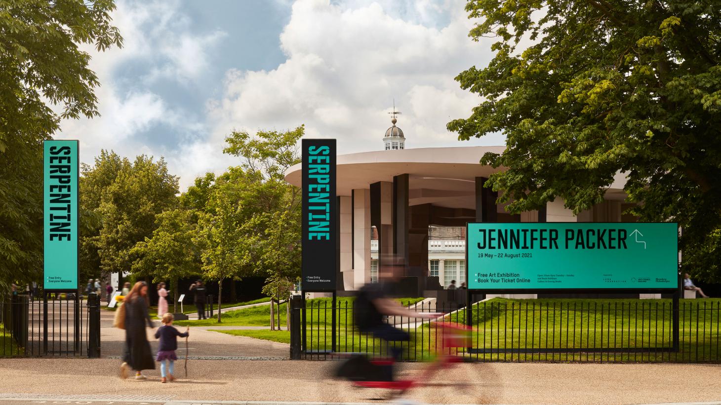
Banners featuring the Serpentine Galleries’ new visual identity by Hingston Studio, in front of the 2021 Serpentine Pavilion designed by Counterspace.
Ahead of Serpentine Galleries’ 50th anniversary celebrations, Hingston Studio was commissioned to redesign its visual identity in 2019, replacing a much lauded Pentagram design that was introduced in 2013. The brief, which proved prescient when the Covid-19 pandemic compelled cultural institutions to move into the digital realm, was to create a digital-first identity, with ‘a dynamic presence and a greater level of flexibility across multiple platforms’.
Hingston recalls he was drawn to ‘the notion that the urgent voice of the gallery, with its location in London’s Hyde Park, known for its history of protest and free speech, would be coupled with this sense of nature and openness to surround it. Space to think and breathe.’
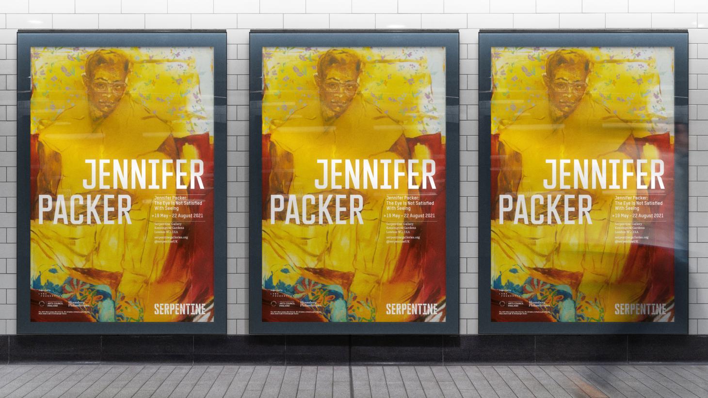
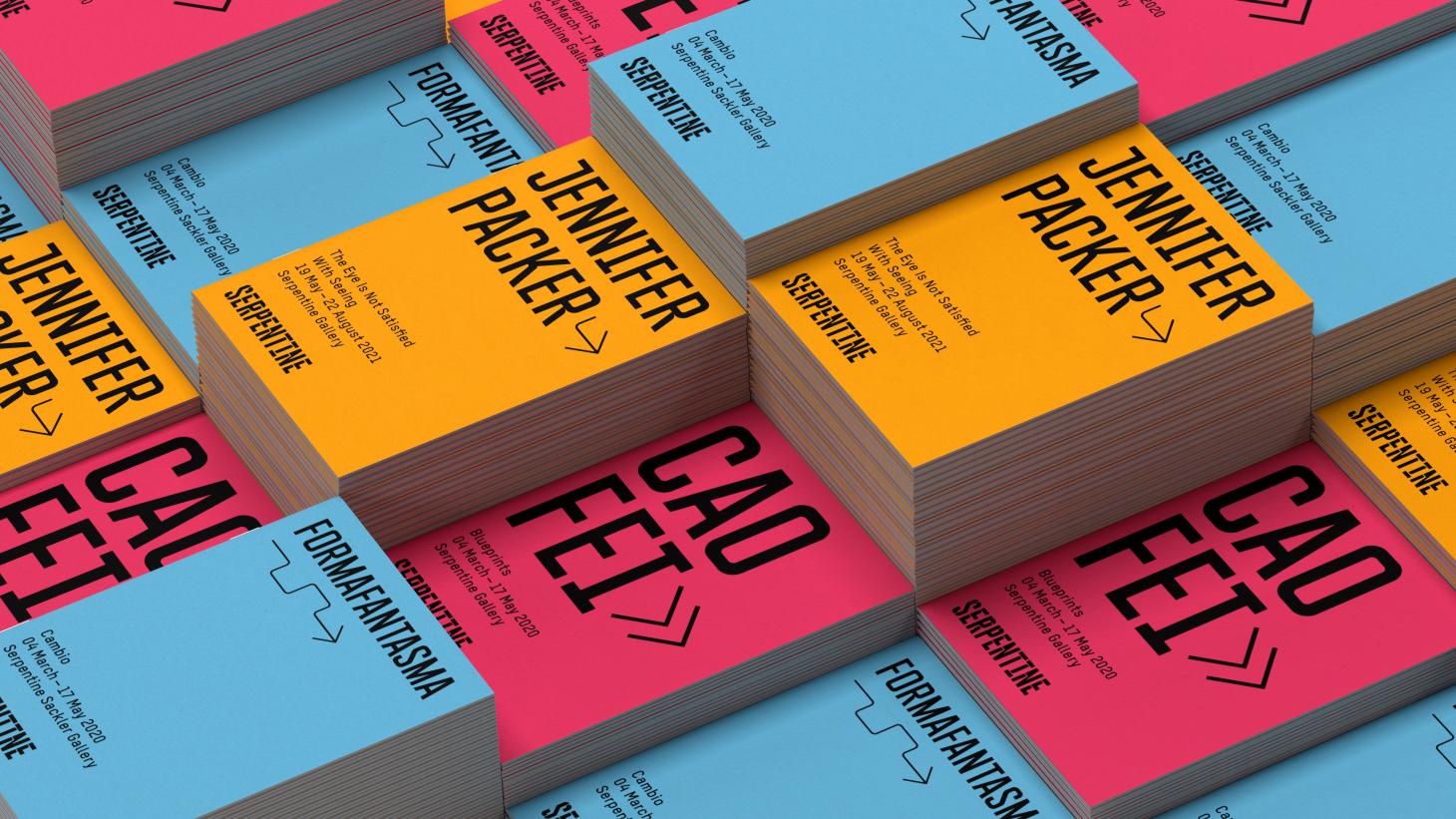
Top, posters for painter Jennifer Packer's recent exhibition at Serpentine Galleries, featuring the visual identity by Hingston Studio, courtesy of Hingston Studio. Above, mock-ups of the galleries' exhibition literature, featuring larger type in Platanus and smaller type in T-Star.
He created a modular identity to reflect Serpentine Galleries’ duality – championing cutting-edge art and ideas in serene surroundings, occupying a small space compared to its peers while punching well above its weight. The flexible construction of his visual system, and of the individual letterforms, ‘allows a process of deconstruction, a kind of open invitation for artists and practitioners to reinterpret the identity in infinite ways’. On a more practical level, it also lends itself to versatile applications across social media, on the galleries’ website, digital screens within physical spaces, and the physical spaces themselves.
As part of his research, Hingston looked at patterns found in nature – growth rings from trees, wind patterns, the movement of water, and light passing through leaves – and then applied these behavioural characteristics to the typographic system. The headline typeface is bespoke, with bold, condensed letterforms that evoke strength and urgency. Its title, Platanus, derives from the Latin name for the London Plane tree, which dominates the treescape of Hyde Park. ‘Knowing that it will predominantly be in-house teams who use [it] on a day-to-day basis, the naming serves as a gentle reminder to the relationship the identity has to the park and its surrounding environment,’ Hingston says.
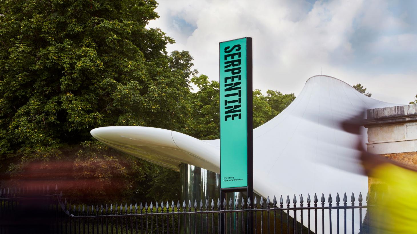
Hingston Studio's wordmark for Serpentine Galleries, set in the bespoke typeface Platanus and with radial cuts to add a sense of movement, is seen here in front of Zaha Hadid's extension to the Serpentine North Gallery.
Within the wordmark, Hingston introduced radial cuts to the Platanus letterforms, adding a sense of movement and further referencing the irregular geography of the Serpentine Lake. Elsewhere, Platanus is complemented by two existing typefaces – Schick Toikka’s Noe, with large, wedge-shaped serifs that come to a sharp point; and Michael Mischler’s T-Star, a subtler sans serif with laterally flattened, round basic forms.
Wallpaper* Newsletter
Receive our daily digest of inspiration, escapism and design stories from around the world direct to your inbox.
Rounding off the system is an extended series of glyphs, including functional elements such as arrows and wayfinding symbols, and more playful forms that serve to add character and personality. As Hingston explains, ‘some reference the motifs you might find in the surrounding element, others act as a playful punctuation to the information system’.
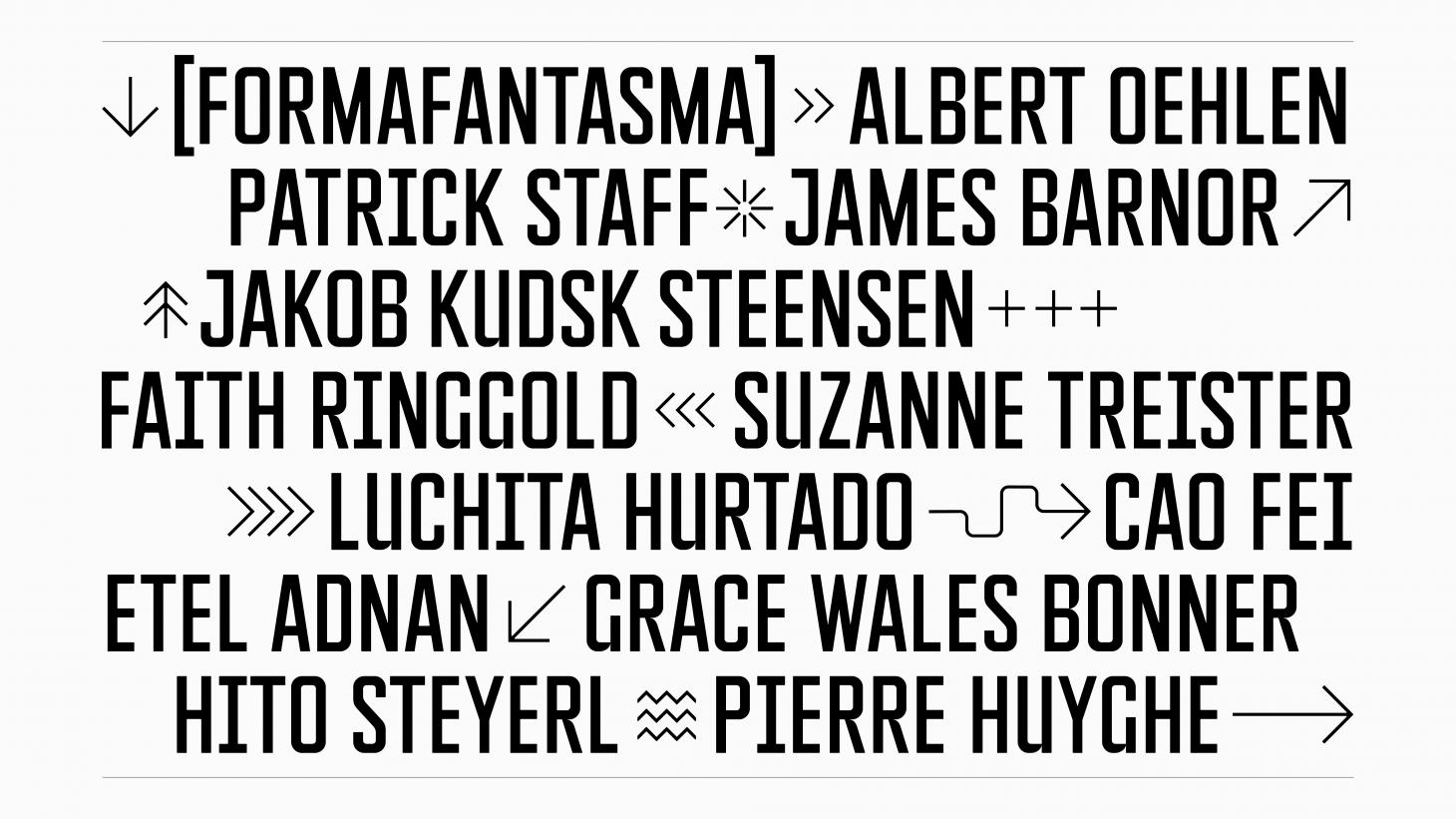
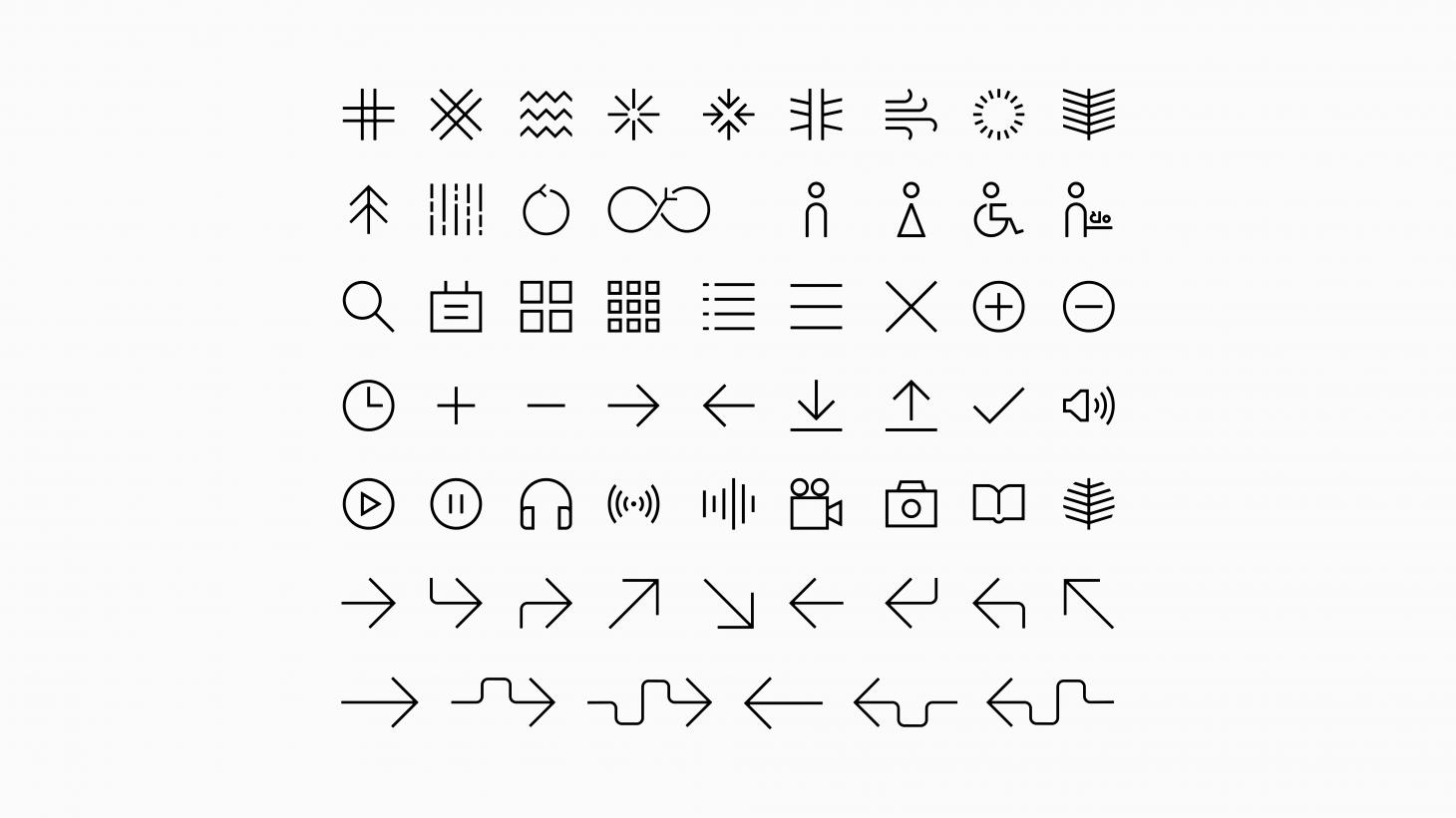
Top, names of artists and designers who have recently shown at Serpentine Galleries, set in Platanus and interspersed with glyphs designed by Hingston Studio; above, the full set of glyphs, including more functional elements and playful symbols that add character and personality.
‘Alice: Curious and Curiouser’ at the V&A museum
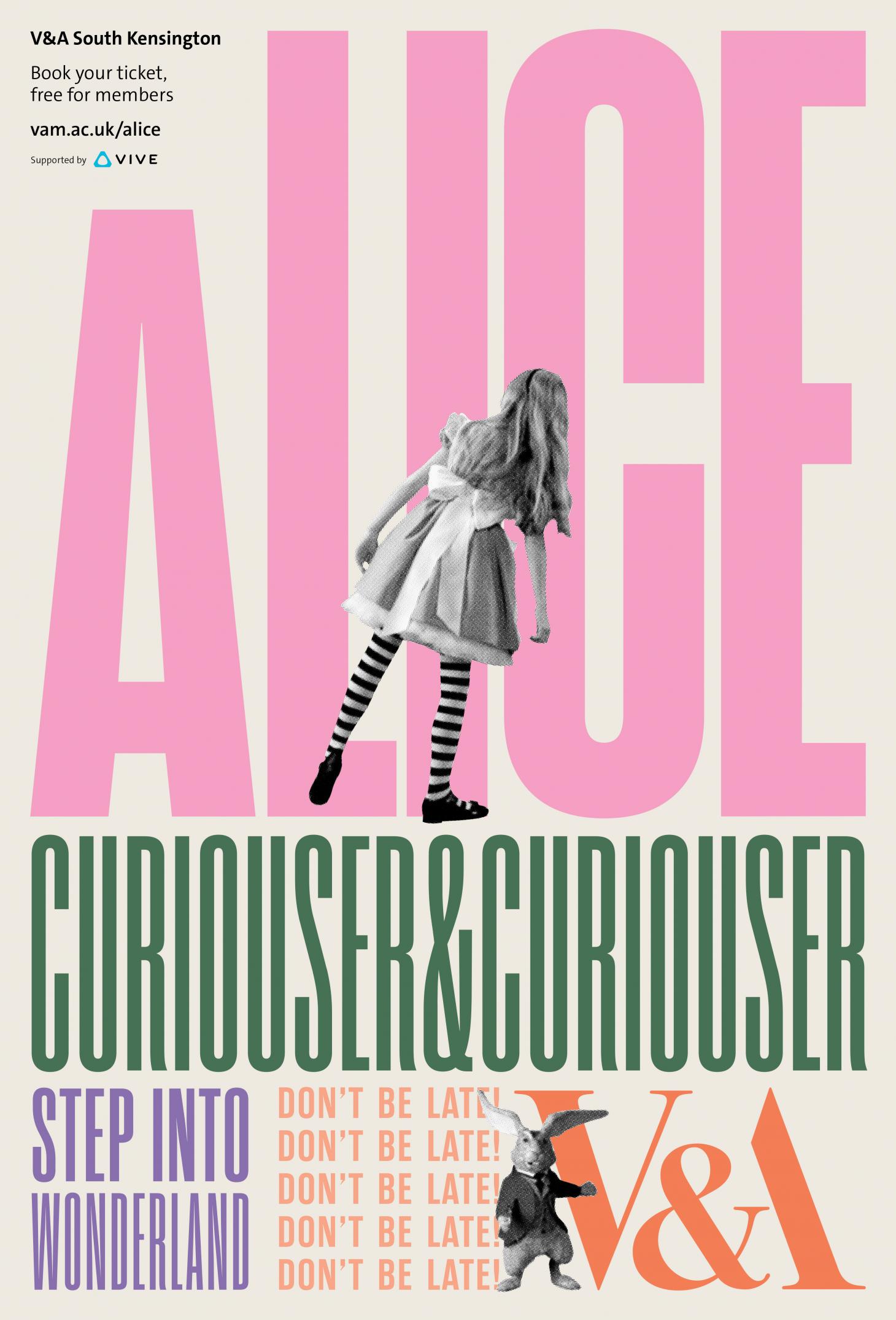
A poster for the V&A’s exhibition ‘Alice: Curious and Curiouser’, designed by Hingston Studio. The character of Alice was filmed in live action, while the rabbit at the bottom was developed with puppeteers Jonny & Will.
A stone’s throw from Serpentine Galleries, Hingston has designed the visual identity for the V&A’s blockbuster exhibition, ‘Alice: Curious and Curiouser’. The show explores the origins, adaptations and reinventions of Lewis Carroll’s Alice in Wonderland, charting its evolution from manuscript to a global sensation, so its identity is suitably ambitious.
The museum wanted ‘to express its own interpretation of this iconic cultural figure, but also connect in a much wider sense with a multigenerational audience’, says Hingston. The timings of the show added to the burden of expectation; originally scheduled for 2020, it wound up opening in May 2021, when London’s museums could finally welcome the general public again after many months of closure: ‘So the campaign had to serve a dual purpose – announcing the Alice show, but also welcoming visitors back into the physical space.’
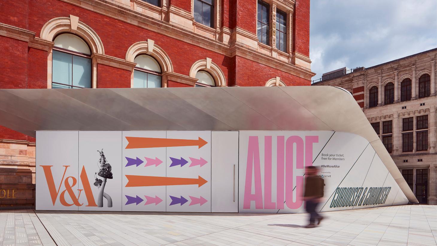
Promotional material for the 'Alice: Curious and Curiouser' exhibition in the V&A's Exhibition Road entrance courtyard.
The messaging was complex, ‘and rather than try and work around that, we made a strategic decision to embrace it in a celebratory manner and flip the conventional hierarchy – text and messaging would become hero’, Hingston recalls. So it made sense to explore historical examples of design that featured a contrasting mix of messaging and typography; in particular, vintage circus posters with proclamations such as ‘roll up, roll up’, and ‘the greatest show is coming to town’. These posters would offer an expressive framework for the language of the Alice show, but also offer an opportunity to introduce various characters from the book.
Within the visual identity, the calls to action became ‘Step Into Wonderland!’, ‘See the Amazing…’ and ‘Don’t be Late!’ Another departure from the vintage circus posters is the use of a sans serif, condensed font, which puts a fresh spin on the typology and allows it to feel more elastic in behaviour.
RELATED STORY
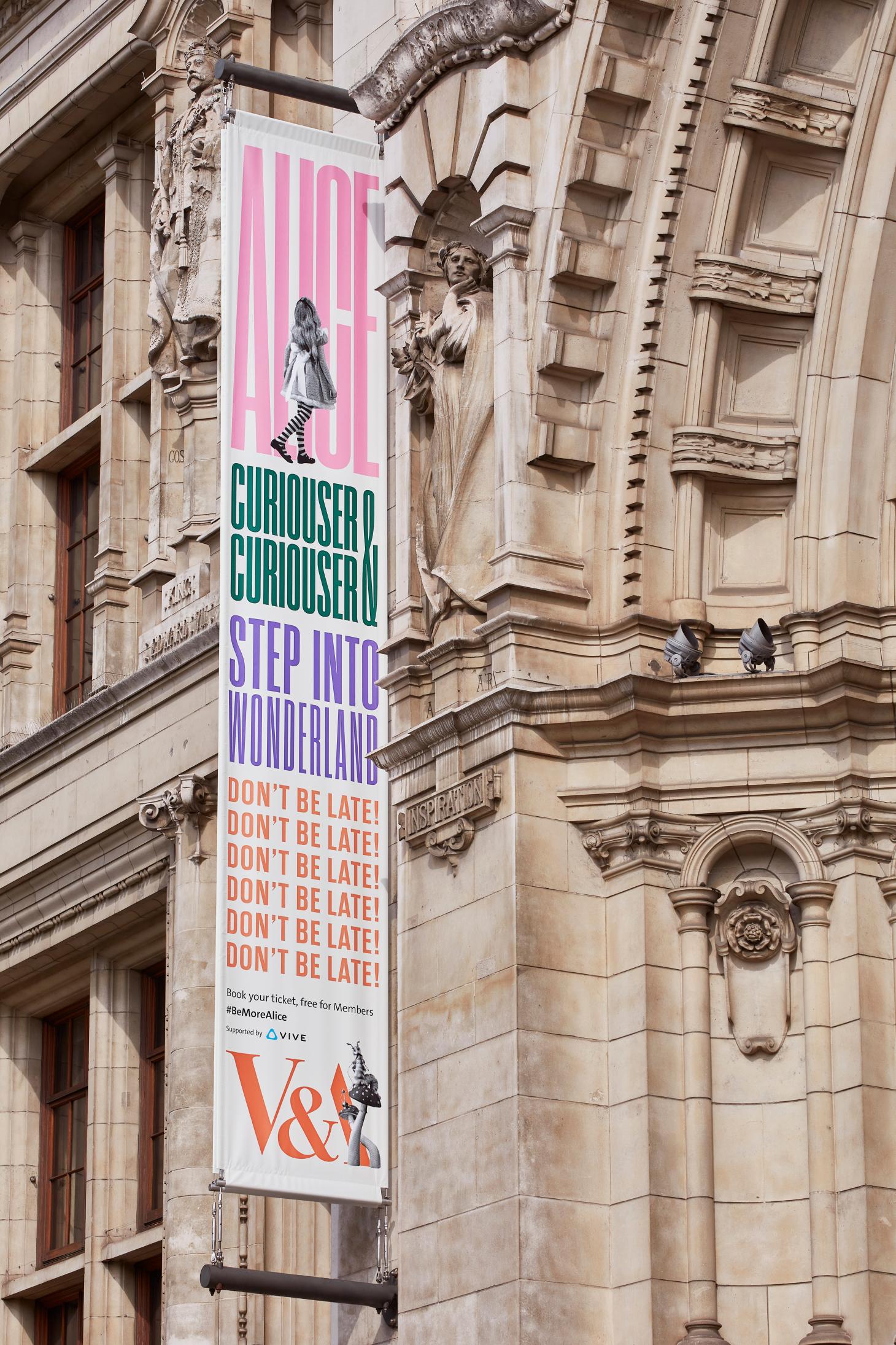
A banner for the 'Alice: Curious and Curiouser' exhibition outside the V&A main building on Cromwell Road courtesy of Hingston Studio
‘Different segments of messaging are treated as a series of building blocks, which are reconfigured, scaled and stretched to fit any given format in both digital and print. This in turn makes reference to the book’s famed exploration of perspective and shifting scales and size,’ Hingston explains.
Complementing the typography is a cast of characters from the book, including Alice herself, the rabbit, and the caterpillar. The two animals were created in collaboration with BAFTA-nominated puppeteers Jonny & Will in another meticulous process. Natural references such as fur textures and caterpillar skin were developed into sketches and then clay maquettes, and finally remodelled in CGI so they could be moved and manipulated in any way necessary for the visual design.
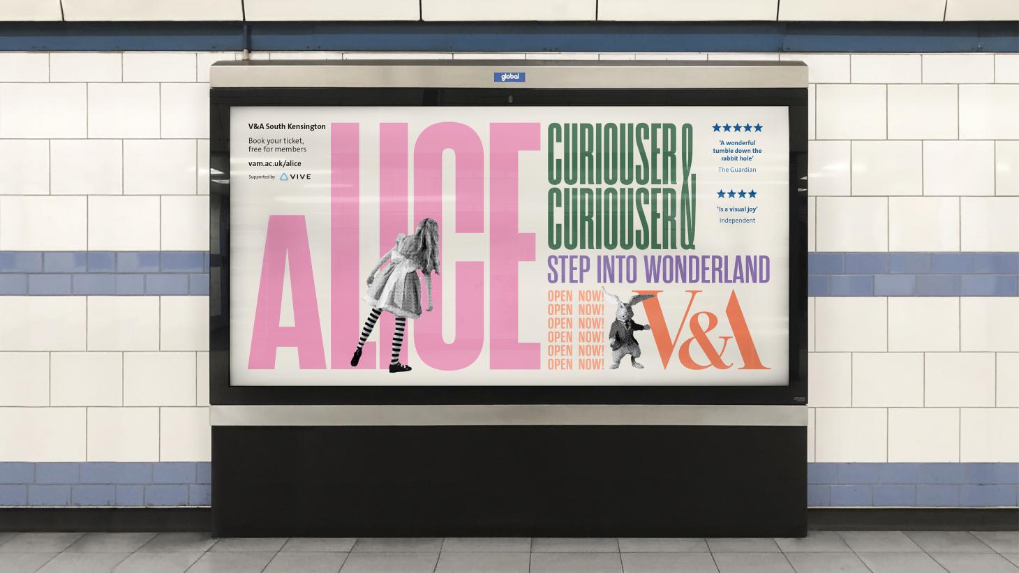
Advertising for the V&A’s ‘Alice: Curious and Curiouser’ exhibition on the London Underground courtesy of Hingston Studio
Meanwhile, Alice was cast as a young actress who was filmed in live action, always from behind so her face would be concealed. ‘Alice means so many different things to so many different people, [so] maintaining this level of ambiguity around her character, whilst also retaining some obvious visual clues in her wardrobe, was essential to us.’
Hingston’s identity went beyond the V&A’s walls and promotional material to include the main entrance to the show, which leads down the striking wooden staircase in the museum’s Exhibition Road Quarter by AL_A. ‘It was an opportunity to transform the entrance into something more unexpected,’ explains Hingston. ‘We designed a glyph set of arrows which could act as a signposting device to help guide visitors in and down the space. These multidirectional arrows were also a nod back to the book itself – where Alice is being pushed and pulled along different paths.’
‘Alice: Curious and Curiouser’, until 31 December 2021, Victoria and Albert Museum, Cromwell Road, London, vam.ac.uk
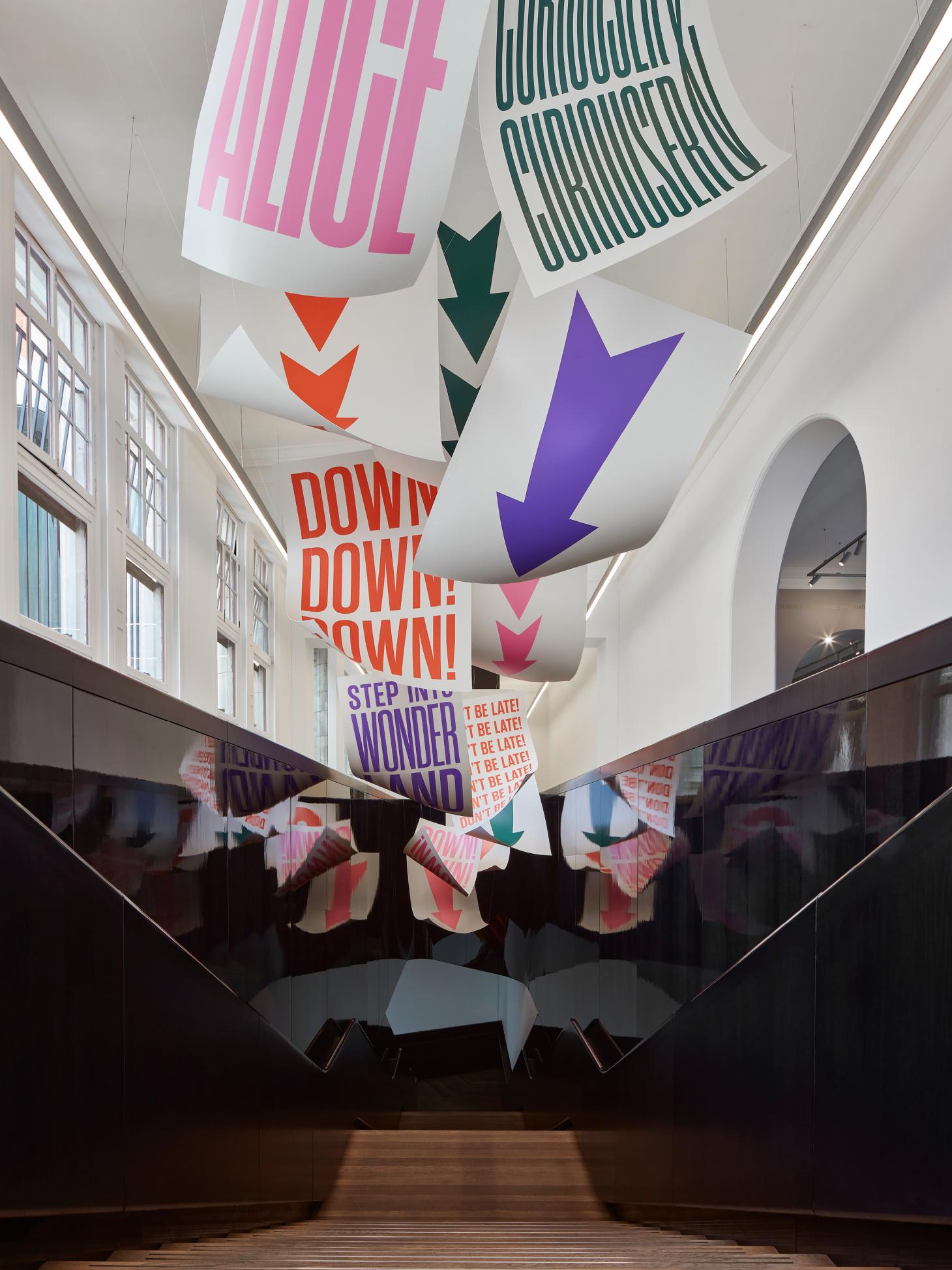
Hingston Studio’s intervention at the entrance and staircase leading to the V&A 'Alice: Curious and Curiouser' exhibition. courtesy of Hingston Studio
the V&A’s ‘Alice: Curious and Curiouser’ exhibition, and his newsstand cover for Wallpaper’s August 2021 issue
Wallpaper* August 2021 issue cover
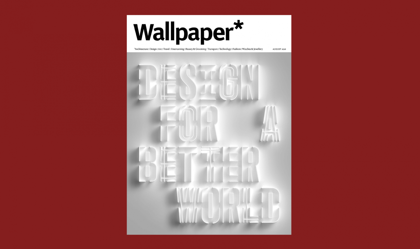
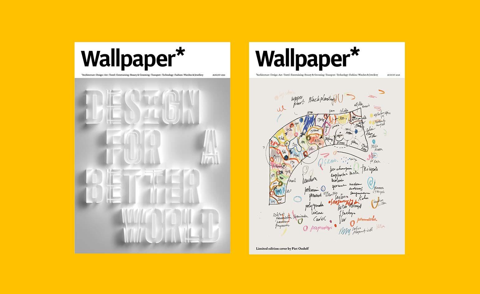
Hingston Studio’s cover design Wallpaper’s August 2021 ’Design for A Better World’ issue
Wallpaper’s relationship with Hingston dates back a decade – he was first interviewed in our April 2011 issue about a bespoke typeface and phone icons he’d created for a new Danish mobile phone company called Æsir, and in 2012 he was one of 30 cover artists (selected from 20,000 submissions) for our August Handmade issue. We have long been admirers of his ability to combine striking typography and distinctive forms with contextual rigour, so when we decided that we wanted a typographic newsstand cover for our August 2021 ‘Design for a Better World’ issue, he was our first port of call.
‘It’s wonderful to be invited back to create a cover for what is the new Handmade initiative – it’s a fantastic issue, featuring some incredible thinkers. Plus I share the honour with Piet Oudolf [who created the issue’s limited-edition cover], of whom I’m a big fan,’ says Hingston.
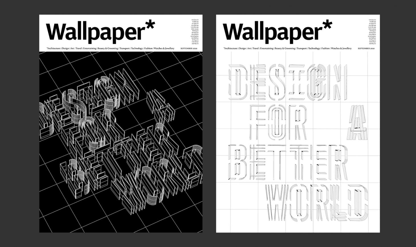
Alternative covers for Wallpaper's August 2021 issue by Hingston Studio
The issue celebrates the creative leaders and projects that are addressing some of the biggest challenges and concerns of our time – among them the Turner-Prize nominated Cooking Sections, who advocate for more sustainable food supply chains, architect Fernanda Canales, whose social housing encourages us to reconsider the meaning of luxury, and artist Jakob Kudsk Steensen, whose epic VR experiences foster attention and engagement with the natural world. In response, Hingston wanted to ‘convey this notion of something that was incomplete, or a work in progress’.
Hingston and his team recalled their early development work for the Serpentine:
We were talking a lot about this notion of flexible systems, or rather, frameworks that were open and invited re-interpretation. That concept definitely seemed to resonate with the themes of the issue, as does the idea of something which is evolving or fluid
The cover typeface, which Hingston had started to draw in 2020 as part of the Serpentine identity, takes on a new appearance: ‘The more open letterforms invite the viewer to fill in the gaps, so there’s an interesting game at play here.’ Because the letterforms are of equal width, they could be treated like a series of building blocks that shift around the grid, which allowed for a more dynamic configuration – two of the lines are indented, and there is a double space between ‘for’ and ‘a’.
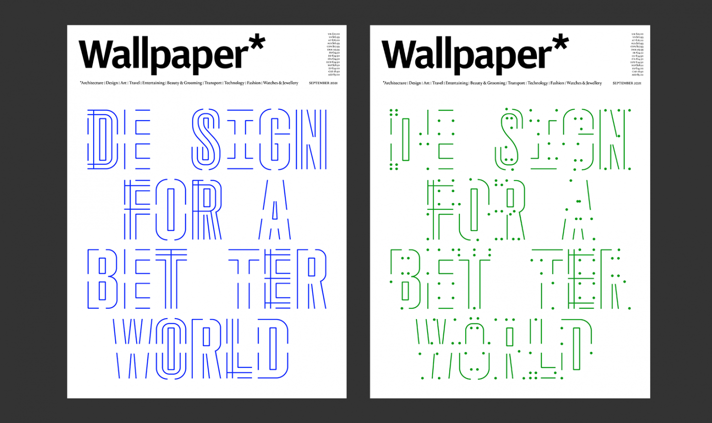
Alternative covers for Wallpaper's August 2021 issue by Hingston Studio
Early iterations of the cover design were two-dimensional, ‘about plotting points, defining parameters, and then testing how much or how little was needed to retain legibility’. But Hingston eventually decided on three-dimensional forms, to suggest ‘something more architectural, more physical, like an emerging structure’.
Unlike Platanus, the Wallpaper* cover typeface doesn’t yet have a name. ‘It’s an evolving identity, so I’m sure it will continue to take on a number of manifestations in future projects,’ Hingston says. ‘We’ve also been discussing the possibility of making it freely available. I’m interested in how other designers or individuals might choose to interpret the template.’
The August 2021 issue of Wallpaper* is now available as a free PDF download
INFORMATION
With thanks to Gillian McVey
TF Chan is a former editor of Wallpaper* (2020-23), where he was responsible for the monthly print magazine, planning, commissioning, editing and writing long-lead content across all pillars. He also played a leading role in multi-channel editorial franchises, such as Wallpaper’s annual Design Awards, Guest Editor takeovers and Next Generation series. He aims to create world-class, visually-driven content while championing diversity, international representation and social impact. TF joined Wallpaper* as an intern in January 2013, and served as its commissioning editor from 2017-20, winning a 30 under 30 New Talent Award from the Professional Publishers’ Association. Born and raised in Hong Kong, he holds an undergraduate degree in history from Princeton University.
-
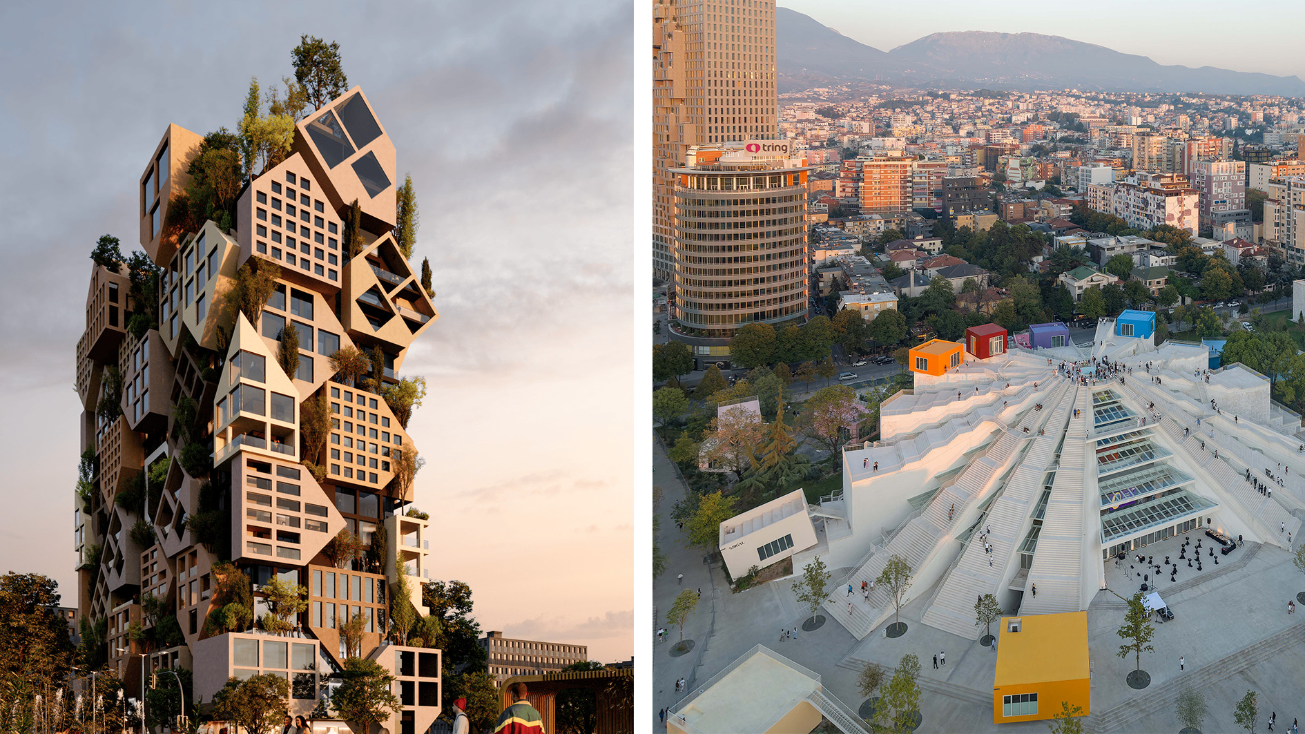 Isolation to innovation: Inside Albania’s (figurative and literal) rise
Albania has undergone a remarkable transformation from global pariah to European darling, with tourists pouring in to enjoy its cheap sun. The country’s glow-up also includes a new look, as a who’s who of international architects mould it into a future-facing, ‘verticalising’ nation
By Anna Solomon
-
 The Lighthouse draws on Bauhaus principles to create a new-era workspace campus
The Lighthouse, a Los Angeles office space by Warkentin Associates, brings together Bauhaus, brutalism and contemporary workspace design trends
By Ellie Stathaki
-
 Extreme Cashmere reimagines retail with its new Amsterdam store: ‘You want to take your shoes off and stay’
Wallpaper* takes a tour of Extreme Cashmere’s new Amsterdam store, a space which reflects the label’s famed hospitality and unconventional approach to knitwear
By Jack Moss
-
 Preview the Jameel Prize exhibition, coming to London's V&A, with a focus on moving image and digital media
The winner of the V&A and Art Jameel’s seventh international award for contemporary art and design inspired by Islamic tradition will be showcased alongside shortlisted artists
By Smilian Cibic
-
 Looking at people looking at art: inside the mind of a gallery attendant
Visitor experience workers at London’s Tate Modern, Serpentine, Barbican and V&A share what it’s like to watch people looking at art during a time of changing attention spans and rising vandalism
By Kyle MacNeill
-
 Gerhard Richter unveils new sculpture at Serpentine South
Gerhard Richter revisits themes of pattern and repetition in ‘Strip-Tower’ at London’s Serpentine South
By Hannah Silver
-
 Tomás Saraceno’s spider-led show at Serpentine has legs, and lots of them
‘Web(s) of Life’, the first major UK show by Tomás Saraceno, is a living, collaborative and multi-species call to climate action involving everything from dog-friendly sculptures to ‘spider diviners’ – but no phones allowed
By Harriet Lloyd-Smith
-
 Steve McQueen to screen his harrowing film 'Grenfell' at London’s Serpentine
Acclaimed film director and artist Steve McQueen will screen his film, Grenfell, at London’s Serpentine South gallery (7 April-10 May 2023), six years after the Grenfell Tower block blaze killed 72
By Harriet Lloyd-Smith
-
 Supergraphics pioneer Barbara Stauffacher Solomon: ‘Sure, make things big – anything is possible'
94-year-old graphic designer Barbara Stauffacher Solomon talks radical typography, motherhood, and her cool welcome for St Moritz
By Jessica Klingelfuss
-
 Montreux Jazz Festival posters: a visual history
As artist Guillaume Grando (SupaKitch) unveils his poster for the 57th Montreux Jazz Festival (30 June - 15 July 2023), we reflect on the most memorable designs since 1967, including from David Bowie to Andy Warhol and Camille Walala
By Harriet Lloyd-Smith
-
 Barbara Chase-Riboud at Serpentine: alternative monuments, parallel histories
‘Infinite Folds’ at Serpentine North Gallery celebrates Barbara Chase-Riboud, the American artist, novelist and poet who has spent more than seven decades pondering history, memory, and the public monument
By MZ Adnan