The Met and J.Hannah create Surrealist nail polish
The Metropolitan Museum of Art has collaborated with LA-based jewellery brand J.Hannah to create nail polish shades inspired by ‘Surrealism Beyond Borders’

Receive our daily digest of inspiration, escapism and design stories from around the world direct to your inbox.
You are now subscribed
Your newsletter sign-up was successful
Want to add more newsletters?
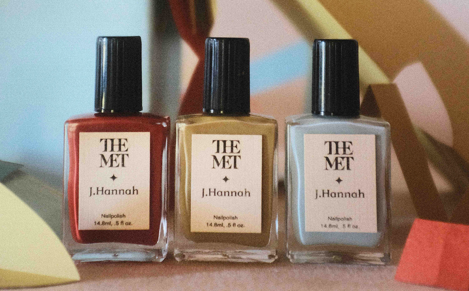
J.Hannah, a brand best known for its modern interpretations of heirloom jewellery and jazzy nail polish shades, has just launched a line of polishes in collaboration with The Metropolitan Museum of Art inspired by the museum’s new exhibition, ‘Surrealism Beyond Borders’.

The new collection comes a year after J.Hannah’s first collaboration with The Met, on a range of black, pearl, and glittery metallic shades inspired by the Costume Institute’s ‘About Time’ exhibition. The Met Surrealist Polish Set features a more vibrant range of colours, which J.Hannah’s founder, Jess Hannah Révész, describes as ‘twists on vivid shades that were at once familiar and slightly strange, like a dream you can’t quite remember’.
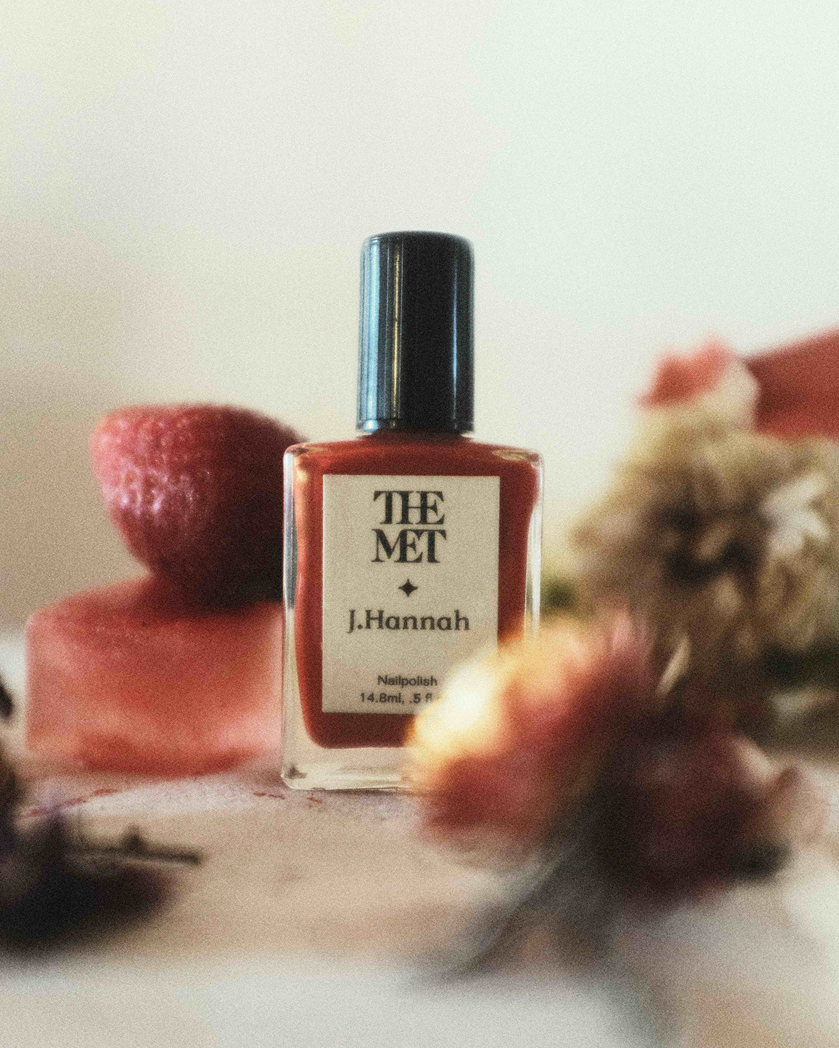
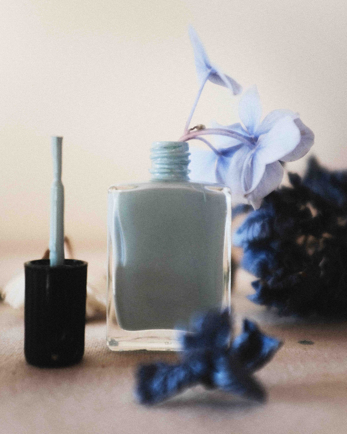
Explaining the thought process behind each of the three shades, Révész notes that Carnelian, a faded tomato red, ‘is a reference to the symbolic role that red plays in the Surrealist movement, an iconic statement in the form of pigment’. Prim, a soft powdery blue, is ‘an ode to unmoored sky [and] a nod to the familial nickname of Surrealist artist Leonora Carrington’.

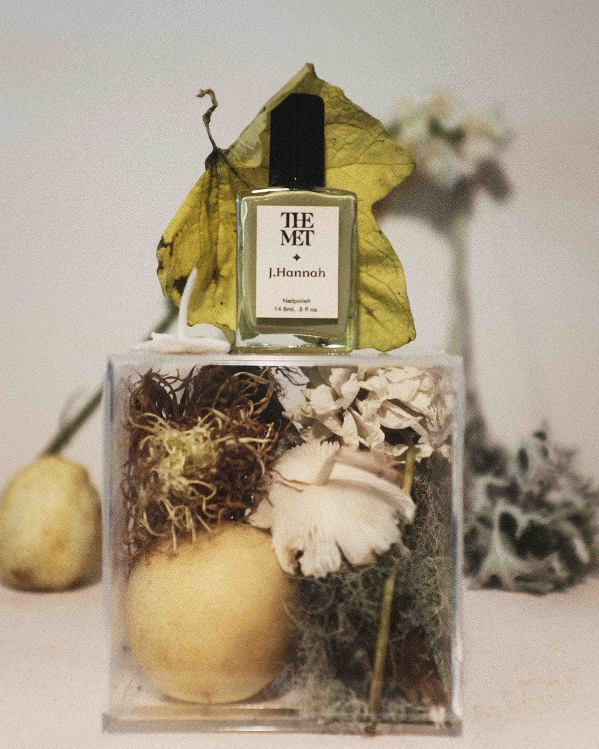
Meanwhile, Enigma, a yellow-toned artichoke green, ‘hints at Surrealism’s deep strangeness, an embrace of the unsettling, uneasy delve into the subconscious’.
Even before The Met collaborations, J.Hannah has looked to art to inspire its singular nail polish shades. Some of its most memorable colours include Hepworth, a taupe shade inspired by the British sculptor’s muted palette; and Agnes, a delicate pink drawn from the Minimalist works of Agnes Martin.

‘We’re guided by colour as idea,’ says Révész, ‘chasing the possibility of what a feeling or concept might look like in visual form, rather than holding an allegiance to pure optics or trend. As a result, we’ve been delighted to find an expansive beauty in overlooked or untraditional shades or, in some cases, colours that are considered outright “ugly” or boring.’
INFORMATION
Receive our daily digest of inspiration, escapism and design stories from around the world direct to your inbox.
Mary Cleary is a writer based in London and New York. Previously beauty & grooming editor at Wallpaper*, she is now a contributing editor, alongside writing for various publications on all aspects of culture.