Wallpaper* Design Awards 2025: Charli XCX’s album campaign was a masterclass in culturally impactful marketing
Described as ‘four blurry letters centered in a puke-green square’, Charli XCX’s 'Brat' album campaign is more than just a colour, but a way of life
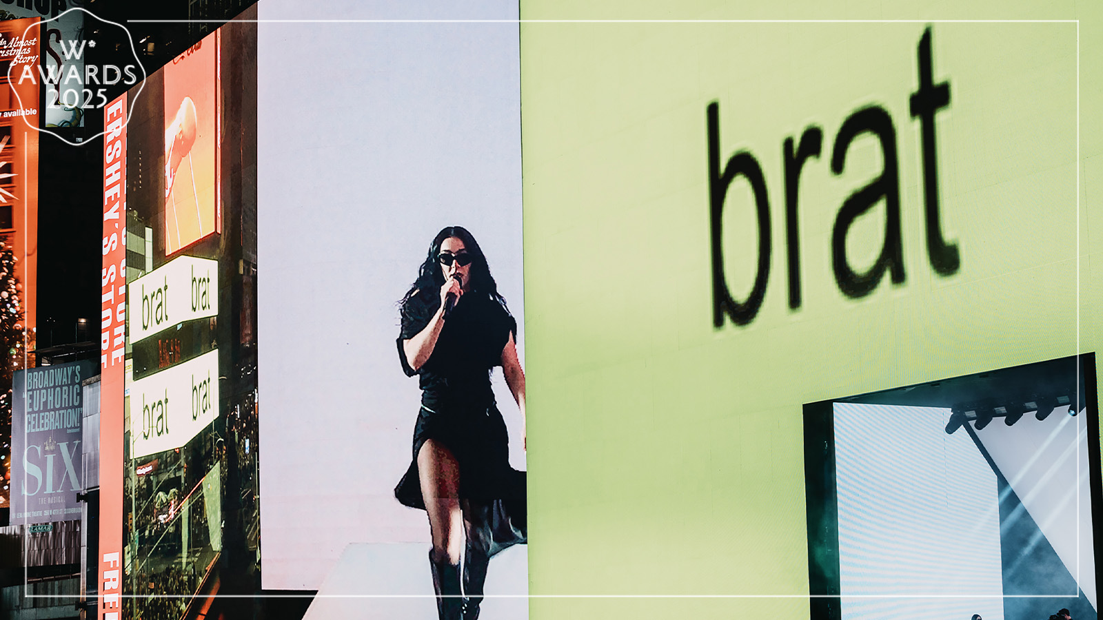
In the six weeks following the June launch of Charli XCX’s Brat, the campaign behind the album achieved cultural ubiquity. It became a hot topic among a public who, until that point, had likely barely heard of the singer. The pivot from fan bubble to part of the ether was Charli XCX’s reaction on X to Kamala Harris’ bid for the US presidency, posting ‘kamala IS brat’. The Harris team responded by revamping the backdrop of its X page in what has become known as ‘brat green’. From there, a mainstream phenomenon was born.
How Charli XCX’s Brat became a mainstream phenomenon
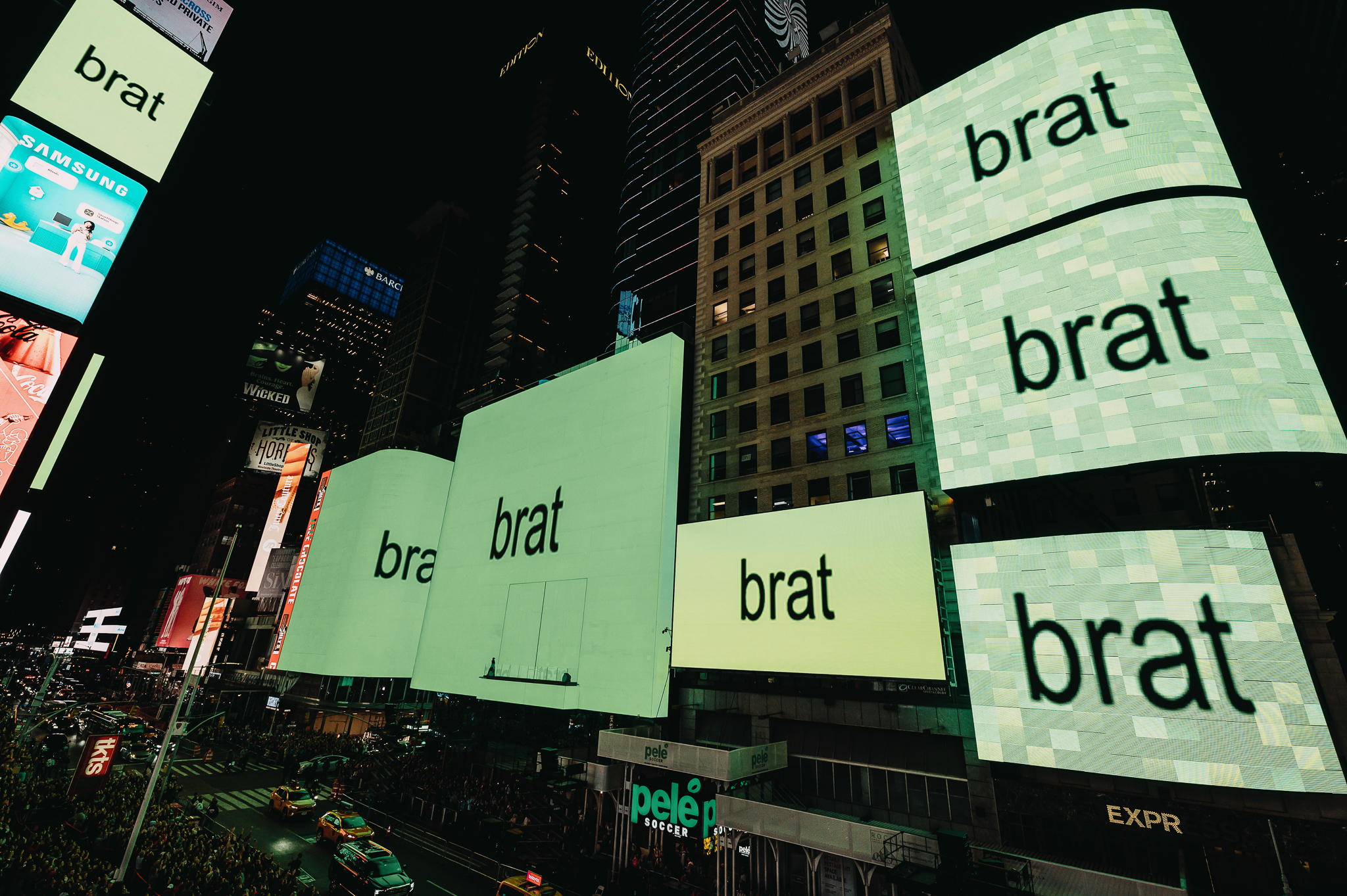
Charli XCX realised the design for the brat concept with Brent David Freaney, the founder of Manhattan-based studio Special Offer Inc. On 29 July, The New York Times published an article titled, ‘You Can’t Escape This Color’, in which the design was described as ‘four blurry letters centered in a puke-green square’. Interviewed for the same piece, Freaney said, ‘Charli had comped up what she wanted and was like, “This is what I think it should be”. Truthfully, as a designer, I was a little bit like: OK?’
Said brat/puke green is, in fact, Pantone colour 3570 C, a hue that Charli XCX and her team opted not to protect with copyright. This was a brilliant move as the key to the agility of the campaign is the accessibility of its colour. Meanwhile, the blurred typeface is Arial, a sans-serif alternative to Helvetica. Originally released by Monotype in 1982, it was one of four fonts shipped with Microsoft Windows 3.1 in the early 1990s. It was later shipped with Microsoft Office, from 1999-2016, when it was dropped for underperforming. As a result, Arial has the peculiar quality of being everywhere, while also, to a certain extent, being redundant.
The blurring of the letters also has a whiff of the past. It feels like a throwback to turn-of-the-millennium branding exercises, such as that for Tate Modern by design firm Wolff Olins. Back then, in 1999, it was clear that the digital realm would become increasingly important in all aspects of our lives, yet no one understood what that meant. Graphic designers responded to the prevailing uncertainty literally, with vague edges. In the NYT article, Freaney mentions the early noughties social networking site Myspace as an inspiration, with its 100 x 100 pixel user icon, explaining that ‘the blur came from designing it at a really small scale and just blowing it up. We did it at 100 pixels by 100 pixels, 72 dpi’.
‘Charli had comped up what she wanted and was like, “This is what I think it should be”. Truthfully, as a designer, I was a little bit like: OK?’
Brent David Freaney
Charli XCX and Freaney are millennials, born in 1992 and 1985 respectively, so Myspace would have been the social media environment of their teens and early twenties. With hindsight, it feels like an age of innocence and, for them, it is apparently a source of nostalgia. Another throwback, mining even deeper into nascent digital culture, is the song credit sheet for the vinyl version of Brat, which comes as an insert printed on dot matrix paper.
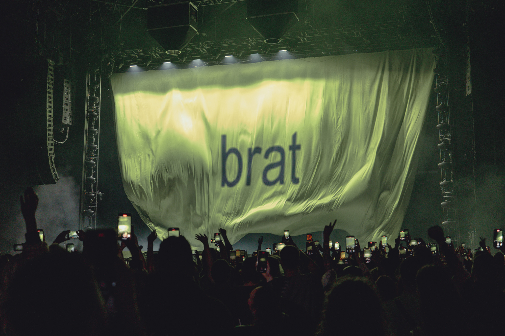
This created some confusion among youngsters who had never seen material of this kind, leading to discussions on sites such as Reddit as to whether it was included in error. Significantly, the retro design is absolutely in keeping with its music. Brat is a fusion of Charli XCX’s lifelong artistic influences, ranging freely and fabulously between hard techno and sugary pop.
The album’s design and musical content may be embedded in the past, but the campaign around it was up-to-the-minute innovative. Erecting a large brat-green wall in Greenpoint, Brooklyn, weeks before its release, Charli XCX used the space to update fans, meanwhile encouraging said fans to broadcast her messages far and wide.
Wallpaper* Newsletter
Receive our daily digest of inspiration, escapism and design stories from around the world direct to your inbox.
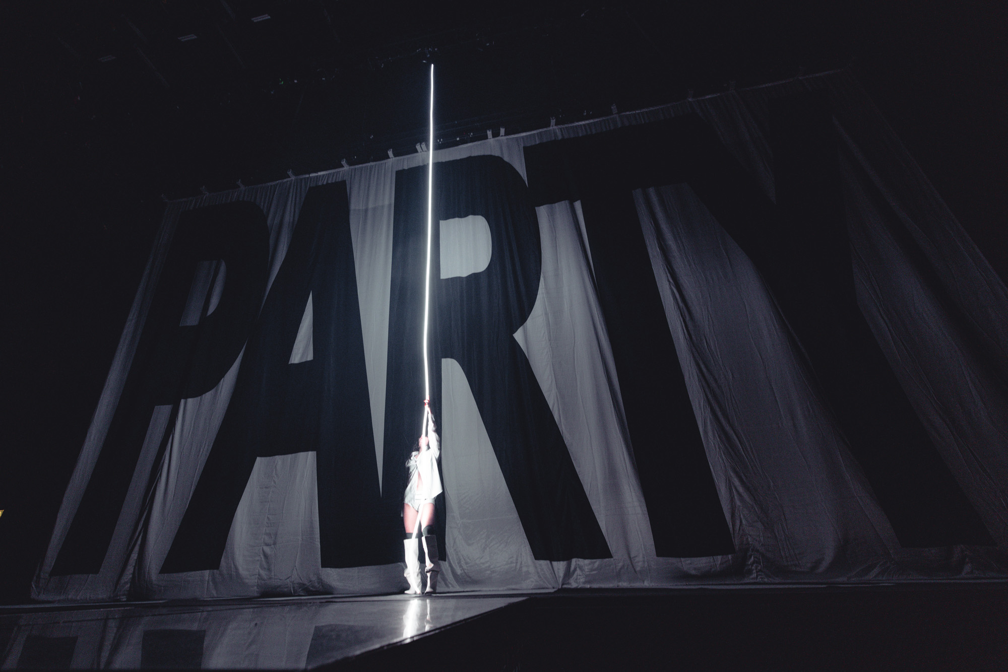
Spawning imitation walls worldwide, it was a masterclass in the deployment of real space with the aim of occupying virtual space. And, in an even more significant move, Charli XCX changed the online appearance of her previous albums to match Brat, placing their titles in Arial text at the centre of plain-coloured squares. For those raised to revere the singularity of record sleeve design, this strategy seems particularly rogue.
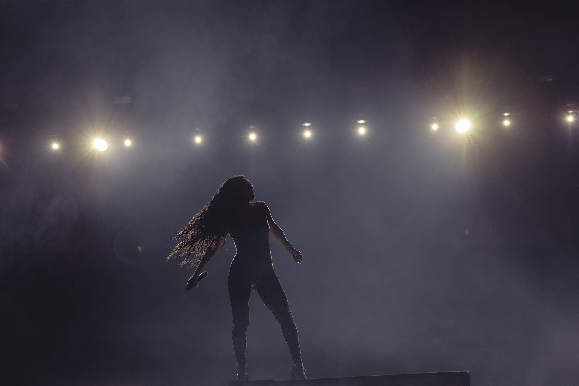
Charli XCX’s campaign ignited a summer-long discussion as to what it is to be ‘brat’ and what a ‘brat summer’ might actually involve. It evolved into too broad a subject to fully address here, but the comedian Munya Chawawa’s formulation on TikTok (‘I’m on ket right now watching Mean Girls’) sums it up. Primarily, it’s about giving in to impulses without being concerned about the consequences. Yes, it’s messy, and drugs are definitely involved, but as an alternative to the more oppressive summertime exhortations to young women, those that refer to a ‘beach body’ or a ‘hot girl’, it feels especially liberating.
Perhaps brat’s last significant flourish was its designation as the ‘word of 2024’ by the compilers of the Collins Dictionary (it was defined as someone with a ‘confident, independent and hedonistic attitude’). According to these lexicographers, it ‘resonated with people globally, and ‘brat summer’ established itself as an aesthetic and a way of life’. All this, driven by a colour that most people find positively offensive.
A version of this article appears in the February 2025 issue of Wallpaper* , available in print on international newsstands, on the Wallpaper* app on Apple iOS, and to subscribers of Apple News +. Subscribe to Wallpaper* today.
Emily King is a graphic design historian and curator who has written widely on design-related subjects. She lives in London. Recent projects include editing a monograph for the art directors M/M (Paris) and curating an exhibition of the work of the designer Richard Hollis that launched in London, toured to the Pompidou in Paris and concluded its international tour at Artists Space in New York. Emily writes for a range of publications including Frieze, Apartamento and The Gentlewoman
-
 Warp Records announces its first event in over a decade at the Barbican
‘A Warp Happening,' landing 14 June, is guaranteed to be an epic day out
By Tianna Williams
-
 Cure your ‘beauty burnout’ with Kindred Black’s artisanal glassware
Does a cure for ‘beauty burnout’ lie in bespoke design? The founders of Kindred Black think so. Here, they talk Wallpaper* through the brand’s latest made-to-order venture
By India Birgitta Jarvis
-
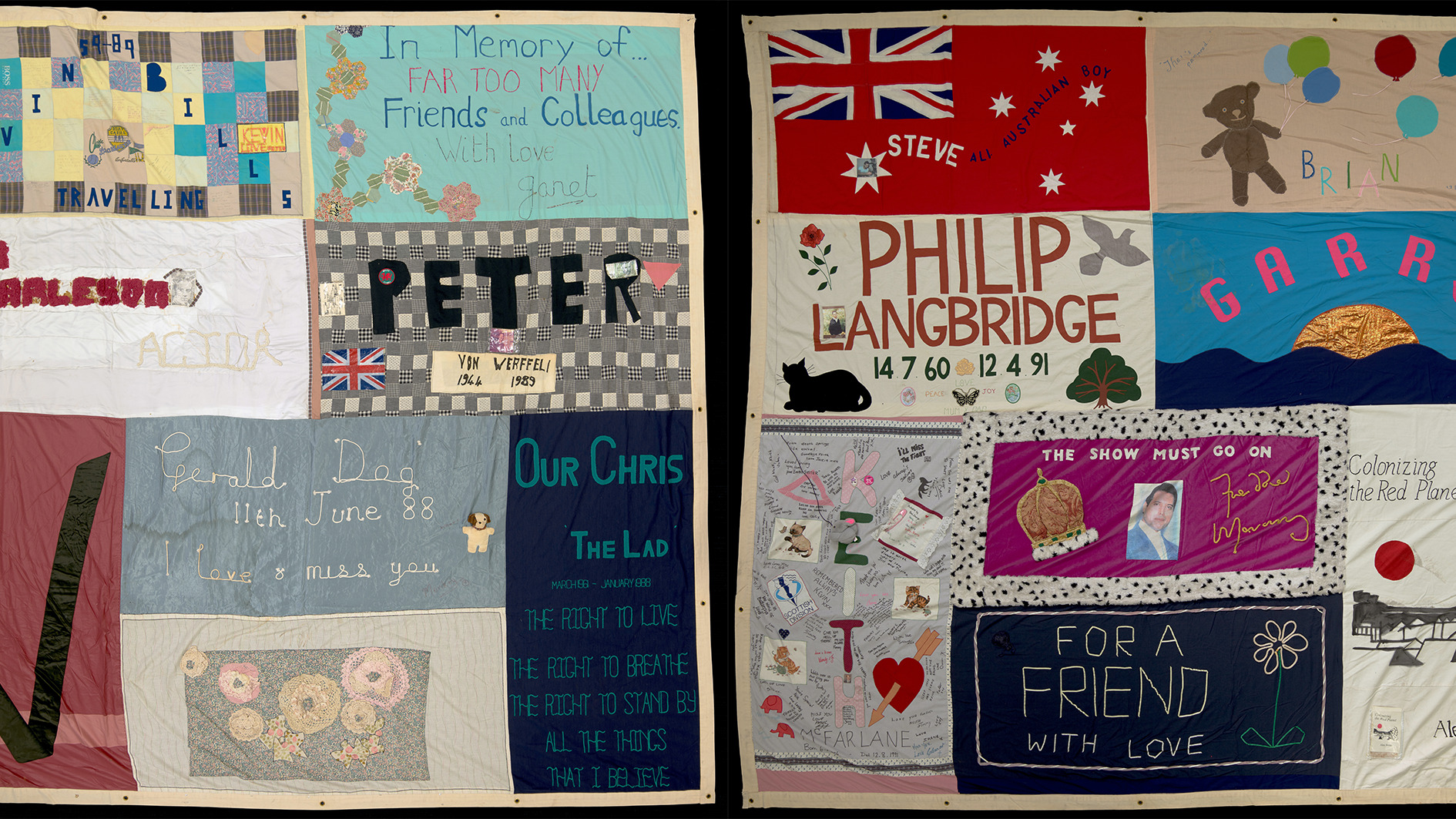 The UK AIDS Memorial Quilt will be shown at Tate Modern
The 42-panel quilt, which commemorates those affected by HIV and AIDS, will be displayed in Tate Modern’s Turbine Hall in June 2025
By Anna Solomon
-
 ‘Air Play Moon Safari’ is an audio-visual, retro-futuristic experience
With the ‘Air Play Moon Safari’ tour in full swing across Europe, the USA and Mexico for the rest of 2024, we explore the design of the French band's White Box stage
By Simon Mills
-
 At Glastonbury 2023, it’s magic mushrooms galore
At Glastonbury 2023, we speak to the minds behind a new mycelium-fuelled pavilion for the Silver Hayes area of the festival, set to become a new annual platform for creative research and development
By Harriet Lloyd-Smith
-
 Experience ‘the high’ of running with Satisfy’s vinyl drop
Paris-based sports clothing brand Satisfy launches sustainably-produced double vinyl album, The High – Improvisations
By Simon Mills
-
 Solange judges Wallpaper* Design Awards 2020
With a repertoire that – in addition to music – encompasses filmmaking, choreography, performance art, sculpture and design, Solange has lent her creative energy to judging our highest honours
By Ekow Eshun