
One consolation for the sorry state of the world has been a widespread revival of the art, application and appreciation of colour. We’ve tracked architects, artists and designers who are making a polychromatic splash in ways that would have been considered outrageously tasteless just a decade ago.

The Year of the Tiger Posters, by Cheng Peng
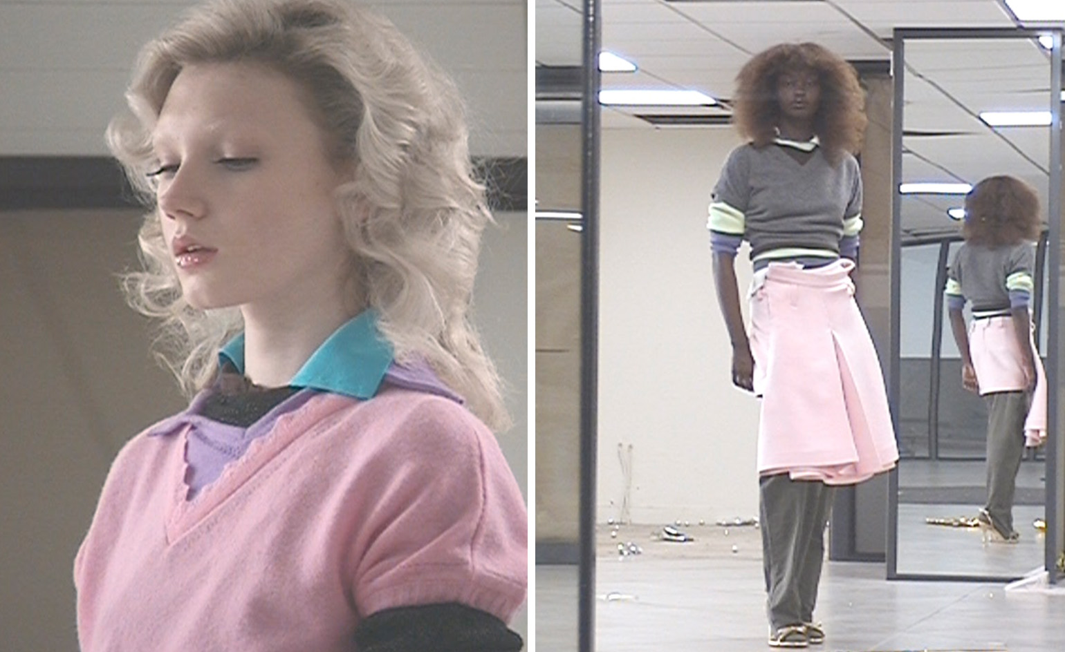
Colour Clash is a new book from Counter-Print, a boutique design publisher that respects and relishes the value, tactility and endurance of print. The book gathers together a number of graphic projects that fit this bold brief, ‘combinations that surprised, engaged, challenged and grabbed our attention – the ones that shouldn’t work but just do’.
Colour Clash: palettes that distract and disrupt

Information poster by Simin Xu
Gathering work from around the world, including posters, packaging design, corporate identities and branding, Colour Clash is a vibrant insight into the catholic tastes of the contemporary design industry, all vying to stand out from the crowd with palettes that disrupt and distract, albeit in a mostly pleasing way.

Varieté packaging by Requena
We live in an attention-overloaded era, a time when quiet good taste often finds itself at the bottom of the pile, ignored by all in the relentless searching for attention. Many of the featured designs are ephemeral, but that’s partly the point; colour catches the eye, and jarring colours stand out still further, making them a perfect choice for event branding, pop-up shops or supergraphics.

Packaging for The Scientist Coffee by HDU²³ Lab
Colour Clash also taps into the anti-aesthetics of the post-beauty world, as design disciplines have fallen out of love with modernist rigour. In addition to colours, the forms and fonts used in the book play with the prosaic and invert the quotidian, making a virtue out of the collision between the ordinary and the unexpected.

'Visible Invisible' exhibition graphics by Fakepaper
Designers represented include the French studio My Name is Wendy, Hong Kong-based Atelier Avocado, Irish designer Duane Dalton and many more.
Colour Clash, Counter-Print Books, £20, Counter-Print.co.uk
-
 All-In is the Paris-based label making full-force fashion for main character dressing
Part of our monthly Uprising series, Wallpaper* meets Benjamin Barron and Bror August Vestbø of All-In, the LVMH Prize-nominated label which bases its collections on a riotous cast of characters – real and imagined
-
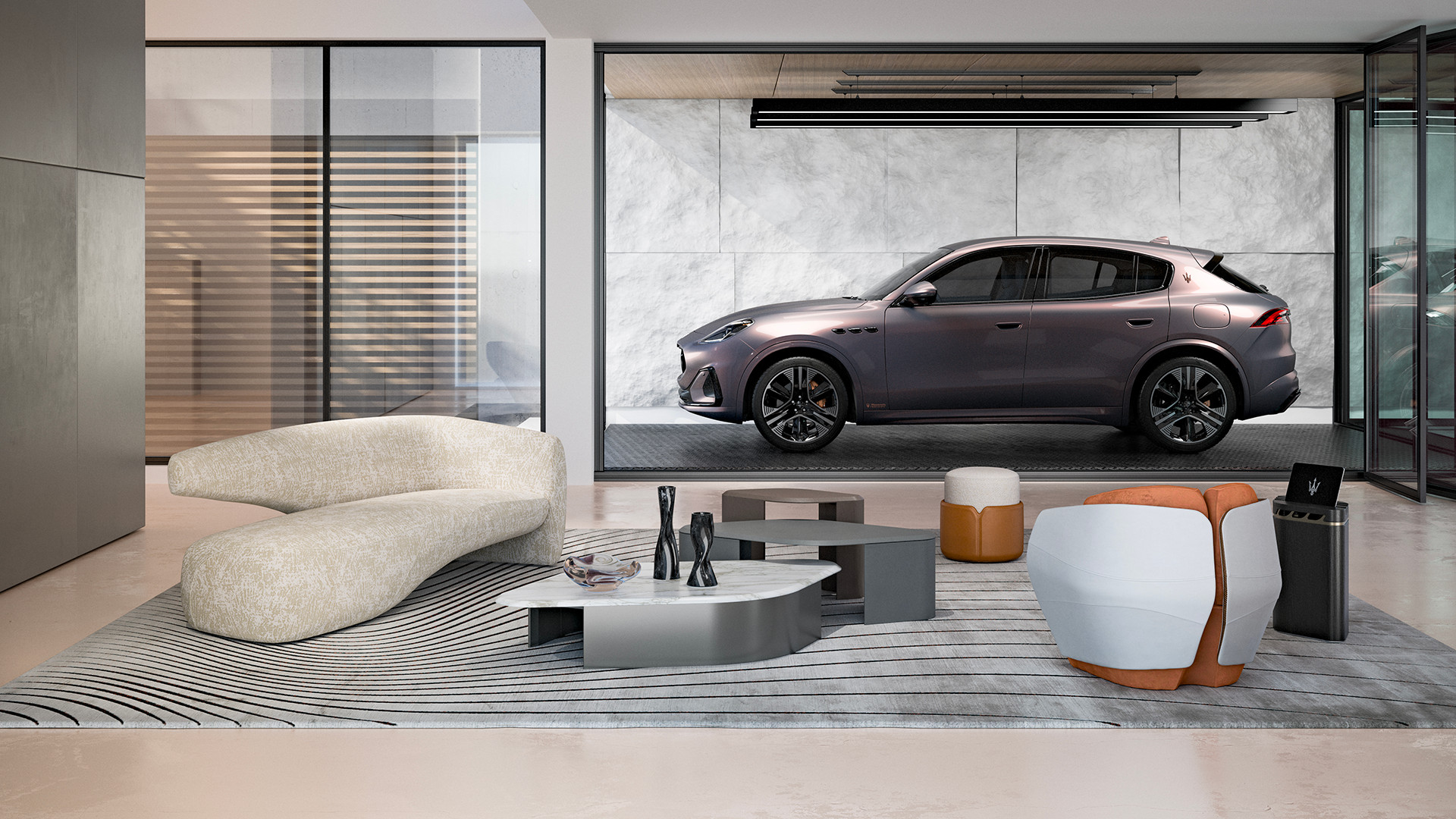 Maserati joins forces with Giorgetti for a turbo-charged relationship
Announcing their marriage during Milan Design Week, the brands unveiled a collection, a car and a long term commitment
-
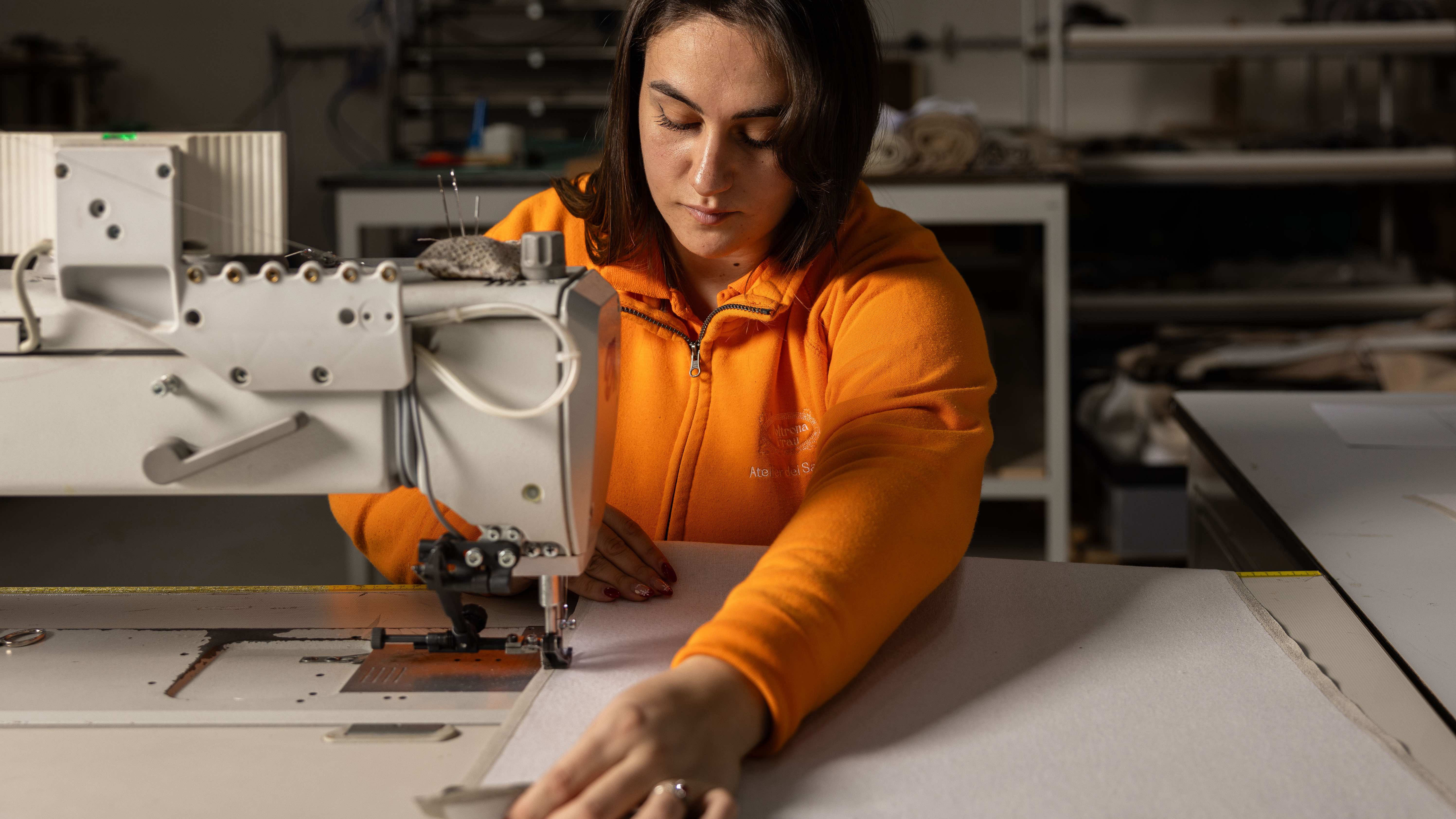 Through an innovative new training program, Poltrona Frau aims to safeguard Italian craft
The heritage furniture manufacturer is training a new generation of leather artisans


