Cooper Hewitt’s ‘Making Home’ triennial reveals an intimate side of the museum’s Gilded Age architecture
'We live and work in the Carnegie Mansion, but it's not typically something that we engage with directly in our exhibitions,' says Alexandra Cunningham-Cameron, one of the co-curators
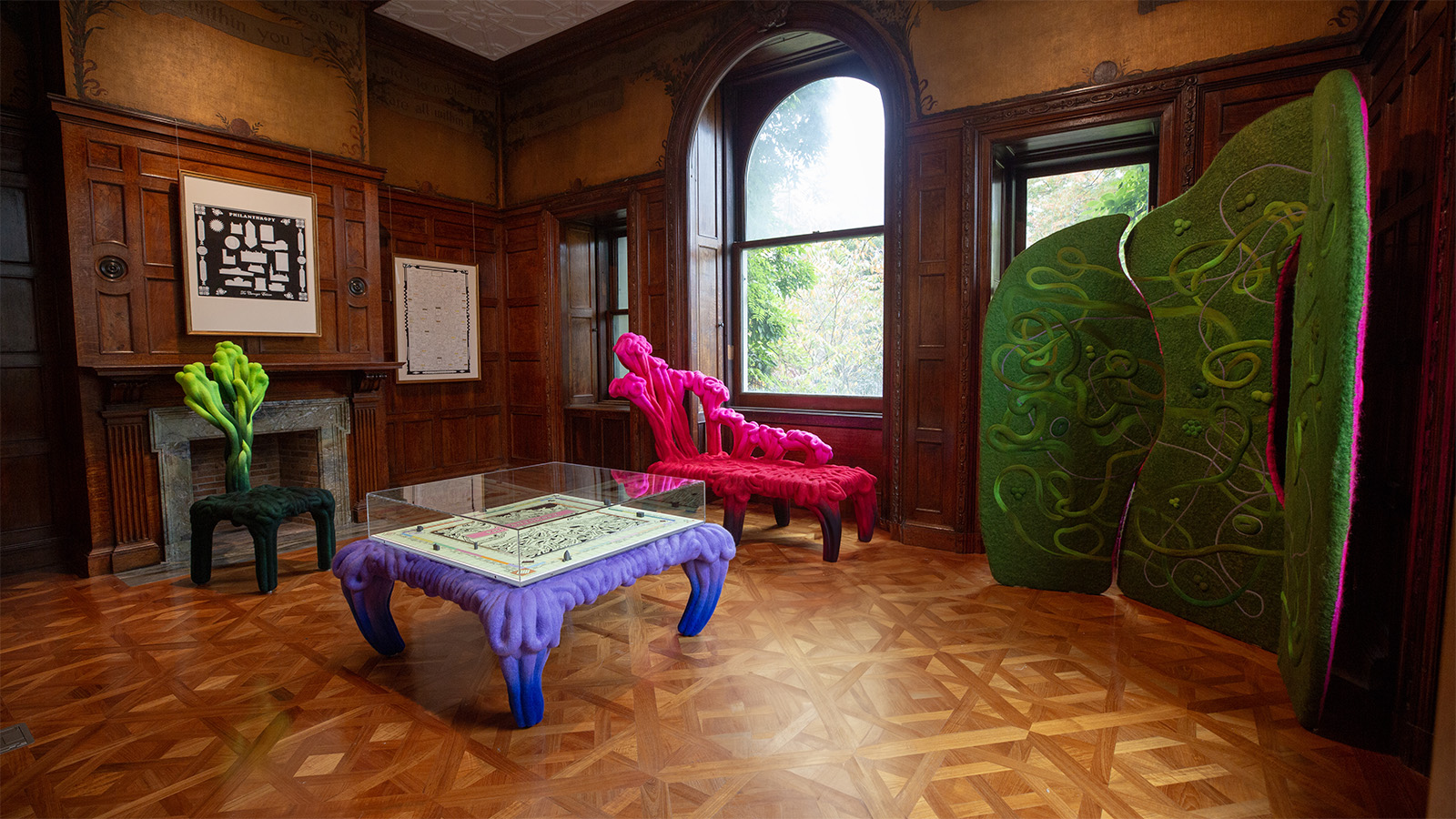
There’s usually a trim crimson carpet on the grand carved-wood staircase inside the Cooper Hewitt, Smithsonian Design Museum, but earlier this month it was swapped out for an exuberant, black-and-white patterned rug by the 87-year-old Chicago-based artist Robert Earl Paige. Above the landing, Paige hung gauzy fabric panels featuring more of the African motifs his textile designs are known for, plus an inscription by the poet Robert Frost: 'Home is the place where, when you have to go there, they have to take you in.'
Since 2000, The Cooper Hewitt, Smithsonian Design Museum has staged triennial exhibitions that explore what is new and notable in the world of design. This year, it’s on the idea of home. The curators of ‘Making Home’—Alexandra Cunningham Cameron, Christina de León, and Michelle Joan Wilkinson—commissioned 25 original installations from artists based in the United States and its tribal nations and territories that interpret the layered, nuanced, and personal meanings behind the term. 'Us being sneaky curators, we do not define home,' de León says. 'We allowed all of the participants in this exhibition to define home in their own ways.'
Cooper Hewitt’s ‘Making Home’ triennial
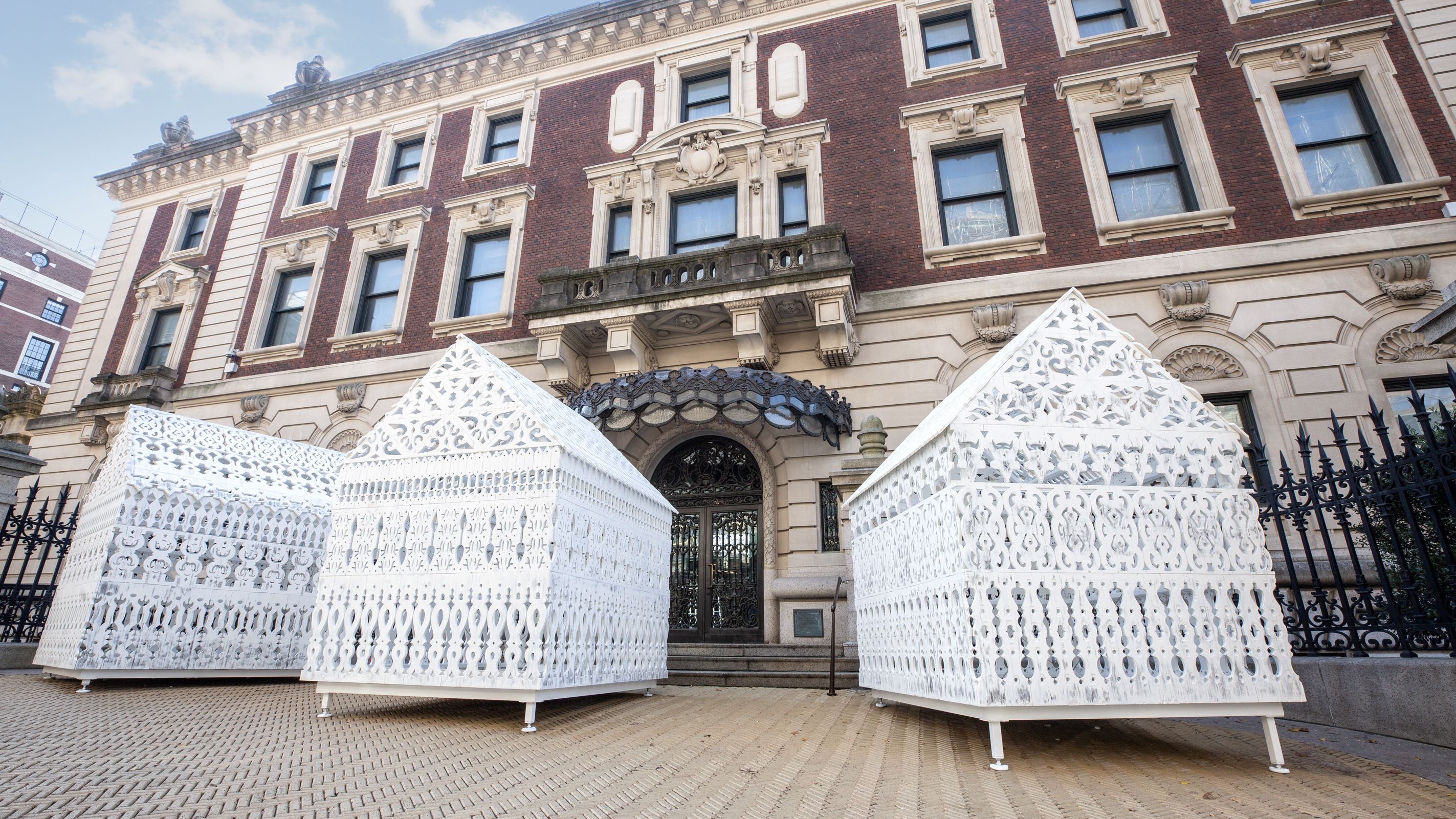
Installation of 'The House That Freedoms Built' by La Vaughn Belle in "Making Home—Smithsonian Design Triennial" at Cooper Hewitt, Smithsonian Design Museum.
The designers and artists ran with the prompt. William Scott, a painter from San Francisco, California, created a series of canvases that reimagine his hometown as an inclusive utopia—a counter narrative to the redevelopment throughout the city that has displaced working people like him and his family. The installations are often deeply personal, like the multidisciplinary designer Curry Hackett’s exploration of his home in rural Virginia which yielded an intimate room covered in hundreds of pounds of tobacco leaves (a crop his family has grown for generations), a painting by his mother, and AI-generated film and imagery of speculative futures. And they often question what a home even is, like Natalia Lassalle-Morillo and Sofía Gallisá Muriente’s interrogation of the Smithsonian’s archives as home for Puerto Rican cultural objects.

Installation of "Welcome to Territory” by Lenape Center with Joe Baker in "Making Home—Smithsonian Design Triennial" at Cooper Hewitt, Smithsonian Design Museum.
The installations in ‘Making Home’ are made all the more evocative by the fact that they are site specific (an inspired curatorial move) and that site is also a home—Andrew Carnegie’s Gilded Age mansion. For the first time in many, many years visitors to the museum will be able to see and experience the building like a residence. 'We live and work in the Carnegie Mansion, but it's not typically something that we engage with directly in our exhibitions,' Cunningham-Cameron says. 'We thought it would be a good foil for discussion about what home in the United States means.'

Installation of "Is a Biobank a Home?” by Heather Dewey-Hagborg in "Making Home—Smithsonian Design Triennial" at Cooper Hewitt, Smithsonian Design Museum. Photo: Ann Sunwoo © Smithsonian Institution
The windows are open and daylight streams in. The fact that many of the installations directly reference the intended use or design of the rooms lends a slightly voyeuristic feeling to the show and also amps up the message behind the installations. The architecture finally isn’t in stiff competition with the content of the exhibitions taking place; it’s in dialogue with it.
'The evolution of [the museum] has turned it neither into a real exhibition space nor a home that it once was,' says Mark Lee, cofounder of Johnston Marklee, the architecture firm tasked with the exhibition design. 'So for us, this theme also prompted us to feel that maybe it's time to readdress a lot of the histories of the mansion that have been either erased or covered over the last 50 years. How do we bring back the mansion—the ‘houseness’ of the house that somehow has been forgotten?'
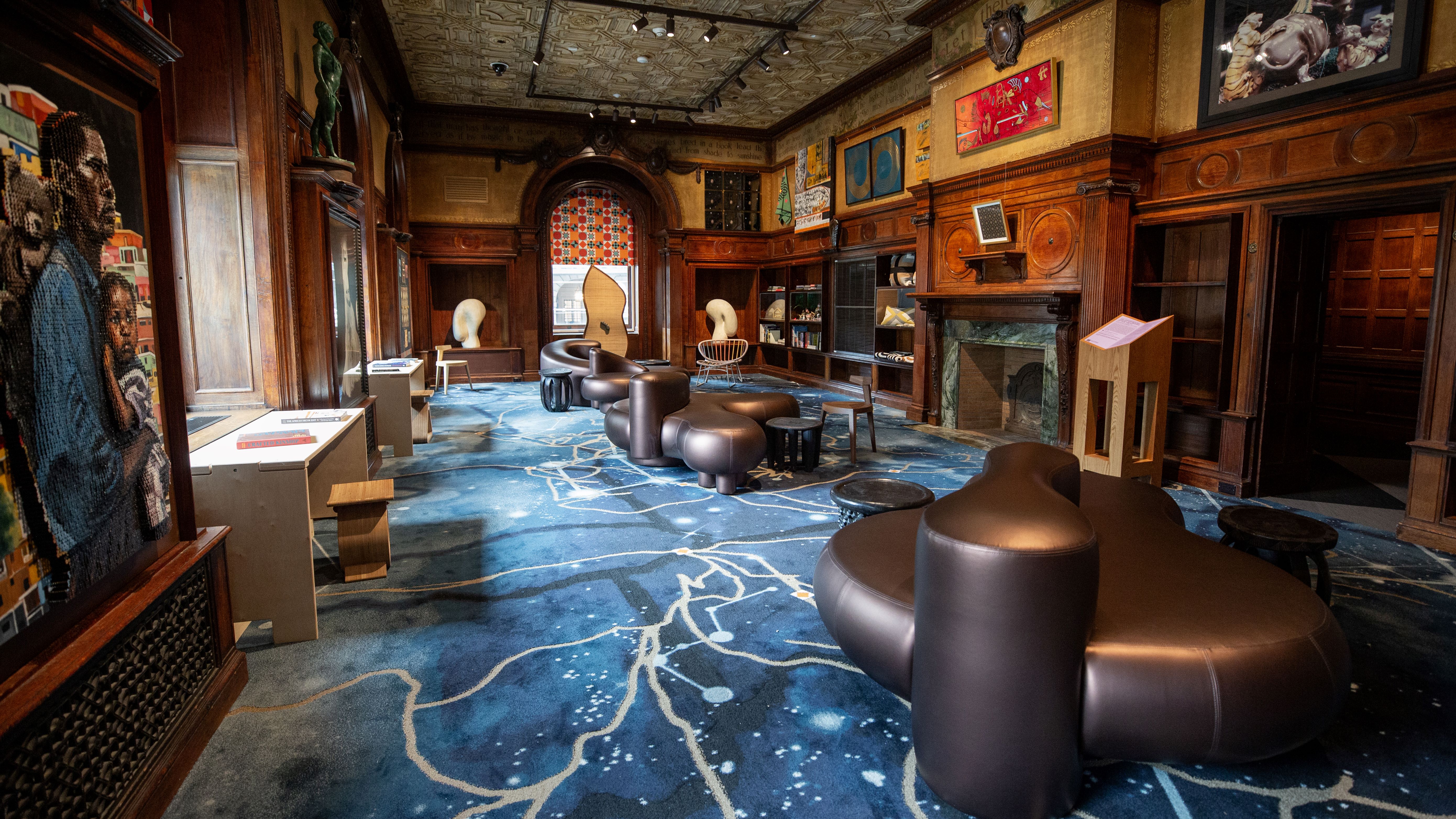
Installation of "The Underground Library” by the Black Artists + Designers Guild in "Making Home—Smithsonian Design Triennial" at Cooper Hewitt, Smithsonian Design Museum.
Around the turn of the 20th century, the Upper East Side of Manhattan was lined with extravagant mansions that came to represent the spectacular wealth of Gilded Age New York. Over the years, these spectacularly decorated homes, many of which were modelled after European palaces and châteaux, were demolished—casualties of financial strain in the city’s elite and changing tastes about domestic life. One of the few that remains is the Carnegie mansion, which has been home to Cooper Hewitt since the 1970s, and is a registered historic landmark.
Wallpaper* Newsletter
Receive our daily digest of inspiration, escapism and design stories from around the world direct to your inbox.
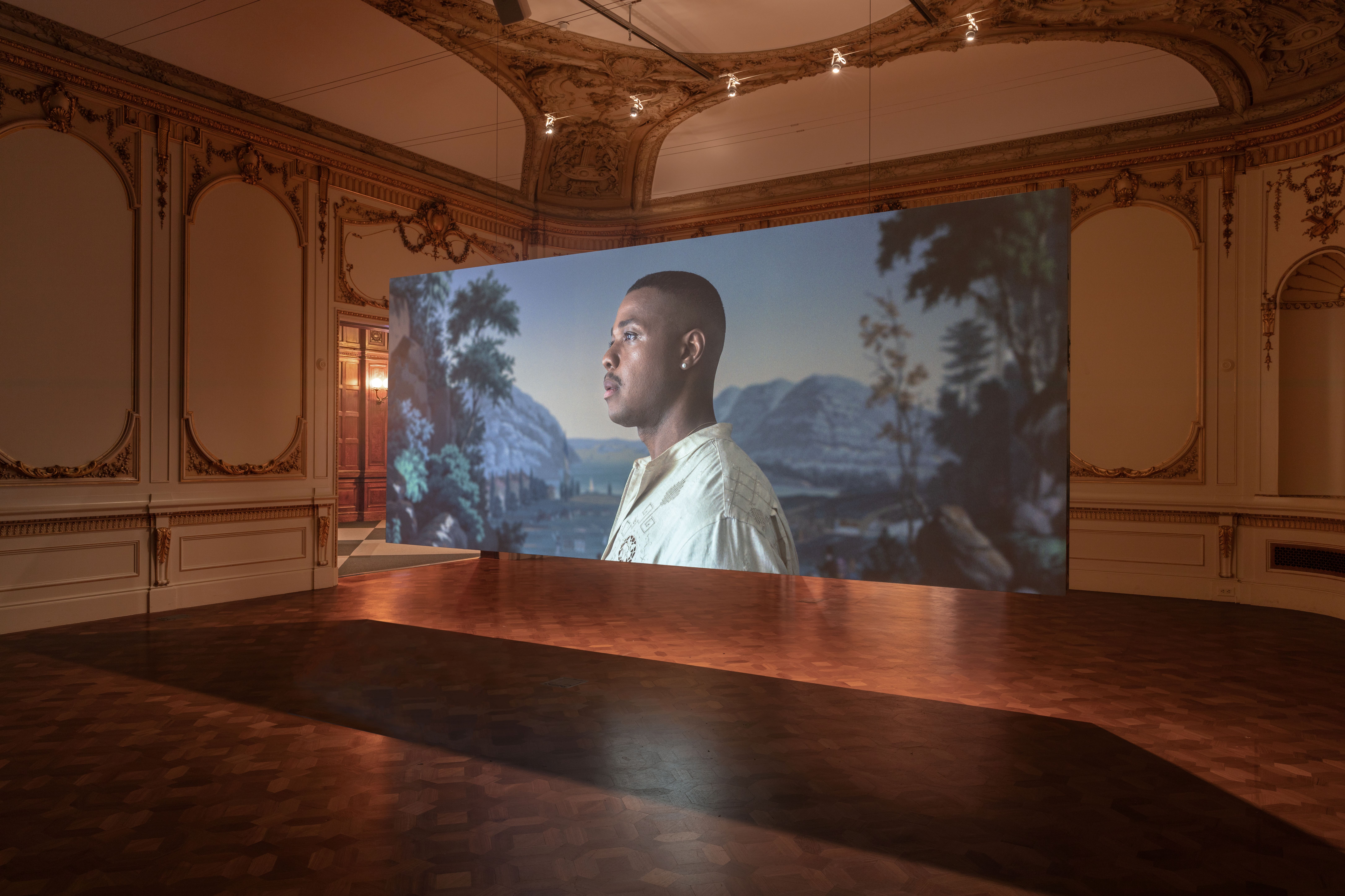
Installation of “Vues/Views” by Amie Siegel in "Making Home—Smithsonian Design Triennial" at Cooper Hewitt, Smithsonian Design Museum.
'As the container for the Triennial, the building bridges the public and private, the monumental and the intimate,' says Ben Ganz, the designer behind the exhibition’s visual identity, which is found on the wood plinths and screens (also his studio’s design) featuring the accompanying texts and in the logo, which riffs on museum’s the parquet floors. 'Our identity reflects this tension, contrasting strong graphics with intricate details.'

Installation of “We:sic ’em ki" by Terrol Dew Johnson and Aranda\Lasch in "Making Home—Smithsonian Design Triennial" at Cooper Hewitt, Smithsonian Design Museum.
The ground floor of the museum remains the most mansion-y, with many of the coffered ceilings, carved millwork, and gilded embellishments still intact. In these spaces, curators have typically needed to build a room within a room to display objects and wall text. However, in ‘Making Home,’ the rooms are a core part of the installation, such as in the Black Artists + Designers Guild’s reimagination of Carnegie’s personal library, which they refurnished with books by Black authors and cabinets, rugs, lighting, and artwork by Black designers. In what was once the reception room of the mansion, Joe Baker, an artist and the cofounder of the Lenape Center, collaborated with Calico Wallpaper on a scintillating wallpaper with a pattern based on the tulip tree, which once grew abundantly in Lenapehoking (present day New York, New Jersey, and Pennsylvania) and was used for canoe making. Meanwhile, feathered capes hang from the ceiling—a nod to the people who once wore them.
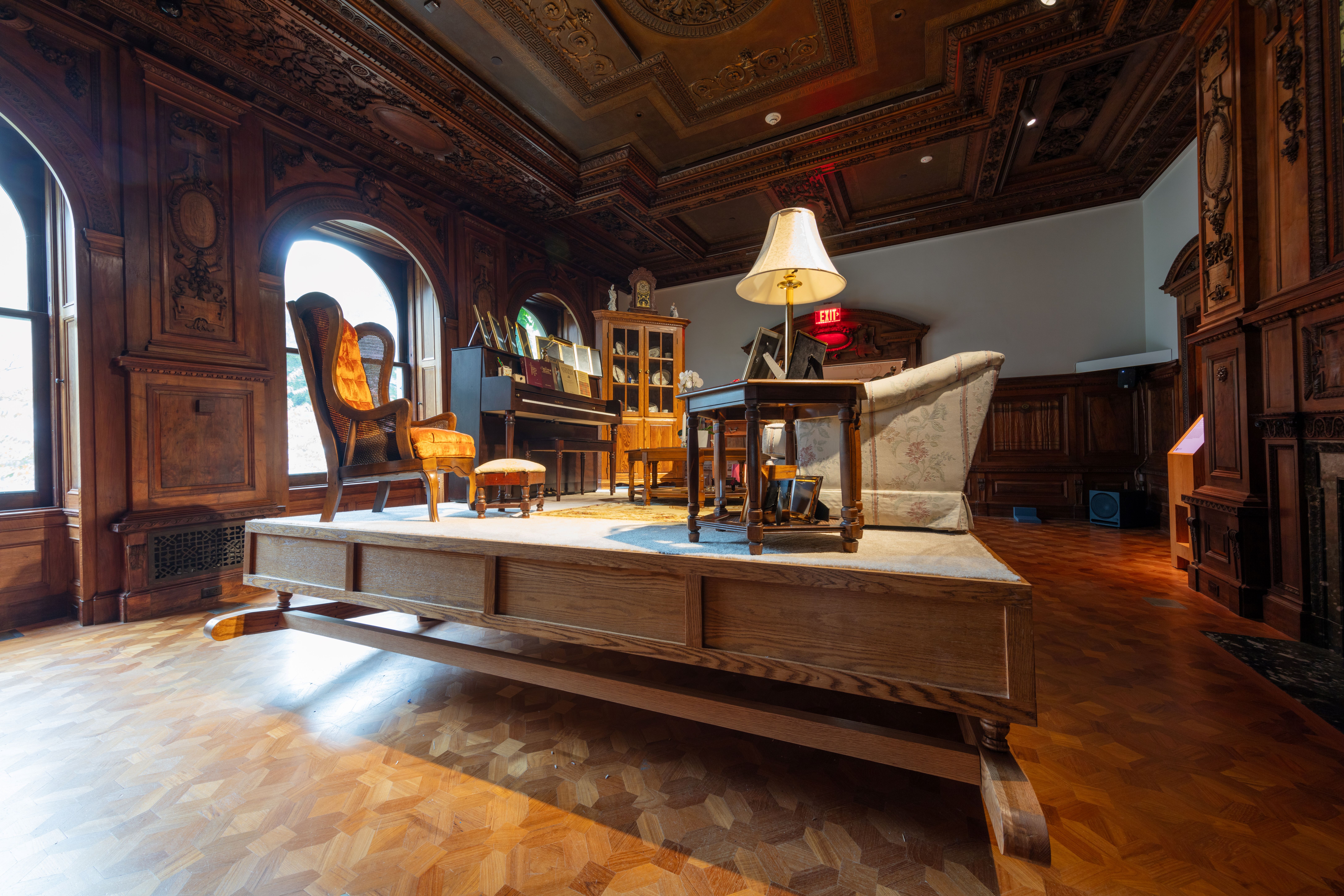
Installation of “Living Room, Orlean, Virginia” by Hugh Hayden, Davóne Tines and Zack Winokur in "Making Home—Smithsonian Design Triennial" at Cooper Hewitt, Smithsonian Design Museum.
'In re-imagining these domestic spaces, the triennial installations bear witness to the process of making home, particularly when home is tenuous,' Wilkinson said during a press conference. 'They reveal that safeguarding home is not completely in one's control.'As you ascend higher and higher, the museum becomes more like a white-box gallery and so a hide-and-reveal theme emerges. Johnston Marklee threaded more of the domesticity found on the first floor throughout the building. This included adding carpeting and seating to the central hallways on each floor. 'We were thinking about a comfortable interior again, as it's been sort of erased over time,' Sharon Johnston says. So on the second floor, out went the Immersion Room that was built in what was once a nursery and in went Heather Dewey-Hagborg’s chilling installation of thousands of vials of fake blood, a commentary on biobanks and what home is for our biological data, and a stained glass panel composed of microscope slides hung in the window.
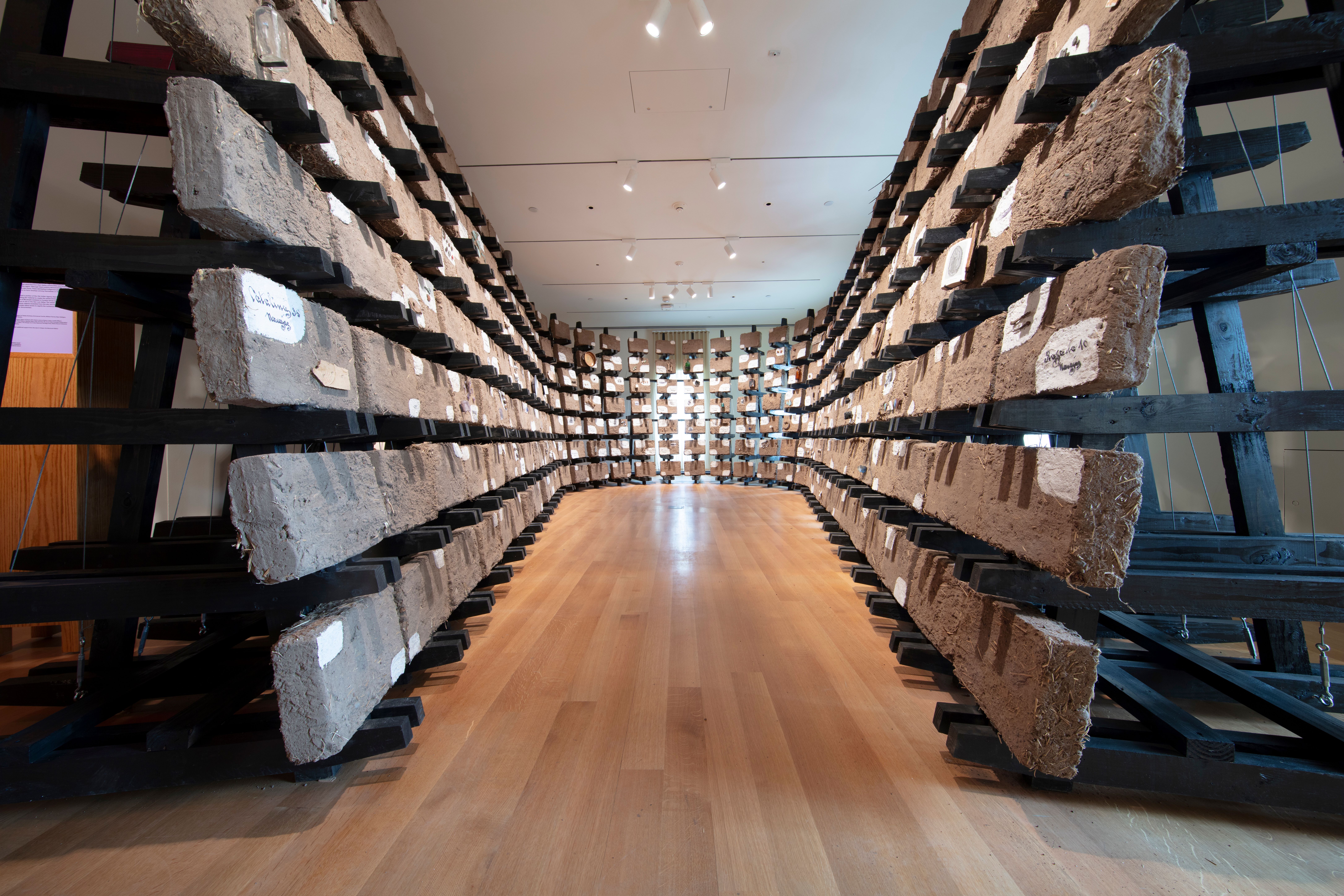
Installation of “Casa Desenterrada” by designer Ronald Rael in "Making Home—Smithsonian Design Triennial" at Cooper Hewitt, Smithsonian Design Museum.
In 2014, the museum underwent a restoration, which included extensive work in what was known as the 'teak room'—a space on the second-floor designed by Lockwood de Forest, a Victorian painter and interior designer whose hallmark was creating panelled rooms using a pastiche of traditional South and East Asian carving techniques he saw during his travels. This small room is typically the most expressive in the museum, but for the exhibition CFGNY erected construction walls in the space, leaving cutouts for the millwork to be framed. Are these meticulous carvings decoration or artwork? It’s an ethical quandary in discussion about the ethics of orientalist themes in interior design.
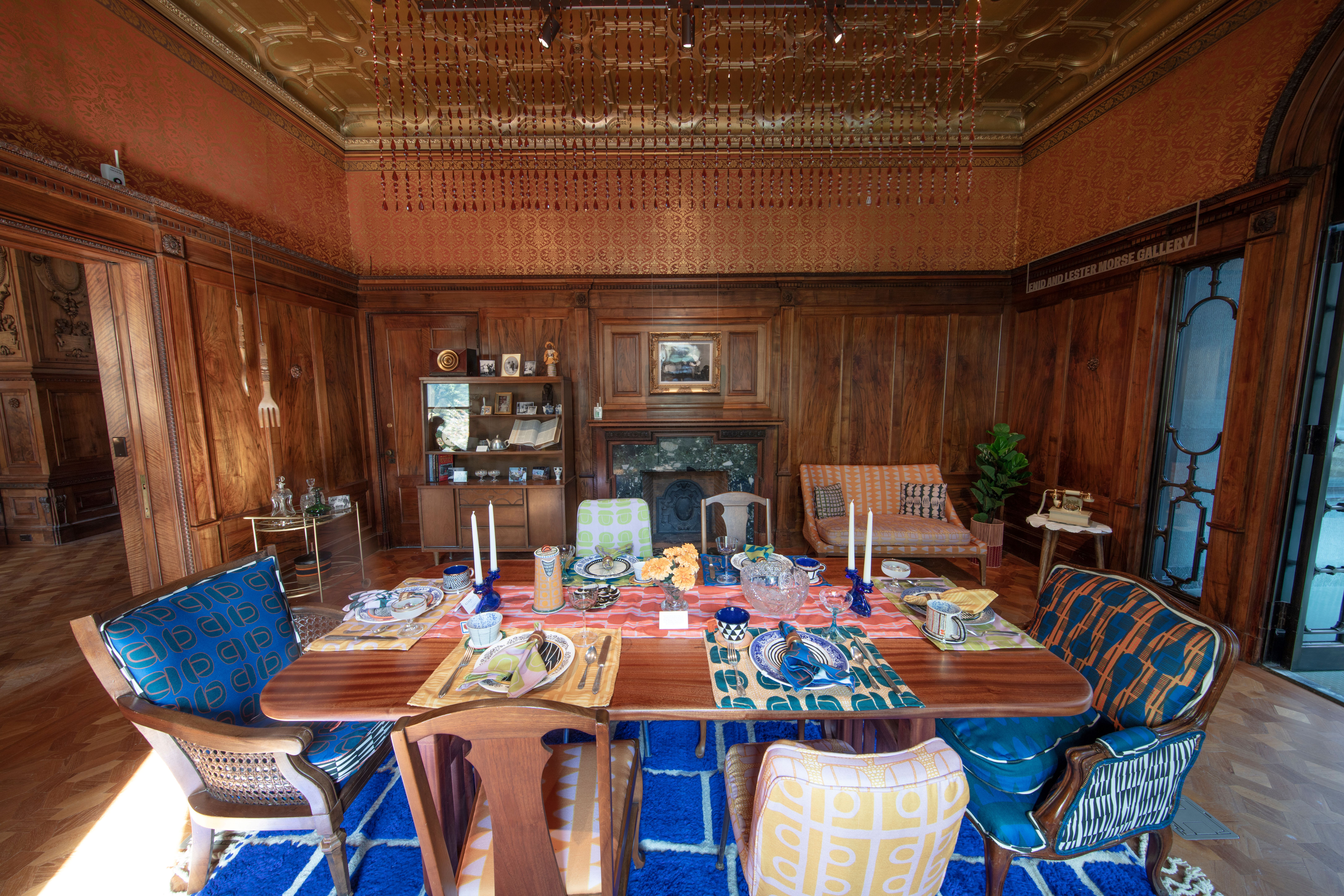
Installation of “The Offering” by Nicole Crowder and Hadiya Williams in "Making Home—Smithsonian Design Triennial" at Cooper Hewitt, Smithsonian Design Museum. Photo: Elliot Goldstein © Smithsonian Institution
Moving up to the third level, which is the most gallery like of all, Johnston Marklee added added floor-to-ceiling ivory-colored curtains to the windows—a nod to the family’s decorating choices. 'Curtains were a big part of the house historically, like brocades and wall textiles,' Johnston says. 'And so we thought that was another echo back to the house as a place that was human scaled and just signalled a more domestic environment versus an institutional one.'
The third floor holds the most architectural of the triennial’s installations, including a full-scale prototype of a wood canopy by Leong Leong and the After Oceanic Built Environments Lab. The structure is held together by Native Hawaiian canoe lashing knots and represents how collaborative construction can support cultural recovery on the islands. The other projects on the floor—including senior housing and residences for formerly incarcerated individuals illustrate 'how architects are working collaboratively to expand and redefine home as something that is much more than shelter, much more than domestic space,' Cunningham-Cameron says.
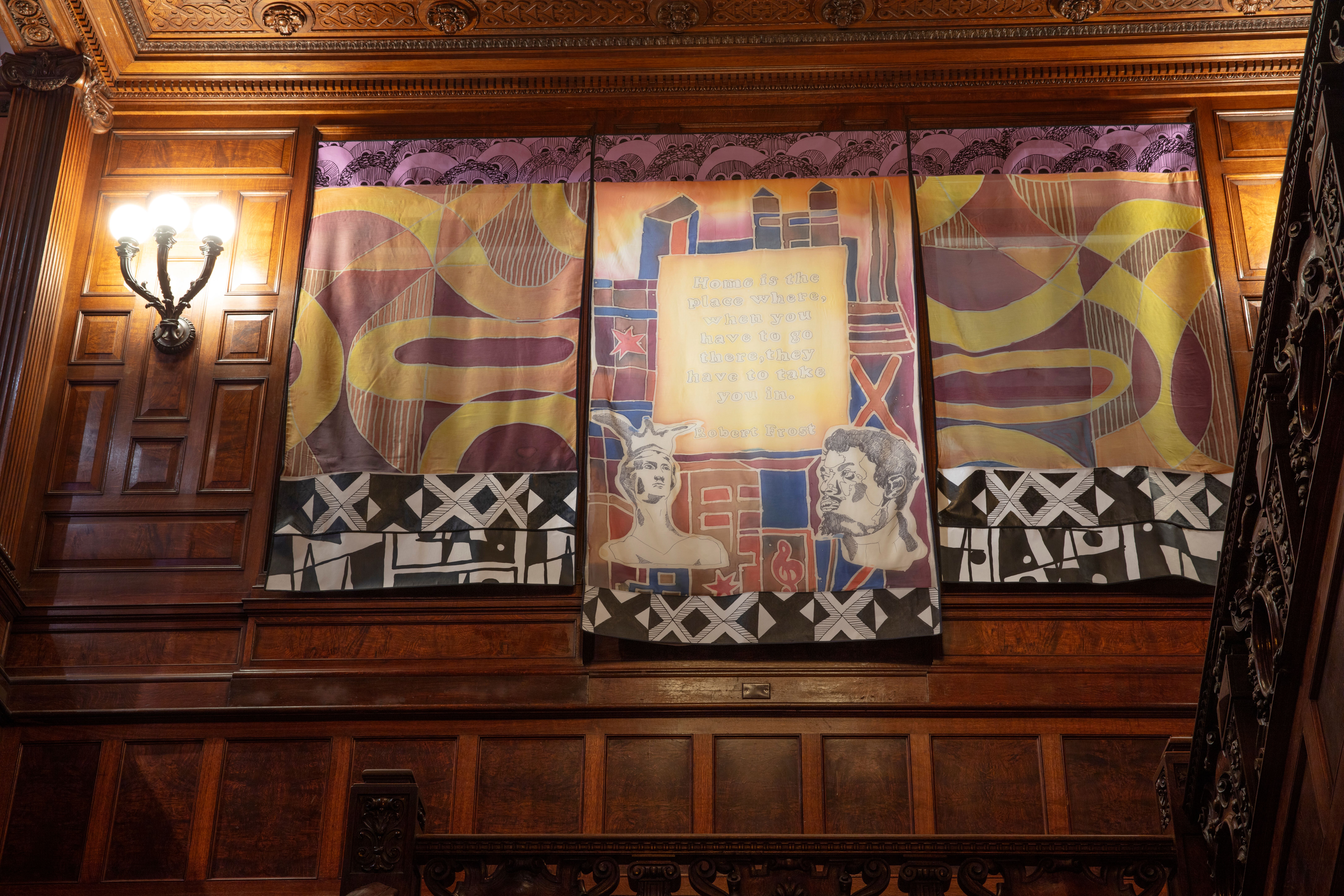
Installation of “Fahara: Chicago in View” by Robert Earle Paige in "Making Home—Smithsonian Design Triennial" at Cooper Hewitt, Smithsonian Design Museum.
In the centre of the third-floor gallery, in an area that would only be accessed by the servants the Carnegies employed, Johnston Marklee created a seating area with plush slipcovered stools and benches, bringing comfort to a space that was normally about labour. The family, and visitors to the home, would only circulate through the rooms on the perimeter. 'Reinstating that central room as a social space, as this collective space for the public to orient themselves was also inverting the hierarchies of the social practice of the house,' Johnston says. It’s a line of thinking made more interesting when the backdrop is one of the most famous homes ever built. How might the established hierarchies about the meanings of home, and who has access to them, continue to shift in the future?
Diana Budds is an independent design journalist based in New York
-
 Extreme Cashmere reimagines retail with its new Amsterdam store: ‘You want to take your shoes off and stay’
Wallpaper* takes a tour of Extreme Cashmere’s new Amsterdam store, a space which reflects the label’s famed hospitality and unconventional approach to knitwear
By Jack Moss
-
 Titanium watches are strong, light and enduring: here are some of the best
Brands including Bremont, Christopher Ward and Grand Seiko are exploring the possibilities of titanium watches
By Chris Hall
-
 Warp Records announces its first event in over a decade at the Barbican
‘A Warp Happening,' landing 14 June, is guaranteed to be an epic day out
By Tianna Williams
-
 Designer Danny Kaplan’s Manhattan showroom is also his apartment: the live-work space reimagined
Danny Kaplan’s Manhattan apartment is an extension of his new showroom, itself laid out like a home; he invites us in, including a first look at his private quarters
By Diana Budds
-
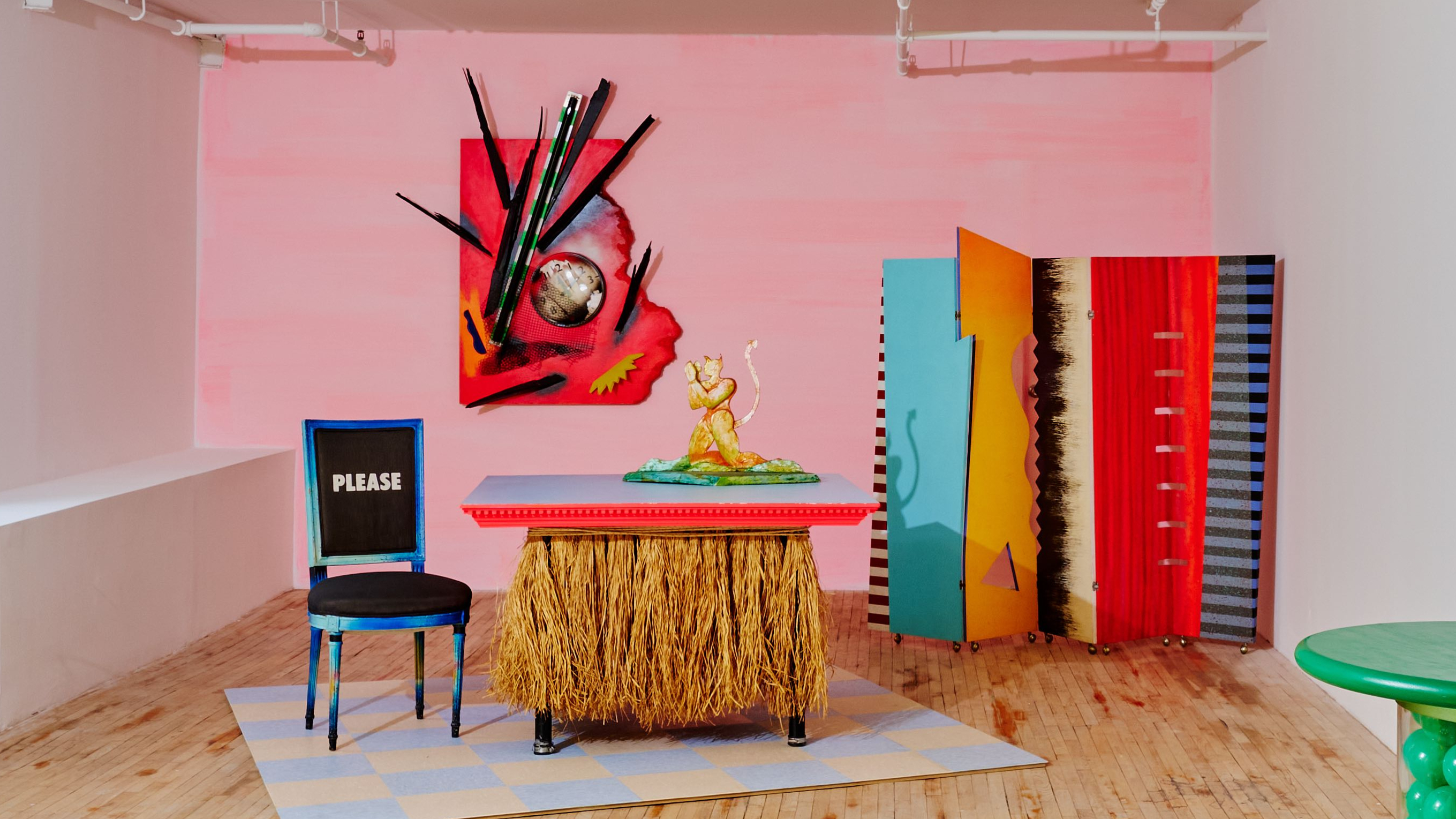 New Superhouse show captures the rebellious spirit of Dan Friedman’s Manhattan apartment
In the late 1970s, graphic designer and artist Dan Friedman transformed his apartment into a Day-Glo laboratory of ideas. Now, a new exhibition at Superhouse in New York revisits his vibrant, rebellious world
By Ali Morris
-
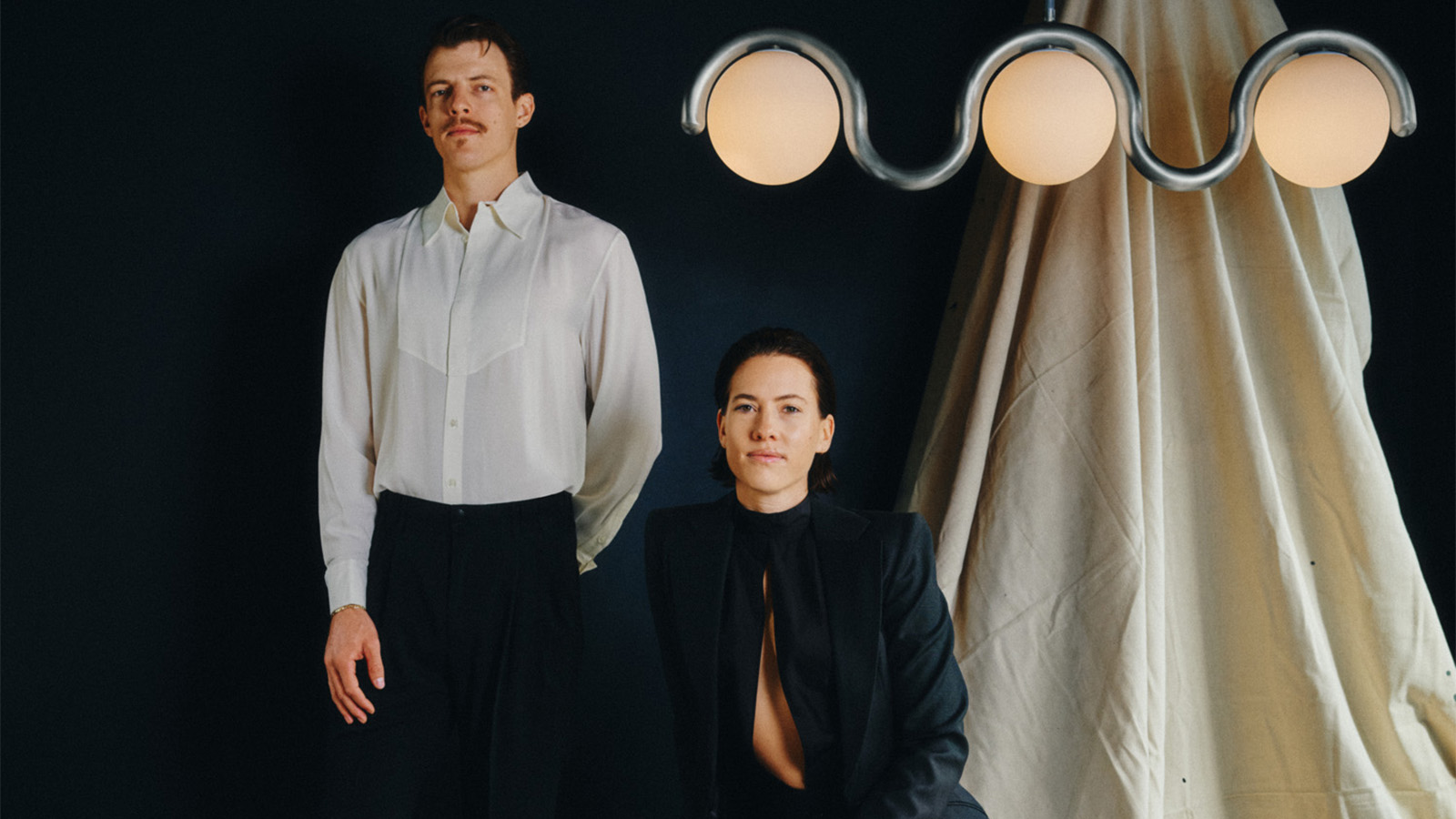 Design practice Astraeus Clarke is inspired by cinema to tell a story and evoke an emotion
In a rapidly changing world, the route designers take to discover their calling is increasingly circuitous. Here we speak to Chelsie and Jacob Starley the creative duo behind Astraeus Clarke
By Hugo Macdonald
-
 Hella Jongerius’ ‘Angry Animals’ take a humorous and poignant bite out of the climate crisis
At Salon 94 Design in New York, Hella Jongerius presents animal ceramics, ‘Bead Tables’ and experimental ‘Textile Studies’ – three series that challenge traditional ideas about function, craft, and narrative
By Ali Morris
-
 One to Watch: designer Valerie Name infuses contemporary objects and spaces with historical detail
From vessels to furnishings and interiors, New York- and Athens-based designer Valerie Name finds new relevance for age-old craft techniques
By Adrian Madlener
-
 First look: Matthew Fisher opens the doors to his first gallery in Manhattan
History, design, and environmental consciousness converge at M. Fisher in New York City, offering an experience that is as meaningful as it is visually striking
By Jacob Gaines
-
 Forged in the California desert, Jonathan Cross’ brutalist ceramic sculptures go on show in NYC
Joshua Tree-based artist Jonathan Cross’ sci-fi-influenced works are on view at Elliott Templeton Fine Arts in New York's Chinatown
By Dan Howarth
-
 Italian designer Enrico Marone Cinzano fuses natural perfection with industrial imperfection
Enrico Marone Cinzano's first solo show at New York’s Friedman Benda gallery debuts collectible furniture designs that marry organic materials with upcycled industrial components
By Adrian Madlener