

You’d be forgiven for thinking that ceramics have little in common with wallpaper and textiles. However there’s a shared alchemy at play in the processes that bring these practices to life. They all deal with organic matter – earth, wood pulp, fibres – each material undergoes a process of transformation via mind, hand and machine, to produce the layers and objects that soften the edges of our interior lives and worlds. We are living in times of experimental creative commingling, on a quest to discover what we might learn from introducing the skills and insights of people with different sectoral and cultural experiences into traditionally siloed practices. And the results can be surprising, innovative and joyful, as ceramicist Henry Holland’s range of wallpaper and textile collections for Harlequin (launching 6 August) bears testament.

Henry Holland working up his Nerikomi-inspired ceramics in his Hackney, London studio
Holland closed his riotous and irreverent London-based fashion label House of Holland in 2020. He hung up his scissors and turned his attention to clay, subsequently and quickly forging a cult following for his ceramics practice at Henry Holland Studio, based in Hackney. It was during the pandemic, with his local pottery studio shuttered, that Holland began experimenting with the Japanese technique of Nerikomi – folding and slicing clay, which is then built by hand into objects that take on a distinct marbling effect. Holland’s Nerikomi-inspired signature has in turn translated into a textural motif that lends itself with beauty and intrigue to the papers and textiles in his Harlequin collaboration.

Blenets Check Mini textile upholstering the curtain, daybed surrounds and cushions
Beyond the more explicit derivation, Holland’s Harlequin ranges are a masterclass in mood texture and mood. Harlequin is a Sanderson house that celebrates colour and pattern with a contemporary zing, and Holland has both softened and augmented these tenets in various techniques. There is a richness here for the eyes and hands, thanks to a playful approach to combining printing and weaving techniques within a distinctly earthy, tonal palette. The results are evocative and accessible, expressive without being overbearing. They cater for and reflect the current penchant for patterned interiors that feel crafted and integrated, neither superficial nor superimposed. We’ve come to think of this as a Millennial x Bloomsbury revival.
The papers and textiles are on sale from today, and their beauty speaks for itself. That said, we wanted to find out more about Holland’s involvement, so we put a few questions to him, which he gamely answers below...
Henry Holland on the making of his collection for Harlequin

Elsworthy wallpaper from the Harlequin x Henry Holland collection
W*: Swapping clay for wallpaper and textiles must have been an interesting challenge – how has your process as a potter informed your design process here?
Henry Holland: Working on the wallpaper and textile collection with Harlequin was a fascinating departure from working in clay as we had so many more options available. While our ceramics are really tactile and have a texture of their own, it's still very uniform across our portfolio and the pattern is all created below the glaze.

Pot Shop drapery fabric from the Harlequin x Henry Holland collection
W*: Did your fashion industry background help with the process of textile manufacture?
HH: For this collection I drew from my background in fashion, especially when working with the textiles, but also a lot of the wall coverings have a fabric texture created using an embossing technique. I had some knowledge from my years working with fabric mills, creating my own custom cloths, but this collection presented a whole new challenge, working into two categories for both upholstery and drapery, which meant learning the qualities that the different collections needed to encompass – not to mention learning about the all-important fabric rub count for upholstery. I was really engaged and fascinated by the whole process and when it came to working with the wallpapers, the team at Harlequin were able to guide me through and execute my ideas of adding textures through different printing and embossing techniques.

Loopy Spot fabric and Southborough wallpaper
W*: How do you describe the different moods of the collections?
HH: The colour palette is intentionally really tight within the collection, which allows it to be used in myriad combinations. We used really neutral bases of oatmeal and off-white – never stark white – with a ‘Chocolate Black’ brown – never the stark coldness of a true black. I think this creates a very calming mood throughout the collection and the tactility of the texture within it – both for the walls and the fabrics – creates a cocooning feeling of sanctuary when they’re used in the home. I've recently renovated my own house using a lot of the collection and it has really created a much-needed safe sense of calm for me and my husband.

A collection of wallpapers from the Harlequin x Henry Holland range
W*: What is your most significant discovery or learning from the collaboration?
HH: The constant learning is the best thing about my job, whether it's learning about new printing and embossing techniques for the wallpapers, or different weaving techniques like crewel, appliqué and boucle for the fabrics. I'm self-taught in everything I've ever done, which definitely has its drawbacks, but one of the positives is that with every new project comes a process of learning and discovery and I love that – it's what gets me going!
Harelquin.sandersongroupdesign.com

Henry Holland by Jessica Gates

-
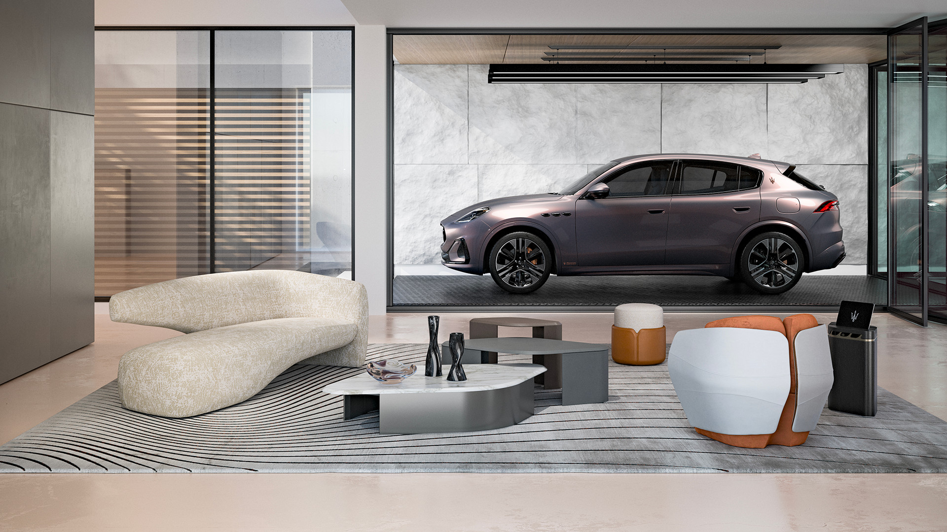 Maserati joins forces with Giorgetti for a turbo-charged relationship
Announcing their marriage during Milan Design Week, the brands unveiled a collection, a car and a long term commitment
-
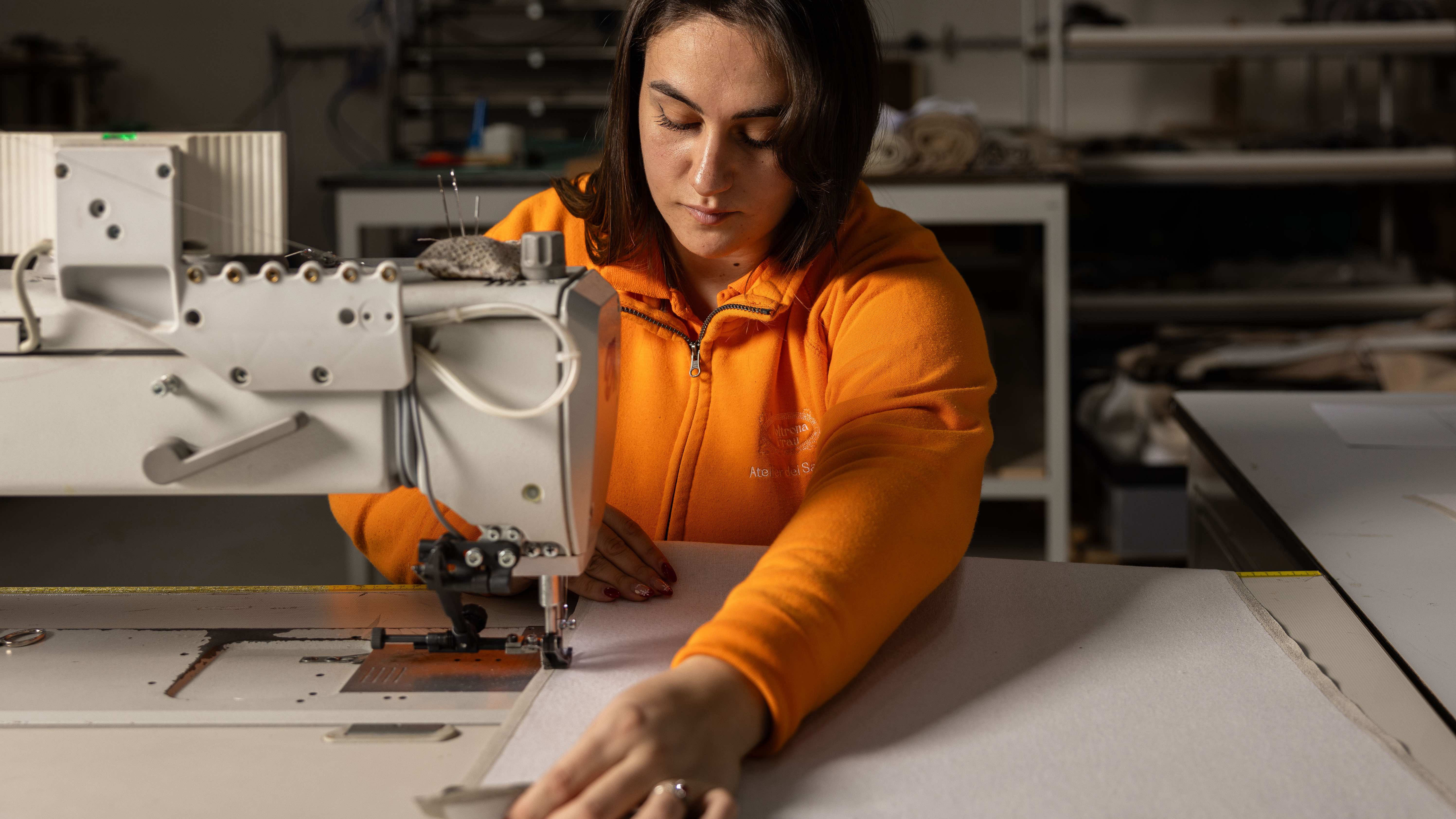 Through an innovative new training program, Poltrona Frau aims to safeguard Italian craft
The heritage furniture manufacturer is training a new generation of leather artisans
-
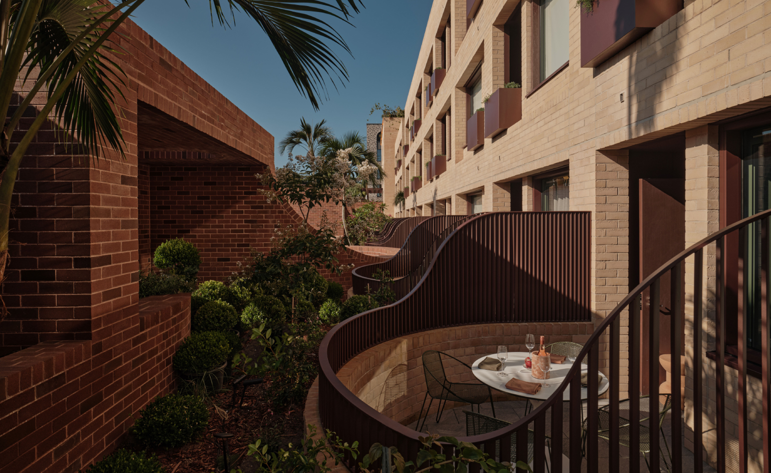 Wallpaper* checks in at The Eve Hotel Sydney: a lush urban escape
A new Sydney hotel makes a bold and biophilic addition to a buzzing neighbourhood that’s on the up


-
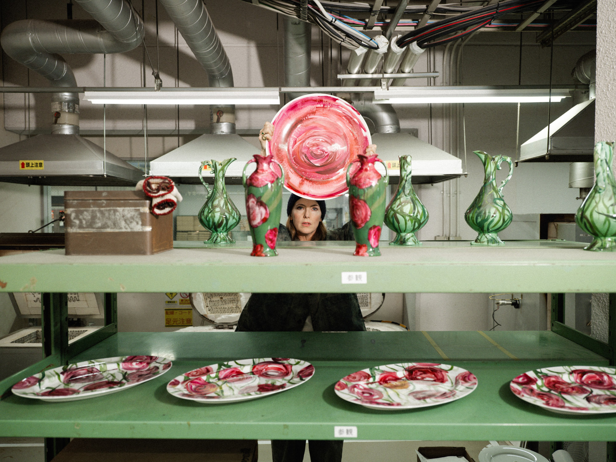 Faye Toogood comes up roses at Milan Design Week 2025
Japanese ceramics specialist Noritake’s design collection blossoms with a bold floral series by Faye Toogood
-
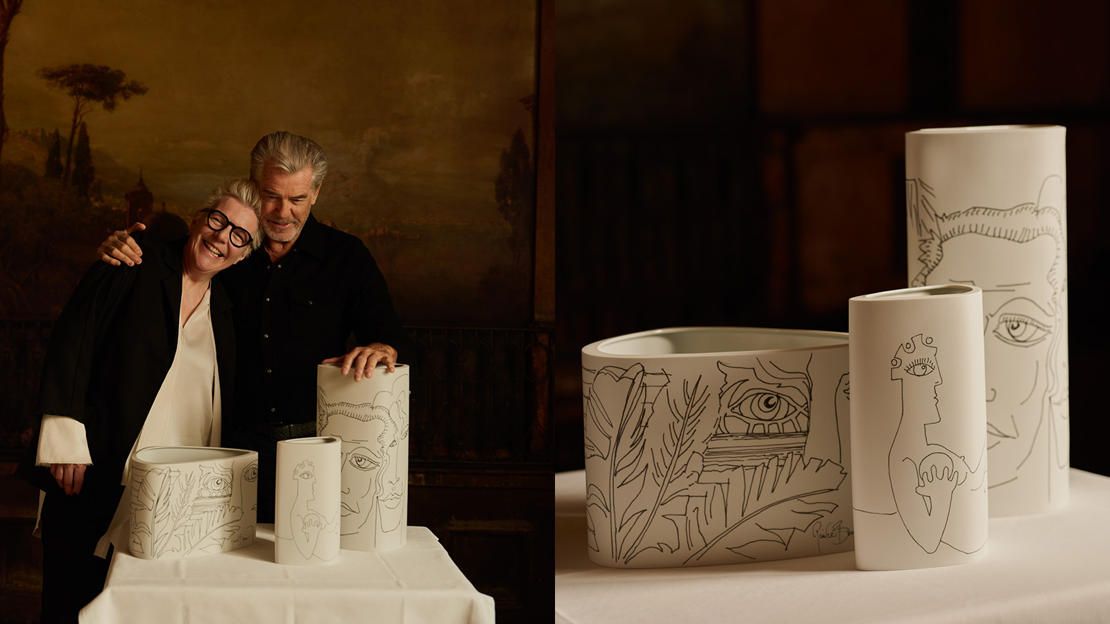 Pierce Brosnan and Hering Berlin's ceramic vases explore love, loss and renewal
Actor and artist Pierce Brosnan translates his ‘So Many Dreams’ artworks to Hering Berlin ceramic vases in a new limited edition
-
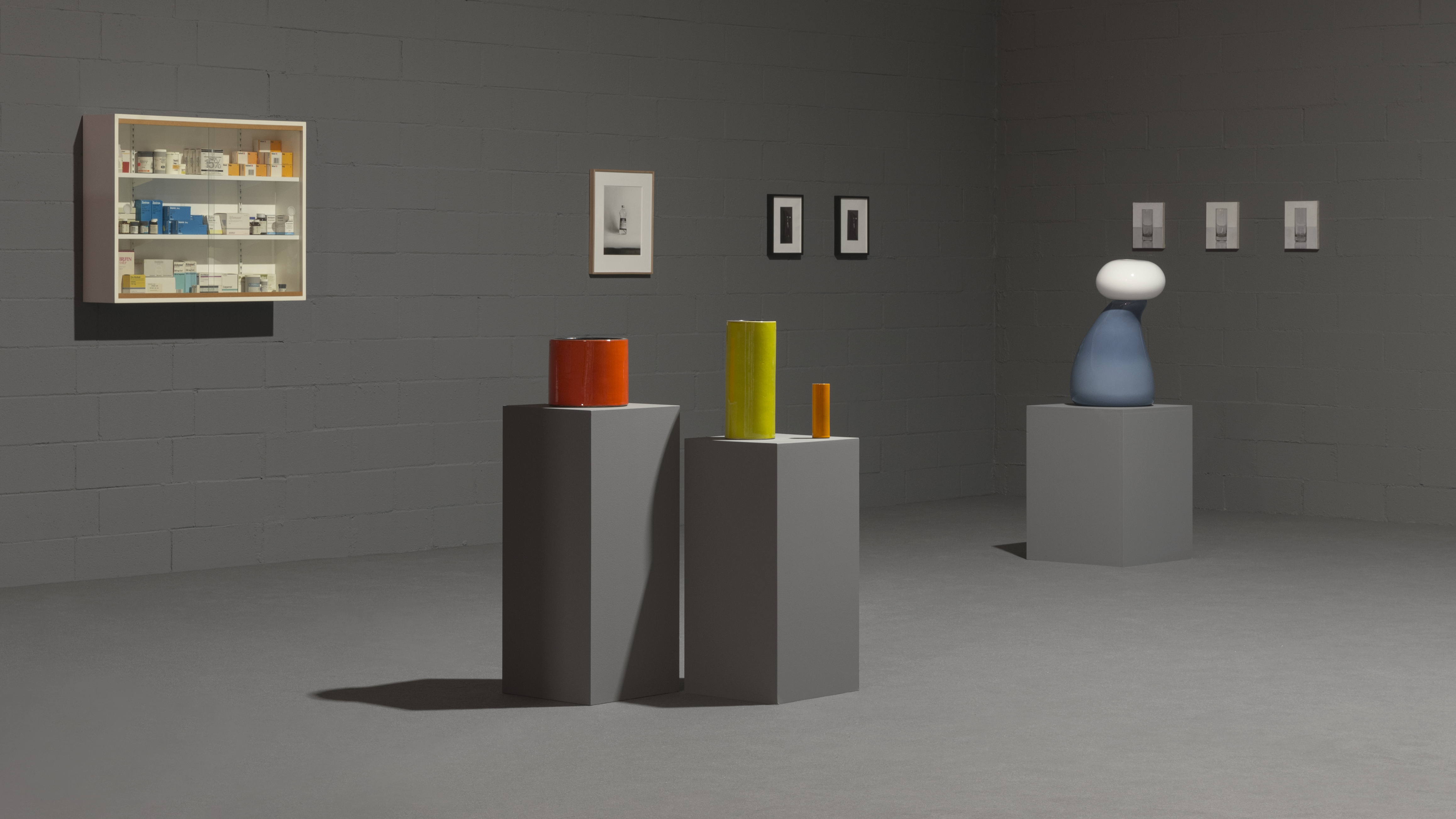 Ceramics brand Mutina stages a poetic tribute to everyday objects
Design meets art as a new Mutina exhibition in Italy reframes the beauty of domestic stillness, juxtaposing ceramics, sculpture, paintings and photography
-
 Designer Danny Kaplan’s Manhattan showroom is also his apartment: the live-work space reimagined
Danny Kaplan’s Manhattan apartment is an extension of his new showroom, itself laid out like a home; he invites us in, including a first look at his private quarters
-
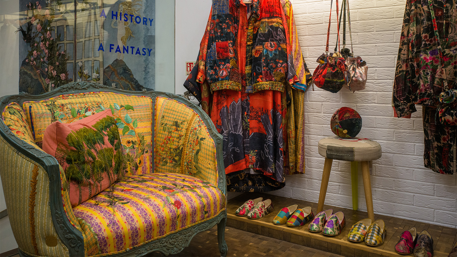 This Beirut design collective threads untold stories into upholstered antique furniture
Beirut-based Bokja opens a Notting Hill pop-up that's a temple to textiles, from upholstered furniture to embroidered cushions crafted by artisans (until 25 March 2025)
-
 15 highlights from Heimtextil: spot the textile trends for 2025
We were at textile trade fair Heimtextil 2025 in Frankfurt last week – here are the trendsetters and names to know among innovative launches, from health-boosting lava fabric to sheets made of milk
-
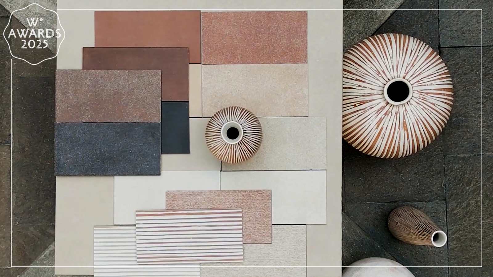 Florim’s new ceramic surface collection is an ode to tactility
A primal pleasure, Matteo Thun and Benedetto Fasciana’s SensiTerre collection of ceramic flooring and cladding surfaces for Florim is a Wallpaper* Design Award winner
-
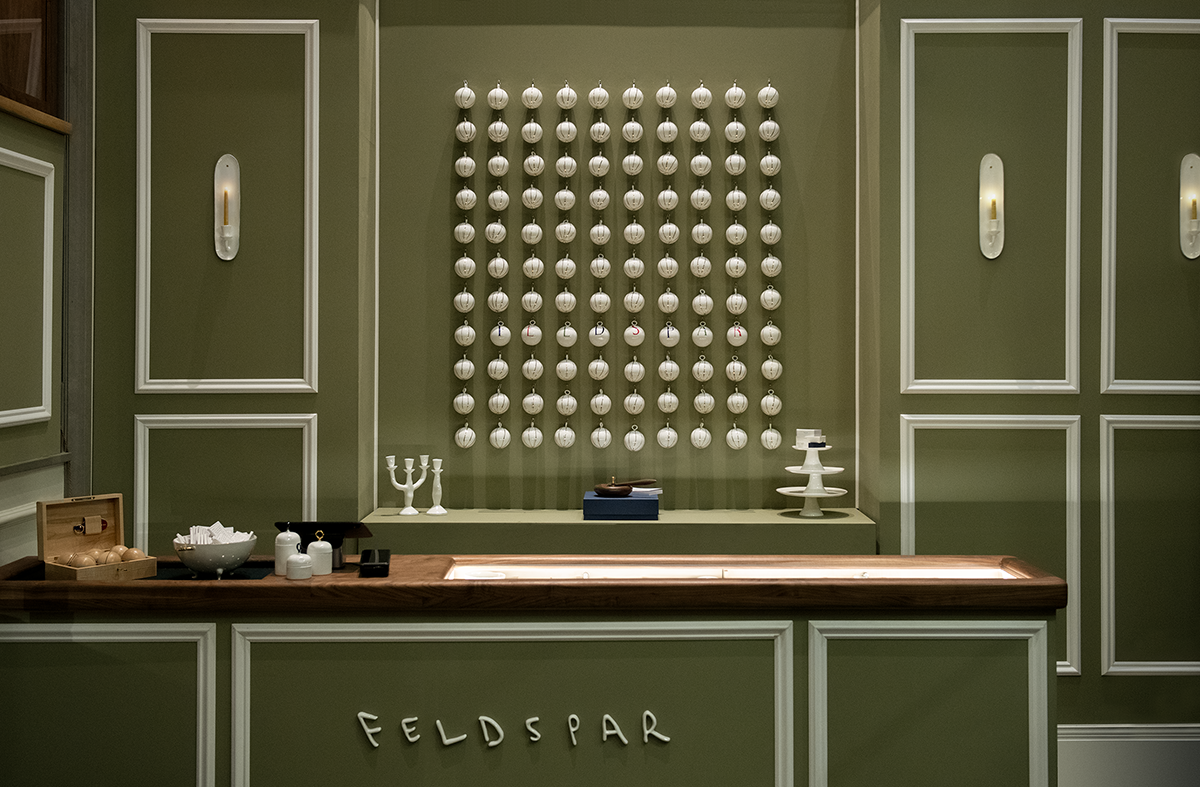 Feldspar makes its mark on Whitehall with a festive pop-up at Corinthia Hotel
Devon-based bone china brand Feldspar makes its first foray into shopkeeping with a pop-up at London’s Corinthia Hotel. Ali Morris speaks with the founders and peeks inside


