First look: Ini Archibong explores 2D design with Dr Dre and Snoop Dogg for new canned gin drink
‘I had to make sure that the packaging looks like it deserves to be in their hands’: Ini Archibong tells us what it was like working with music giants Dre Dre and Snoop Dogg on their new canned ‘Gin & Juice'
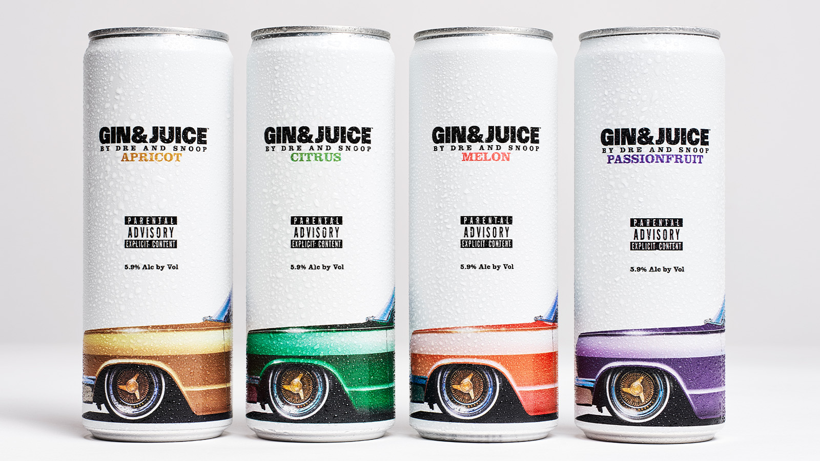
Ini Archibong is no stranger to setting the design agenda. Known for his craftsmanship in furniture-making, lighting, and glass – and with a portfolio of creative collaborations including a recent appearance at Craft x Tech in Japan, whereby he created a musical instrument intertwined in a sculptural shell; a frequent featuring at the global gallery Freidman Benda; and his considered Pavilion of the African Diaspora at London Design Biennale in 2021 – it is no wonder he made the Wallpaper* USA 400 of creative names to know. With a seemingly natural mastery for a variety of mediums, when he was asked by music legends Dr Dre and Snoop Dogg to design the packaging for their latest canned drink, Gin & Juice, Archibong jumped into the world of 2D design, merging his spiritual design trademark with the coolness of 1990s California.
Celebrating the 30th anniversary of Snoop's 1993 debut album, Doggystyle, produced by Dr Dre, the canned drink gin its namesake from Snoop's beloved, Grammy-nominated song ‘Gin & Juice’, and comes in a variety of summertime flavours: Citrus, Melon, Passionfruit, and Apricot. Archibong noticed, when browsing the shelves for a canned tipple, that drinks packaging can often be filled with large graphics, and bold colours. The California-born designer wanted to take this potentially saturated concept and spin it on its head.
‘With Dre there’s a lot of technical intuitiveness, whereas Snoop is the spirit and energy of the brand. Snoop is Snoop’
Ini Archibong
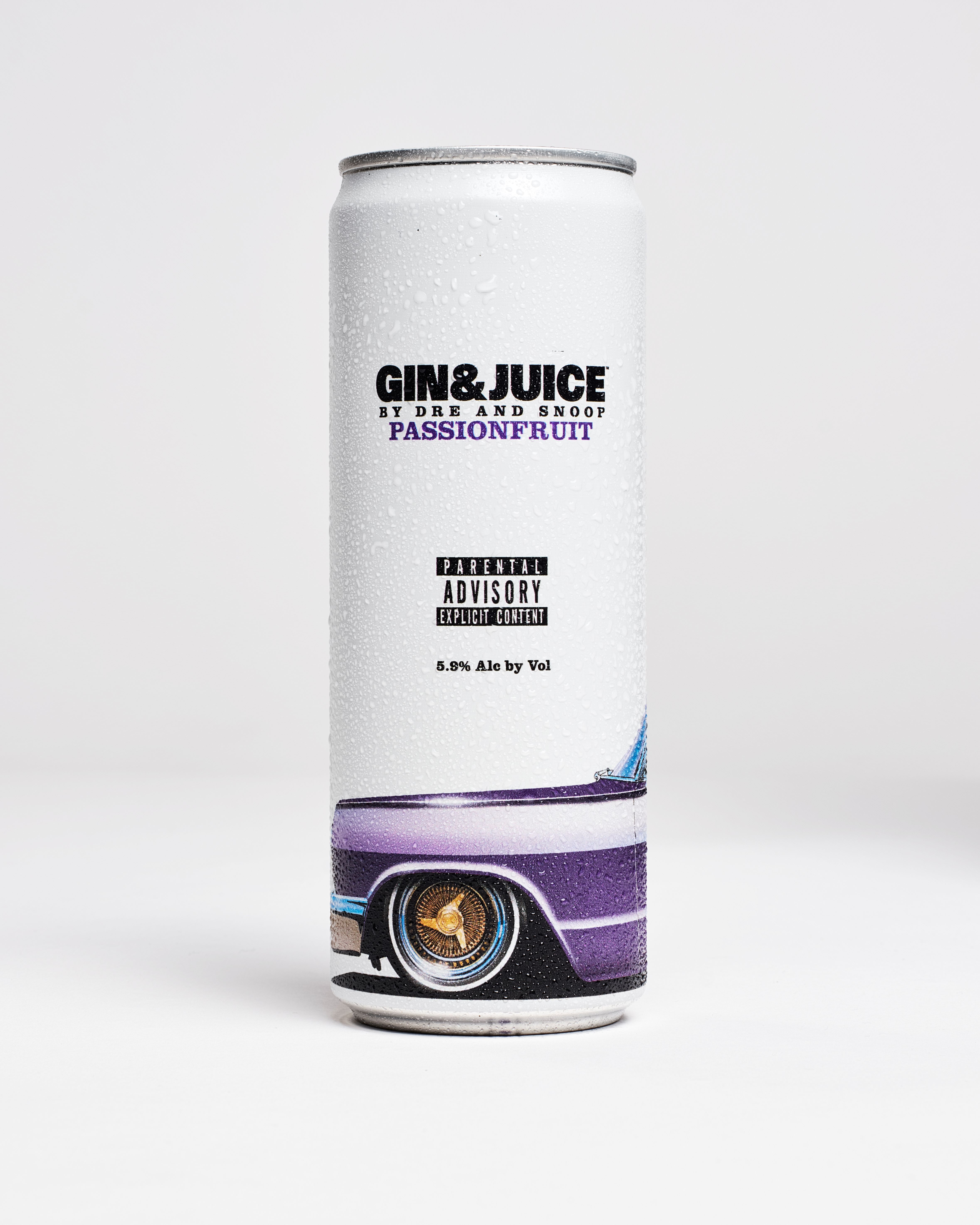
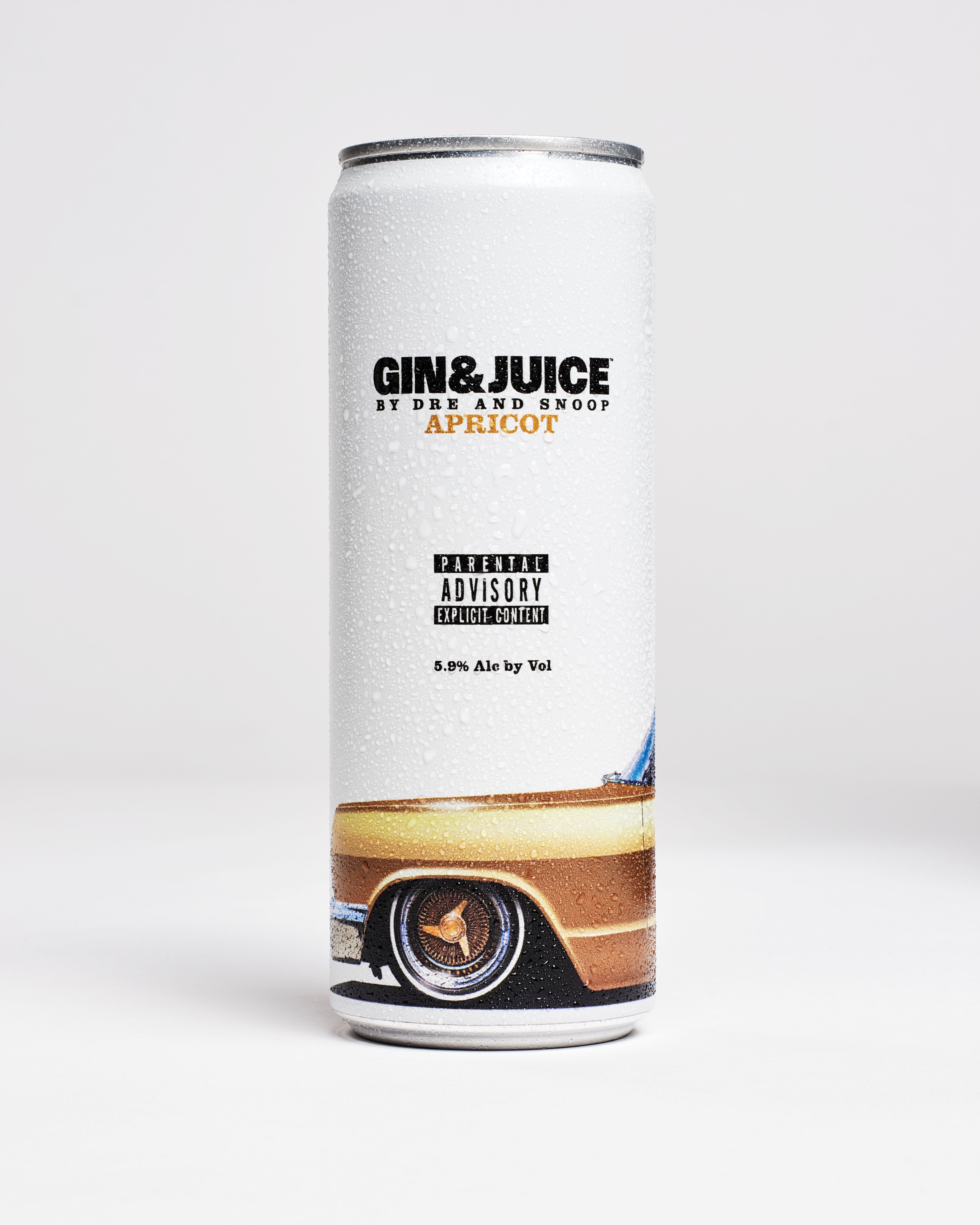
Stripping back the design to four colours that signify each flavour, Archibong worked with close school friend and illustrator Wayne Johnson to hand draw a classic lo-rider that takes centre-stage against the white background, alongside the iconic ‘Parental Advisory, Explicit Content’ iconography that is emblematic to the era of the song's release.
Gin & Juice has just launched in the UK, and is also available in select other European countries and the US. We couldn’t let this elite partnership of creativity slide without speaking with Archibong about the design process, and what it was like working with Snoop Dogg and Dr Dre.
Ini Archibong on working with Dr Dre and Snoop Dogg for Gin & Juice
Wallpaper*: First things first, how did the collaboration come about?
Ini Archibong: So the story is quite simple. I have a good friend and mentor named Mark Byers, who has been in the music industry for many years and was the former general manager of Motown Records. We started having a casual conversation about my upcoming visit to LA and how to find new ways to tap into my roots. He then introduced me to [Dr] Dre and Beats co-founder Jimmy Iovine.
The way it really kicked off was with a quick introduction and I had to have a very fast understanding of the brief. Dre is very particular and demands perfection, and for me, meeting Dre and Snoop is like meeting my childhood superheroes, so the pressure was on. I grew up in LA in the 1990s and I grew up on their music, so I really needed to show them something that matched what they put into Gin & Juice. Once I showed them the can, everybody was like, ‘that is it’.
W*: We tend to think of you more in furniture, lighting and glass – what was it like working on packaging?
IA: It's a completely different industry and mindset. I'm mostly somebody that works three dimensionally, but I've had plenty of experience working with brands and helping to translate brand identity. I was able to pull together ideas rather quickly, and I worked on this project like I would with any design; I started sketching it out, I talked to my collaborators, I got the pieces, and then I assembled it. However, when I first designed the can, I wasn't sure if I had made something really terrible because it didn't look like any of the other ready-to-drink cans on the market. When you look at the refrigerator in the liquor store, you see a lot of graphics and information-dense products. So for me to present a white can with a car and the parental advisory icon, I was uncertain whether or not people would be able to understand why I went in such an opposite direction.
Wallpaper* Newsletter
Receive our daily digest of inspiration, escapism and design stories from around the world direct to your inbox.
W*: Snoop Dogg’s enjoyment of the Paris Olympics has been almost more fun to watch than the sport – was it fun to work with him?
IA: It is fun. I've had the privilege of being together with Dre and Snoop in the studio. However, working with Snoop and working with Dre are two very different things. With Dre there's a lot of technical intuitiveness, whereas Snoop is the spirit and energy of the brand. Snoop is Snoop. It's insane, sitting and sharing a space with the greatest, most meticulous craftsmen and one of the world's biggest superstars. I had to make sure that the packaging looks like it deserves to be in their hands. It's a pretty amazing thing.
W*: What’s next for you?
IA: We definitely have more things coming from this new drink brand. I'm spending my time in Venice twice a month making new pieces, experimenting and playing with new materials. Hopefully I will present some works in bronze and wood, coming soon.
W*: What's been your greatest learning from the project?
IA: The biggest learning is that I should always follow my intuition. I don't need to design for other designers. If it touches people viscerally, then it's all also going to fit the criteria of good design from a technical standpoint. The days of overthinking are far gone.
Tianna Williams is Wallpaper*s staff writer. Before joining the team in 2023, she contributed to BBC Wales, SurfGirl Magazine, Parisian Vibe, The Rakish Gent, and Country Life, with work spanning from social media content creation to editorial. When she isn’t writing extensively across varying content pillars ranging from design, and architecture to travel, and art, she also helps put together the daily newsletter. She enjoys speaking to emerging artists, designers, and architects, writing about gorgeously designed houses and restaurants, and day-dreaming about her next travel destination.
-
 In search of a seriously-good American whiskey? This is our go-to
Based in Park City, Utah, High West blends the Wild West with sophistication and elegance
By Melina Keays Published
-
 Esperit Roca is a restaurant of delicious brutalism and six-course desserts
In Girona, the Roca brothers dish up daring, sensory cuisine amid a 19th-century fortress reimagined by Andreu Carulla Studio
By Agnish Ray Published
-
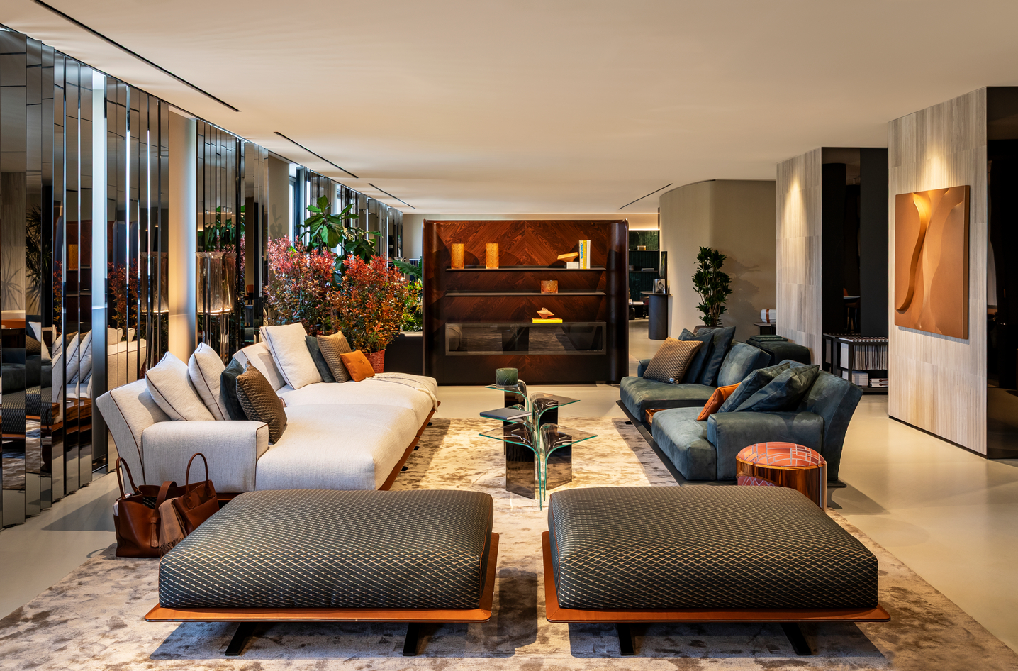 Bentley’s new home collections bring the ‘potency’ of its cars to Milan Design Week
New furniture, accessories and picnic pieces from Bentley Home take cues from the bold lines and smooth curves of Bentley Motors
By Anna Solomon Published
-
 From migrating elephants to a divisive Jaguar, was this the best Design Miami yet?
Here's our Design Miami 2024 review – discover the best of everything that happened at the fair as it took over the city this December
By Henrietta Thompson Published
-
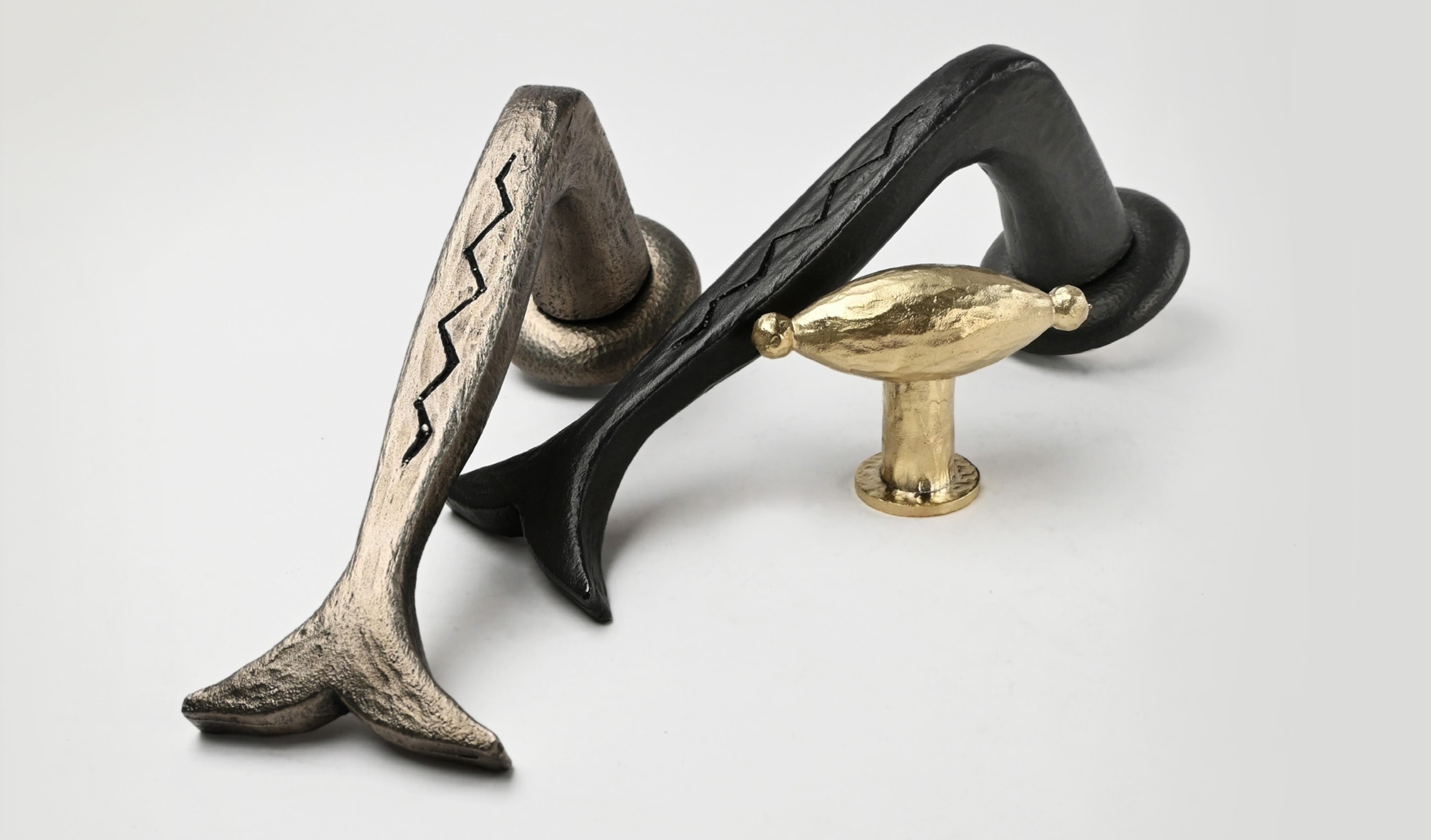 California cool: Studio Shamshiri debuts handmade door handles and pulls
Los Angeles interior design firm Studio Shamshiri channels the spirit of the Californian landscape into its handcrafted hardware collections. Founder Pamela Shamshiri shares the inspiration behind the designs
By Ali Morris Published
-
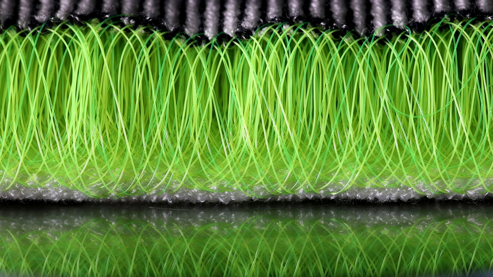 Is Emeco's 'No Foam KNIT' a sustainable answer to synthetic upholstery textiles?
'Make more with less' is Emeco's guiding light. Now, the US furniture maker's new mono-material textile, the 'No Foam KNIT', may offer a sustainable solution to upholstery materials
By Ali Morris Published
-
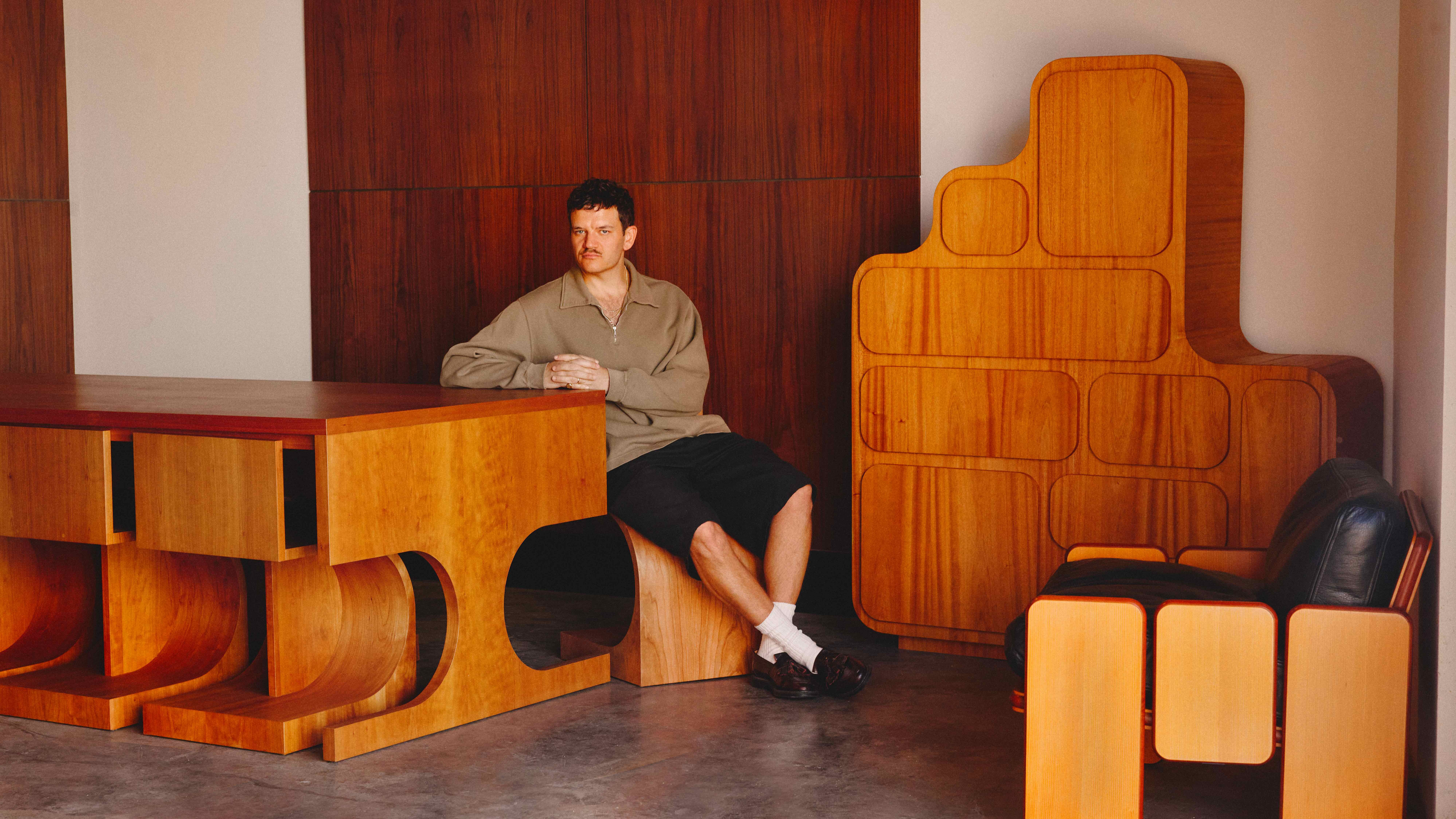 Smooth operator: Willett debuts new furniture at Design Miami 2024, with a playful touch of retro allure
LA furniture designer Willett turned heads in the design world with the launch of his eponymous brand earlier this year. Ahead of his Design Miami debut, he told us what’s in store for 2025
By Ali Morris Published
-
 Forged in the California desert, Jonathan Cross’ brutalist ceramic sculptures go on show in NYC
Joshua Tree-based artist Jonathan Cross’ sci-fi-influenced works are on view at Elliott Templeton Fine Arts in New York's Chinatown
By Dan Howarth Published
-
 Italian designer Enrico Marone Cinzano fuses natural perfection with industrial imperfection
Enrico Marone Cinzano's first solo show at New York’s Friedman Benda gallery debuts collectible furniture designs that marry organic materials with upcycled industrial components
By Adrian Madlener Published
-
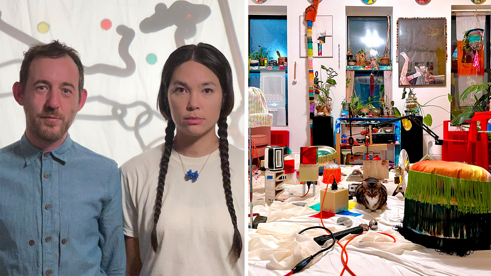 One to Watch: Brooklyn studio Outgoing gives new meaning to the idea of world building
Life and creative partners Brett Gui Xin and Del Hardin Hoyle from Outgoing blur the lines between craft and concept in experimental designs that have the potential for greater application
By Adrian Madlener Published
-
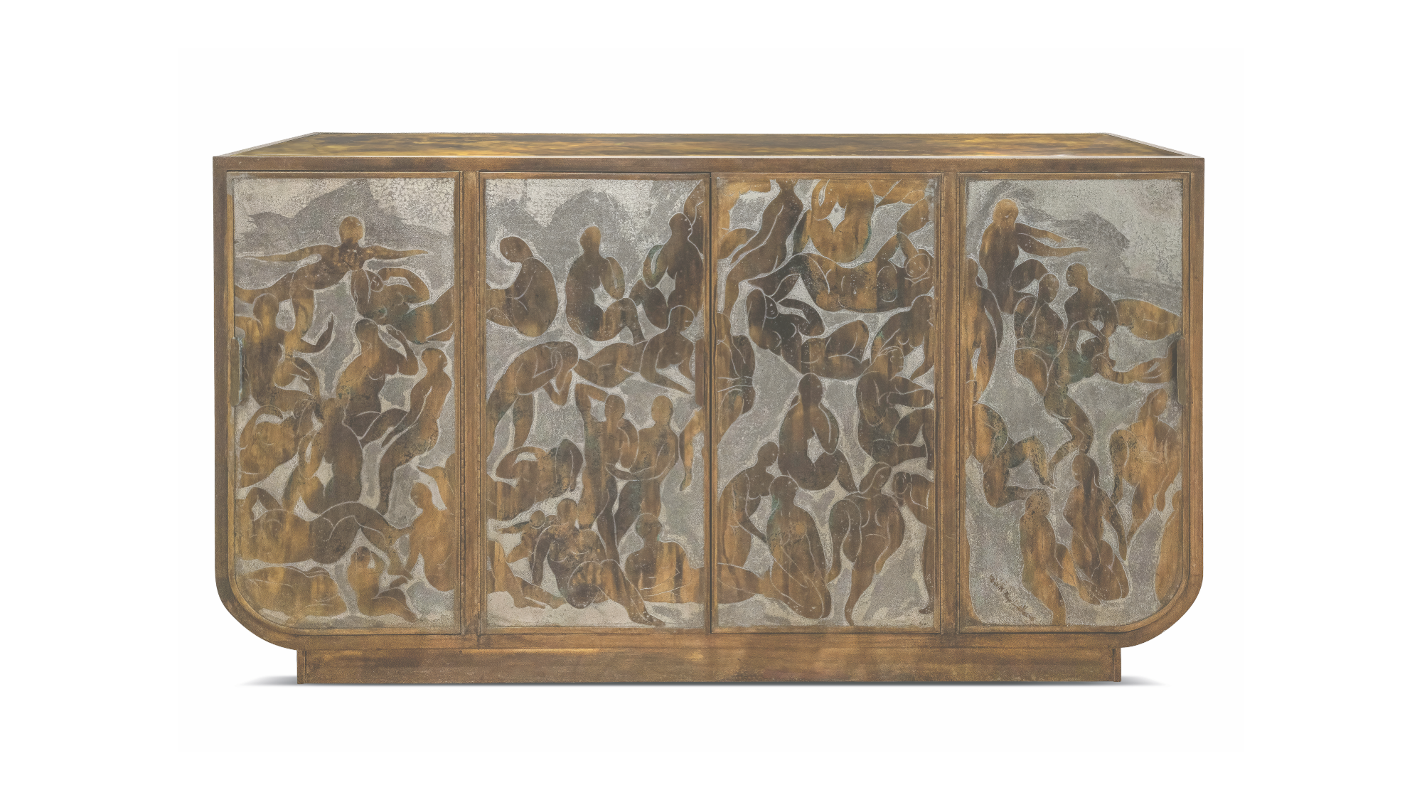 Discover the alchemy of American artists Philip and Kelvin LaVerne
The work of Philip and Kelvin LaVerne, prized by collectors of 20th-century American art, is the subject of a new book by gallerist Evan Lobel; he tells us more
By Léa Teuscher Published