‘Inside’ movie set: capitalism meets brutalism in the art- and design-filled thriller starring Willem Dafoe
Thorsten Sabel takes us through the making of ‘Inside’, the movie starring Willem Dafoe as a thief trapped in an art- and design-filled penthouse inspired by Oscar Neimeyer architecture
Receive our daily digest of inspiration, escapism and design stories from around the world direct to your inbox.
You are now subscribed
Your newsletter sign-up was successful
Want to add more newsletters?
Nemo is locked in a brutalist penthouse. His heist has gone wrong, and he is stuck among artworks and exclusive furniture designs for days, weeks, months. This is the premise of Inside, the new movie by director Vasilis Katsoupis starring Willem Dafoe as the only character. But the single protagonist is in great company, at least visually.
At the heart of the film is Katsopis’ decade-long exploration of the objects that adorn contemporary life: could this sophisticated and impeccable living turn against life itself? ‘Inside is a story about a house and a man, both sharing the leading role,’ Katsoupis explains. ‘An ironic look at how our golden cages can come out as prison cells. A brutal view of the dark side of luxury. A note on the perception of the real world and how it changes given unprecedented stimuli. And, last but not least, a cinematographic take on contemporary art and living, and its real value.’
‘Inside’: a cinematographic take on the value of contemporary art and living
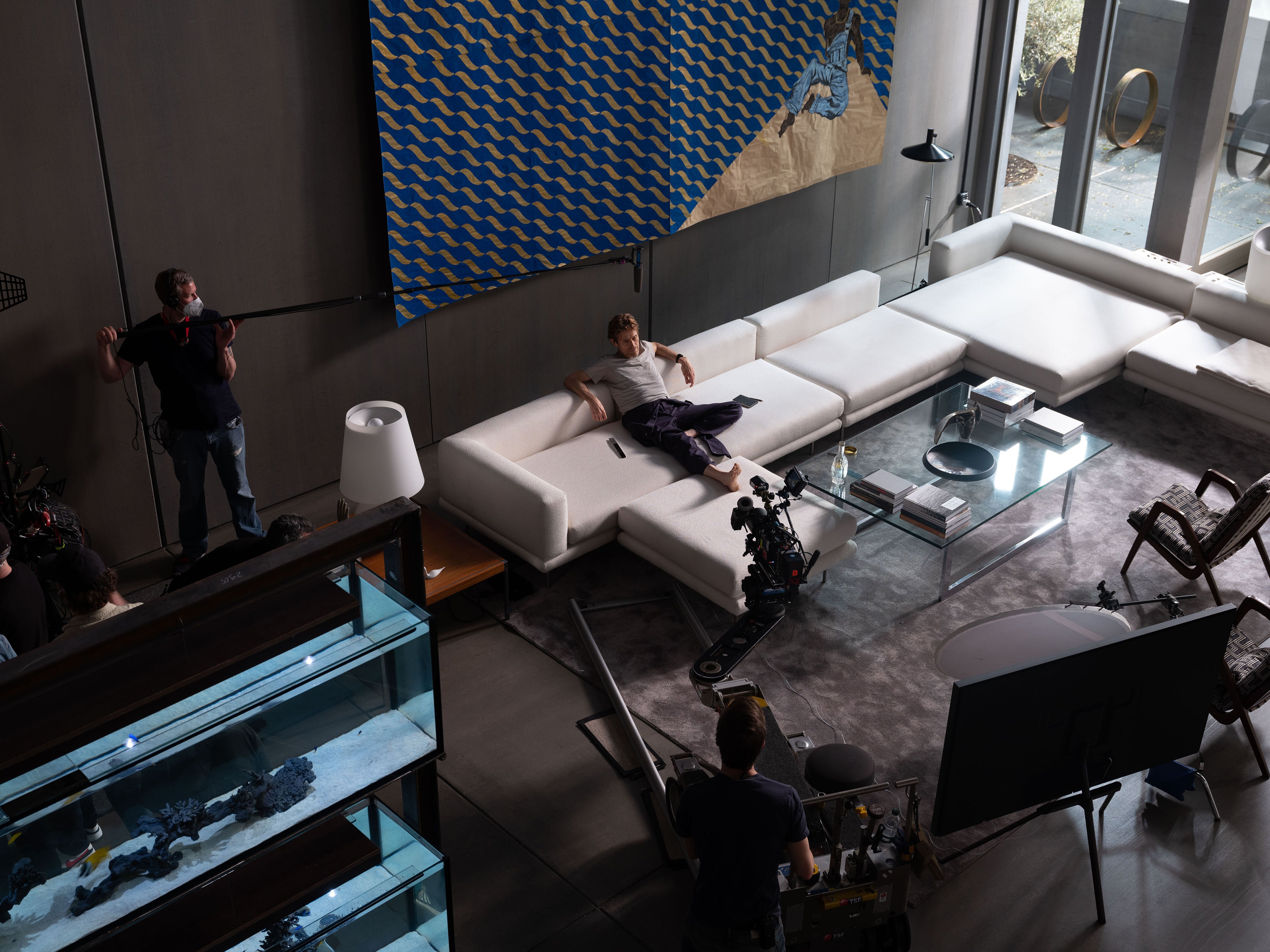
Willem Dafoe during filming of Inside. Behind him is Maxwell Alexandre’s Se eu fosse vocês olhava pra mim de novo (If I were you I'd look at me again), 2018. Courtesy the Artist and A Gentil Carioca
To bring his idea to life, Katsopis enlisted art director Thorsten Sabel, and together they concocted a space that fits the idea the director wanted to express with the feature. For the interiors, Katsopis and Sabel were inspired by Oscar Niemeyer and brutalist churches by German architect Gottfried Böhm, as well as Eastern European brutalism. In particular, the penthouse's central staircase was based on Niemeyer’s helix staircase from the Itamaraty Palace of the Brazilian Foreign Ministry.
These architectural references were merged with the atmosphere of an art gallery, to convey the invisible character of the apartment's art collector owner. 'We wanted a mix, the environment of a fancy apartment and the strength and un-cosiness of brutalism,' adds Sabel.
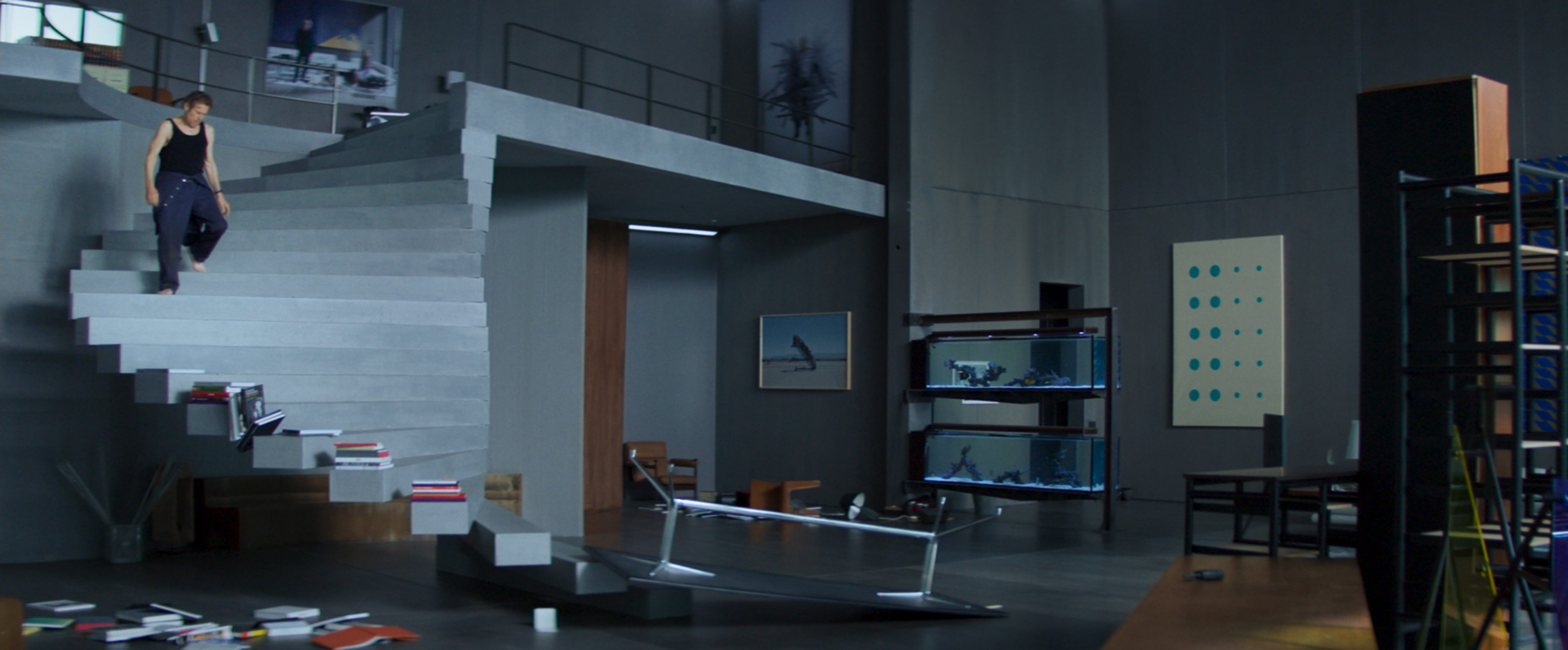
The apartment's staircase is inspired by Oscar Niemeyer’s Itamaraty Palace of the Brazilian Foreign Ministry
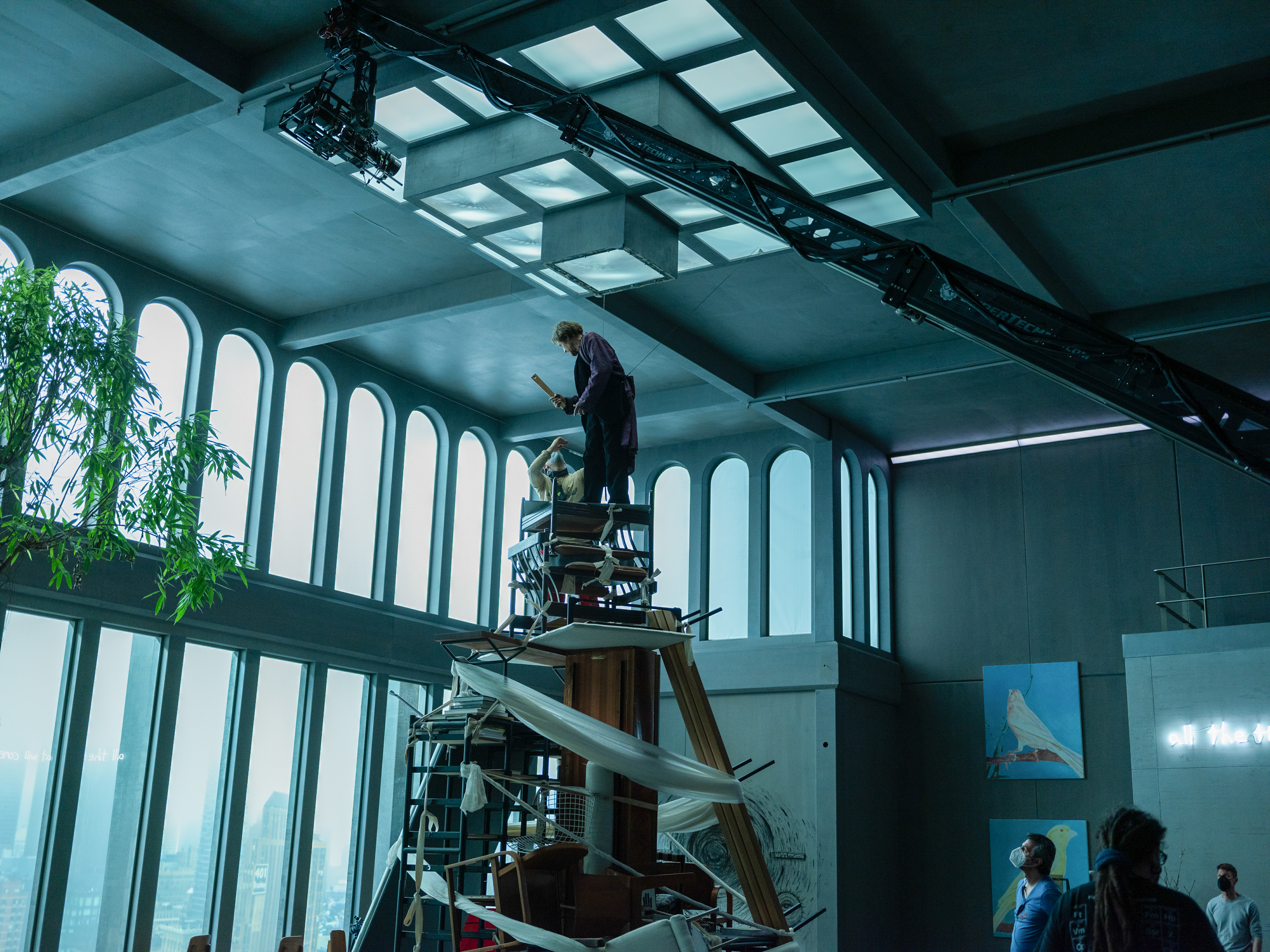
Says Katsopis: 'Together, we treated the penthouse as a giant birdcage made of glass and cement – where capitalism meets brutalism. The materials we used were minimal, cold, and raw, intensifying the “unwelcome” nature of the house and helping the artworks stand out.' The apartment then evolves throughout the film, as Nemo takes apart its art and design features to build a giant tower in an attempt to escape.
To bring the space to life, Sabel used light as a storytelling device. 'Nothing works in the apartment, just the light from outside through the huge window,' he says. 'But we needed to think about light sources during the night scenes, so our camera and lighting department came up a technical ground lighting, to have some light during the night scenes.
The film's set offers a commentary on luxury living, something at the heart of the director's concept: 'it's a high-rise apartment and you can't escape, nobody can help you, or hear you,' says Sabel. 'Most of the apartments in high-rise, high-price buildings like that are empty, they are just owned and nobody is living there. Nemo feels as lost and vulnerable as possible.‘
Receive our daily digest of inspiration, escapism and design stories from around the world direct to your inbox.
‘Inside’ movie set: a story told through art
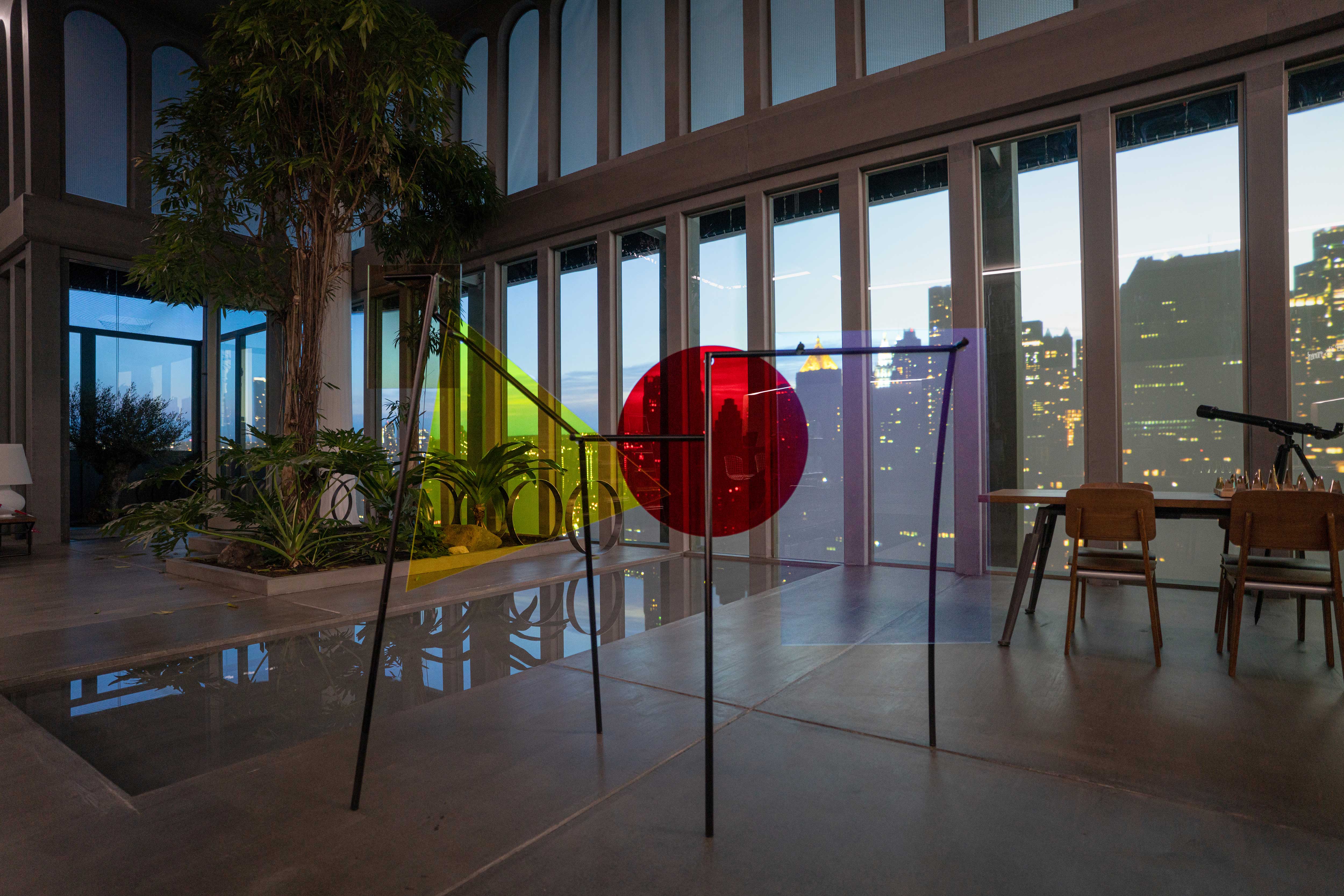
Amalia Pica, Memorial for Intersections #15, 2015. Courtesy Amalia Pica and Herald St, London
‘The set had to be so interesting for the camera and the acting that the audience not get bored after 20 minutes,' says Sabel. The apartment is filled with an eclectic mix of art, created in collaboration with Italian art curator Leonardo Bigazzi, who assembled a unique art collection featuring a diverse range of media including painting, sculpture, photography, drawing, installations, and video, ranging from figurative to abstract and conceptual works inspired by architecture.
Bigazzi worked closely with international galleries and artists, using some original artworks as well as specially-commissioned pieces. In particular, he commissioned a drawing by Francesco Clemente, photography by Albrecht Fuchs and further artworks by Alvaro Urbano and Stefanos Rokos.
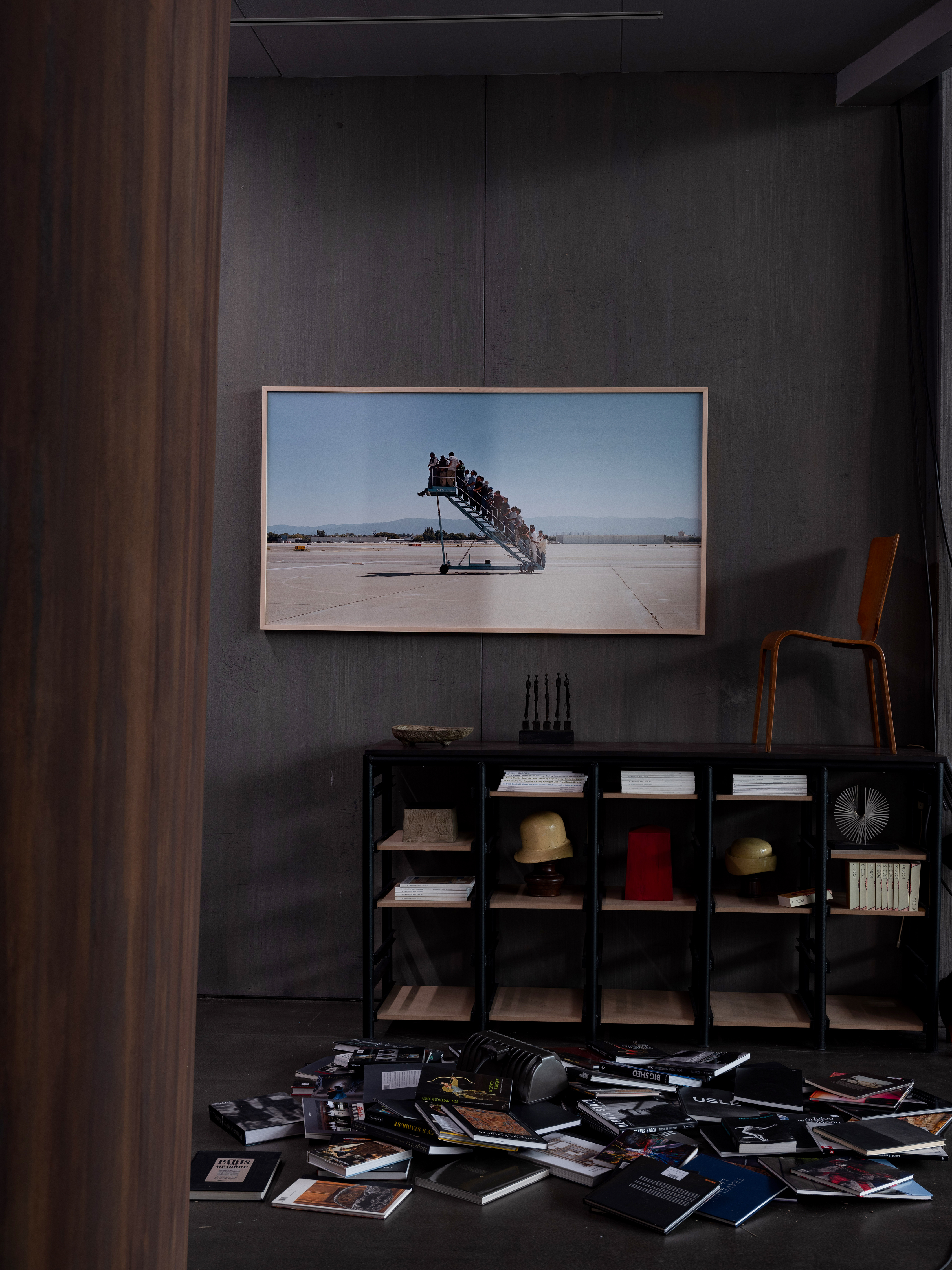
On the wall is Adrian Paci, Centro di permanenza temporanea (2007). Courtesy the artist, Peter Kilchmann galley, Zurich, kaufmann repetto, Milano, New York
While the team enjoyed the process of assembling the art collection as an artistic project, it was important that the space speak to the viewers of the film. 'Both a general audience and art connoisseurs will be able to trace the thread that links the experiences and the psychological condition of our main character to the different aesthetic and conceptual layers of the collection,' explains Bigazzi.
The art collection was also chosen for its symbolism: for example, Bogazzi notes, several of the artworks featured in the film are depictions of human figures, ideally witnessing Nemo's struggles throughout the movie. 'The iconography of some of the figurative paintings directly relates to the physical features of our tormented character, while other works resonate with his state of being trapped inside a man-made ecosystem,' the curator says. 'Strong and evocative images, often with allegorical meanings, amplify the general sense of discomfort and suspension in time and space. Specific abstract and conceptual works of the collection, with a subtle sense of irony, become tools that support Nemo in his fight to survive inside the penthouse.'
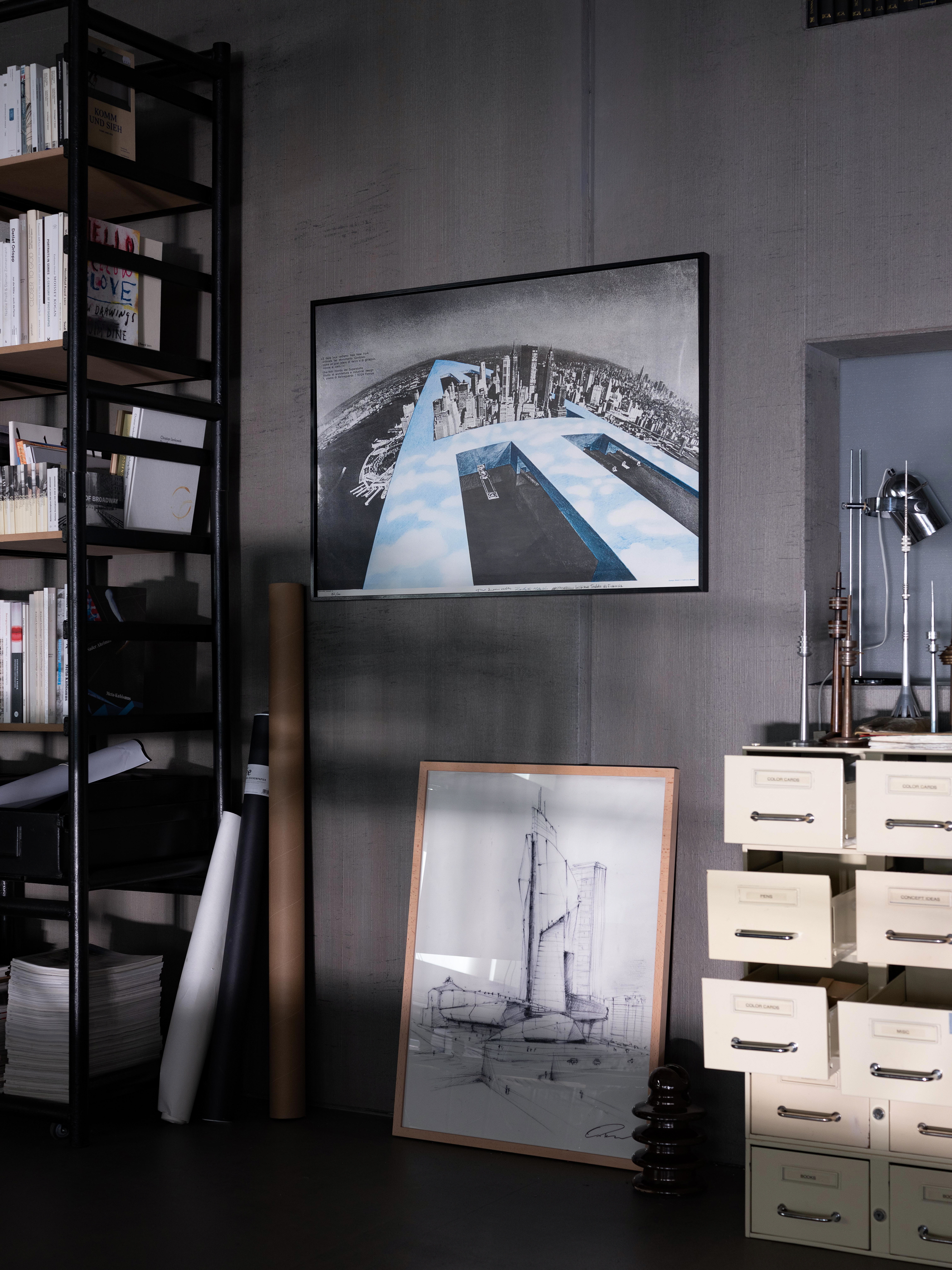
On the wall is Superstudio, Monumento Continuo- New New York (1969). Courtesy Archivio Superstudio
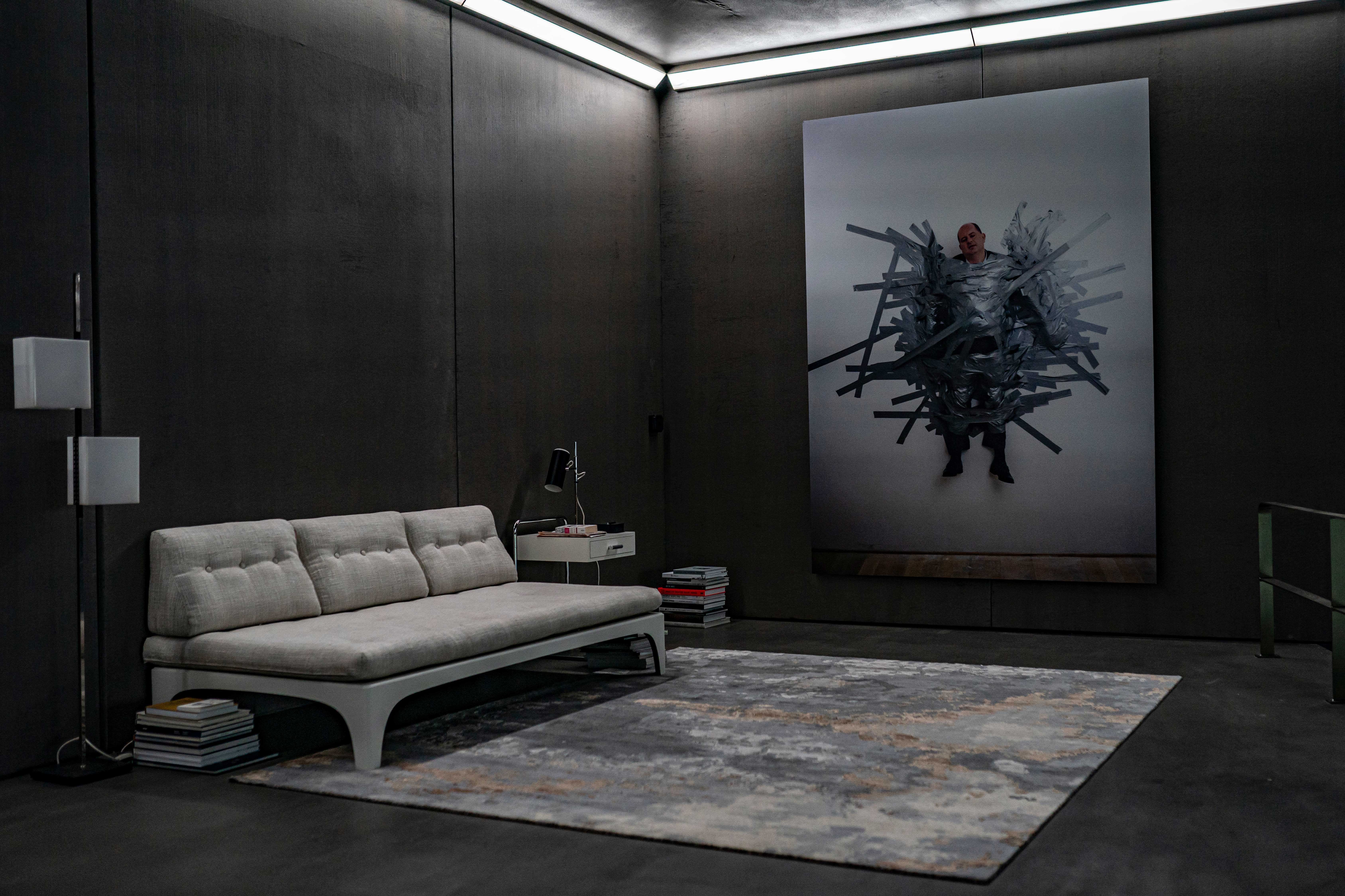
Maurizio Cattelan, Untitled (1999). Courtesy Maurizio Cattelan ,DECARLO and Maurizio Cattelan’s Archive
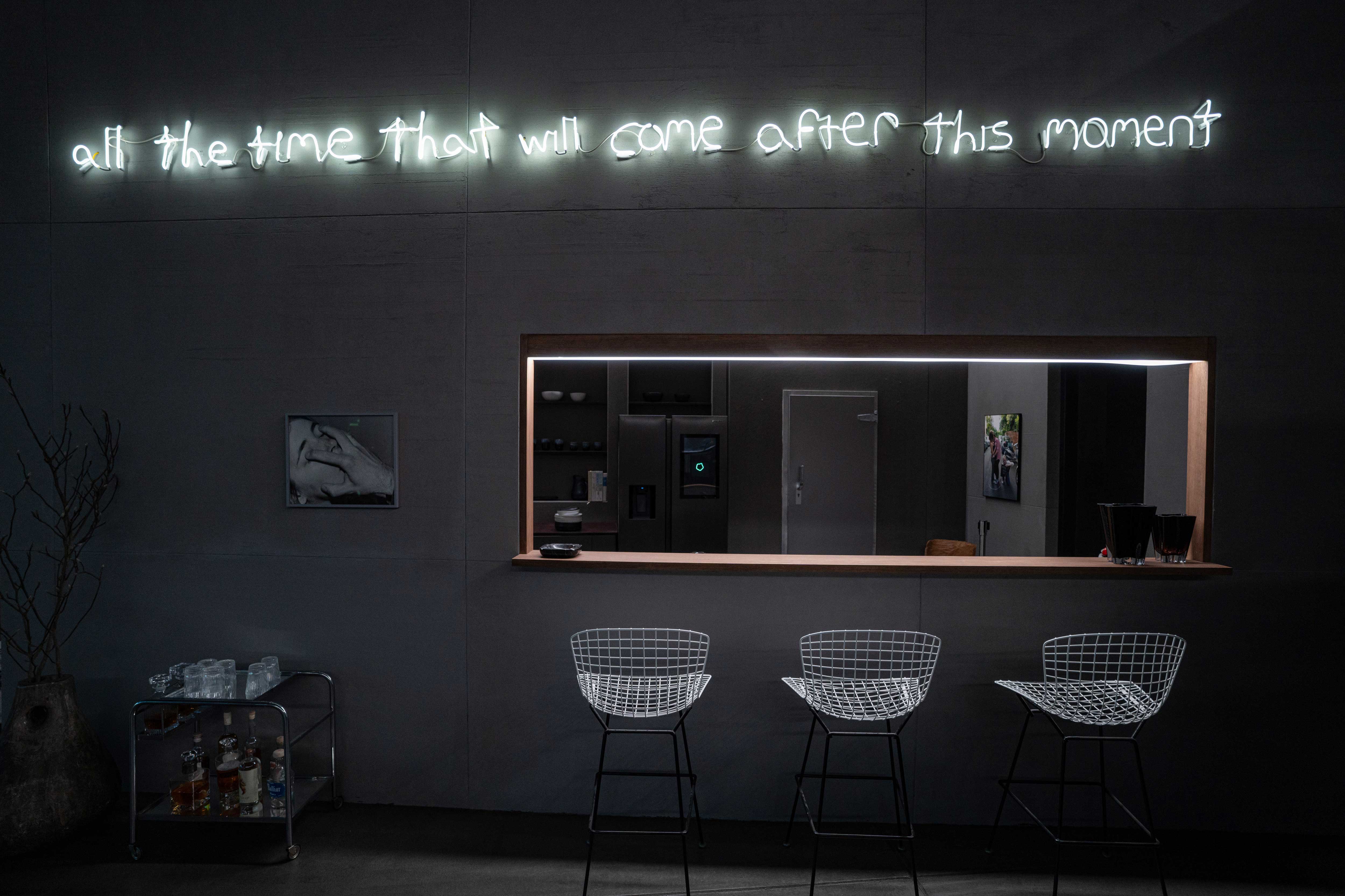
David Horvitz, All the time that will come after this moment (2019) neon installation. Courtesy the artist and ChertLüdde, Berlin. Joanna Piotrowska, Untitled (2017)
Rosa Bertoli was born in Udine, Italy, and now lives in London. Since 2014, she has been the Design Editor of Wallpaper*, where she oversees design content for the print and online editions, as well as special editorial projects. Through her role at Wallpaper*, she has written extensively about all areas of design. Rosa has been speaker and moderator for various design talks and conferences including London Craft Week, Maison & Objet, The Italian Cultural Institute (London), Clippings, Zaha Hadid Design, Kartell and Frieze Art Fair. Rosa has been on judging panels for the Chart Architecture Award, the Dutch Design Awards and the DesignGuild Marks. She has written for numerous English and Italian language publications, and worked as a content and communication consultant for fashion and design brands.