'To My Ships' is a new personal care brand with a clean conscience
We interview founder Daniel Bense and designers Formafantasma to hear how the brand came to life
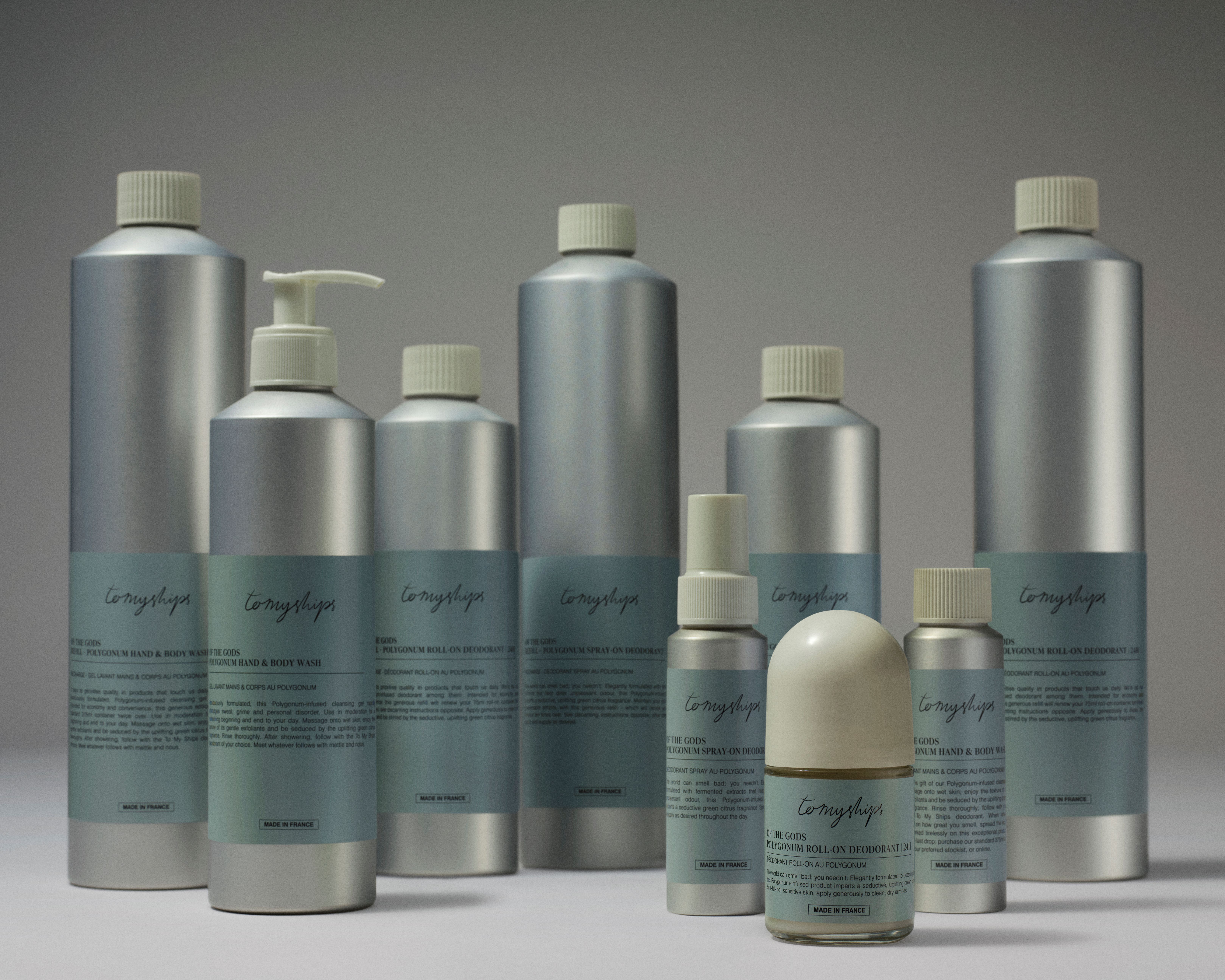
A new personal care brand, made from natural and naturally derived ingredients, is staking a claim for territory on our bodies and bathroom shelves. To My Ships was founded by Daniel Bense, formerly Head of Commercial at Aesop and Managing Director of Sunspel. Bense’s mission is to bring natural ingredients and fine fragrance together with intelligent packaging to create a poetic brand that might nudge consumer behaviour in a more conscious direction.
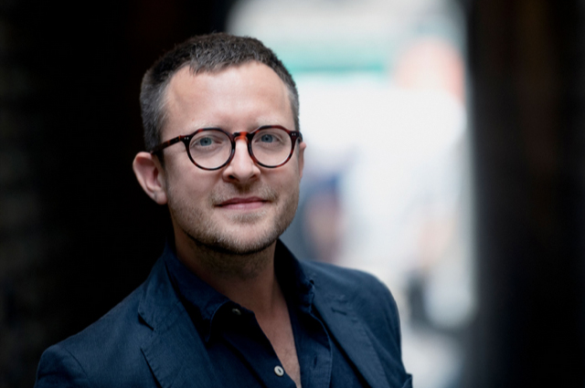
Bense called on the talents of Formafantasma to dig deep into all design decisions with their signature rigour. The packaging is post-consumer recycled and recyclable aluminium, and every product is refillable - also from aluminium refill containers. Working with a packaging manufacturer outside Bilbao, the team discovered that reducing the diameter of the bottles in favour of a taller, more slender proportion would save 10% of the material usage, resulting in a family of refined, handsome containers. And what of the contents? The inaugural launch comprises a deodorant, body wash and a fine fragrance, with a peppy main ingredient derived from flowers of the ‘polygonatum odoratum’ or Solomon’s Seal plant. The debut range is called ‘Of the Gods’ and take it from us, it smells divine. We gathered Bense and Formafantasma together to hear more…
Wallpaper*: Working with Formafantasma needs little justification, but I’m curious what attracted you to work with them in this instance?
Daniel Bense: We were keen to balance our brand positioning with our commercial expectations, while making sure we were designing products that expressed our values. Those brains don’t always overlap. We love the breadth of work that Formafantasma has done, whether for brands or cultural institutions, their deep engagement is always so impressive. We got in touch and asked if they’d be interested to help us by doing an audit of our fledgling brand to examine various viabilities. This is how it began – where it ended was a little different!
Formafantasma: We were delighted to see how we might work together, not just because the brand and product itself was interesting, but because there was a desire for a critical approach in their own process and development. This is what we love doing. It is the mindset in which we approach all of our work.
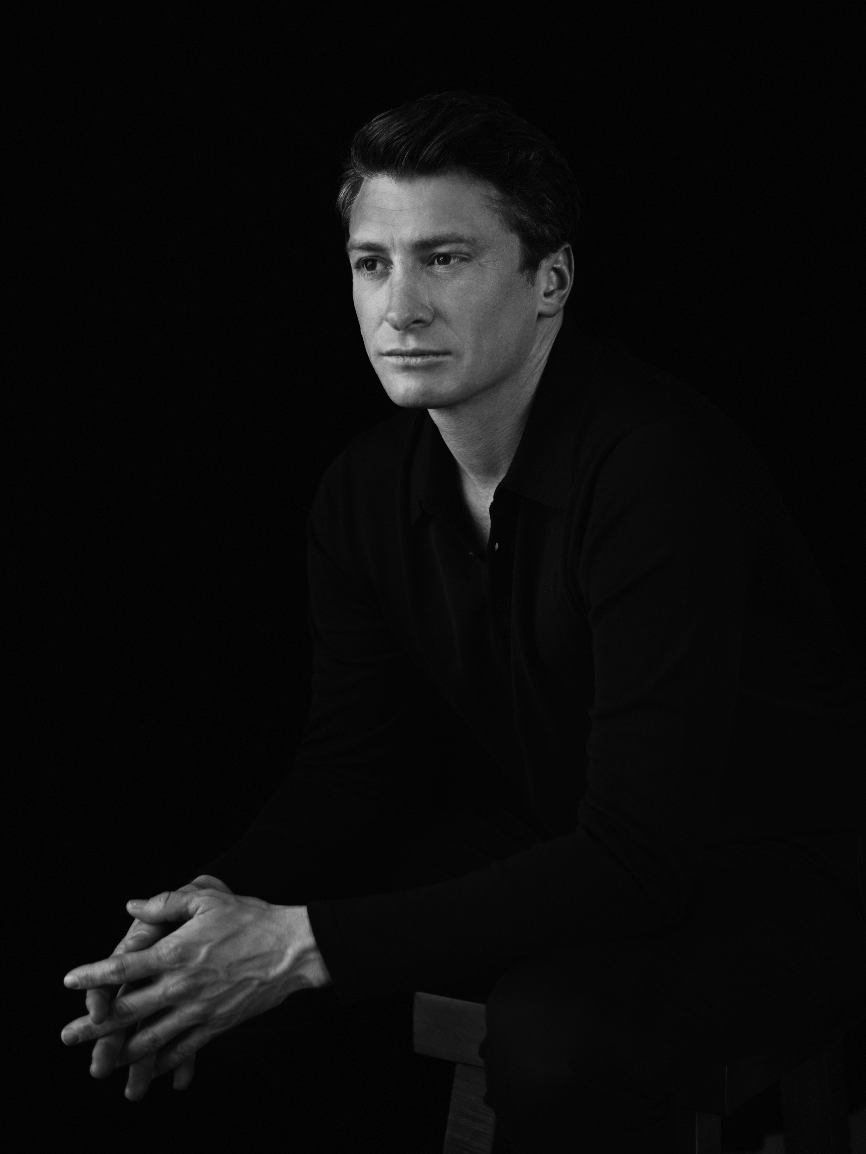
Daniel Bense, founder of 'To My Ships'
W*: Fortuitous commissioning then, to address systems not end products?
DB: Our entry point was not about designing a product line or packaging at that point. We were fairly certain about using aluminium, but our decision-making was based on assumptions so we were keen for Formafantasma to get digging.
Wallpaper* Newsletter
Receive our daily digest of inspiration, escapism and design stories from around the world direct to your inbox.
FF: The team at To My Ships granted us full access to all their decision-making. We were allowed to talk with their suppliers, designers, graphics people. We interrogated everything.
W*: Daniel you mention that you ended up somewhere different – I’m keen to hear where?
DB: The team went deep, as we knew and hoped they would. We stuck with fully post-consumer recycled aluminium as the material for our packaging, for its ongoing recyclability. Our learnings were in a shift in dimensions and a confident approach to shift consumer behaviour.

Andrea Trimarchi and Simone Farresin of Formafantasma
FF: While aluminium made sense for the reasons Daniel says, when we visited the bottle factory and producer near Bilbao, we learnt that if you reduced the diameter of the bottle to make it narrower and taller, you save grams of material – almost 10%. It might sound trivial, but at scale that’s a significant volume.
W*: That’s impressive. Use less is a golden rule of better design.
FF: Wherever possible we like to remove more than we add, work with less material, fewer people, smaller supply chains and see what is achievable. People sometimes say ‘no’ or ‘impossible’ but it’s important to push possibility to effect change. There is always something you can do. In this case, a shift in proportions of the bottles led to different decisions about volumes and quantities, and the relationships between people and their personal care habits. In the best cases you end-up with a refined system, not just a nice product.
DB: In our case we have also ended-up with more beautiful bottles.

Gregorio Gonella of Formafantasma
FF: What we find sexy in the packaging is that it is not sexy. There’s a wonderful directness to it; it’s not trying to seduce you. There’s no fuss. This is a refreshing approach in the personal care and beauty industry. We were based in Holland for several years; we like straightforward things.
W*: Daniel you mentioned shifting consumer behaviour – tell us more…
DB: It’s widely known and understood that the beauty industry needs to get rid of mini bottles. Formafantasma pushed us to go up in size and to think about refilling less frequently and from vessels also made from aluminium. We aim to encourage refilling and reusing first and only later recycling. We hope the archetypal shape and material of the bottle will encourage people to reuse and not automatically recycle.
FF: More and more beauty brands are doing refillables, with a precious bottle to keep and a shitty bottle to refill from and throwaway. It makes no sense to throwaway a bottle fill up another one. So we equalised the packaging by using aluminium and increased the sizing. We also reduced the label size, and made sure nothing was printed on the bottles themselves, and the label glue leaves no trace on the bottle either. You could use them as a water bottle once they’re empty if you wish.
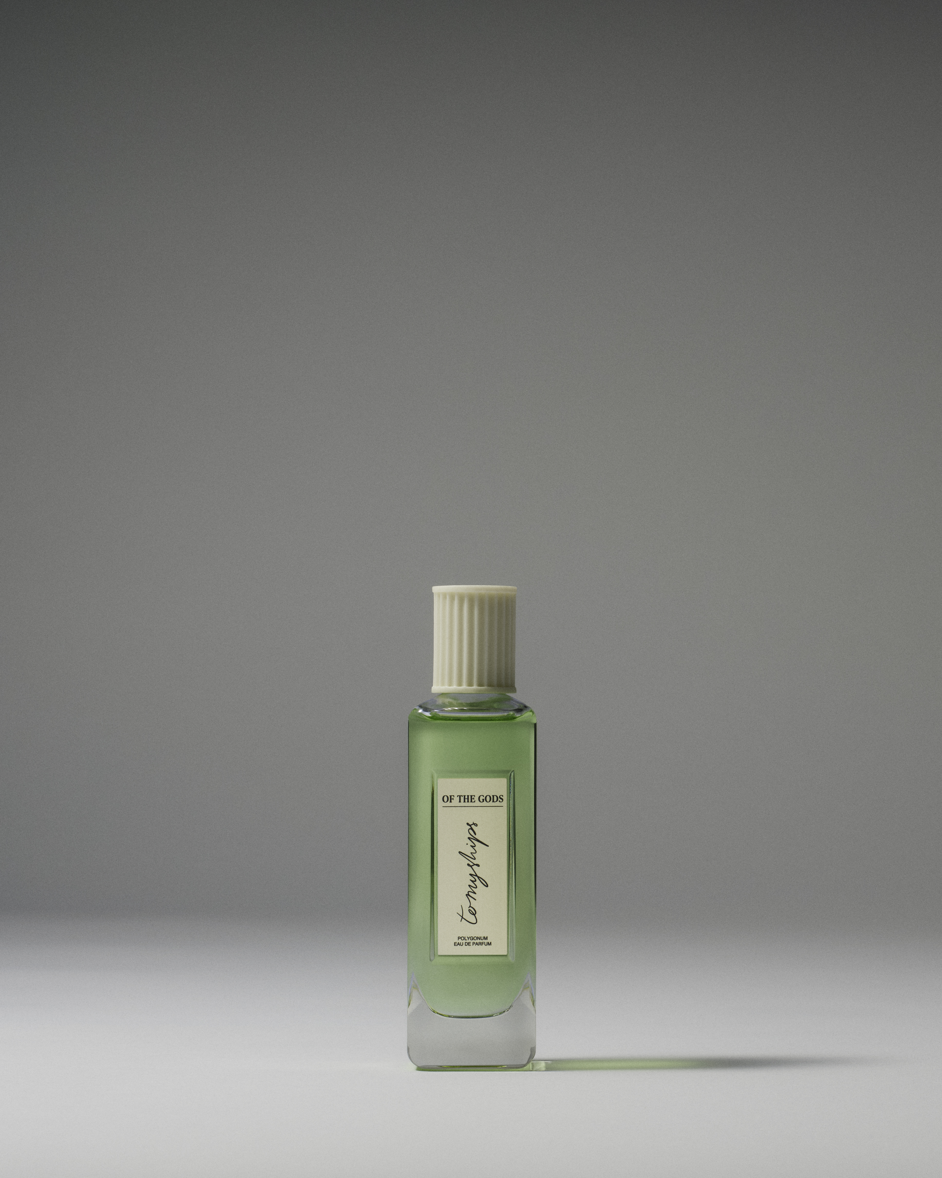
The Eau de Parfum 'Of the Gods' from 'To My Ships'
W* Hmm how clever. I hope it tastes as good as it smells. On that note, tell me about the magic ingredient that I’m unfamiliar with: Polygonum.
DB: Our first range of products is called ‘Of the Gods’ and we’ve used Polygonum Odoratum, native to southeast Asia, from the Solomon Seal family. It’s rarely found in natural sources, but Lily of the Valley is a relative. It has a top note high in aldehydes and a bold natural brightness, which is seductive without being overbearing. Someone described it as smelling like the steam from an iron.
W*: I can totally get that. I have had so many people ask me about it in the short time I’ve been trialling it since we last met. Beyond this wonderful ingredient, what have you learnt through the process of bringing this brand to market?
DB: Integrity and trust really matter when it comes to building any brand, especially in the realm of personal care. It’s not just a rewarding way of doing business, it really resonates with the end consumer. You have to know your suppliers and build relationships with them. Sharper scientific developments nowadays are unlocking the potential for natural ingredients to be used in place of synthetic ones. Science is helping us figure out what nature can do.


Hugo is a design critic, curator and the co-founder of Bard, a gallery in Edinburgh dedicated to Scottish design and craft. A long-serving member of the Wallpaper* family, he has also been the design editor at Monocle and the brand director at Studioilse, Ilse Crawford's multi-faceted design studio. Today, Hugo wields his pen and opinions for a broad swathe of publications and panels. He has twice curated both the Object section of MIART (the Milan Contemporary Art Fair) and the Harewood House Biennial. He consults as a strategist and writer for clients ranging from Airbnb to Vitra, Ikea to Instagram, Erdem to The Goldsmith's Company. Hugo has this year returned to the Wallpaper* fold to cover the parental leave of Rosa Bertoli as Global Design Director.
-
 Extreme Cashmere reimagines retail with its new Amsterdam store: ‘You want to take your shoes off and stay’
Wallpaper* takes a tour of Extreme Cashmere’s new Amsterdam store, a space which reflects the label’s famed hospitality and unconventional approach to knitwear
By Jack Moss
-
 Titanium watches are strong, light and enduring: here are some of the best
Brands including Bremont, Christopher Ward and Grand Seiko are exploring the possibilities of titanium watches
By Chris Hall
-
 Warp Records announces its first event in over a decade at the Barbican
‘A Warp Happening,' landing 14 June, is guaranteed to be an epic day out
By Tianna Williams
-
 Elegant floor lamps to brighten autumn nights
The best floor lamps and where to buy them: switch on to subtle lighting with our edit of elegant standing lamps for your home
By Ali Morris
-
 Formafantasma’s minimalist, responsible shelving system for Hem
Formafantasma and Hem unveil the ‘T Shelf’, a design in extruded aluminium created in collaboration with specialist Hydro
By Anne Soward
-
 Formafantasma on GEO-Design and design education
Design Emergency began as an Instagram Live series during the Covid-19 pandemic and is now becoming a wake-up call to the world, and compelling evidence of the power of design to effect radical and far-reaching change. Co-founders Paola Antonelli and Alice Rawsthorn took over the October 2020 issue of Wallpaper* – available to download free here – to present stories of design’s new purpose and promise. Here, Paola Antonelli talks to designers Andrea Trimarchi and Simone Farresin of Studio Formafantasma
By Paola Antonelli
-
 Studio Formafantasma tackles the ‘mammoth’ problem of electronic waste recycling through design
By Pei-Ru Keh