'It turns ordinary moments into sensory experiences' – a colour theorist's verdict on Pantone's Colour of the Year
The PANTONE 17-1230 Mocha Mousse is a soft brown hue that evokes the warmth of coffee, chocolate and cocoa
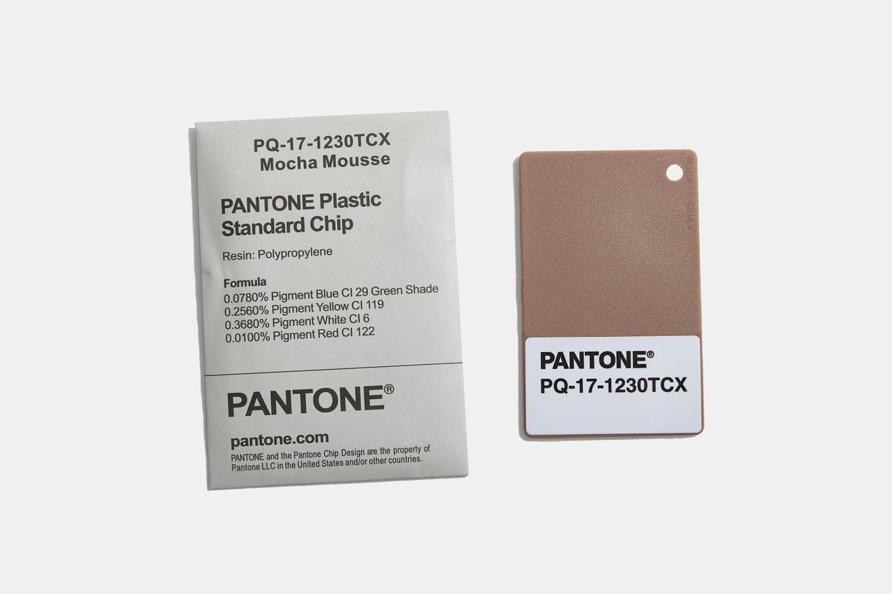
Pantone has unveiled Mocha Mousse (17-1230) as its Colour of 2025, drawing inspiration from the world’s cherished beverages and desserts, such as coffee and chocolate. This mellow brown shade radiates feeling of warmth, comfort, and pleasure.

Leatrice Eiseman, Executive Director of the Pantone Colour Institute, describes Mocha Mousse as 'sophisticated and lush, yet at the same time an unpretentious classic,' extending our perception of browns from humble and grounded to aspirational and luxe.
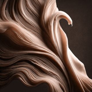
Colour theorist Jane Boddy's verdict on Mocha Mousse
Jane Boddy is a colour trend forecaster and fashion designer with over twenty years experience. We asked for her take on Pantone's choice for colour of the year 2025.
'Mocha Mousse (PANTONE 17-1230) is a sensorial colour that captivates the eye while engaging other senses like touch, smell, and taste. Its soft, velvety appearance is visually soothing, but its true beauty lies in its ability to ignite the imagination. This rich brown hue, reminiscent of the earthy depth of cacao and the comforting warmth of freshly brewed coffee, goes beyond the visual to create a deeply immersive sensory experience. Its aromatic allure stimulates multiple senses.
Whether it’s the indulgence of velvety hot chocolate, the smoothness of coffee, or the nostalgic scent of leather-bound books, Mocha Mousse (PANTONE 17-1230) enriches our daily interactions, turning ordinary moments into sensory experiences that are both comforting and indulgent.
As we approach 2025, the importance of individual priorities, self-care, and mindfulness is expected to shape consumer behaviour. Mocha Mousse (PANTONE 17-1230) resonates with this shift, embodying the desire for simple, meaningful pleasures in daily life. It reflects a broader need for calm, presence, and sustainable living, aligning with the growing appreciation for premium aesthetics and the comforting familiarity of everyday luxuries.
The colour’s versatile appeal lies in its earthy, grounding qualities, which promote peace and natural beauty while enhancing the overall quality of life. Its soft, velvety brown tone, accented with gentle pink undertones, adds a sensual and inviting dimension. These pink notes subtly enrich its warmth, giving it a unique, sophisticated character that feels both contemporary and timeless.
Wallpaper* Newsletter
Receive our daily digest of inspiration, escapism and design stories from around the world direct to your inbox.
From a design perspective, Mocha Mousse (PANTONE 17-1230) is incredibly adaptable, making it a commercial success across various markets. It complements and enhances other colours effortlessly, whether in fashion, interiors, automotive design, or technology. Its commercial appeal is rooted in its ability to pair harmoniously with diverse palettes, resonating with the cautious optimism of today’s market. At the same time, when used alone or paired with similar shades, it achieves a refined, highly modern aesthetic that exudes sophistication and understated elegance.
Mocha Mousse exemplifies the essence of everyday luxury and the aesthetics of simplicity, offering a colour that balances warmth, versatility, and a sense of presence. It invites us to savour the small joys of life, proving that even the simplest elements—when thoughtfully designed—can inspire a profound emotional connection.
Mocha Mousse (PANTONE 17-1230) highlights the evolving role of design, where colour choices go beyond aesthetics to evoke deeper emotional connections. This trend reflects a growing emphasis on adding dimension and meaning to design, making it more impactful and resonant.'
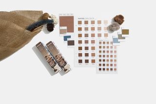
Continuing the momentum from last year’s selection of 'Peach Fuzz,' Pantone reaffirms its commitment to environmentally conscious choices in its colour selections.
Each year, forward-thinking and innovative brands collaborate with Pantone to develop products inspired by the Colour of the Year. This year's launch partners include Motorola, Joybird, Pura, WIX Studio, Libratone, Spoonflower, IPSY, Society6, Ultrafabrics, Capsule 11, Oyuna, and Post-it, showcasing a diverse range of applications from technology and furniture to fashion and office supplies.
In celebration of the 26th anniversary of Pantone Colour of the Year, Pantone will, for the first time, showcase its colour through events and experiences around the globe. From New York and London to Shanghai and Mumbai, Pantone will transform public spaces and host vibrant colour events, ensuring that the Pantone Colour of Year 2025 is celebrated and accessible to everyone.
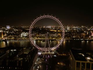
Launching the festivities, Pantone will illuminate the London skyline on Thursday the 5th of December in Mocha Mousse in collaboration with the London Eye. This inaugural event will be open to the public starting at 7 p.m.
Smilian Cibic is an Italian-American freelance digital content writer and multidisciplinary artist based in between London and northern Italy. He coordinated the Wallpaper* Class of '24 exhibition during the Milan Design Week in the Triennale museum and is also an audio-visual artist and musician in the Italian project Delicatoni.
-
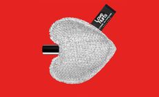 Dover Street Market reissues a rare piece of Comme des Garçons perfume history
Dover Street Market Paris has re-issued the heart-shaped packaging from Comme des Garçons 2 Love Hurts, a limited edition design first launched in 2005
By Hannah Tindle Published
-
 The Wallpaper* wellness report: Joining 150 people in the sauna at London’s first contrast therapy centre
For this instalment of the Wallpaper* wellness report, Emma O’Kelly investigates the rise of contrast therapy by joining more than 150 people at the opening night of Arc in London
By Emma O'Kelly Published
-
 Wallpaper* checks in at Park Hyatt London River Thames: ‘Luxury meets the skyline’
Tour the long-awaited debut of the Park Hyatt brand in the UK, soaring within a KPF-designed sleek glass tower in Nine Elms
By Sofia de la Cruz Published