Giulio Ridolfo’s latest colour work for Kvadrat is ’like a piece of jazz that you can play in different ways’
Orgatec 2022: Kvadrat expands the Steelcut collection by Giulio Ridolfo, a series of vibrant blends of colours demonstrating the colour maestro’s eclectic sensibility

Receive our daily digest of inspiration, escapism and design stories from around the world direct to your inbox.
You are now subscribed
Your newsletter sign-up was successful
Want to add more newsletters?
Conversing with Giulio Ridolfo is rather like joining the Italian colour maestro as he saunters around a city or the countryside, using all his senses to fuel his creative process. Ostensibly meeting to talk about three new textiles he has developed for Danish textile company Kvadrat, he meanders, pausing to note a yellow flower on a photo here, listen to a dissonant note there, or admire the layered colours of a Paul Klee painting on a postcard he picked up somewhere. Ridolfo, who trained as a fashion designer before becoming a colour adviser to many leading interiors and fashion companies, draws inspiration from his surroundings, always in analogue. ‘I have to touch things. I have to show you a postcard, I have boxes of them, look at this beautiful nymph from the archaeology museum in Napoli.’
He is such a bower bird, travelling with a seemingly bottomless suitcase to cart his haul home, that he calls himself Mario Poppins. And like the character from the children’s book, there is something magical or alchemical in how he translates mementoes into a realm of colour. ‘To me, work is like a travelogue. I learn by doing, I collect my souvenirs, which I can use or not, I blend stories, I can create mock-ups about a postcard or a piece of leather I bought in Australia. The system of colour to me is nothing, if not compared to other sources.’
Giulio Ridolfo and Kvadrat: the Kvadrat Steelcut collection
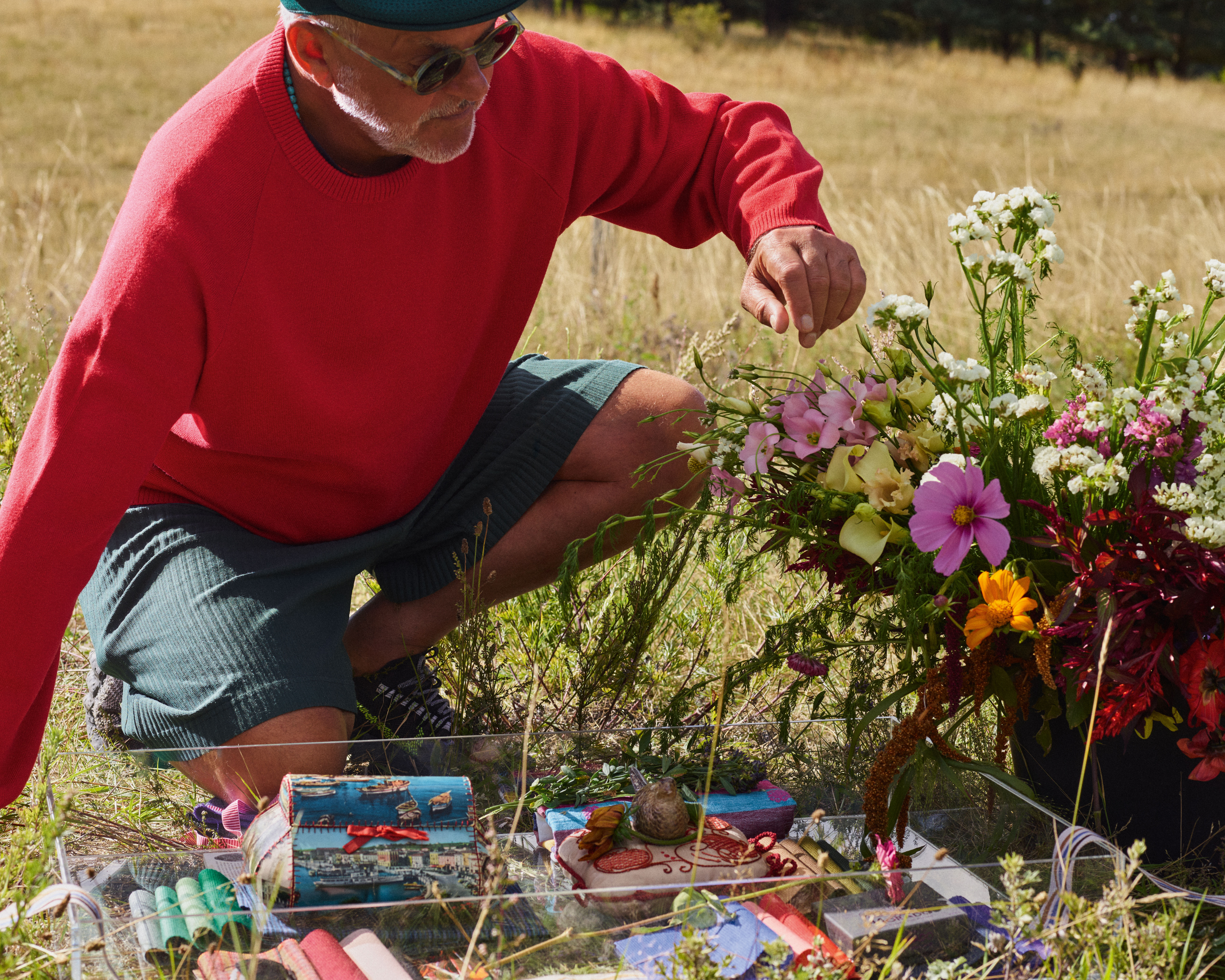
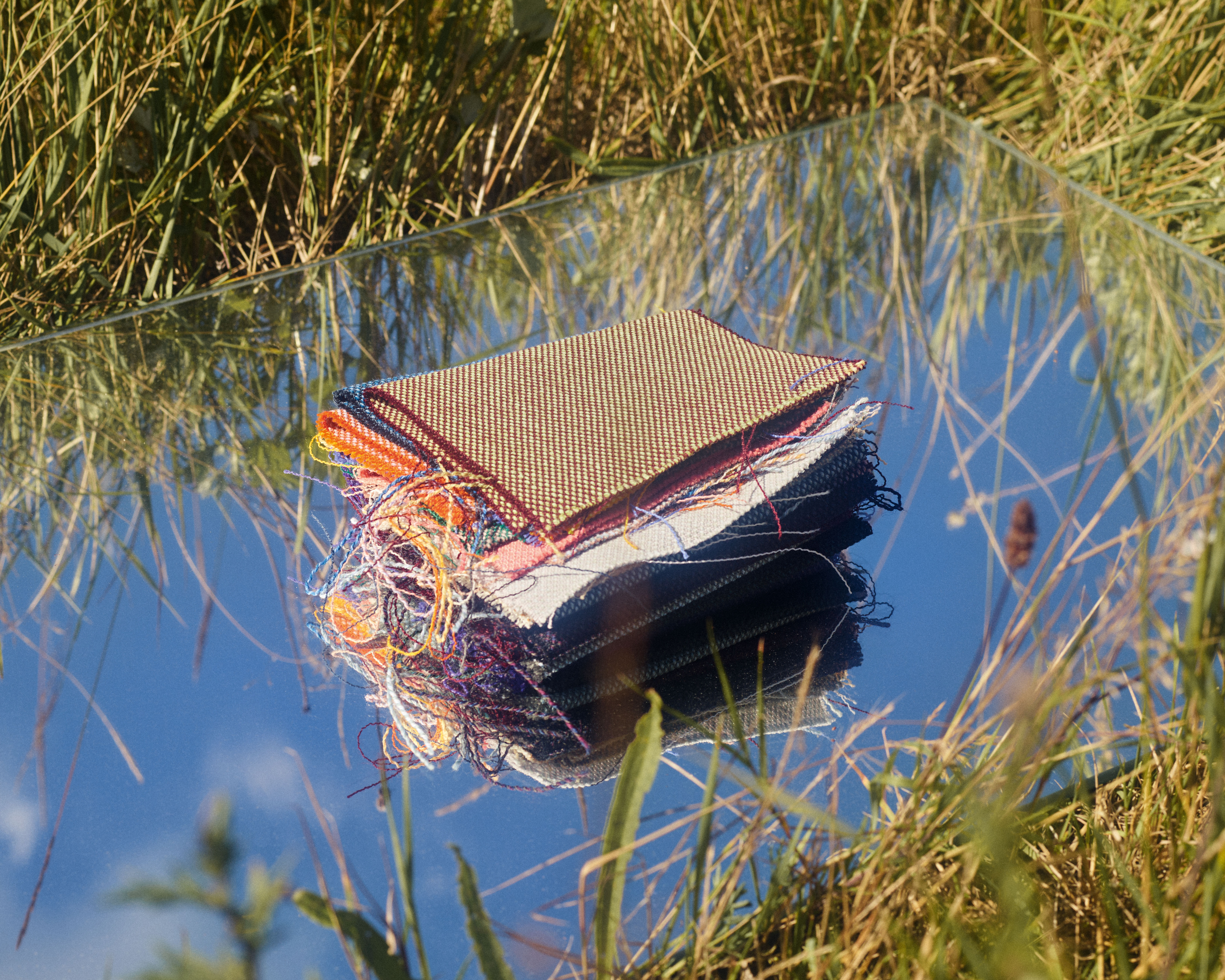
Giulio Ridolfo with samples of the new Steelcut collection for Kvadrat alongside objects that have inspired the colours for the series
Ridolfo has worked with Kvadrat for 15 years. He likes to say that he used his southern European colour sensibility to ‘contaminate’ a company rooted in the design traditions of a region known for its cool Northern light. The relationship began with the first version of Steelcut, developed in 2004 by Dutch master weaver Frans Dijkmeijer, who invited Ridolfo to create the colour palette. The Italian is so embedded within Kvadrat that, when he conducted a workshop at the headquarters in Ebeltoft a few years ago, he timed it for summer solstice so he could weave inspirations from the Sankt Hans celebrations into a new colour range. He makes the point that he doesn’t design textiles, but rather creates colours in the context of the textiles. He believes that colour is nothing without a material, and vice versa.
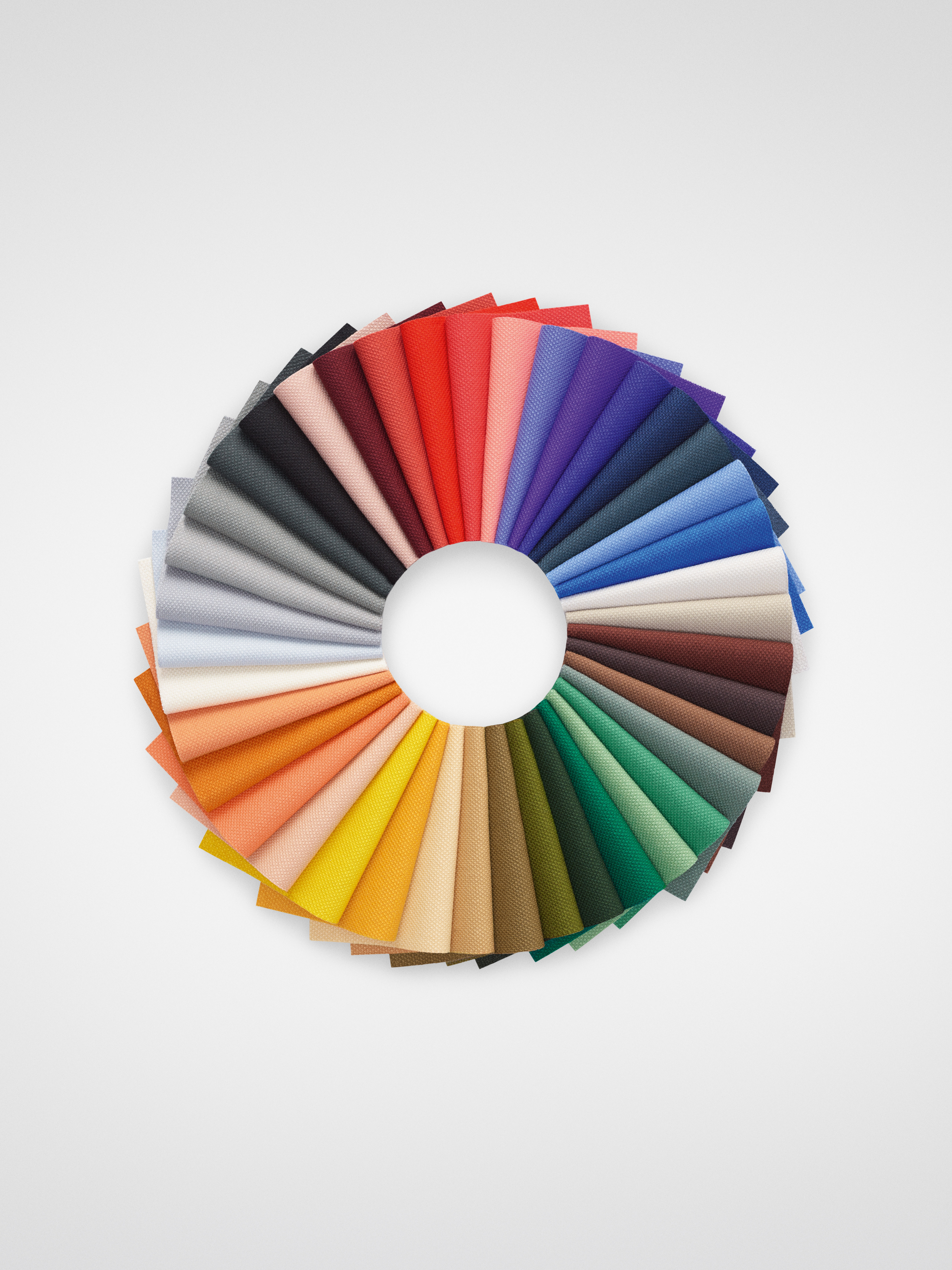
Steelcut 3 colour wheel
An example of his impact came with Steelcut Trio, launched in 2007, a basketweave construction made up of three threads that has an almost faceted surface. Unlike the original Steelcut, which was piece-dyed (coloured as a whole), Steelcut Trio is yarn-dyed (the individual threads are dyed before weaving), which allowed Ridolfo to bring complex and sophisticated colour effects. His latest iteration, Steelcut Quartet, blends four colours. In musical terms, Trio is a minimal harmonic rhythm by [American minimalist composer] Steve Reich, whereas Quartet is more of a jazz standard, he says. ‘Quartet is the result of a beautiful blending of four yarns with a kind of vibration. The yarns are the same as Steelcut Trio. We only play with more. To me, Quartet is fired by [Canadian jazz composer] Oscar Peterson, a good standard, like a piece of jazz that you can play in different ways.’
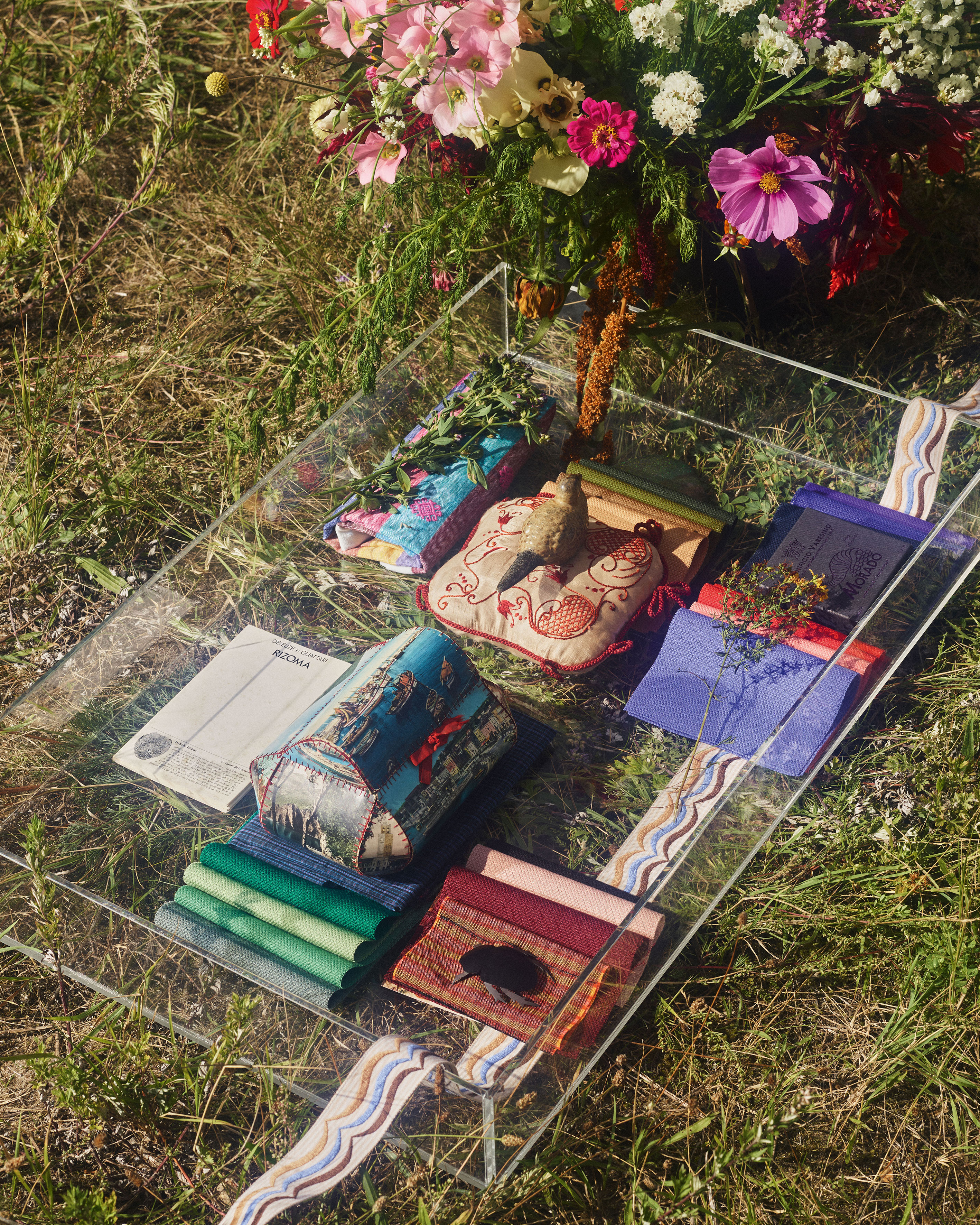
To demonstrate his point, he takes a sample of Quartet with a weft (effectively a base note) of purple. It is the dominant tone, used also as a yarn in the warp combined with another thicker one made by twisting three colours into one yarn, creating more vibrancy and nuance. A deeper version with the same purple base is directly inspired by the layering of moody colours in Klee’s Angelus Militans (1940). ‘If you are an artist you can work with layering, you see the colour becomes deeper and deeper when you layer one, two, three, four colours.’
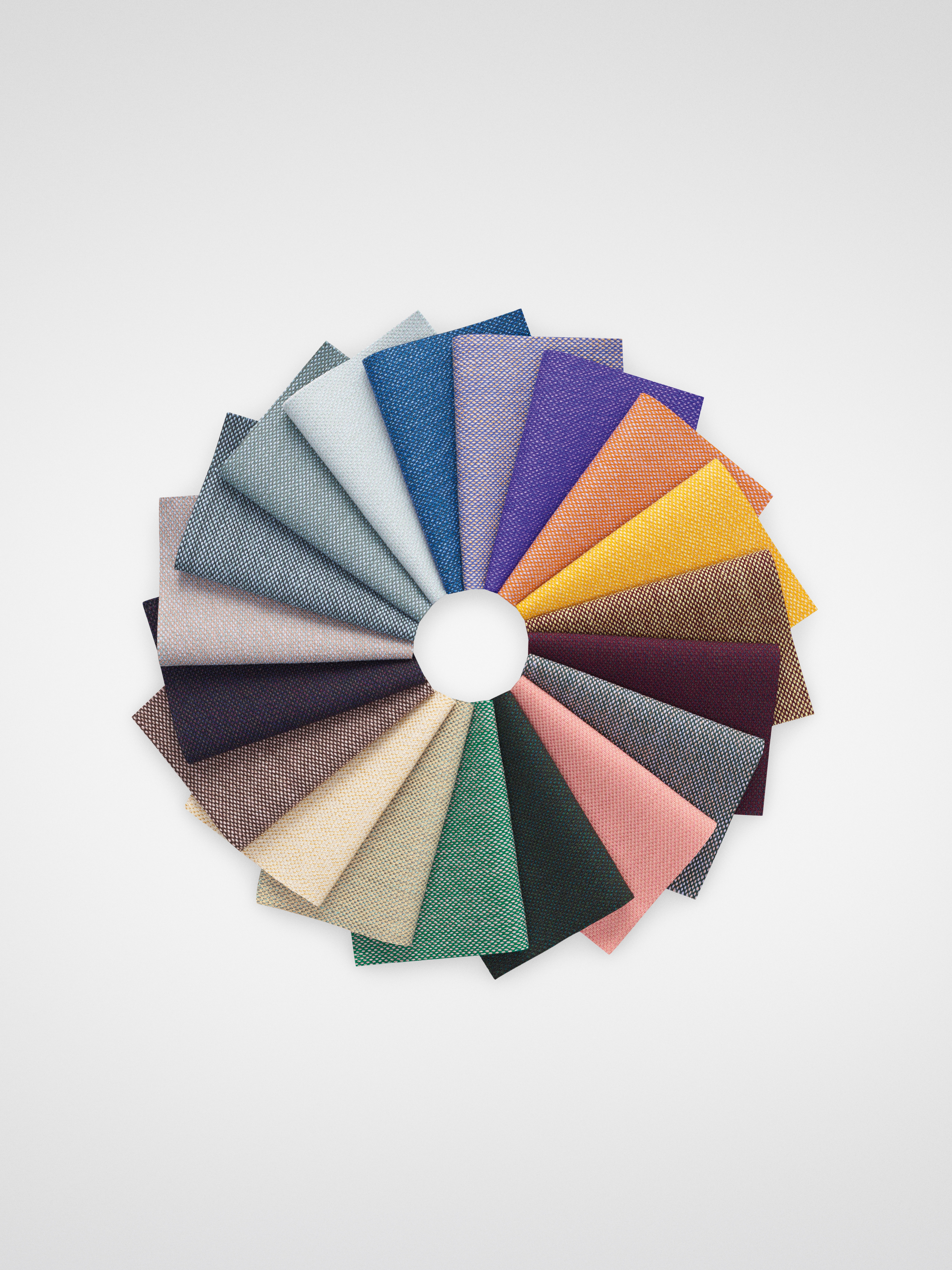
Steelcut Quartet colour wheel
As well as updating the palette of Steelcut to an iteration called Steelcut 3, with 19 new colours, Ridolfo also developed a checked version made out of 100 per cent recycled polyester. Intentionally colouring it in bright, happy hues, Ridolfo called it Beat (to be launched in 2023). The fabric seems to have the effect of synaesthesia on him, he almost taps his feet to the tune he can see in the jaunty checks. ‘It’s like a beat, like a sound,’ he says before rattling off the fabric’s many references, ranging from cotton stripes in Sumatra, to colourful ski suits, the nymph from Naples, and a vintage Hermès foulard in emerald green with a hand-rolled border in chocolate brown. ‘This is only the beginning. There will be many, many colours, big checks, small checks,’ he says, with a faraway look in his eye.
Receive our daily digest of inspiration, escapism and design stories from around the world direct to your inbox.
Jeni Porter is the founding Editor and now Editor-at-Large of Ark Journal, a Copenhagen-based architecture, art and design magazine. Originally from Sydney, Jeni also writes for a range of international publications and does commissioned editorial-based projects for leading Danish brands.