First Look: Remsen reframes ageing through design. ‘As you age, you should want the things you need’
New brand Remsen is on a mission to shift perspectives on ageing, re-envisioning “geriatric products” as luxury home goods.

Rosa Bertoli
Ageing populations are a growing concern across swathes of the planet, so it stands to reason that we’re seeing an increasing number of initiatives by urbanists, developers, architects and designers aimed at easing the grimmer realities of our twilight years. After all, old age is a fact of life not a medical diagnosis and, though we clearly have more specific needs as we get older, those needs can be met with beauty and dignity. Enter a new brand Remsen, founded by New York-based architects Sam Zeif and Spencer Fried, who are bringing to market a range of objects, furniture and household elements designed with compassion for elderly people to love.
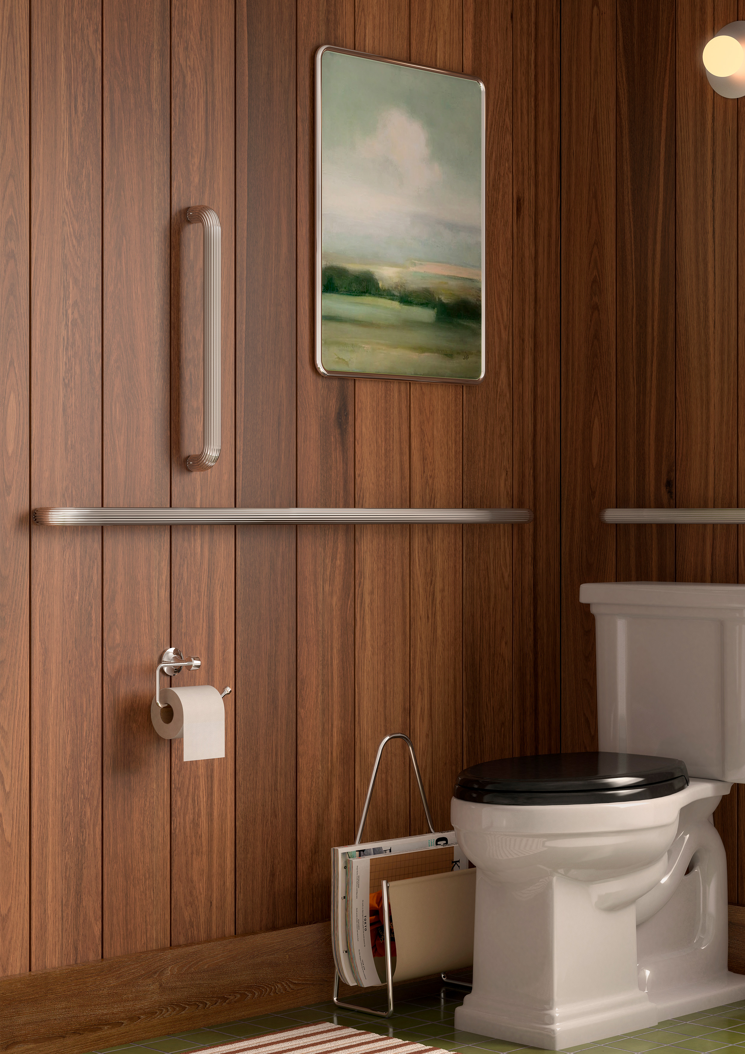
Handsome grab bars with tactile knurling
Growing up in multi-generational households gave Fried and Zeif a clear idea of how inadequately designed everyday essential objects for elders could be. After meeting as students at Yale, then working at Herzog & de Meuron, Tankhouse and Post Company, the duo have taken grey matters into their own hands with Remsen, designing, manufacturing and retailing a portfolio of products aimed to address how our daily needs evolve with age.
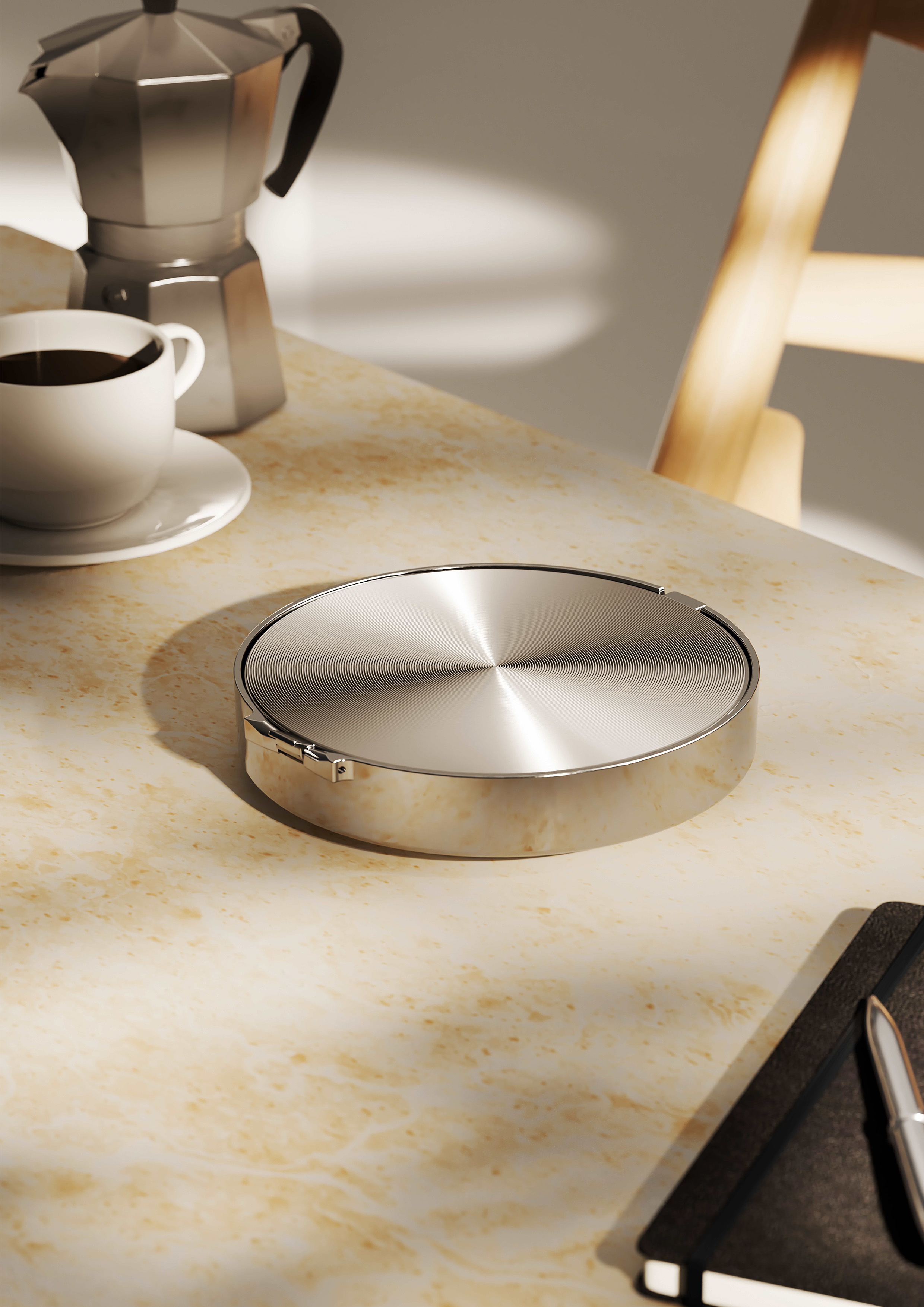
Remsen's pill box
The first two products to launch are a pill container and a grab bar with a cane, card holder, a shower chair and a key turn on the horizon. Each is a careful balance of form, function and feeling. They are designed to troubleshoot the inevitabilities of impaired human ability, whilst adding craft and charm into the mix; these qualities are not mutually exclusive and, as the duo correctly point out, joy only enhances a product’s function. For too long we’ve taken as standard that products for older people should be white plastic and wipe-clean. Nonsense. We took the opportunity of speaking with Fried and Zeif to find out more…

Sam Zeif and Spencer Fried
Wallpaper*: Where did the idea for Remsen come from?
Fried and Zeif: We were both fortunate enough to grow up surrounded by multiple generations of family, and we saw just how underwhelming the products our elders needed and used every day were. The existing products on the market are pessimistic — no appreciation for the fact that our sense of style and appreciation of beauty don’t go anywhere with age. This shared insight shaped Remsen's mission: to craft beautiful, premium products that address a market often overlooked by the design industry. People are not patients, and we are past seeing age and disability as something to fear or solve for.
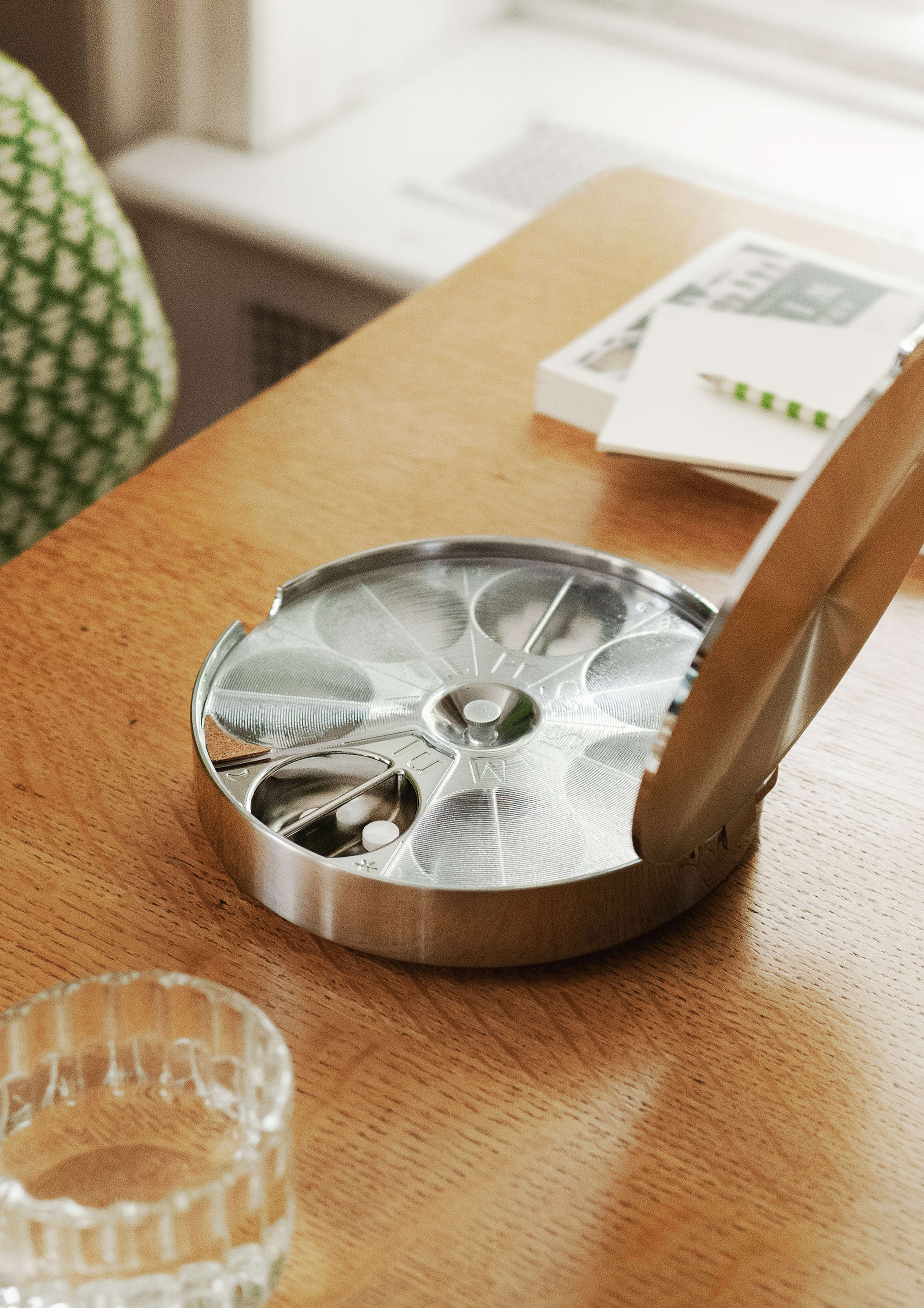
Remsen's pill box
W*: What previous experiences, or references you had encountered, informed the first steps of the project?
F. and Z: We’re both architects by training and we saw that the essential objects our loved ones needed as they aged routinely failed them — not because they didn't work, but because they didn't bring any joy, pride or beauty. Instead of celebrating age, these objects tended to be sterile and cheap — medical devices, not designed objects. Remsen intends to shift perspectives on ageing through the design of these everyday goods. We believe that as you age, you should want the things you need.
Receive our daily digest of inspiration, escapism and design stories from around the world direct to your inbox.
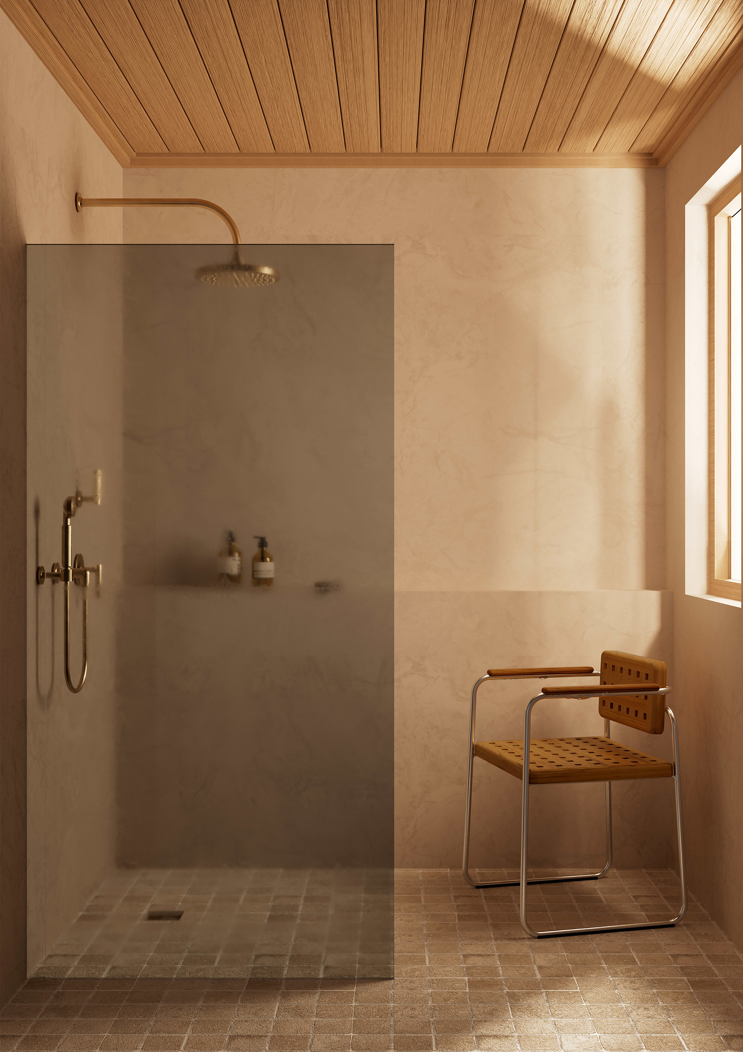
Remsen's chair for the bathroom
W*: Can you tell us about the objects that are part of the launch, and how you chose them?
F. & Z: We’re introducing our Pill Container and Grab Bar as our first products. Both products embody Remsen’s mission of combining functionality and beauty to create pieces that you can be proud to display in your home.
The Pill Container is a stunningly minimal cast aluminium object with a mirrored underside and a secure, sculptural arrangement of compartments organised according to the days of the week. Every element of this pill container, from its ergonomic design to its practicality and aesthetic allure, has been thoughtfully considered to transform a mere routine into a meaningful ritual.
Likewise, unlike its cumbersome counterparts, Remsen’s Grab Bar is an elegant and welcome addition to a tastefully conceived bathroom. This fixture, with its polished nickel finish, fluted profile, and concealed stainless steel mounting hardware, caters as much in its functionality as it does in its ability to amplify an interior design vision.
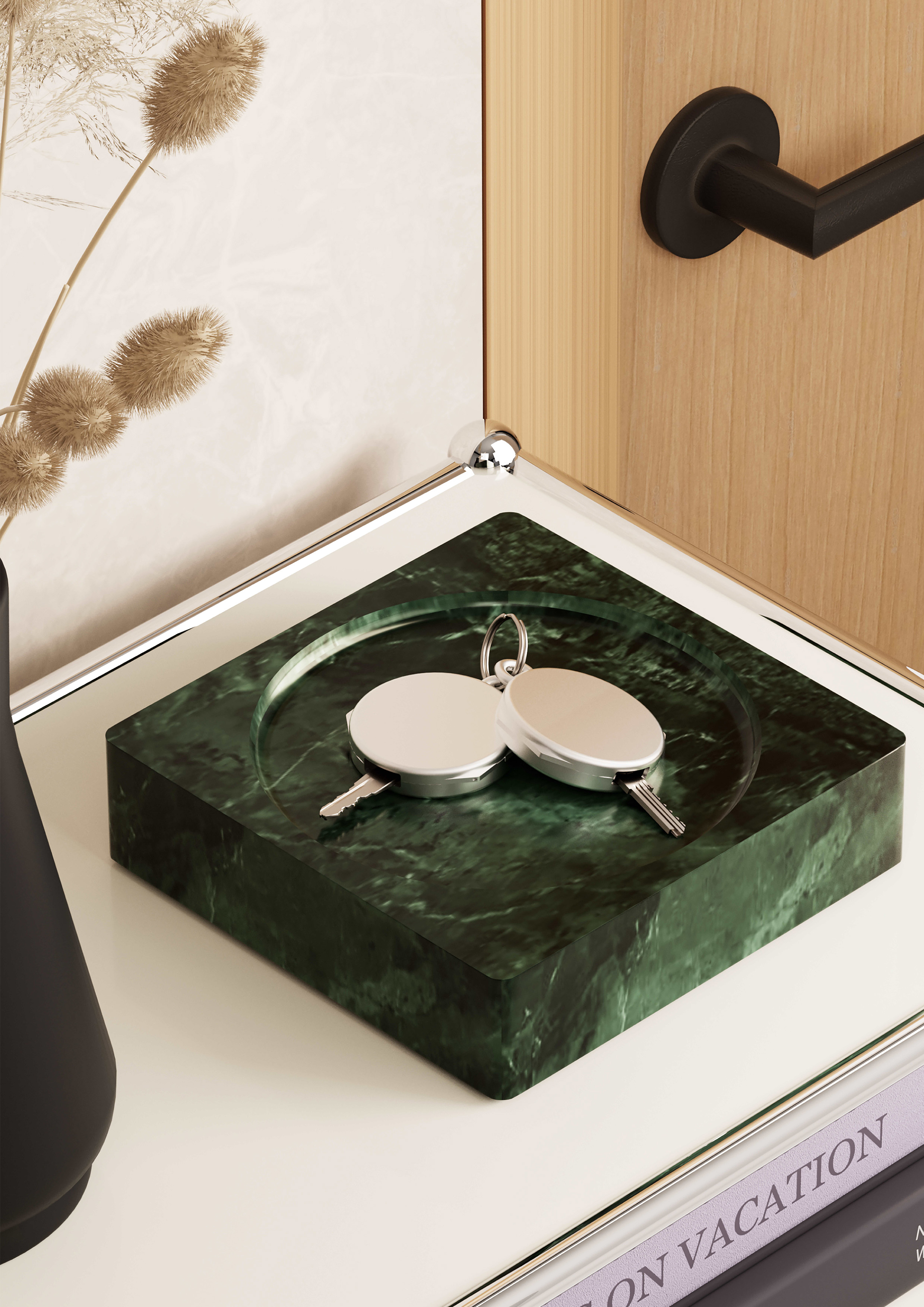
Remsen's key turn, for greater grip
W*: How did the function inform the design decisions?
F. & Z: The issue we saw with current products in this area of the market is that function is prioritised at the expense of beauty. We believe you don’t have to sacrifice one for the other; function is crucial, but so is beautiful design. Remsen brings to life products that serve as compelling visual statements while embodying a commitment to enhancing lives. Our design approach blends expertise, empathy and compassion, and each product stands as a testament to inclusive design by transcending age and ableness barriers.
Remsen’s Pill Container is truly unlike others. It’s outfitted with more generous compartments radially arrayed and organised according to the days of the week. We designed it with an easy-to-open magnetically secured lid, a rotating inner cover, and an easy to handle, yet sculptural, geometry. We chose die-cast aluminium as our material to provide a sleek appearance and integrated a mirrored underside to enhance both functionality and aesthetic allure. This object can sit beautifully on your nightstand or coffee table without looking out of place or like something that needs to be shoved inside a drawer when guests visit.
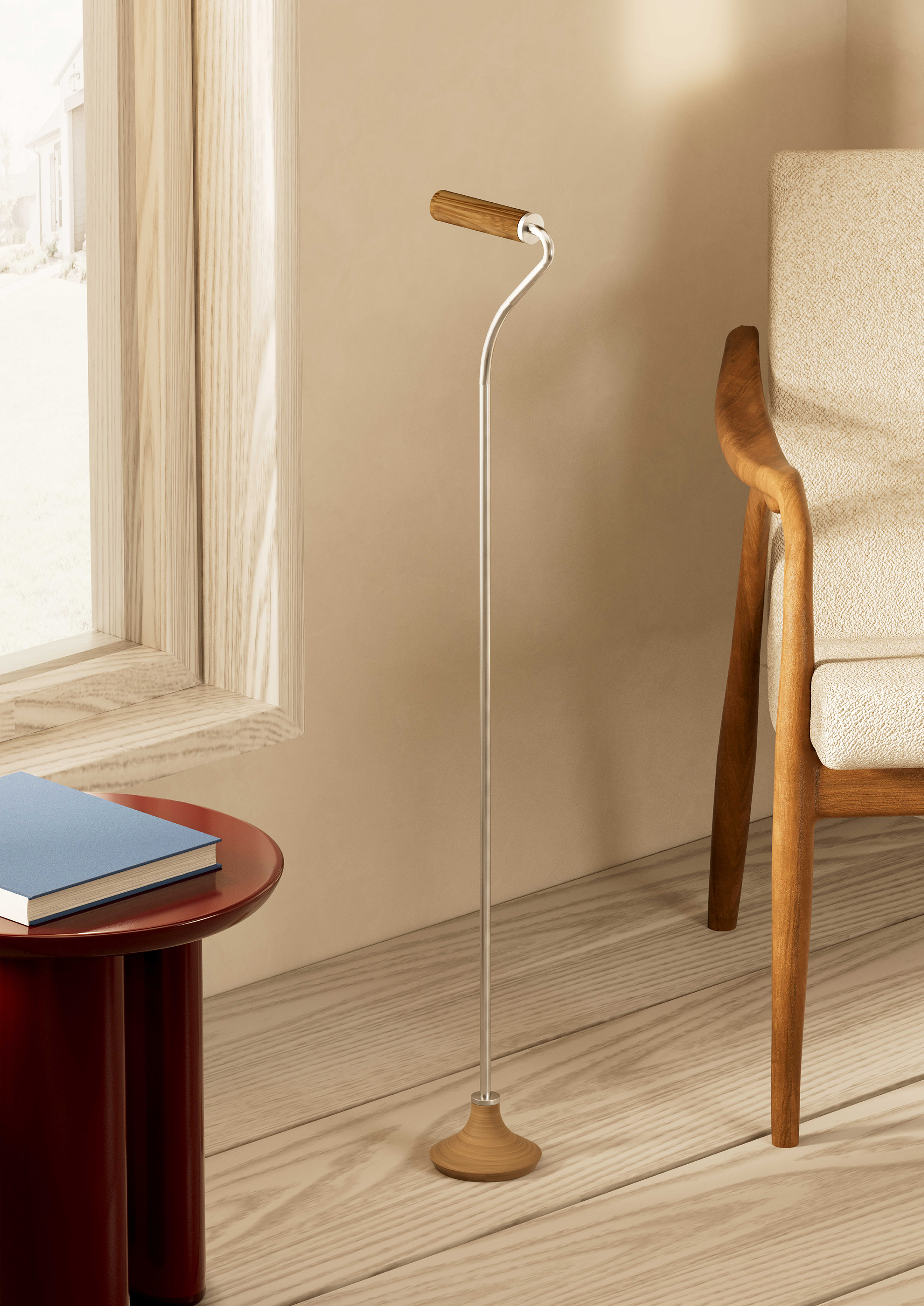
Remsen's elegant cane
W*: What will the wider collection look like?
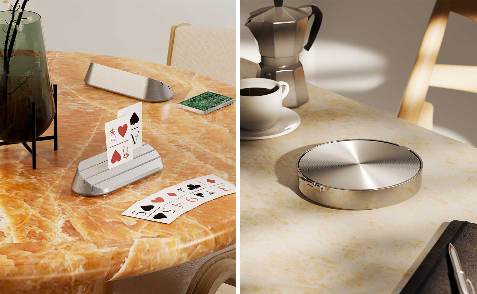
F. & Z: Remsen is designing a suite of wellness products that we all need as we move through life by taking pieces that have been historically categorised as “geriatric products” and re-envisioning them as luxury home goods. Our forthcoming products will include the Cane, Shower Chair, Key Turn and Playing Card Set and Card Holder.
W*: Which object(s) do you think best encapsulate the mission of Remsen, and why?
F. & Z: We like to think that Remsen is greater than the sum of its parts, and that real impact in this market is about changing the broader narrative about what ageing looks like, not solving for a single product.
That said, if we had to pick one piece that encapsulates what Remsen stands for, The Grab Bar is a great example of the power of rethinking simple, everyday objects. This is a piece that is added to many homes as people age and greatly enhances lives, but is usually an afterthought in terms of design. Remsen’s Grab Bar is a graceful, streamlined product that can be easily incorporated into a stylish bath or powder room. While other offerings compromise the spaces they occupy, this piece enriches any surface and room it graces.

Hugo is a design critic, curator and the co-founder of Bard, a gallery in Edinburgh dedicated to Scottish design and craft. A long-serving member of the Wallpaper* family, he has also been the design editor at Monocle and the brand director at Studioilse, Ilse Crawford's multi-faceted design studio. Today, Hugo wields his pen and opinions for a broad swathe of publications and panels. He has twice curated both the Object section of MIART (the Milan Contemporary Art Fair) and the Harewood House Biennial. He consults as a strategist and writer for clients ranging from Airbnb to Vitra, Ikea to Instagram, Erdem to The Goldsmith's Company. Hugo has this year returned to the Wallpaper* fold to cover the parental leave of Rosa Bertoli as Global Design Director.
-
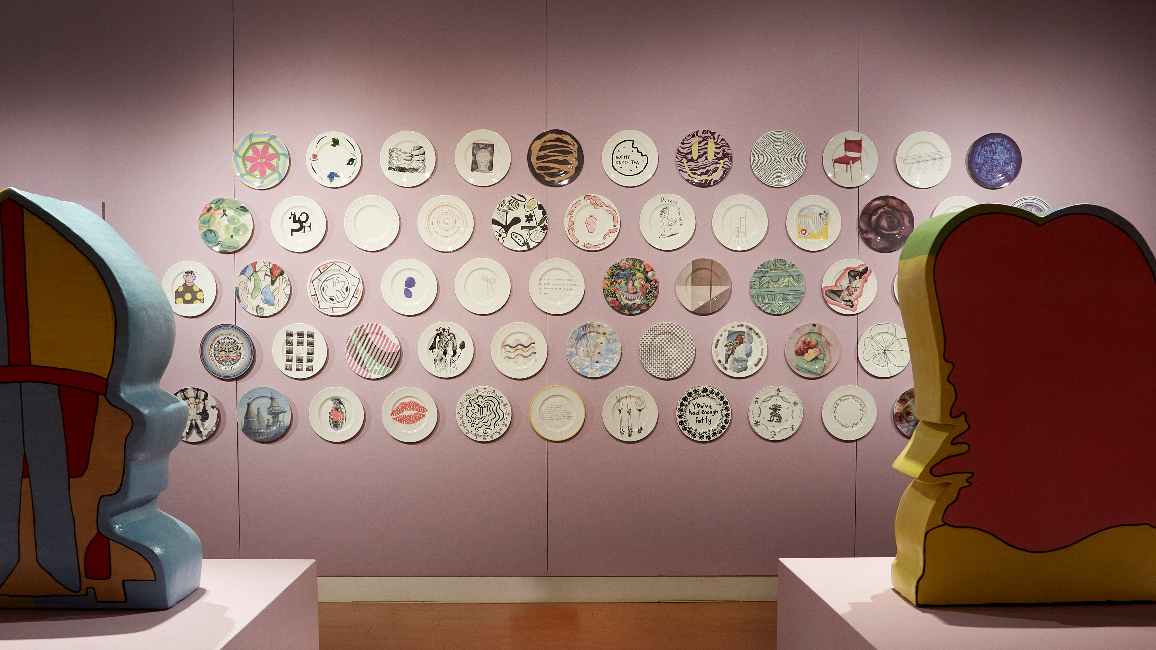 ‘100 Years, 60 Designers, 1 Future’: 1882 Ltd plate auction supports ceramic craft
The ceramics brand’s founder Emily Johnson asked 60 artists, designers, musicians and architects – from John Pawson to Robbie Williams – to design plates, which will be auctioned to fund the next generation of craftspeople
-
 Jonathan Anderson’s Dior debut: ‘bringing joy to the art of dressing’
The Irish designer made his much-anticipated debut at Dior this afternoon, presenting a youthful S/S 2026 menswear collection that reworked formal dress codes
-
 Emerging artist Kasia Wozniak’s traditional photography techniques make for ethereal images
Wozniak’s photographs, taken with a 19th-century Gandolfi camera, are currently on show at Incubator, London