Sarah Solis’ first furniture collection is an homage to art deco
‘Is it weird to call furniture sexy?’ Los Angeles-based designer Sarah Solis discusses her debut furniture line and new brand and store, Galerie Solis
Receive our daily digest of inspiration, escapism and design stories from around the world direct to your inbox.
You are now subscribed
Your newsletter sign-up was successful
Want to add more newsletters?
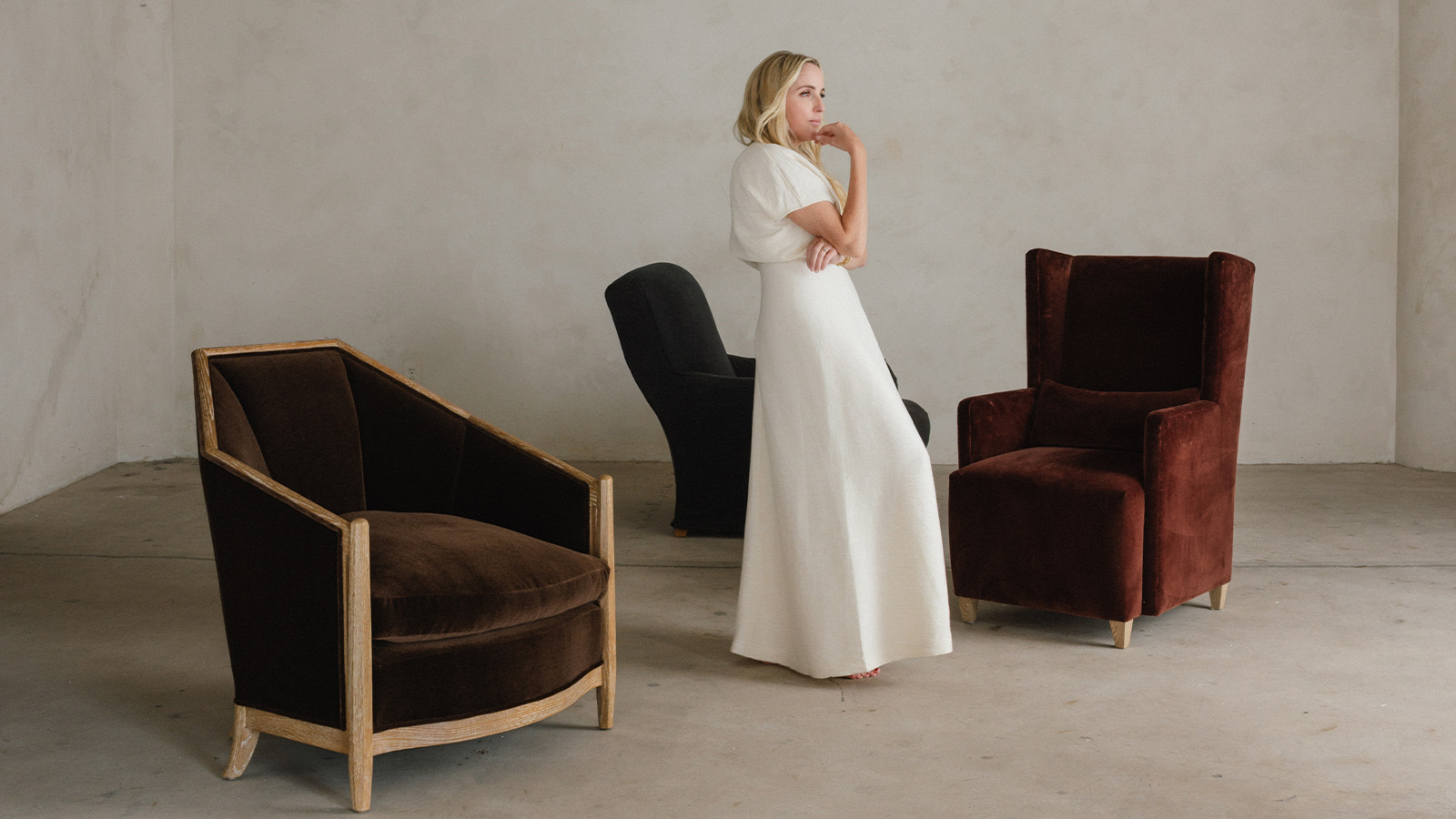
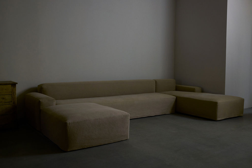
Having cemented her reputation as a highly in-demand interior designer who has worked on the homes of several celebrities, Sarah Solis is embarking on a new chapter. The Los Angeles-based creative has been developing a range of furniture for several years, and the Heritage Collection finally made its debut on 24 September 2024 at The Goldwyn House – the impressive Hollywood mansion that’s home to The Future Perfect’s West Coast gallery.
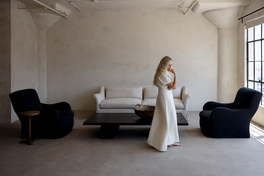
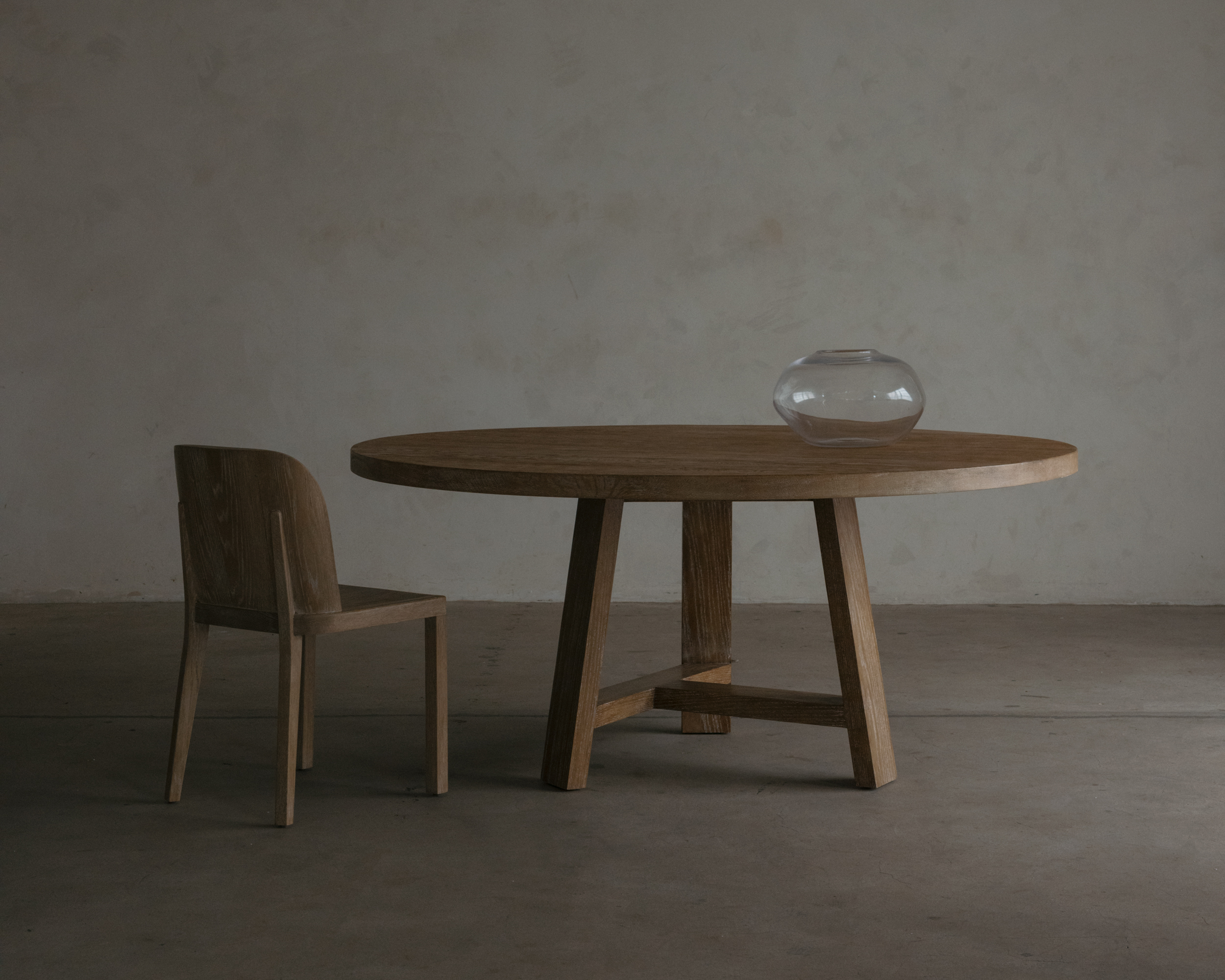
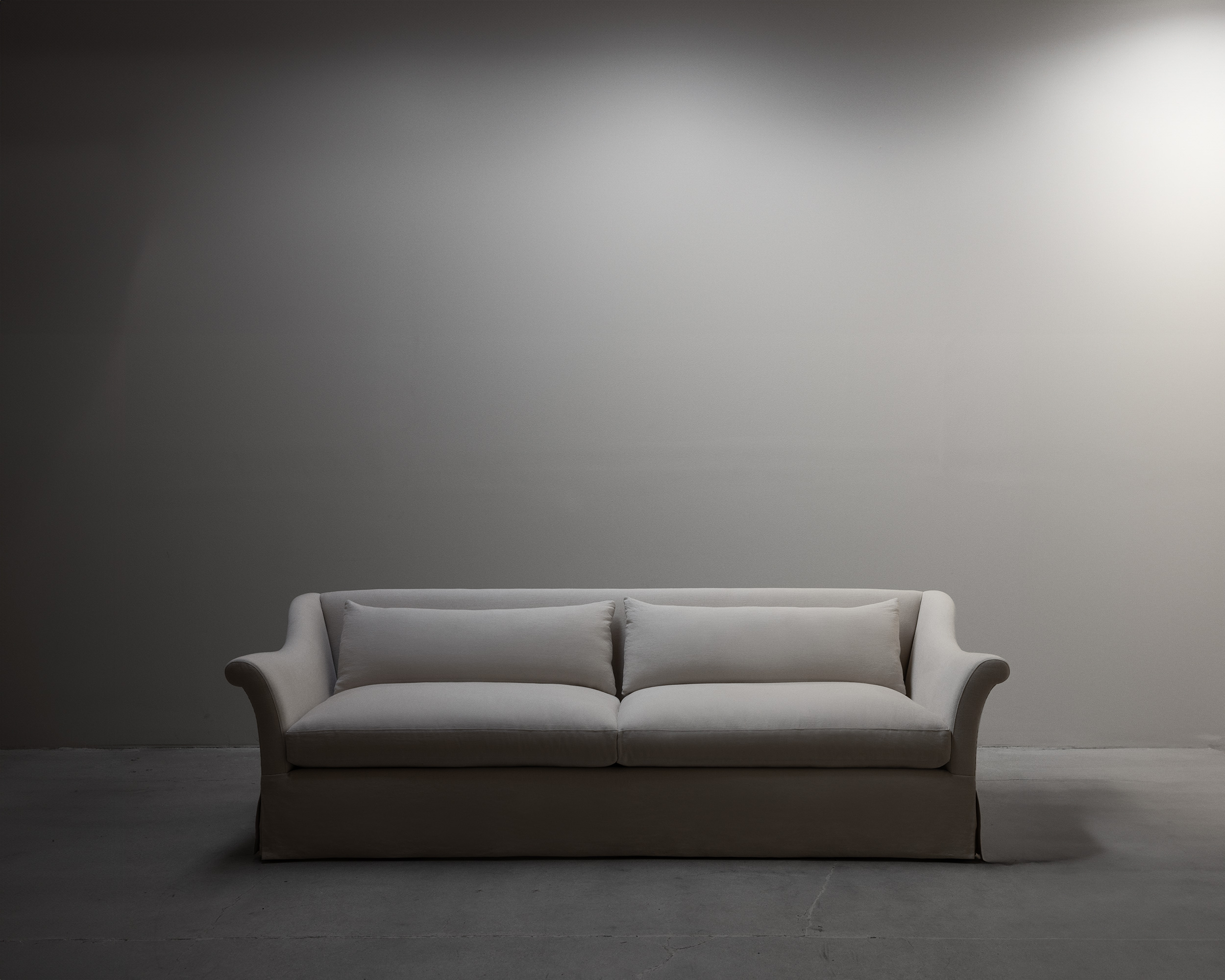
Solis, whose studio is located in Agoura Hills, took her time to carefully craft and refine the new 11-piece series, which takes cues from European art deco and is produced using textiles created by master artisans at family-run mills. As well as her own collection, her company Galerie Solis will also sell antique furniture and a selection of fabrics, both online and at a Westlake Village showroom.
Hours before the launch event for the Heritage Collection, she spoke to Wallpaper* about the need to create heirlooms for future generations, why she has such an affinity for art deco, and balancing aspiration and accessibility in design.
Discover the inner-workings of Sarah Solis' furniture line and antiques store, Galerie Solis
Wallpaper*: Tell us about Galerie Solis. How did the concept come about, and how does it fit into your wider practice?
Sarah Solis: I've always dreamed of making furniture, and it is something that came really naturally to me. As a young child, I understood that you could make something if it wasn't there. My parents were artists, and they always said: if you can't find it, make it. So I knew there was a way to create something different than what is already what already exists, or to improve on it.
‘My parents were artists, and they always said: if you can't find it, make it’
Sarah Solis
I think it's always been a part of me. It's always been there. It's just it took me a long time to access it, and really to gain the confidence. I did that through working with clients and them enjoying the pieces that we made and then through that, we could always tweak them and perfect them. That's how we landed with this 11-piece collection, which we've designed, tested, perfected and brought to a place that we're really proud of.
W*: Can you describe the collection as a whole, and talk about your influences, as well as the gap you wanted to fill?
Receive our daily digest of inspiration, escapism and design stories from around the world direct to your inbox.
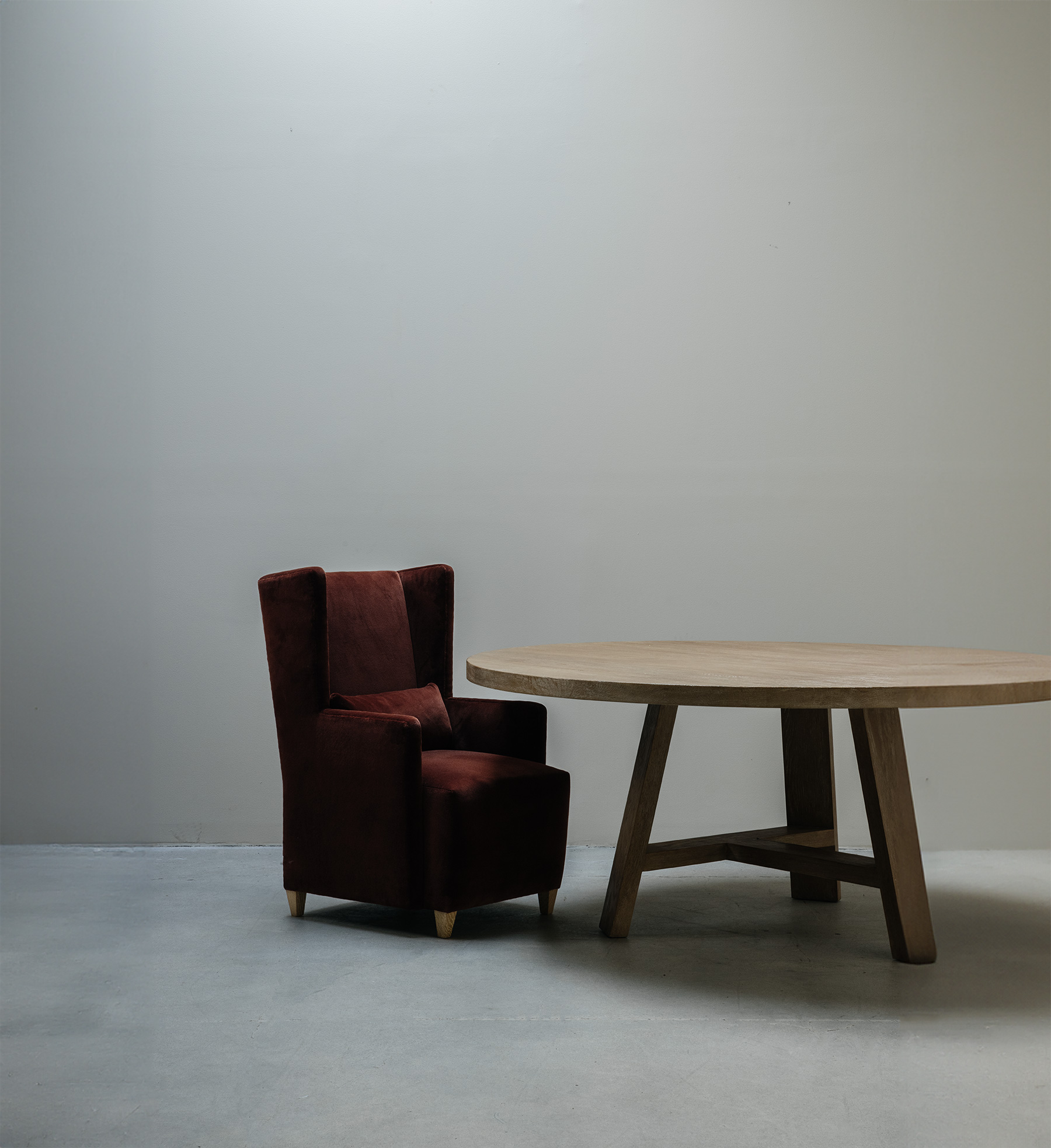
SS: I’m really into Swedish and French art deco, and I'd say those are probably the two biggest influences. Architects and furniture designers from that time period really served as a big inspiration for this collection. But the issue that I had with a lot of what came before me is it's very beautiful, but it’s not comfortable. I really wanted that European perspective of making things that are built to last, and I want it to be comfortable still. A lot of that comes down to scale and the materials you use within to create that comfort, and the structure itself is for longevity.
When I'm sourcing for clients – which is shopping, let's be honest – I'm primarily looking in Belgium, France, Italy, Sweden, Norway, and those areas because I find that work the most inspiring.

W*: There’s been a significant resurgence in art deco recently. And it's interesting that wider appreciation for the style tends to resurface when society is craving structure. When the world seems to be out of control, as it is now, we crave rigid shapes and clean lines, whereas when the world is more calm, design tends to shift to the more amorphous. Is that something that you've ever considered?
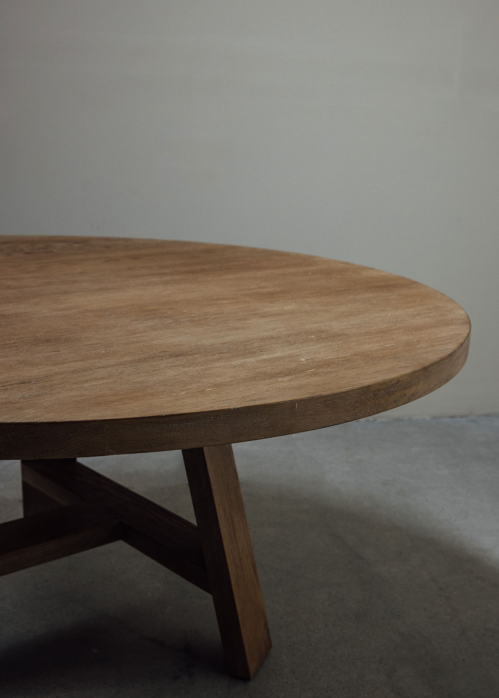
SS: That totally makes sense. I think that speaks to a great way of trend forecasting. I personally have always leaned more towards structure and clean lines, aesthetically, and great design that I've admired has been less about those types of curves. The way I bring curves into my collection is more connected to Japanese or Asian philosophies, which talk about the circle or the spirit having no beginning and no end. And I really love that perspective, and I love the way it influences the flow of energy. It's positive and uplifting. For example, I like that a circular dinner table keeps everybody on the same level, rather than creating a hierarchy.
W*: Why does art deco resonate with you?
SS: For me, it's all about the lines. In European countries during [the art deco] period, there was this beautiful use of lines. We had it here [in the US] too, but it was just a whole other level of quality. I think [lines are] sexy, sultry and unique, and I find that really engaging and very captivating. Is it weird to call furniture sexy?
W*: No, furniture can be very sexy, and should be.
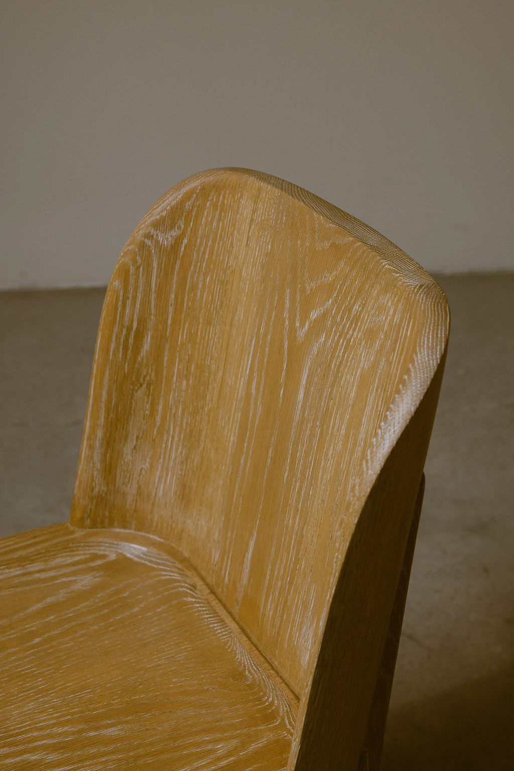
SS: It can be sensual and ties into the textures and materials that were important to us to use as well. A very big motivator was doing this [collection] with sustainability in mind. And it is not easy to do. When we were looking at fabrics that we could buy off the shelf, I just wasn't impressed with how the companies did things. So much waste comes from textiles, and the garment industry as well, so I felt like this is a place I can make a difference, and it will at least have a minimal footprint.
‘I think lines are sexy, sultry and unique, and I find that really engaging and very captivating. Is it weird to call furniture sexy?’
Sarah Solis
I have a dear friend who is a textile consultant, and together we found these century-old mills run by families for multiple generations. And they have their own flocks, and they process, weave and dye the materials in their own facility. Everything is done in one shop for our velvets, mohairs and linens. That to me was so cool to be able to support an industry like that.

W*: The design scene in LA has grown considerably over the past few years. How has that affected your approach to business and the timing of this collection particularly?
SS: On my calendar, this was launching a year ago. Of course I set goals, but one of the biggest things I learned during the pandemic is surrendering to the process and not sweating missed deadlines. It's really tough, but I don't think I could have made it happen any faster, even though I did feel that moment and the momentum building in LA specifically for the opportunity to gain that exposure. I wouldn't necessarily say it was a moment, but it was more my community encouraging me and the team at The Future Perfect, seeing it and saying: ‘This is the time. Don't wait anymore.’
W*: How do you think both consumers and other designers are going to perceive the collection? What do you think their impression is going to be like?
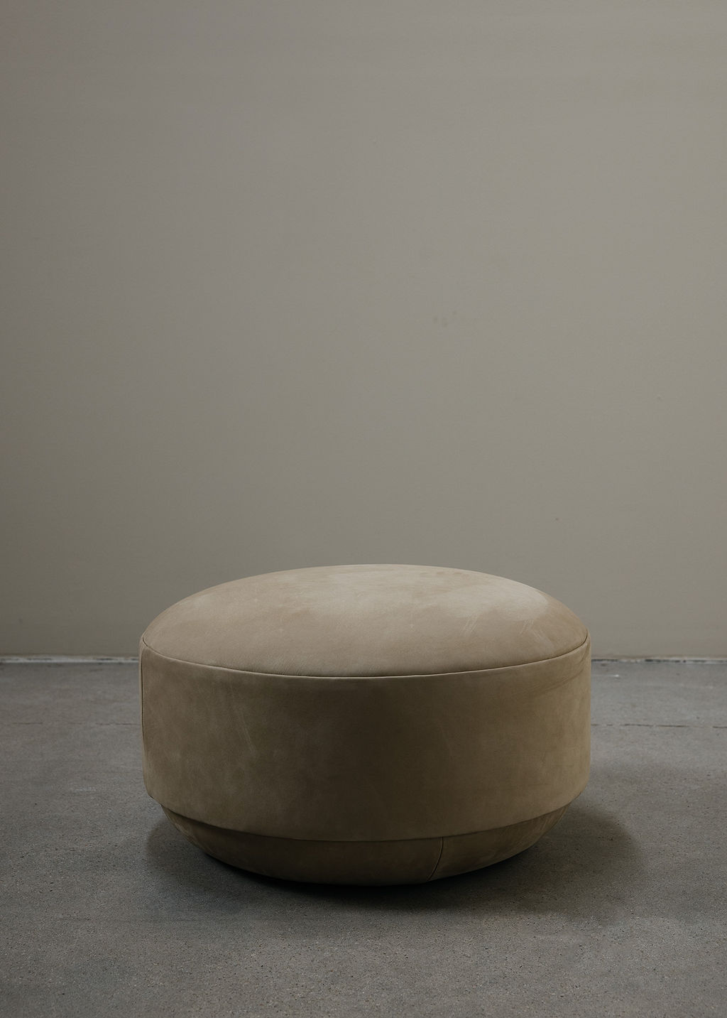
SS: I feel like they will see it as a luxury line. I hope they value the philosophy from a sustainability perspective. I often think: What are our kids going to inherit as far as furniture pieces? And what are we leaving to the world? We've been left beautiful inspiration from designers who came before us. And I want this to be that.
W*: So your aim was to create enough emotional value and aesthetic impact to have someone want to pass these pieces on?
SS: We live at a time where everything is just so expensive. I want to be mindful that I understand this is a luxury product, but it's not so out of reach. You're paying for the quality that you're getting. My goal is to have created a brand that is aspirational without being completely inaccessible.

W*: Interior styling has become so popular lately and developed into its own segment of the industry. How do you feel about that, and do you incorporate it into your own practice?
SS: I love collaborating. It's all about the team. Seeing something so singularly is really vanilla. Part of the problem with a lot of advertising, and with a lot of Instagram, [is that] you see designers showing just their project or product. Great design is collaborative with other artists and team members. Really great work is how you bring people or things together.
A big reason that I partnered with The Future Perfect is that I didn't want the brand identity to get too singular, because that type of representation just gets boring. Not that my stuff alone is boring, but I think that it's all about how you bring it together and contextualise it.
W*: You spoke about sourcing from all over Europe. Will Galerie Solis also sell vintage pieces?
SS: Yes, we will be selling antiques from my collection, and we'll have a small showroom in Westlake Village, as well as an online presence. We have a few things up right now, but we're just starting to break into that. In terms of selling it, sometimes you fall in love with all this stuff and it's hard to let it go, which is such a hoarder thing to say.
W*: I think most creatives have some sort of hoarder sensibility, because they want to hold on to the things that inspire them. And you mentioned passing on beautiful pieces to future generations.
SS: Yeah, my kids will be like, ‘I got this warehouse full of all this old furniture, thanks, Mom.’
Dan Howarth is a British design and lifestyle writer, editor, and consultant based in New York City. He works as an editorial, branding, and communications advisor for creative companies, with past and current clients including Kelly Wearstler, Condé Nast, and BMW Group, and he regularly writes for titles including Architectural Digest, Interior Design, Sight Unseen, and Dezeen, where he previously oversaw the online magazine’s U.S. operations. Dan has contributed to design books The House of Glam (Gestalten, 2019), Carpenters Workshop Gallery (Rizzoli, 2018), and Magdalena Keck: Pied-À-Terre (Glitterati, 2017). His writing has also featured in publications such as Departures, Farfetch, FastCompany, The Independent, and Cultured, and he curated a digital exhibition for Google Cultural Institute in 2017.