Sketch is 20: a design history of London’s ultimate entertaining destination
A visual history of Sketch: from the world-famous pod loos to India Mahdavi’s Gallery, we chart the evolution of the London restaurant’s inspiring collaborations and colourful makeovers
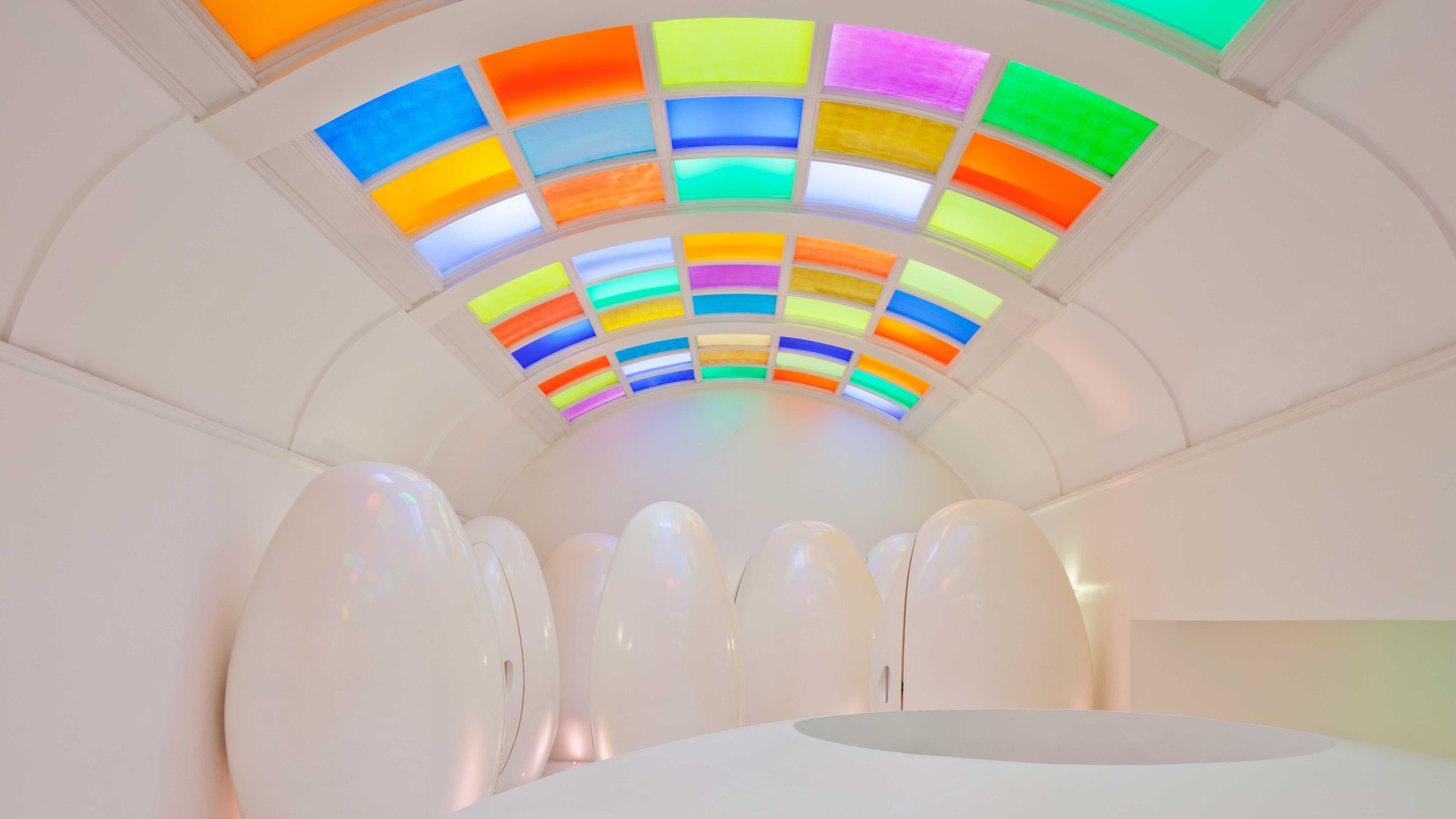
Sketch needs little introduction. The London restaurant, bar and art destination founded by entrepreneur Mourad Mazouz in 2002 is best known for its imaginative interiors, created over the years in collaboration with leading designers and artists including India Mahdavi, Noé Duchaufour-Lawrance, Martin Creed, David Shrigley and Yinka Shonibare among many more, with contributions to the spaces by Mazouz himself.
Sketch: 20 years of creative experimentation
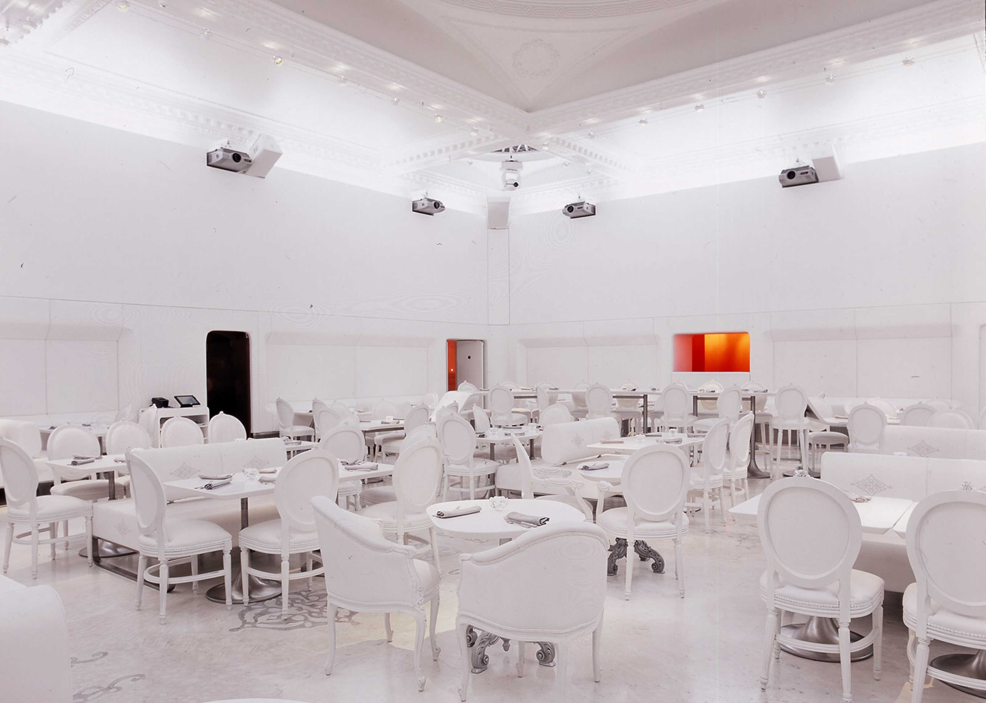
The Gallery at Sketch by Noé Duchaufour-Lawrance and Mourad Mazouz, 2002
Sketch was born out of a creative friendship between Mazouz and French chef Pierre Gagnaire. Together, they opened the space as ‘a destination for experimentation’, taking over a 1779 building designed by James Wyatt. A storied location, 9 Conduit street hosted a variety of institutions over the years, including the Royal Institute of British Architects and a headquarters of the suffragette movement in the early 20th century, while at some point it served as the London atelier of Christian Dior.
‘There was never a mission for Sketch – this is the same for all my restaurants,’ says Mazouz. ‘The ideas started to emerge as I walked through the building, making me shiver in excitement and fear. The burden felt enormous – how could I bring back this 18th-century Grade II* townhouse to life?’
Mazouz continues: ‘It took me four years to open Sketch. I gathered everything I knew at the time in one place: contemporary art, video, cooking, music and drinks. There was no specific outcome or mission.’
Each space at Sketch features a distinctive character and since 2002, has been handed over to a designer or artist to create a unique interior concept.
'Each and every designer and artist brought something to Sketch; this is what Sketch is – continuous, evolving, and impactful collaborations,' he adds. 'If you ask me, the most impactful project is always the latest. Each project and reflection is an exciting process to share with artists and designers.'
In pictures: the design evolution of Sketch
The Gallery at Sketch
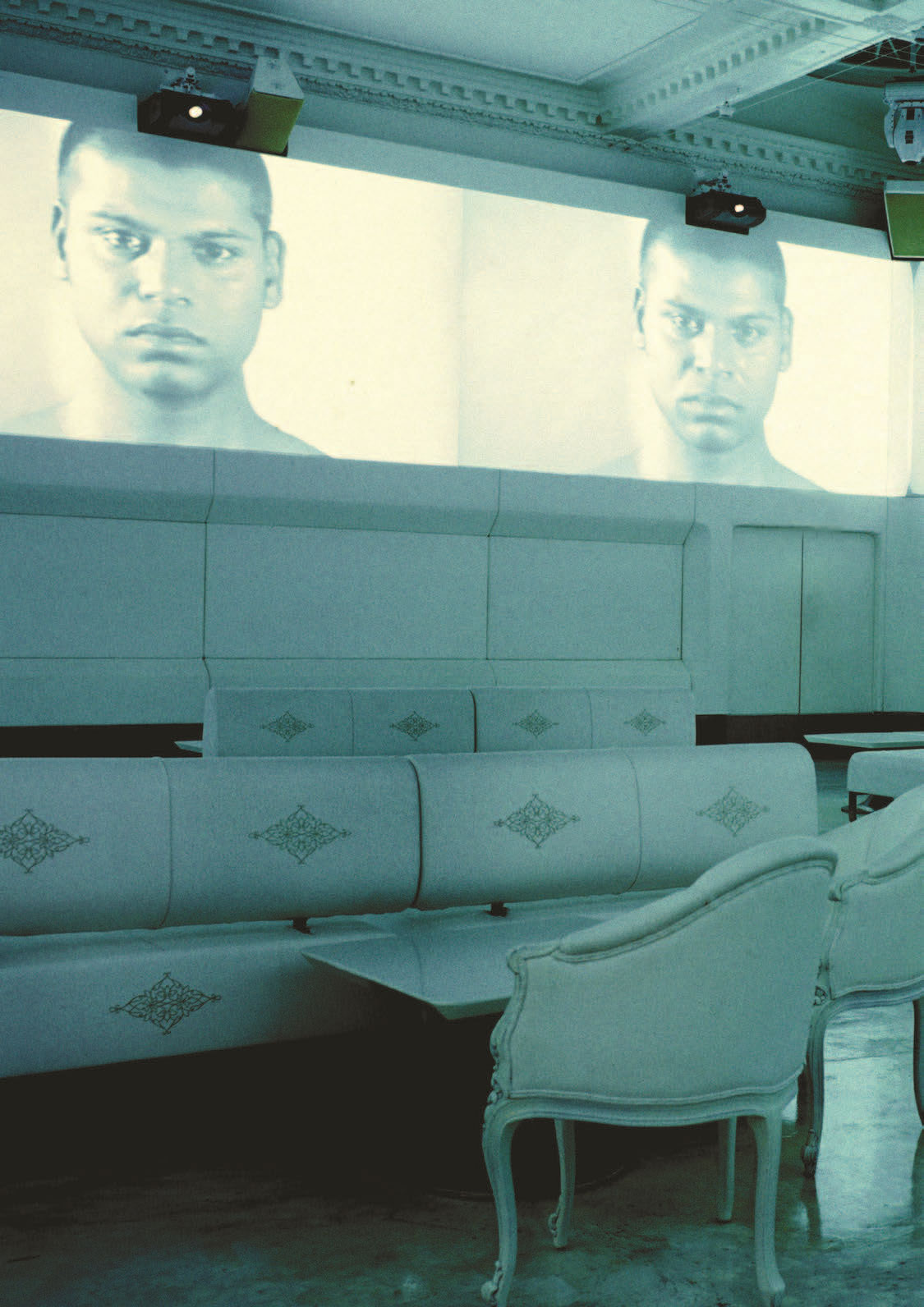
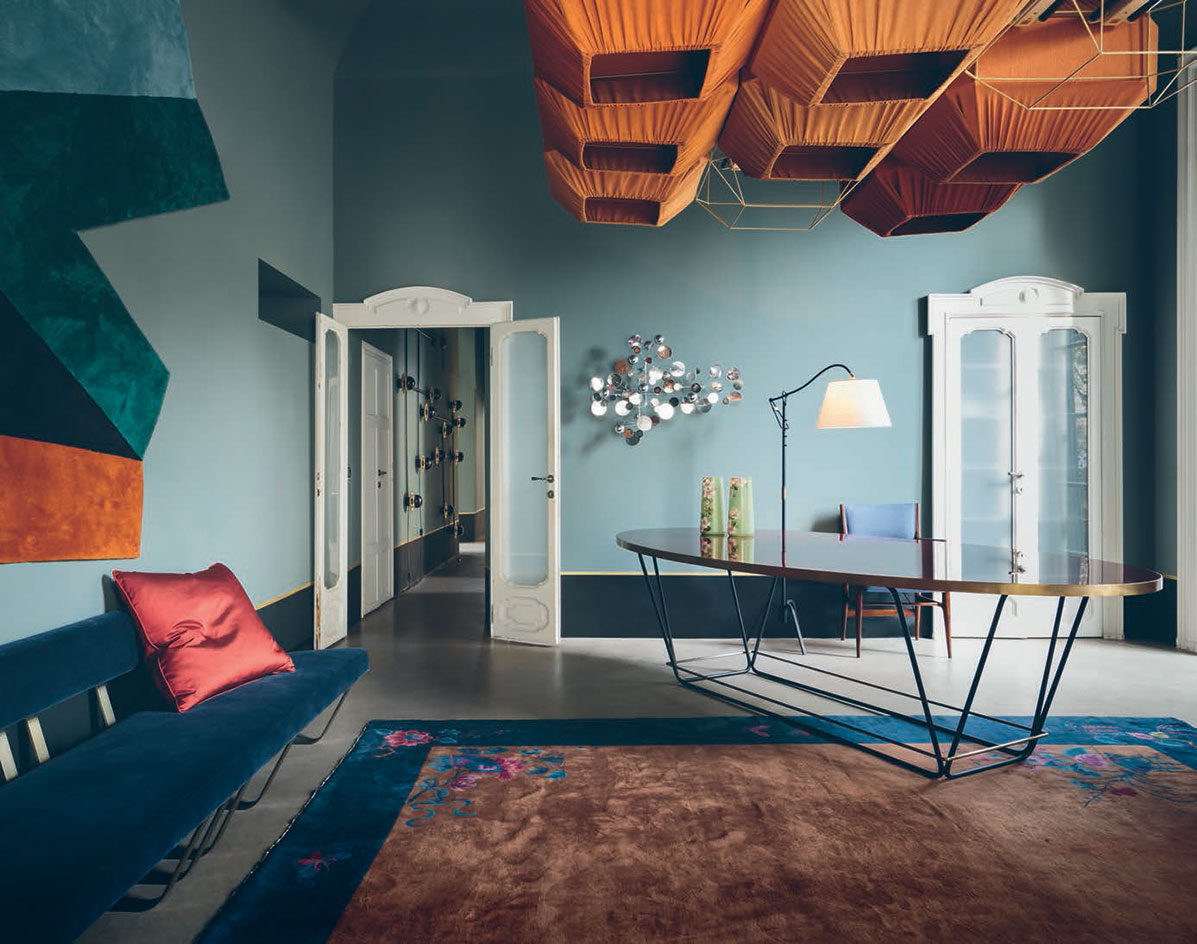
The Gallery at Sketch is best known for its Millennium pink interiors by India Mahdavi and David Shrigley. But the once-candy-hued space started as a 'Big White Cube' conceived by Noé Duchaufour-Lawrance and Mazouz. On the walls, 12 screens displayed avant-garde shorts: during the day, the space served as an art gallery, free of furniture and free to access, while by night, it was turned into a dining space.
Wallpaper* Newsletter
Receive our daily digest of inspiration, escapism and design stories from around the world direct to your inbox.
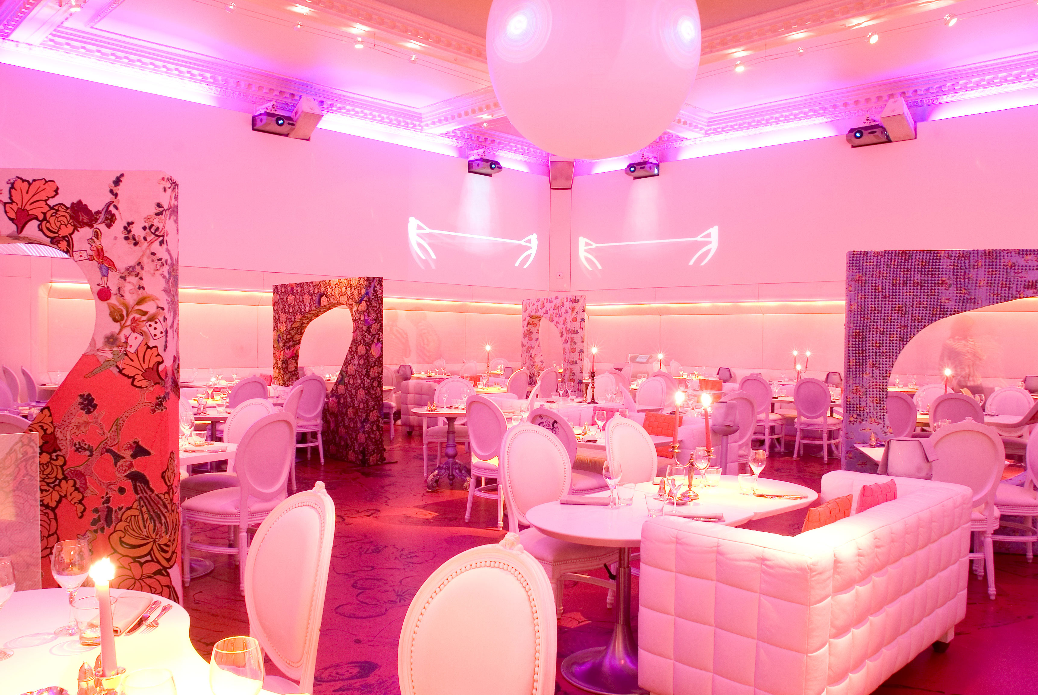
The Big White Cube was transformed by Mazouz in 2005, with the aim of instilling some warmth into the space. He commissioned artists to create decorative screens to partition the room, which once again acted as a space for art and design by day, restaurant and club by night.
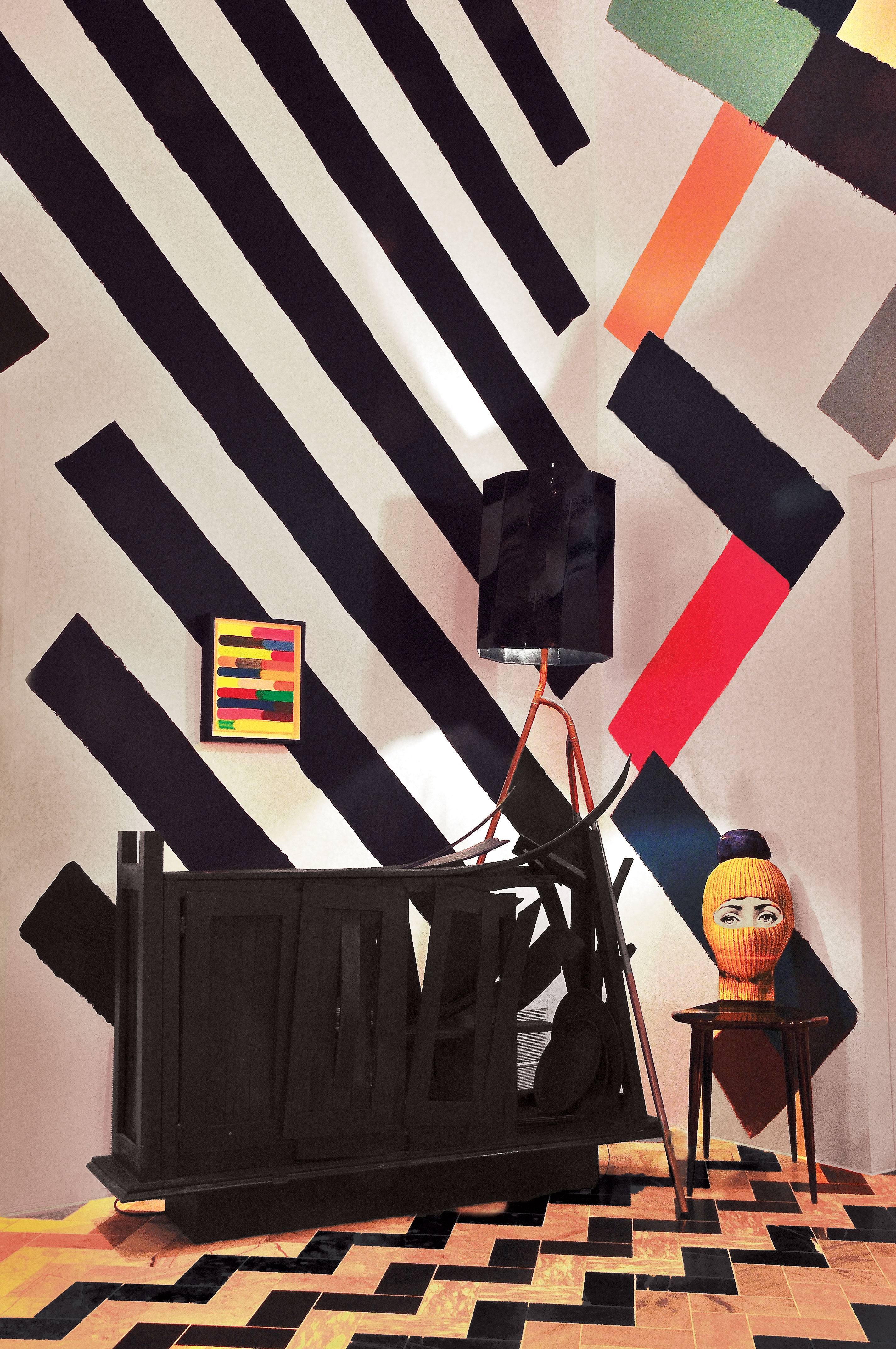
In 2012, on the occasion of its tenth anniversary, artist Martin Creed was entrusted with the décor of Sketch's Gallery. The makeover consisted of a bold graphic treatment and an eclectic mix of art, objects and furniture.
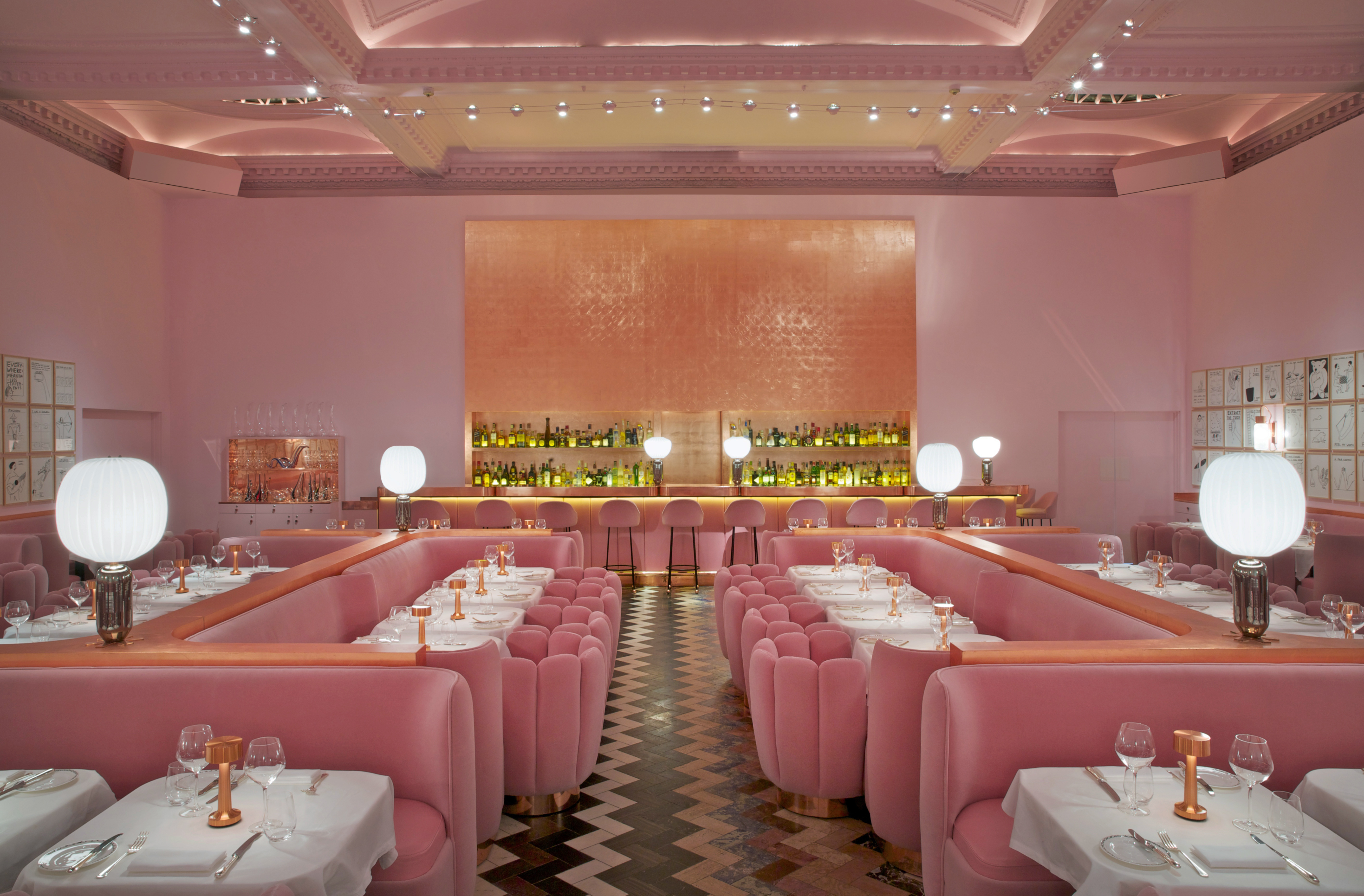
Most legendary is India Mahdavi's pink rendition of the Gallery, in collaboration with artist David Shrigley. 'One designer who has significantly impacted sketch is India Mahdavi,' says Mazouz. 'She created an essence, a time in the Gallery that Sketch enjoyed worldwide media success from. Our visitors still ask today about our pink chairs.'
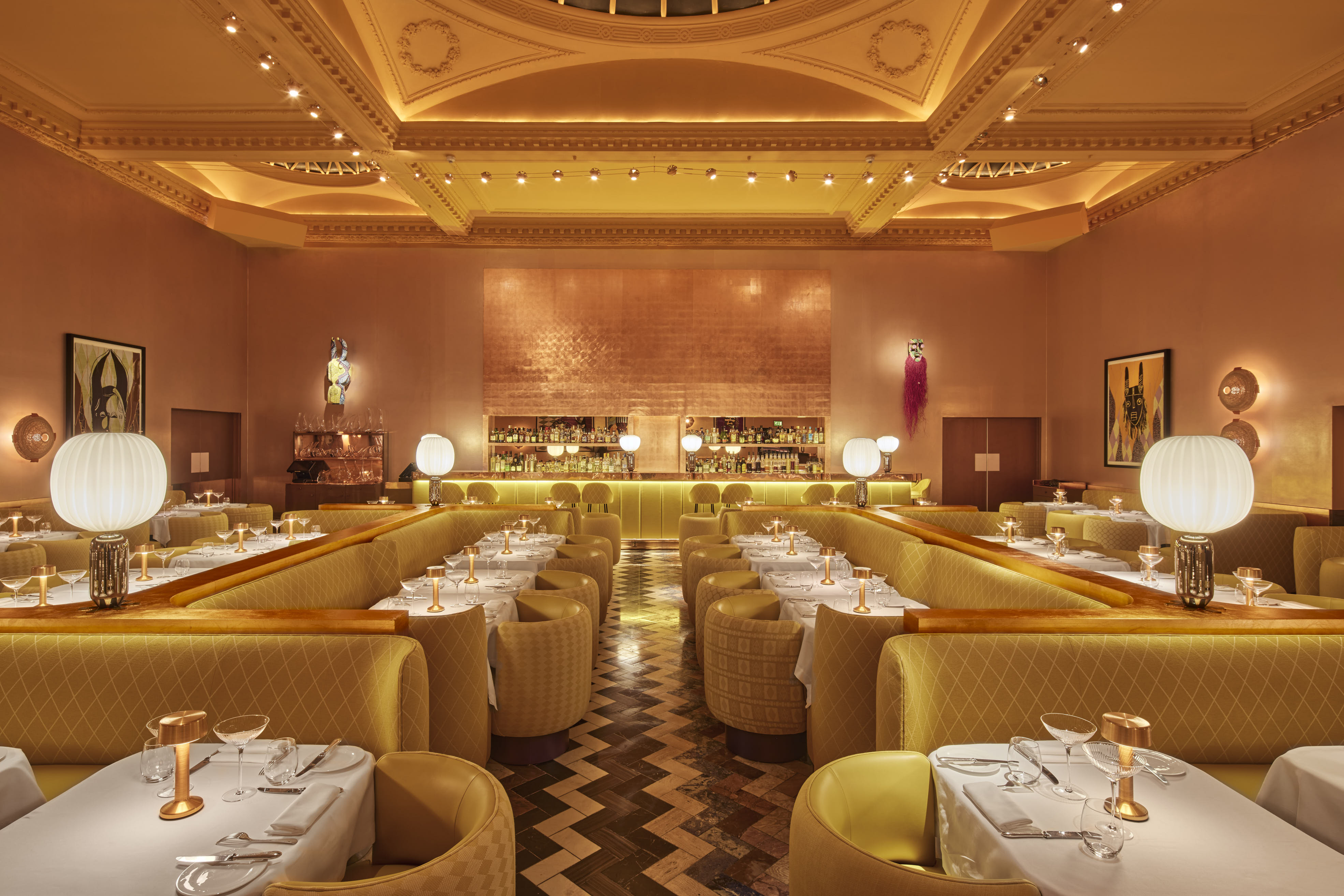
The final in a series of makeovers of the Gallery was unveiled in March 2022. Mahdavi revisited her design in collaboration with artist Yinka Shonibare, who created created 15 new site-specific textile works that offer a powerful celebration of African culture and its legacy. Meanwhile, Mahdavi chose a copper de Gournay wallpaper for the walls with custom-made banquette seating in shades of sunshine yellow.
Sketch Pod Loos and East Bar
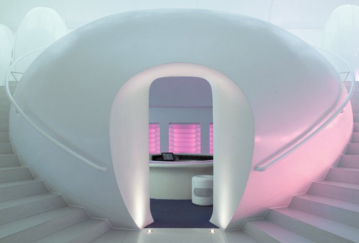
Among the distinctive spaces at Sketch, its pod loos are perhaps the most legendary. They are accessed through the East Bar, for which Mazouz commissioned inflatable-furniture designer Hans-Walter Müller.
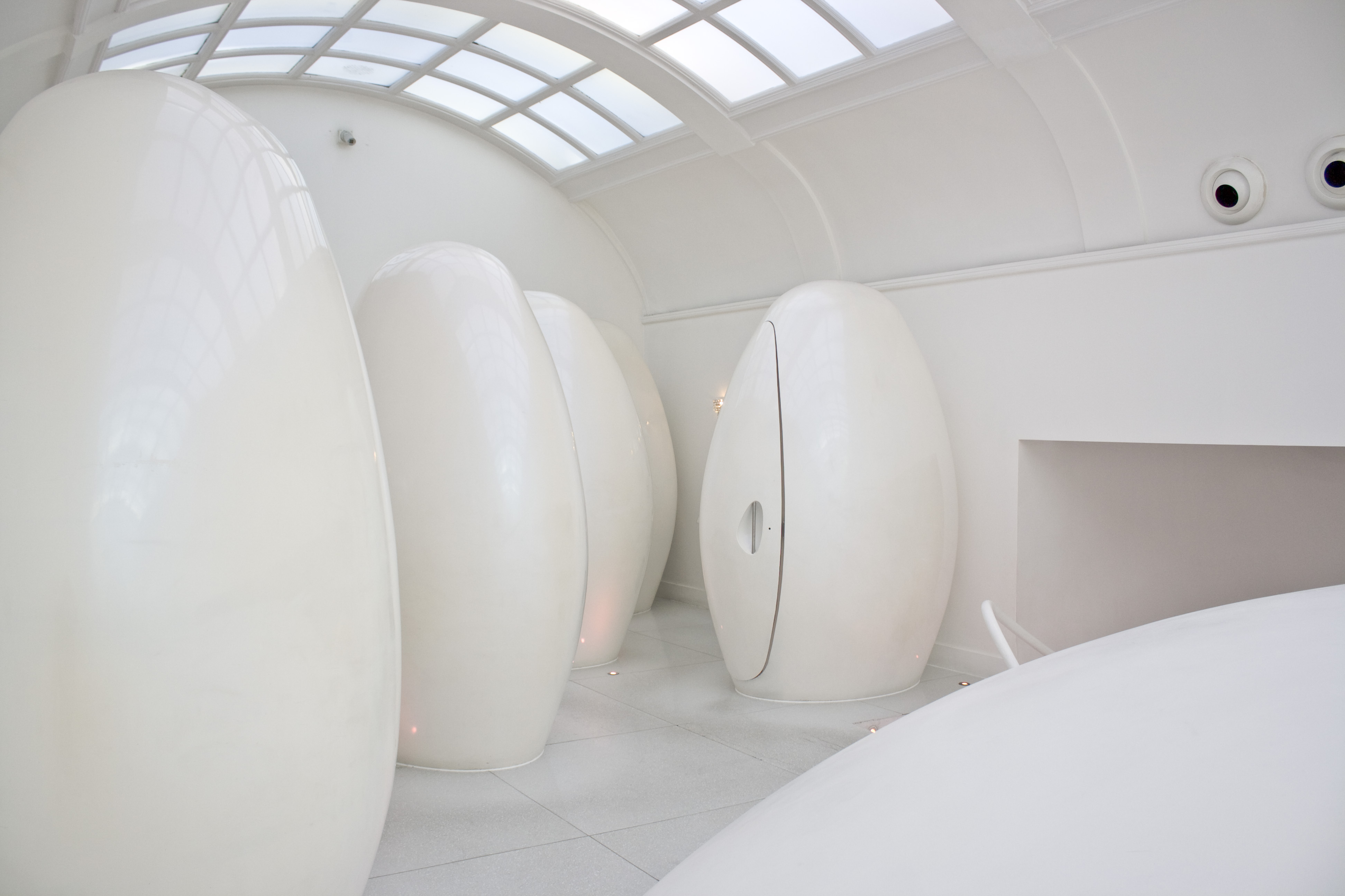
The Sketch pod loos were conceived by Mazouz and Duchaufour-Lawrance as an innovative bathroom design, and have remained unchanged since 2002, becoming the most distinctive element of Sketch's interior design.
The Glade
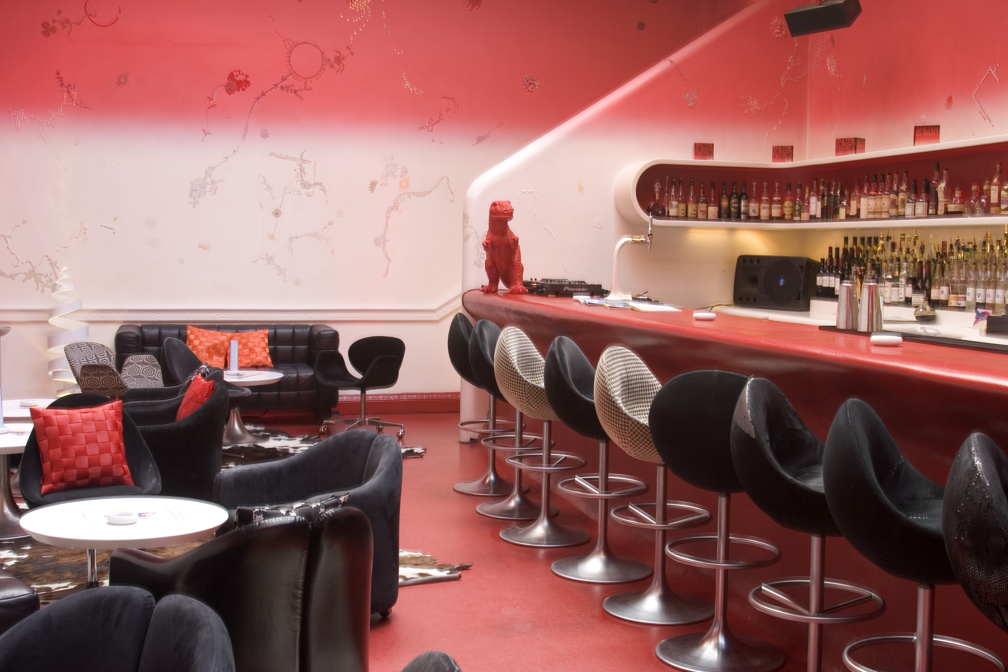
The Glade (once named 'The West Bar') was originally created as a black and white space by Mazouz and Duchaufour-Lawrance. A scarlet colour graduation was later integrated into the walls, inspired by artist Chris Levine’s Laserpods, which were installed on the walls.
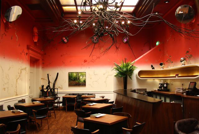
The room was slowly transformed into an urban forest and renamed The Glade, its furniture swapped for warmer pieces. By 2010, an imposing, 6m-long tree-branch chandelier by French sculptor Vincent Dubourg was added to the ceiling over the centre of the room.
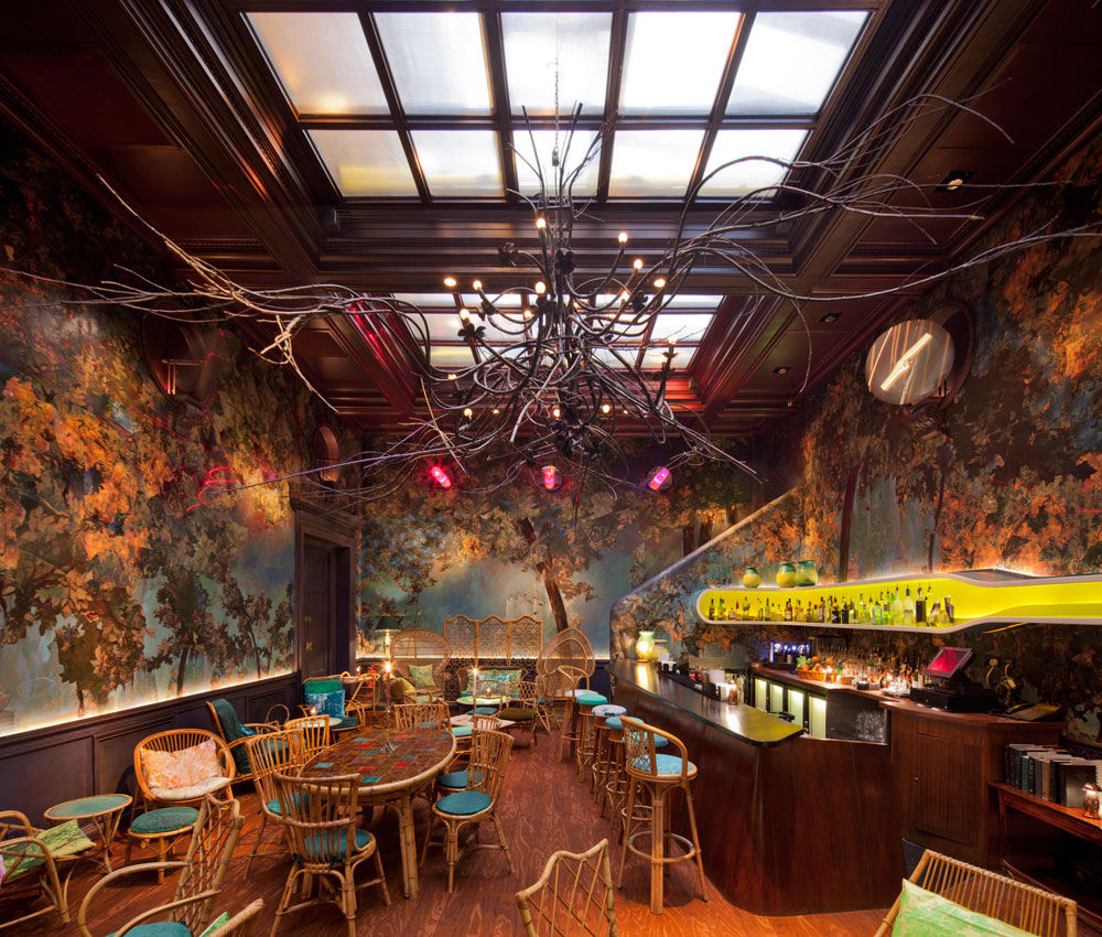
In 2012, Carolyn Quartermaine and Didier Mahieu were invited to tranform The Glade into a charming woodland, defined by grass-like carpets and tree-themed wall-coverings. The Glade became Sketch's space for afternoon tea, lunch, dinner and evening cocktails, with a vegetable-based garden menu.
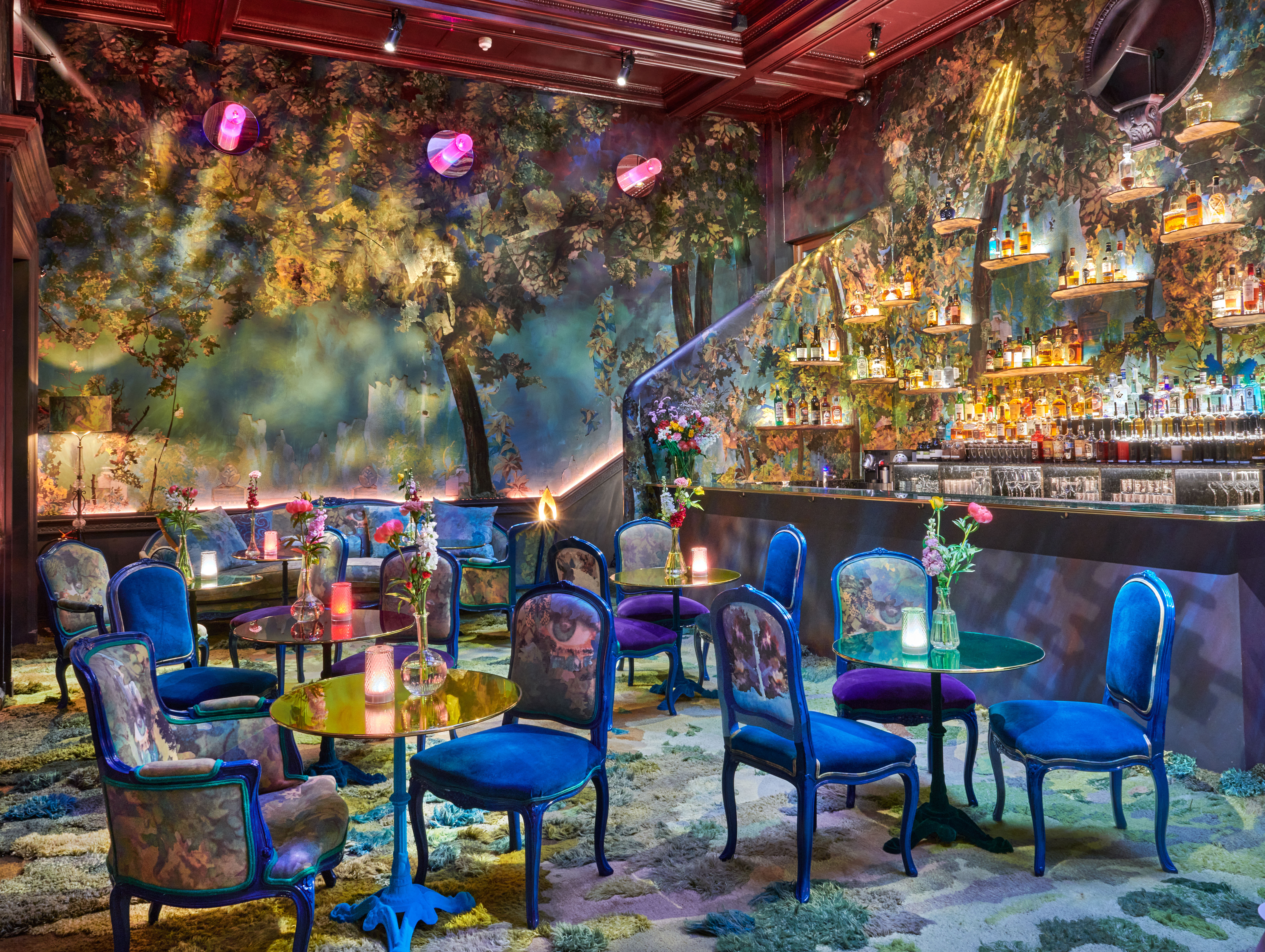
The space's transformation was complete by 2017, when colour was added to the forest-like environment bringing a sense of enchantment to the space.
The Parlour
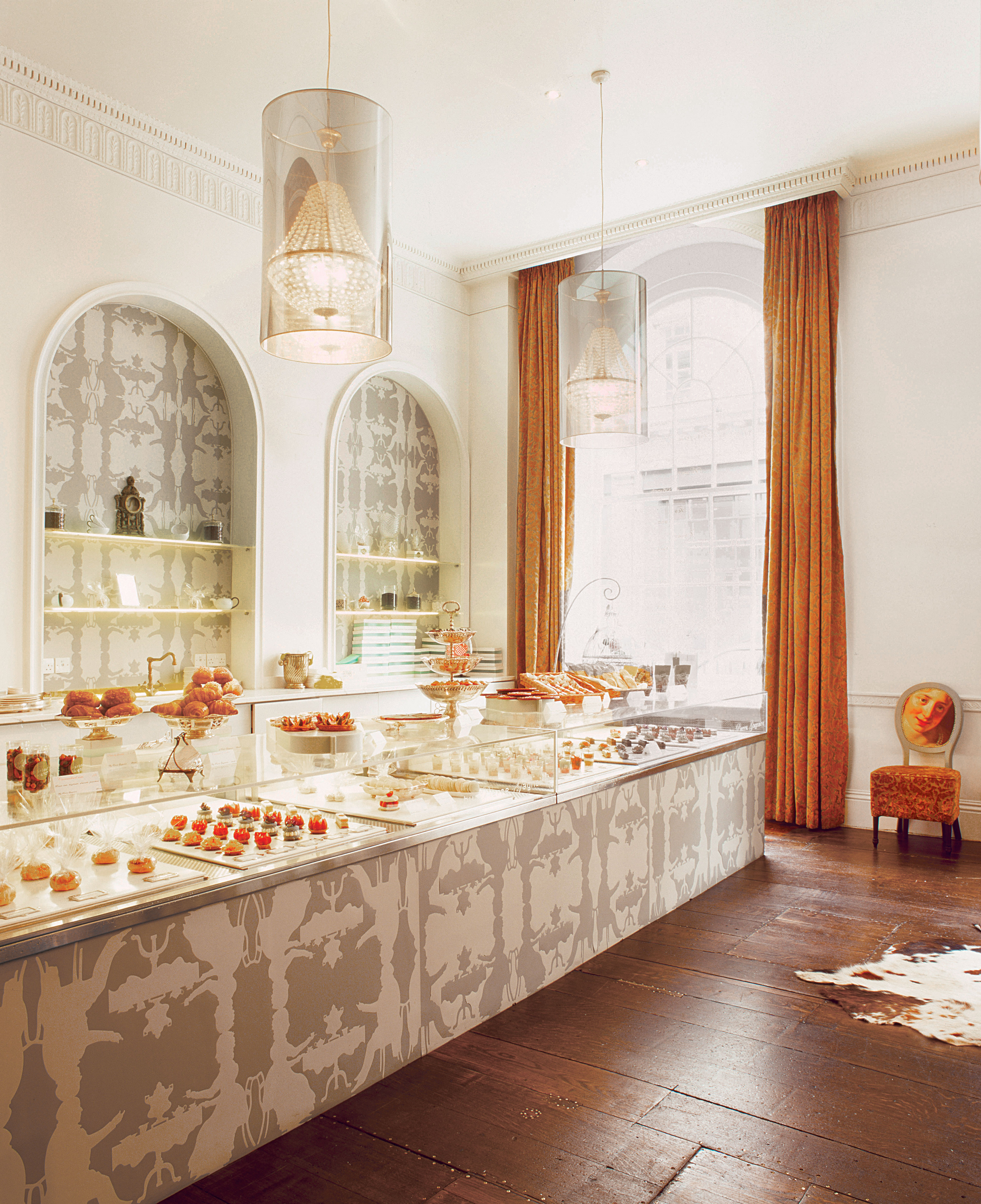
The Parlour was originally designed by Mazouz in 2002, a street-facing space composed of two rooms defined by high ceilings and nods to neoclassical style. For the interior design, he was inspired by cult Parisian tea room Angelina, a literary salon for tea and patisserie.
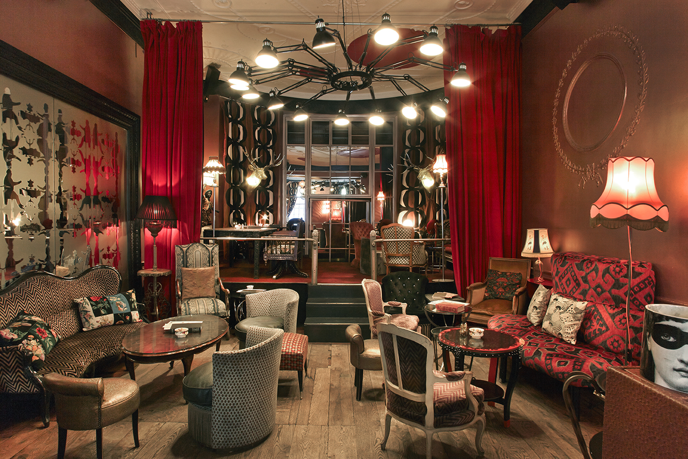
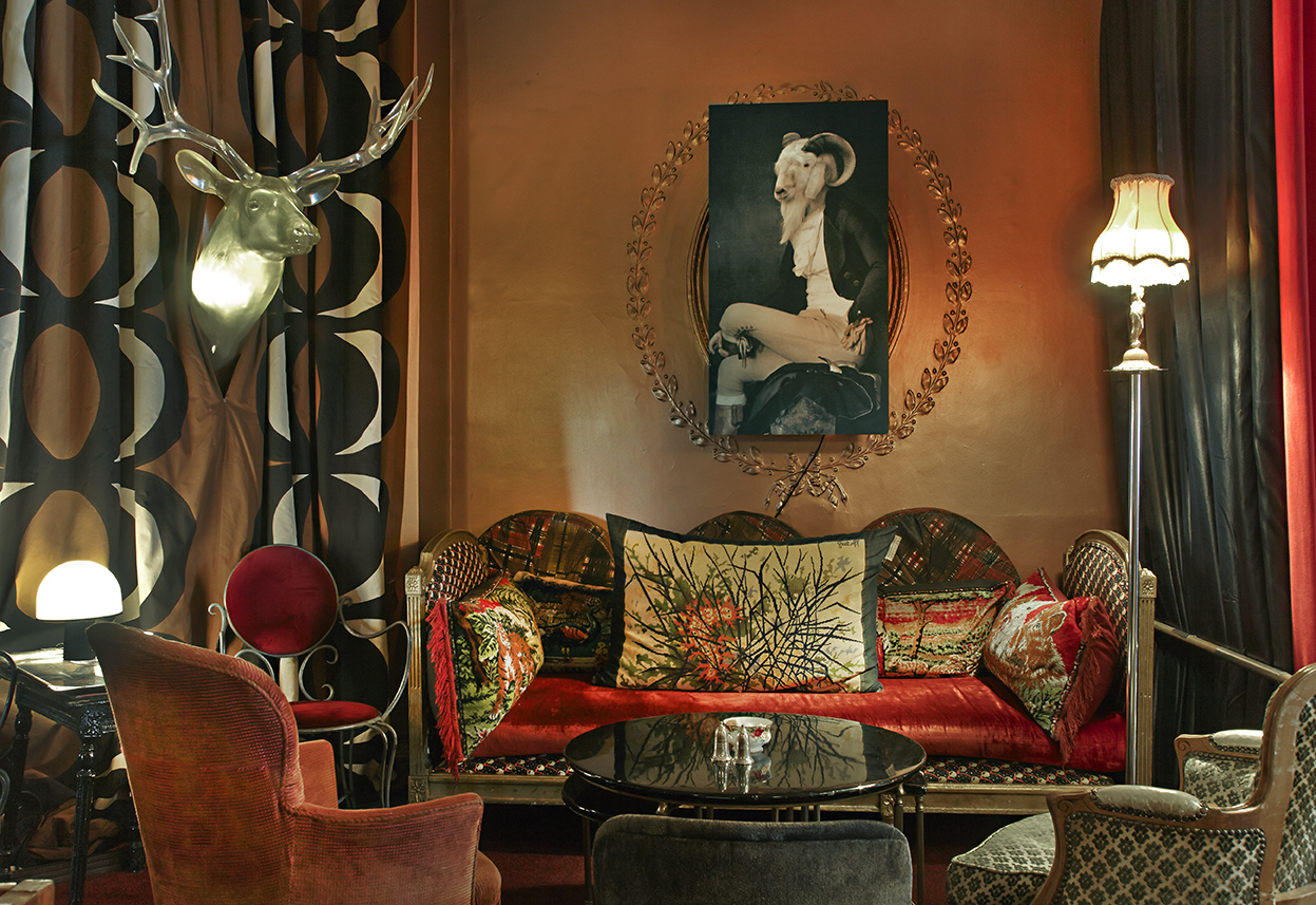
Jurgen Bey took the reins of the Parlour's interior design, transforming it from an all-white minimalist space into a French hunting lodge-inspired interior featuring re-upholstered flea-market chairs.
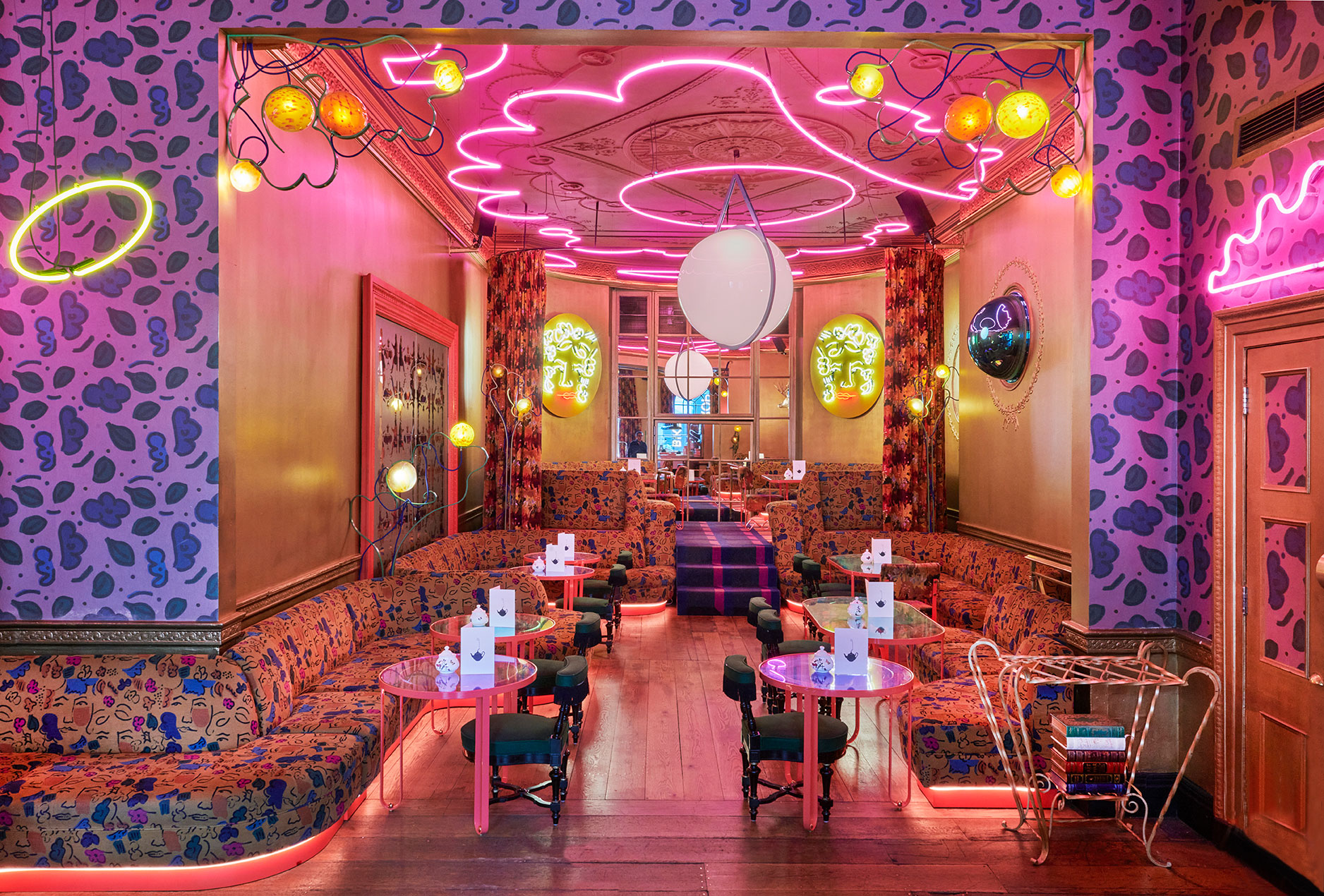
The Parlour was once again transformed by Mazouz in 2017: together with Andres Ros Soto, he created an exuberant space featuring a clash of print and a colourful neon light installation.
Lecture Room and Library
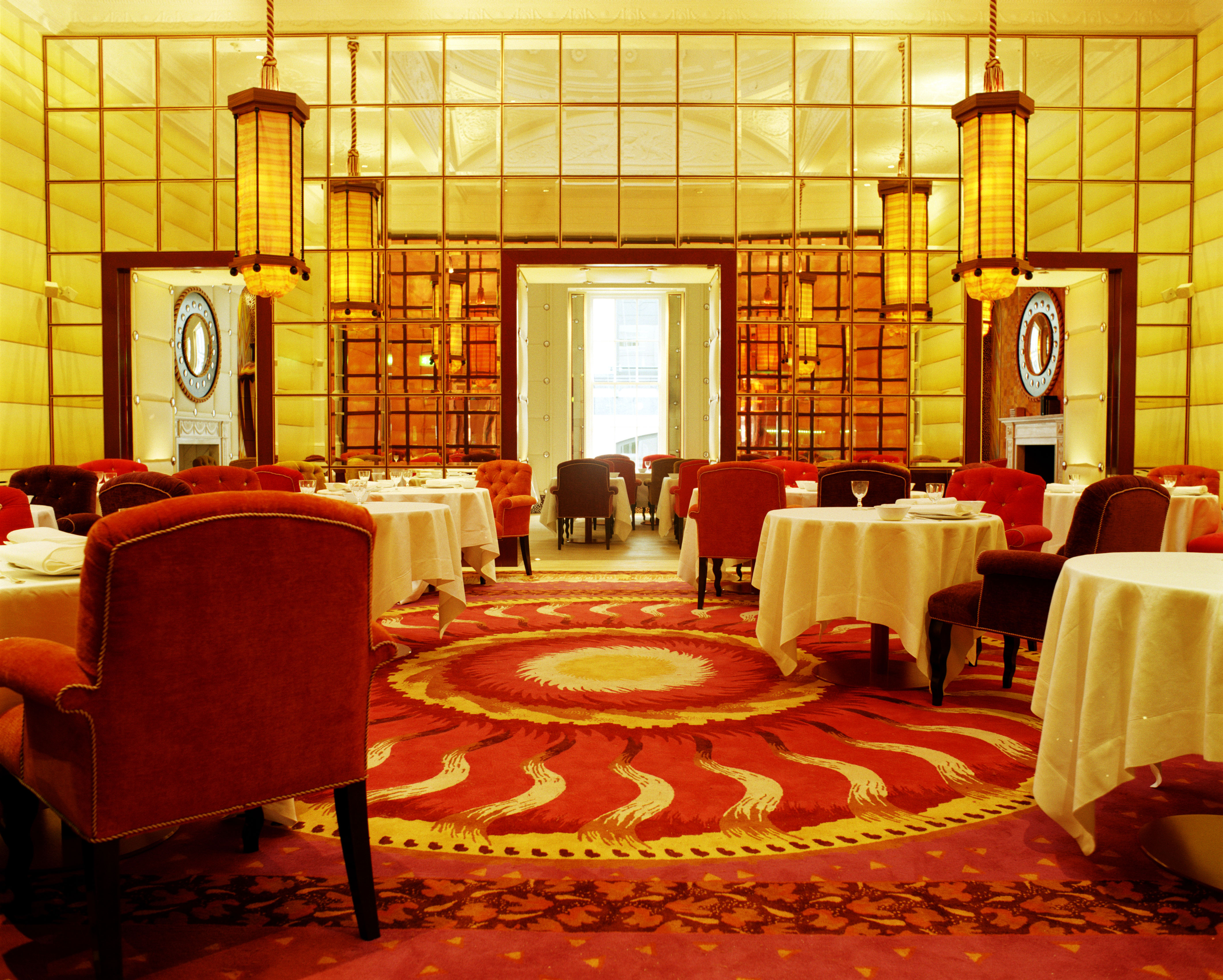
This room was curated by Gabhan O’Keeffe, and has remained mostly untouched since 2002.
Sketch, 9 Conduit St, London W1S 2XG
Rosa Bertoli was born in Udine, Italy, and now lives in London. Since 2014, she has been the Design Editor of Wallpaper*, where she oversees design content for the print and online editions, as well as special editorial projects. Through her role at Wallpaper*, she has written extensively about all areas of design. Rosa has been speaker and moderator for various design talks and conferences including London Craft Week, Maison & Objet, The Italian Cultural Institute (London), Clippings, Zaha Hadid Design, Kartell and Frieze Art Fair. Rosa has been on judging panels for the Chart Architecture Award, the Dutch Design Awards and the DesignGuild Marks. She has written for numerous English and Italian language publications, and worked as a content and communication consultant for fashion and design brands.
-
 Put these emerging artists on your radar
This crop of six new talents is poised to shake up the art world. Get to know them now
By Tianna Williams
-
 Dining at Pyrá feels like a Mediterranean kiss on both cheeks
Designed by House of Dré, this Lonsdale Road addition dishes up an enticing fusion of Greek and Spanish cooking
By Sofia de la Cruz
-
 Creased, crumpled: S/S 2025 menswear is about clothes that have ‘lived a life’
The S/S 2025 menswear collections see designers embrace the creased and the crumpled, conjuring a mood of laidback languor that ran through the season – captured here by photographer Steve Harnacke and stylist Nicola Neri for Wallpaper*
By Jack Moss
-
 This Gujarat home by MuseLAB is a sculptural, textural delight
A study in materiality, this home in Gujarat, India layers idiosyncratic details while staying true to its provenance, and is the latest focus of The Inside Story, our series spotlighting intriguing and innovative interior design
By Anna Solomon
-
 This multigenerational Delhi home plays with colour and texture in unexpected ways
Welcome to the Wallpaper* series, The Inside Story, where each week we spotlight an intriguing, exciting or innovative interior. This apartment, curated by Studio Jane Designs, finds ever-creative ways to meet the needs of the three generations that live under its roof
By Anna Solomon
-
 Curvature, cantilevers and cashmere: Mumbai-based designer Rooshad Shroff on his new furniture collection
Rooshad Shroff’s new furniture collection Balance is a masterclass in structural luxury
By Emily Wright
-
 India Mahdavi monograph reveals a life in full colour
An ode to the power of colour, India Mahdavi’s first monograph shines the spotlight on the designer’s trendsetting interiors and signature pieces
By Léa Teuscher
-
 Indian kitchen utensils revisited with a contemporary aesthetic
Designers Nikita Bhate and Pascal Hien present SĀR, a new brand of sculptural everyday objects inspired by Indian rituals and cooking traditions
By Rosa Bertoli
-
 DeMuro Das launches new Uncommon Thread collection
The New Delhi studio presents a collection of furnishings inspired by Indian modernist architecture, Le Corbusier's Chandigarh and local craft
By Pei-Ru Keh
-
 Touch and glow: a token of Lord Shiva informs the ‘Monolith’ table lamp
For Wallpaper* Handmade X, Indian studio Paul Matter and Belgian natural stone manufacturer Van Den Weghe produce a lamp with ‘calming and meditative’ energy
By Harriet Lloyd Smith
-
 Top 20 interior designers who know how to create sublime spaces
From delicate and muted minimalism to eye-popping, era-hopping fancies, here are the designers who know how to mix, match, edit, illuminate, decorate and otherwise create sublime spaces
By Rosa Bertoli