Yorgo&Co unveils Yota Fonts, its new type foundry
Parisian creative studio Yorgo&Co launches Yota Fonts, its online retail typeface catalogue with four new font families and matching accessories
Receive our daily digest of inspiration, escapism and design stories from around the world direct to your inbox.
You are now subscribed
Your newsletter sign-up was successful
Want to add more newsletters?
After years of custom typographic creation for a variety of luxury, art, fashion, sports, media and automotive brands, Yorgo&Co has released Yota Fonts, a collection of four fonts: Nocturne, a monospace typewriter; Tuileries, a refined serif; Hypercube, a graphic sans-serif; and Lipslide, a bold titling typeface.
They were developed by a team led by Yorgo Tloupas, the Parisian studio’s co-founder, and type designer Martin Pasquier. A former magazine creative director for the likes of Libération and Les Inrockuptibles, Tloupas is currently design director at Black Crows Skis and teaches at Lausanne’s ÉCAL. The logotype expert also recently created the visual identity for Maison Gainsbourg, the new museum dedicated to the legendary French singer Serge Gainsbourg.
Yota Fonts: type and objects by Yorgo&Co
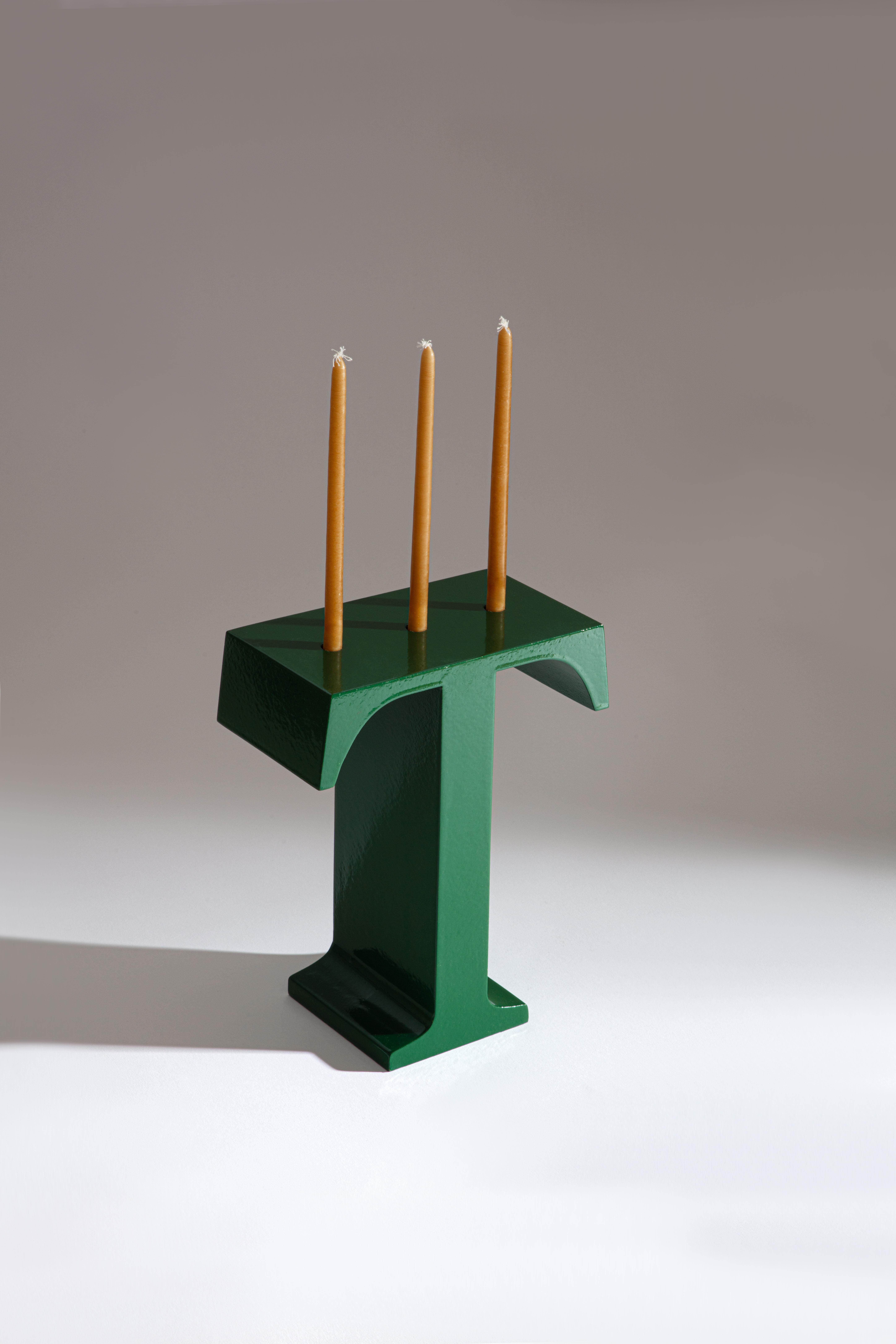
Tuileries candlestick
The first font of the new collection, Nocturne, was actually designed for this museum, and is based on a sheet of paper with ‘Je t’aime, moi non plus’ typed by Gainsbourg in every font available on his IBM 6750-3 typewriter. ‘We based our design on the line written in Pica 72,’ writes Tloupas, ‘and to create the 45-degree angles at the junctions, we took inspiration from the shape of the black and white cabochon paving of his living room.’
As for Tuileries, it was originally designed for the reopening of Hotel de Crillon in Paris, and inspired by a 1909 invitation sourced in the hotel’s archives, where the team found an opened typeface reminiscent of the Caslon Open letters style, fashionable at the beginning of the 20th century.

Lipslide wax candle
Finally, the narrow letters and contrasting counter and outer shapes of Hypercube echo of the singular architecture of the Grande Arche of La Défense, for which the font was originally created, while the heavy headline typeface Lipslide features shapes reminiscent of skateboarding obstacles and 1970s storefronts.
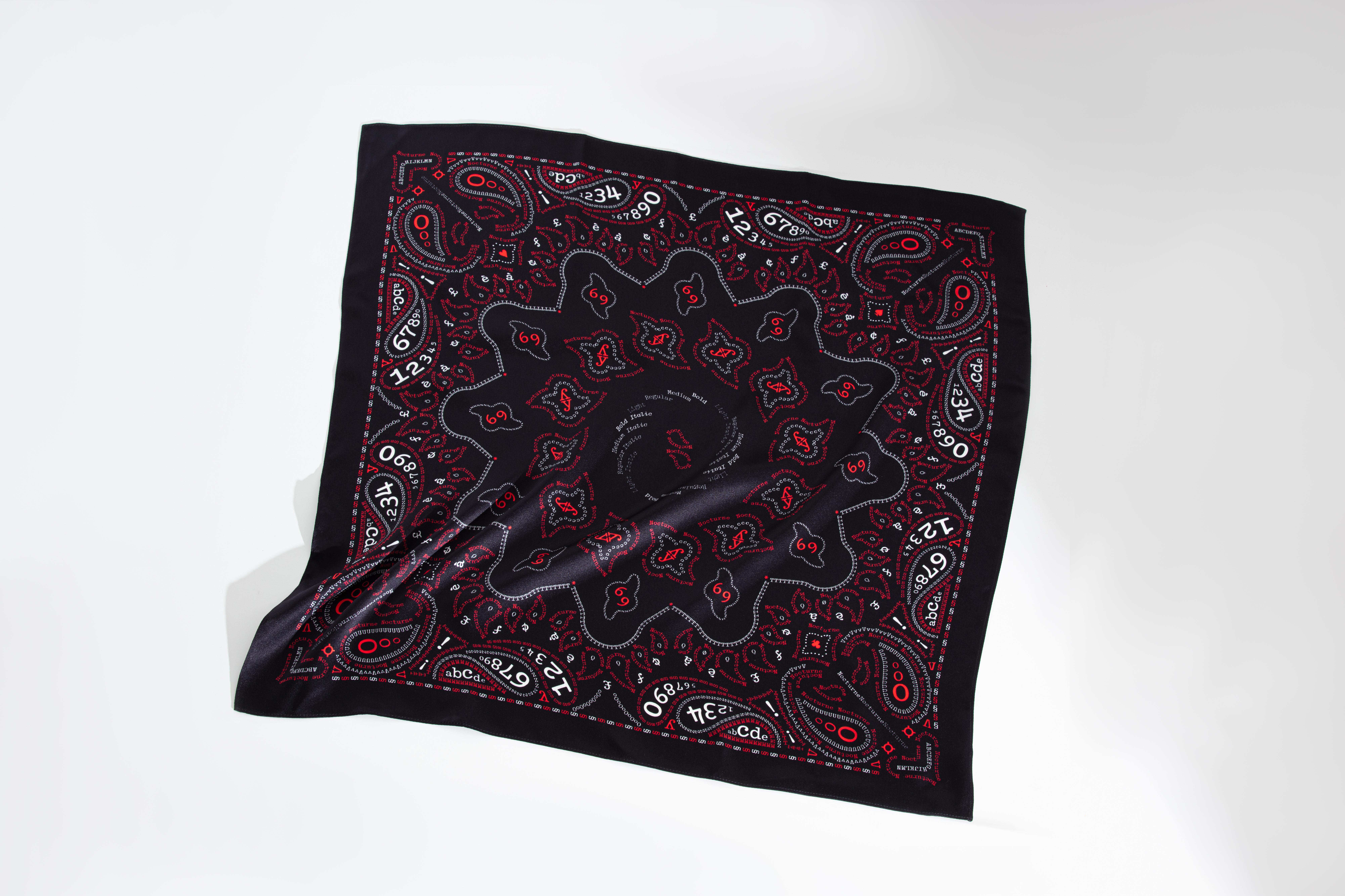
Nocturne Bandana
As well as designing custom fonts for brands, and creating and distributing retail fonts, Yota Fonts has also imagined a unique capsule collection of accessories to celebrate the launch of its new type foundry.
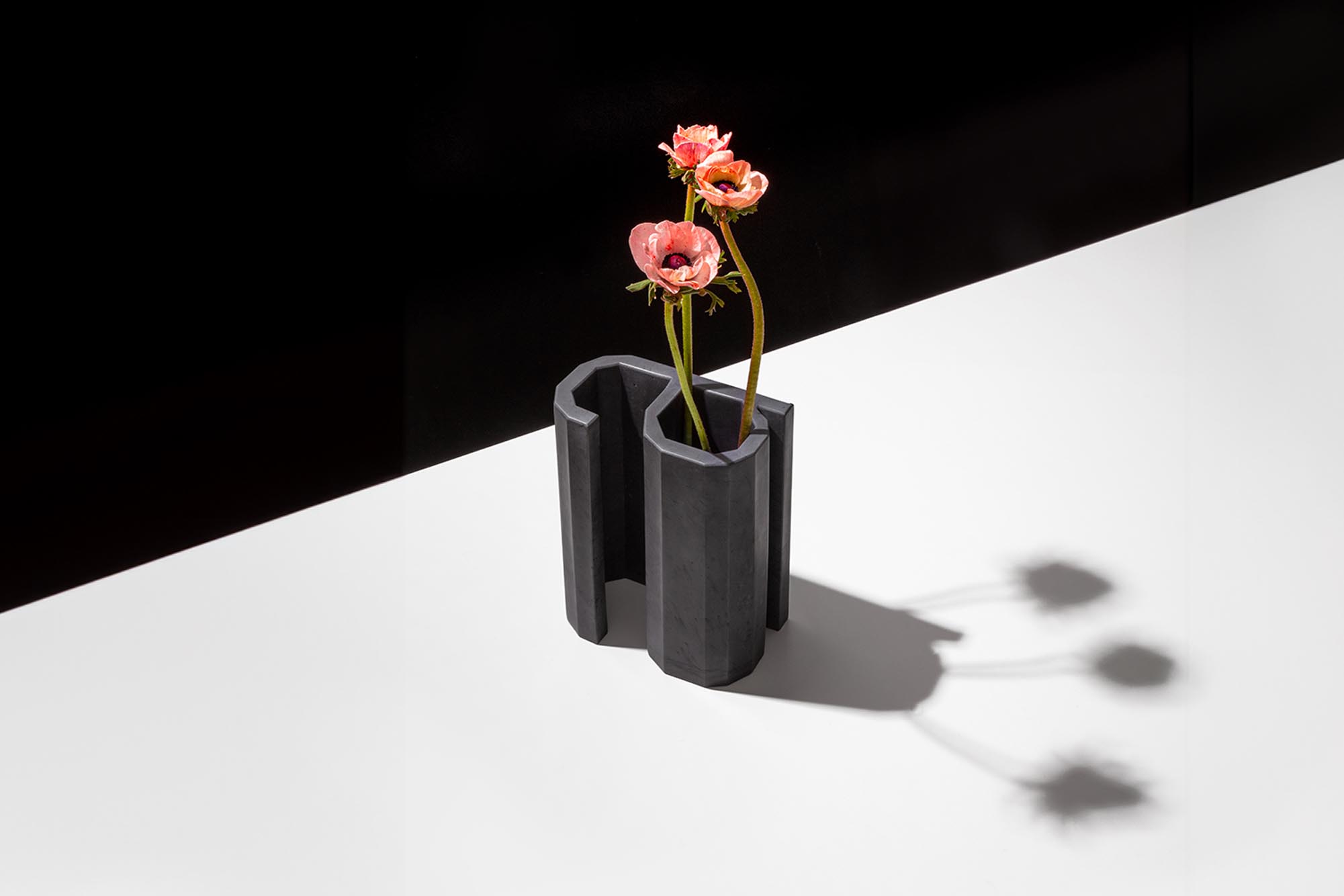
It includes a series of letter-objects, such as a A-shaped vase in Hypercube, a skateboard with a Lipslide graphic, and a G-shaped ashtray in Nocturne (an homage to the Gitanes-smoking singer), as well as wearable printed specimens. These range from a black and red bandana printed with a paisley pattern made out of Nocturne letters and numbers, to a T-shirt showcasing the various Tuilerie styles, and a Hypercube-branded cap.
Receive our daily digest of inspiration, escapism and design stories from around the world direct to your inbox.
These accessories are on show at Le Bon Marché until 21 April 2024 at the Yota Fonts pop-up store on the department store’s 2nd floor, as part of ‘Mise en Page’, an exhibition celebrating the art of printing.
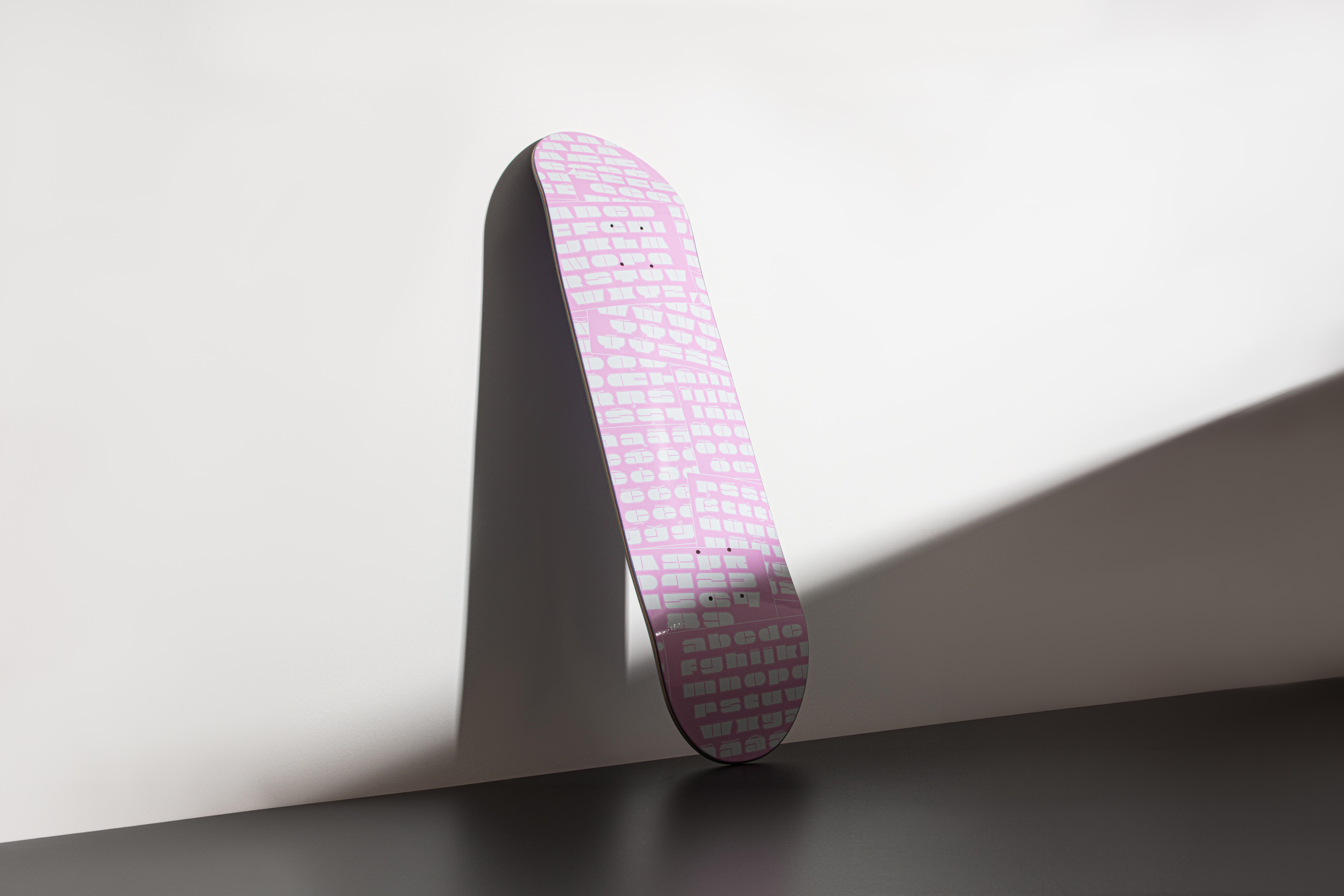
Lipslide skateboard
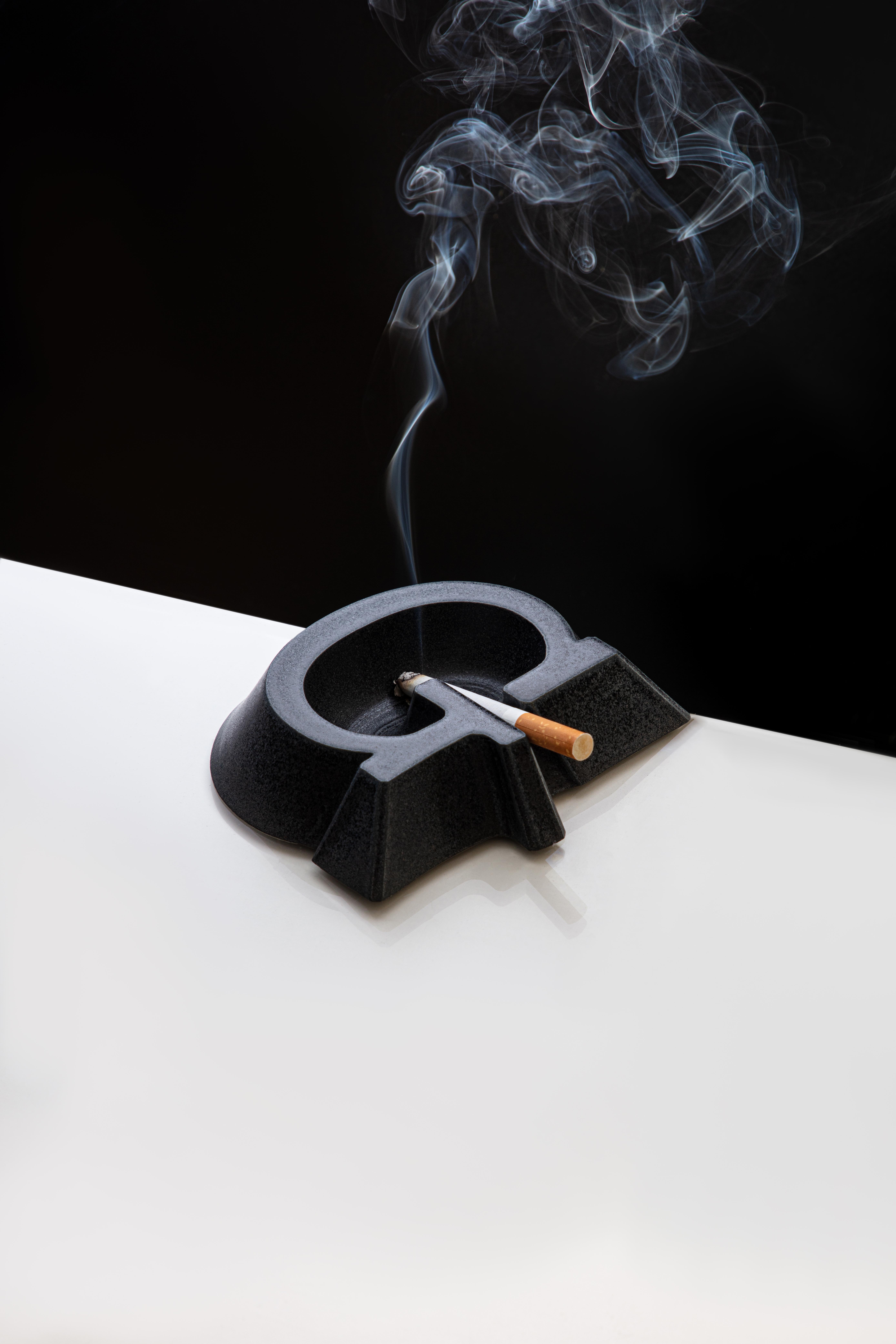
Nocturne ashtray
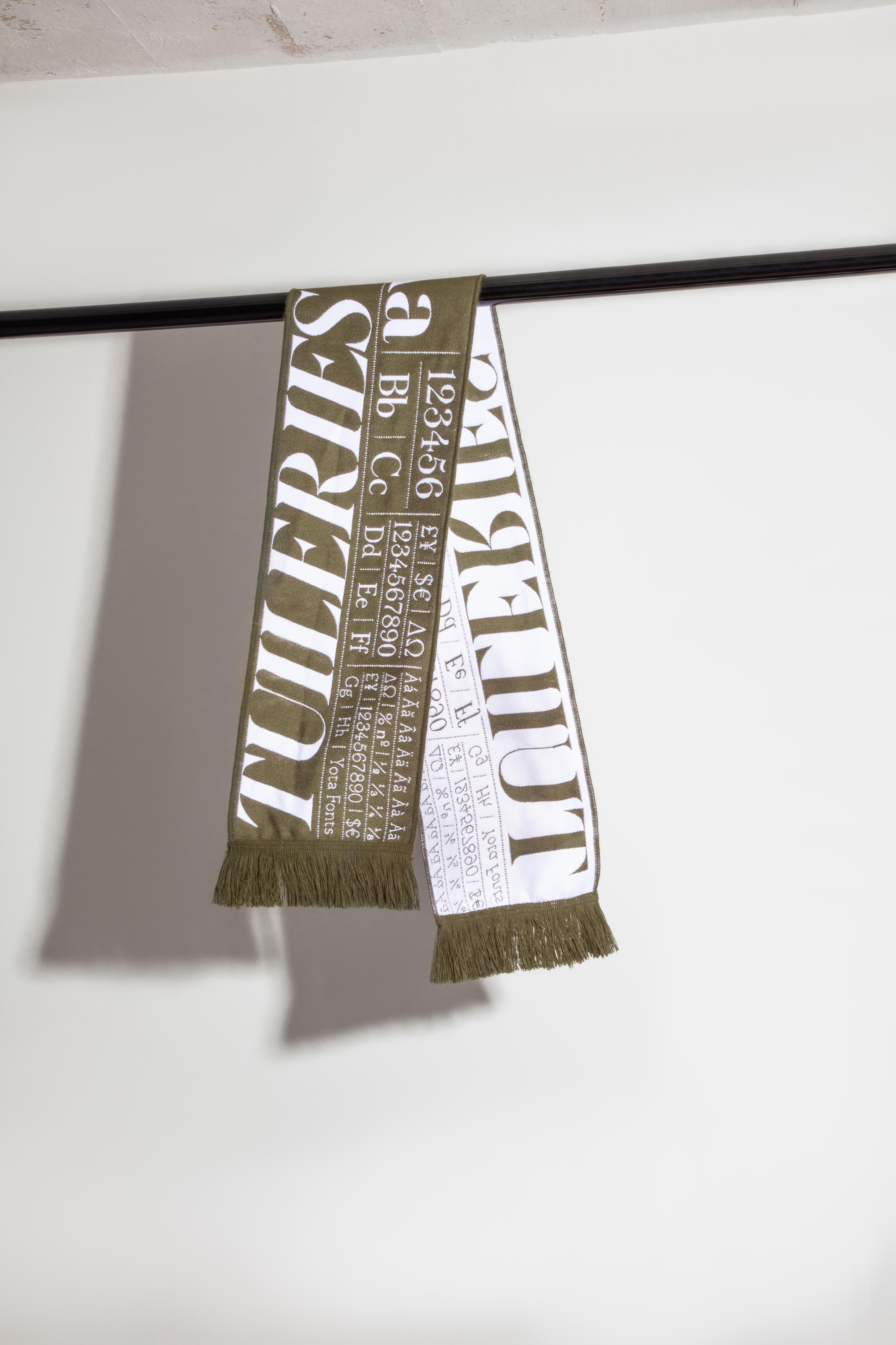
Tuileries Scarf
Léa Teuscher is a Sub-Editor at Wallpaper*. A former travel writer and production editor, she joined the magazine over a decade ago, and has been sprucing up copy and attempting to write clever headlines ever since. Having spent her childhood hopping between continents and cultures, she’s a fan of all things travel, art and architecture. She has written three Wallpaper* City Guides on Geneva, Strasbourg and Basel.