A common tongue: a new show in Berlin unites nations through the universal language of graphic design
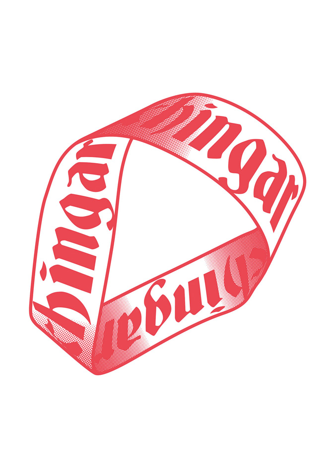
Like many words in Mexican Spanish, the word ‘chingar’ has many different meanings, both good and bad. If used as a verb, depending in the context, it can mean ‘to bother’, ‘to work hard’, ‘to eat’, ‘to have sexual intercourse’, ‘to steal’ or ‘to break’. If used as an adjective, it can mean ‘good’, ‘cool’, ‘bad’, ‘awful’, ‘the best’ or ‘curse’. You can also combine it with other words to create new ones. Some people use the word 'chingar' for almost everything.
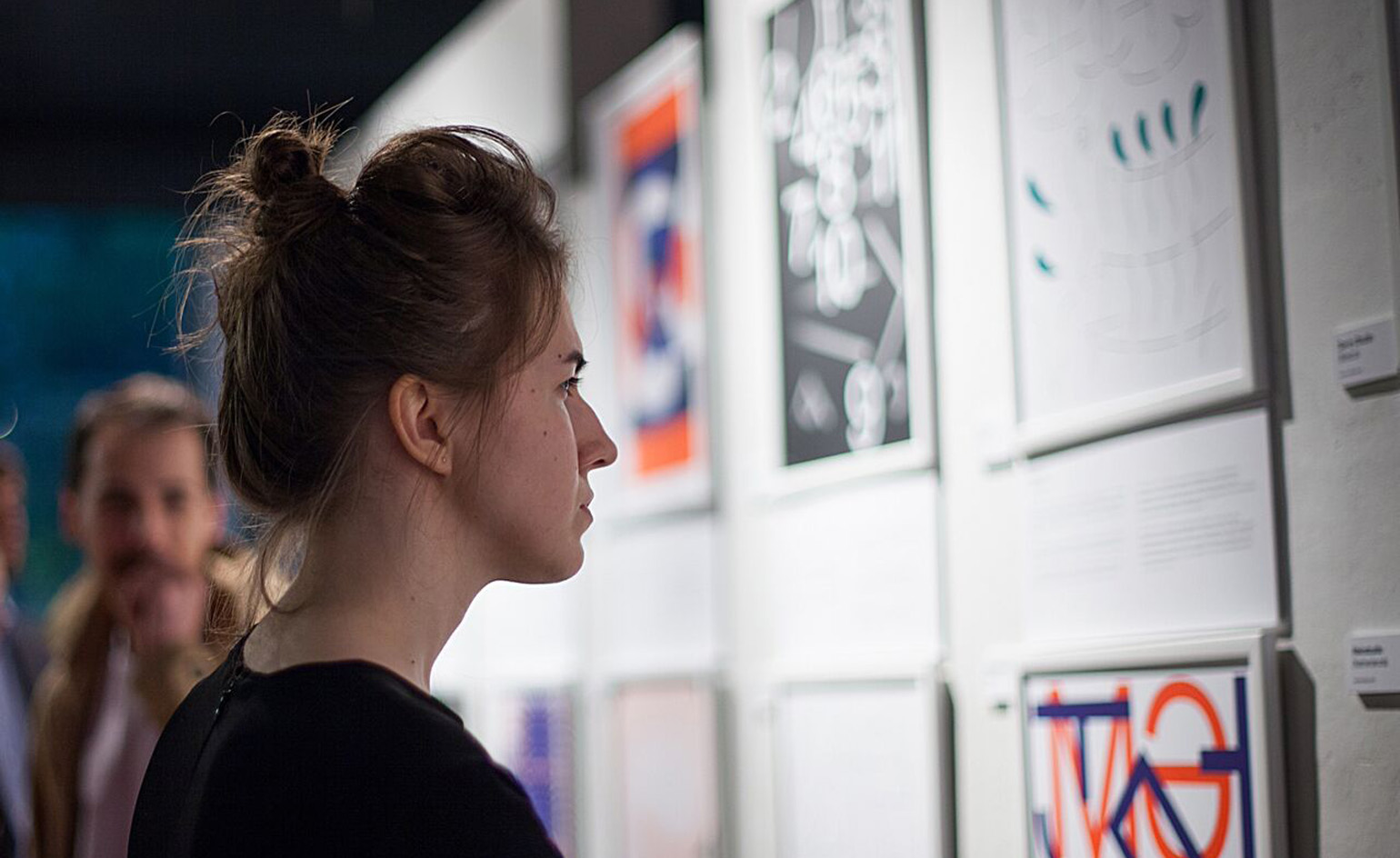
This multifacted example is one of many cultural clichés and idiomatic expressions illustrated in a new exhibition of poster design organised by young Russian studio The Bakery in collaboration with paper manufacturer Arjowiggins. Encompassing 40 posters from 20 studios across the globe, the show, titled ‘United Notions’, is an exercise in explaining both simple and complex concepts through type, illustration, form and colour.
At the start of the project, participating studios were divided into pairs to create two posters each – one based on a word or expression used in their native country and another based on one selected by their peers. The result is two different graphical interpretations of each expression.
‘The aim is to show that as much as we differ from each other, we still can speak the same language,’ says Anna Khmelevskaya, the exhibition's curator, which is due to go on show at Berlin's Kreuzberg Umspannwerk this week. ‘While governments and politicians can’t come to certain agreements, we still can relate to each other's culture.’
Encompassing 40 posters from 20 studios across the globe, the exhibtion is an exercise in explaining cultural clichés and idiomatic expressions through type, illustration, form and colour. Photography: Lena Tsibizova
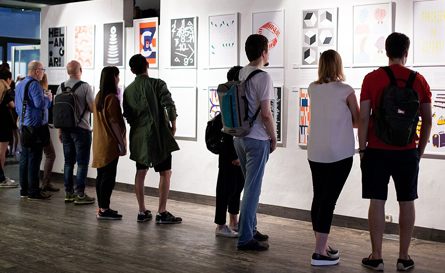
Participating studios were divided into pairs to create two posters each – one based on a word or expression used in their native country and another based on one selected by their peers. The result is two different graphical interpretations of each expression. Photography: Lena Tsibizova
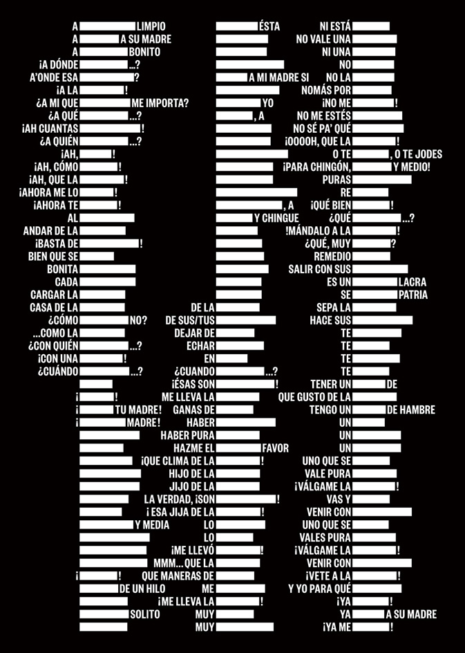
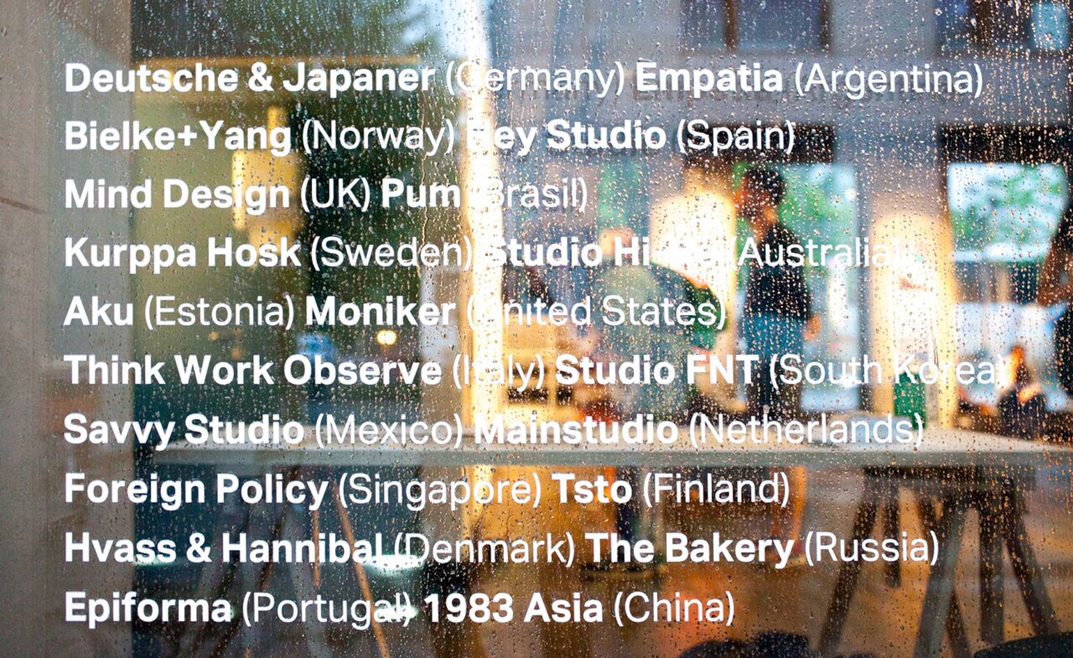
Pictured is an explanation of the Mexican Spanish word 'chingar' by Dutch studio, Mainstudio...
... and here, Mexican studio Savvy offer their own visualisation of the word's meaning
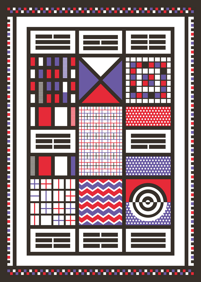
Portuguese studio Epiforma attmept to communicate the Chinese concept of 'Feng Shui' (a philosophical system that seeks to achieve harmony between people and their environment) as a bright grid of pattern and colour...
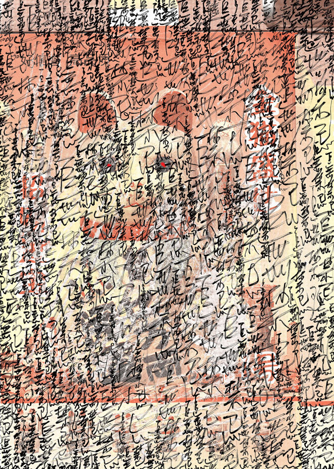
... while Chinese studio 1983 Asia illustrate the philosophy by layering Chinese handwriting with an image of a maneki-neko with glowing red eyes
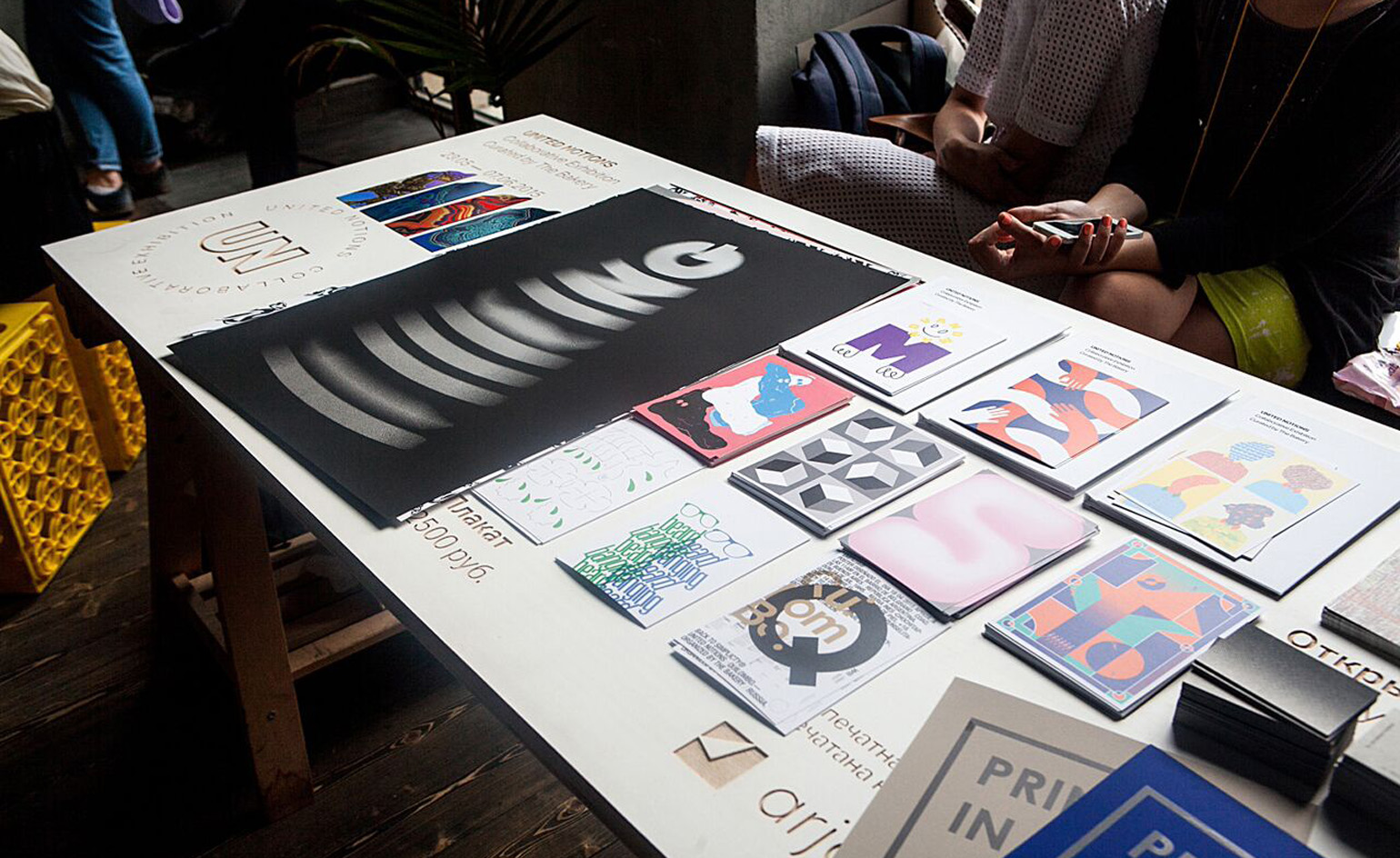
Due to go on show at Berlin's Kreuzberg Umspannwerk this week, the exhibition has already run in Moscow and is scheduled to conclude in St Petersburg in September. Photography: Lena Tsibizova
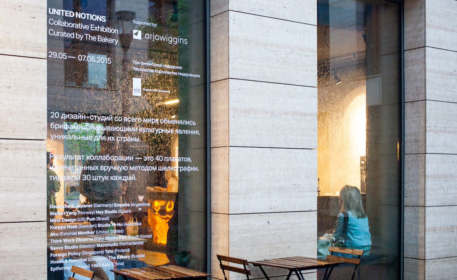
'When we came up with an idea for this exhibition three years ago, we could not imagine [we'd recieve] such an emotional feedback,' says curator Anna Khmelevskaya of The Bakery. 'Our aim was to launch it in Moscow to arouse interest in graphic design among the Russian audience. But after the exhibition opened on 29 May, we received a huge amount of attention from the international community.' Photography: Lena Tsibizova
ADDRESS
Ohlauer Str. 43
10999 Berlin
Germany
Wallpaper* Newsletter
Receive our daily digest of inspiration, escapism and design stories from around the world direct to your inbox.
Ali Morris is a UK-based editor, writer and creative consultant specialising in design, interiors and architecture. In her 16 years as a design writer, Ali has travelled the world, crafting articles about creative projects, products, places and people for titles such as Dezeen, Wallpaper* and Kinfolk.
-
 All-In is the Paris-based label making full-force fashion for main character dressing
Part of our monthly Uprising series, Wallpaper* meets Benjamin Barron and Bror August Vestbø of All-In, the LVMH Prize-nominated label which bases its collections on a riotous cast of characters – real and imagined
By Orla Brennan
-
 Maserati joins forces with Giorgetti for a turbo-charged relationship
Announcing their marriage during Milan Design Week, the brands unveiled a collection, a car and a long term commitment
By Hugo Macdonald
-
 Through an innovative new training program, Poltrona Frau aims to safeguard Italian craft
The heritage furniture manufacturer is training a new generation of leather artisans
By Cristina Kiran Piotti
-
 Graphic tributes celebrate the Design Museum’s 30th anniversary
Paul Smith, Nathalie du Pasquier, John Pawson and more have riffed on the number 30 in punchy new logos
By Jessica Mairs
-
 Amorepacific HQ signage by Sascha Lobe wins Wallpaper* Design Award
By Jonathan Bell
-
 Sharjah gains a new graphic design biennial set inside a former 1970s abandoned bank
By Rosa Bertoli
-
 Graphic design studio LucienneRoberts+ reimagines the display system at the Royal Academy
By Charlotte Jansen
-
 The infographics of tyranny exposed in a new handbook
By Jonathan Bell
-
 Doctor’s orders: graphic design is good for you, reflects a new London show
By Jonathan Bell
-
 Musical notes: an exhibition of rhythmic lettering design at Aldeburgh's Snape Maltings
By Elly Parsons
-
 The letterpress life: Alan Kitching’s epic creative past revealed in a new tome
By Sujata Burman